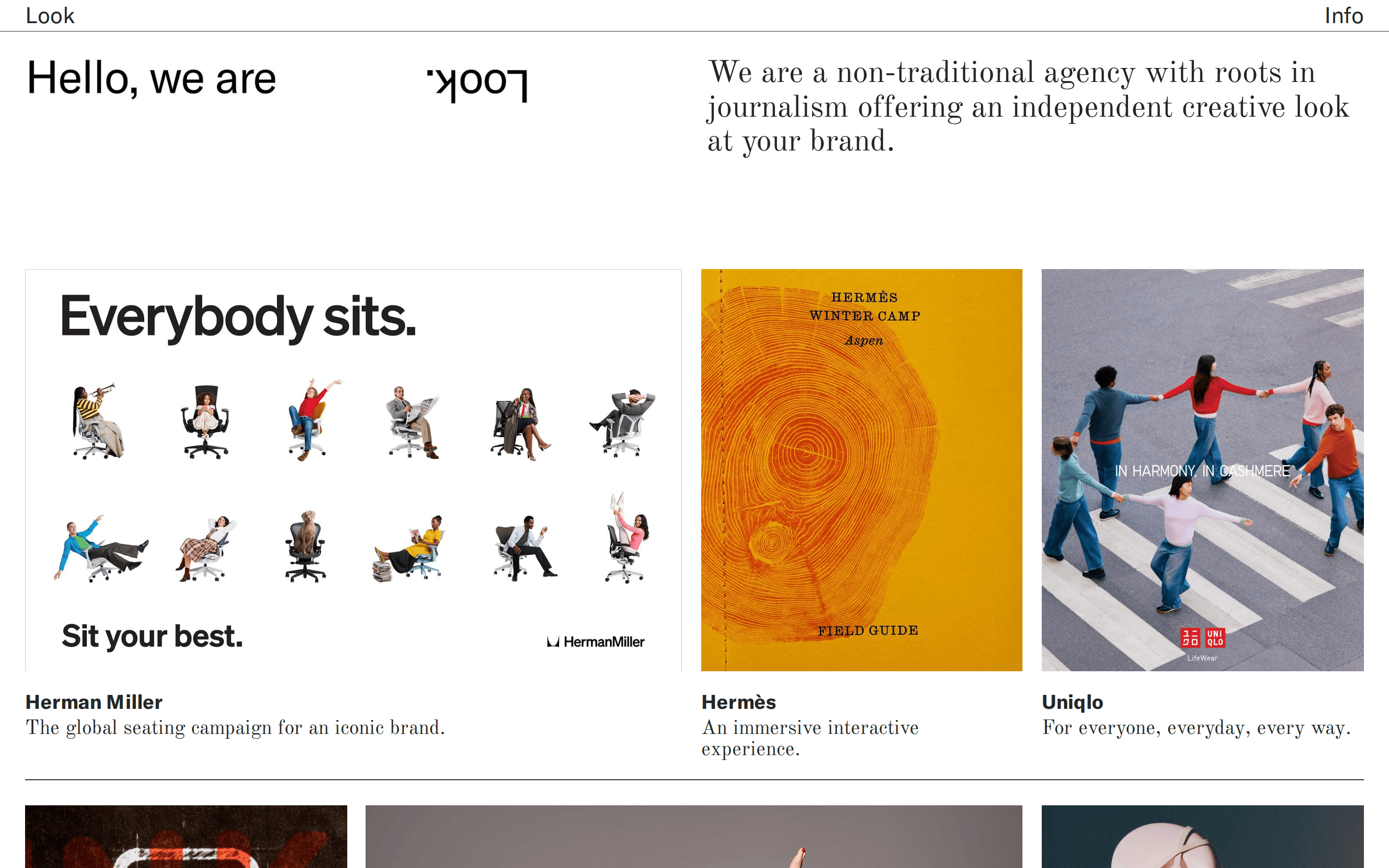
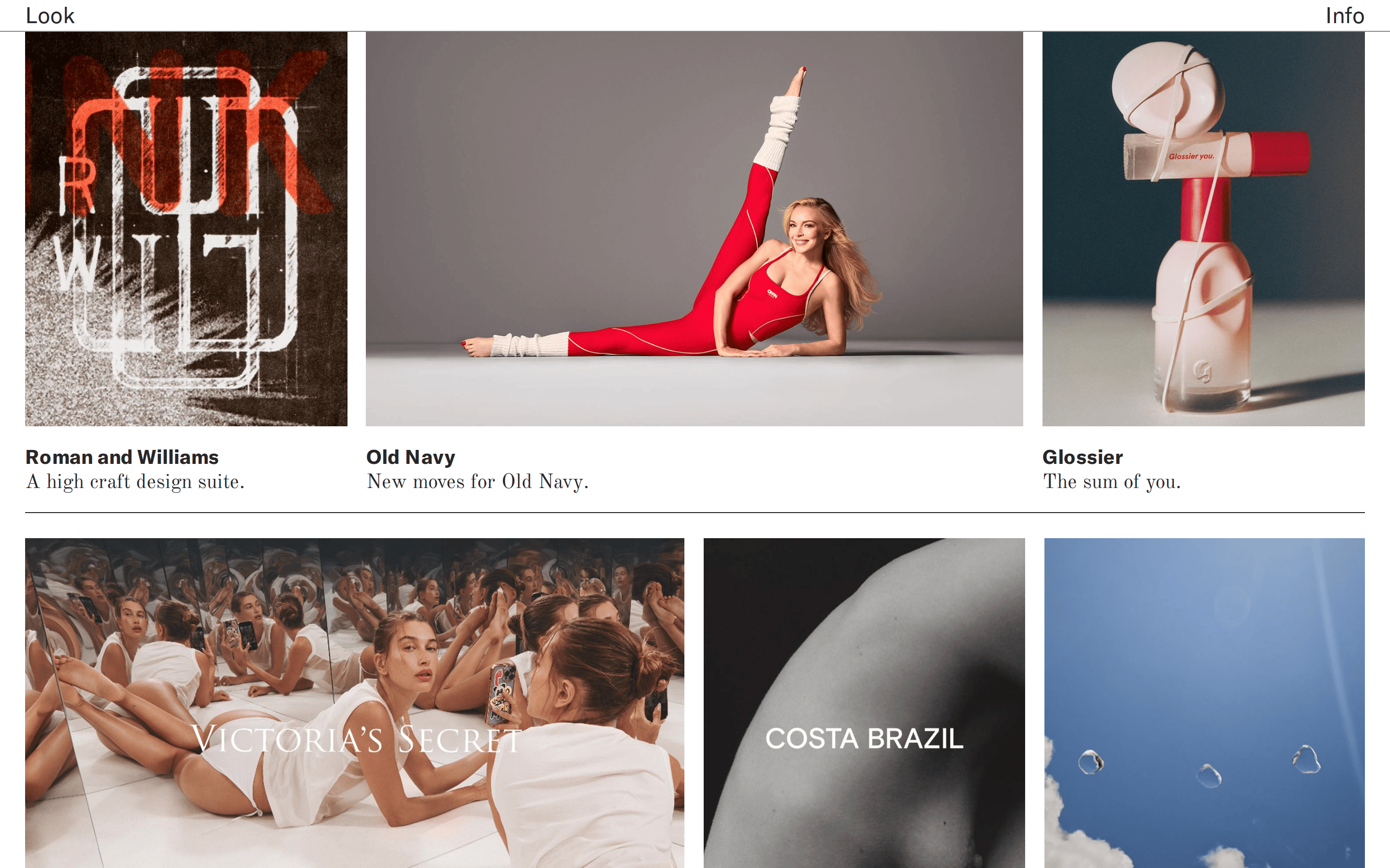
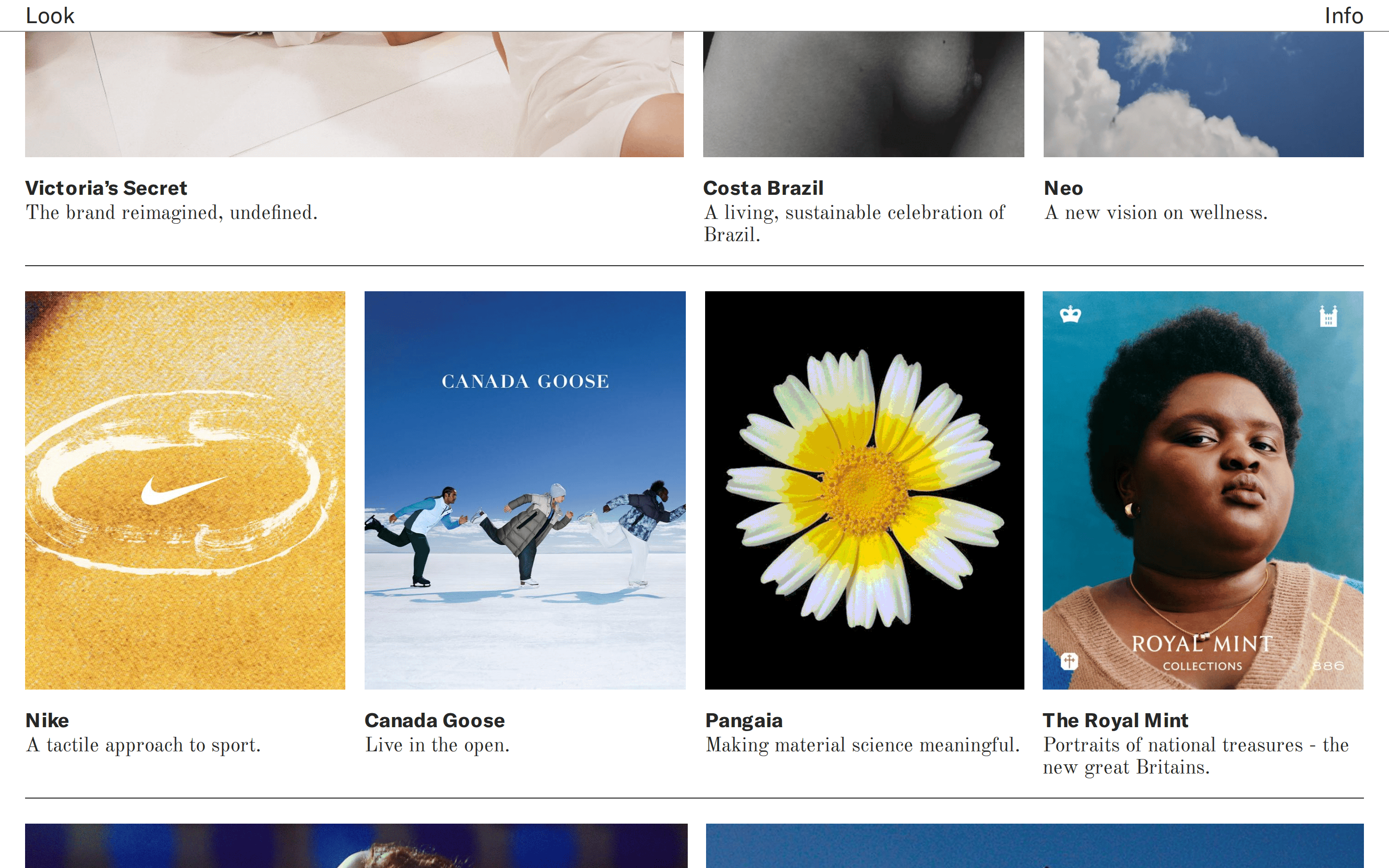
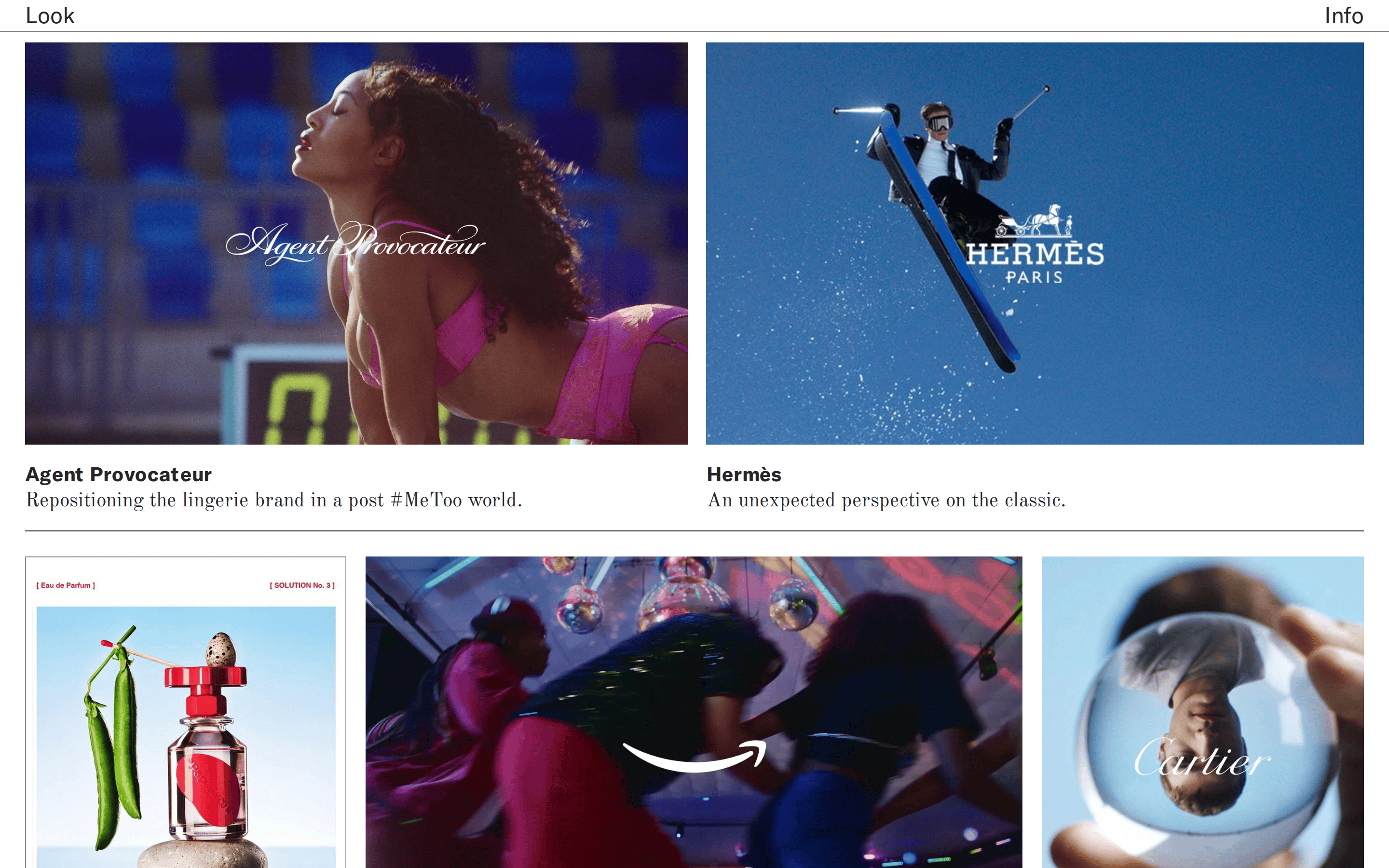
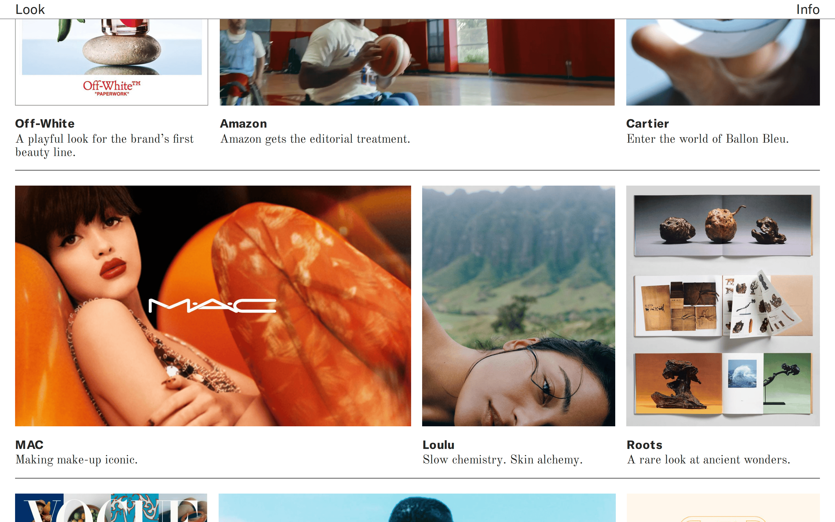
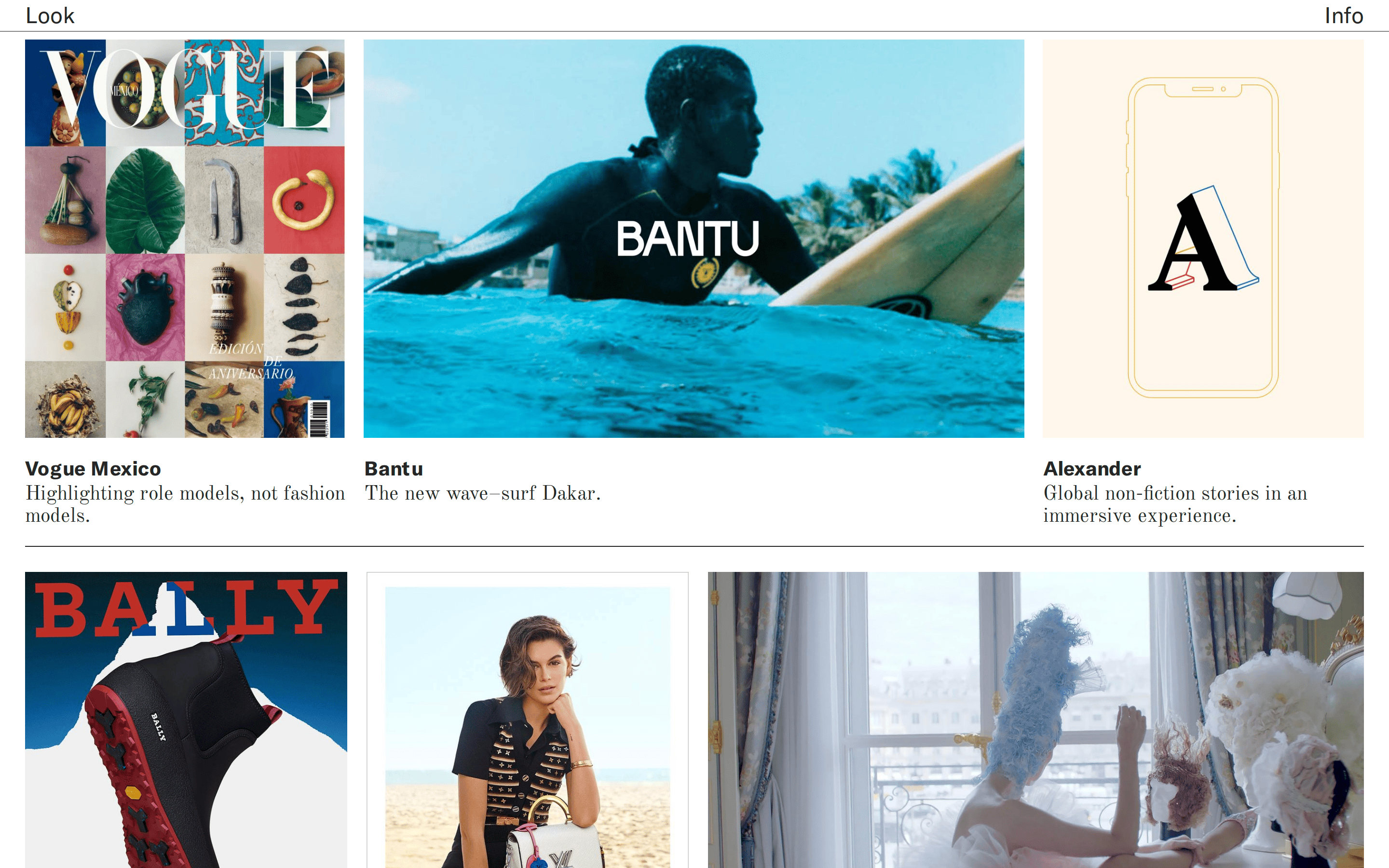
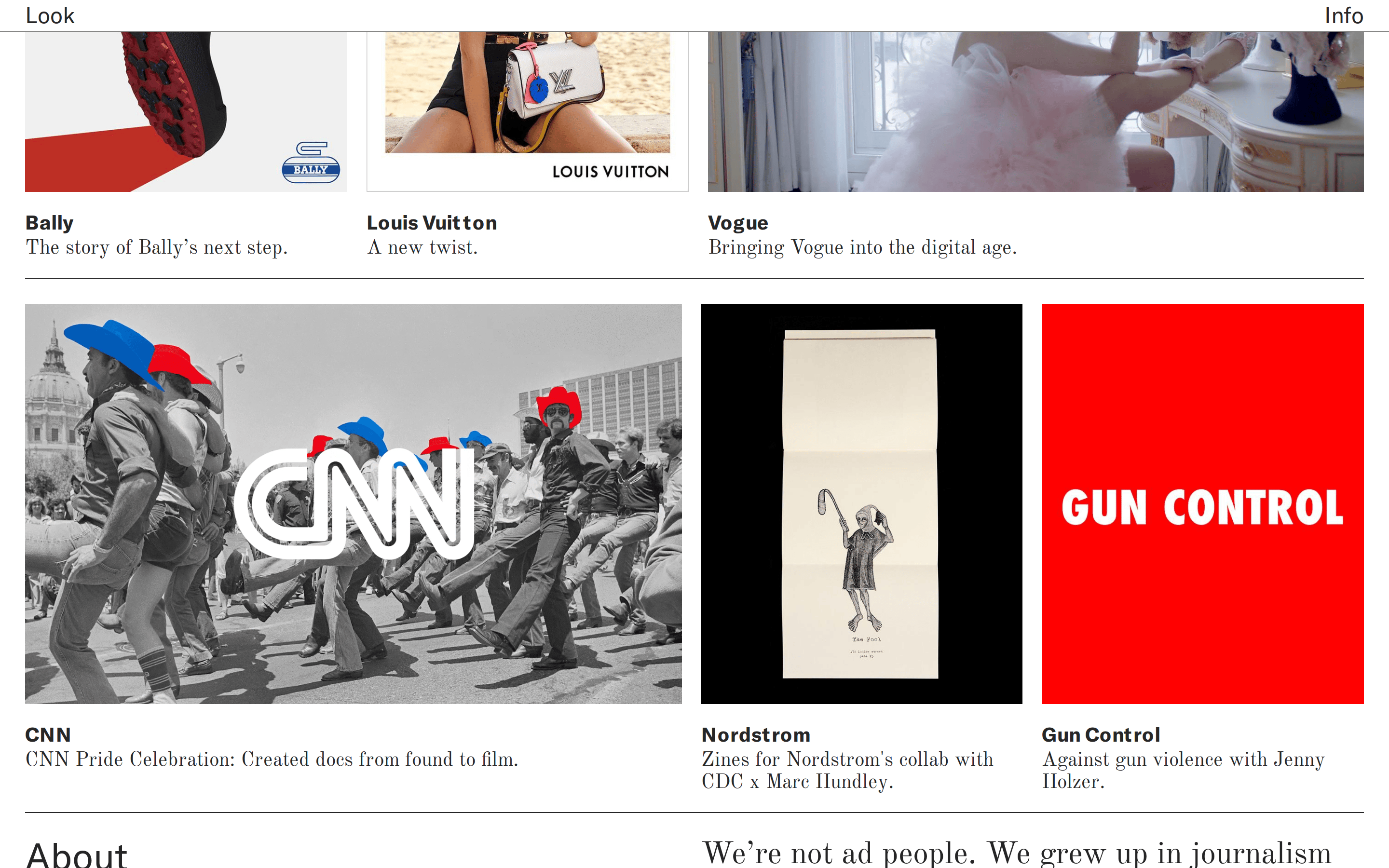
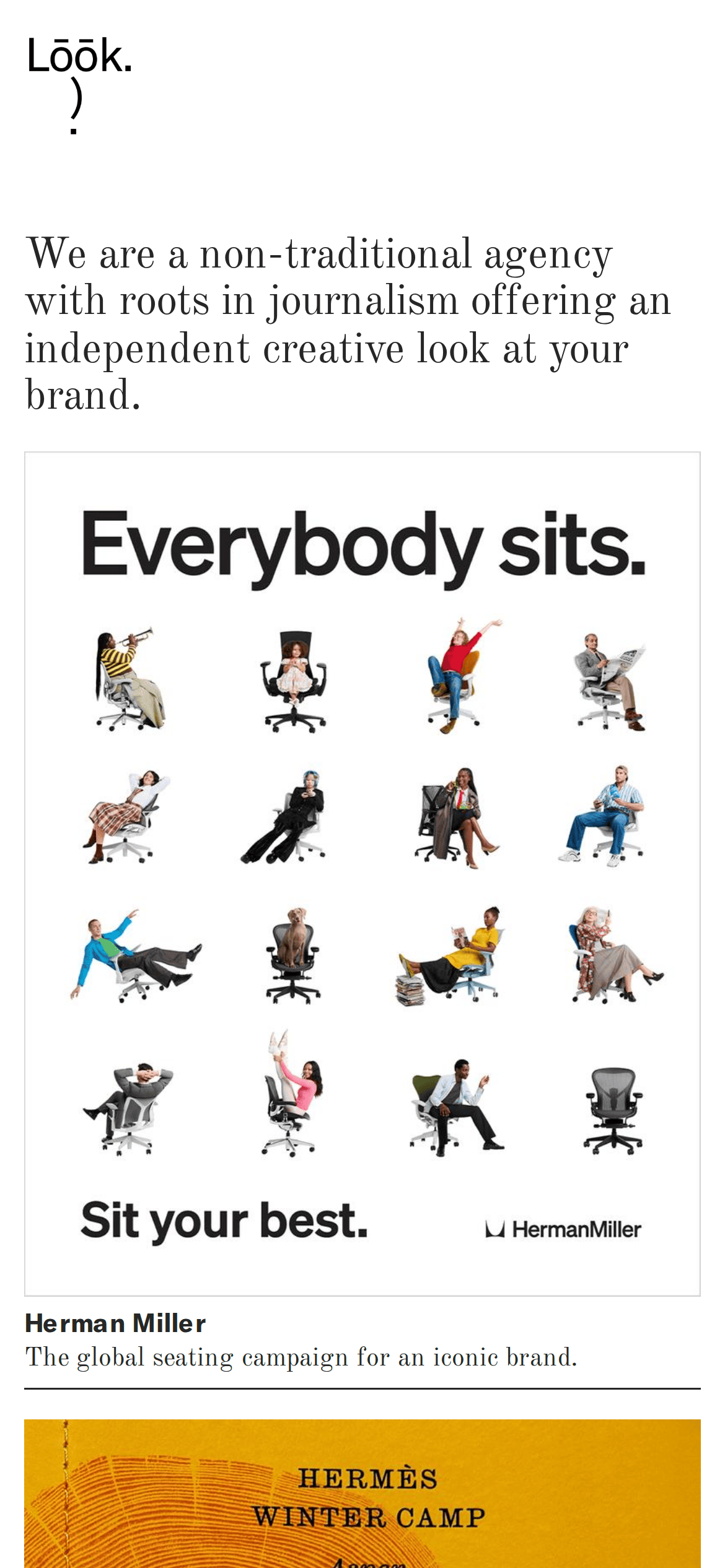
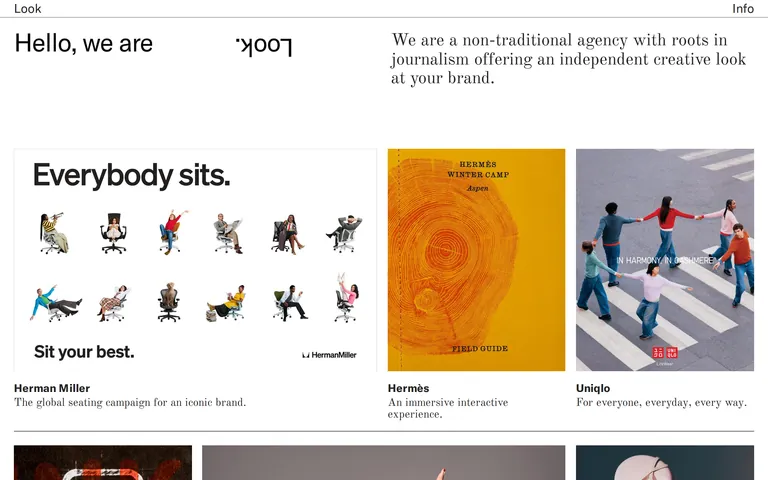
A high-end fashion or culture magazine layout for an agency portfolio.
02
Color
#000000Ink
#000000D9Ink soft
#FFFFFFBG
rgba(0, 0, 0, 0.85)Line
High-contrast monochrome that prioritizes the photography of the portfolio pieces.
03
Typography
transitional-serif · geometric-sans
display56px · 400
h238px · 700
body20px · 400
caption14px · 400
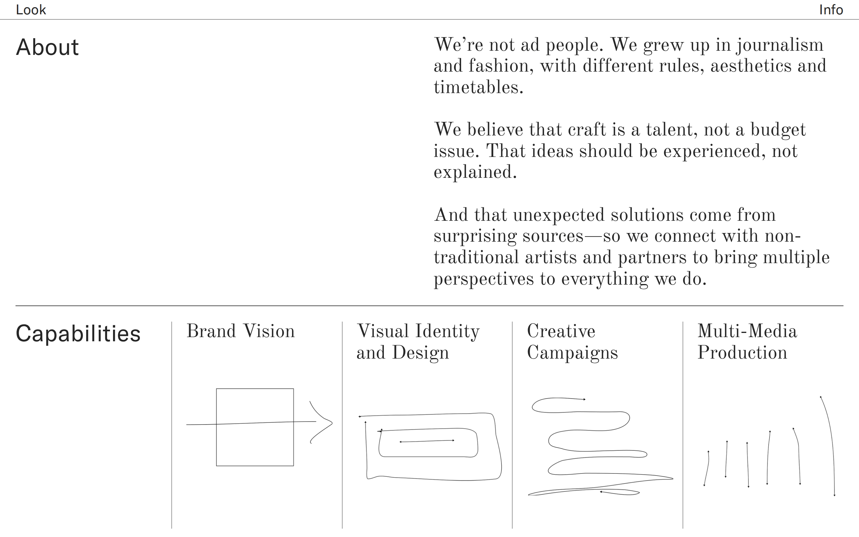
Use a transitional serif for main narrative text to evoke a journalistic feel. · Use a bold geometric sans for case study titles to provide contrast. · Keep font weights mostly regular (400) for a sophisticated, editorial tone.
04
Spacing
4px
8px
16px
24px
32px
48px
64px
96px
Generous vertical padding creates a relaxed, editorial rhythm between content blocks.
05
Surfaces
sm · 0px
md · 0px
lg · 0px
pill · 999px
Thin, sharp horizontal lines (1px solid rgba(0,0,0,0.85)) separate sections and grid items.
06
Layout
1440container
12columns
24pxgutter
768 / 1024breakpoints
A grid-based portfolio layout with asymmetric column spanning for featured works.
07
Motion & Interaction
220msmicro
200mssmall
400msmedium
cubic-bezier(0.4, 0, 0.2, 1)easing
Smooth color and background transitions on interactive elements. · Page transitions likely smooth to maintain the premium feel.
Standard pointer cursor; subtle color or underline transitions on text links. · Immediate navigation to detailed case study pages.
08
Components
buttonText-only links with a simple underline on hover.
cardMinimalist project cards defined by the image and typography rather than visible containers.
chipNone visible; relies on text hierarchy.
inputNone visible; purely a portfolio showcase.
heroA two-column editorial layout with a large typographic treatment and a concise brand statement.
09
Voice & Don'ts
ToneSophisticated, understated, and authoritative.
HeadlinesShort, punchy, and often stylized (e.g., the inverted 'Look').
CTAsMinimalist and direct, focusing on content exploration.
Don't use heavy drop shadows or blurred backgrounds — screenshot shows flat, crisp image presentations.
Don't use bright, saturated neon accent colors — screenshot shows a strict monochrome palette with images providing color.
Don't use a bubbly or rounded UI — screenshot shows sharp corners and straight, thin divider lines.
Don't use playful, script, or decorative fonts — screenshot shows a clear mix of transitional serif and geometric sans.
Don't use complex, multi-layered gradients — screenshot shows solid white backgrounds and flat color blocks within images.
Don't clutter the interface with many UI controls — screenshot shows a minimal top navigation and focus on content.
Avoid: Loud, neon, or overly saturated color palettes
Avoid: Heavy drop shadows or soft, rounded UI elements
Avoid: Dense, cluttered layouts without breathing room
Captured from the live site · real computed styles
11
System prompt
This is a premium agency portfolio for Look Inc, a non-traditional agency with journalism roots. The visual language is defined by a strict black-and-white palette (#FFFFFF background, #000000 ink) that lets high-quality editorial photography stand out. The typography relies on a mix of transitional-serif and bold geometric-sans to create a magazine-like hierarchy. Critical constraints: avoid any vibrant accent colors or multi-colored gradients; never use rounded corners or drop shadows, maintaining a sharp, clean grid; and avoid dense, cluttered layouts, ensuring generous white space between sections to preserve the sophisticated, editorial tone.
Bring this taste to your agent
Hand your AI agent a machine-readable spec of this design — tokens, type, motion, the whole DNA.