← OpenDesign CURATED · OPEN · FREE
Eye on Design
An editorial design blog featuring curated articles with a distinctive pink and green color palette.
editorial design
01
Identity DNA
design publication curation visual culture
A premium digital design magazine with a clean, editorial layout.
02
Color
#FF8C8CAccent
#000000Ink
#524B48Ink soft
#FFFFFFBG
#ECE2E2BG quiet
rgba(0,0,0,1.0)Line
Clean white canvas with a dominant pink accent and high-contrast black typography.
03
Typography
grotesque-sans · humanist-sans
display 44px · 700body 16px · 400Headings use a bold grotesque sans-serif · Body text uses a clean humanist sans-serif · Uppercase labels with increased letter spacing
04
Spacing
4px
8px
16px
24px
32px
48px
64px
96px
Consistent vertical rhythm with generous whitespace between sections.
05
Surfaces
sm · 4px
md · 4px
lg · 4px
pill · 999px
Solid 2px black for featured elements, minimal elsewhere.
06
Layout
1280 container
3 columns
24px gutter
768 / 1024 breakpoints
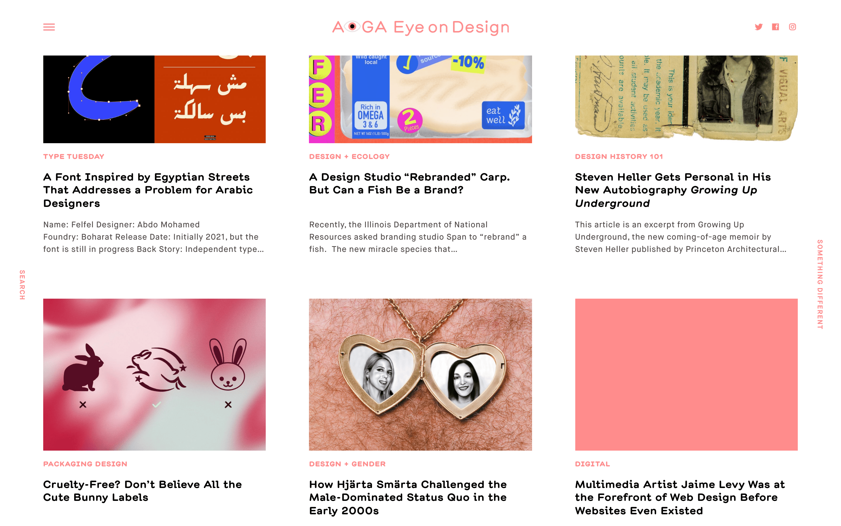
3-column grid for article cards, single column for main content.
07
Motion & Interaction
150ms micro
300ms small
300ms medium
ease-in-out easing
Smooth transitions for interactive elements
Color transitions on links and buttons. · Immediate response.
08
Components
button Simple text links or small uppercase labels. card Image, category label, headline, and short excerpt. chip Uppercase category labels in pink. input Search functionality integrated into navigation. hero Large featured article with bold headline and image. 09
Voice & Don'ts
Tone Professional, authoritative, yet approachable and engaging. Headlines Direct, informative, and bold. CTAs Understated and functional. don't use a cluttered layout — screenshot shows clean, generous whitespace between elements don't use decorative fonts — screenshot shows clean, functional grotesque and humanist sans-serifs don't use a dark background — screenshot shows predominantly white backgrounds don't use subtle gradients — screenshot shows flat, solid color blocks like the pink accent don't use low-contrast text — screenshot shows high-contrast black text on white backgrounds don't hide navigation — screenshot shows persistent, clear navigation elements Avoid: Overly casual language Avoid: Decorative elements that distract from content Avoid: Cluttered layouts 10
Inside the pack — real screenshots
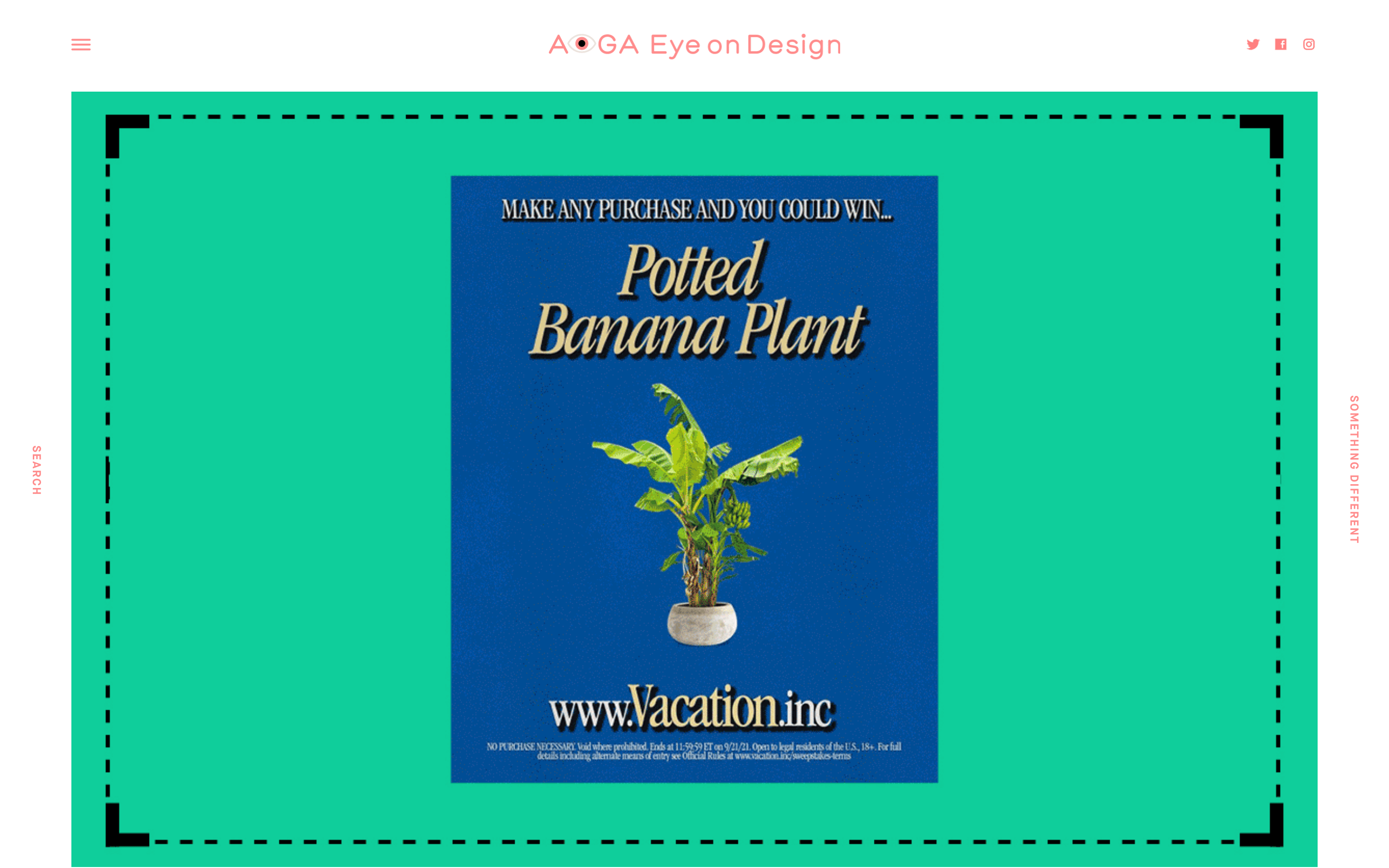
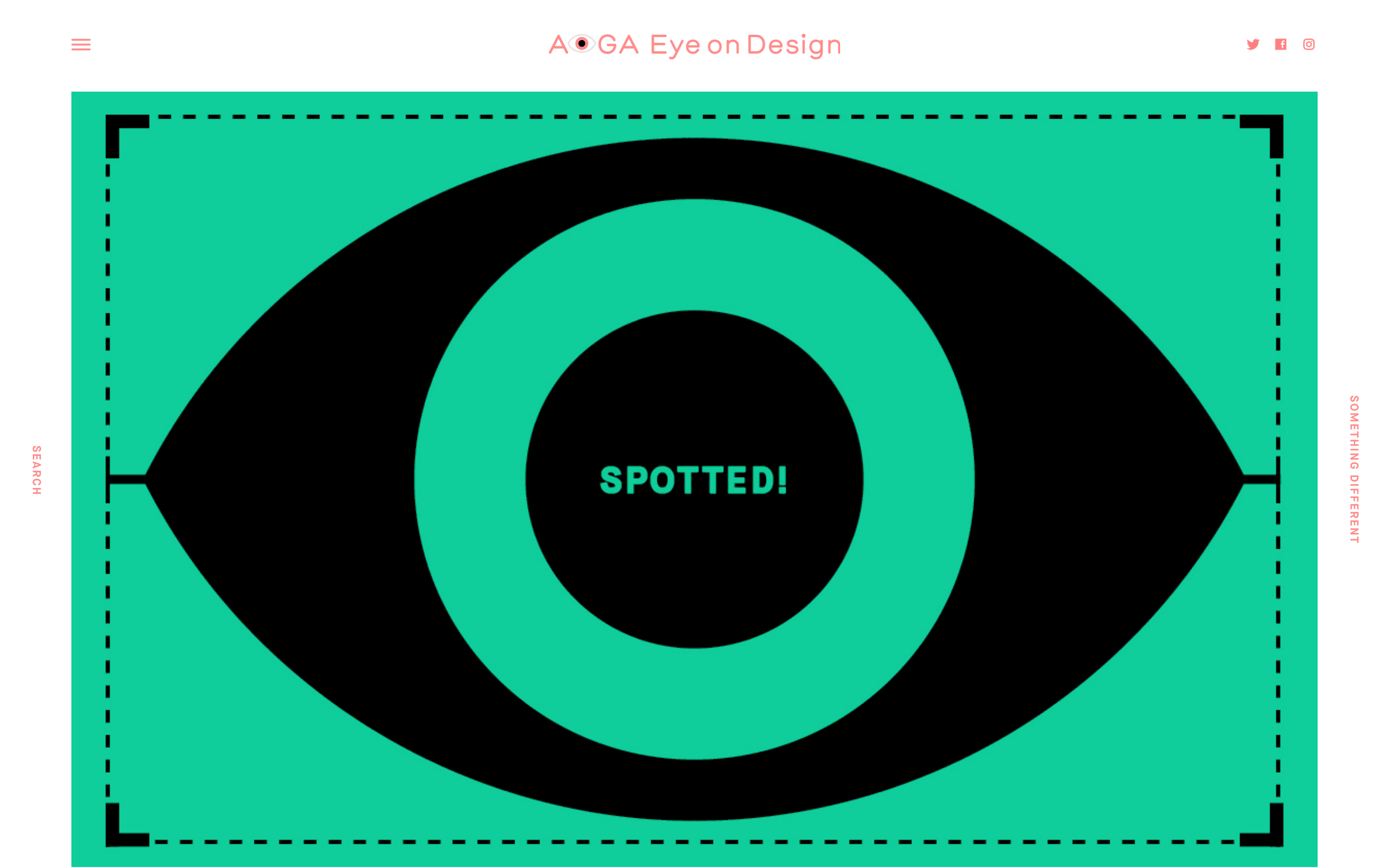
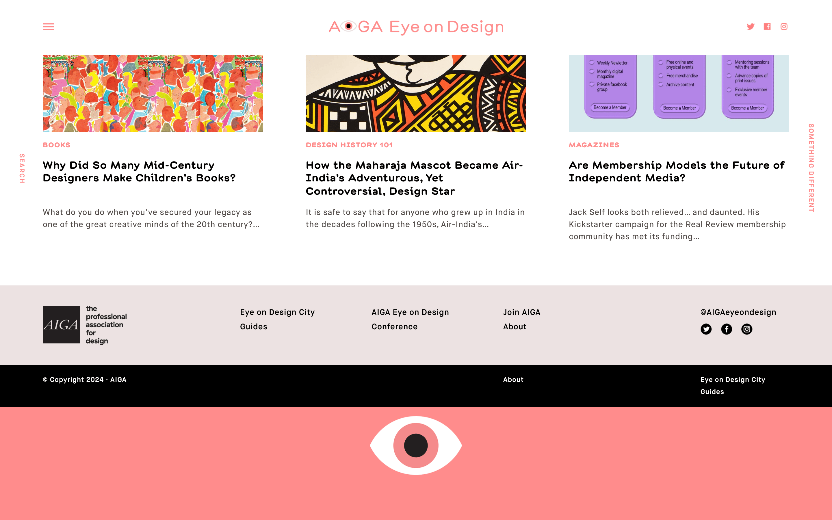
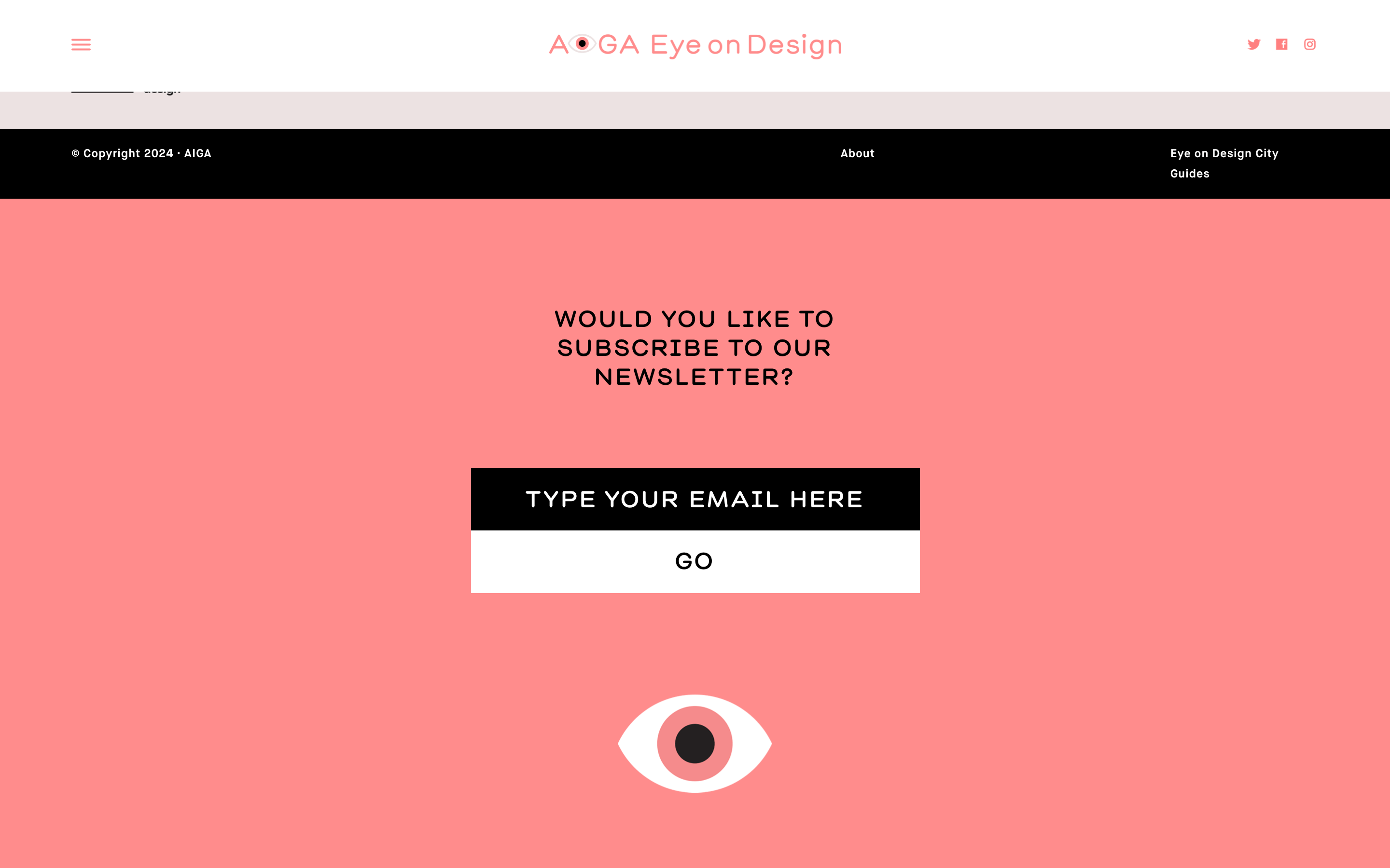
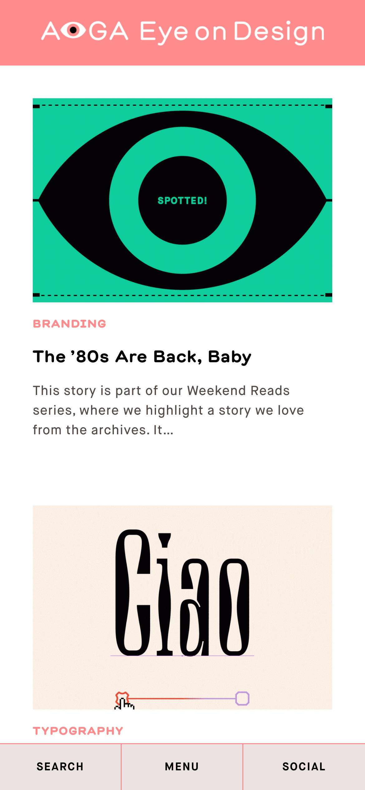
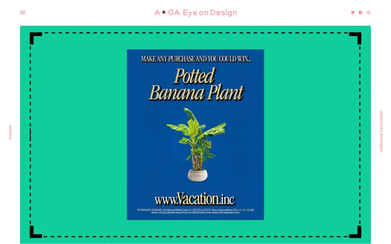
桌面首屏(hero) 桌面滚动分段(90% viewport 步进,作为视觉证据) 桌面滚动分段(90% viewport 步进,作为视觉证据) 桌面滚动分段(90% viewport 步进,作为视觉证据) 桌面滚动分段(90% viewport 步进,作为视觉证据) 桌面滚动分段(90% viewport 步进,作为视觉证据) 桌面滚动分段(90% viewport 步进,作为视觉证据) 桌面滚动分段(90% viewport 步进,作为视觉证据) 桌面滚动分段(90% viewport 步进,作为视觉证据) 移动首屏 Captured from the live site · real computed styles
11
System prompt
This is an editorial design publication website. It uses a clean, 3-column grid layout with generous whitespace and high-contrast typography. The primary color is a vibrant pink (#FF8C8C) used for accents and category labels, paired with black (#000000) for headings and white (#FFFFFF) for backgrounds. The typography relies on grotesque and humanist sans-serif categories. Critical design constraints: avoid cluttered layouts, decorative fonts, and low-contrast text. Maintain a professional, authoritative tone while keeping the visual presentation clean and focused on the content.
More from the library en · zh-CN · zh-TW · ja · ko
OpenDesign · curated web aesthetics for AI-readable design DNA · opendesign.cc
Why we curated this: A strong example of editorial design principles applied to a digital medium, balancing content with distinctive branding.
浙ICP备2021038972号-5