← OpenDesign CURATED · OPEN · FREE
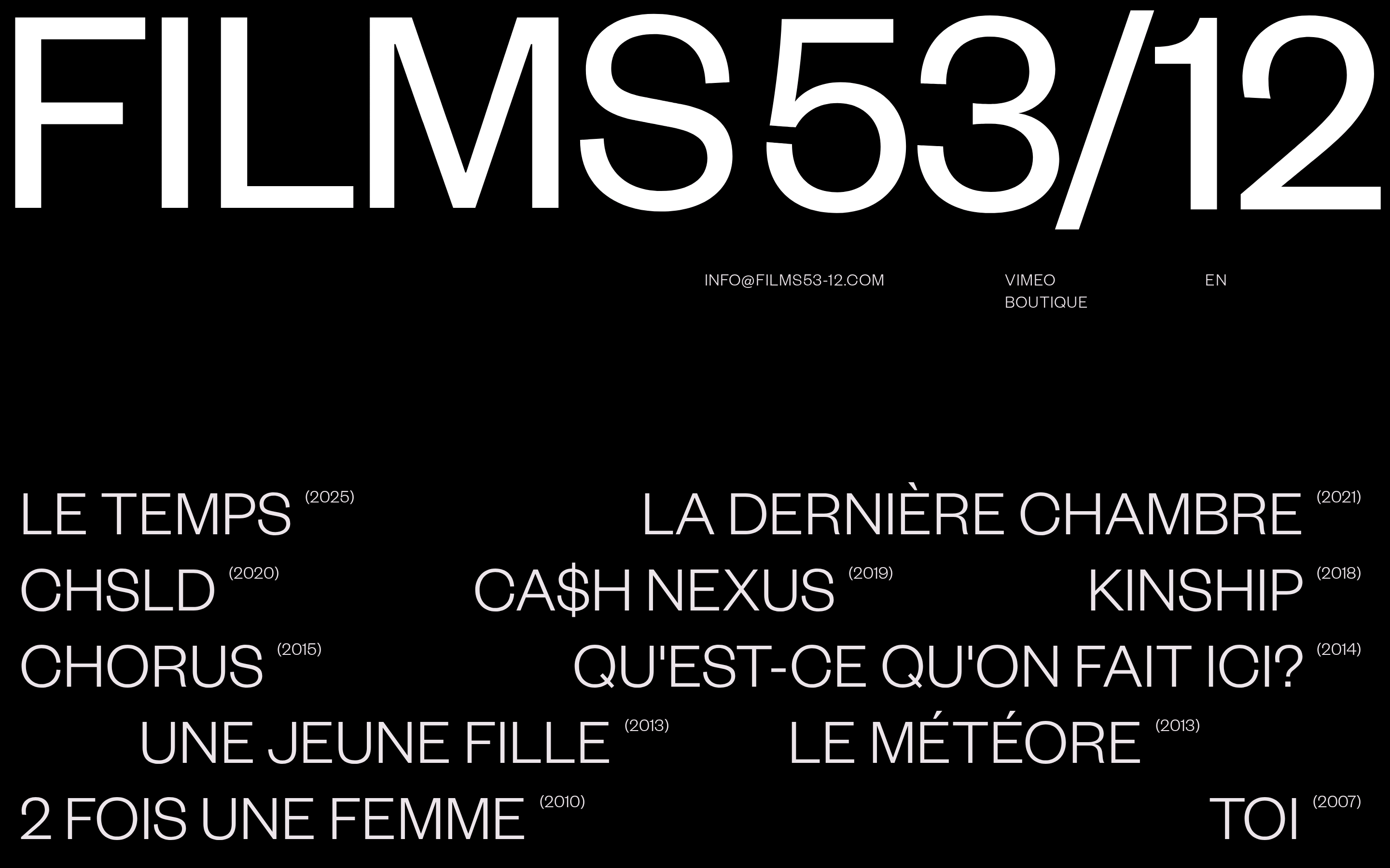
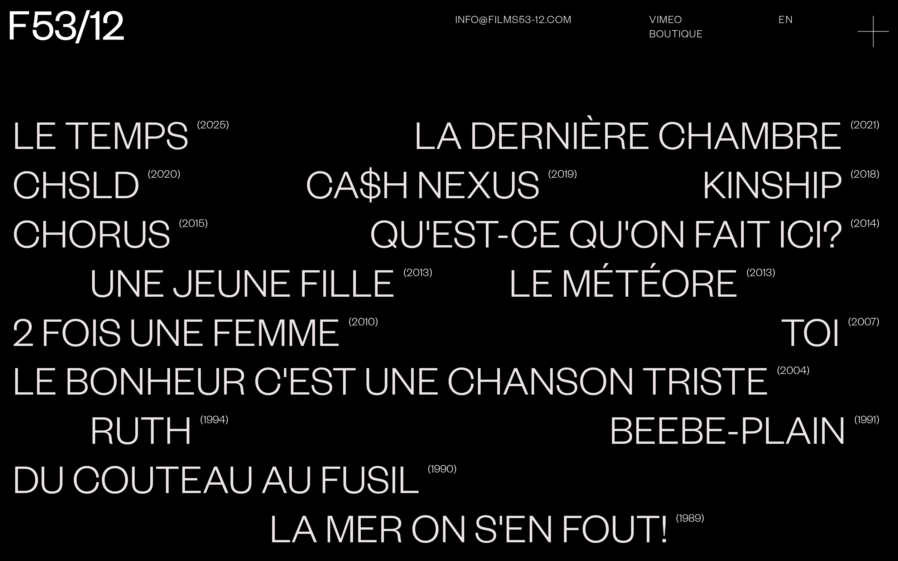
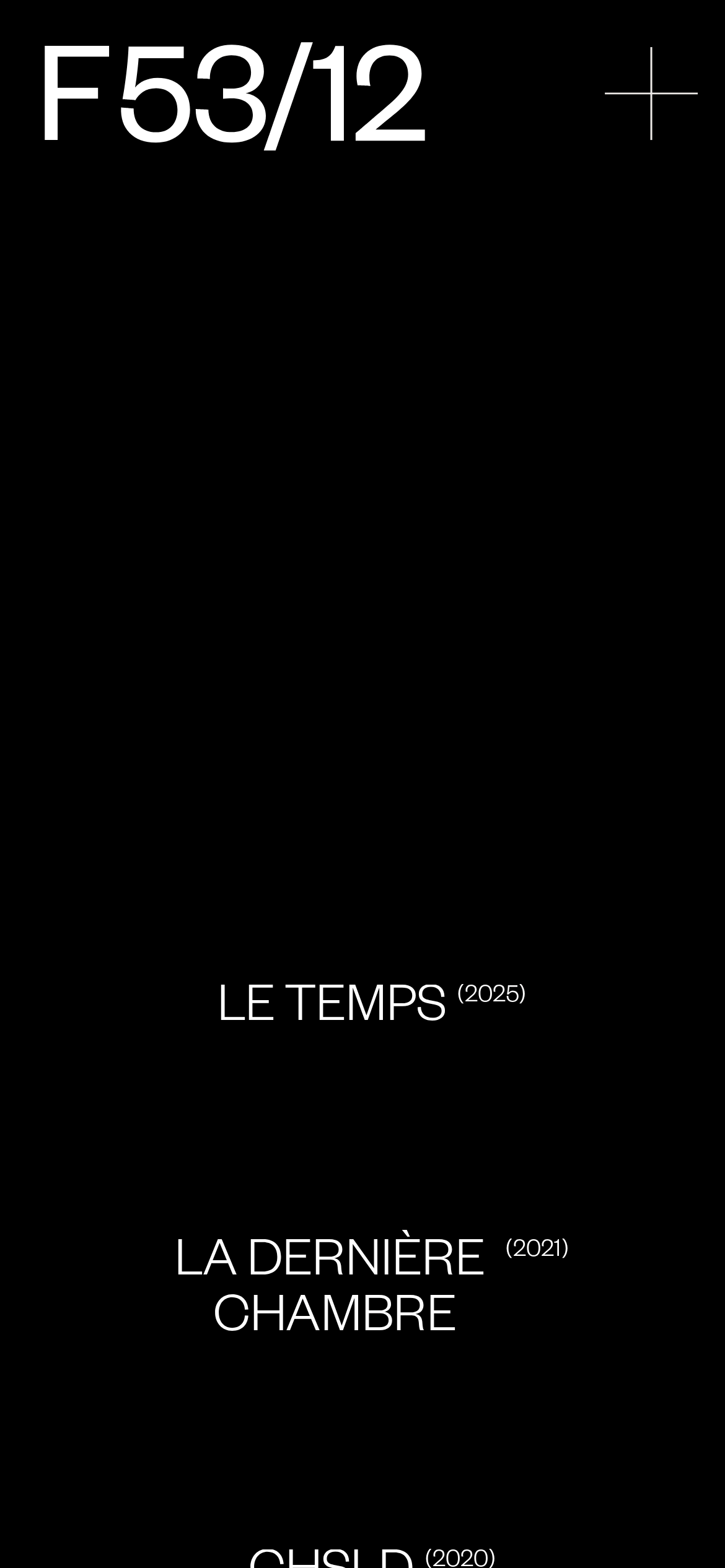
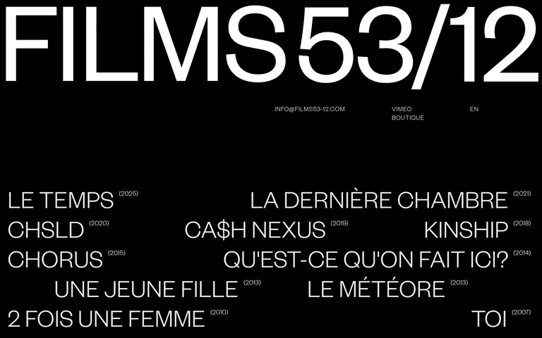
Films53 12
A minimalist filmography site using bold typography on a stark black canvas.
Editorial Bold Typography Photographic Studio Clean
01
Identity DNA
cinema minimalism filmography editorial
A cinematic filmography presented with stark, modernist typography.
02
Color
#ECE5EAInk
#000000BG
rgba(236,229,234,0.1)Line
Stark, high-contrast monochrome for maximum cinematic impact.
03
Typography
grotesque-sans
display 200px · 300headline 68px · 300body 14px · 300All text is uppercase · Primary font weight is light (300) · Film titles are large and visually dominant
04
Spacing
4px
8px
16px
24px
32px
48px
64px
96px
Asymmetric and airy, using generous whitespace to separate typographic elements.
05
Surfaces
sm · 0px
md · 0px
lg · 0px
pill · 0px
None visible; relies on pure spatial contrast.
06
Layout
1280 container
12 columns
24px gutter
768 / 1024 breakpoints
Free-flowing typographic grid with scattered titles.
07
Motion & Interaction
220ms micro
400ms small
800ms medium
cubic-bezier(0.25, 0.1, 0.25, 1) easing
Subtle opacity or transform transitions on hover.
Cursor changes to pointer; likely a subtle color or opacity shift. · Immediate navigation to film detail.
08
Components
button Simple text link with no visible border or background. card None; the layout is purely typographic. chip None. input None. hero Massive, screen-spanning logotype at the top of the viewport. 09
Voice & Don'ts
Tone Formal, archival, and cinematic. Headlines Uppercase, light-weight, and highly spaced. CTAs Minimalist text links without traditional button styling. Don't use bold font weights — the screenshot shows exclusively light (300) typography. Don't add drop shadows or 3D effects — the screenshot shows a flat, high-contrast design. Don't use bright accent colors — the screenshot shows a strictly monochrome black and light-pinkish-white palette. Don't use rounded corners or card-based layouts — the screenshot shows sharp, edge-to-edge text elements. Don't use justified text alignment — the screenshot shows a mix of left and right alignments for a dynamic feel. Don't clutter the interface with icons — the screenshot shows almost purely typographic navigation. Avoid: Do not use bold weights Avoid: Do not add decorative borders or shadows Avoid: Do not use multiple colors or gradients 10
Inside the pack — real screenshots
桌面首屏(hero) 桌面滚动分段(90% viewport 步进,作为视觉证据) 桌面滚动分段(90% viewport 步进,作为视觉证据) 移动首屏 Captured from the live site · real computed styles
11
System prompt
This is a minimalist filmography portfolio using stark, high-contrast typography. The primary colors are a pure black background (#000000) and an off-white/light-pinkish ink (#ECE5EA). The typography is exclusively a light-weight (300) grotesque sans-serif, used in massive scales for film titles and hero logotypes. All text is uppercase. Critical donts: never use bold weights, never add shadows or rounded corners, and never introduce multiple colors. The layout is airy and uses generous whitespace to separate elements. Position the brand as a formal, archival cinema portfolio.
More from the library en · zh-CN · zh-TW · ja · ko
OpenDesign · curated web aesthetics for AI-readable design DNA · opendesign.cc
Why we curated this: A masterclass in using extreme scale and light font weights to create a powerful, editorial feel with zero decorative elements.