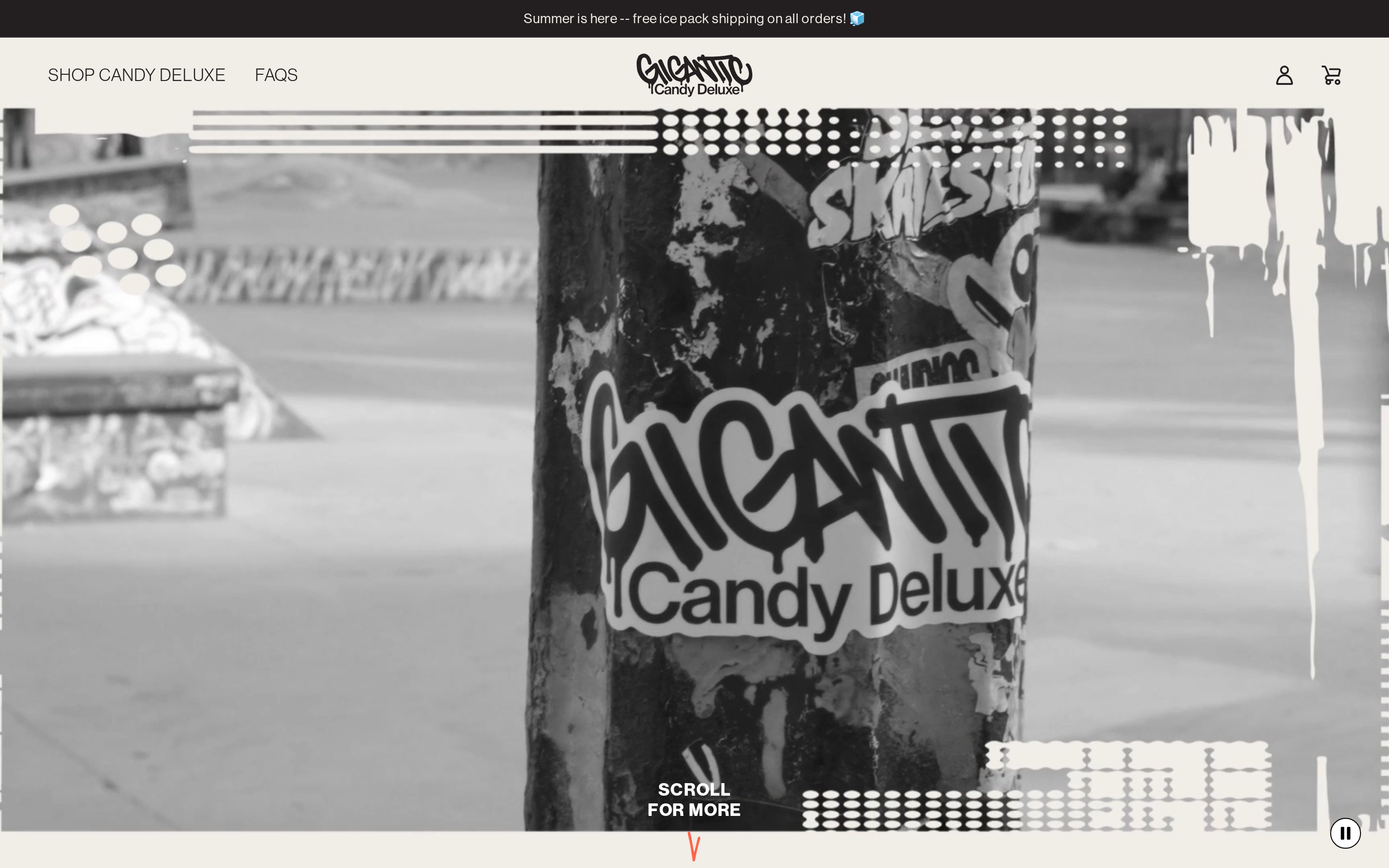
A skate park sticker aesthetic meets premium candy branding.
02
Color
#FF634BAccent
#231F20Ink
#F0EDE7BG
#FFFFFFBG soft
rgba(35, 31, 32, 1.0)Line
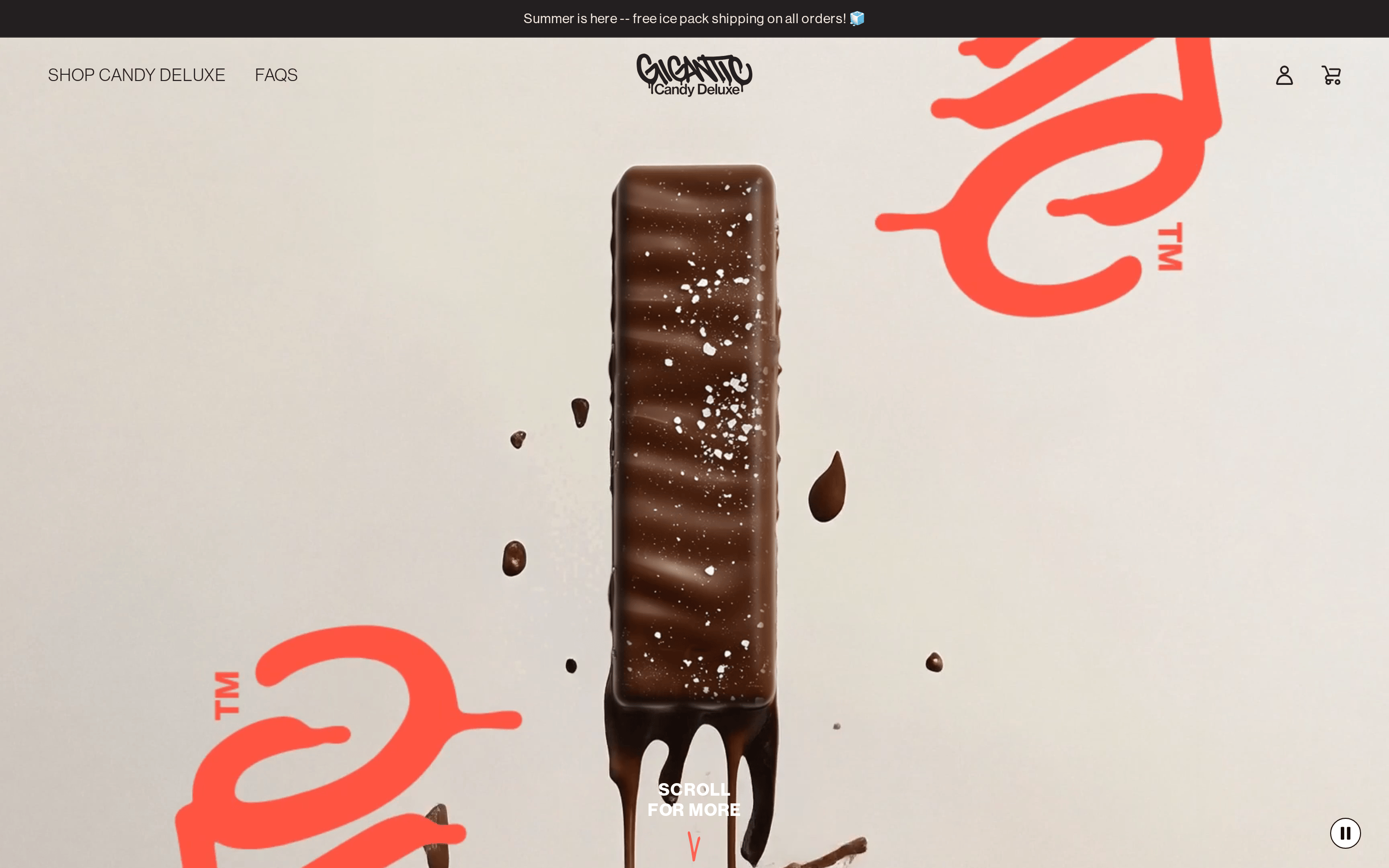
High-contrast, primarily monochromatic with a single high-chroma accent (tomato red) and strategic use of pure white and black.
03
Typography
geometric-sans · humanist-sans
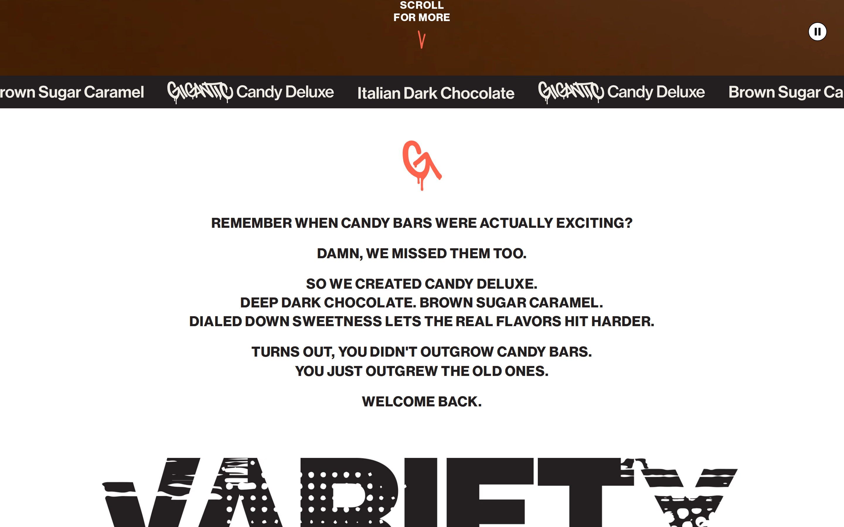
display96px · 700
heading48px · 700
body16px · 400
Display and headings use uppercase letter transformation. · Body text is set with a generous line height of 1.8 for readability. · Tight tracking is applied to large display text.
04
Spacing
4px
8px
16px
24px
32px
48px
64px
96px
Vertical rhythm is based on a 4px grid, with generous padding in larger sections.
05
Surfaces
sm · 2px
md · 10px
lg · 12px
pill · 999px
Solid 1px borders using the primary ink color.
06
Layout
1280container
12columns
24pxgutter
768 / 1024breakpoints
A single-column centered layout for content, with full-bleed hero images.
07
Motion & Interaction
220msmicro
400mssmall
800msmedium
cubic-bezier(0.25, 0.46, 0.45, 0.94)easing
Smooth transitions on hover states · Parallax or slow fade-in for hero elements
Subtle opacity change or color inversion on buttons. · Minimal feedback, relying on standard cursor changes.
08
Components
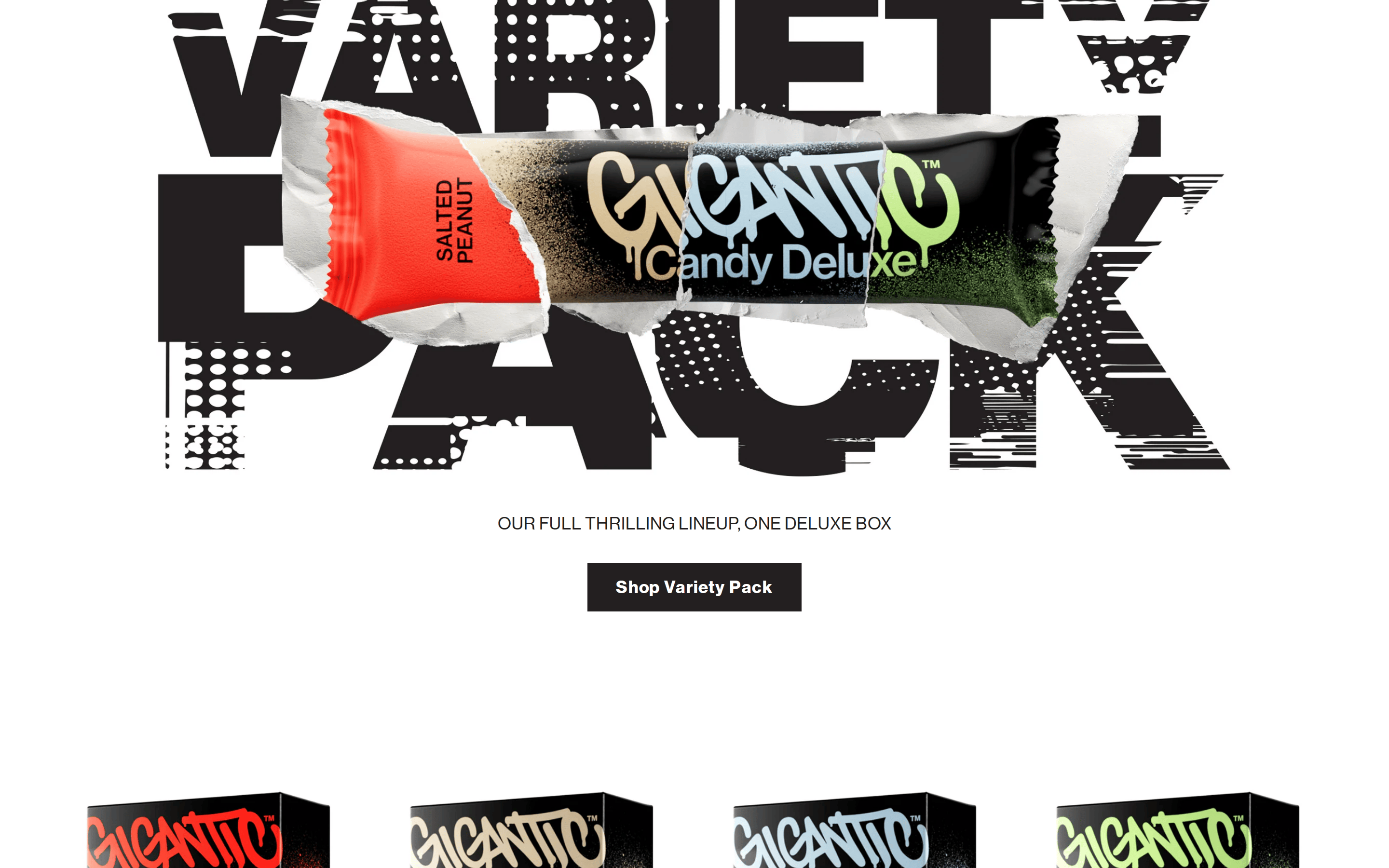
buttonSolid black background with white uppercase text, or outlined with ink color.
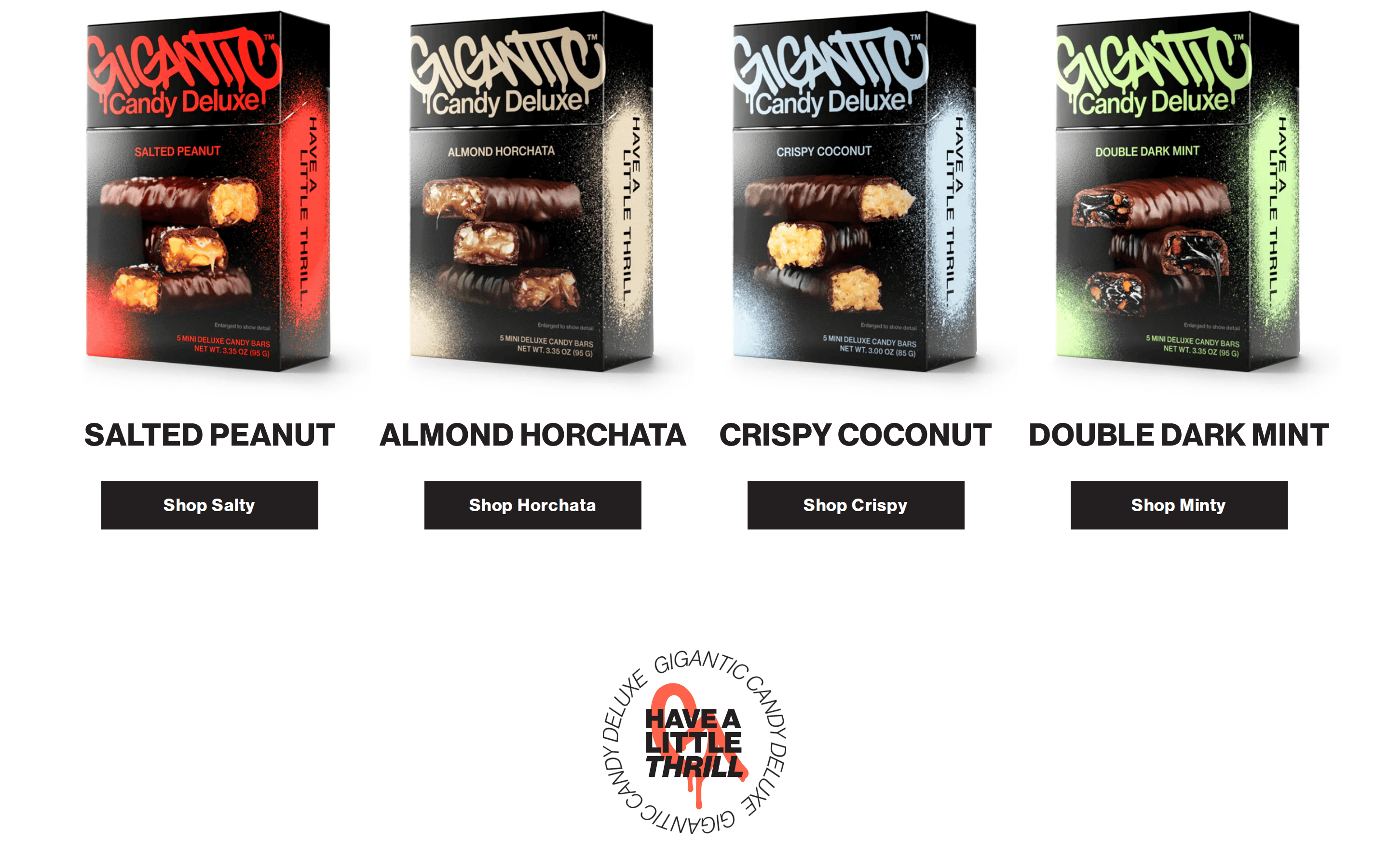
cardProduct cards featuring product images on a clean white background.
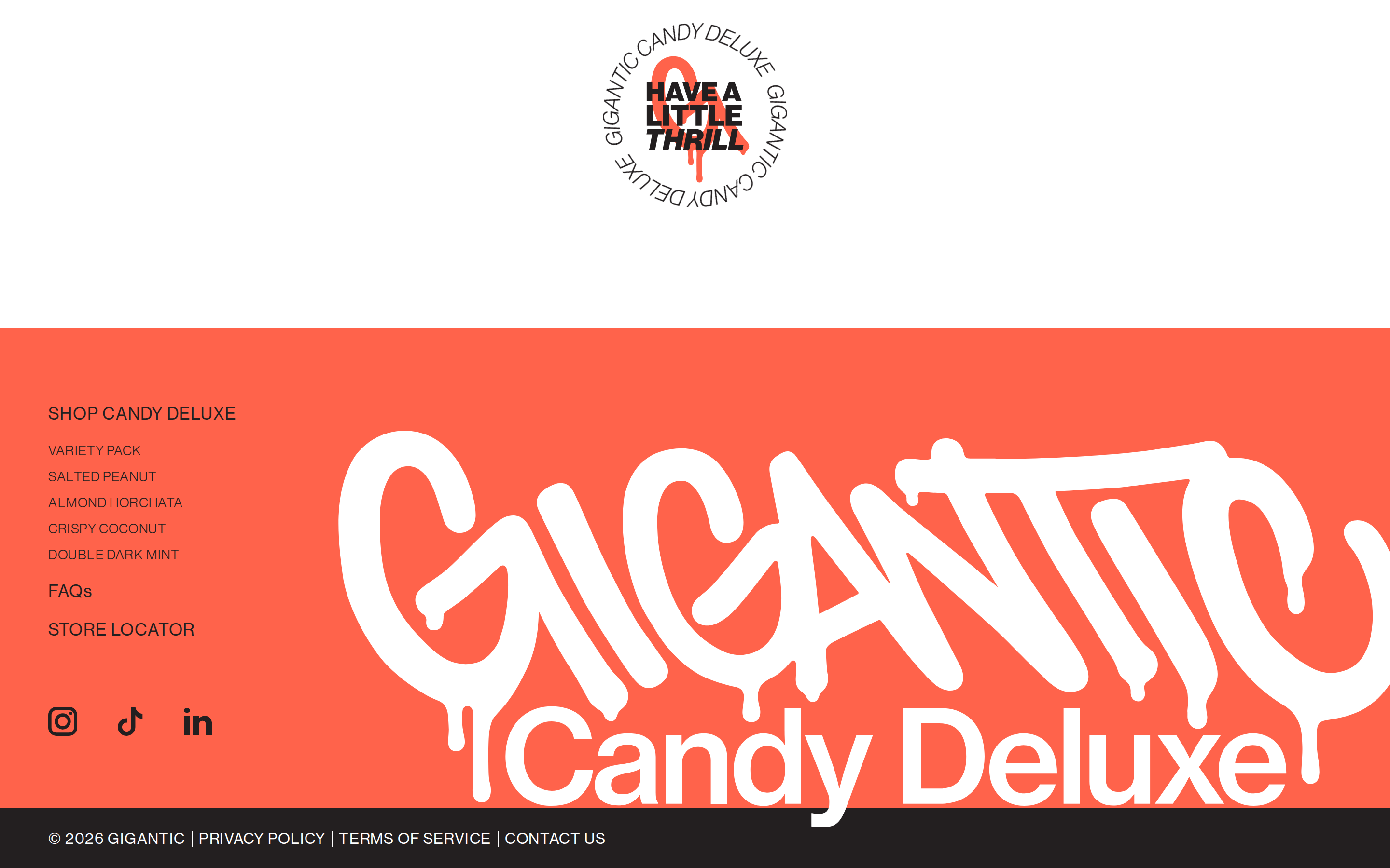
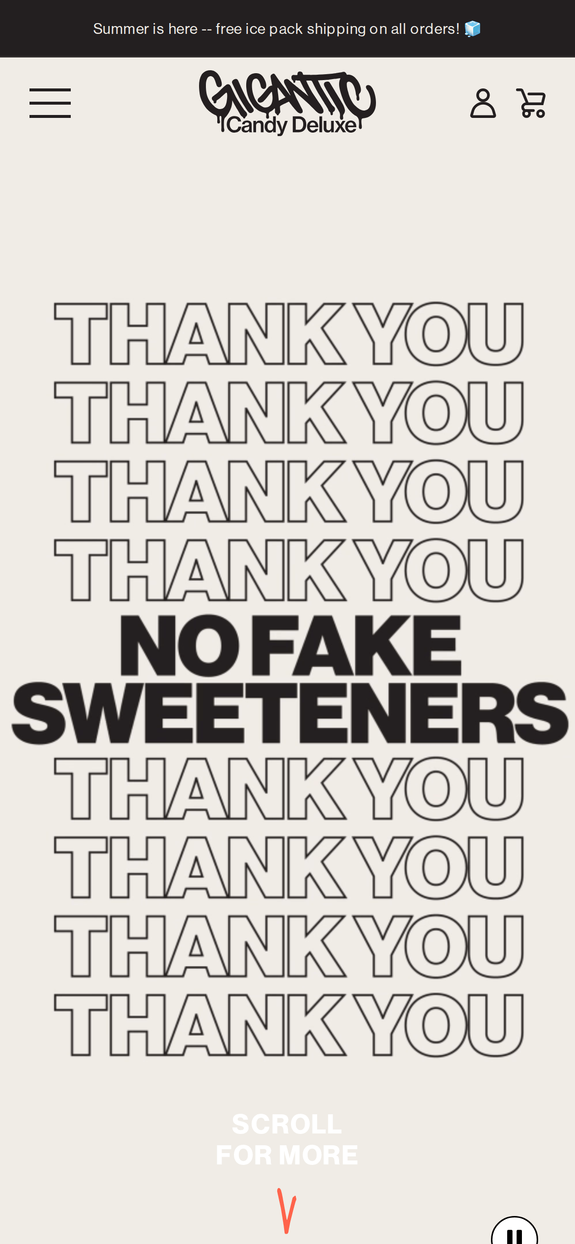
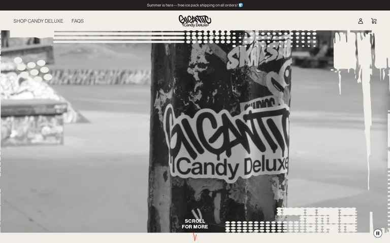
heroFull-viewport section with a large, moody photographic background and bold, centered typography.
09
Voice & Don'ts
TonePlayful, bold, and slightly irreverent.
HeadlinesShort, impactful, and always in uppercase.
CTAsDirect and action-oriented, often using 'Shop' or 'Scroll'.
Don't use small, delicate typography — screenshot shows large, bold display text instead.
Don't use a muted, pastel color palette — screenshot shows a high-contrast black, white, and red-orange palette instead.
Don't use complex multi-column layouts — screenshot shows a clean, single-column centered layout instead.
Don't use rounded, bubbly shapes — screenshot shows sharp, mostly rectangular elements instead.
Don't use subtle, hidden navigation — screenshot shows a clear, fixed header with obvious links instead.
Don't use serif fonts for headlines — screenshot shows geometric and grotesque sans-serif fonts instead.
Captured from the live site · real computed styles
11
System prompt
This is a bold, urban-inspired e-commerce site for a candy brand, characterized by oversized display typography and a high-contrast palette. The primary background is a warm off-white (#F0EDE7), with ink (#231F20) used for all text and borders. A single high-chroma accent color, a vibrant tomato red (#FF634B), is used sparingly for highlights and calls to action. The typography relies heavily on geometric and grotesque sans-serif families, always set in uppercase for headlines and body text to maintain a strong, uniform voice. Critical design constraints: avoid using delicate or thin typography, never use a muted or pastel color scheme, and maintain a strict single-column layout for core content sections.
Bring this taste to your agent
Hand your AI agent a machine-readable spec of this design — tokens, type, motion, the whole DNA.