← OpenDesign CURATED · OPEN · FREE
Koox
Clean, product-first organic juice e-commerce with bold typography and a restrained, natural palette.
Consumer Product Clean Photographic
01
Identity DNA
organic fresh clean juice premium
Modern artisanal juice lab meets clean e-commerce
02
Color
#D25A24Accent
#232323Ink
#727272Ink soft
#FFFFFFBG
#F5F5F5BG soft
#EFEFEFBG quiet
#CCCCCCMuted
rgba(0,0,0,0.12)Line
High-contrast minimalism with a warm, earthy accent color.
03
Typography
geometric-sans · grotesque-sans
display 56px · 900headline 30px · 700body 16px · 400Use bold, uppercase for primary calls to action and section headers. · Keep line-height tight for display text to maintain visual impact.
04
Spacing
4px
8px
16px
24px
32px
48px
64px
96px
Consistent 4px base with clear hierarchy established through varied vertical spacing.
05
Surfaces
sm · 1px
md · 4px
lg · 0px
pill · 0px
Sharp, 1px solid borders for structural definition.
rgb(107, 18, 41) 5px 5px 0px 0px · rgba(0, 0, 0, 0.2) 0px 6px 27px 0px
06
Layout
1200 container
12 columns
24px gutter
768 / 1024 breakpoints
Centered content with a full-width hero and a grid of three product cards below.
07
Motion & Interaction
100ms micro
200ms small
300ms medium
cubic-bezier(0, 0, 0.3, 1) easing
Smooth fade and transform transitions on interactive elements.
Subtle opacity or transform changes on buttons and links. · Immediate response with slight shadow adjustment.
08
Components
button Solid background block with uppercase text, no border-radius, and a subtle offset shadow. card Full-bleed image with centered, bold white text overlay. chip N/A input N/A hero Full-viewport background image with centered white text overlay and a prominent CTA button. 09
Voice & Don'ts
Tone Confident, clean, and straightforward. Headlines Bold, uppercase, and benefit-driven. CTAs Direct, action-oriented, and set in all-caps. Don't use decorative or script typography — screenshot shows bold, clean geometric sans-serif fonts. Don't use rounded corners or soft shapes — screenshot shows sharp, 1px borders and no border-radius. Don't use a complex multi-color palette — screenshot shows a restrained palette of white, black, grey, and one warm accent. Don't use centered-aligned body text — screenshot shows centered display text but structured product layouts. Don't use dark mode or moody backgrounds — screenshot shows bright, white-based backgrounds with high-contrast ink. Don't use busy patterns or textures — screenshot shows clean photography and solid color blocks. Avoid: Avoid overly decorative or script fonts. Avoid: Avoid complex gradients or shadows. Avoid: Avoid cluttered layouts with too many competing elements. 10
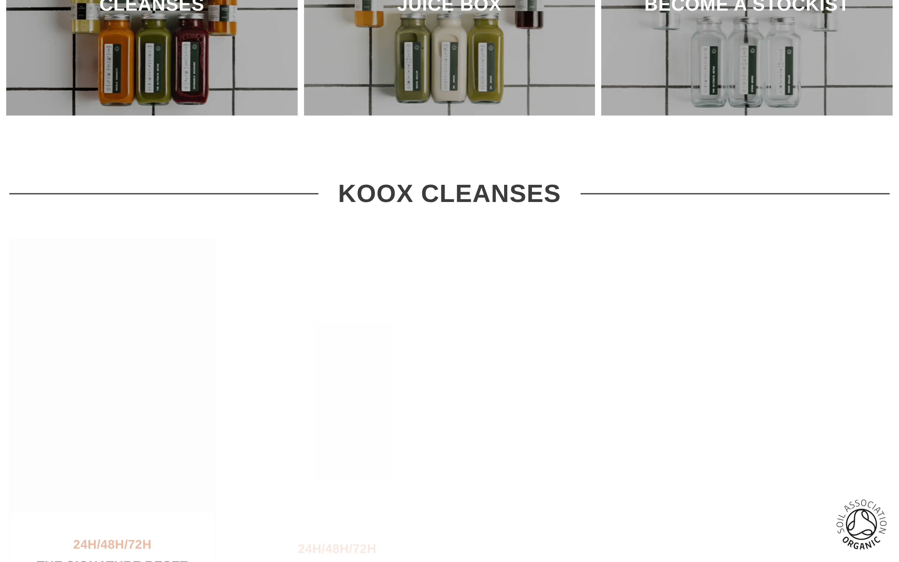
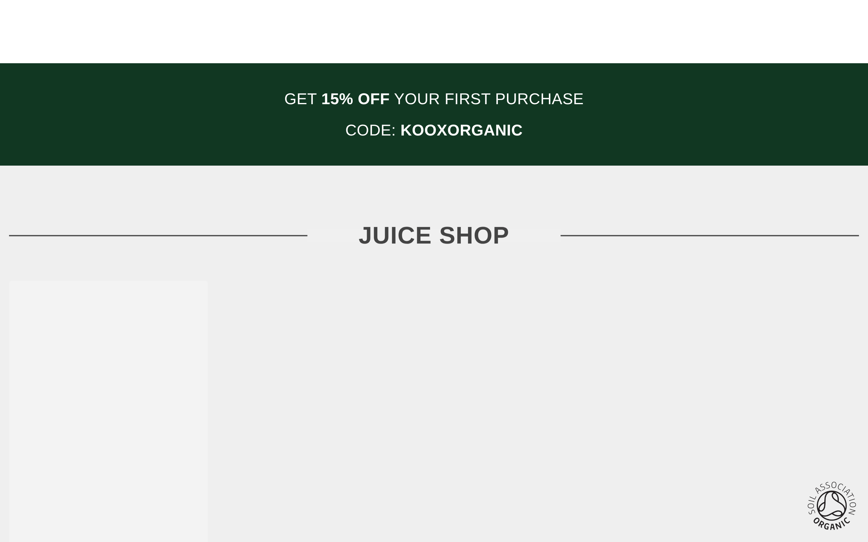
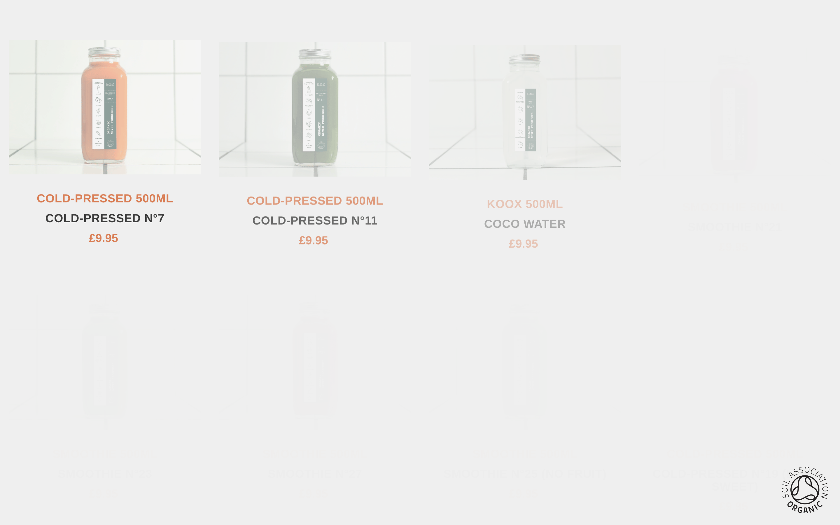
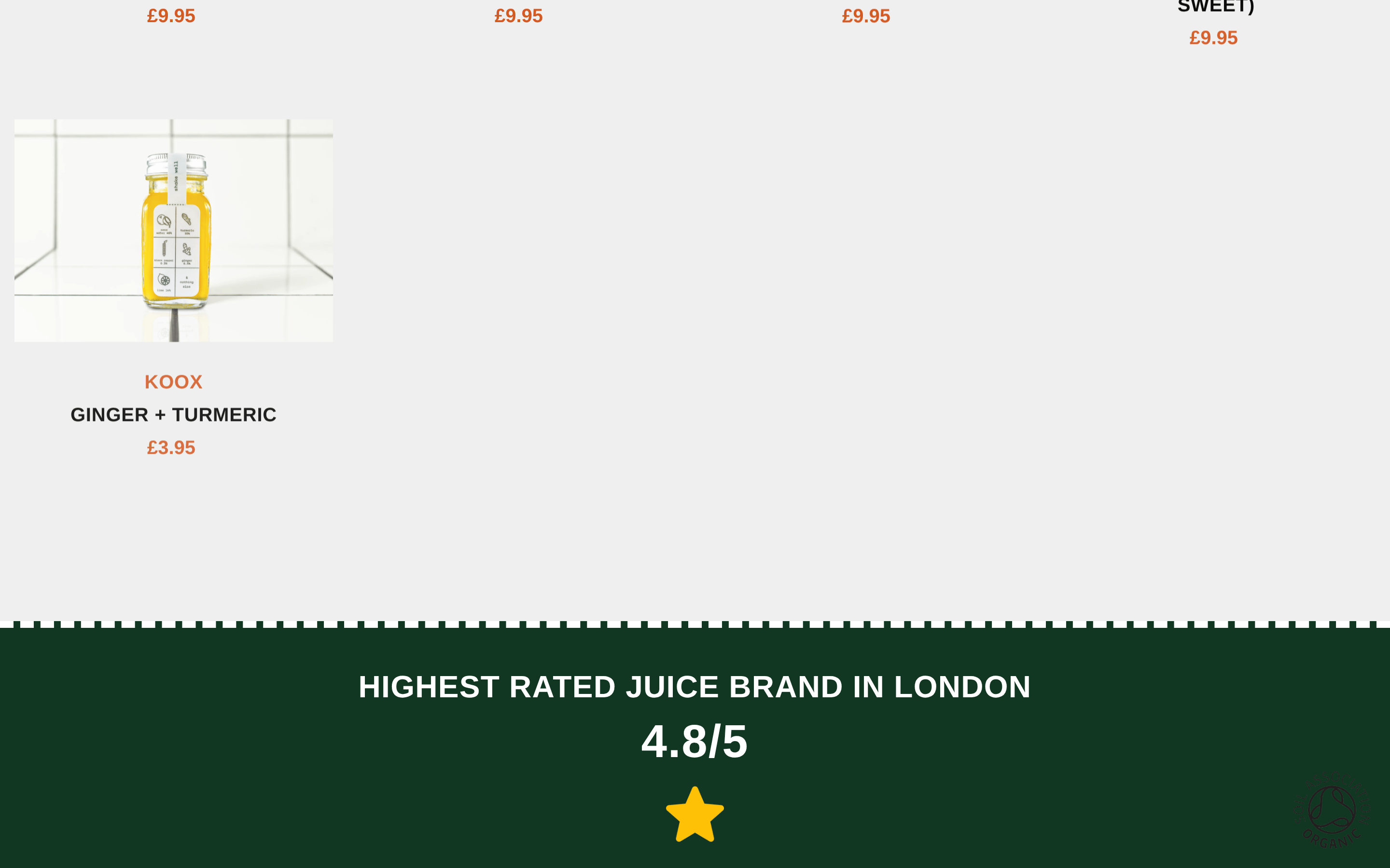
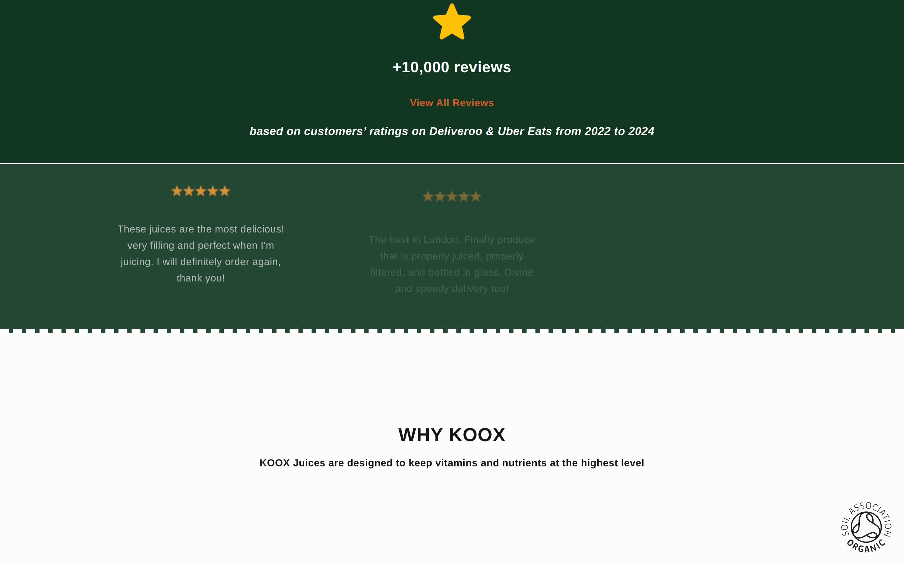
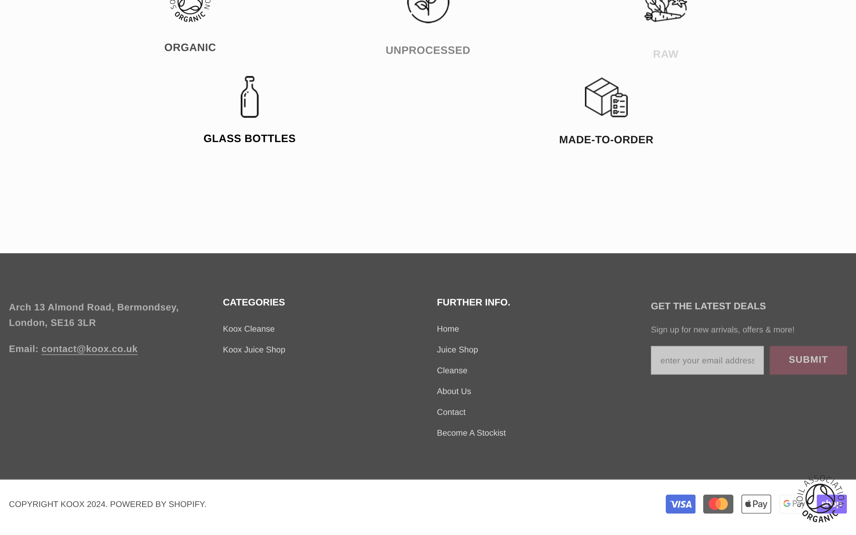
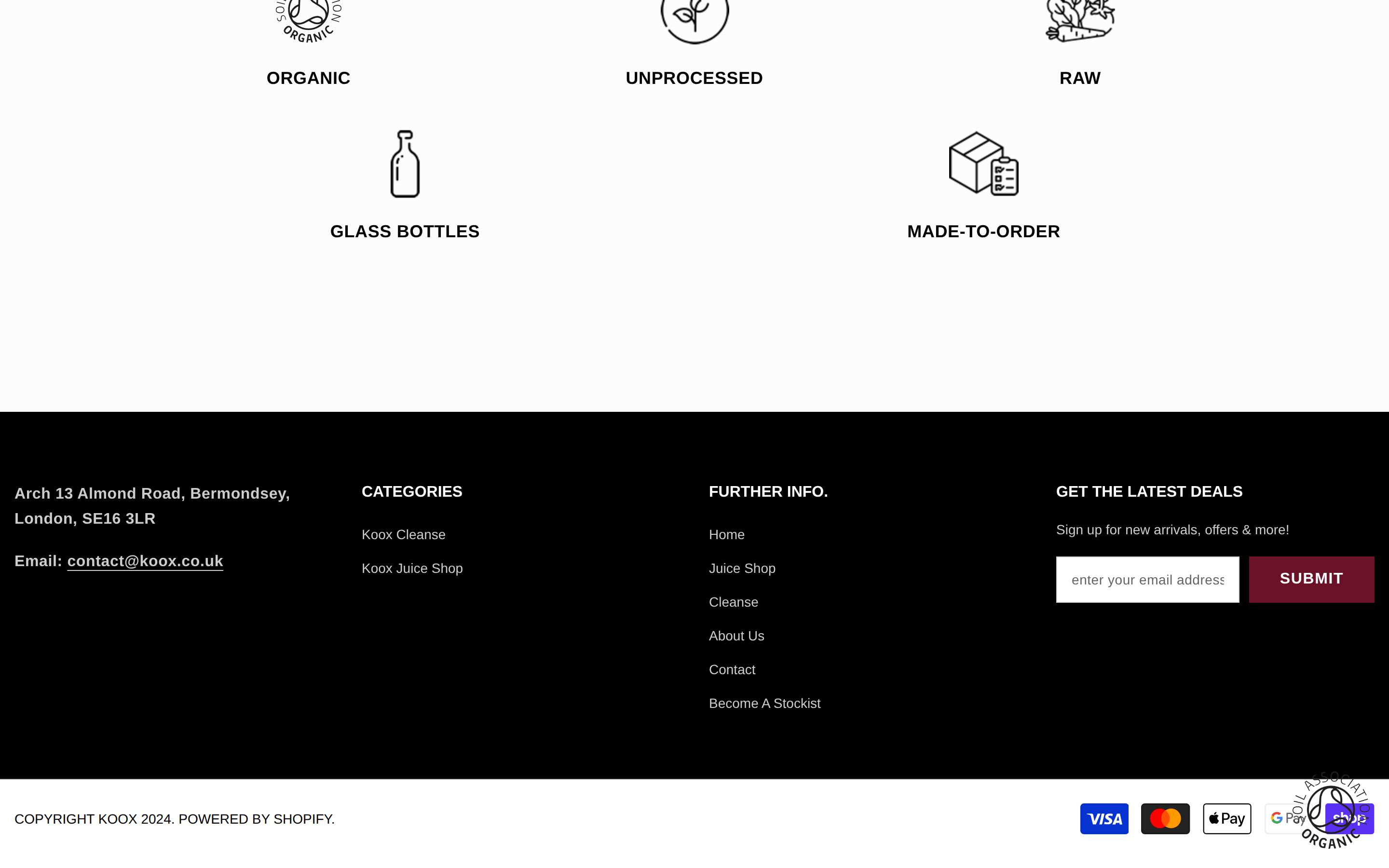
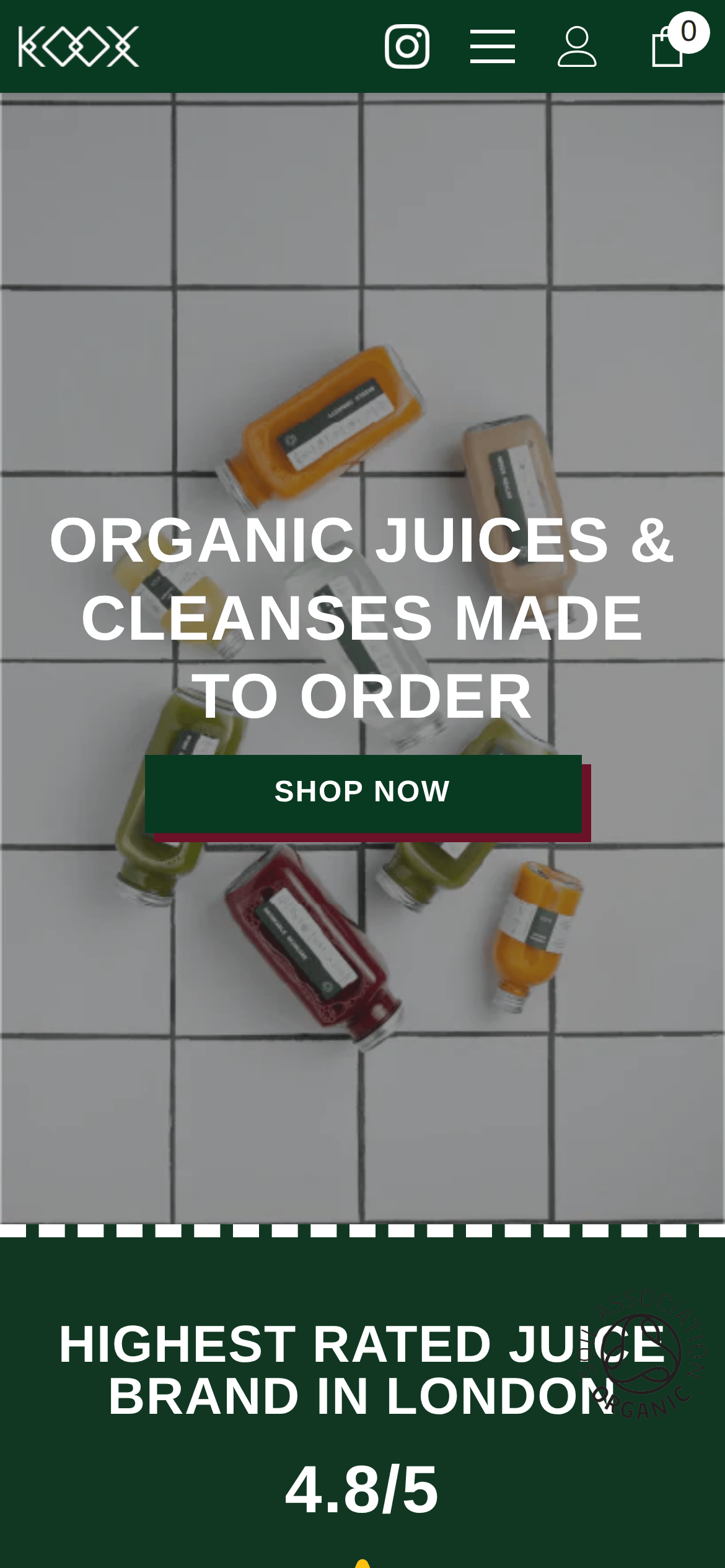
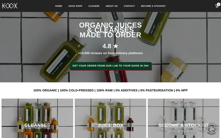
Inside the pack — real screenshots
桌面首屏(hero) 桌面滚动分段(90% viewport 步进,作为视觉证据) 桌面滚动分段(90% viewport 步进,作为视觉证据) 桌面滚动分段(90% viewport 步进,作为视觉证据) 桌面滚动分段(90% viewport 步进,作为视觉证据) 桌面滚动分段(90% viewport 步进,作为视觉证据) 桌面滚动分段(90% viewport 步进,作为视觉证据) 桌面滚动分段(90% viewport 步进,作为视觉证据) 桌面滚动分段(90% viewport 步进,作为视觉证据) 桌面滚动分段(90% viewport 步进,作为视觉证据) 移动首屏 Captured from the live site · real computed styles
11
System prompt
Koox is a modern, product-first e-commerce site for organic juices and cleanses. It features a clean, minimalist aesthetic with a high-contrast palette of white, black, and a warm terracotta accent (#D25A24). The typography is bold and geometric, using uppercase for impact. Key hex colors are #FFFFFF (bg), #232323 (ink), #D25A24 (accent), and #113722 (dark green brand color). Critical donts: Don't use decorative fonts, don't use rounded corners, don't use dark mode, don't use busy patterns, don't use a complex color palette, and don't use low-contrast text. The layout is centered and spacious, emphasizing product photography.
More from the library en · zh-CN · zh-TW · ja · ko
OpenDesign · curated web aesthetics for AI-readable design DNA · opendesign.cc
Why we curated this: This site is an excellent example of how to combine bold typography and clean photography to create a premium, artisanal brand identity.