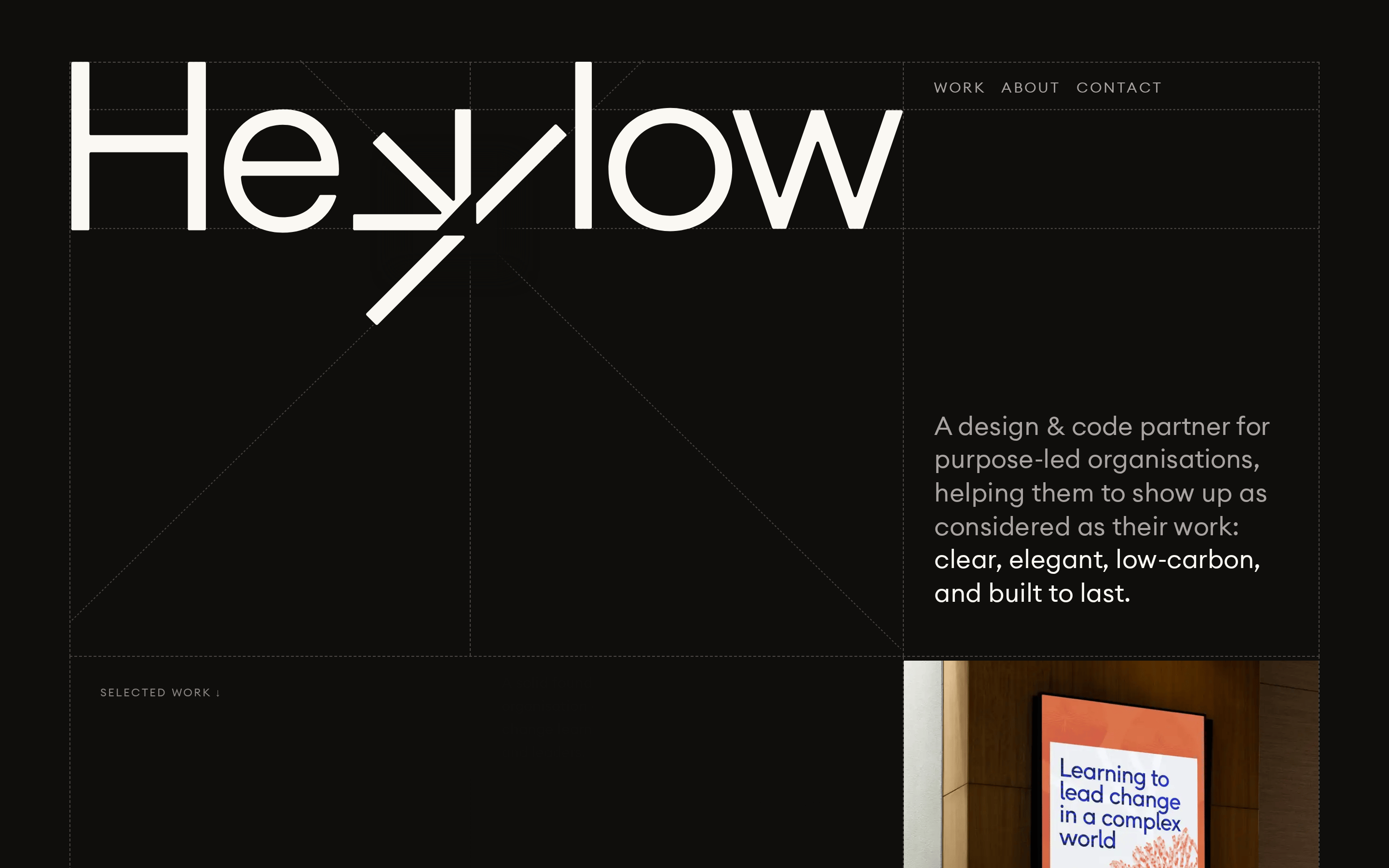
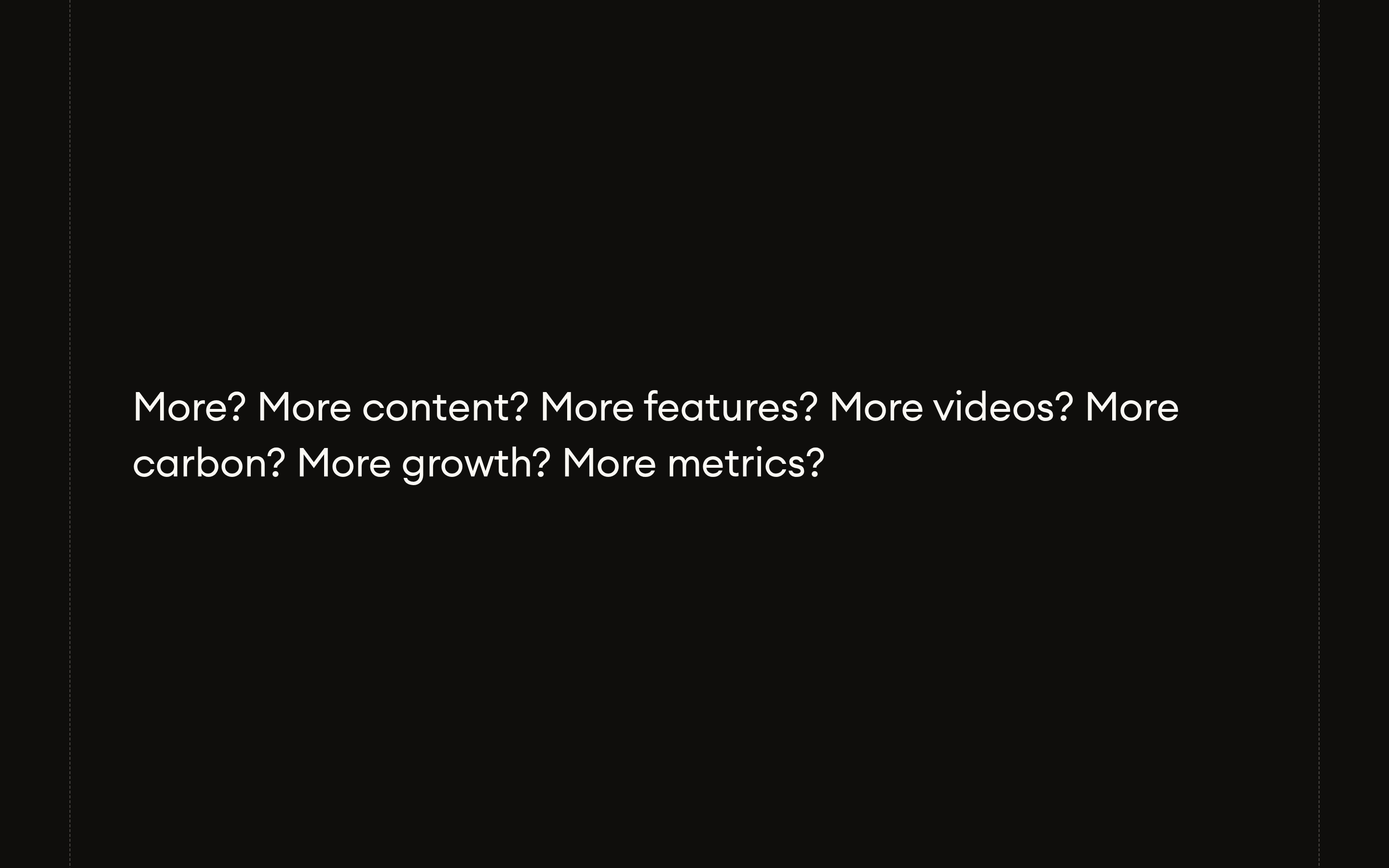
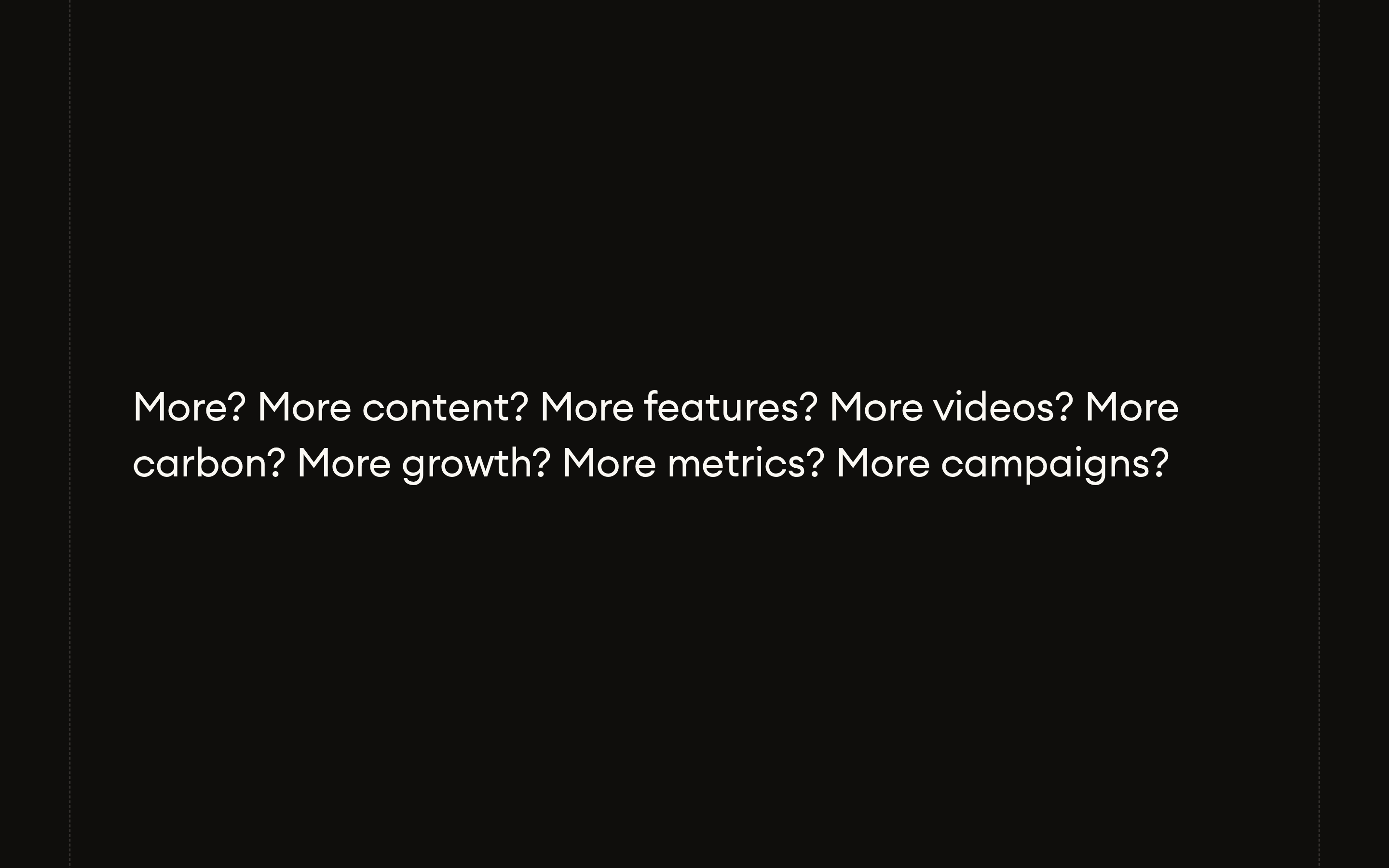
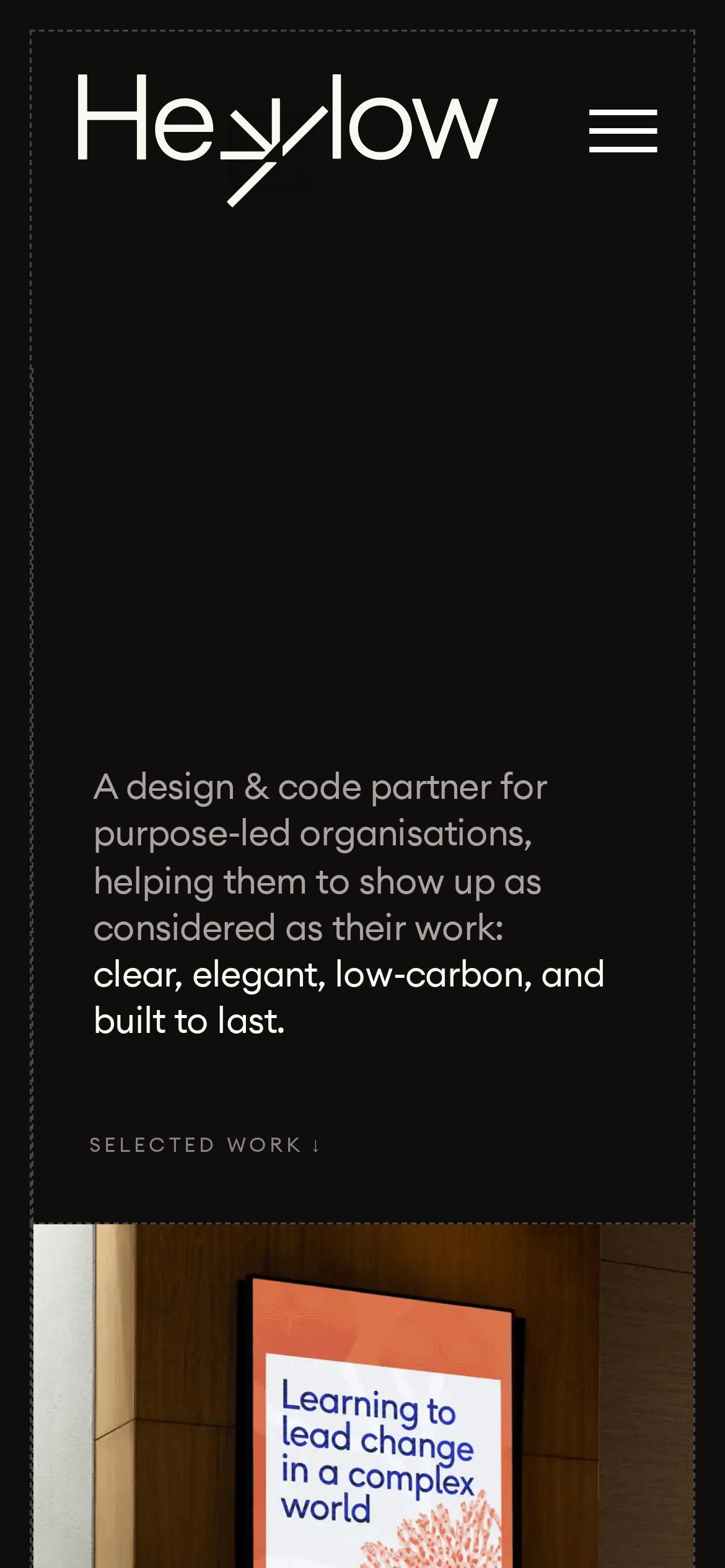
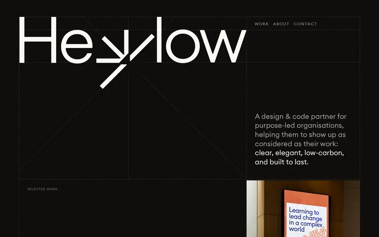
designcodepartnerpurpose-ledlow-carbonbuilt to last
A high-end, purpose-driven creative studio that values clarity, elegance, and sustainability in both design and digital execution.
02
Color
#faf8f3Ink
#a8a3a1Ink soft
#0f0e0cBG
#4a4643Muted
rgba(74, 70, 67, 1.0)Line
Dark, warm, earthy monochromatic palette with high contrast text for clarity and focus.
03
Typography
humanist-sans
display160px · 400
h148px · 400
body20px · 400
caption12px · 400
Use tight tracking on large display text for a refined, modern feel. · Maintain generous line-height (1.6) for body text to ensure readability. · Navigation and small labels are uppercase with wide letter-spacing. · All typography maintains a consistent weight of 400 for a calm, unified look.
04
Spacing
4px
8px
16px
24px
32px
48px
64px
96px
A consistent 4px base grid is used for all spacing, providing a structured and predictable layout rhythm.
05
Surfaces
sm · 4px
md · 8px
lg · 12px
pill · 999px
Thin, 1px borders in muted earth tones (#4a4643 or #faf8f3) are used to structure the layout and define interactive zones without heavy visual weight.
06
Layout
1280container
12columns
24pxgutter
768 / 1024breakpoints
A strong, visible grid structure is revealed through dashed border lines, emphasizing architectural precision.
07
Motion & Interaction
200msmicro
200mssmall
500msmedium
cubic-bezier(0.4, 0.0, 0.2, 1)easing
Subtle opacity transitions on hover. · Smooth fade-in/out for menu interactions. · Minimal, purposeful motion that doesn't distract from the content.
Subtle opacity change to indicate interactivity. · Immediate feedback with minimal animation.
08
Components
buttonMinimalist text-based buttons with uppercase labels and generous padding, defined by subtle borders.
cardContent sections are defined by thin borders and generous whitespace rather than elevated cards.
chipSmall, uppercase text labels used for categorization or metadata.
inputClean, minimal input fields with bottom borders.
heroA massive, bold typographic wordmark dominates the viewport, paired with descriptive copy.
09
Voice & Don'ts
ToneProfessional, considered, and thoughtful.
HeadlinesDirect, concise, and impactful.
CTAsUnderstated, action-oriented, and often presented as a simple text link.
Don't use bright, saturated accent colors — screenshot shows a monochromatic, earthy palette.
Don't use decorative or script fonts — screenshot shows a clean, humanist sans-serif.
Don't use heavy drop shadows or gradients — screenshot shows flat surfaces with thin borders.
Don't use uppercase text for body copy — screenshot shows uppercase only for small labels and navigation.
Don't use thick, heavy borders — screenshot shows thin 1px lines in muted tones.
Don't use complex, busy layouts — screenshot shows a spacious, grid-based structure with ample whitespace.
Avoid: Avoid loud, aggressive, or overly energetic language.
Avoid: Avoid cluttering the interface with too many elements.
Avoid: Avoid using bright, saturated accent colors that break the calm palette.
Captured from the live site · real computed styles
11
System prompt
This is a portfolio website for a design & code partner agency called Heylow. The design is characterized by a calm, sophisticated, and considered aesthetic. Key colors are a deep, warm black (#0f0e0c) background with light, warm off-white text (#faf8f3) and muted gray accents (#a8a3a1, #4a4643). The typography uses a clean, humanist sans-serif font family at various weights, with a strong focus on bold, oversized display type for the wordmark. The layout is spacious and grid-based, with visible structural lines. Critical donts: Do not use bright, saturated accent colors; do not use decorative or script fonts; do not clutter the interface with unnecessary elements or heavy visual effects; do not use uppercase text for body copy; do not use heavy drop shadows; do not use complex, busy layouts.
Bring this taste to your agent
Hand your AI agent a machine-readable spec of this design — tokens, type, motion, the whole DNA.