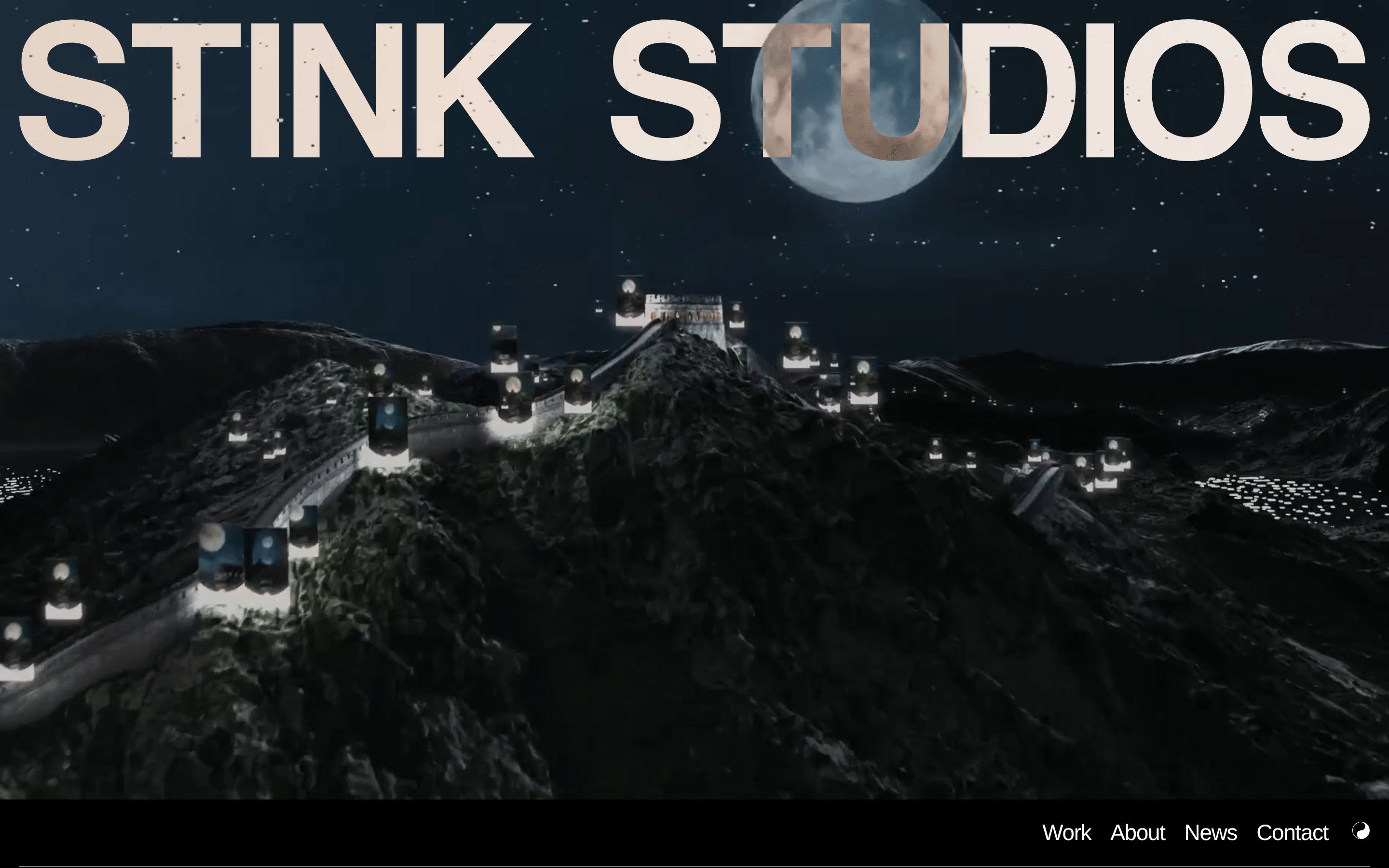
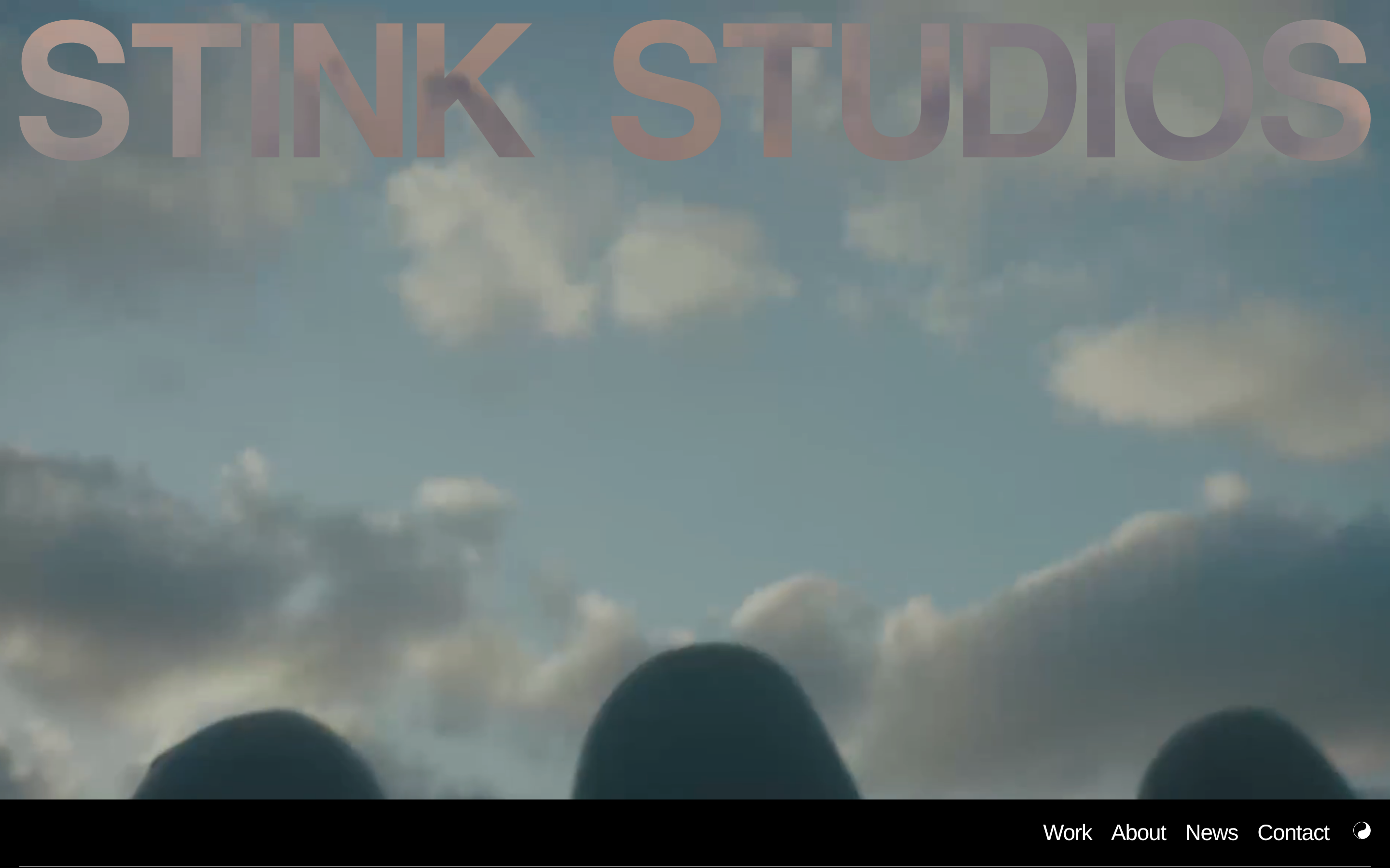
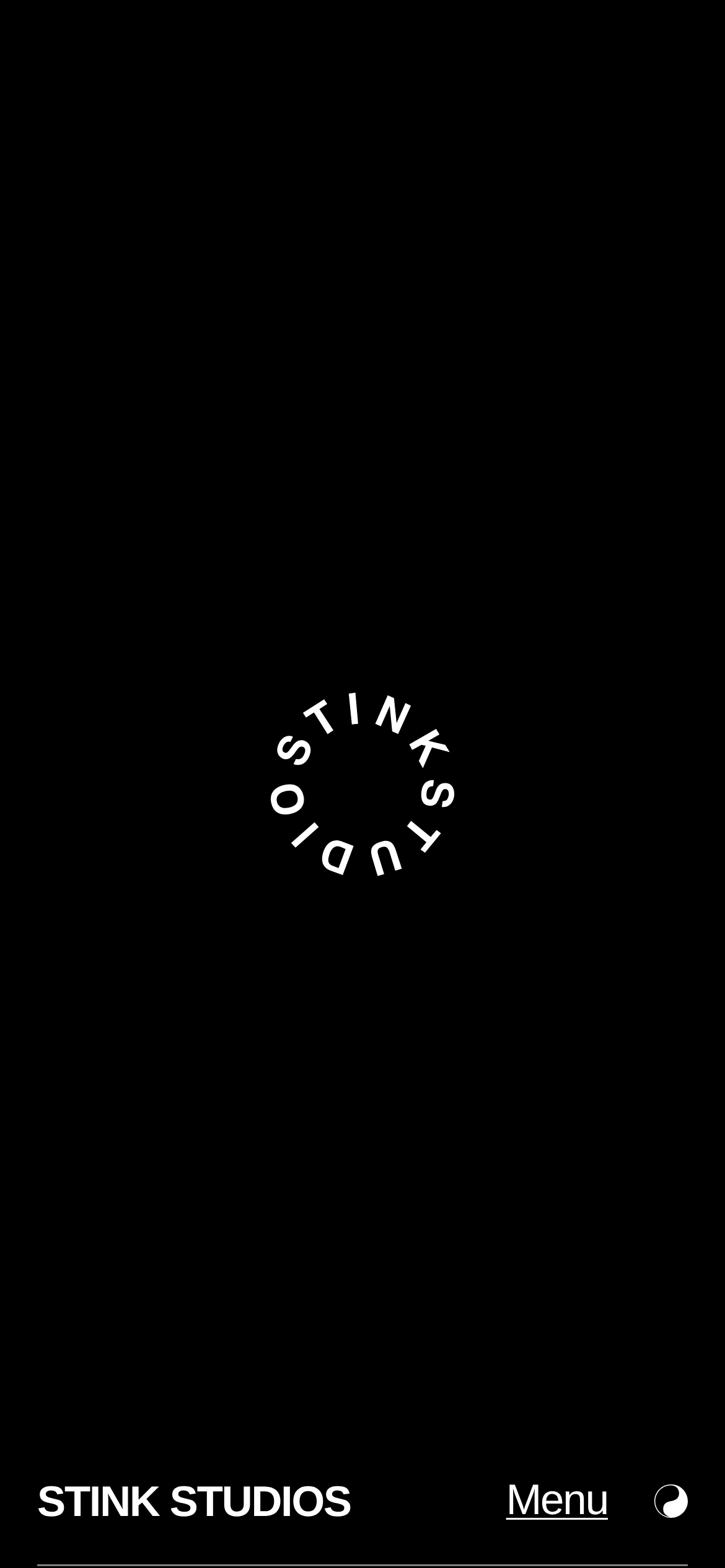
A cinematic gallery showcasing large-scale creative work with high-contrast typography.
02
Color
#FFFFFFInk
#000000BG
#101010Muted
rgba(255,255,255,0.2)Line
High-contrast monochrome foundation to let cinematic project photography serve as the primary visual focus.
03
Typography
grotesque-sans · monospace
display60px · 300
heading52px · 300
body16px · 300
caption14px · 300
Use Helvetica, sans-serif as the primary typeface. · Maintain extremely tight negative letter-spacing on large display text. · All UI text should be lightweight (300 weight).
04
Spacing
4px
8px
16px
24px
32px
48px
64px
96px
Generous padding around large visual elements with tighter, consistent gaps in navigation and lists.
05
Surfaces
sm · 0px
md · 10px
lg · 10px
pill · 999px
Thin 1px solid white or black lines used primarily for separation and underlines.
06
Layout
1280container
12columns
20pxgutter
768 / 1024breakpoints
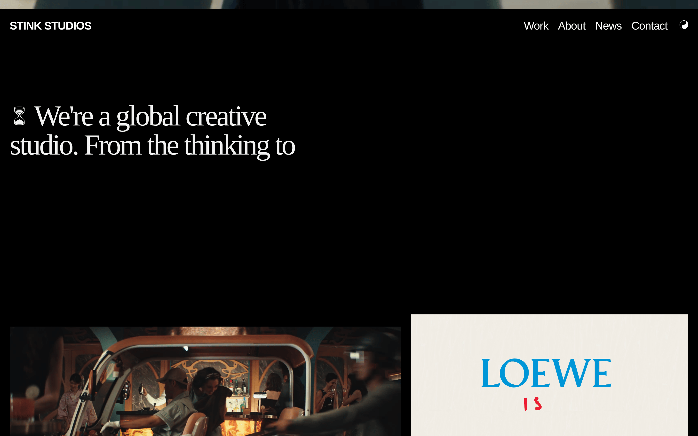
Full-bleed hero imagery followed by a mixed grid of large and small project cards.
07
Motion & Interaction
200msmicro
250mssmall
400msmedium
ease-outeasing
Smooth opacity fades on interactive elements. · Transform-based hover states on navigation and cards. · Rotating or spinning animations for logo elements during loading states.
Subtle opacity reduction or slight color shift to indicate interactivity. · Immediate state change or navigation to project details.
08
Components
buttonSimple text-based links with underline or hover opacity changes.
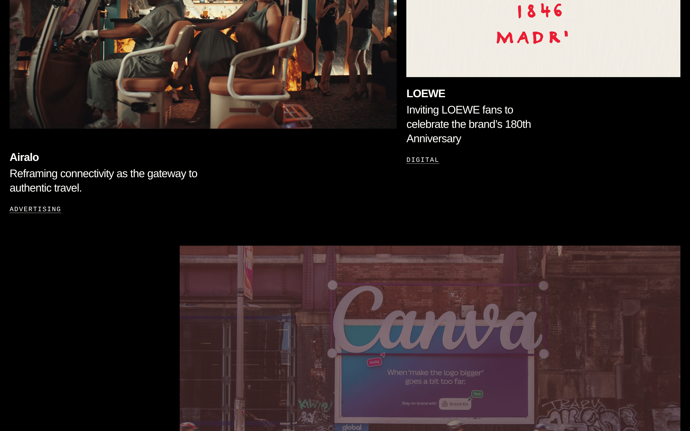
cardEdge-to-edge photographic thumbnails with minimal text overlays below or beside them.
chipSmall, uppercase, spaced-out monospaced text for categories like 'ADVERTISING'.
inputMinimal, likely appearing as simple text fields with bottom borders.
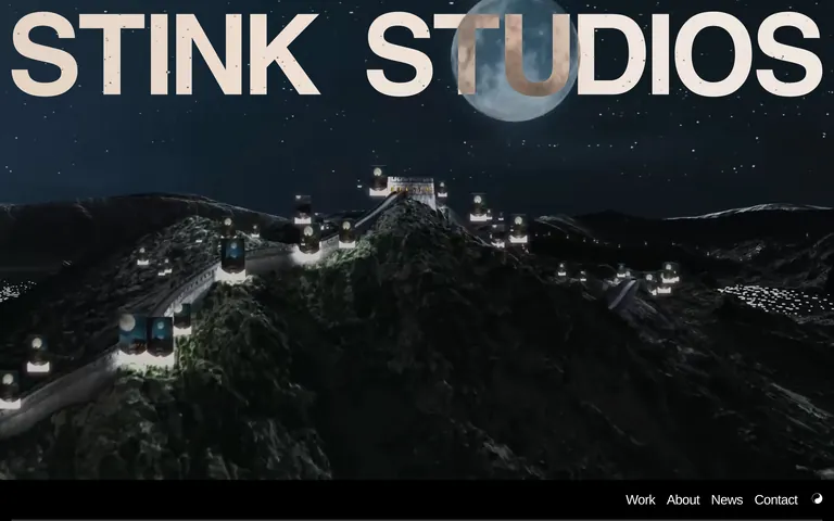
heroFull-viewport immersive video or image background with massive, tightly-tracked display typography.
09
Voice & Don'ts
ToneConfident, minimalist, and professional.
HeadlinesShort, punchy, and visually dominant, relying on scale rather than complex wording.
CTAsUnderstated text links that blend into the overall minimalist aesthetic.
Don't use decorative serif fonts — screenshot shows a clean, geometric grotesque sans-serif across all UI and display text.
Don't add drop shadows to UI elements — screenshot shows completely flat surfaces with no elevation effects.
Don't use vibrant, high-chroma accent colors — screenshot shows a strict monochrome palette (black, white, muted gray).
Don't use centered text alignment for navigation — screenshot shows right-aligned navigation links at the bottom of the hero.
Don't use heavy font weights for body text — screenshot shows predominantly lightweight (300) text for a refined feel.
Don't use rounded corners on primary cards — screenshot shows sharp edges on project imagery, with only small 10px radius on minor elements.
Avoid: Avoid decorative serif fonts.
Avoid: Avoid vibrant neon or multi-color gradients.
Avoid: Avoid cluttered UI with excessive borders or drop shadows.
Avoid: Avoid playful or rounded bubble-like UI elements.
Avoid: Avoid dense blocks of body text in hero sections.
Avoid: Avoid complex animations that distract from the photography.
Captured from the live site · real computed styles
11
System prompt
Design a premium creative agency portfolio with a high-contrast, cinematic aesthetic. Use a strict monochrome palette with a #000000 background and #FFFFFF text. Use a geometric grotesque-sans font (like Helvetica) at a lightweight (300) weight for a refined, modern feel. Ensure massive display typography has tight negative letter-spacing (e.g., -3px). Critical don'ts: never use decorative serifs, avoid drop shadows, and do not use vibrant accent colors. The UI should feel like a quiet, professional gallery that lets large-scale photography and video be the primary focus.
Bring this taste to your agent
Hand your AI agent a machine-readable spec of this design — tokens, type, motion, the whole DNA.