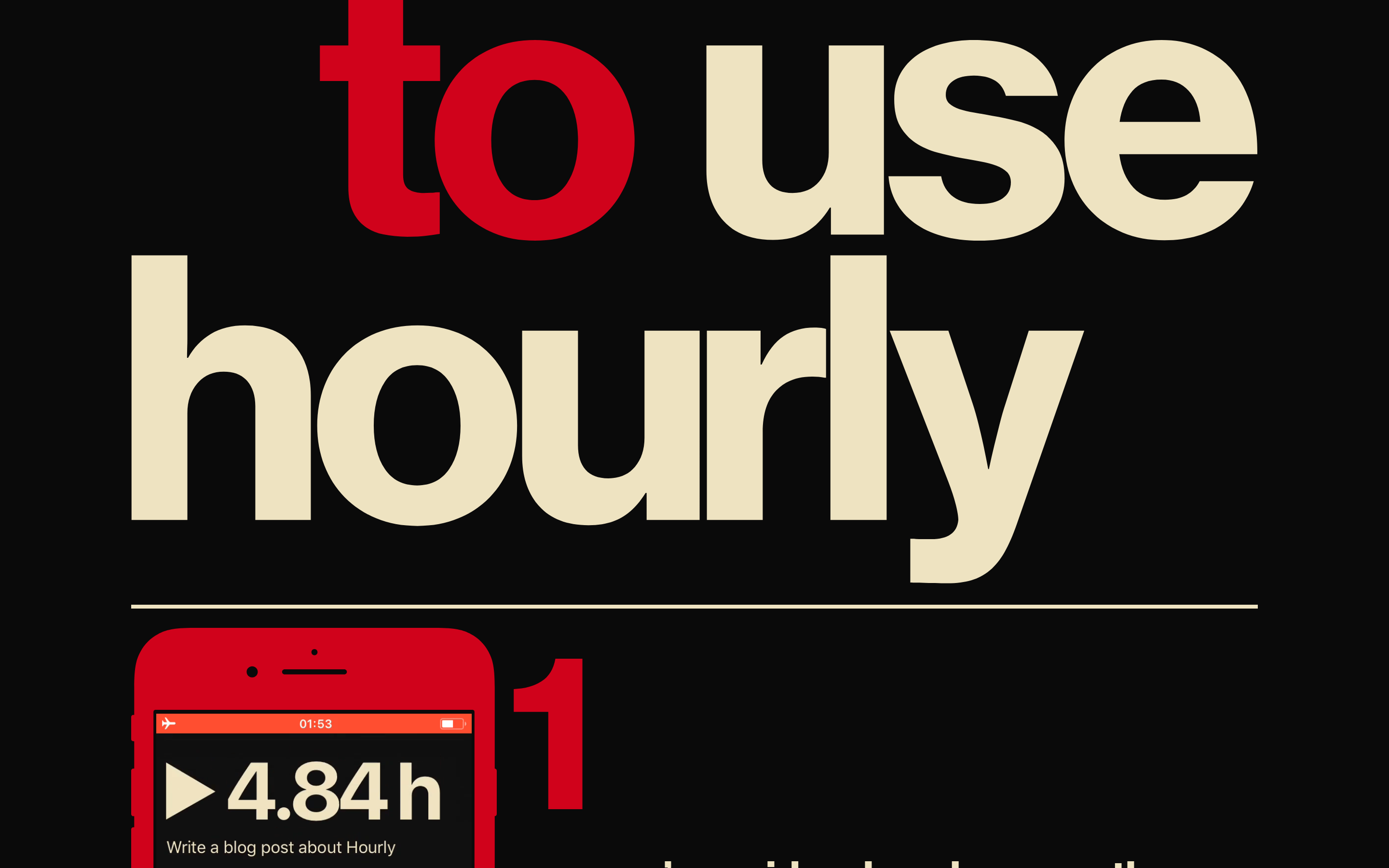
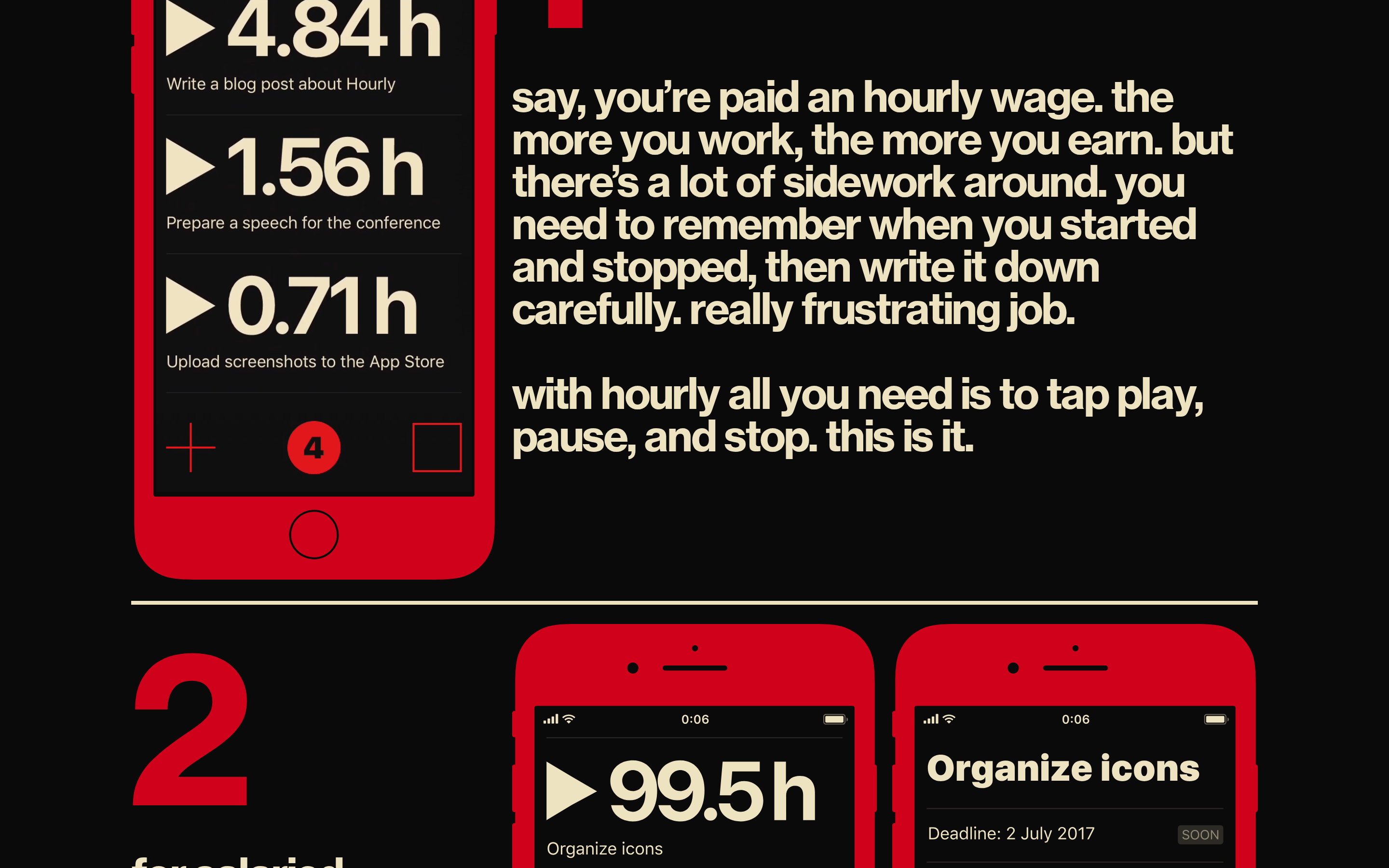
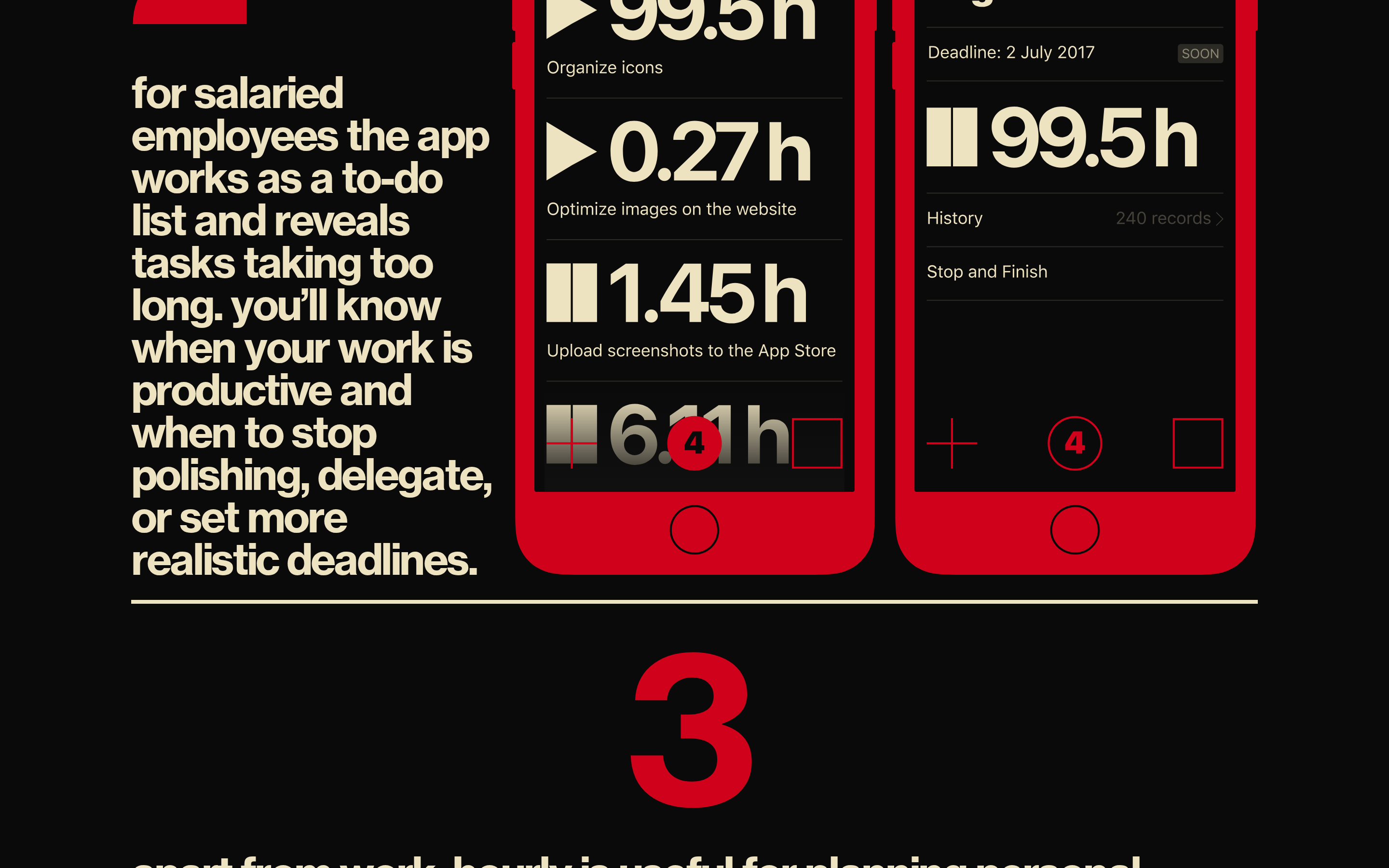
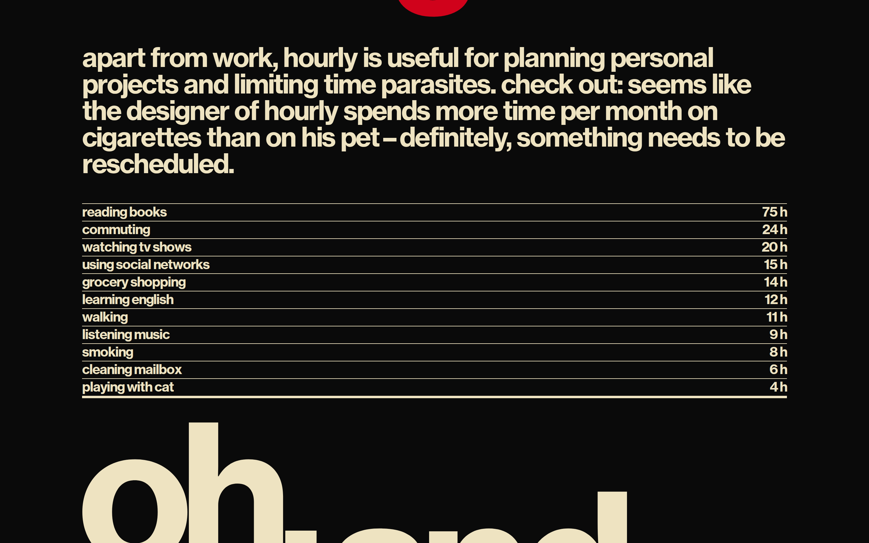
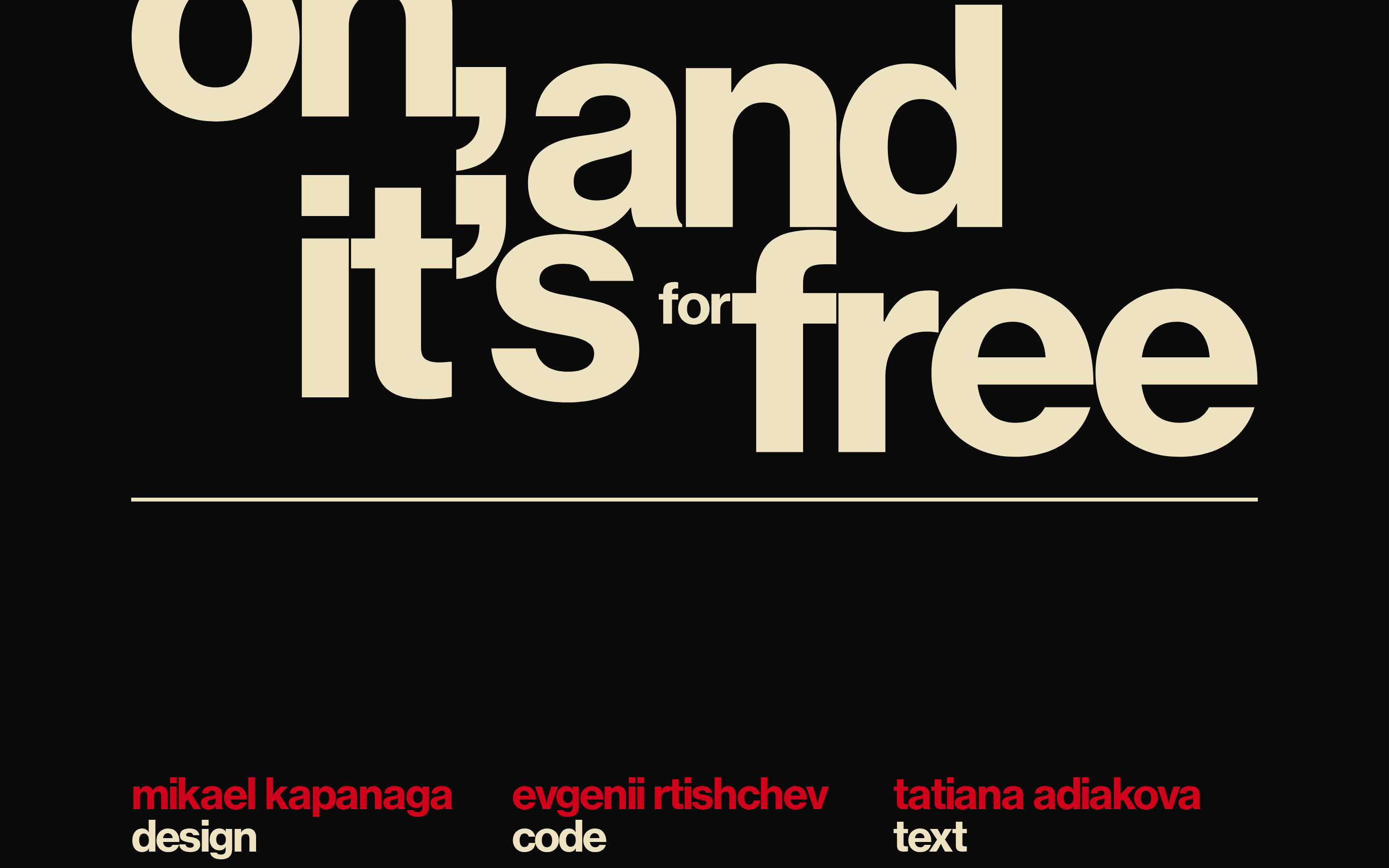
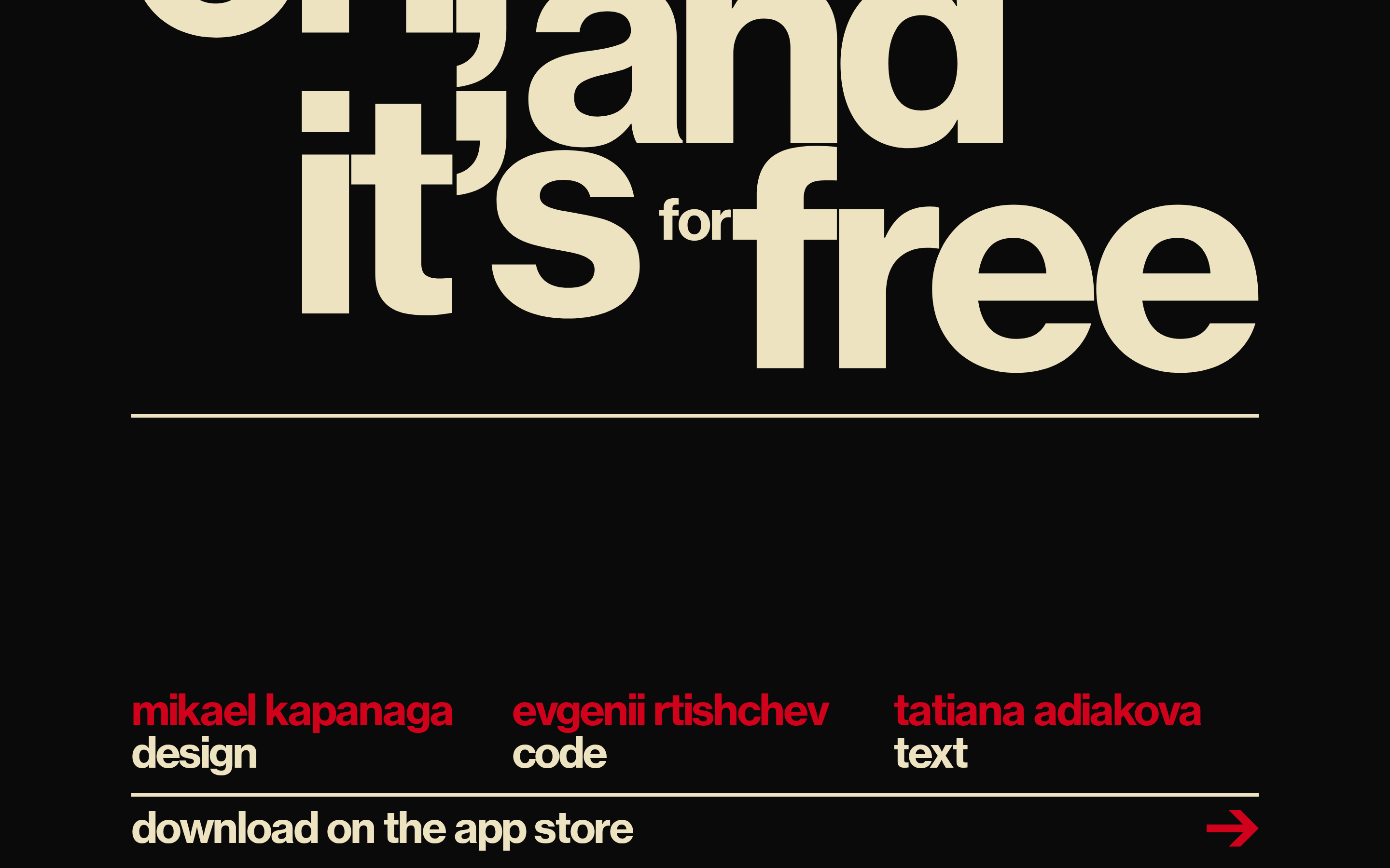
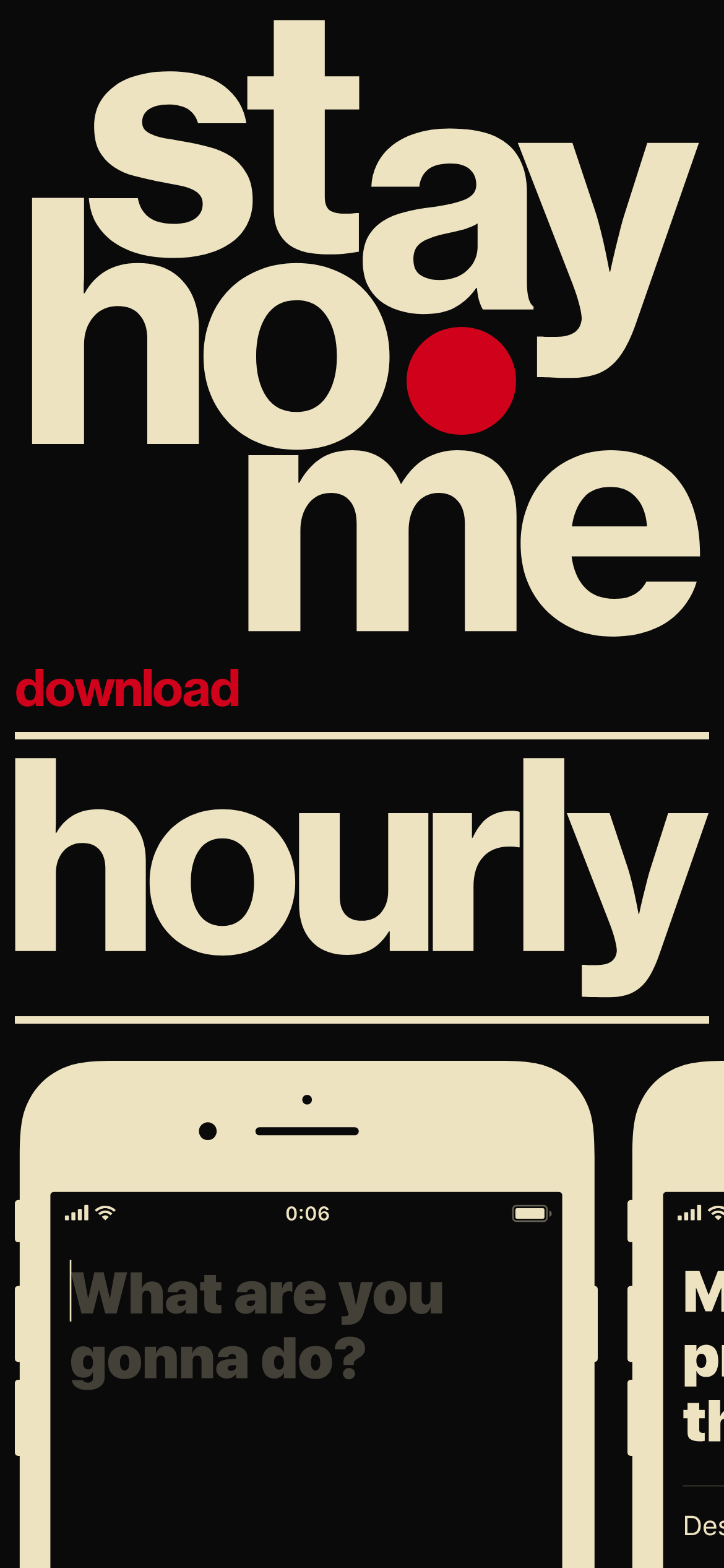
A high-contrast, typographic poster for a utility app
02
Color
#D0021BAccent
#EEE1C1Ink
#0A0A0ABG
rgba(238, 225, 193, 1)Line
Extreme contrast with a strict three-color palette of black, cream, and red.
03
Typography
grotesque-sans
display217px · 700
headline44px · 700
body16px · 700
All primary text is set in bold grotesque sans. · Tight tracking and line-heights are used throughout. · Text often acts as the primary visual element.
04
Spacing
4px
8px
16px
20px
24px
32px
Irregular, driven by large typographic blocks rather than a consistent grid.
Captured from the live site · real computed styles
11
System prompt
This design is a minimalist, high-impact landing page for a mobile app, relying almost entirely on massive, tightly-set bold typography to convey its message. The core palette is restricted to three colors: a near-black background (#0A0A0A), a warm cream for primary text and borders (#EEE1C1), and a vibrant red for accent and emphasis (#D0021B). The typography is a bold grotesque sans-serif, often scaled to massive sizes and set with very tight leading and tracking. Key design constraints include avoiding any light font weights, avoiding wide letter-spacing, avoiding drop shadows or complex backgrounds, and maintaining a stark, high-contrast aesthetic. The layout is a single-column vertical stack with phone mockups breaking up the text blocks.
Bring this taste to your agent
Hand your AI agent a machine-readable spec of this design — tokens, type, motion, the whole DNA.