A vintage literary gazette meets modern software craftsmanship
02
Color
#000000Ink
rgba(0,0,0,0.85)Ink soft
#EDEEE7BG
#A0A0A0Muted
rgba(0,0,0,0.15)Line
Strict two-tone palette relying on warm off-white and deep black for maximum editorial contrast
03
Typography
transitional-serif · geometric-mono
display36px · 400
caption14px · 400
micro10px · 400
Use transitional serif for all main copy and headlines · Use geometric mono for all UI labels, navigation, and micro-copy · Apply uppercase and generous tracking to mono labels
04
Spacing
4px
8px
12px
16px
20px
24px
32px
40px
48px
64px
75px
96px
Centered vertical rhythm with generous whitespace to emphasize editorial breathing room
05
Surfaces
sm · 0px
md · 0px
lg · 0px
pill · 999px
1px solid rgba(0,0,0,0.15)
06
Layout
1280container
1columns
24pxgutter
768 / 1024breakpoints
Single centered column layout with extreme vertical padding and centered elements
07
Motion & Interaction
200msmicro
250mssmall
400msmedium
cubic-bezier(0.4, 0, 0.2, 1)easing
Smooth color and fill transitions on interactive elements
Subtle color shifts or fill changes on interactive elements · Immediate state change
08
Components
buttonSimple text-based buttons with no background, relying on hover transitions
cardNot visible
chipNot visible
inputNot visible
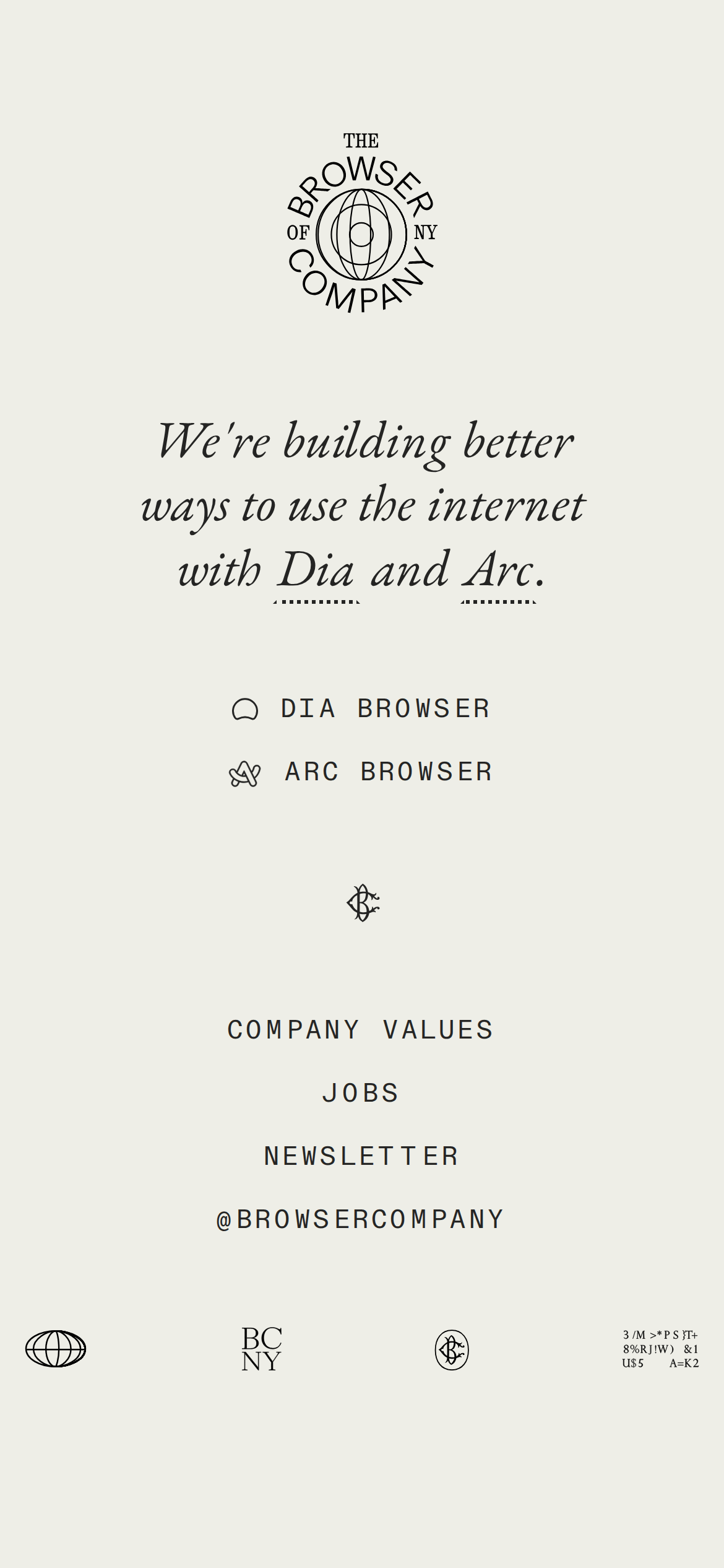
heroCentered, symmetrical composition featuring a typographic logo mark and a two-line serif headline
09
Voice & Don'ts
ToneArtisanal, quiet, and confident
HeadlinesPoetic, serif, and gently italicized for emphasis
CTAsUnderstated, monospaced, uppercase labels
don't use bright, saturated background colors — screenshot shows a warm, muted off-white (#EDEEE7)
don't use heavy drop shadows or 3D effects — screenshot shows completely flat, borderless surfaces
don't use sans-serif fonts for headlines — screenshot shows an italicized transitional-serif headline
don't center-align all body copy — screenshot shows a centered layout but implies left-aligned flow for long-form content
don't use rounded corners on primary containers — screenshot shows sharp, geometric edges throughout
don't use aggressive call-to-action buttons — screenshot shows understated, monospaced text links
Captured from the live site · real computed styles
11
System prompt
This design serves as a premium, artisanal presentation for developer tools, prioritizing a refined editorial aesthetic over typical SaaS conventions. The palette is strictly two-tone, relying on a warm off-white background (#EDEEE7) and deep black text (rgba(0,0,0,0.85)) to create high contrast with minimal noise. Typography uses a transitional-serif for display and body text, paired with a geometric-mono for UI labels and navigation. The layout is highly symmetrical and centered, utilizing generous whitespace and micro-copy. Critical constraints include: never use saturated or primary colors like blue, do not apply drop shadows or heavy rounded corners, and avoid sans-serif type for any headlines. Maintain a quiet, literary voice throughout all copy and interactions.
Bring this taste to your agent
Hand your AI agent a machine-readable spec of this design — tokens, type, motion, the whole DNA.