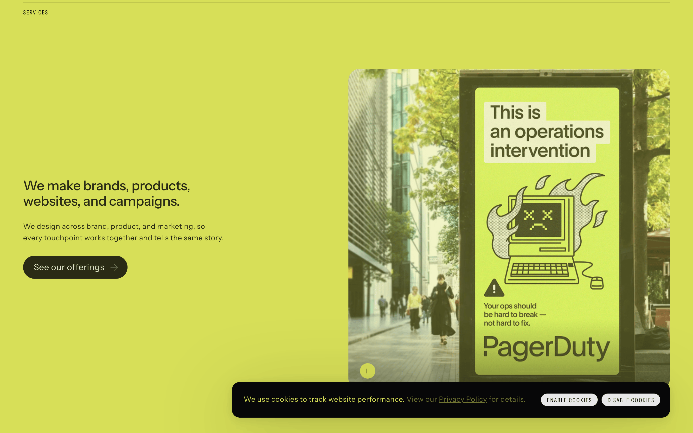
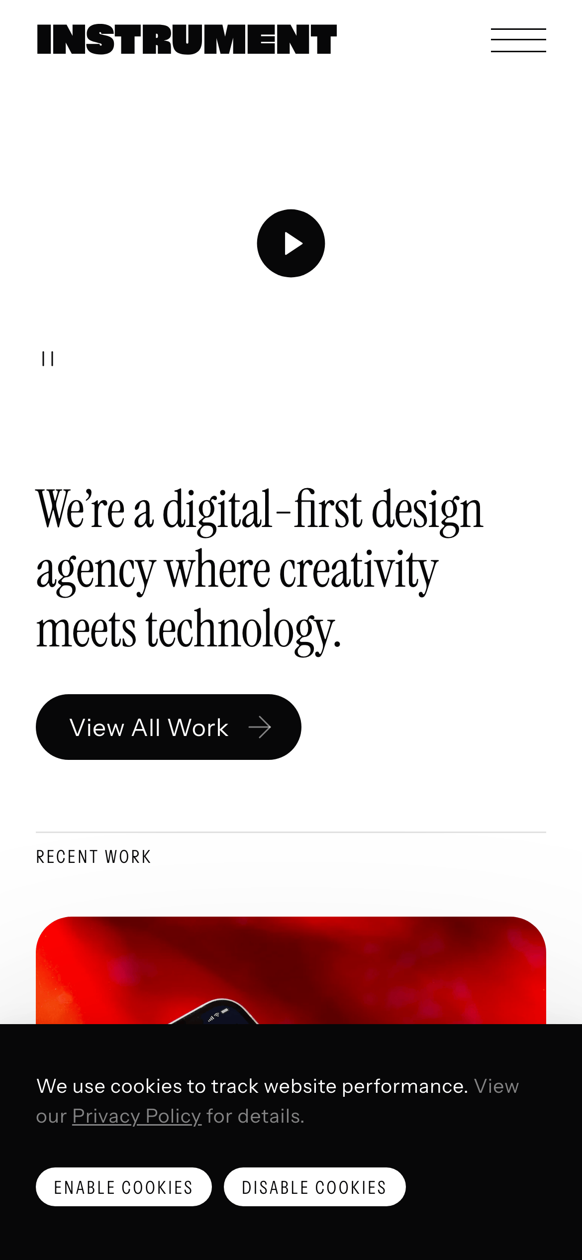
A digital-first design agency where creativity meets technology.
02
Color
#070708Ink
#525252Ink soft
#E8E8E9BG
#F0F0F1BG soft
#D4D4D5BG quiet
#808080Muted
rgba(7,7,8,0.5)Line
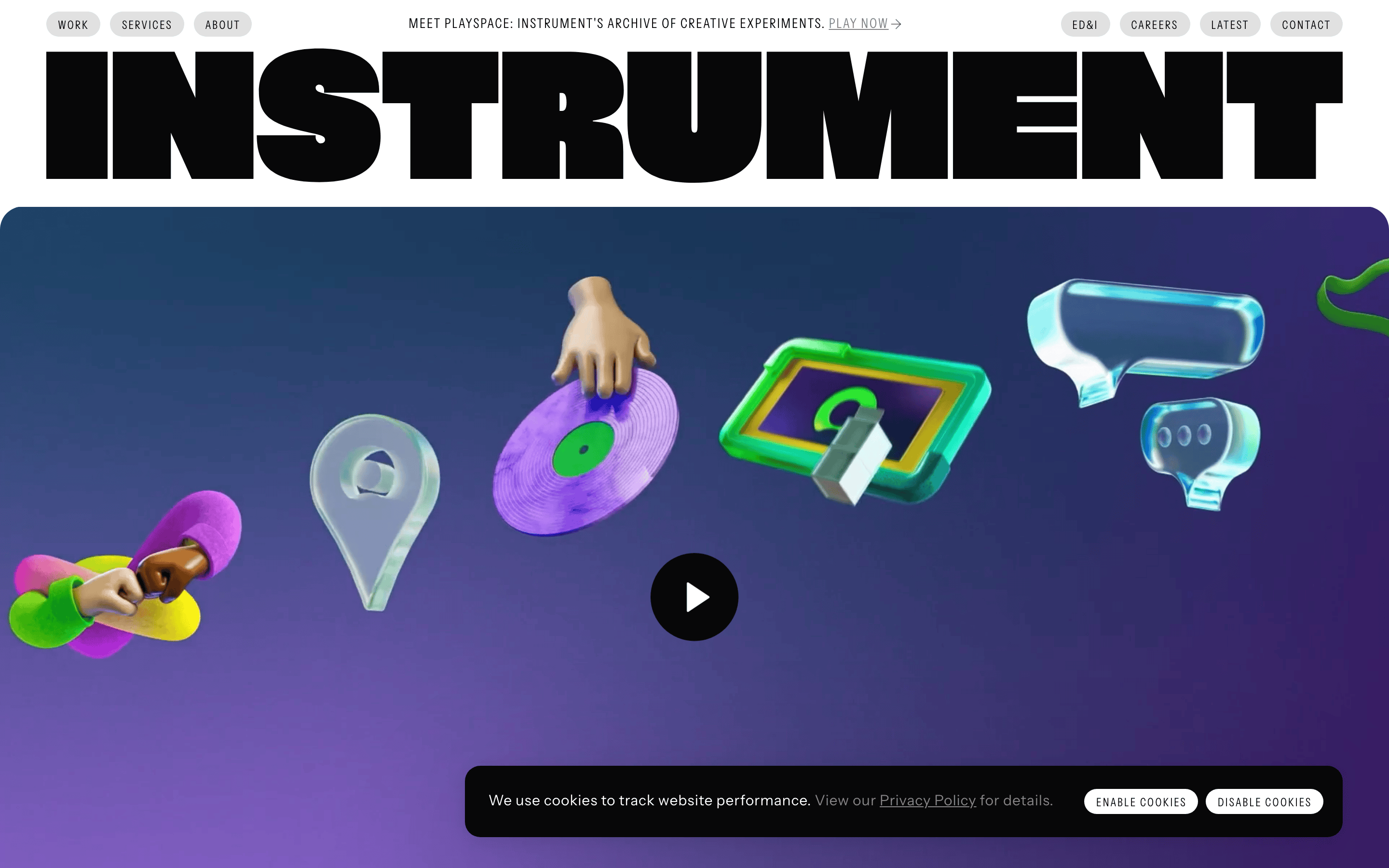
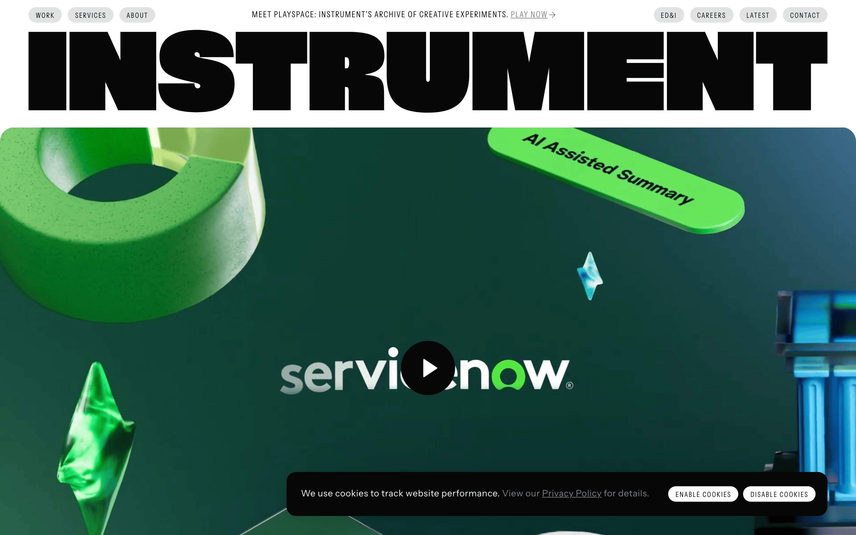
High-contrast monochrome base with playful 3D gradient accents in hero.
03
Typography
grotesque-sans · sans-serif · monospace
display352px · 400
headline36px · 400
body16px · 400
Use Instrument-Sans for all primary UI and body text. · Use Instrument-Serif for elegant editorial highlights. · Use Instrument-Mono for technical metadata or tags. · Set display headlines with tight tracking and high contrast.
04
Spacing
4px
8px
16px
24px
32px
48px
64px
96px
4px grid with generous whitespace for editorial breathing room.
05
Surfaces
sm · 4px
md · 24px
lg · 32px
pill · 999px
1px solid rgba(7,7,8,0.5)
0 0 0 1px rgba(7,7,8,0.5)
06
Layout
1440container
12columns
24pxgutter
768 / 1024breakpoints
Grid-based with a massive full-bleed hero and stacked content sections.
07
Motion & Interaction
150msmicro
250mssmall
350msmedium
cubic-bezier(0.4, 0, 0.2, 1)easing
Smooth color transitions for interactive states. · Subtle transform shifts on hover for depth.
Invert colors or subtle background shift. · Immediate visual feedback with no scale bounce.
08
Components
buttonPill-shaped primary buttons with high contrast ink/bg.
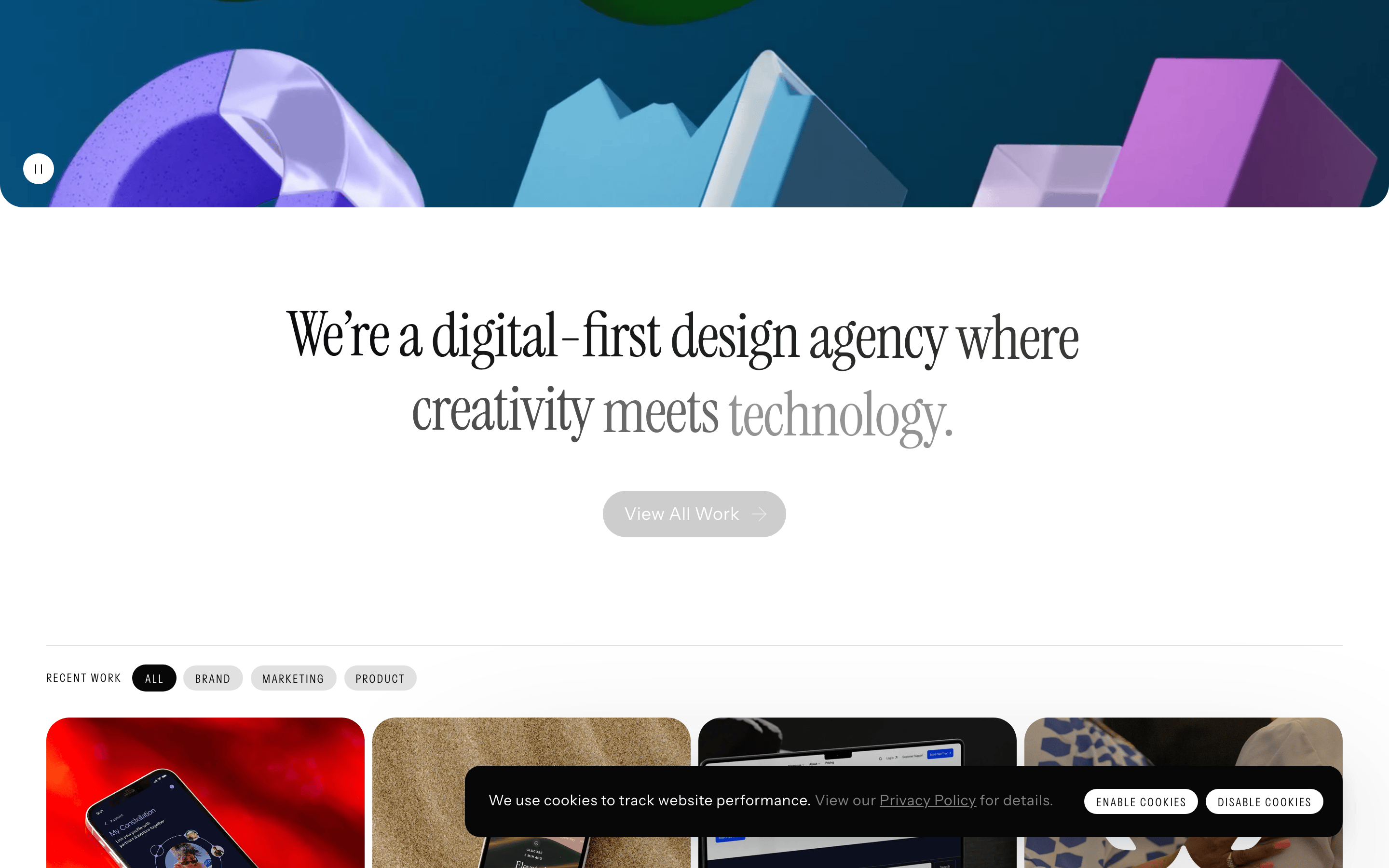
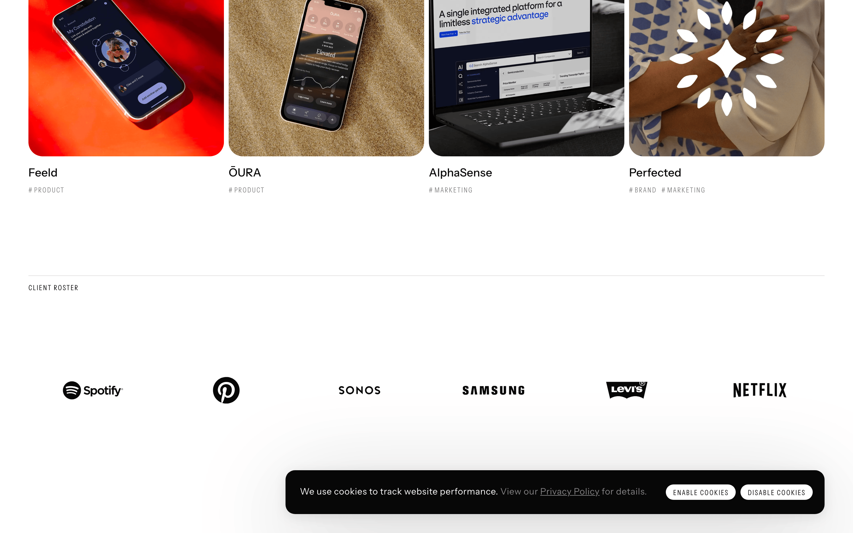
cardLarge editorial cards with 3D or photographic content.
chipSmall pill tags for navigation with thin borders.
inputMinimalist form inputs with bottom borders.
heroFull-bleed 3D animated scene with a centered play button.
09
Voice & Don'ts
ToneConfident, minimalist, and professional.
HeadlinesBold, uppercase, and tightly tracked.
CTAsDirect and action-oriented.
Don't use multi-colored gradients — the palette is primarily monochromatic with specific accent scenes.
Don't use rounded corners on everything — the hero uses sharp edges and circles.
Don't use heavy drop shadows — use subtle 1px borders for separation.
Don't use center-aligned body text — the layout is strictly left-aligned.
Don't use casual or friendly fonts — stick to the sharp, grotesque Instrument family.
Don't clutter the interface — use generous whitespace and clear hierarchy.
Captured from the live site · real computed styles
11
System prompt
This site is a premium digital-first design agency portfolio. It features a bold, monochromatic base (#E8E8E9 bg, #070708 ink) with playful 3D colorful accents in the hero. The typography is dominated by a custom grotesque-sans family (Instrument-Sans) used for massive, tightly tracked headlines and clean body copy. Key criticals: never use center-aligned body text (it's strictly left-aligned), never use heavy drop shadows (use 1px borders instead), and never break the minimalist, high-contrast monochromatic aesthetic. The layout is editorial and spacious, using a 4px grid and 12-column system.
Bring this taste to your agent
Hand your AI agent a machine-readable spec of this design — tokens, type, motion, the whole DNA.