A digital vinyl record crate with a nostalgic, tactile UI.
02
Color
#FFF8F1Ink
#8FCEEEBG
#E5E7EBMuted
rgba(255, 248, 241, 0.15)Line
High-contrast soft palette using a dominant light blue background with warm off-white text.
03
Typography
grotesque-sans
display124px · 700
title48px · 700
body14px · 300
Text is heavily weighted towards uppercase transforms. · Titles use extremely tight negative letter-spacing for a bold, modern look. · Large typography acts as a structural graphic element rather than just content.
04
Spacing
4px
8px
16px
24px
32px
48px
64px
96px
Irregular spacing focused on large, dramatic padding to allow photographic content to breathe.
05
Surfaces
sm · 0px
md · 0px
lg · 0px
pill · 999px
Solid borders in warm off-white and neutral gray used to define layers.
06
Layout
1280container
12columns
24pxgutter
768 / 1024breakpoints
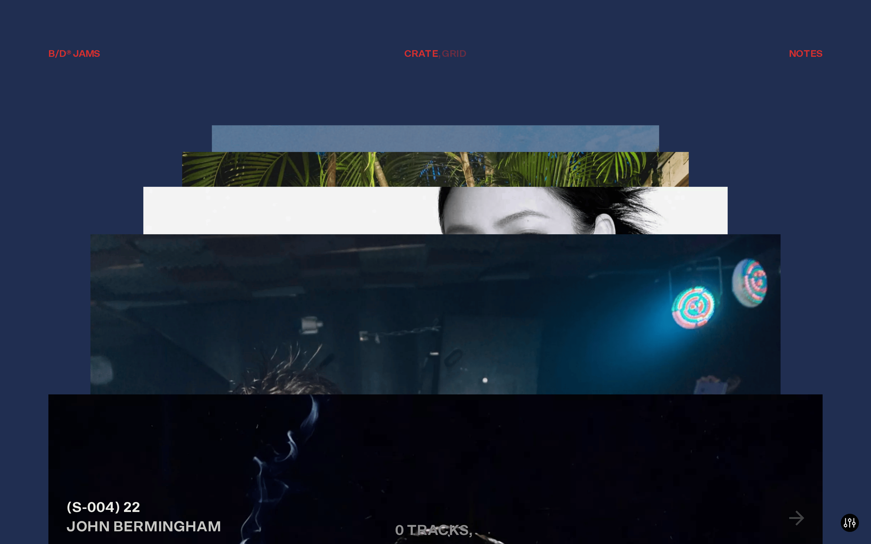
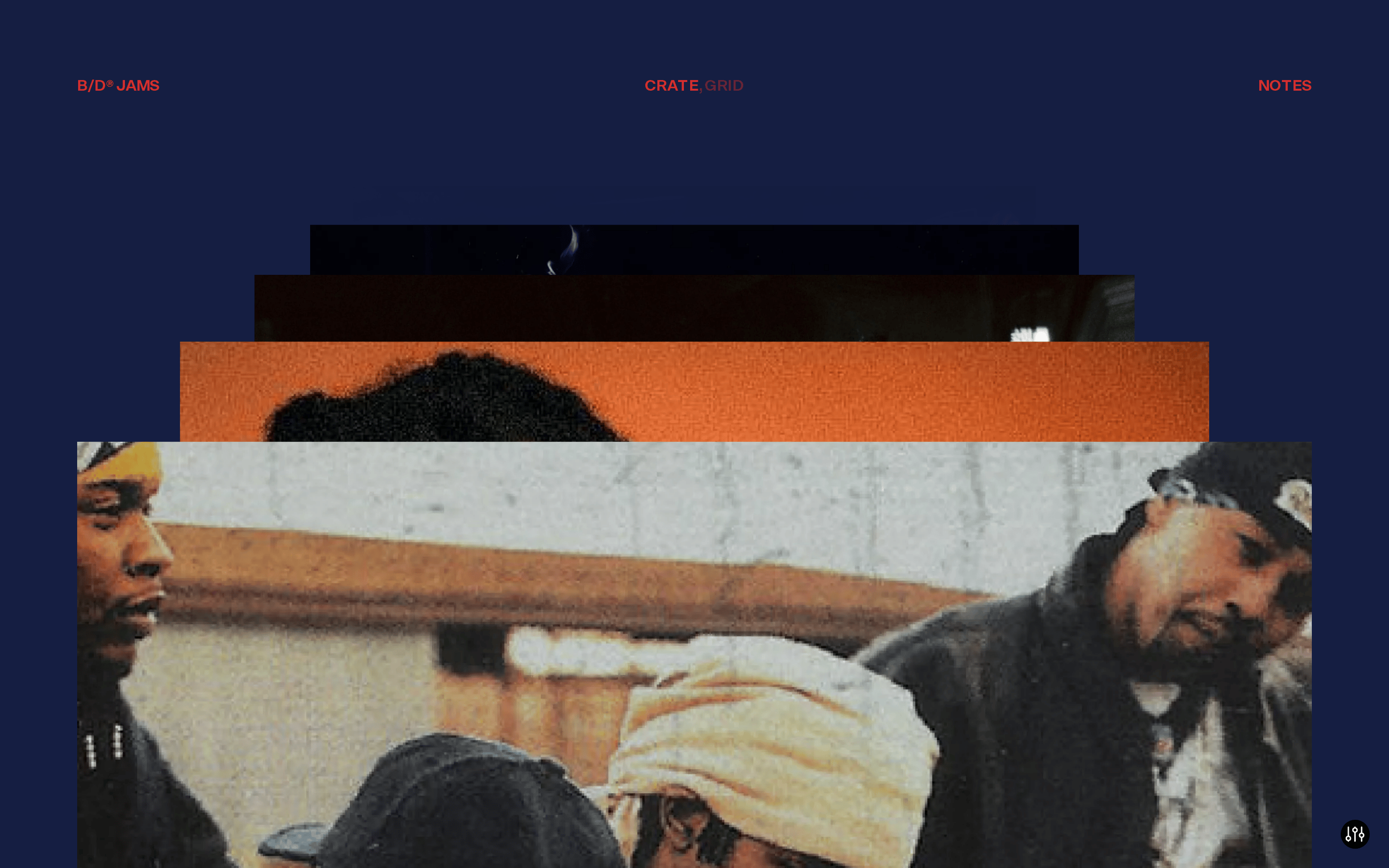
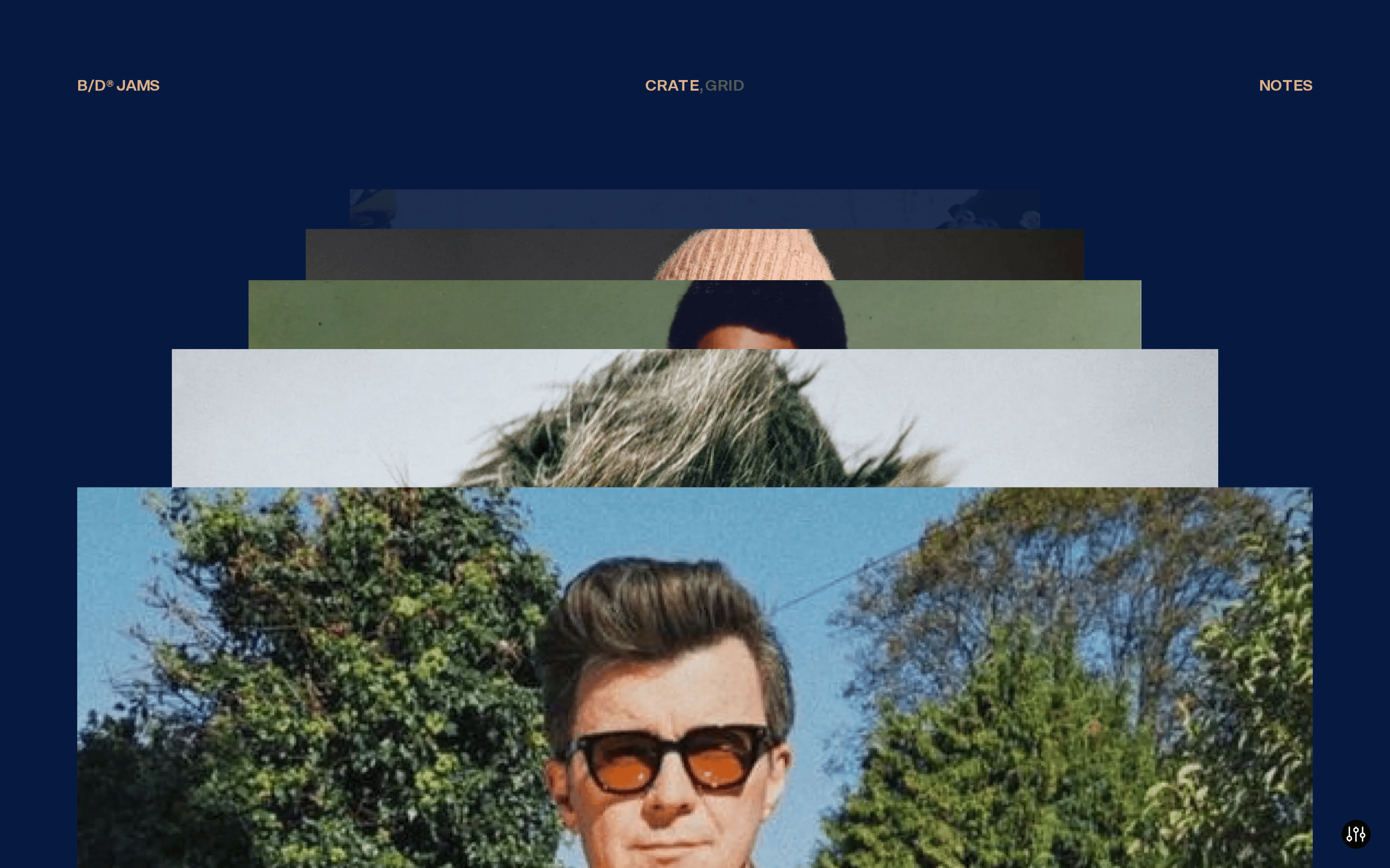
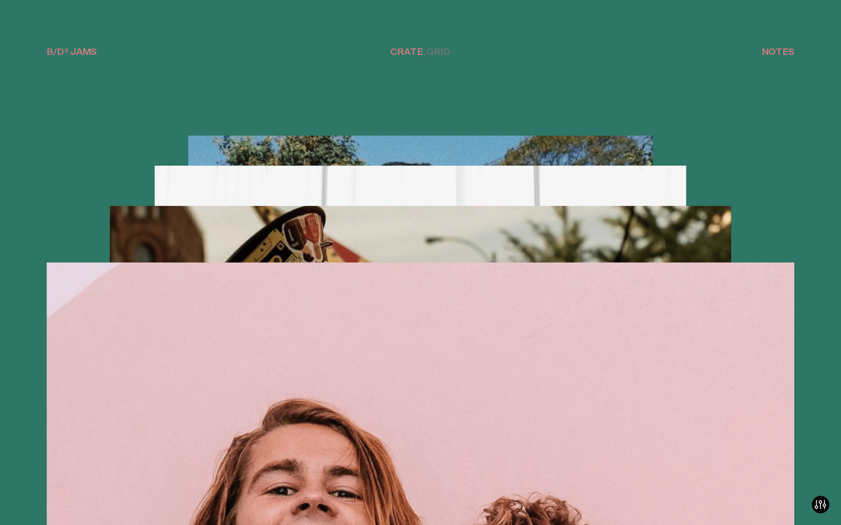
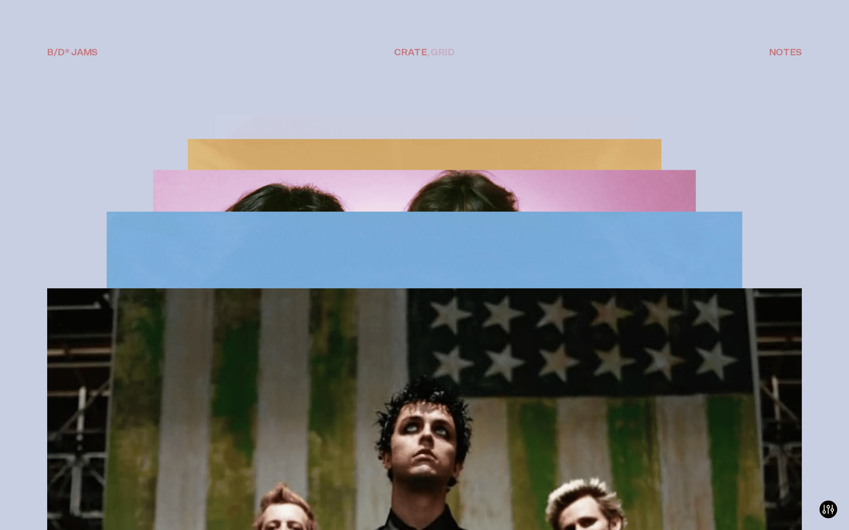
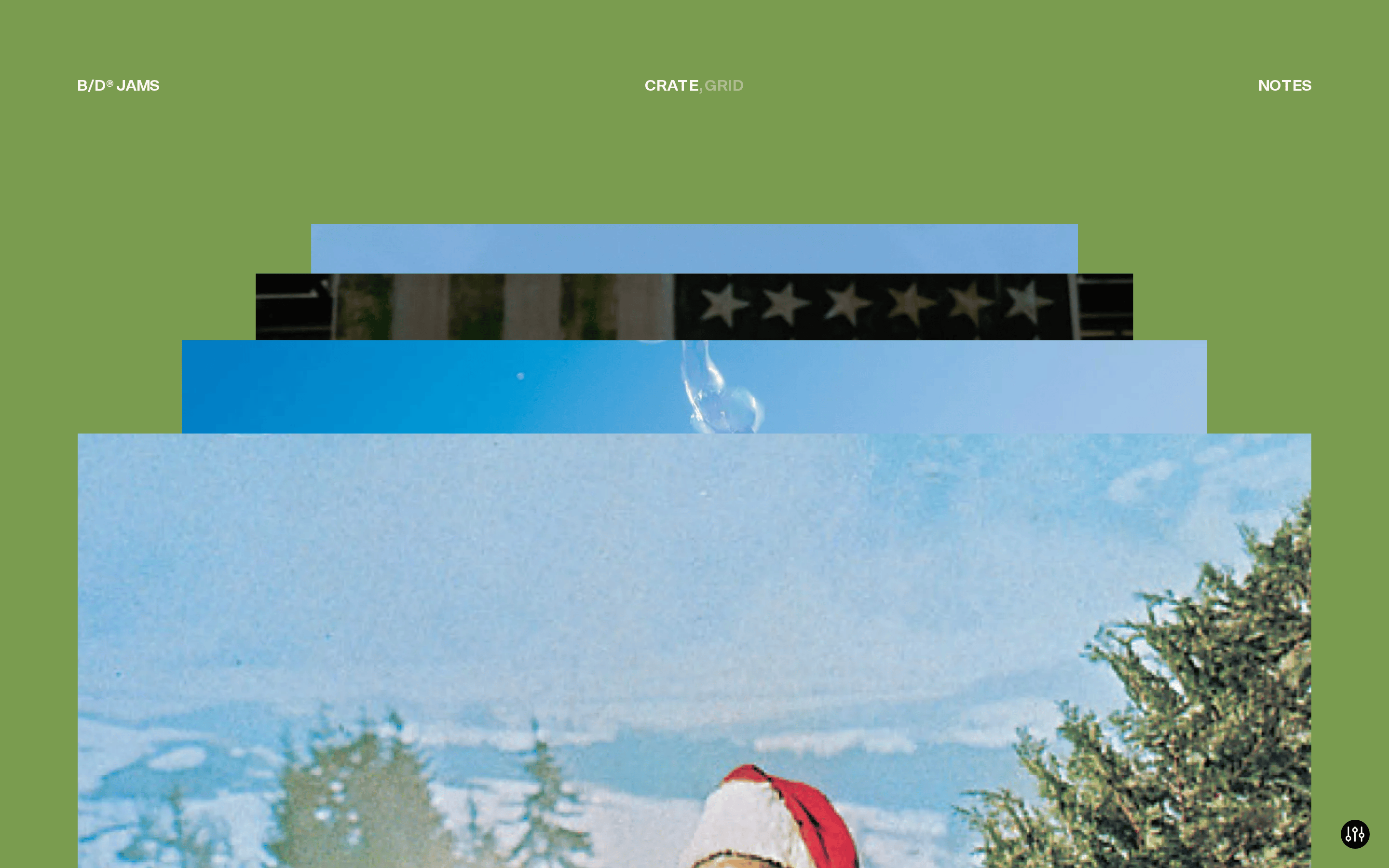
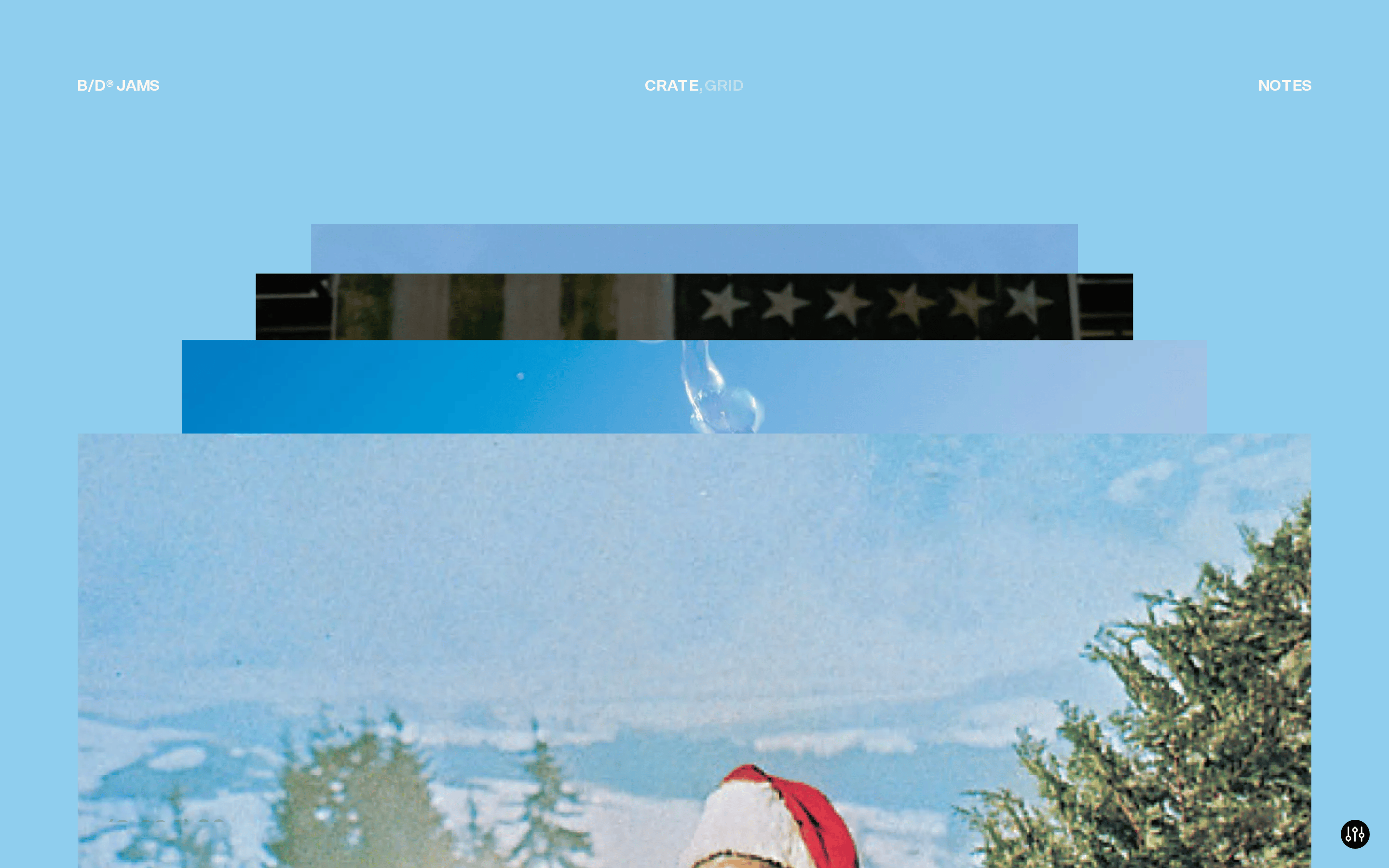
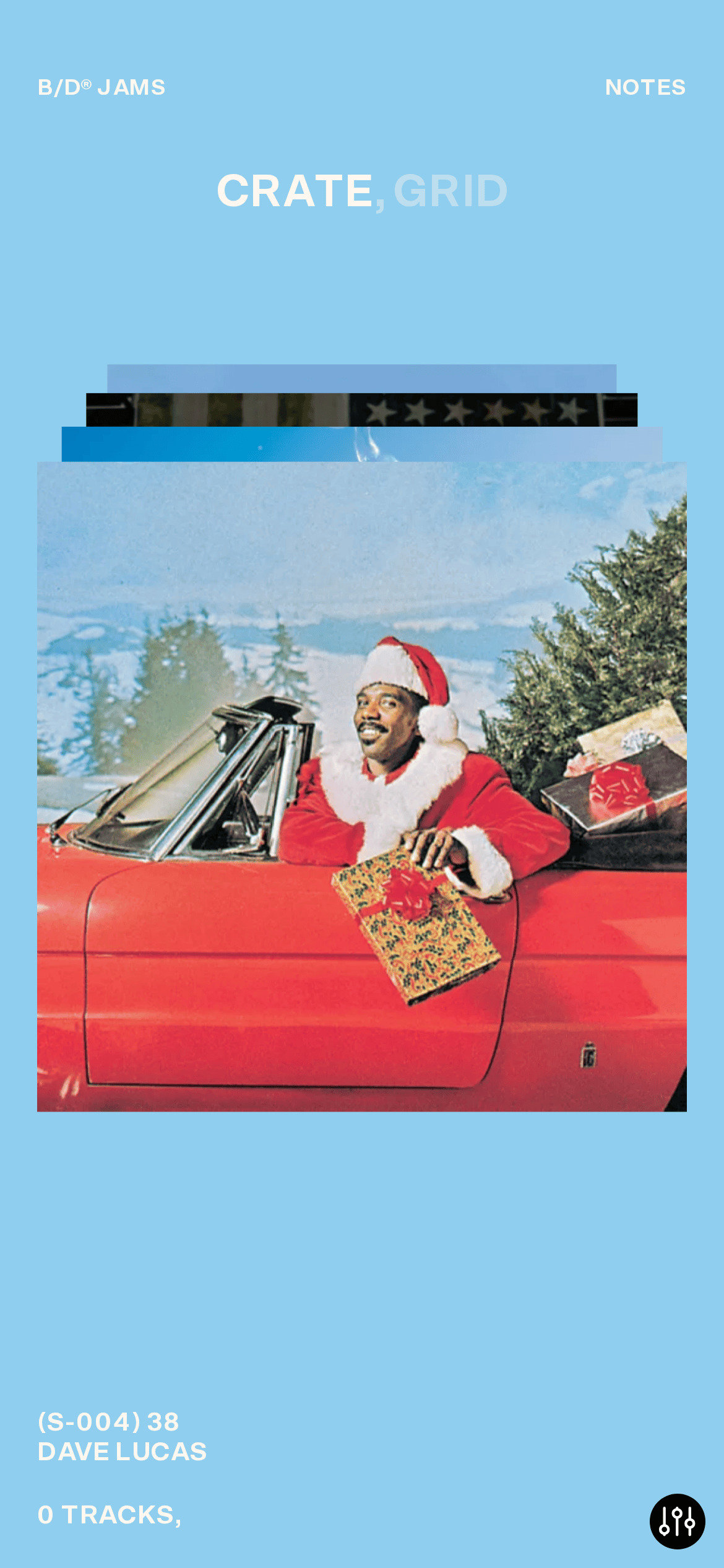
Asymmetric, layered composition where images are stacked and offset to create a physical crate-like depth.
07
Motion & Interaction
220msmicro
400mssmall
800msmedium
cubic-bezier(0.25, 0.1, 0.25, 1)easing
Smooth opacity and transform transitions over 0.5s for state changes. · Likely includes drag interactions suggested by the grab cursors.
Cursor changes to pointer for interactive elements and grab for draggable images. · Engages the interactive elements of the collection viewer.
08
Components
buttonText-based navigation with uppercase styling and pointer cursors.
cardLayered photographic elements acting as the primary 'cards'.
chipSimple text tags like 'CRATE' and 'GRID' used for navigation.
heroFull-bleed stacked image composition with heavy typographic metadata.
Captured from the live site · real computed styles
11
System prompt
A bold, curatorial interface for a music or photography collection, reminiscent of physical crate digging. The design relies heavily on a light blue background and warm off-white text, using a clean grotesque sans-serif for massive, tightly-tracked titles. Photography is presented in stacked, offset layers to create depth and encourage exploration. Critical donts: avoid dark mode, avoid rounded corners on main containers, avoid standard sentence-case headers, and avoid standard button components. The layout is intentionally asymmetric and uses large typography as a structural element, requiring generous padding and strict uppercase text transforms to maintain its premium, curated feel.
Bring this taste to your agent
Hand your AI agent a machine-readable spec of this design — tokens, type, motion, the whole DNA.