A modern, well-designed nursery furniture store that feels both premium and approachable.
02
Color
#b3cce8Accent
#0a0a0aInk
#f9f5f2BG
#f8e7e5BG soft
#f3f3f3BG quiet
#535353Muted
rgba(10, 10, 10, 0.1)Line
Warm neutral backgrounds create a calm, inviting atmosphere, with deep navy and light blue accents providing clear focal points.
03
Typography
geometric-serif · humanist-sans
display32px · 400
body16px · 400
caption13px · 400
Use geometric-serif for large display headlines to add a touch of classic elegance. · Use humanist-sans for body text and UI elements for excellent readability and a modern feel. · Maintain a generous line height (1.5-1.6) for body text to enhance comfort. · Apply subtle letter spacing (0.24-0.28px) to sans-serif text for a refined, airy look.
04
Spacing
4px
8px
10px
12px
16px
24px
25px
32px
48px
A consistent 4px base unit is used throughout, with common padding values like 12px and 25px creating a balanced and breathable rhythm.
A full-width, 12-column grid with a 24px gutter. The modal is a centered, fixed-position overlay with a clear image-text split on desktop.
07
Motion & Interaction
220msmicro
300mssmall
400msmedium
cubic-bezier(0.25, 0.1, 0.25, 1)easing
Opacity fades for modal appearances (0.3s) · Smooth all-property transitions for hover states on interactive elements
Elements likely have subtle opacity or color shifts on hover, with cursor: pointer indicating interactivity. · Buttons and interactive elements have defined cursor states and transitions.
08
Components
buttonPill-shaped buttons with solid color fills (like the light blue #b3cce8) and generous padding for a friendly, clickable feel.
cardCards with subtle drop shadows and rounded corners, likely featuring product imagery.
chipNot prominently visible, but likely small, rounded tags for filtering.
inputRounded input fields with a thin border (#0a0a0a at 10% opacity) and placeholder text.
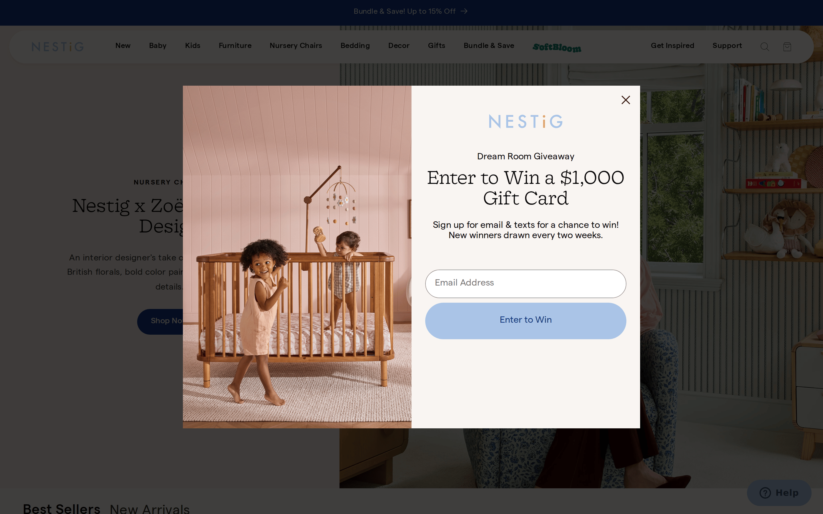
heroA split-layout hero combining a large, warm-toned product photograph with text content on a soft background (#f9f5f2).
09
Voice & Don'ts
ToneWarm, inviting, and design-conscious, speaking directly to parents who value aesthetics and quality.
HeadlinesClear and direct, often using the geometric serif for emphasis, as seen in the modal.
CTAsAction-oriented and simple (e.g., 'Enter to Win', 'Shop Now'), presented in rounded, colorful buttons.
Don't use stark, pure white (#ffffff) as the primary background — the screenshot shows a warm off-white (#f9f5f2) instead.
Don't use a high-chroma, electric accent color — the screenshot shows a soft, pastel blue (#b3cce8) for CTAs.
Don't use sharp, rectangular corners on buttons and inputs — the screenshot shows fully rounded, pill-shaped elements.
Don't use dense, small text blocks — the screenshot shows generous line height and spacing for readability.
Don't use heavy, aggressive drop shadows — the screenshot shows subtle, soft shadows for depth.
Don't use a purely monochrome palette — the screenshot shows warm neutrals with deliberate blue and pink accents in imagery and UI.
Captured from the live site · real computed styles
11
System prompt
Nestig is a premium DTC brand for nursery and kids furniture. Its visual identity blends modern warmth with refined design. The core palette uses a warm off-white background (#f9f5f2) with deep charcoal text (#0a0a0a) and soft blue accents (#b3cce8). Typography pairs a geometric-serif for display headlines with a clean humanist-sans (Matter) for body text, creating a look that is both classic and contemporary. Layouts are spacious and grid-based, relying on generous padding and subtle shadows for structure. Key design rules: maintain warmth through off-white backgrounds, use soft pastel accents instead of bright primaries, and ensure all interactive elements have rounded, pill-shaped forms. Critical donts: do not use pure white backgrounds, avoid sharp corners on buttons, and never let text density overwhelm the generous whitespace.
Bring this taste to your agent
Hand your AI agent a machine-readable spec of this design — tokens, type, motion, the whole DNA.