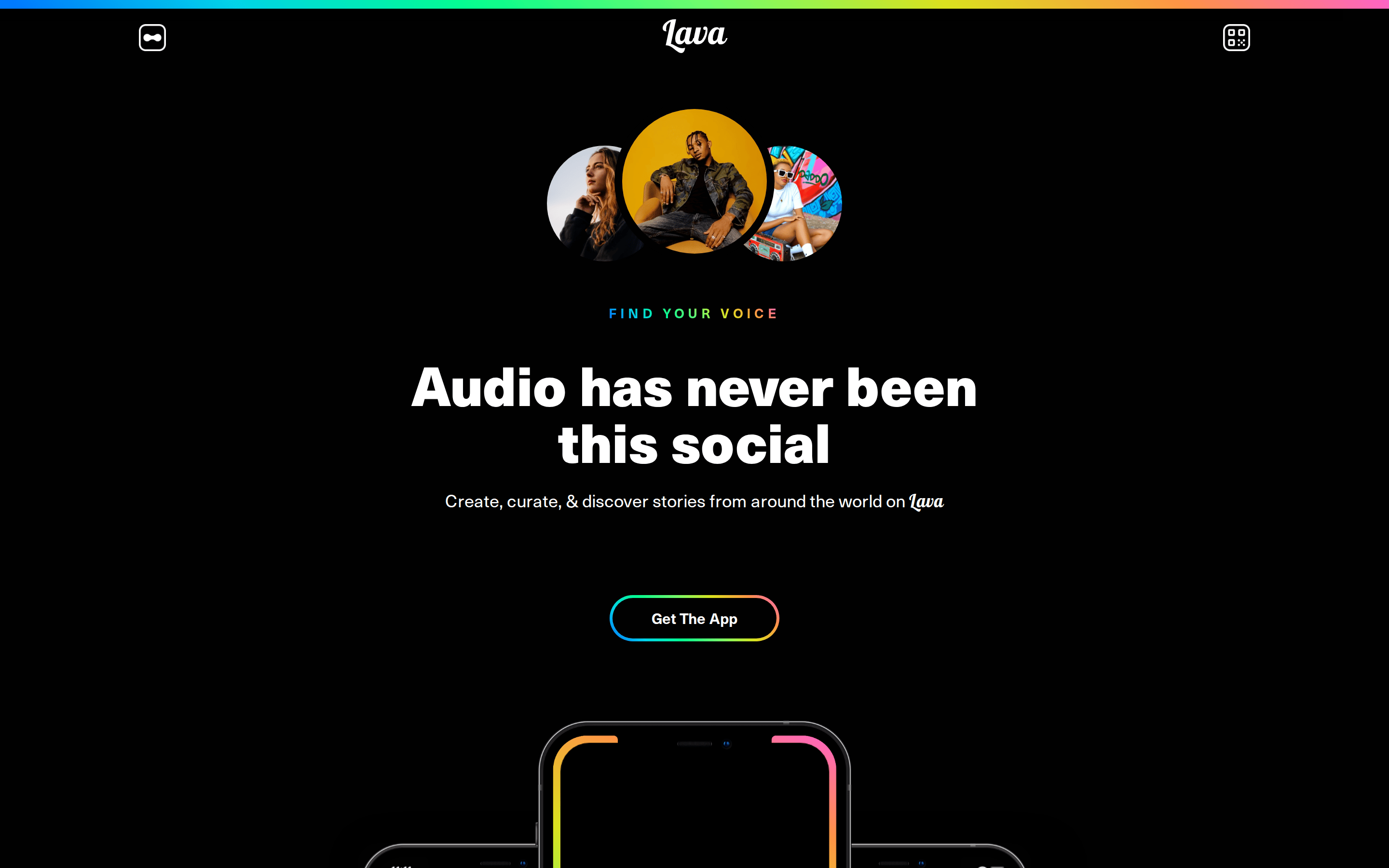
A vibrant neon light show against a midnight sky, representing the energy of diverse voices.
02
Color
#ffffffInk
#010101BG
#1f2023BG soft
#333333BG quiet
rgba(255, 255, 255, 0.1)Line
A dark mode foundation using a vibrant, multi-color gradient to denote energy and creativity.
03
Typography
grotesque-sans · humanist-sans
display53px · 900
subtitle18px · 400
body14px · 400
label11px · 700
Headlines use a tight grotesque-sans with heavy weight (900) and negative tracking. · Body text uses a highly readable humanist-sans at 14px. · Accent labels use a wider tracked uppercase style with a rainbow gradient fill.
04
Spacing
4px
8px
16px
24px
32px
48px
64px
96px
A consistent 4px grid with generous vertical padding (e.g., ~37px) to give elements room to breathe on the dark background.
05
Surfaces
sm · 4px
md · 8px
lg · 15px
xl · 20px
pill · 300px
Primary borders are subtle white or dark grays, often 1px solid, sometimes used to separate grid areas.
None: None
06
Layout
1280container
12columns
24pxgutter
768 / 1024breakpoints
Centered single-column layout for the hero, transitioning to a two-column feature layout.
07
Motion & Interaction
220msmicro
400mssmall
800msmedium
cubic-bezier(0.25, 1, 0.5, 1)easing
Subtle hover transitions on interactive elements. · Gradient animations or glows on key accent areas like the top border.
Buttons and interactive elements likely feature subtle color shifts or border glows. · Standard pointer cursor for all primary interactive elements.
08
Components
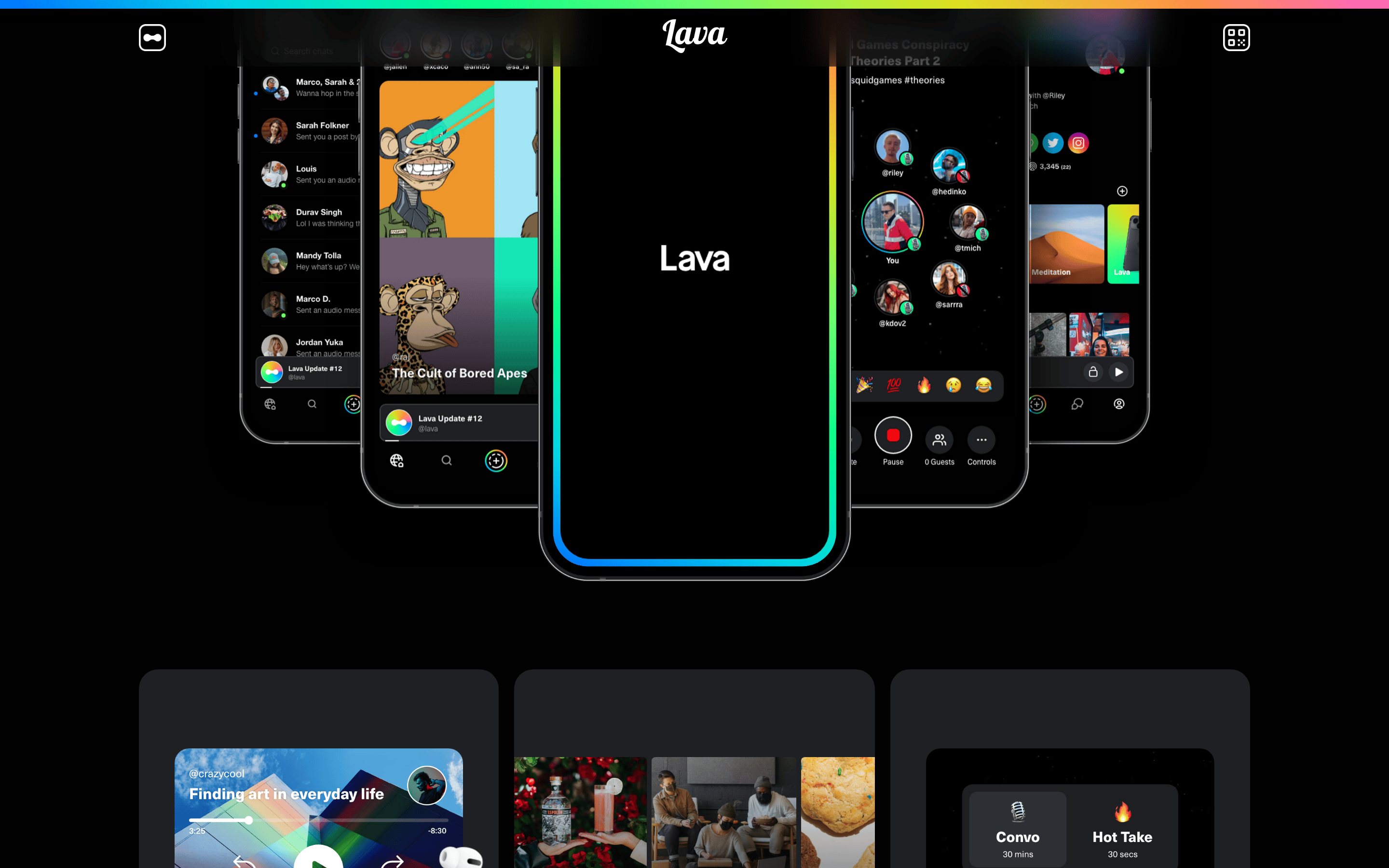
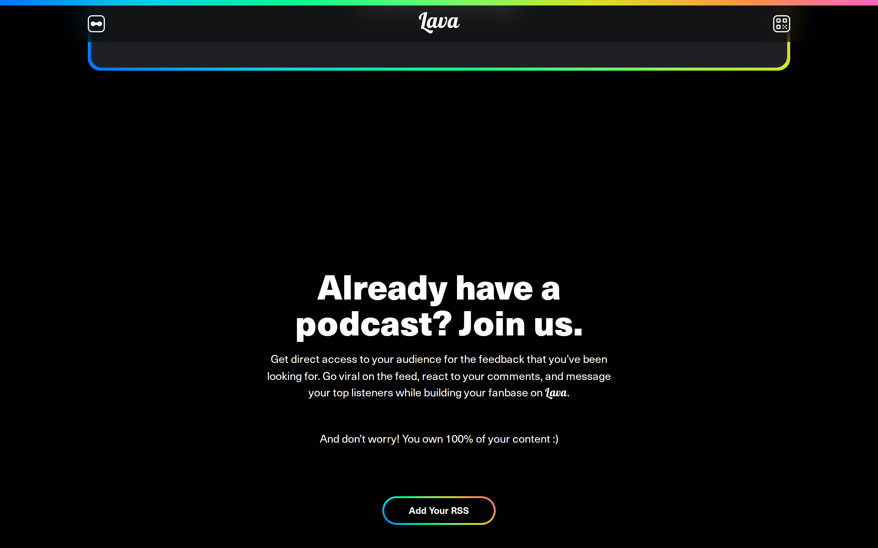
buttonPill-shaped buttons with a black background, white text, and a 1px multi-color gradient border.
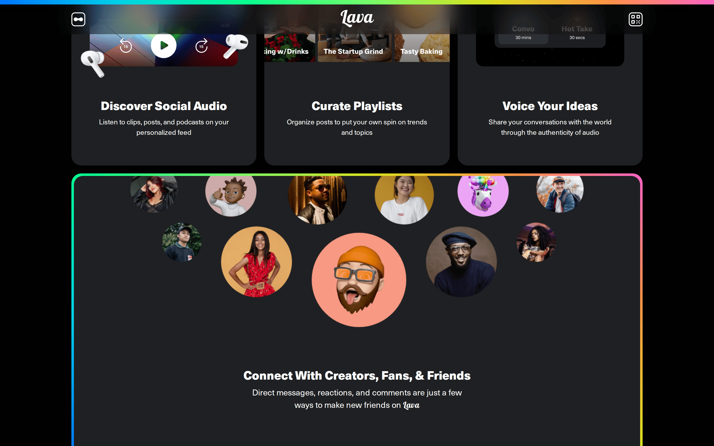
cardRounded cards (15-20px radius) often containing imagery or UI mockups, sometimes with deep drop shadows.
chipSmall, rounded tags or labels, often with a dark background and light text.
inputMinimalist input fields with dark backgrounds and subtle borders.
heroA large, centered section featuring bold, oversized white text on a dark background, accented by colorful floating elements.
09
Voice & Don'ts
ToneEnergetic, confident, and community-focused.
HeadlinesBold, expressive, and direct, often using large, heavy type.
CTAsSimple and action-oriented, e.g., 'Get The App'.
don't use a white background — screenshot shows a deep black (#010101) background.
don't use a serif font for headlines — screenshot shows a heavy, tight grotesque-sans.
don't use solid, single-color accent buttons — screenshot shows buttons with multi-color gradient borders.
don't use wide, airy tracking on headlines — screenshot shows tight, negative letter-spacing (-1px).
don't use delicate, thin font weights for body text — screenshot shows clear, readable medium weights.
don't use a single, static color for branding — screenshot shows a prominent multi-color gradient as a key identifier.
Avoid: Formal or overly corporate language.
Avoid: Muted or monochromatic palettes that lack vibrancy.
Captured from the live site · real computed styles
11
System prompt
Design a vibrant, dark-mode consumer audio app. Use a deep black (#010101) background with bright white (#ffffff) text. Incorporate a signature multi-color gradient for accents, borders, and labels. Typography should be bold and expressive, using a heavy grotesque-sans for headlines with tight tracking. Use a humanist-sans for body text at 14px. Key elements include pill-shaped buttons with gradient borders, generous vertical spacing, and rounded UI cards (15-20px radius). Critical donts: never use a white background, never use serif fonts for headlines, never use solid single-color buttons, and never use wide tracking on display type.
Bring this taste to your agent
Hand your AI agent a machine-readable spec of this design — tokens, type, motion, the whole DNA.