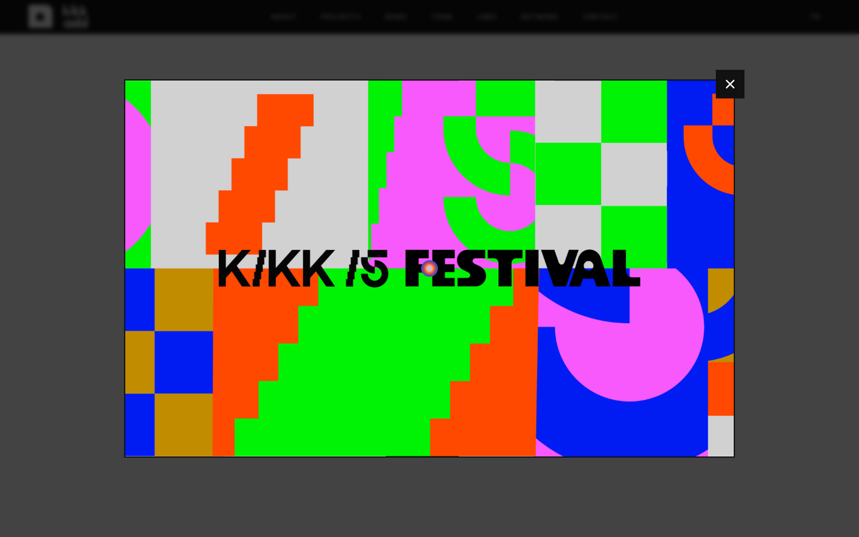
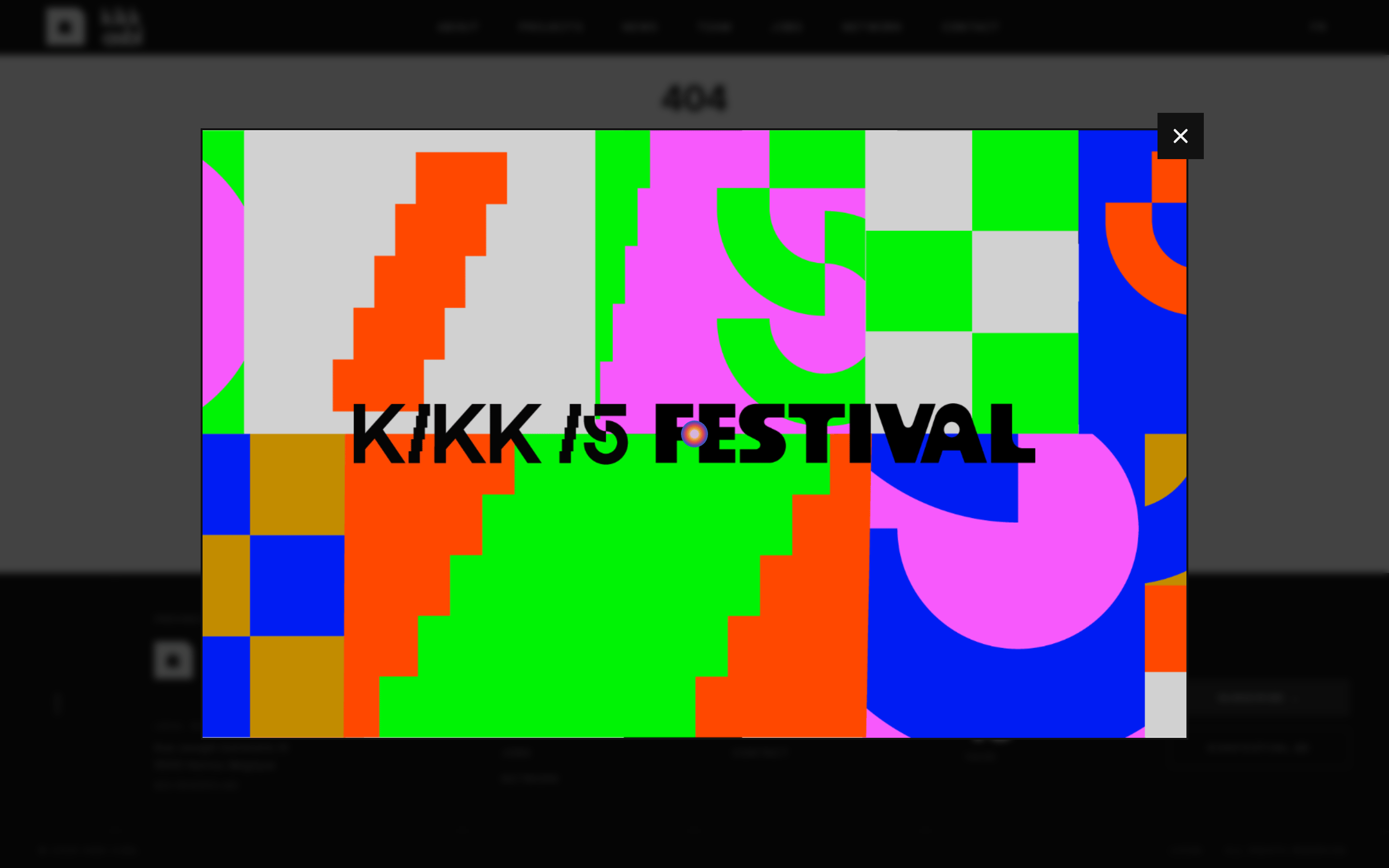
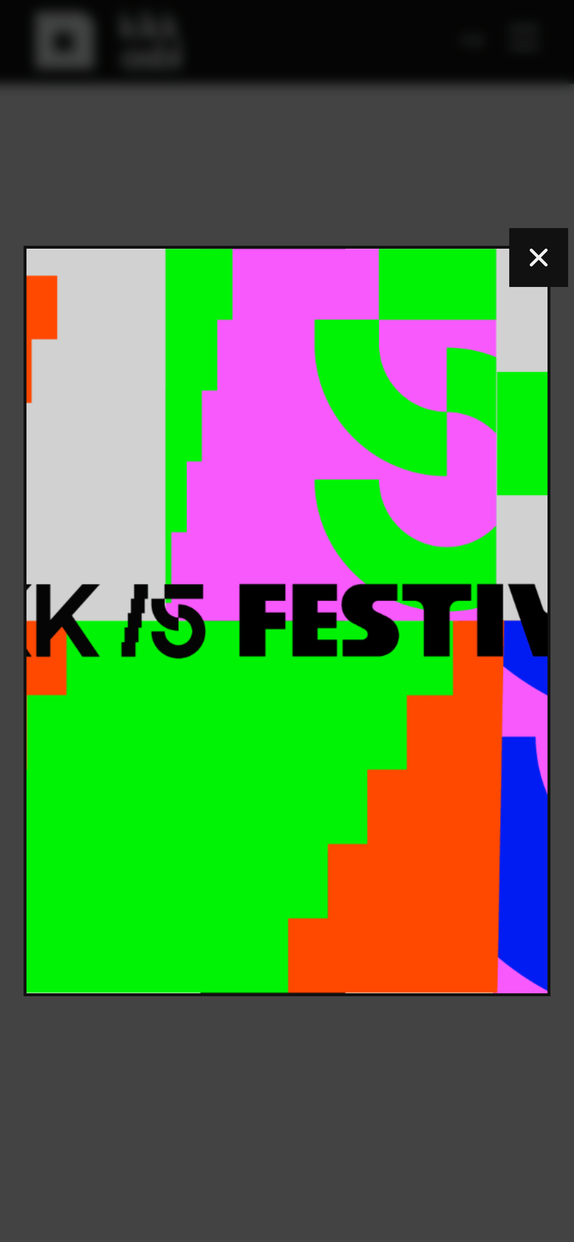
A loud, experimental art gallery that rejects minimalism in favor of bold, clashing colors and heavy typography.
02
Color
#F1F1F1Ink
#F1F1F199Ink soft
#111111BG
#E0E0E0BG soft
#F1F1F180Muted
rgba(241, 241, 241, 0.1)Line
High contrast with a dark base, utilizing a vibrant, experimental, and intentionally clashing multi-color palette.
03
Typography
geometric-sans · grotesque-sans
display72px · 900
heading36px · 900
subheading20px · 400
body16px · 400
caption9px · 400
All-caps tracking heavily for captions · Heavy weight for display and display-like headings · Mix of Poppins and Inter Tight for a contemporary, geometric feel
04
Spacing
4px
8px
12px
16px
24px
32px
40px
48px
56px
64px
A slightly irregular vertical rhythm heavily influenced by tight padding on containers and extensive tracking.
05
Surfaces
sm · 0px
md · 0px
lg · 0px
pill · 0px
Thin 1px borders used strictly for separating content blocks, often asymmetric.
06
Layout
1280container
12columns
24pxgutter
768 / 1024breakpoints
Grid-based with strict horizontal and vertical separators.
07
Motion & Interaction
150msmicro
300mssmall
500msmedium
cubic-bezier(0.4, 0, 0.2, 1)easing
Standard opacity and color transitions for interactive states. · Focus on static, bold visual impact rather than complex entrance animations.
Subtle color or opacity changes on links and text. · Immediate visual feedback.
08
Components
buttonText-based, uppercase, wide tracking, minimal or no background.
cardGrid items with strict 1px borders and no border-radius.
heroFull-width, heavy typography, often accompanied by bold, complex graphic compositions.
09
Voice & Don'ts
ToneExperimental, bold, and authoritative.
HeadlinesExtremely heavy, wide-tracking, uppercase, and impactful.
CTAsIntegrated text links or highly tracked uppercase buttons.
Don't use border-radius — screenshot shows strictly sharp, 0-radius corners on all containers.
Don't use thin or light font weights — screenshot shows heavy 900-weight font for main displays.
Don't use soft or pastel colors — screenshot shows high-saturation, clashing neon and primary colors.
Don't use extensive drop shadows — screenshot shows completely flat design with no visible shadows.
Don't use italic or script typography — screenshot shows exclusively upright, geometric sans-serifs.
Don't use centered, decorative layouts — screenshot shows strict grid-based, left-aligned, or blocky structures.
Captured from the live site · real computed styles
11
System prompt
Kikk Festival is a creative technology and digital arts event with a maximalist, experimental visual identity. It uses a dark (#111111) and light (#F1F1F1) base, contrasted with a wild, high-chroma palette of neon green (#00FF00), magenta, bright blue, and orange. The typography features heavy, geometric sans-serifs with wide tracking, strictly uppercase for captions. Critical donts: Do not use border-radius; always use sharp edges. Do not use thin or light font weights. Do not use subtle gradients or drop shadows; keep it flat. Do not use muted or pastel colors.
Bring this taste to your agent
Hand your AI agent a machine-readable spec of this design — tokens, type, motion, the whole DNA.