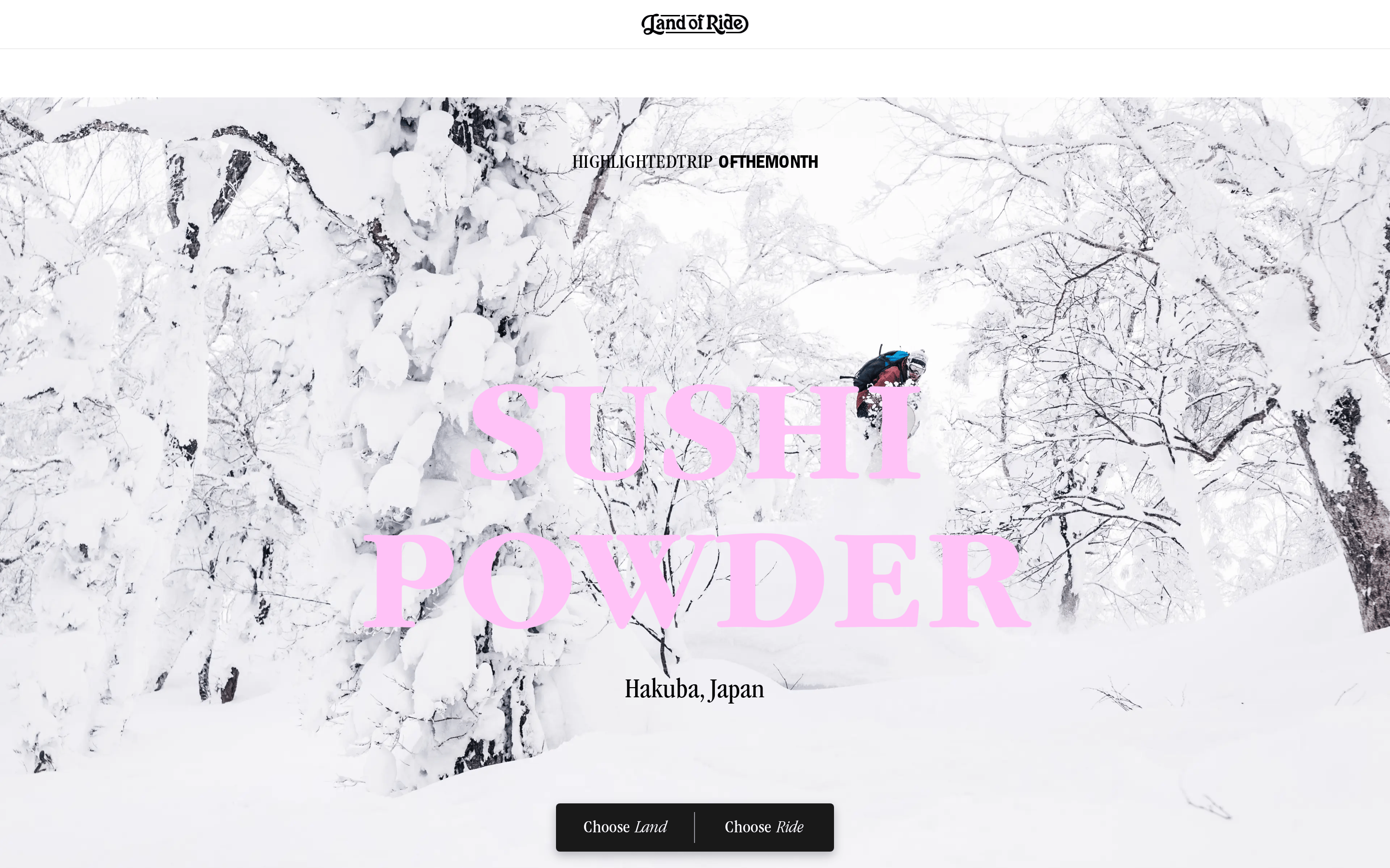
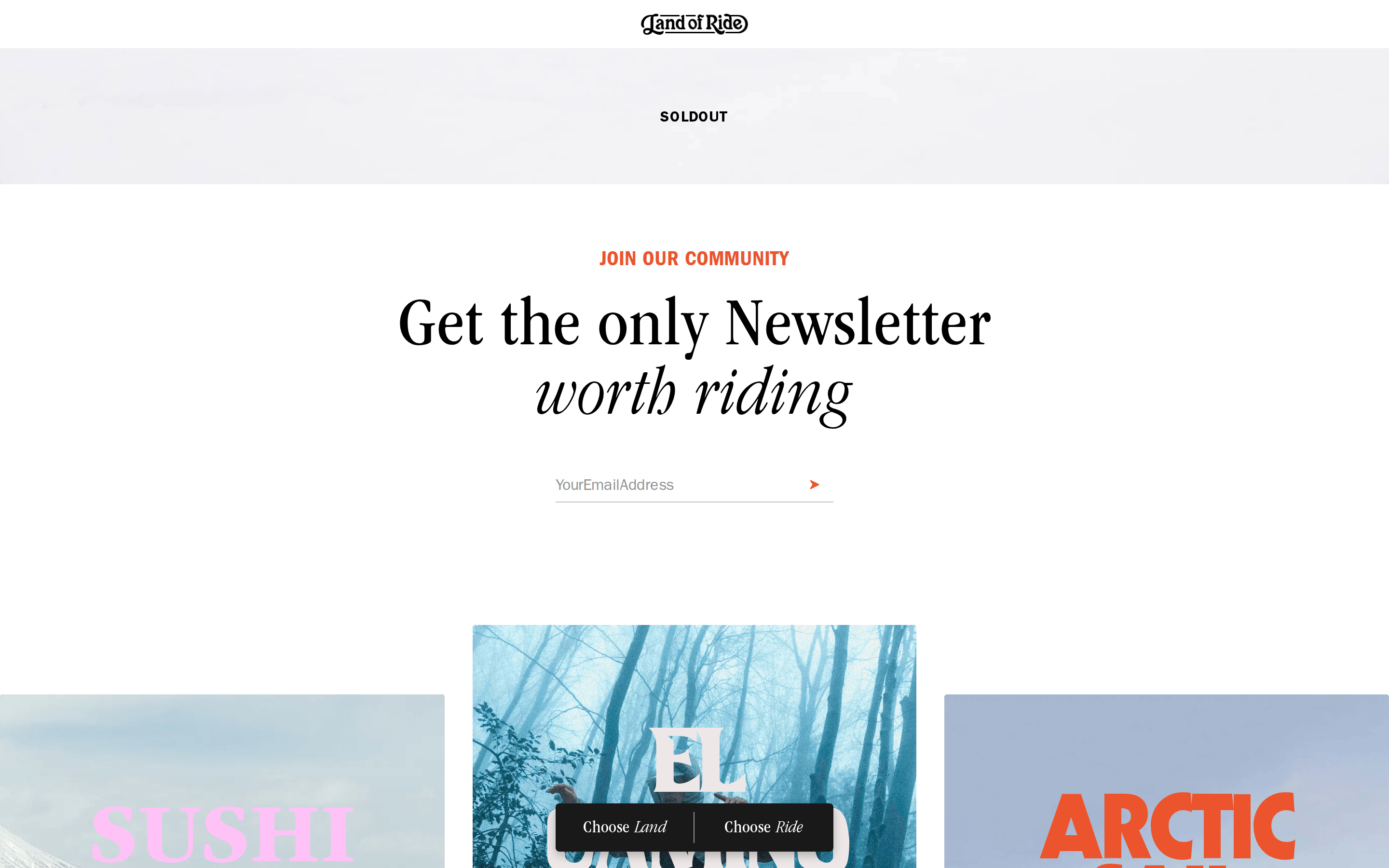
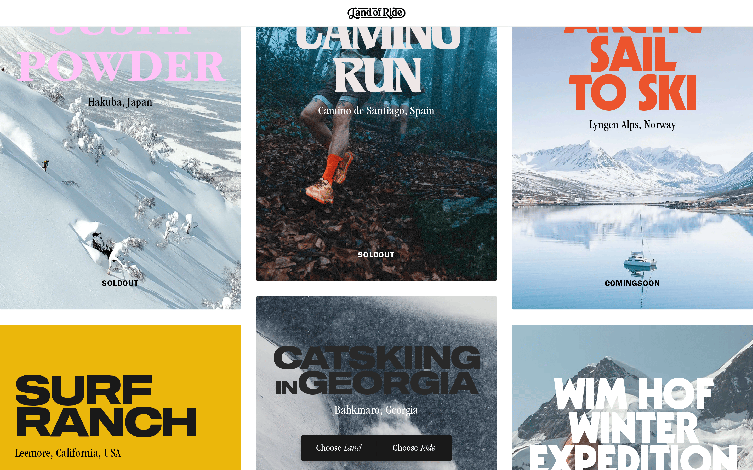
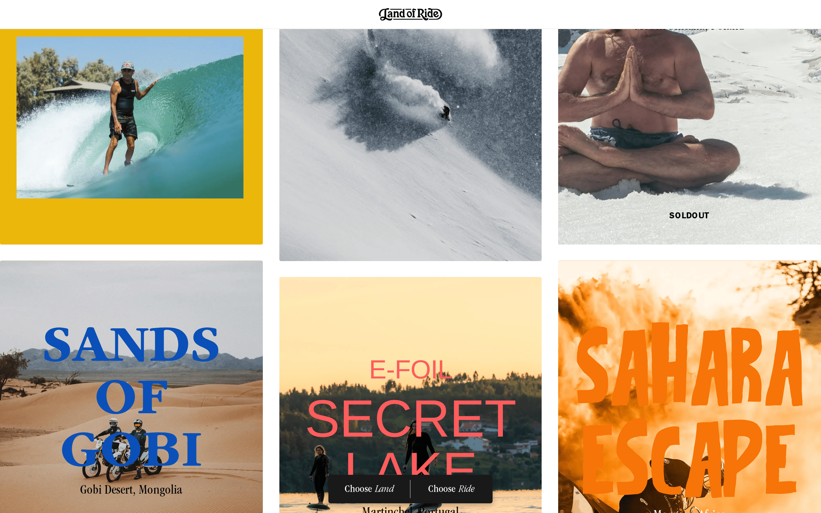
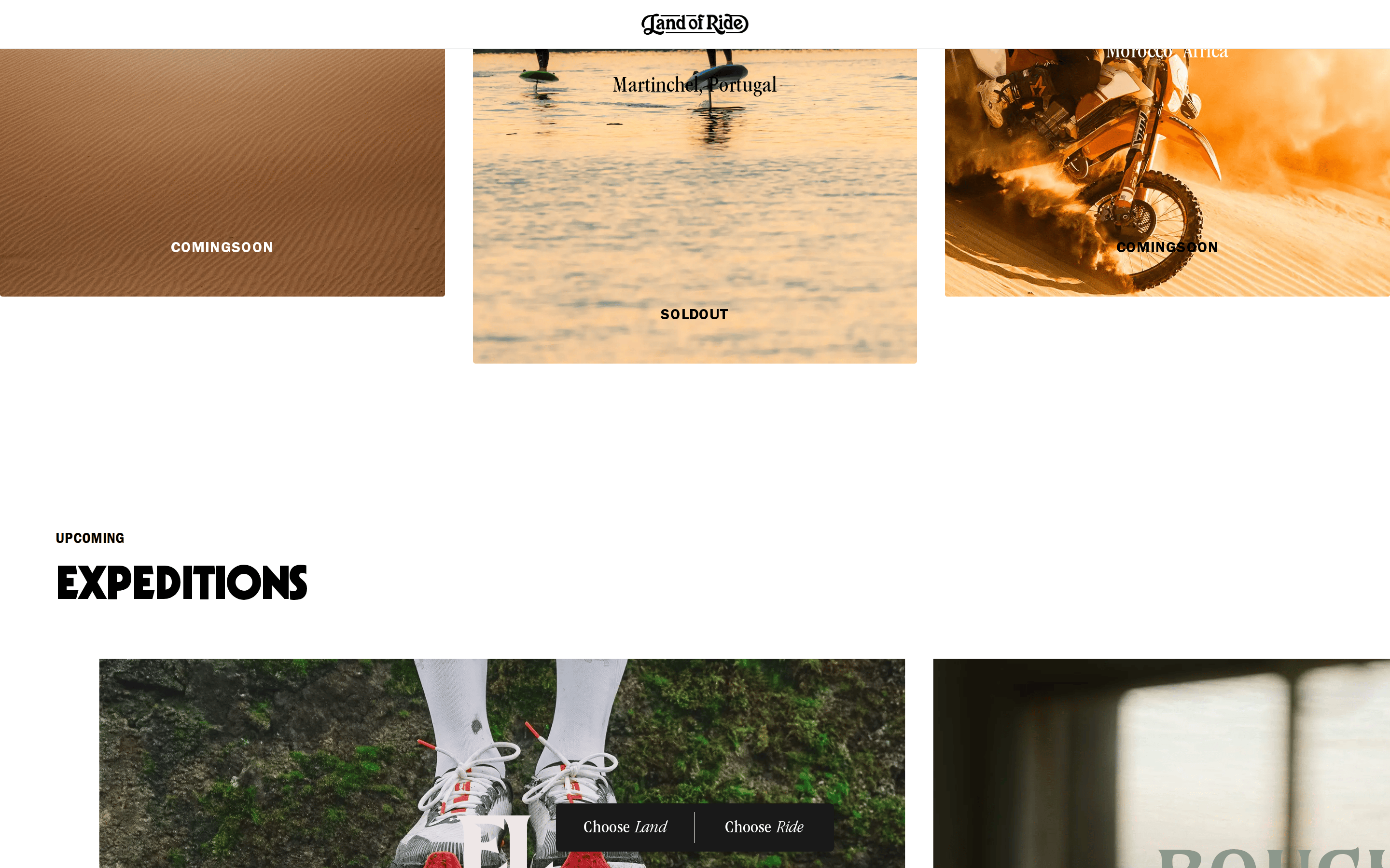
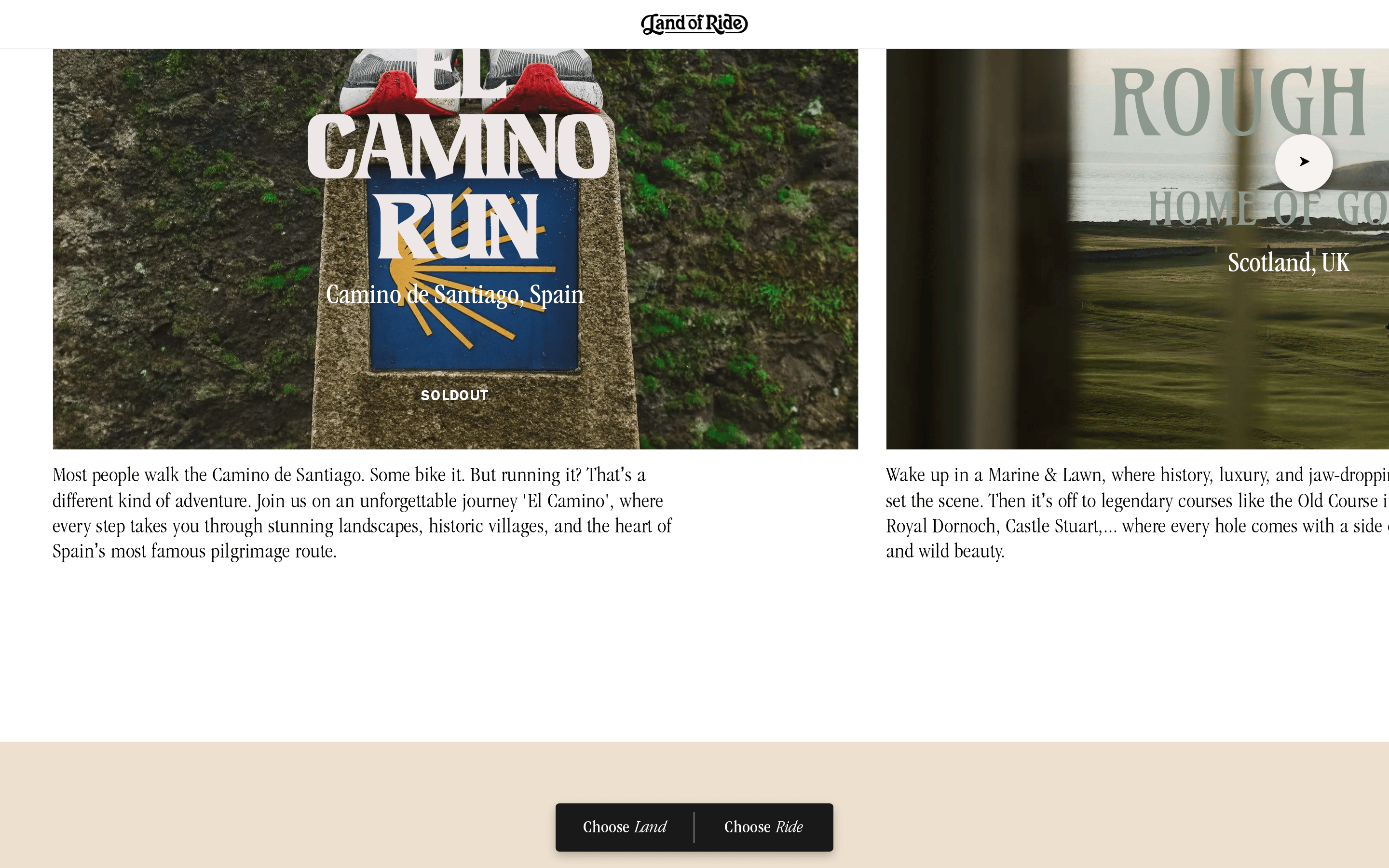
A high-end travel magazine curated for active adventures.
02
Color
#ffc2f7Accent
#000000Ink
#ffffffBG
#f5f5f5BG soft
#514444Muted
rgba(0,0,0,0.1)Line
A high-contrast monochromatic base of black and white, softened by warm neutral beiges, using vibrant pink as a single, bold editorial accent.
03
Typography
didone-serif · transitional-serif
display120px · 400
heading48px · 400
body16px · 400
caption12px · 400
Use didone-serif for large display text. · Use transitional-serif for body copy. · Use grotesque-sans for UI elements and small labels. · Use wide letter-spacing for uppercase labels.
04
Spacing
4px
8px
16px
24px
32px
48px
64px
96px
Generous vertical spacing with a base unit of 4px, emphasizing breathing room between elements.
05
Surfaces
sm · 3px
md · 4px
lg · 8px
pill · 999px
Thin solid black borders used sparingly, often on the bottom of elements.
Captured from the live site · real computed styles
11
System prompt
Land of Ride is an editorial travel platform curating premium, active holiday experiences. The design uses a high-contrast monochromatic base of black (#000000) and white (#ffffff), softened by warm neutral beiges (#f5f5f5), using vibrant pink (#ffc2f7) as a single, bold editorial accent. Typography relies on didone-serif for display headlines and transitional-serif for body copy, with grotesque-sans for UI elements. Critical donts: Don't use a busy layout; the design is spacious and editorial. Don't use multiple font weights; keep it regular and light. Don't use a wide color palette; stick to the monochrome base with a single accent.
Bring this taste to your agent
Hand your AI agent a machine-readable spec of this design — tokens, type, motion, the whole DNA.