An editorial fashion magazine's digital storefront.
02
Color
#892500Accent
#0E0E0EInk
#868686Ink soft
#EEE5D9BG
#F9F6F2BG soft
#B4B4B4Muted
rgba(134, 134, 134, 0.3)Line
Warm, earthy neutrals grounded by a single deep red accent and high-contrast photography.
03
Typography
geometric-sans · humanist-sans
display138px · 700
h156px · 700
body14px · 400
caption11px · 400
Use uppercase for navigation and minor headings. · Maintain generous letter-spacing (2px+) for uppercase elements. · Use a mix of geometric and humanist sans-serif fonts for hierarchy.
04
Spacing
4px
8px
16px
24px
32px
48px
64px
96px
Generous vertical spacing with distinct section padding (e.g., 114px top).
05
Surfaces
sm · 4px
md · 8px
lg · 12px
pill · 999px
Minimal, using 1px solid #868686 for subtle dividers and interactive elements.
06
Layout
1280container
12columns
24pxgutter
768 / 1024breakpoints
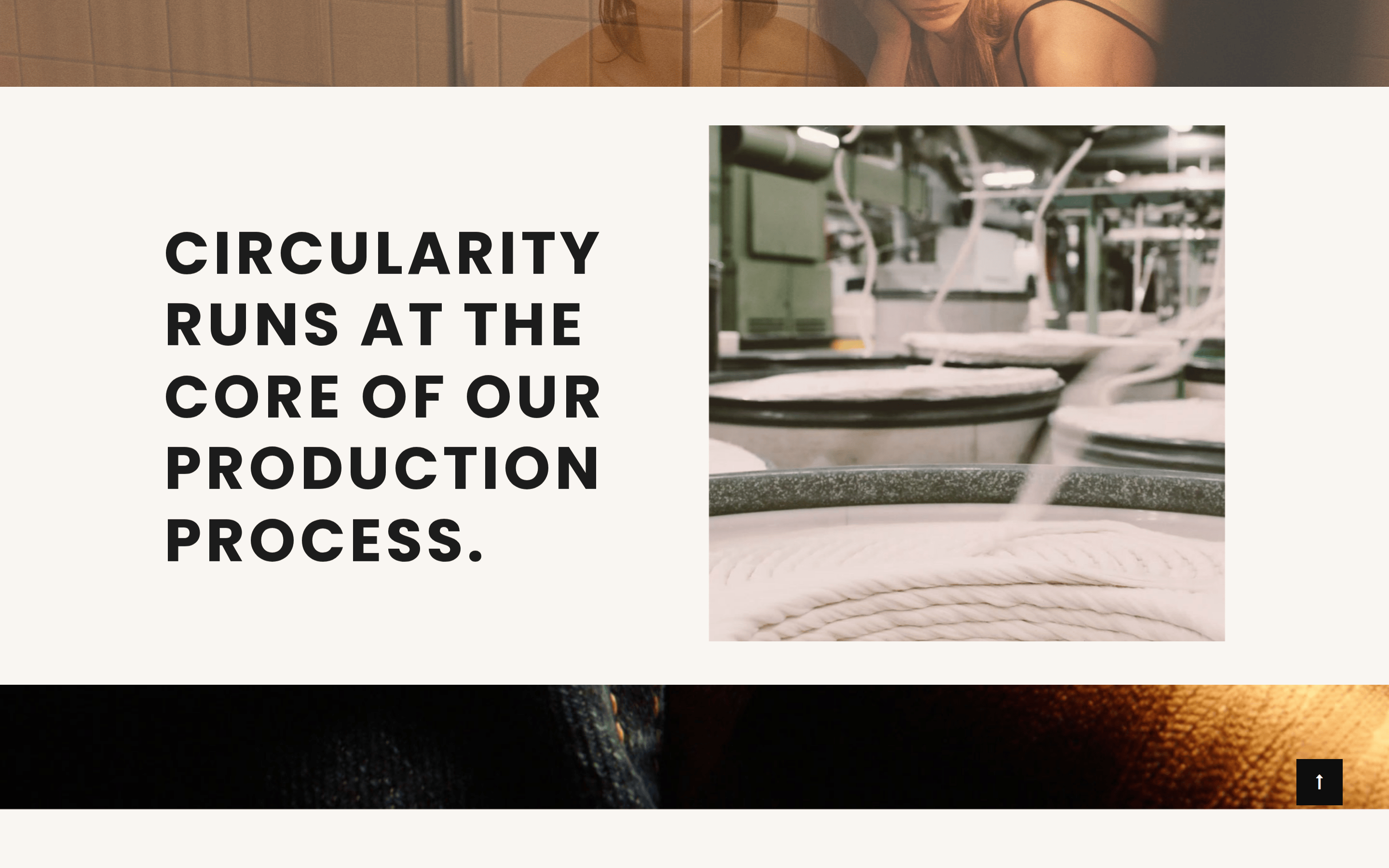
Full-width hero image followed by centered, single-column sections with generous whitespace.
07
Motion & Interaction
150msmicro
200mssmall
400msmedium
cubic-bezier(0.25, 0.1, 0.25, 1)easing
Quick, subtle color transitions on hover for interactive elements. · Smooth transitions for carousel slides.
Subtle color change or opacity shift, typically 0.15s ease-out. · Immediate visual response.
08
Components
buttonText-based or simple rectangular buttons with uppercase text and generous horizontal padding.
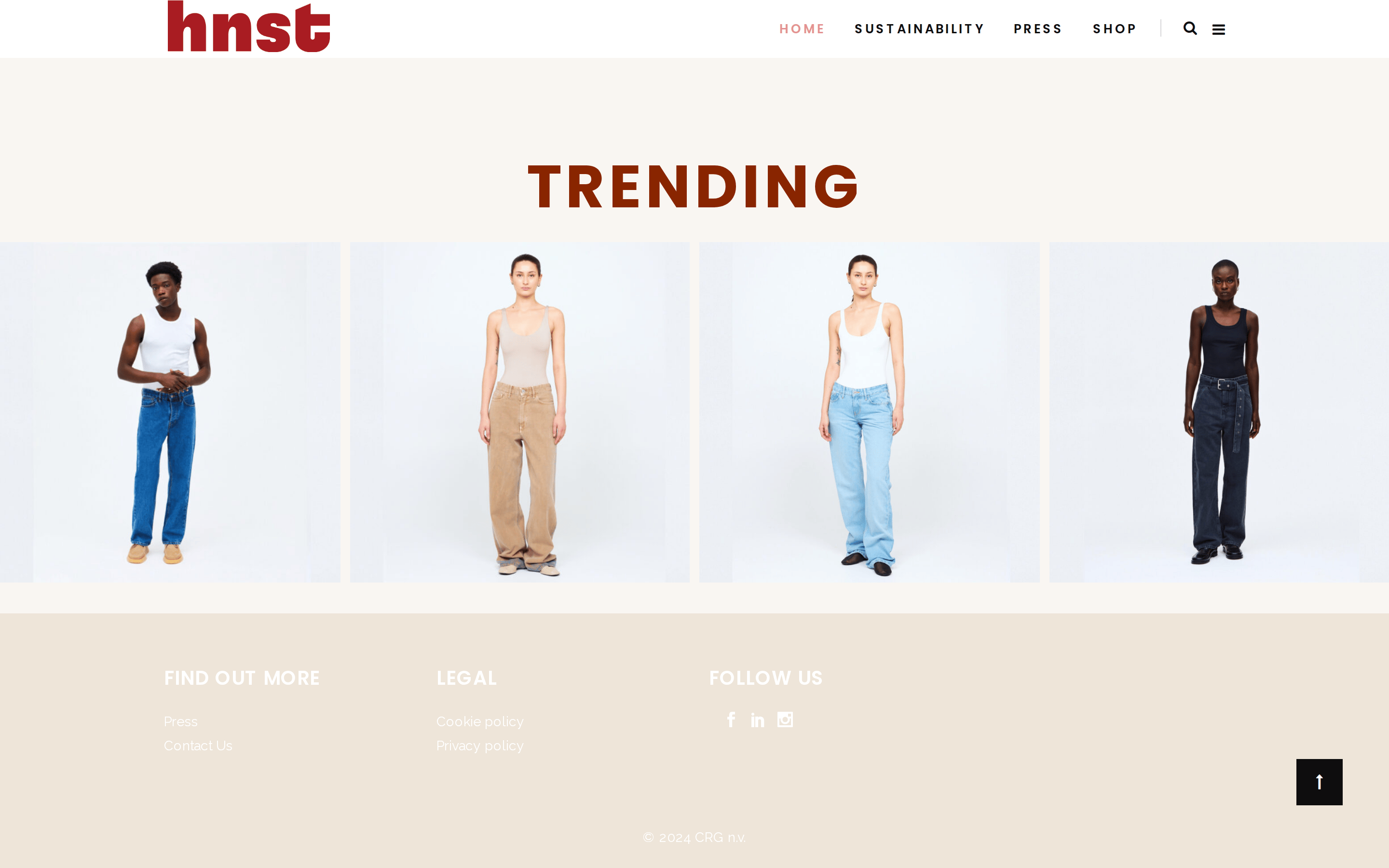
cardClean product cards featuring full-height model photography on neutral backgrounds.
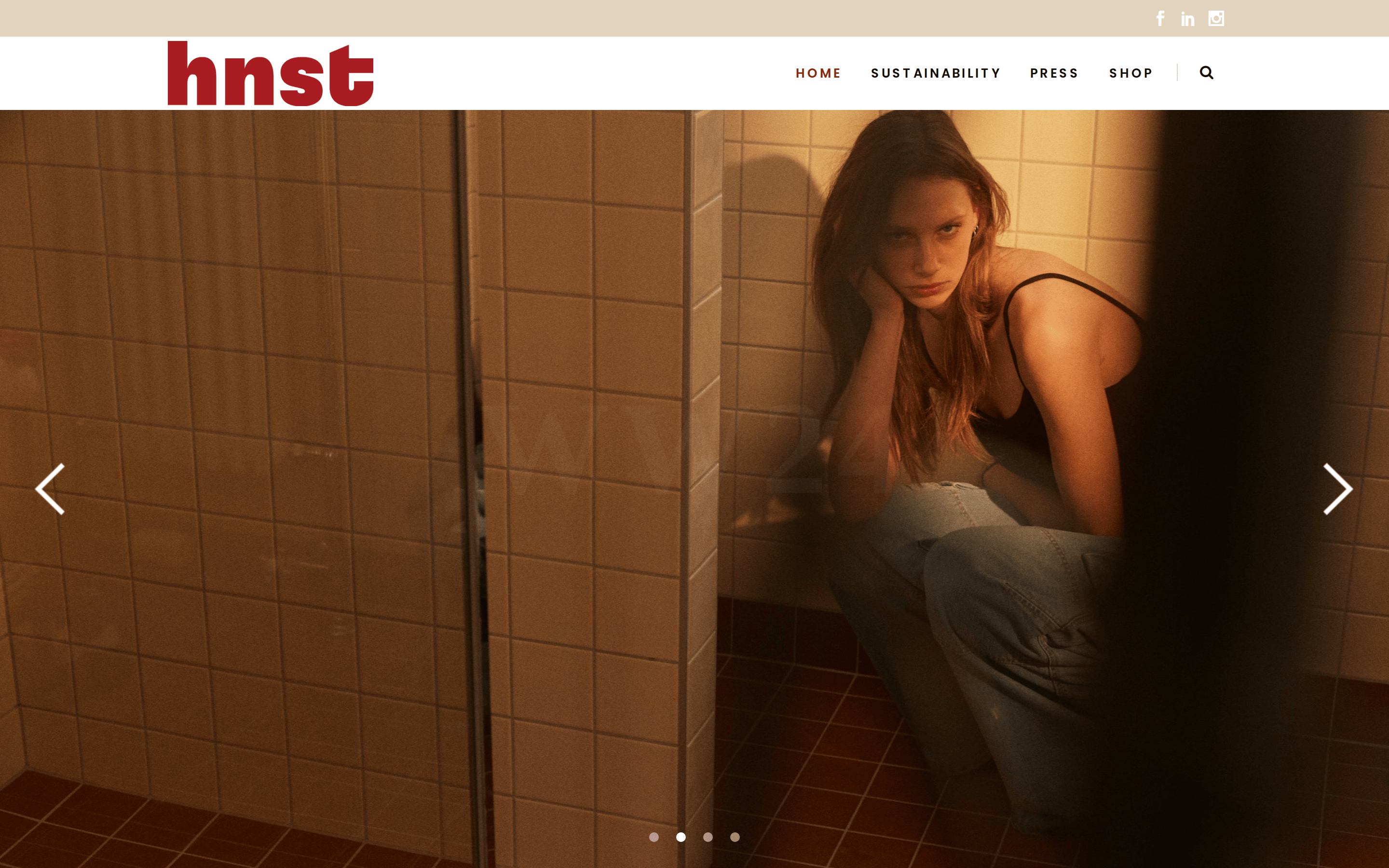
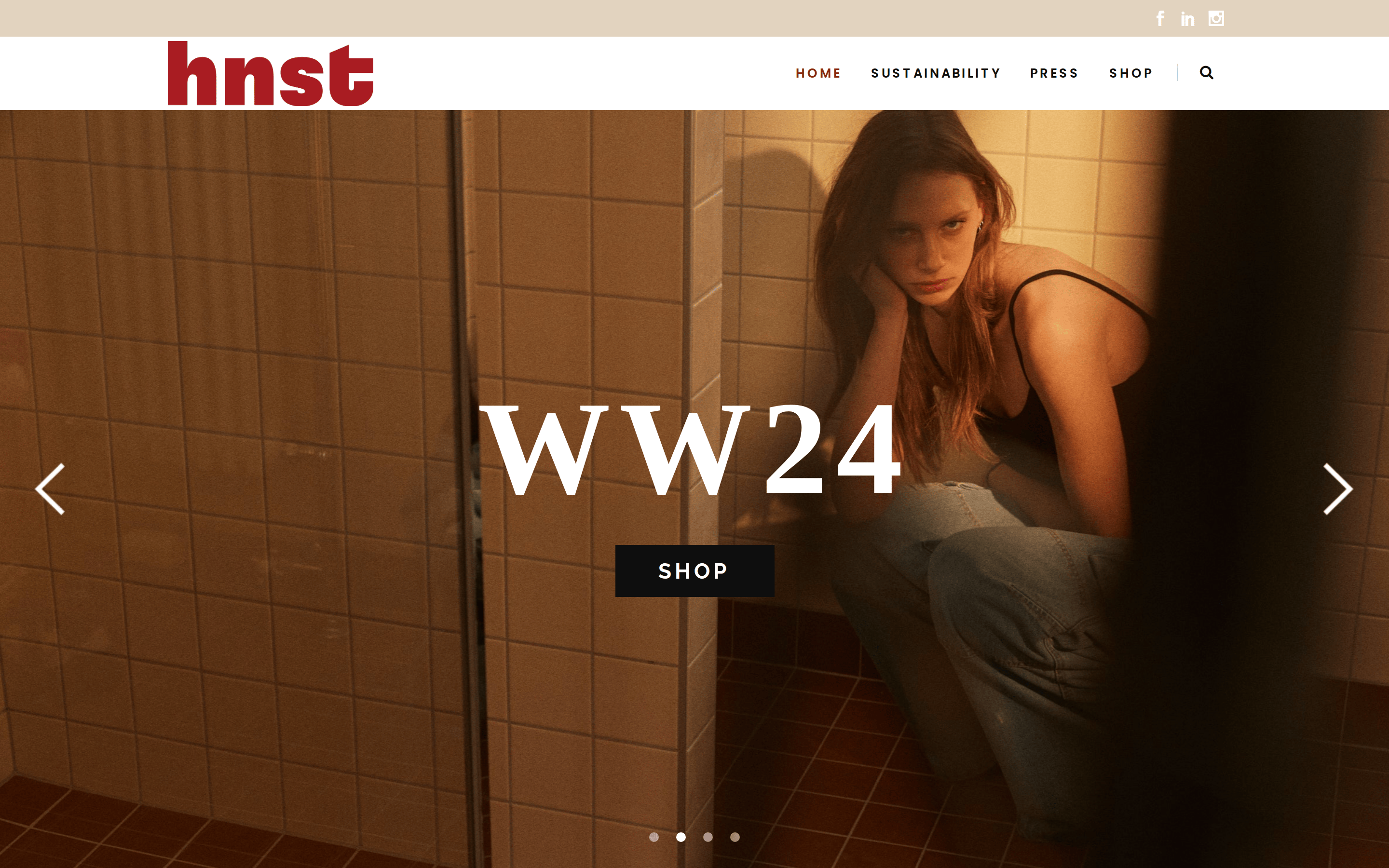
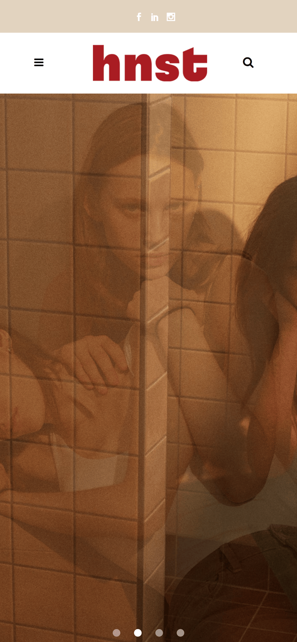
heroFull-bleed, high-resolution editorial photography with minimal overlay text and large carousel arrows.
09
Voice & Don'ts
ToneConfident, minimalist, and sustainably-focused.
HeadlinesShort, impactful, and often displayed in large, bold uppercase letters.
CTAsClean and unobtrusive, often text-based.
Don't use a pure white background — the screenshot shows a warm, beige (#EEE5D9) as the primary canvas.
Don't set navigation in lowercase — the screenshot shows all navigation items in uppercase.
Don't use complex gradients — the design relies on flat colors and high-quality photography.
Don't use a sans-serif for everything — the brand mark uses a bold, condensed sans-serif, while body text is more humanist.
Don't add drop shadows to cards — product cards are borderless and flush with the background.
Don't use a dark mode or dark backgrounds for primary content — the palette is predominantly light and earthy.
Avoid: Using loud, neon, or overly synthetic colors.
Avoid: Employing decorative or script fonts.
Avoid: Creating cluttered layouts with excessive text overlays on images.
Avoid: Using complex shadows or gradients.
Avoid: Adding unnecessary borders or heavy UI chrome.
Captured from the live site · real computed styles
11
System prompt
Design a premium, editorial fashion e-commerce site. The core aesthetic is built on a warm, earthy palette with a primary background of #EEE5D9 and a stark, high-contrast accent of #892500. Use a combination of geometric and humanist sans-serif fonts for display and body text, ensuring uppercase is used for navigation and key labels. The layout must be image-forward, prioritizing large, high-resolution photography with generous whitespace and minimal UI chrome. Avoid cluttered interfaces, heavy shadows, or synthetic-looking colors. Ensure interactions are subtle, using quick 0.15s color transitions. Do not use lowercase for navigation, do not add drop shadows to cards, and do not use a pure white background.
Bring this taste to your agent
Hand your AI agent a machine-readable spec of this design — tokens, type, motion, the whole DNA.