A curated gallery of design work presented with refined, confident minimalism.
02
Color
#282828Ink
#C0C0C0BG
#090909Muted
rgba(40, 40, 40, 0.2)Line
Monochromatic palette using neutral grays and deep blacks to let the work speak.
03
Typography
transitional-serif · humanist-sans · monospace
display40px · 400
body16px · 400
caption8px · 400
Use system sans-serif stack for primary UI and body text. · Use a clean transitional serif for display and emphasis. · Maintain tight line heights for display text.
04
Spacing
4px
8px
16px
24px
32px
48px
64px
96px
Generous whitespace creating a relaxed, editorial feel.
05
Surfaces
sm · 6px
md · 16px
lg · 32px
pill · 162px
1.4px solid #282828
0 4px 20px rgba(0,0,0,0.1)
06
Layout
1280container
12columns
24pxgutter
768 / 1024breakpoints
A simple grid layout with a prominent hero area and scattered project showcases.
07
Motion & Interaction
100msmicro
200mssmall
300msmedium
cubic-bezier(0.4, 0, 0.2, 1)easing
Opacity and transform transitions for interactive elements.
Subtle color change or opacity shift. · Immediate response with minimal feedback.
08
Components
buttonPill-shaped with solid background or text only.
cardClean presentation of app UI screenshots.
chipSmall, uppercase text labels for contact info.
inputMinimalist styling consistent with the overall sans-serif.
heroLarge typography statement with a subtitle.
09
Voice & Don'ts
ToneConfident, minimalist, slightly playful but professional.
HeadlinesLarge, clean serif or sans-serif with tight spacing.
CTAsText-based links or simple pill buttons.
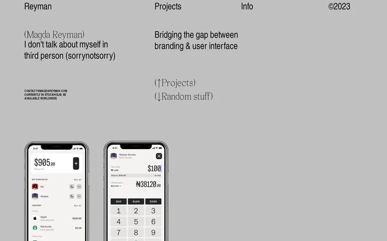
don't use bright, saturated colors — the screenshot shows a strictly monochromatic, gray-scale palette.
don't use ornate display fonts — the display text uses a clean, refined transitional serif.
don't create dense layouts — the screenshot shows generous whitespace and a relaxed, open structure.
don't use complex shadows or gradients — the screenshot shows flat surfaces with minimal, subtle shadows.
don't use rounded rectangles with sharp corners — the screenshot shows pill-shaped buttons and elements with high border-radius.
don't use heavy font weights — the screenshot shows predominantly regular (400) weight typography.
Captured from the live site · real computed styles
11
System prompt
This is a minimalist design portfolio for Magda Reyman. The design DNA features a sophisticated, monochromatic palette centered around a neutral gray background (#C0C0C0) and deep, dark gray/black text (#282828, #090909). Typography is refined, utilizing a humanist sans-serif for body text and a transitional serif for display headings, often with tight line heights and generous spacing. Layouts are open and airy, emphasizing the showcased work. Critical donts: avoid bright, saturated colors; avoid ornate or overly decorative typography; avoid dense, cluttered layouts. The overall feel is confident, premium, and focused on high-quality UI and branding work.
Bring this taste to your agent
Hand your AI agent a machine-readable spec of this design — tokens, type, motion, the whole DNA.