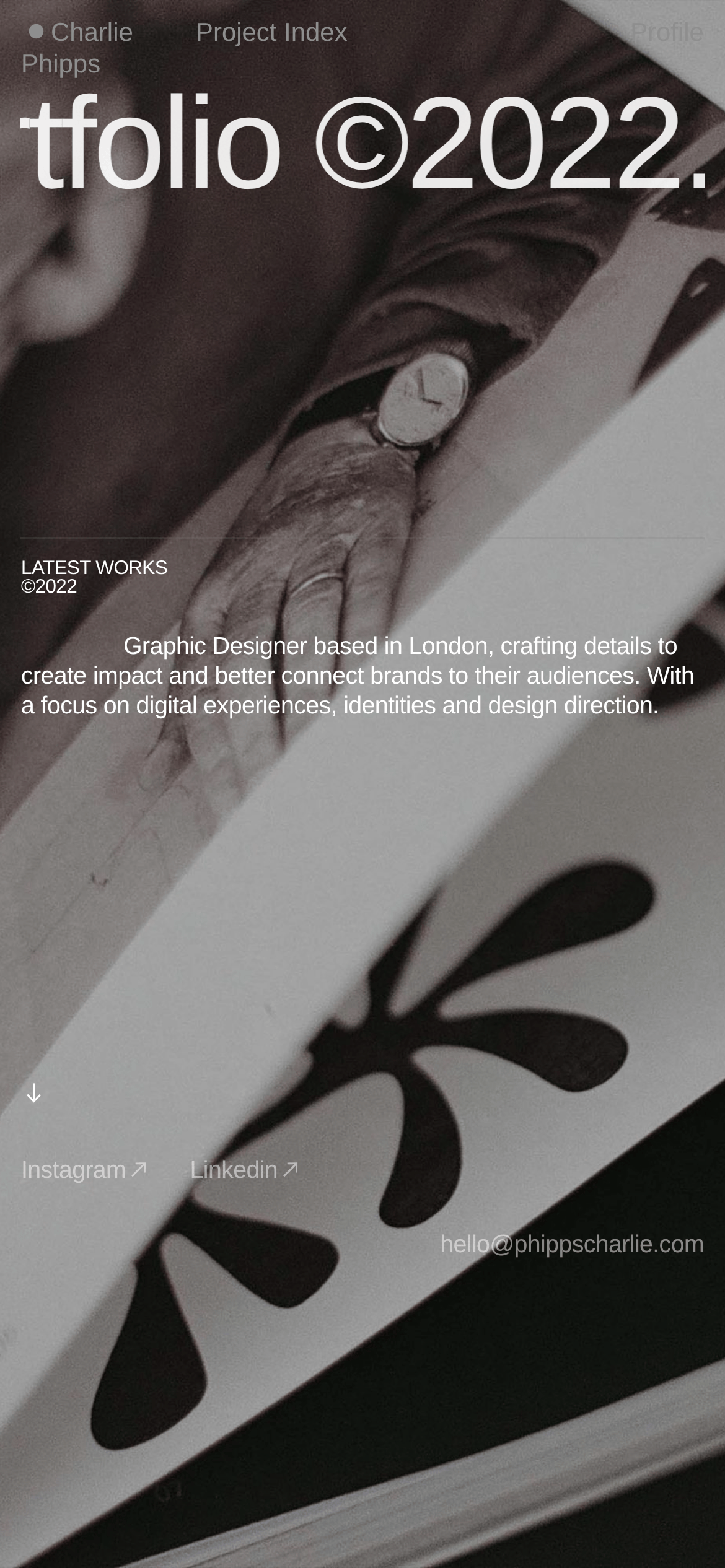
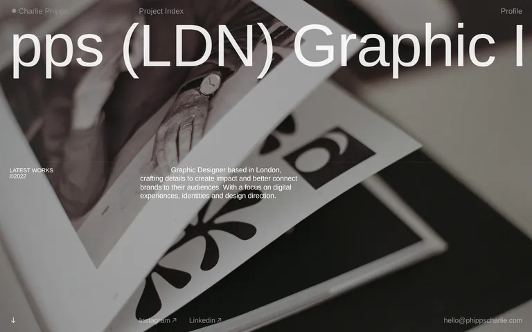
A high-end print magazine layout brought to the web
02
Color
#101011Ink
#ffffffBG
#edededBG quiet
#7f7f7fMuted
rgba(0, 0, 0, 0.1)Line
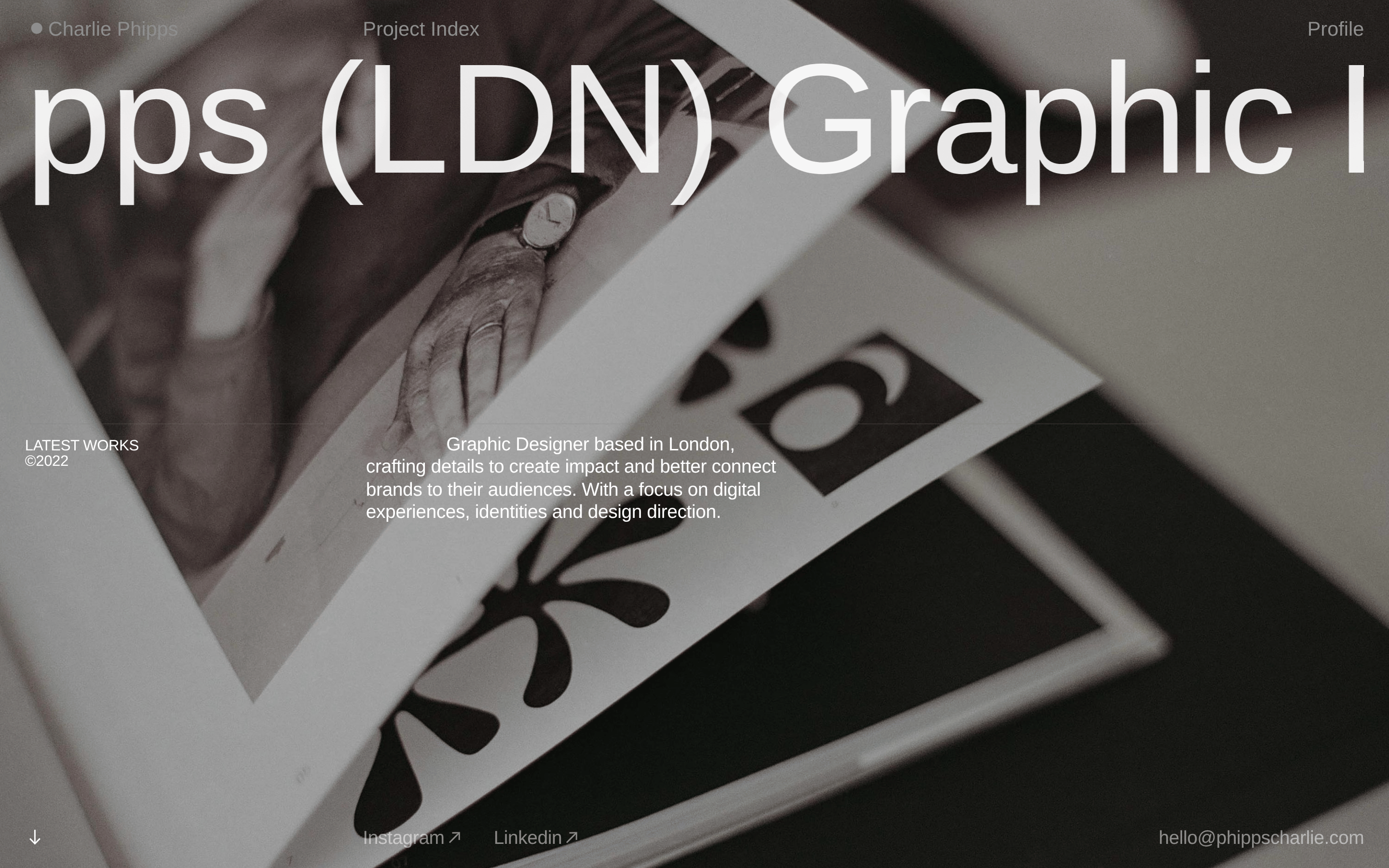
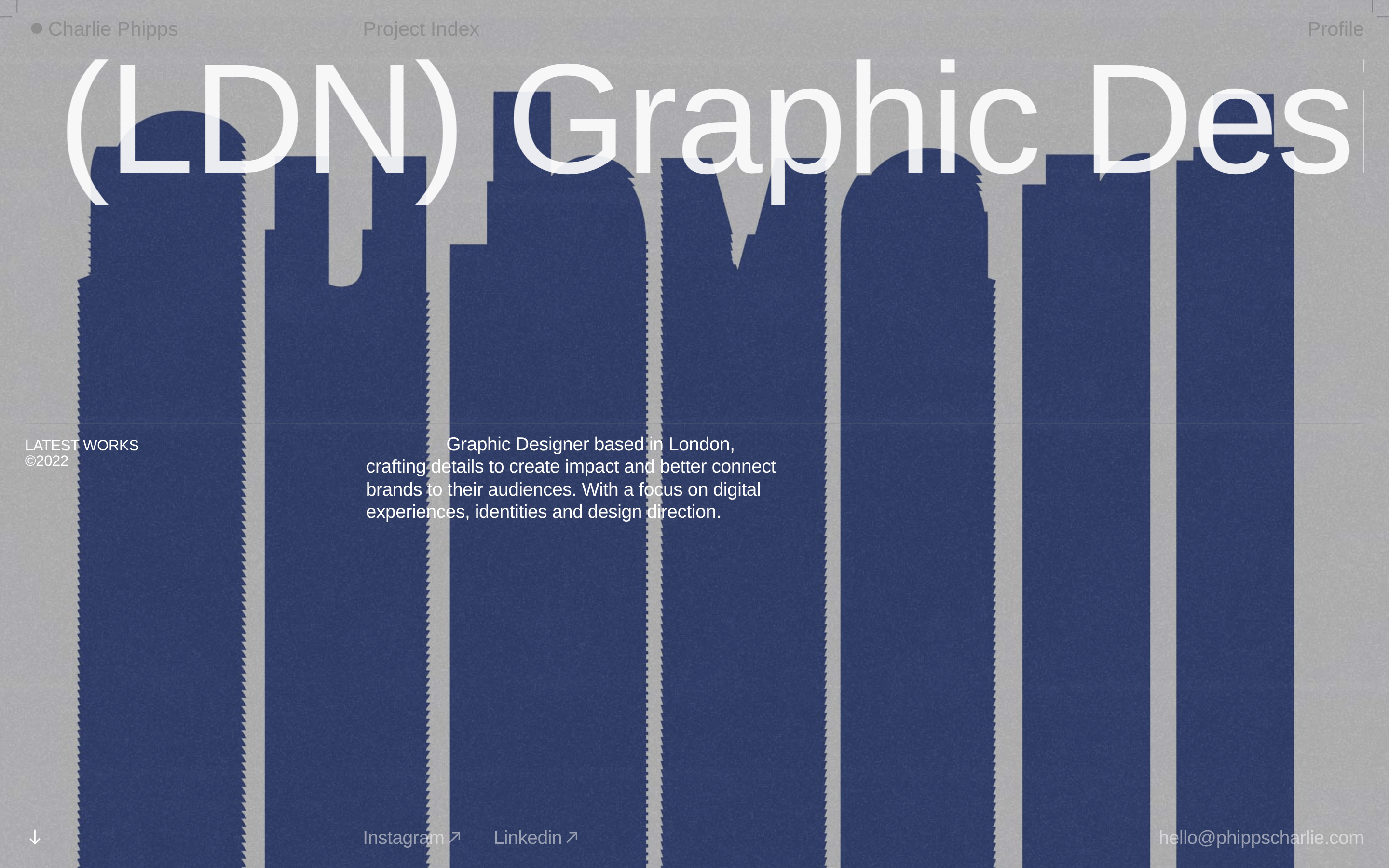
High-contrast monochrome palette with full-bleed photography and stark black sections for dramatic focus
03
Typography
grotesque-sans · monospace
display162px · 400
headline63px · 400
body20px · 400
caption13px · 400
Use extremely tight negative letter-spacing for display type · Maintain consistent regular weight across all typography · Keep body text at a comfortable reading size while letting display type dominate
04
Spacing
4px
8px
16px
24px
32px
48px
64px
96px
generous whitespace with asymmetric placement for editorial feel
05
Surfaces
sm · 4px
md · 8px
lg · 12px
pill · 999px
minimal, only used for subtle separation
06
Layout
1440container
12columns
24pxgutter
768 / 1024breakpoints
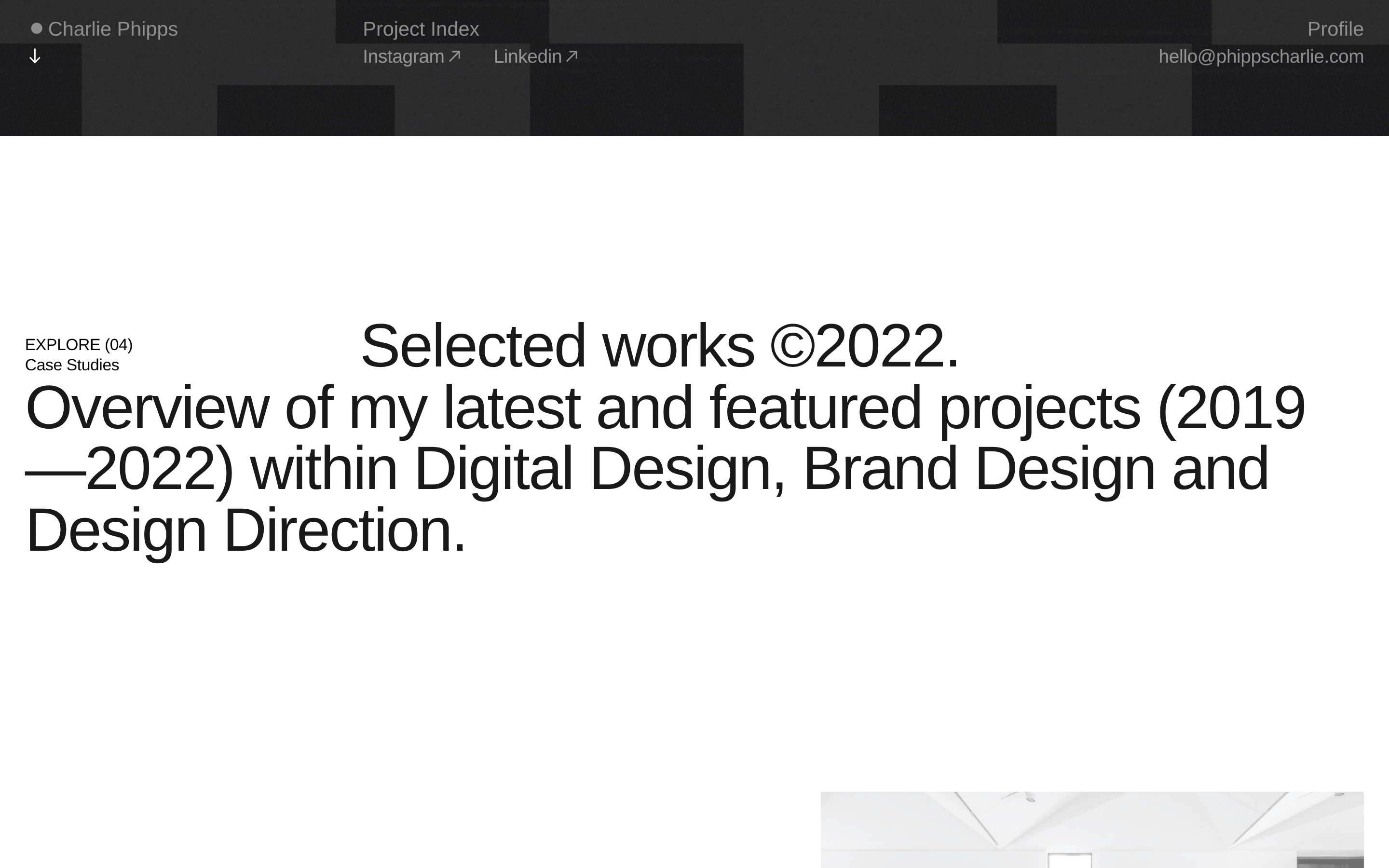
full-bleed hero images with overlaid text, alternating white and black sections
07
Motion & Interaction
220msmicro
500mssmall
1000msmedium
cubic-bezier(0.25, 0.1, 0.25, 1)easing
opacity fade-ins · gentle transforms for scrolling reveals
opacity reduction for links and interactive elements · standard pointer cursor with immediate visual feedback
08
Components
buttonminimal text links with subtle hover opacity changes
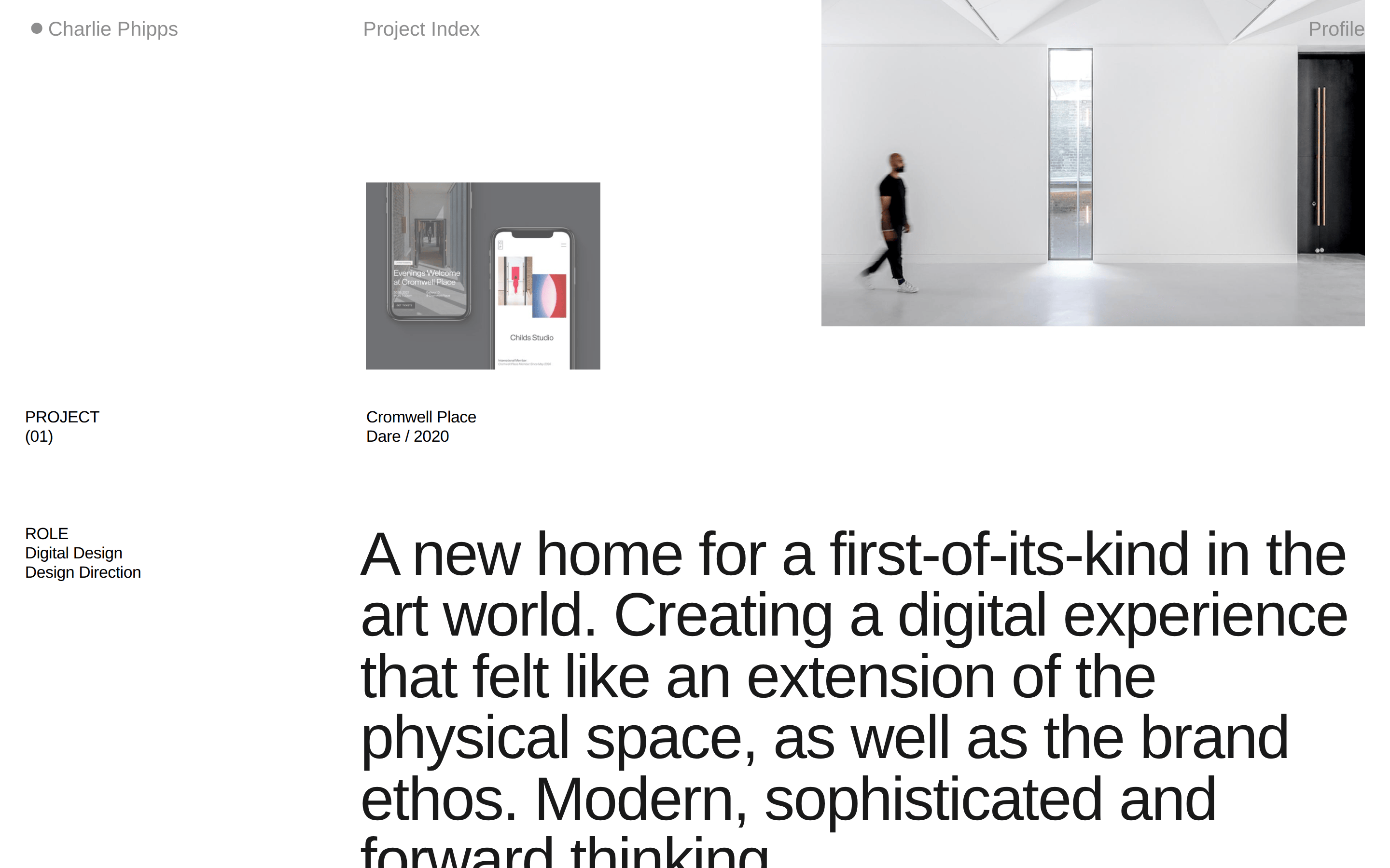
cardlarge image-forward project showcases with minimal text overlay
chipnone visible
inputnone visible
herofull-screen photographic background with massive bleeding typography
09
Voice & Don'ts
Toneconfident, professional, and understated
Headlineslarge, impactful statements that bleed beyond container edges
CTAssubtle text links rather than prominent buttons
don't use bright accent colors — screenshot shows strict monochrome palette with white, black, and photographic tones
don't add decorative borders or shadows — screenshot shows completely flat surfaces with no elevation effects
don't use small, timid typography — screenshot shows massive display type that dominates the viewport
don't center-align all content — screenshot shows asymmetric text placement for editorial dynamism
don't use heavy button styles — screenshot shows text-only navigation links with minimal visual weight
don't overcrowd the layout — screenshot shows generous whitespace and breathing room between elements
Captured from the live site · real computed styles
11
System prompt
This is a sophisticated graphic design portfolio for a London-based designer. The design uses a strict monochrome palette with white (#ffffff) and near-black (#101011) as primary colors, with photographic imagery providing tonal variation. Typography is set in grotesque-sans categories with massive display sizes up to 162px featuring tight letter-spacing. Key critical donts: never use bright accent colors, avoid adding shadows or elevation effects, and never shrink the display typography below its bold, dominant scale. The layout alternates between full-bleed photographic hero sections and clean white or dark sections, creating an editorial magazine-like flow with generous whitespace and asymmetric text placement.
Bring this taste to your agent
Hand your AI agent a machine-readable spec of this design — tokens, type, motion, the whole DNA.