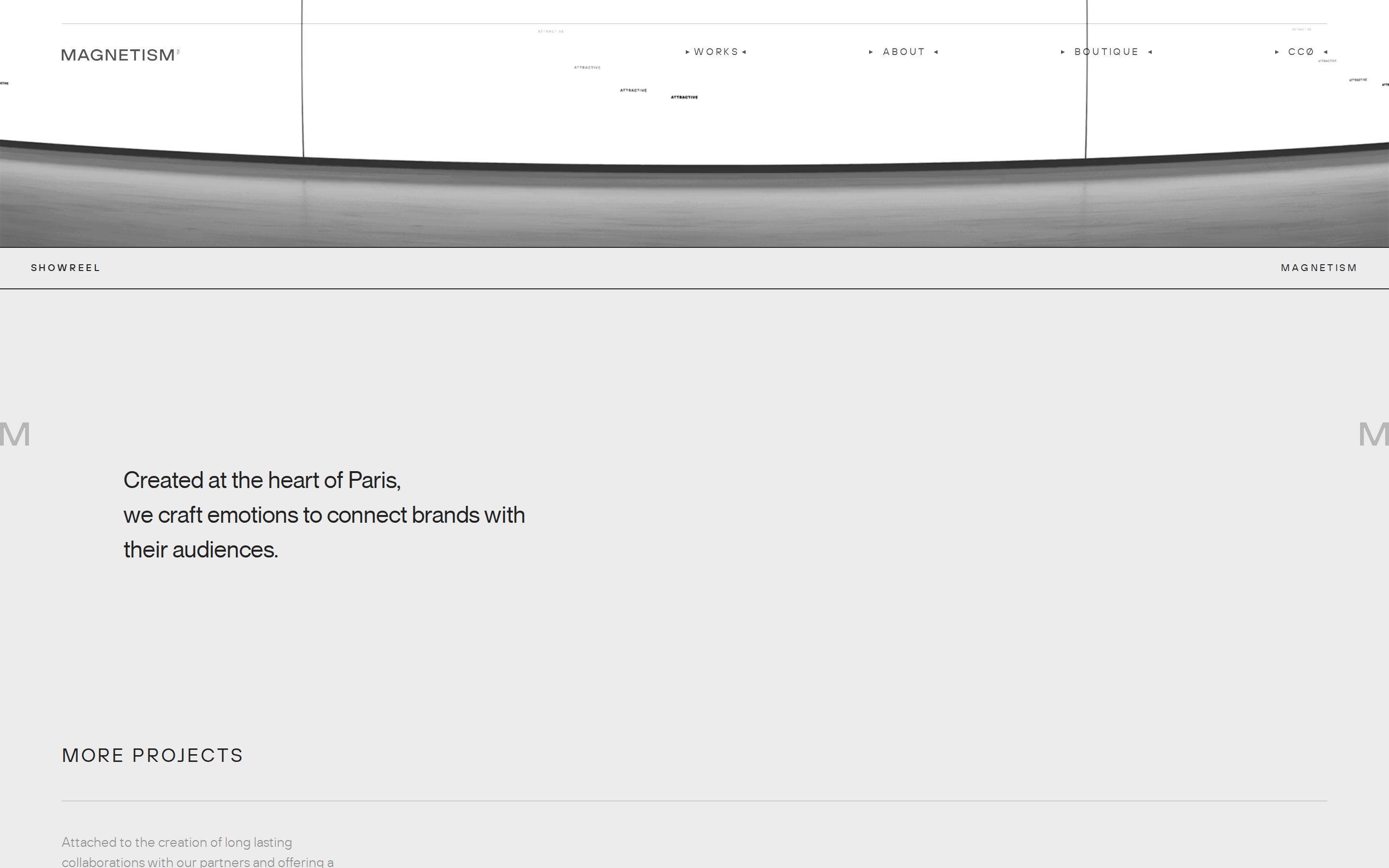
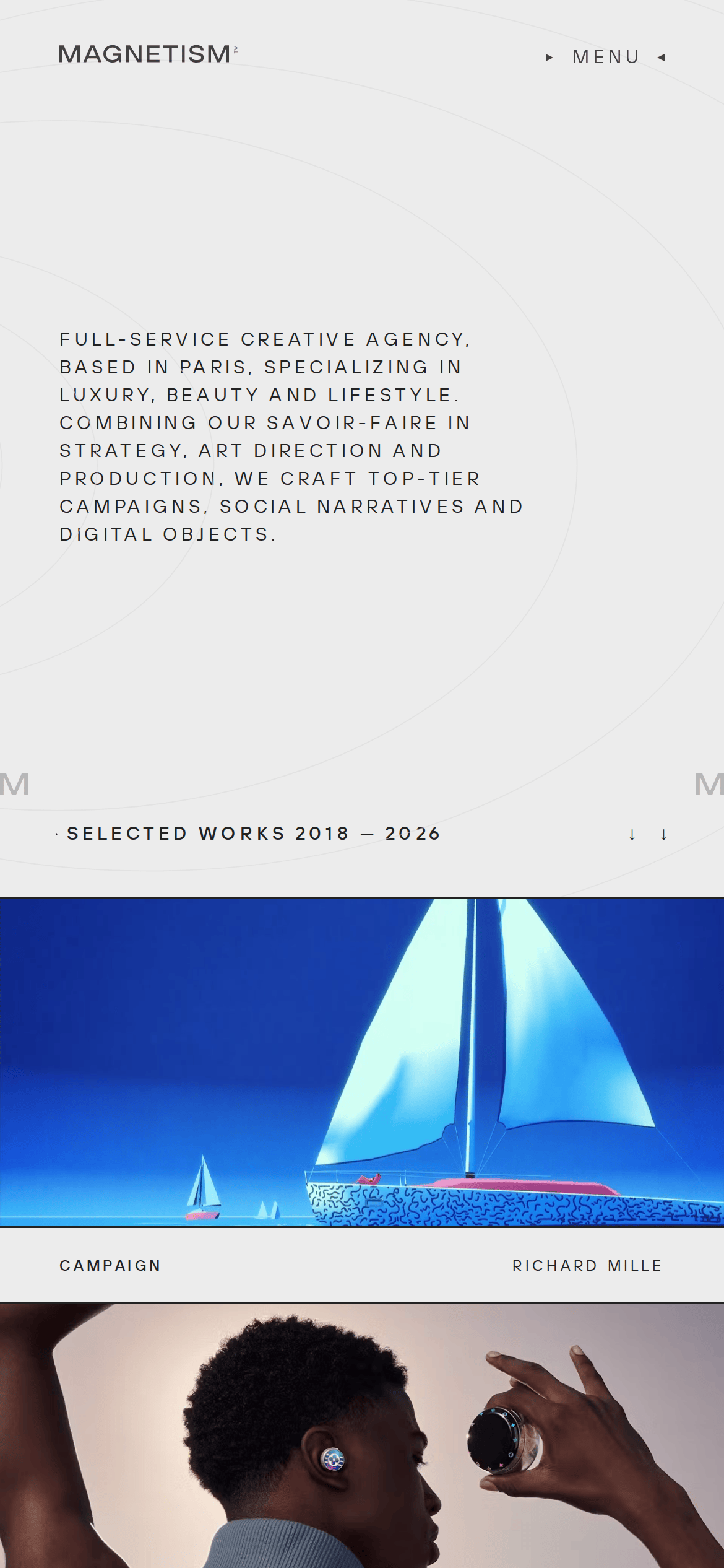
A magnetic field—structured, powerful, and drawing you in.
02
Color
#1A5AFFAccent
#222222Ink
#343434Ink soft
#ECECECBG
#AAAAAAMuted
rgba(229, 231, 235, 1)Line
Restrained, high-contrast palette that prioritizes bold typography and allows vibrant imagery to act as the primary accent.
03
Typography
geometric-sans · grotesque-sans
display120px · 400
h127px · 400
body16px · 400
small10px · 400
Use wide letter-spacing for uppercase UI and meta text · Maintain tight leading for massive display typography · All-caps is standard for navigation and category labels
04
Spacing
4px
8px
16px
24px
32px
48px
64px
96px
Standard 4px grid with generous vertical rhythm for large-scale layouts.
05
Surfaces
sm · 0px
md · 0px
lg · 0px
pill · 999px
Thin, subtle borders using rgb(229, 231, 235) to separate content blocks.
None
06
Layout
1440container
12columns
24pxgutter
768 / 1024breakpoints
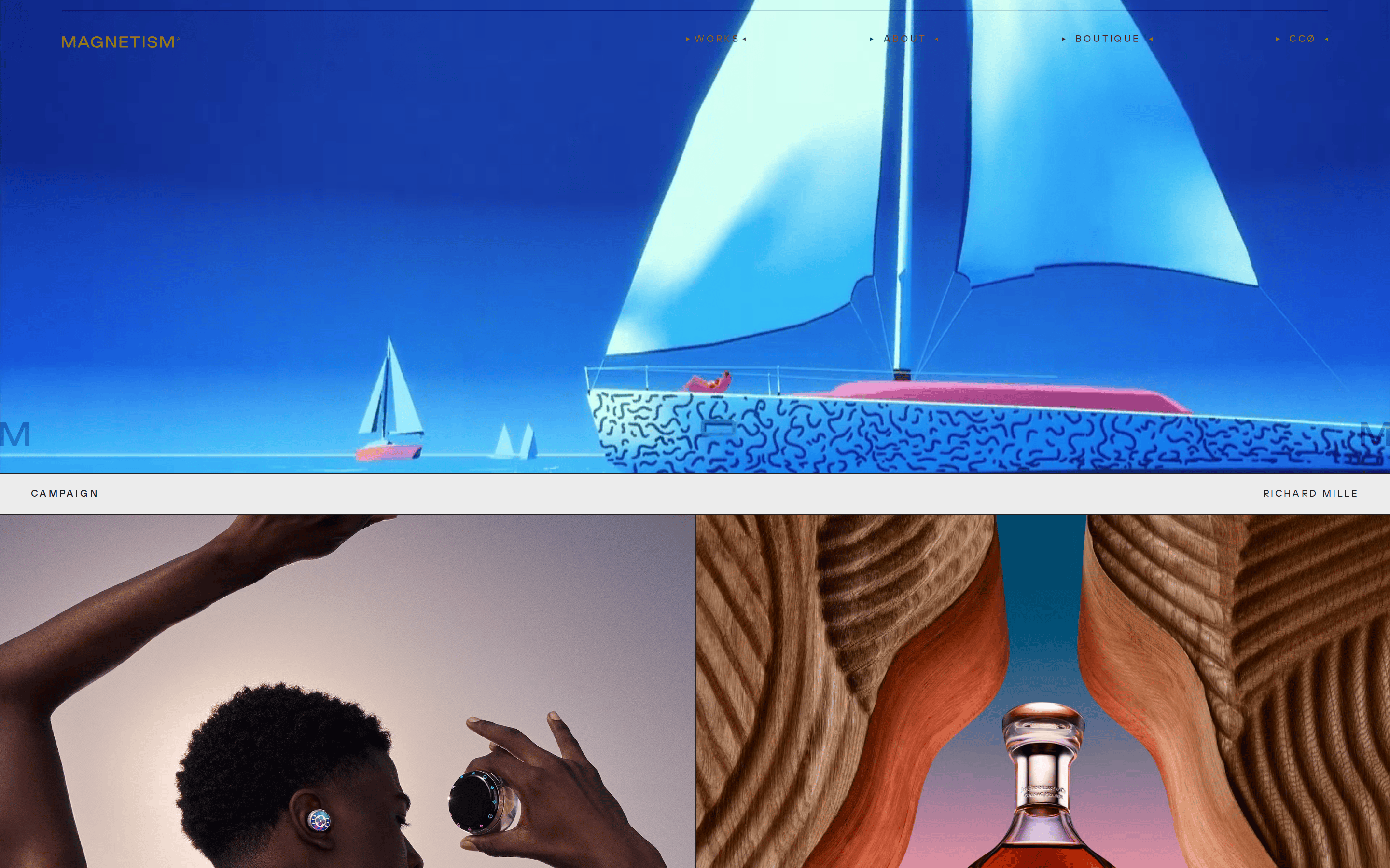
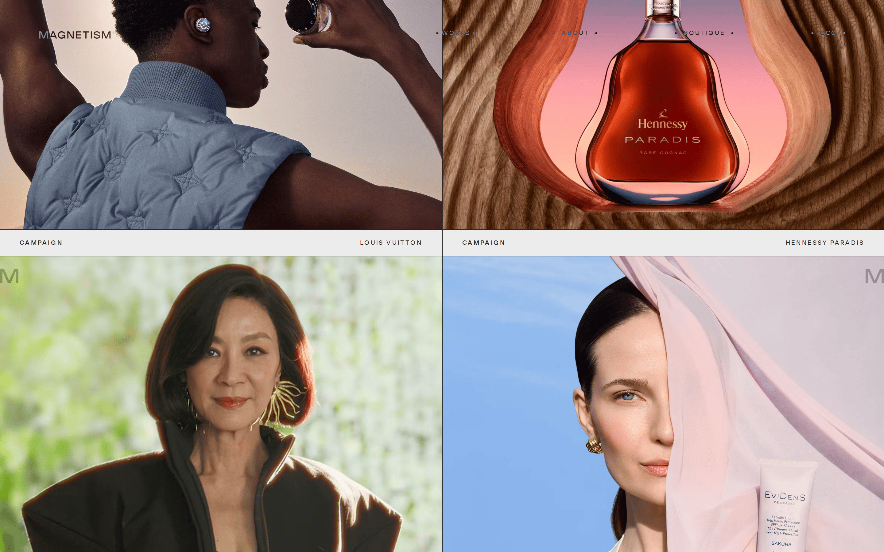
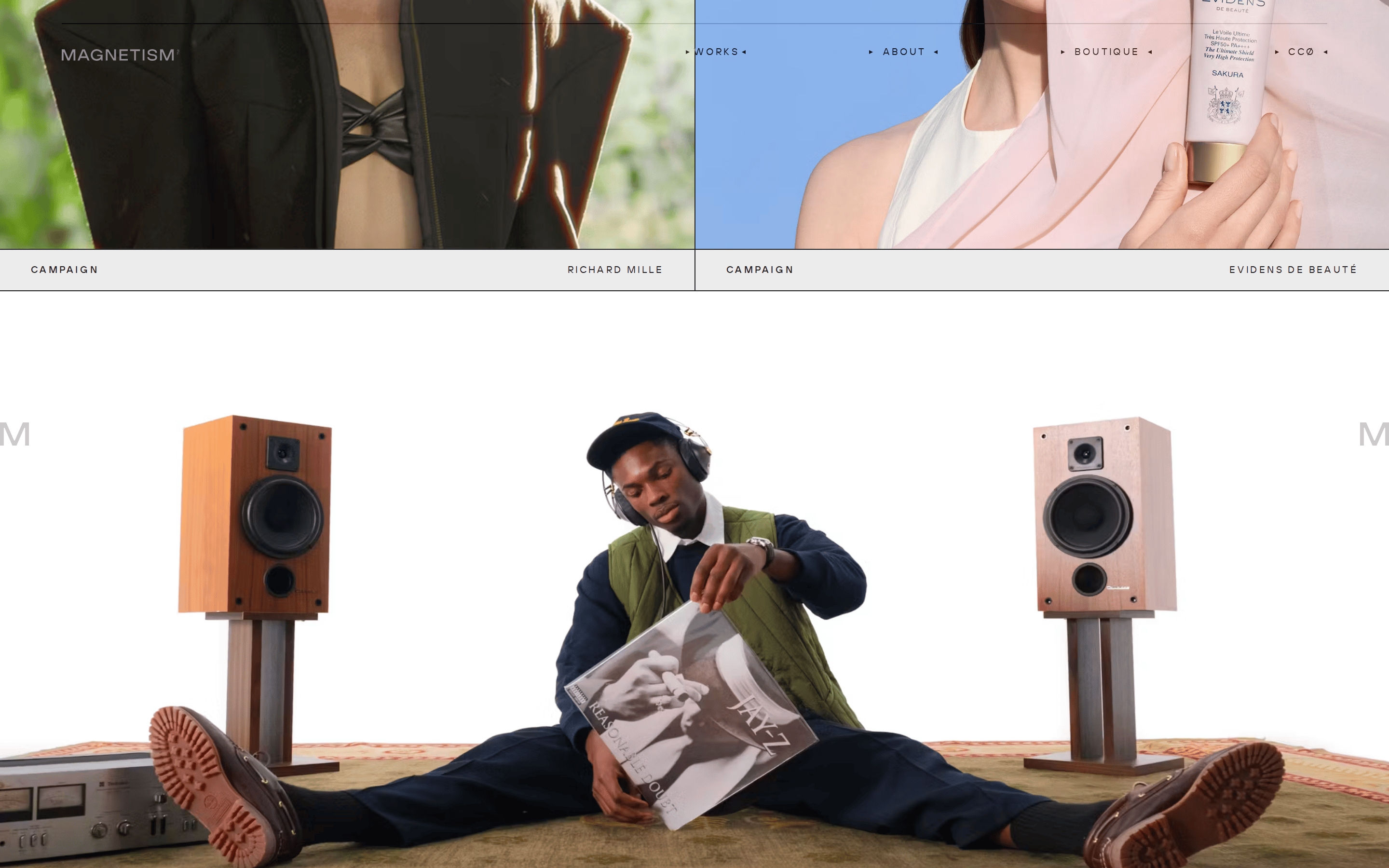
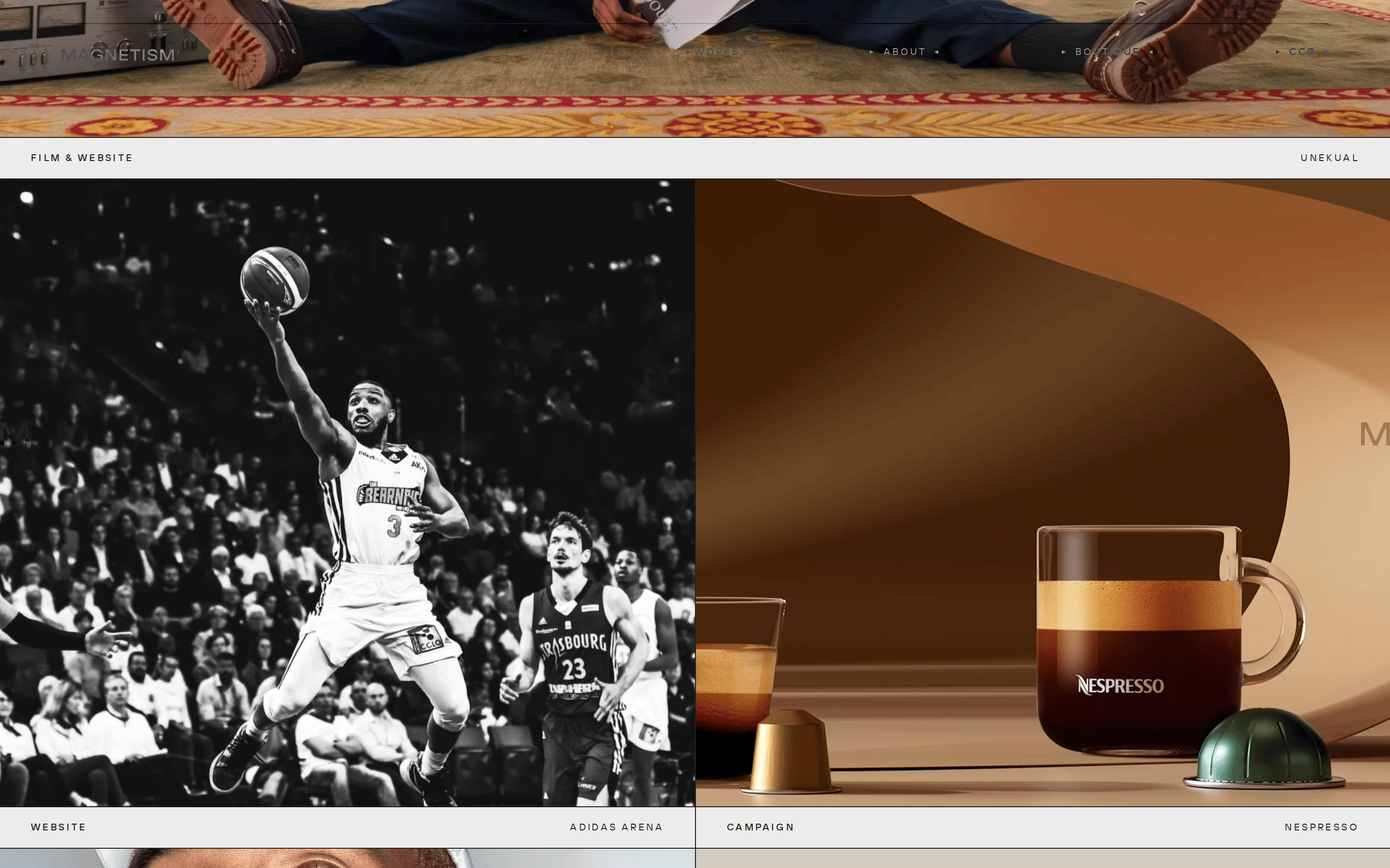
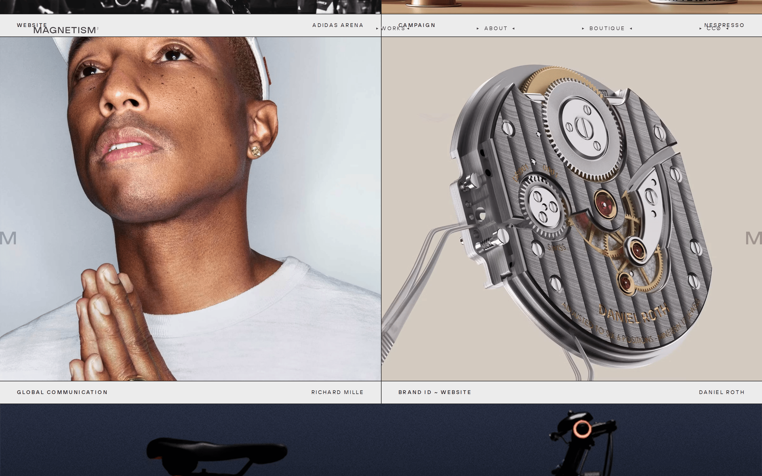
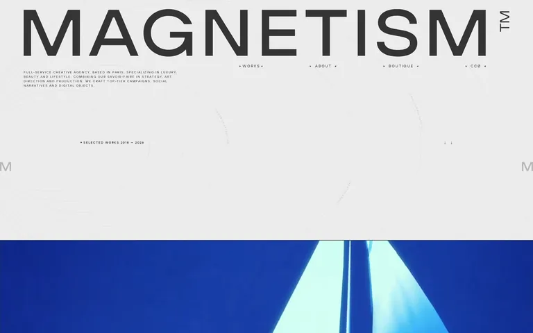
A minimalist, top-heavy layout featuring massive typography that often bleeds into or near the screen edges, paired with full-width cinematic imagery.
07
Motion & Interaction
220msmicro
400mssmall
800msmedium
cubic-bezier(0.19, 1, 0.22, 1)easing
Smooth opacity fades and transitions for page elements · Subtle scale or reveal effects on scroll for imagery
Subtle opacity changes or cursor shifts on text links. · Immediate visual feedback through opacity or minor shifts.
08
Components
buttonMinimalist uppercase text links, often flanked by small geometric arrows.
cardEdge-to-edge photographic cards with simple text overlays below.
chipN/A
inputN/A
heroMassive typographic statement followed immediately by high-impact full-width visuals.
09
Voice & Don'ts
ToneConfident, sophisticated, and authoritative.
HeadlinesAll-caps, ultra-bold, and expansive, often using single words to command attention.
CTAsUnderstated and elegant, using small uppercase text with directional arrows.
Don't use colorful gradients — screenshot shows flat, solid backgrounds like #ECECEC instead
Don't use rounded corners — screenshot shows sharp, 0px radius edges on all elements
Don't use drop shadows — screenshot shows completely flat, shadow-free surfaces
Don't use mixed-case headlines — screenshot shows aggressive use of uppercase textTransform across headers
Don't use wide margins for headers — screenshot shows massive display type bleeding near screen edges
Don't use vibrant UI buttons — screenshot shows minimalist, text-only navigation links with subtle arrows
Avoid: Loud or chaotic color schemes
Avoid: Decorative or overly ornate typography
Avoid: Cluttered layouts with excessive UI elements
Captured from the live site · real computed styles
11
System prompt
This is a high-end creative agency portfolio for Magnetism. The design is defined by extreme typographic contrast: massive geometric sans-serif headlines (like 'MAGNETISM') dominate the viewport against a restrained, neutral background (#ECECEC) and dark ink text (#222222). The layout is minimalist and spacious, letting large-format, cinematic photography drive the visual narrative. Navigation and metadata are handled through small, wide-tracked, uppercase grotesque-sans text. Interactions are smooth and understated, relying on 0.5s cubic-bezier opacity fades. Critical don'ts: never use rounded corners, drop shadows, or casual lowercase headlines. Always prioritize expansive white space and rigid alignment to maintain the premium, refined agency aesthetic.
Bring this taste to your agent
Hand your AI agent a machine-readable spec of this design — tokens, type, motion, the whole DNA.