← OpenDesign CURATED · OPEN · FREE
Drawhistory
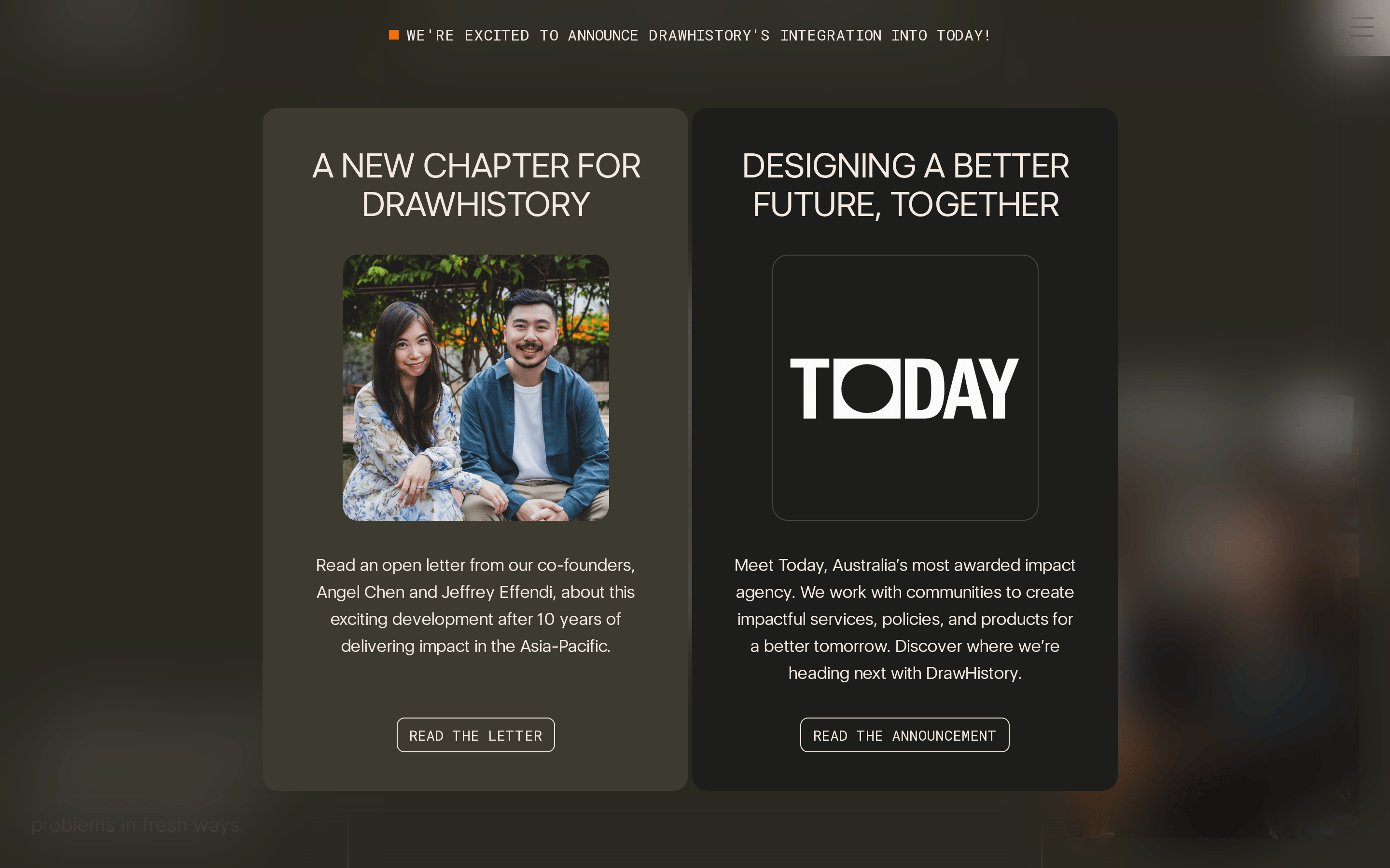
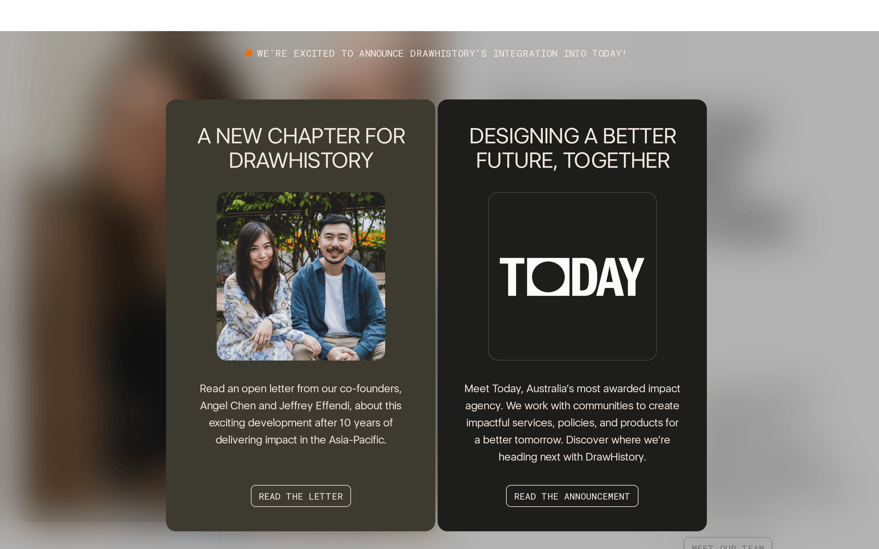
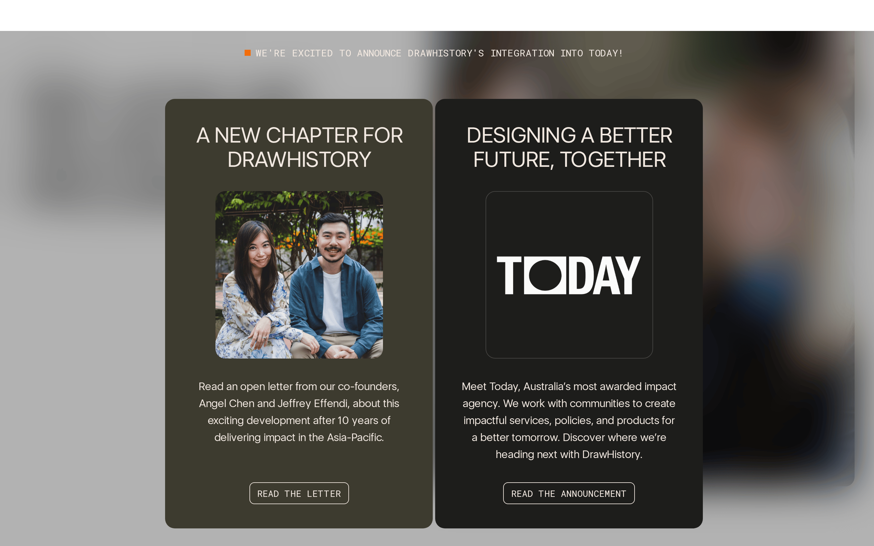
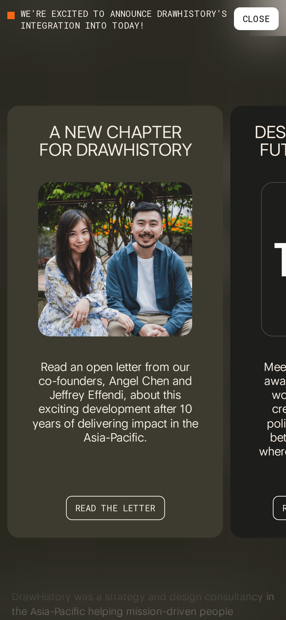
A dual-column editorial layout announcing a company merger with contrasting earthy and dark cards.
Agency Case Study Clean Bold Typography Premium
01
Identity DNA
impact design strategy integration announcement
A formal yet warm corporate announcement card
02
Color
#ff6714Accent
#f2e9e1Ink
#101010BG
#3d3b31BG soft
#808080Muted
rgba(242, 233, 225, 0.4)Line
High contrast between dark backgrounds and light warm text, with a single vibrant orange accent.
03
Typography
geometric-sans · humanist-sans · monospace
display 104px · 400body 16px · 400label 14px · 400All caps for buttons and announcement banners · Tight tracking on large display headings · Monospace used for uppercase UI labels
04
Spacing
4px
8px
16px
24px
32px
48px
64px
96px
Consistent 32px and 24px padding within cards
05
Surfaces
sm · 8px
md · 16px
lg · 16px
pill · 9999px
Subtle light borders separating internal elements
06
Layout
1280 container
2 columns
32px gutter
768 / 1024 breakpoints
Two tall cards centered on a dark background, with a full-width top banner
07
Motion & Interaction
150ms micro
300ms small
800ms medium
cubic-bezier(0.4, 0, 0.2, 1) easing
Smooth color and opacity transitions on hover · Text decoration transitions
Subtle transitions on interactive elements · Pointer cursor on all interactive elements
08
Components
button Text-based buttons with uppercase monospace font and thin borders card Full-height dark cards with generous internal padding and rounded corners chip Top announcement bar with small orange square indicator input None visible in screenshot hero Dense editorial announcement section combining text and imagery 09
Voice & Don'ts
Tone Professional, impactful, and forward-looking Headlines All caps, tight tracking, large scale geometric sans CTAs Uppercase monospace with thin borders Don't use colorful gradients — screenshot shows flat, solid dark surfaces Don't use bold font weights — screenshot shows exclusively regular (400) weight Don't use centered text for paragraphs — screenshot shows centered text for all elements Don't use bright backgrounds — screenshot shows dark, muted earthy tones Don't use complex drop shadows — screenshot shows flat cards with no elevation Don't use decorative serif fonts — screenshot shows clean geometric and monospace types Avoid: Overly casual language Avoid: Cluttered layouts Avoid: High saturation colors 10
Inside the pack — real screenshots
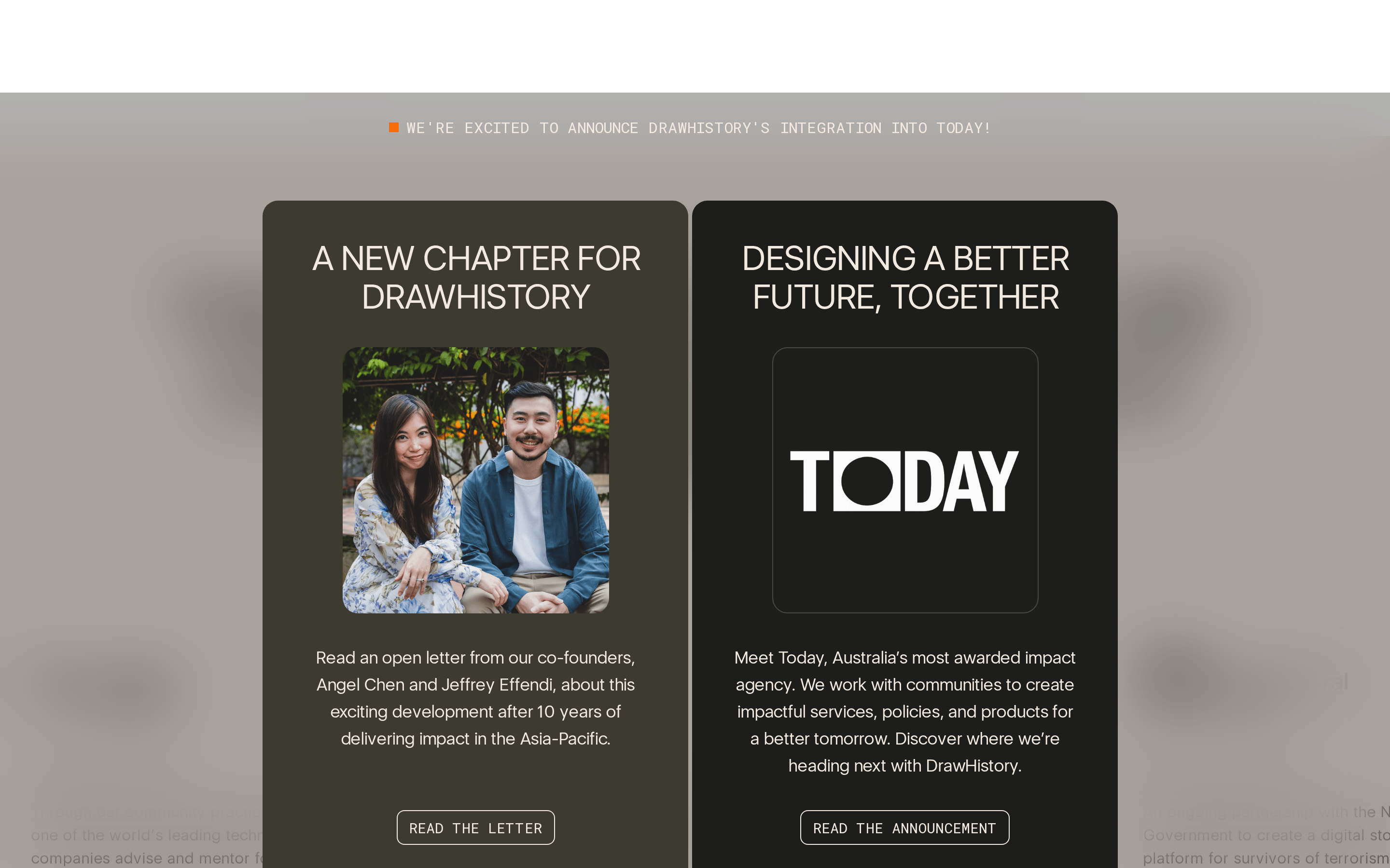
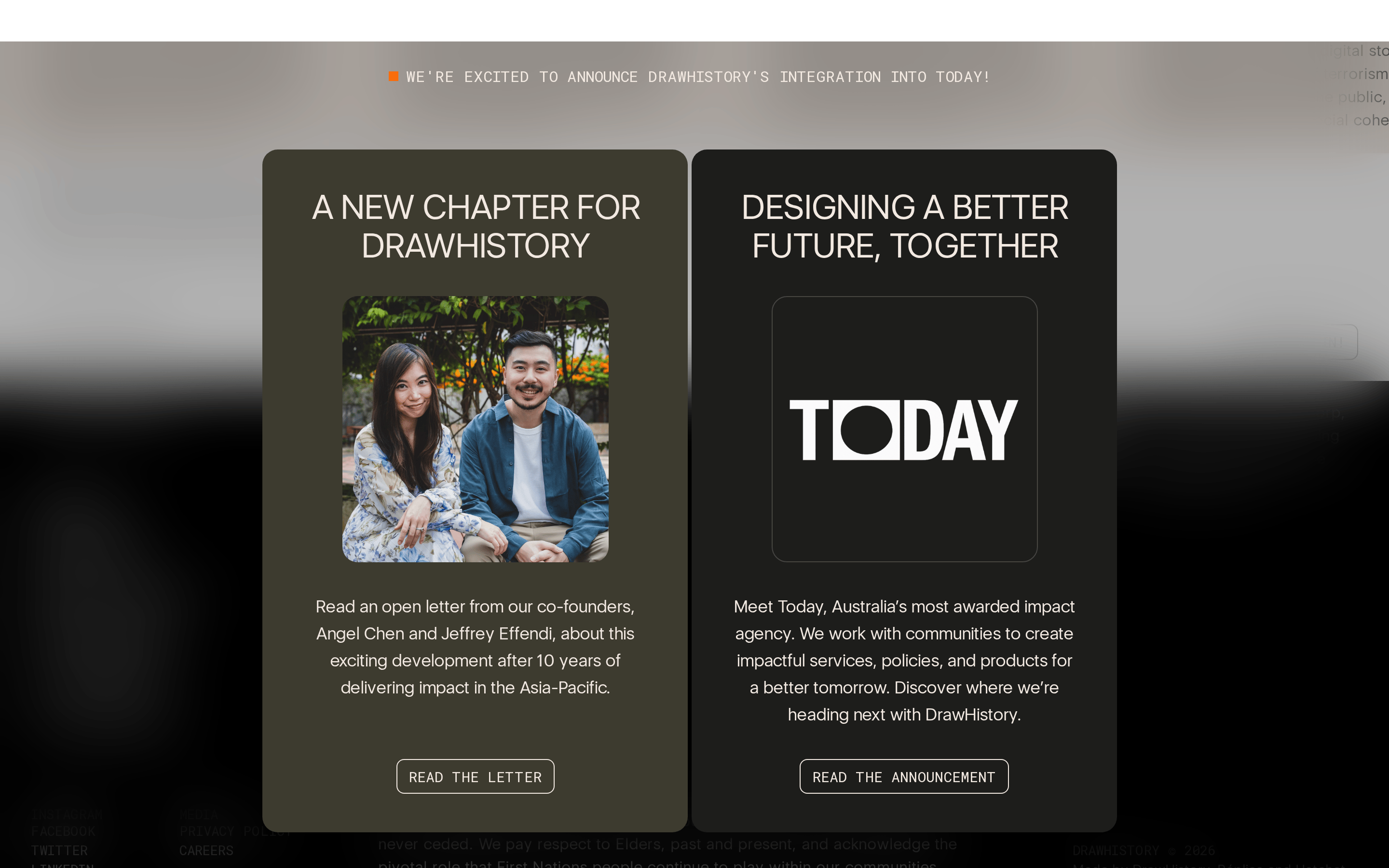
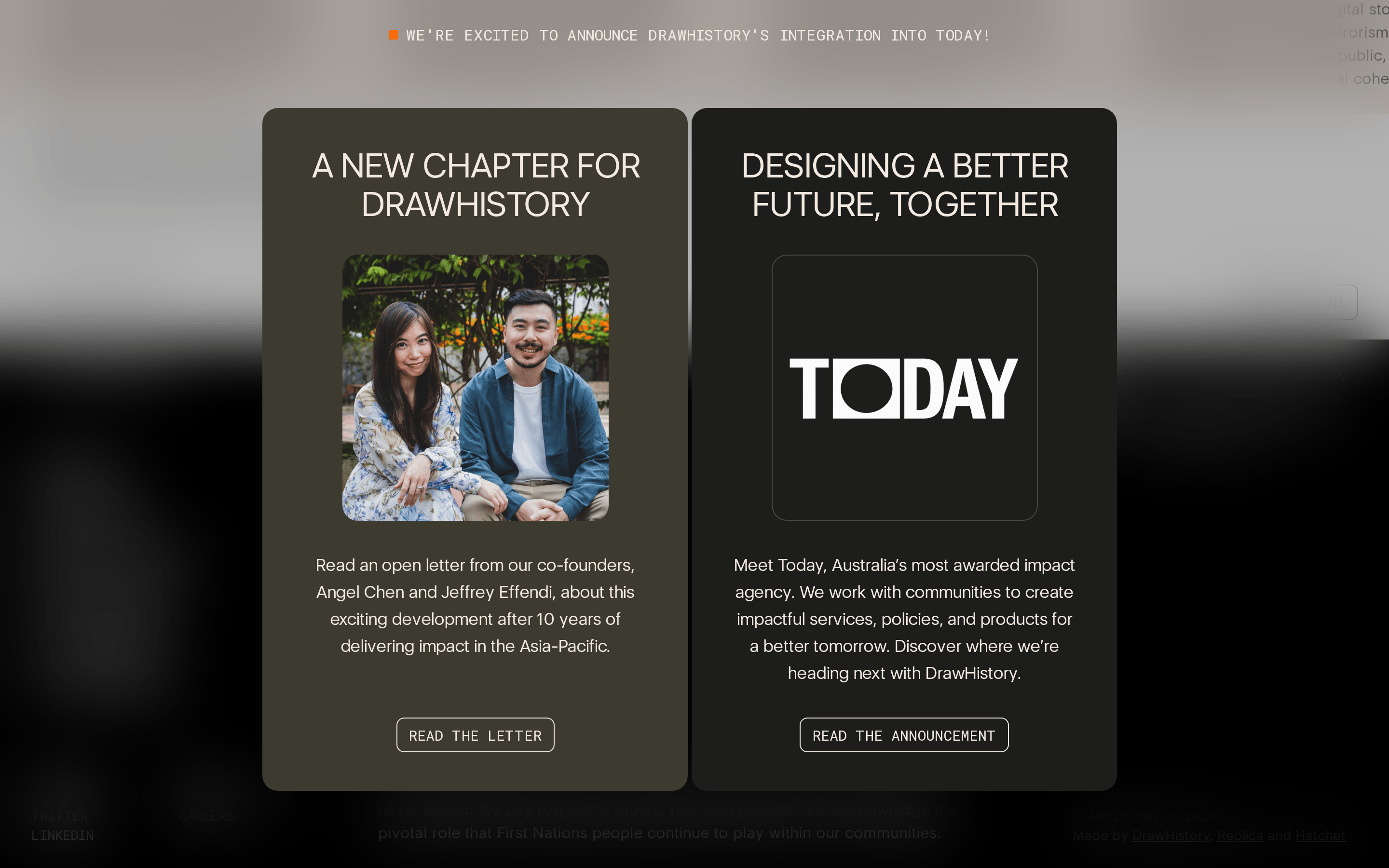
桌面首屏(hero) 桌面滚动分段(90% viewport 步进,作为视觉证据) 桌面滚动分段(90% viewport 步进,作为视觉证据) 桌面滚动分段(90% viewport 步进,作为视觉证据) 桌面滚动分段(90% viewport 步进,作为视觉证据) 桌面滚动分段(90% viewport 步进,作为视觉证据) 桌面滚动分段(90% viewport 步进,作为视觉证据) 桌面滚动分段(90% viewport 步进,作为视觉证据) 桌面滚动分段(90% viewport 步进,作为视觉证据) 桌面滚动分段(90% viewport 步进,作为视觉证据) 桌面滚动分段(90% viewport 步进,作为视觉证据) 桌面滚动分段(90% viewport 步进,作为视觉证据) 桌面滚动分段(90% viewport 步进,作为视觉证据) 移动首屏 Captured from the live site · real computed styles
11
System prompt
This site is a design agency announcement page using a high-contrast, muted palette. The layout features two large, dark cards (dark olive #3d3b31 and charcoal #101010) centered on a dark background. Key colors are #f2e9e1 (text), #101010 (background), and #ff6714 (accent). Typography relies on geometric-sans for display and monospace for labels. Critical donts: never use bold weights (everything is regular), avoid bright or neon colors, and do not use drop shadows for elevation.
More from the library en · zh-CN · zh-TW · ja · ko
OpenDesign · curated web aesthetics for AI-readable design DNA · opendesign.cc
Why we curated this: This site demonstrates a highly restrained, typography-focused editorial design with a professional and impactful tone.