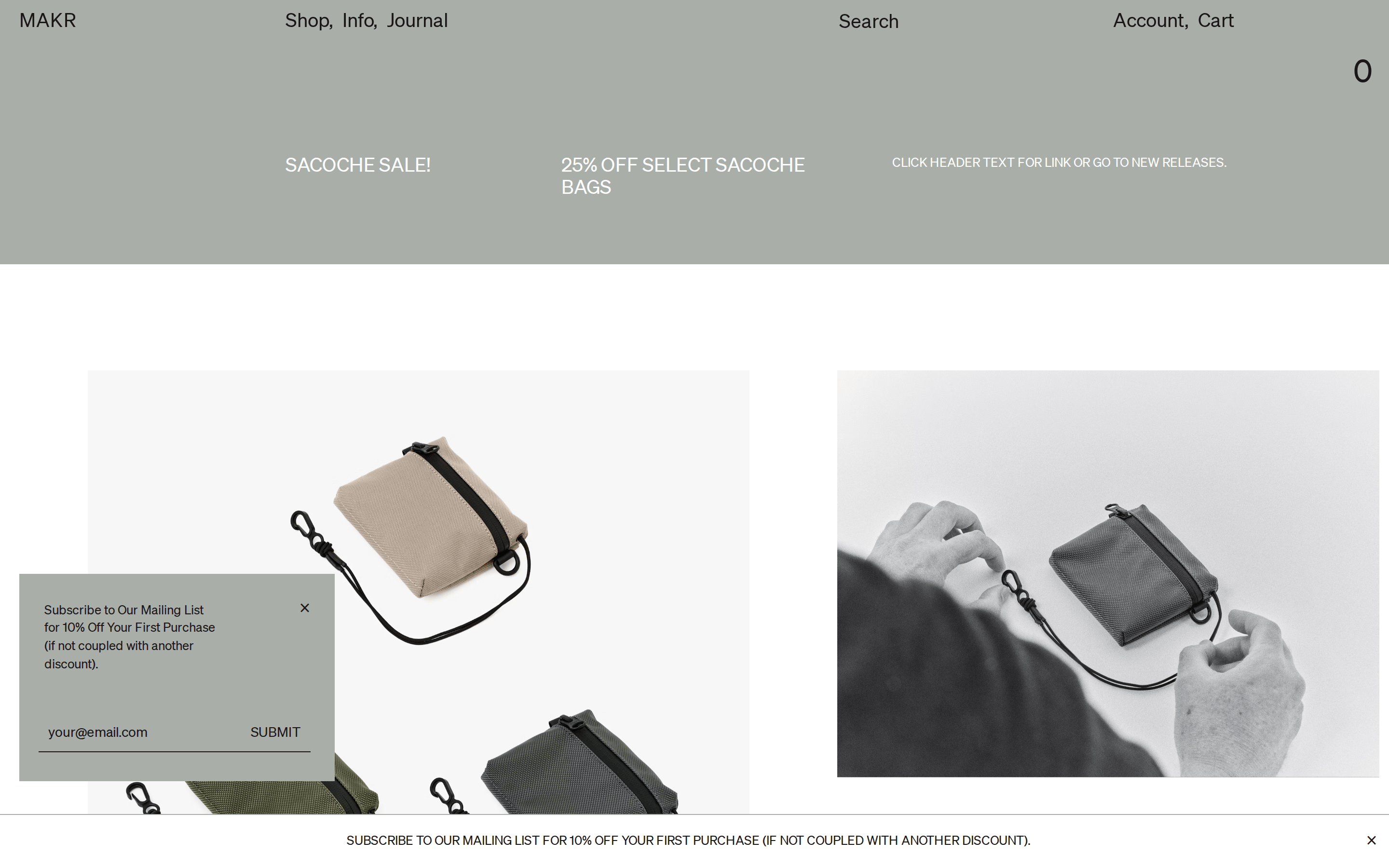
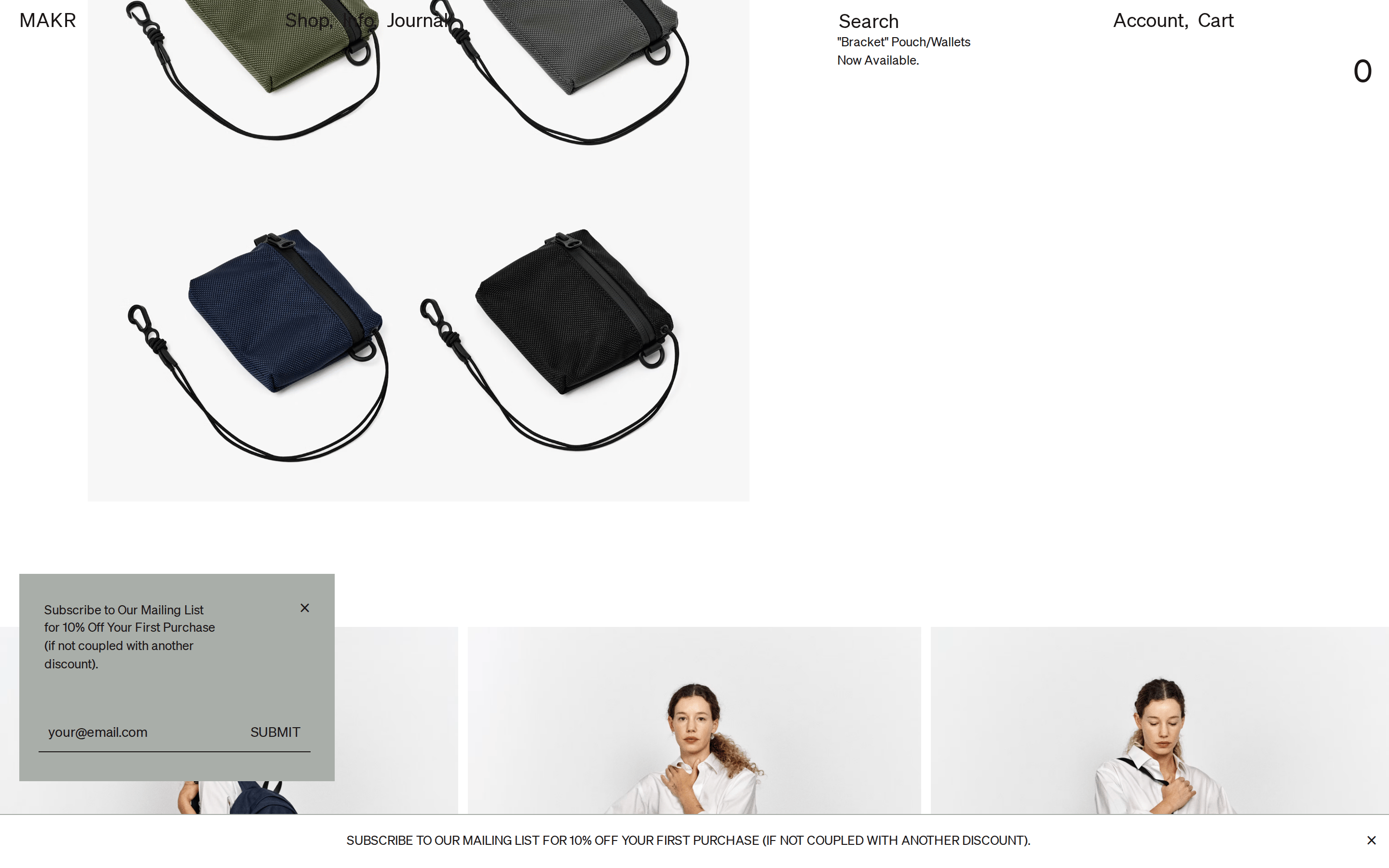
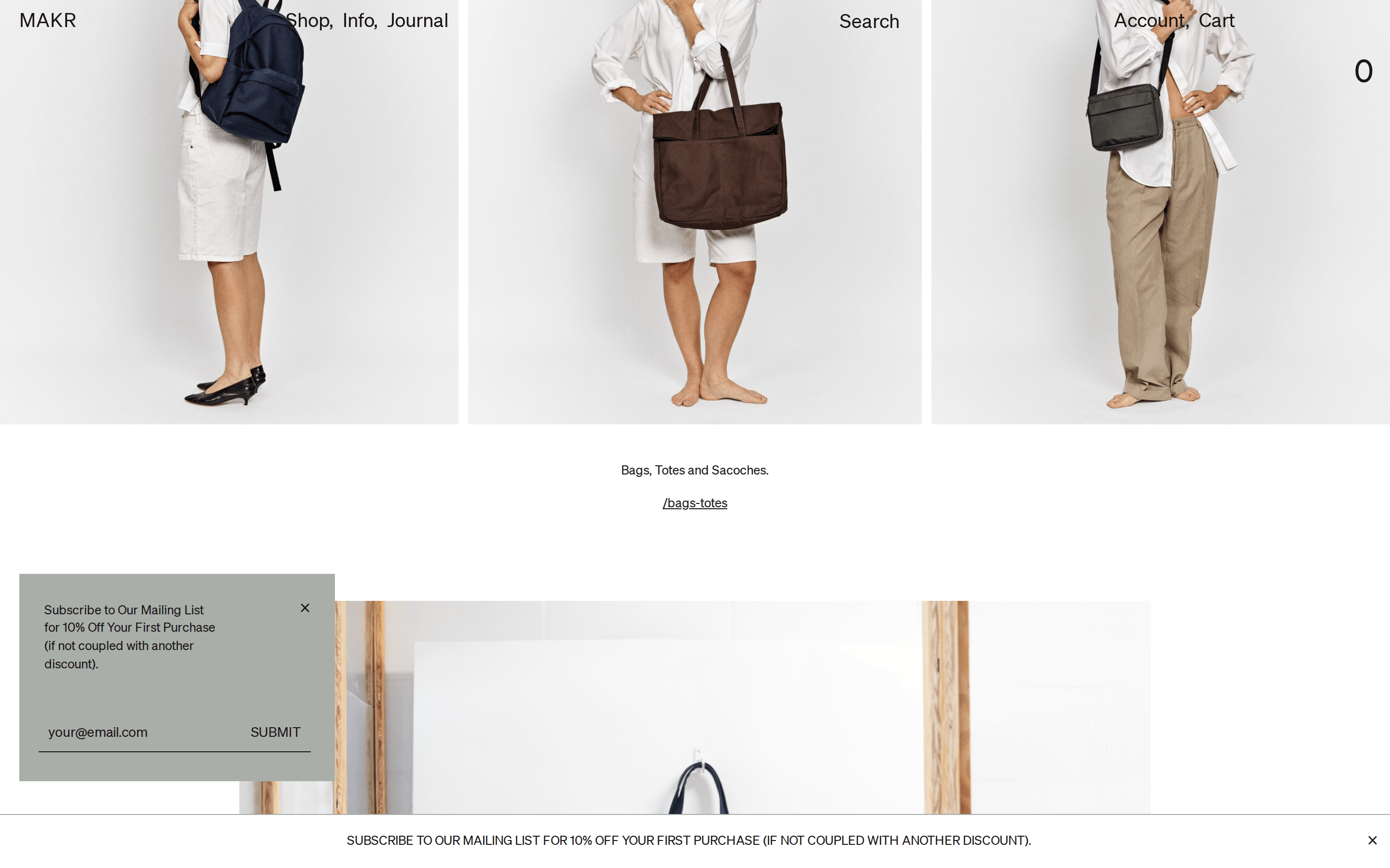
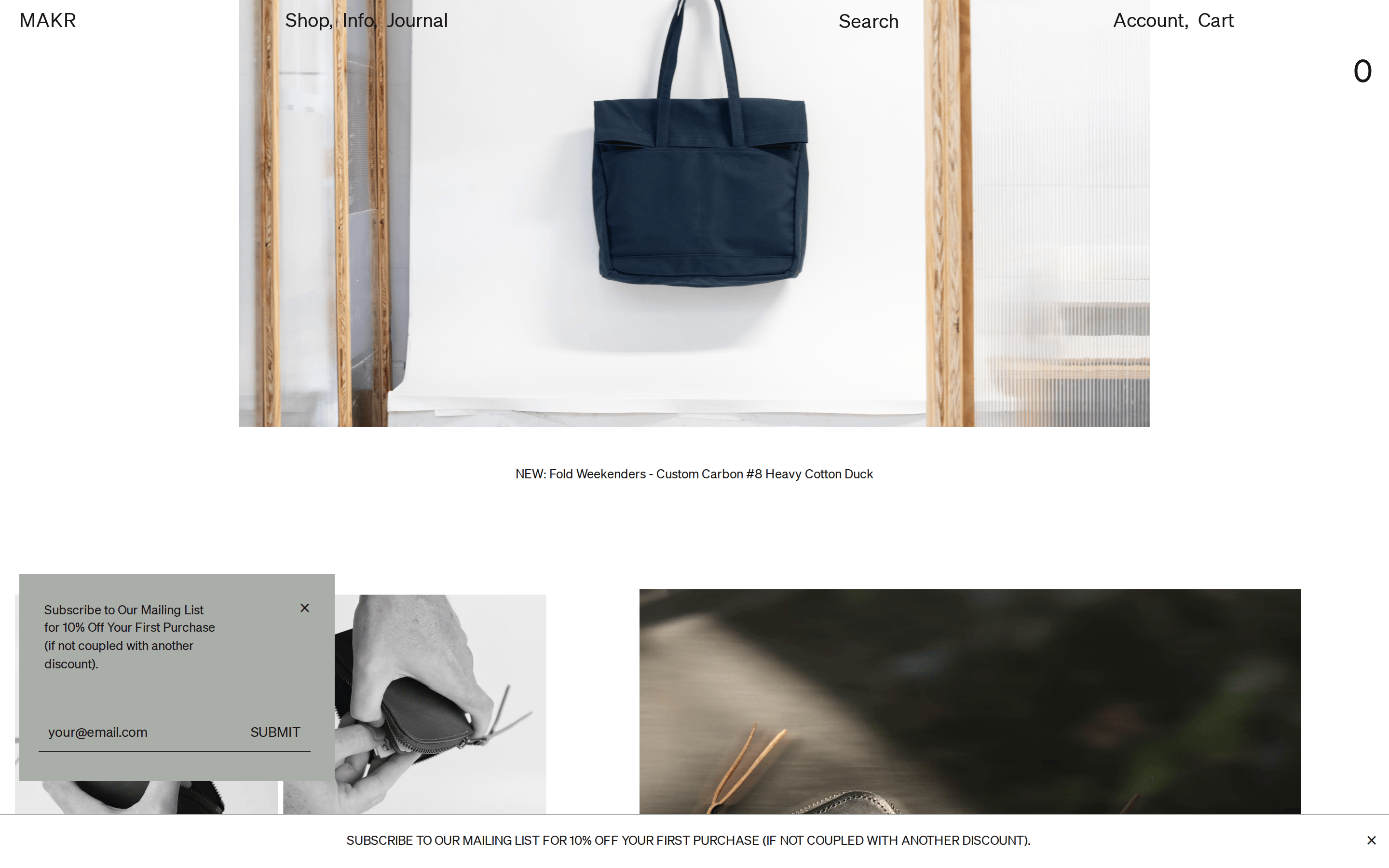
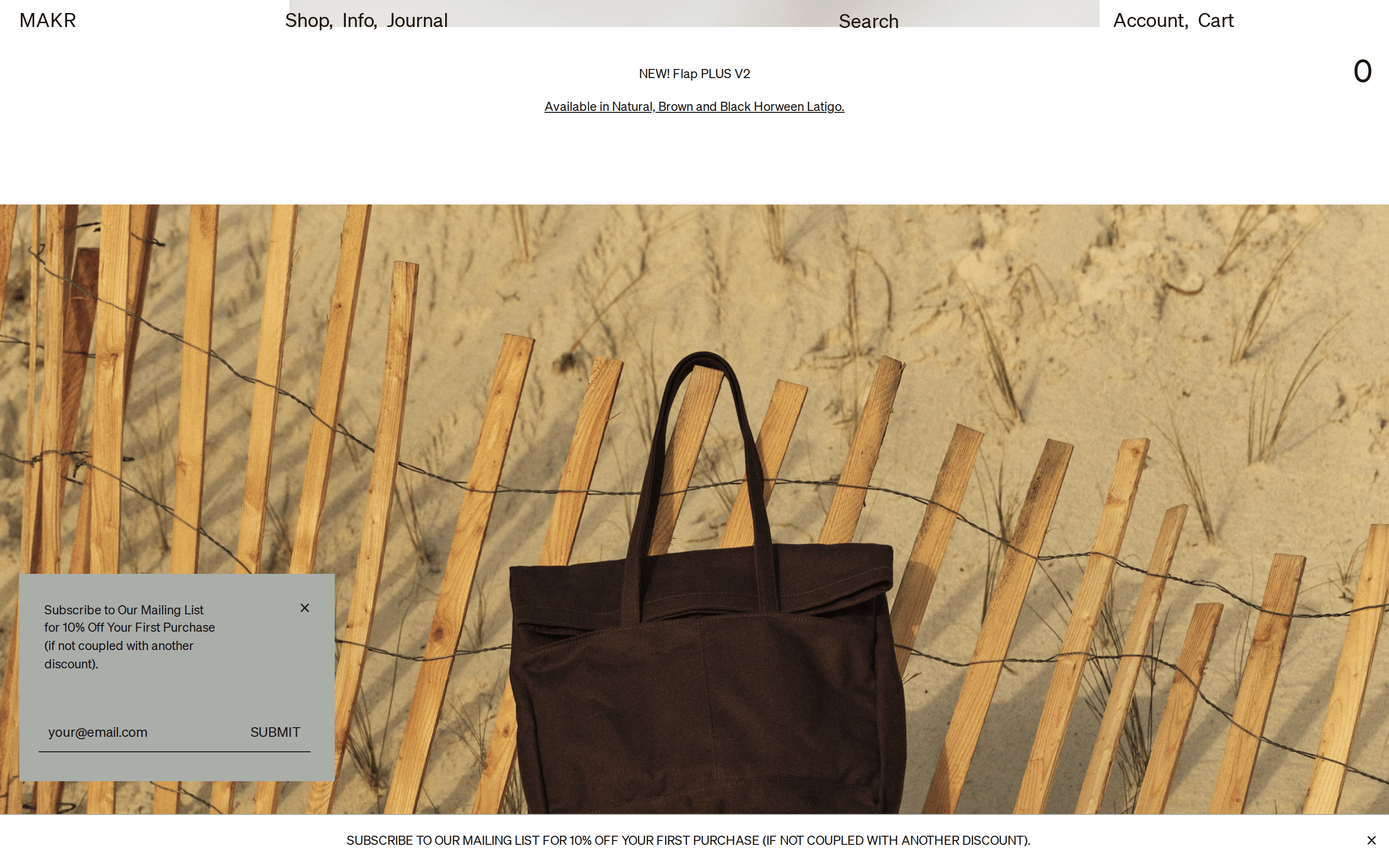
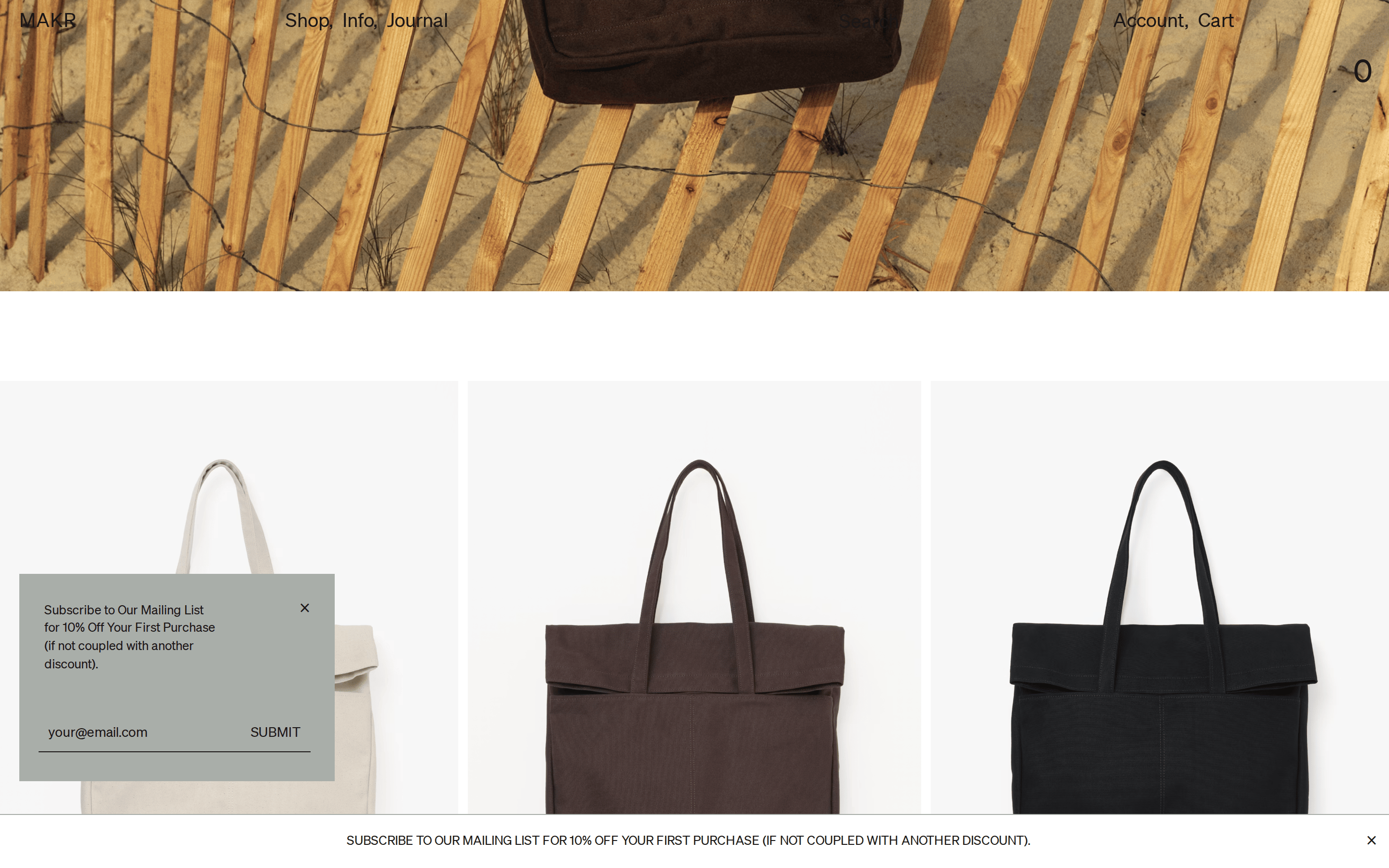
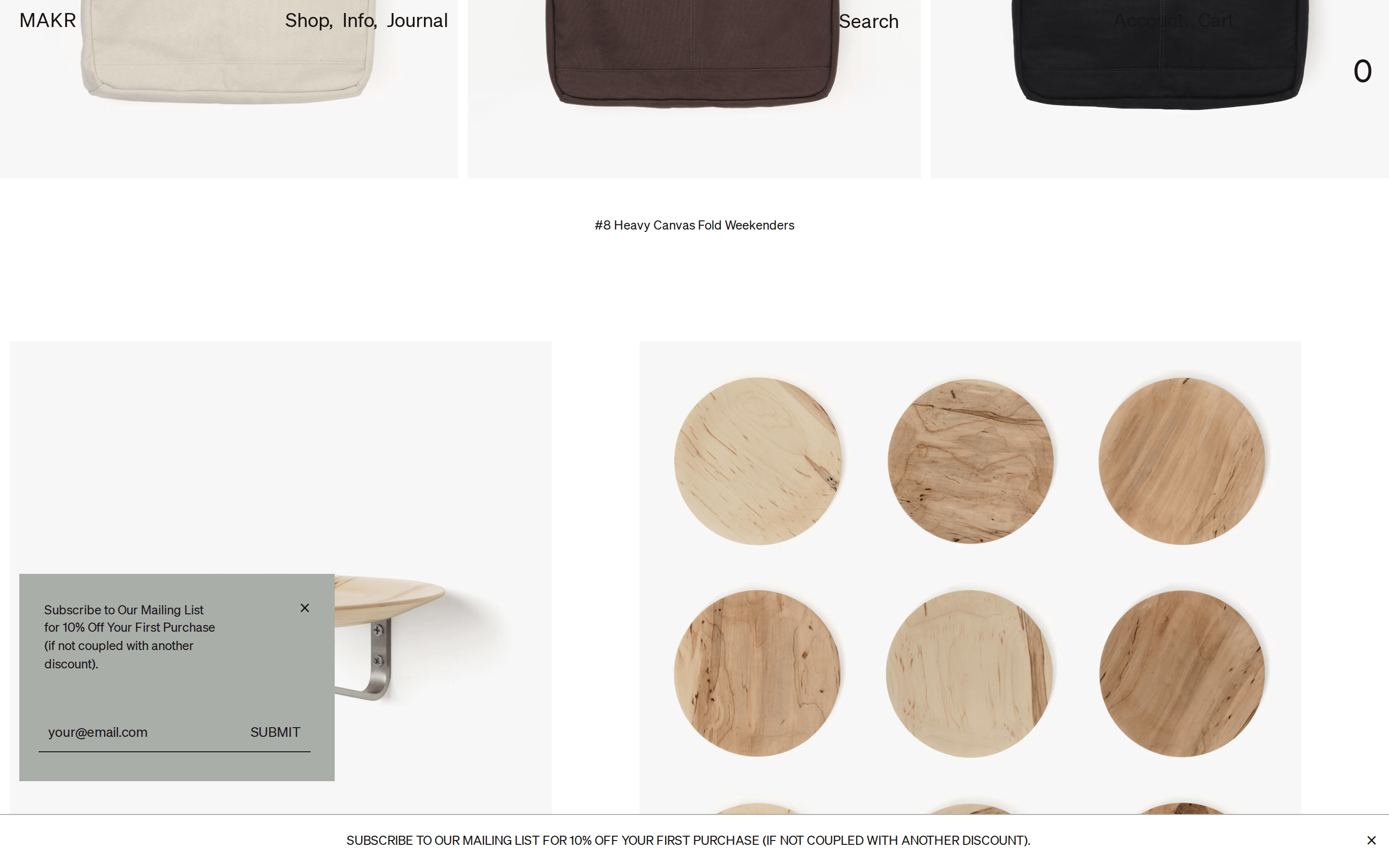
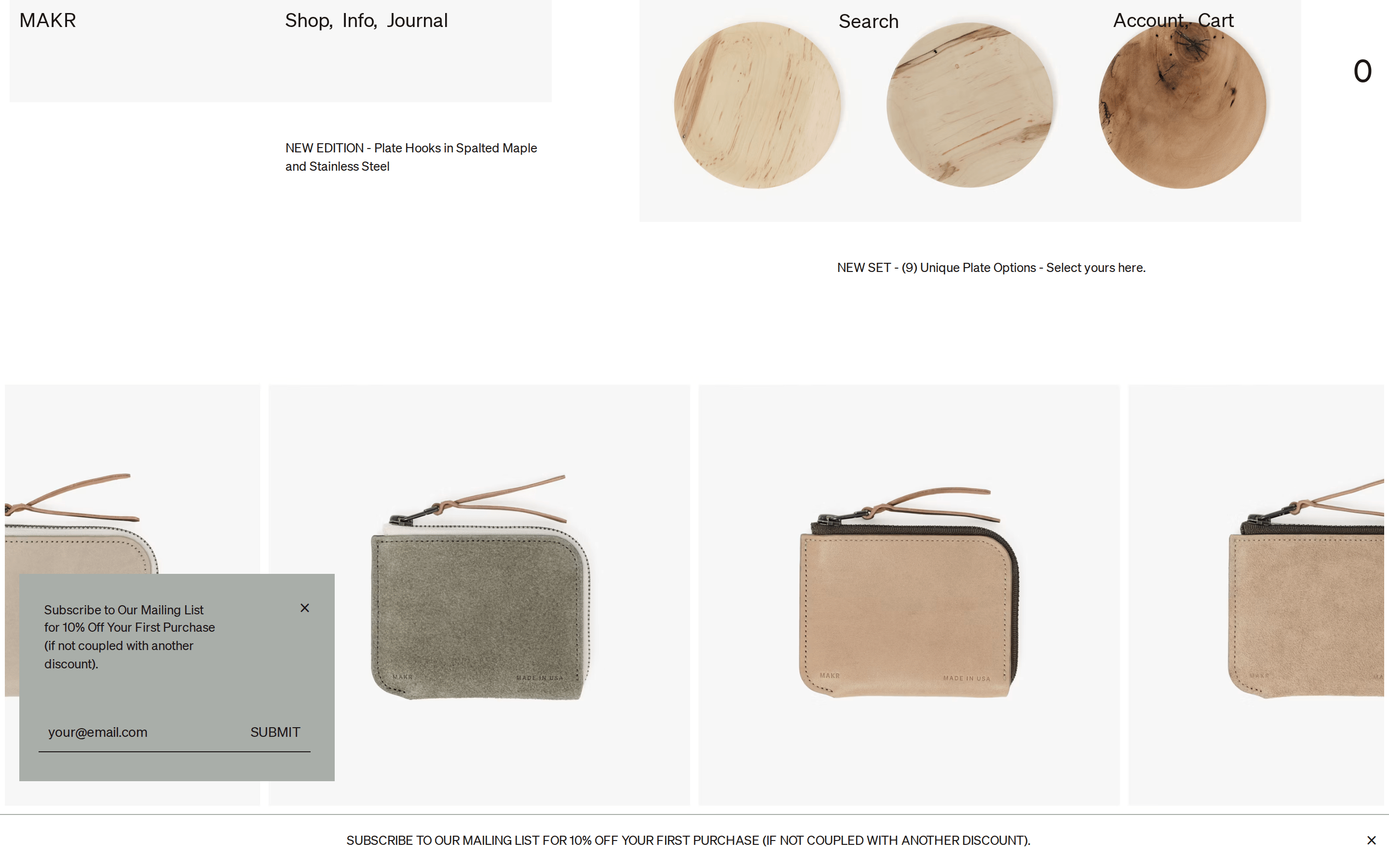
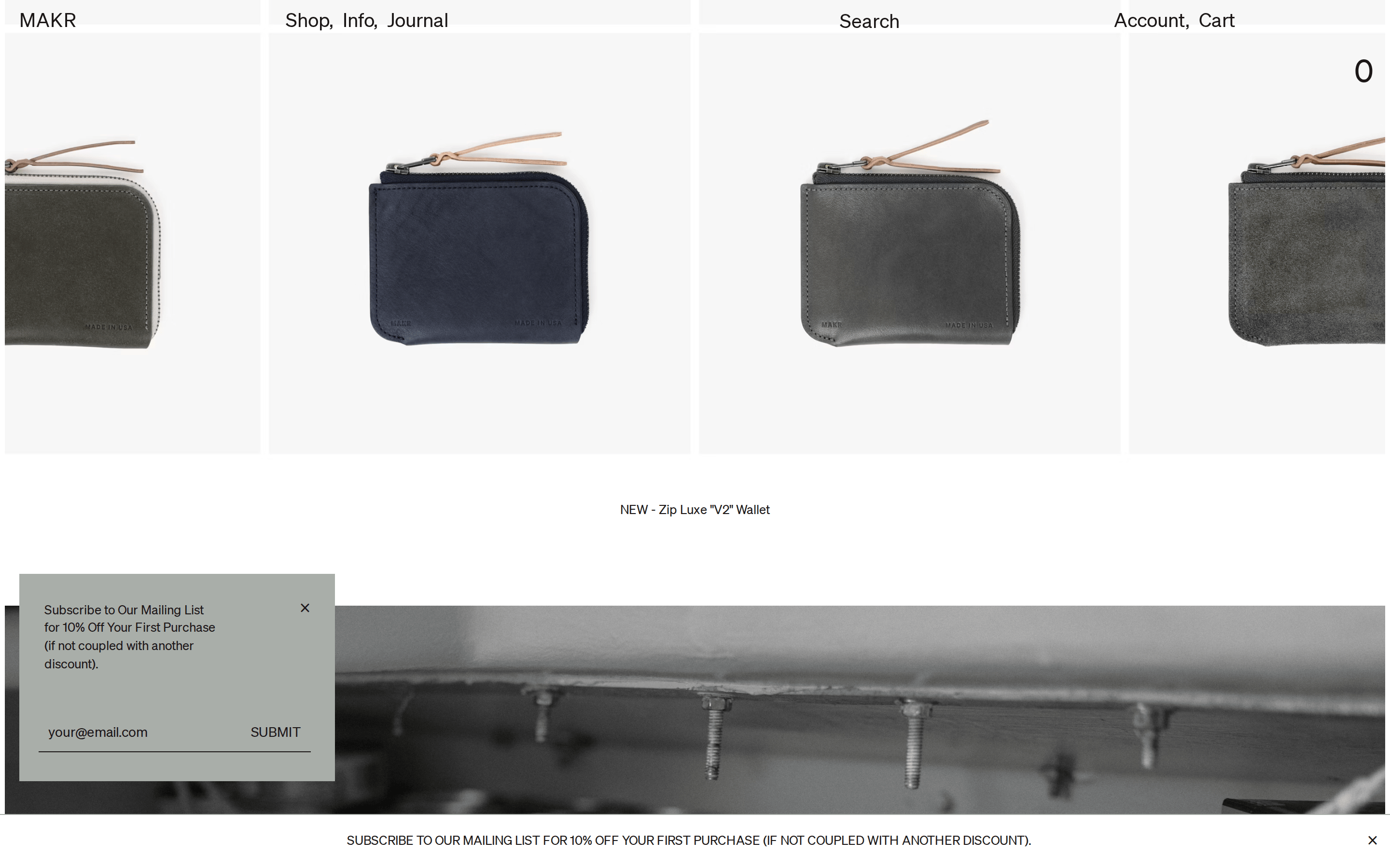
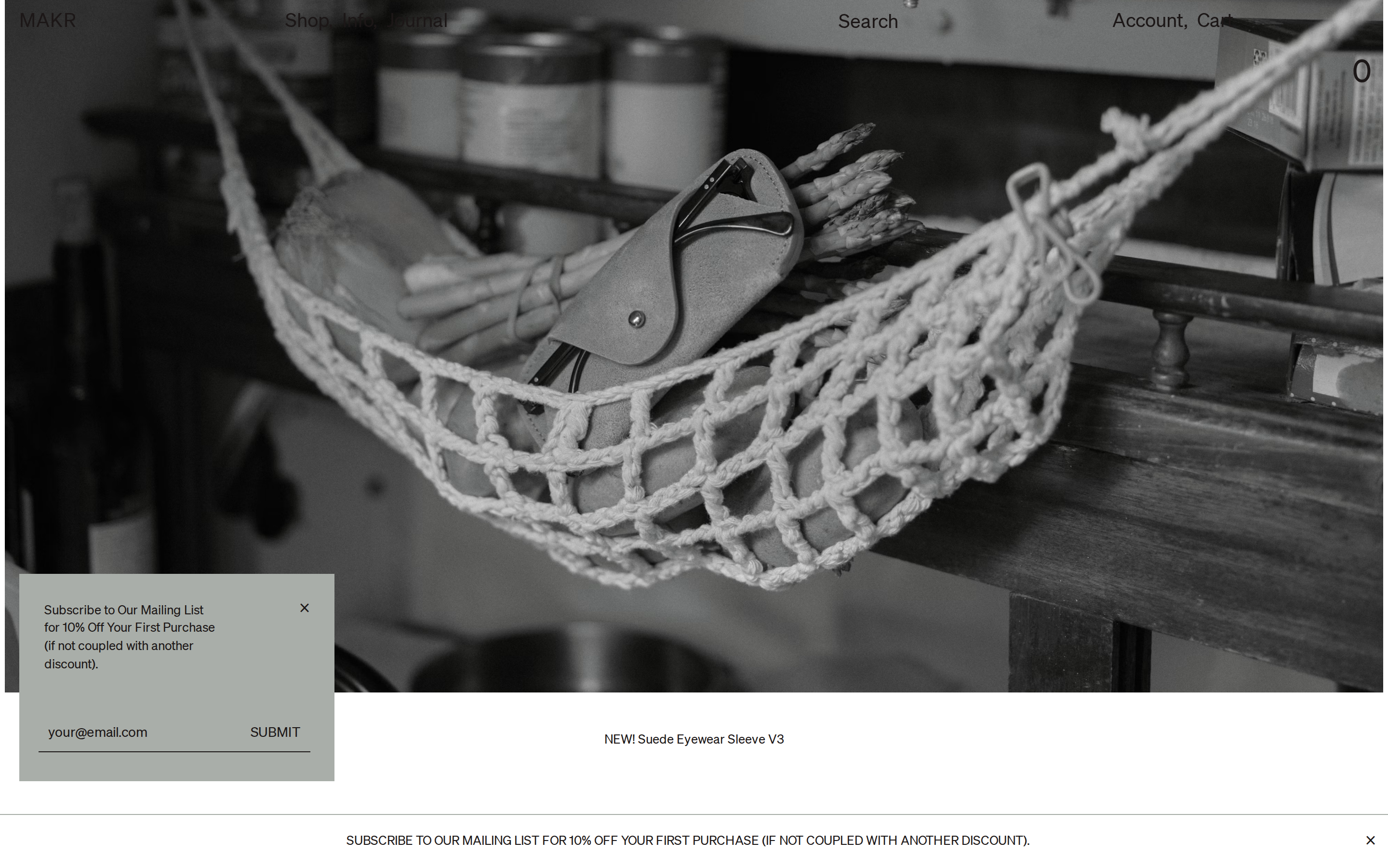
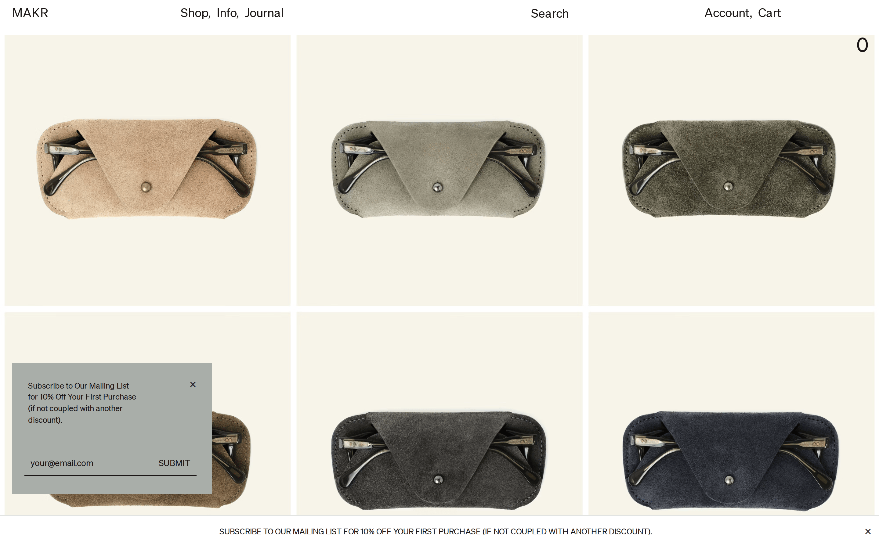
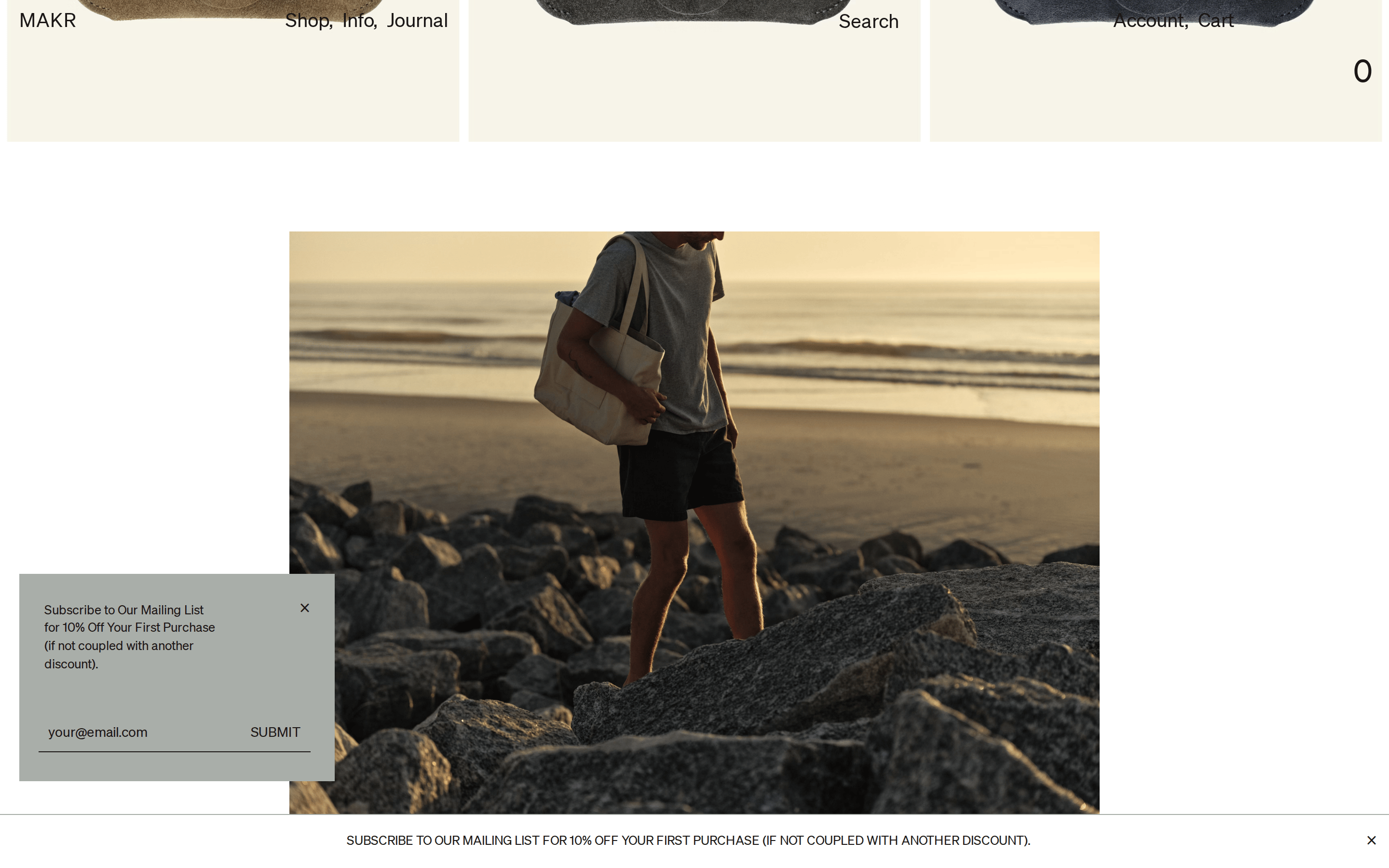
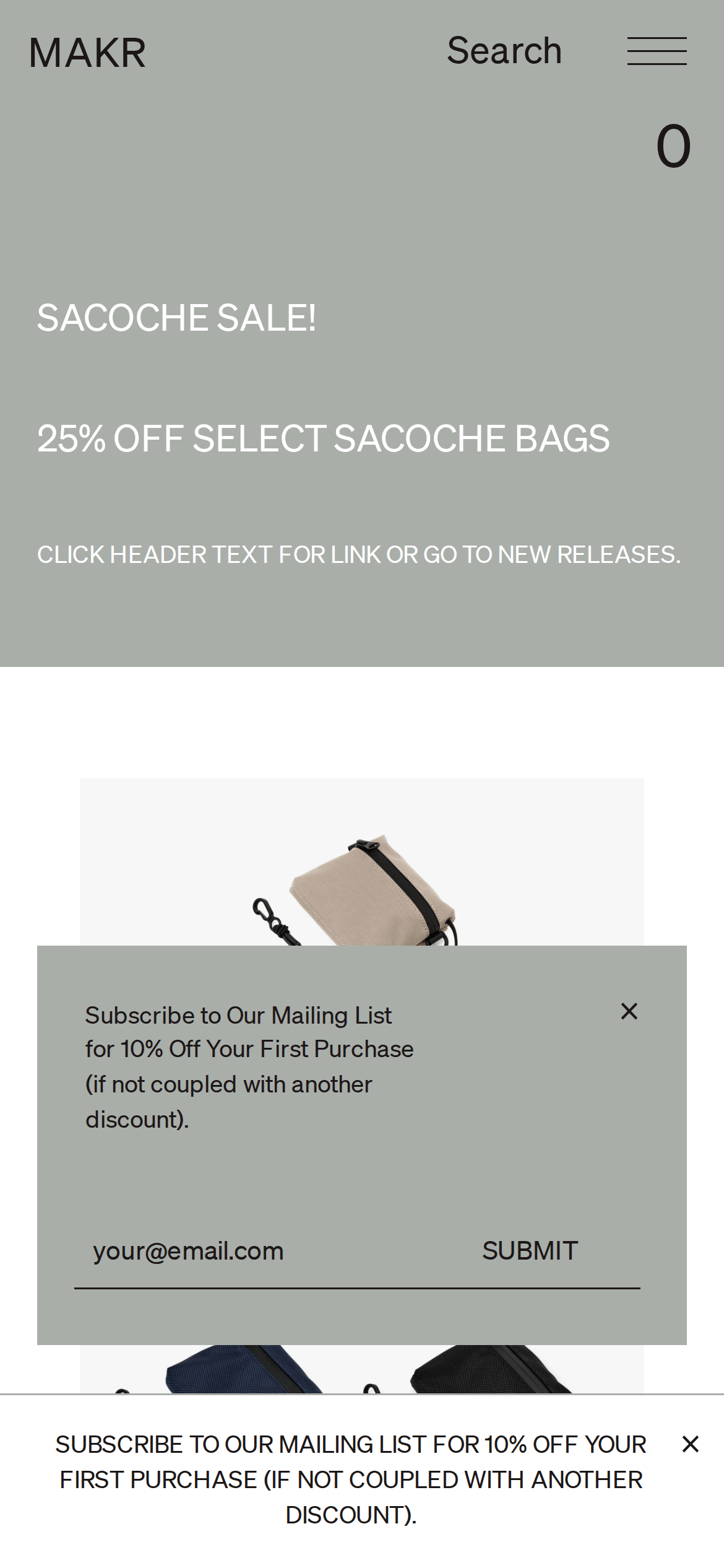
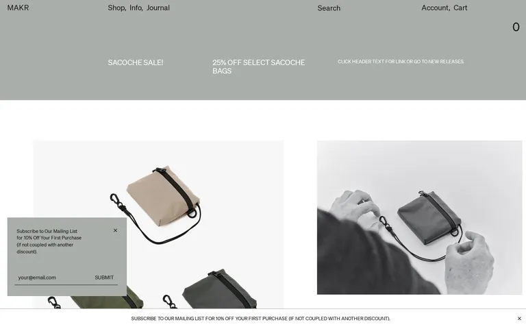
A refined e-commerce interface for premium bags and goods, characterized by a restrained palette, clean typography, and large-scale product photography.
Use uppercase for all secondary labels and promotional text · Maintain a regular weight (400) for all text elements to preserve a clean, uniform appearance · Keep line-height tight for headlines and open for body copy to ensure readability
04
Spacing
4px
8px
16px
24px
32px
48px
64px
96px
A strict 4px-based system that provides consistent spacing, with larger multiples used to define major content blocks and margins.
05
Surfaces
sm · 2px
md · 4px
lg · 8px
pill · 999px
1px solid #1C1717 for inputs and dividers
rgb(128, 128, 128) 0px 0px 5px 0px
06
Layout
1280container
12columns
24pxgutter
768 / 1024breakpoints
A clean, vertical-scroll layout that relies on large full-width image blocks and generous whitespace to guide the eye.
07
Motion & Interaction
100msmicro
150mssmall
200msmedium
cubic-bezier(0.55, 0.06, 0.68, 0.19)easing
Quick color transitions for interactive states · Subtle opacity fades for secondary UI elements
Subtle color transitions on text links and interactive elements · Immediate response with no visible state change beyond the transition
08
Components
buttonMinimal text-based buttons with no background or border, relying on text transform and hover transitions.
cardLarge, borderless image-based cards that prioritize product photography over textual metadata.
chipMinimalist uppercase text labels used for navigation and promotional banners.
inputSingle-line text inputs with a 1px bottom border and no background fill.
heroFull-bleed image or color block (like the sage green section) with large-scale typography overlay.
09
Voice & Don'ts
ToneDirect, utilitarian, and understated
HeadlinesShort, punchy, and often in all-caps to denote importance
CTAsSimple, action-oriented text without heavy button styling
Don't use decorative or script fonts — the screenshot shows a consistent use of neutral, geometric sans-serifs.
Don't use a wide array of colors — the screenshot shows a very limited palette of white, dark ink, and a single muted green.
Don't use heavy drop shadows or 3D effects — the screenshot shows a very flat, clean UI with almost no shadows.
Don't use busy backgrounds or patterns — the screenshot shows solid colors and large-scale product photography.
Don't use complex button shapes — the screenshot shows minimal, text-based interactive elements.
Don't use justified text — the screenshot shows left-aligned text for all content blocks.
Captured from the live site · real computed styles
11
System prompt
Makr.com is a premium e-commerce site for bags and goods. It uses a refined, minimalist aesthetic with a neo-grotesque sans-serif body font (Sohne) and a more geometric display font (Akzidenz Grotesk). The color palette is strictly neutral, dominated by #FFFFFF, #1C1717, and a muted sage green (#A9AFA9). The layout is spacious, relying on large-scale photography and generous whitespace. Key don'ts: avoid high-chroma colors, avoid decorative fonts, and avoid heavy UI elements like thick borders or drop shadows. The overall feel is one of quiet luxury and utilitarian craft.
Bring this taste to your agent
Hand your AI agent a machine-readable spec of this design — tokens, type, motion, the whole DNA.