← OpenDesign CURATED · OPEN · FREE
Glein Wien
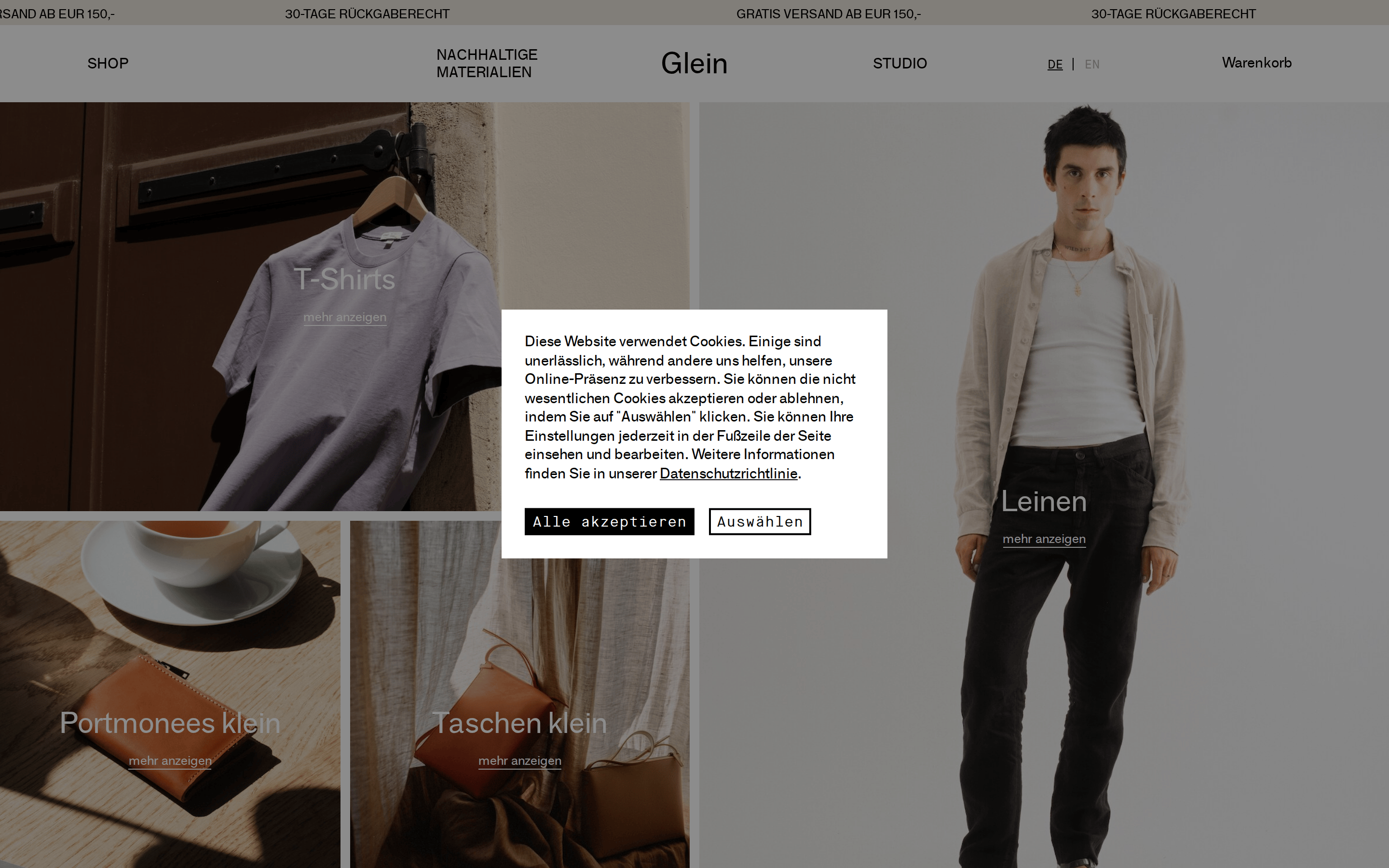
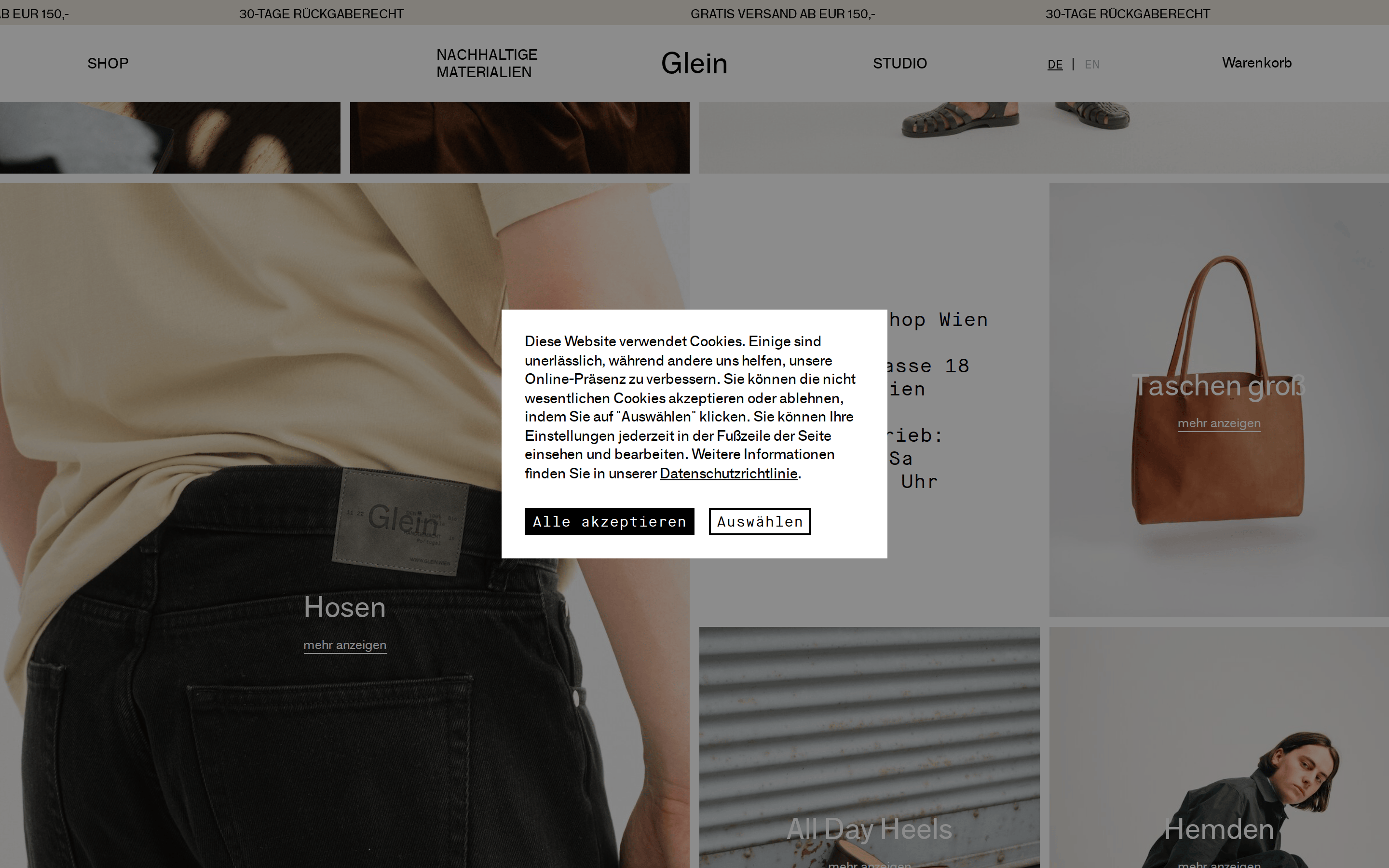
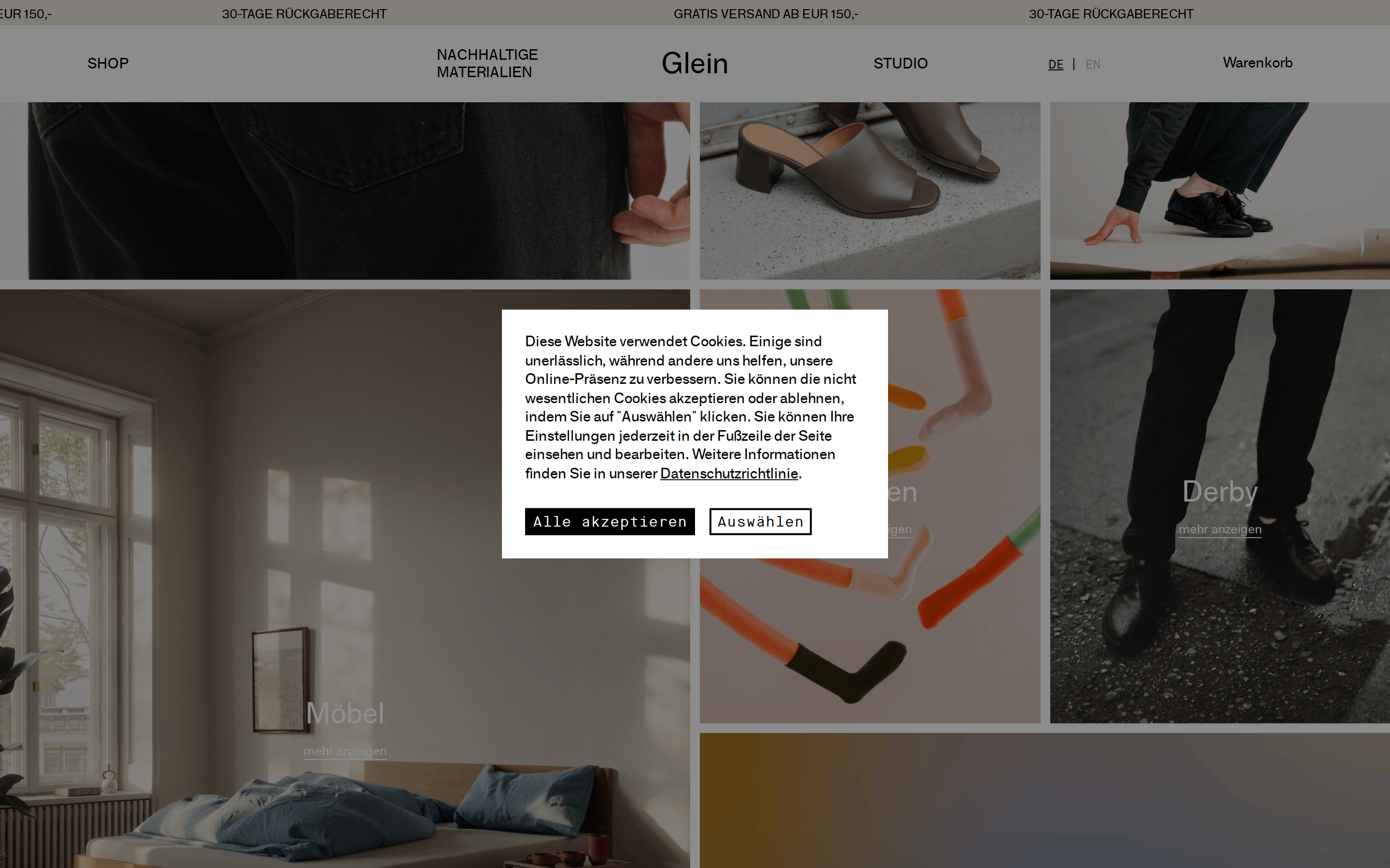
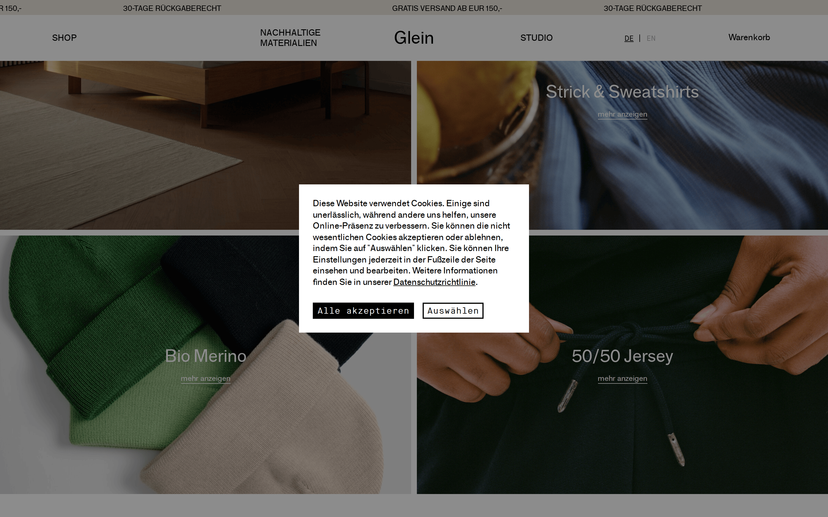
A minimalist, editorial-style e-commerce site emphasizing sustainable materials through high-quality photography and restrained typography.
Editorial Photographic Product Premium Clean
01
Identity DNA
minimalist sustainable lifestyle editorial premium
A curated gallery of material-focused lifestyle goods.
02
Color
#000000Ink
#ffffffBG
#b3b3b3Muted
rgba(0,0,0,0.1)Line
Strict monochrome palette (black, white, light gray) serving as a neutral canvas for large, high-quality editorial photography.
03
Typography
grotesque-sans · monospace
display 111px · 400heading 30px · 400body 15px · 400small 13px · 400Uppercase used extensively for navigation and utility links. · Standard weight (400) used across all typographic elements.
04
Spacing
4px
8px
16px
24px
32px
48px
64px
96px
Generous whitespace and tight internal padding, often relying on image composition rather than strict grid spacing.
05
Surfaces
sm · 0px
md · 0px
lg · 0px
pill · 999px
Minimal; predominantly single-pixel lines used for buttons, links, and subtle dividers.
06
Layout
1440 container
12 columns
16px gutter
768 / 1024 breakpoints
Asymmetric masonry grid dominated by large-scale hero images, adapting to a single-column stack on mobile.
07
Motion & Interaction
100ms micro
250ms small
500ms medium
cubic-bezier(0.25, 0.1, 0.25, 1) easing
Subtle opacity transitions on interactive elements. · Color transitions on hover states.
Subtle color or opacity shifts; minimal visual feedback. · Standard pointer cursor and immediate response.
08
Components
button Minimalist; text-only with monospace font or simple bordered rectangles for primary actions. card Image-driven containers with text overlays, lacking traditional card borders or backgrounds. chip None visible. input Standard minimal form elements (implied by cookie modal). hero Full-bleed or large-panel editorial photography with overlaid category titles and minimal 'mehr anzeigen' links. 09
Voice & Don'ts
Tone Quiet, understated, and refined. Headlines Large, clean, and minimalist, often overlaying imagery. CTAs Understated, often underlined text links rather than prominent buttons. don't use saturated accent colors — screenshot shows a strictly monochrome (black/white/gray) palette. don't use bold font weights — screenshot shows standard weight (400) used exclusively across all text. don't use decorative or handwritten fonts — screenshot shows clean, geometric grotesque-sans and functional monospace. don't add rounded corners to cards or buttons — screenshot shows sharp, 0-radius edges. don't use prominent drop shadows — screenshot shows flat, clean surfaces without depth effects. don't clutter the interface with dense text blocks — screenshot shows a highly visual, photography-driven layout with minimal copy. don't use bright, colorful backgrounds — screenshot shows mostly white or photographic backgrounds. Avoid: Loud, high-contrast call-to-action buttons Avoid: Dense blocks of promotional text Avoid: Bright, saturated color accents Avoid: Complex iconography 10
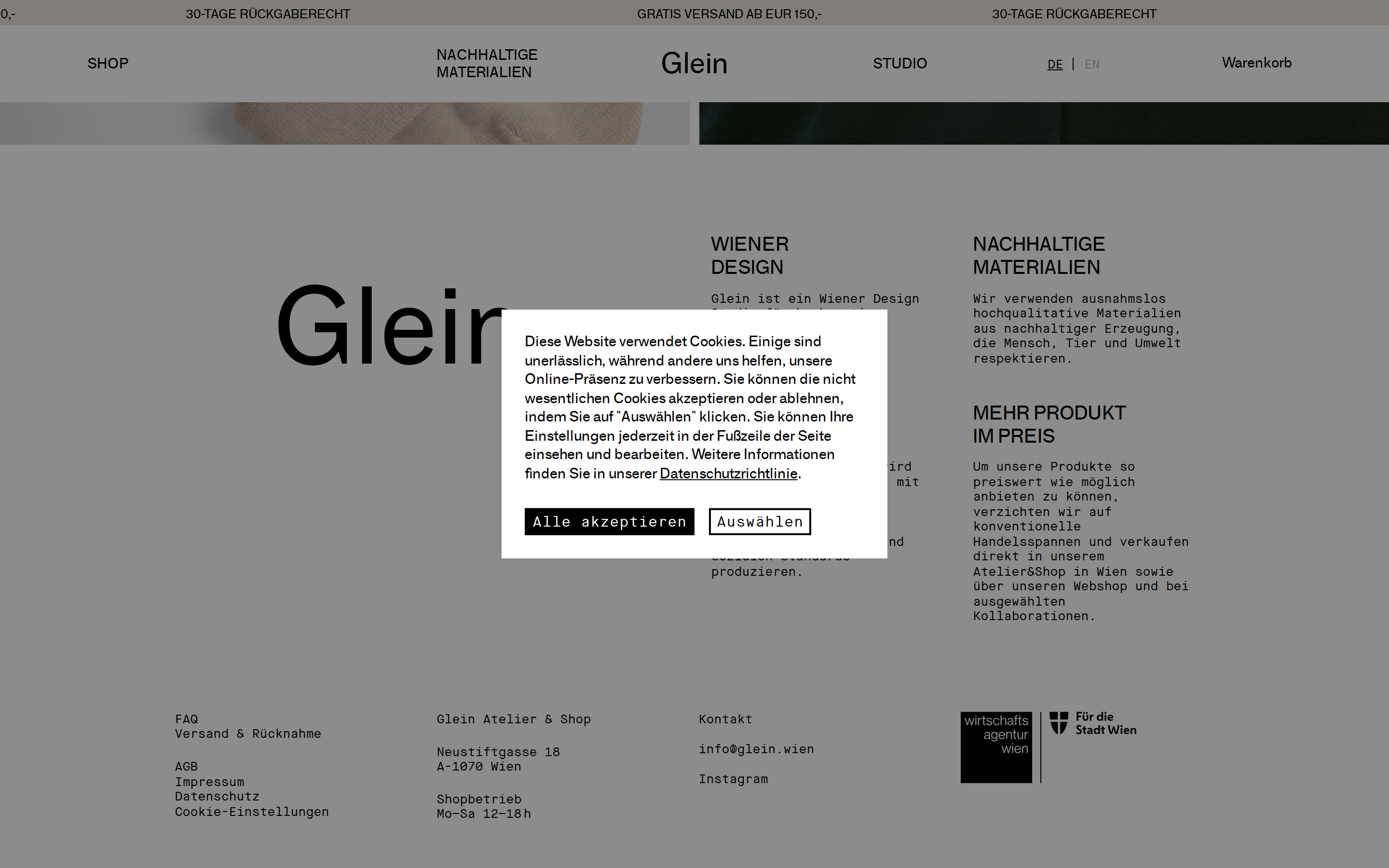
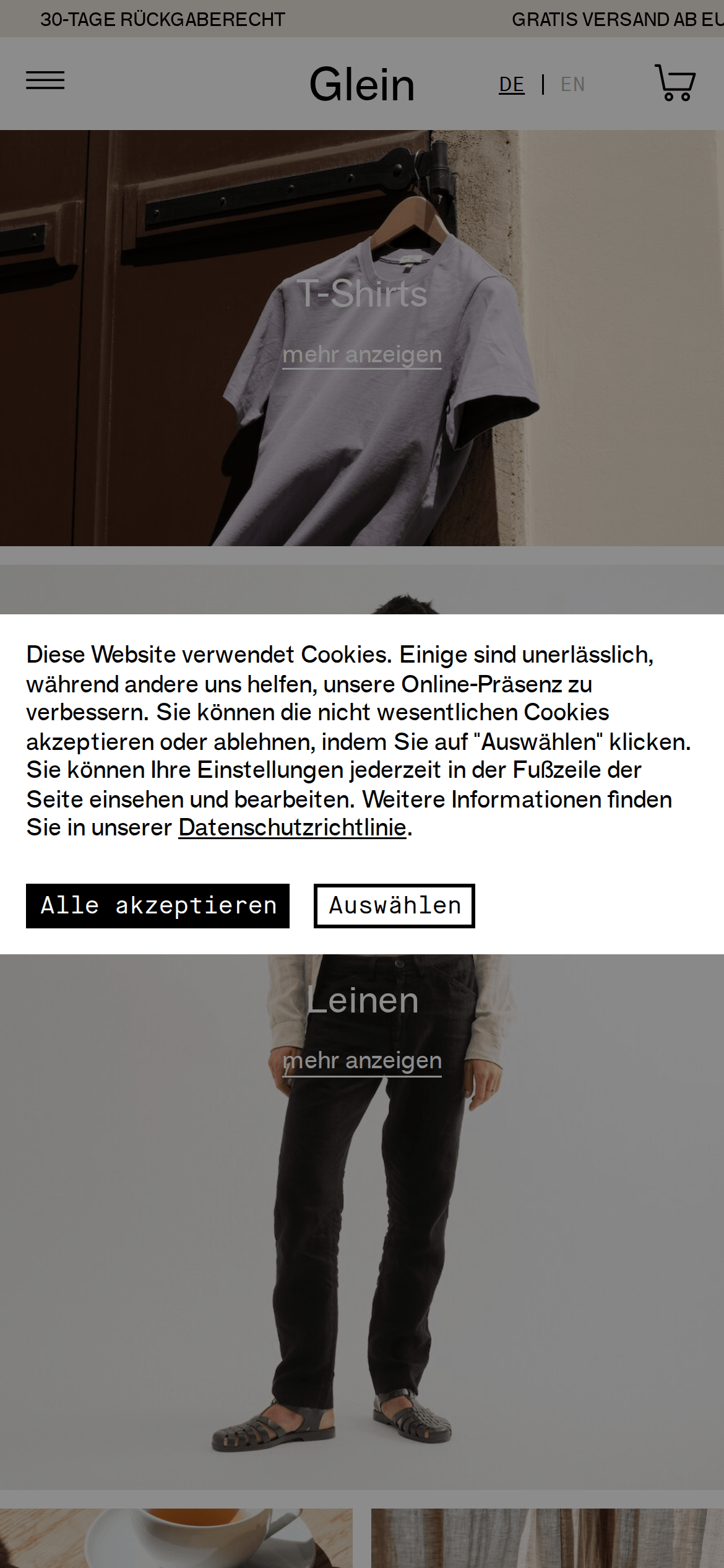
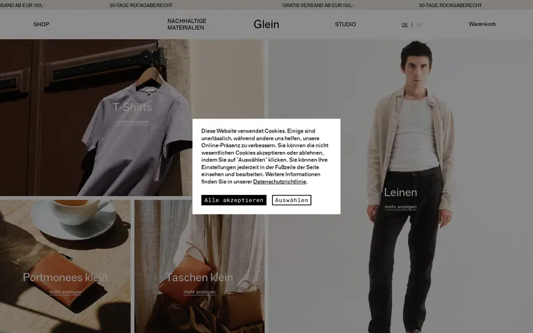
Inside the pack — real screenshots
桌面首屏(hero) 桌面滚动分段(90% viewport 步进,作为视觉证据) 桌面滚动分段(90% viewport 步进,作为视觉证据) 桌面滚动分段(90% viewport 步进,作为视觉证据) 桌面滚动分段(90% viewport 步进,作为视觉证据) 桌面滚动分段(90% viewport 步进,作为视觉证据) 移动首屏 Captured from the live site · real computed styles
11
System prompt
This is a premium, editorial-style e-commerce site for sustainable lifestyle goods. It uses a strict monochrome palette (black, white, #b3b3b3 gray) with sharp, 0-radius corners and zero shadows, creating a flat, minimalist aesthetic. Typography relies on a clean grotesque-sans (F-Grotesk) for display and body text, with a functional monospace (Maison-Neue-Mono) for utility elements; all text is standard weight (400). The layout is a bold, asymmetric masonry grid of large-scale, high-quality editorial photography. Critical donts: never use bold font weights; never add rounded corners or drop shadows; never use saturated accent colors; never clutter the interface with dense text; never use decorative or handwritten fonts; never use bright, colorful backgrounds.
More from the library en · zh-CN · zh-TW · ja · ko
OpenDesign · curated web aesthetics for AI-readable design DNA · opendesign.cc
Why we curated this: Worth including as a masterclass in using restraint, typography, and high-quality photography to create a premium, editorial e-commerce experience.