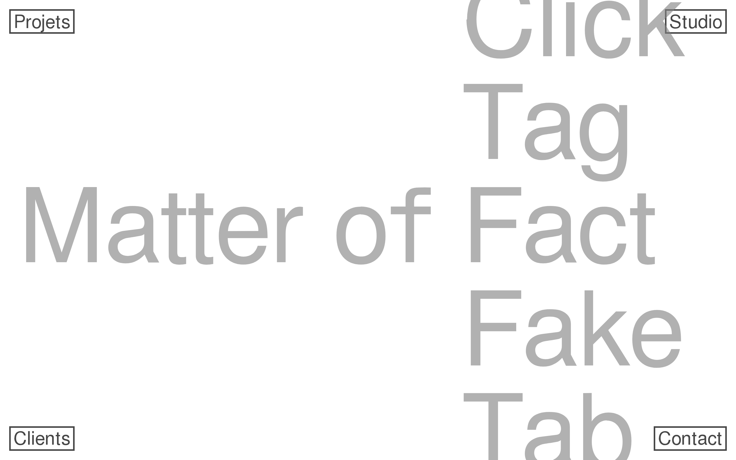
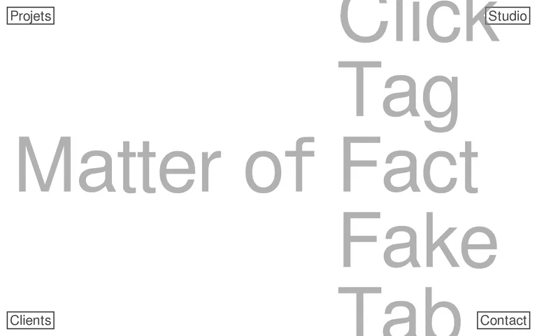
A stripped-back gallery where large-scale typography is the primary exhibit and interaction is reduced to essential, boxed triggers.
02
Color
#000000Ink
#a0a0a0Ink soft
#ffffffBG
#c0c0c0Muted
rgba(0,0,0,1.0)Line
Strict monochrome with black text and borders on a pure white background, using grayscale for visual hierarchy.
03
Typography
grotesque-sans
display160px · 400
h136px · 400
body22px · 400
Use the FreeSans family for all UI and typographic elements · Maintain a font weight of 400 for all text · Keep line height tight at 1.2 for body and subheadings
04
Spacing
4px
8px
16px
18px
24px
32px
48px
64px
Loose, based on a 4px grid with heavy emphasis on 18px and 45px padding for boxed elements.
05
Surfaces
sm · 0px
md · 0px
lg · 0px
pill · 0px
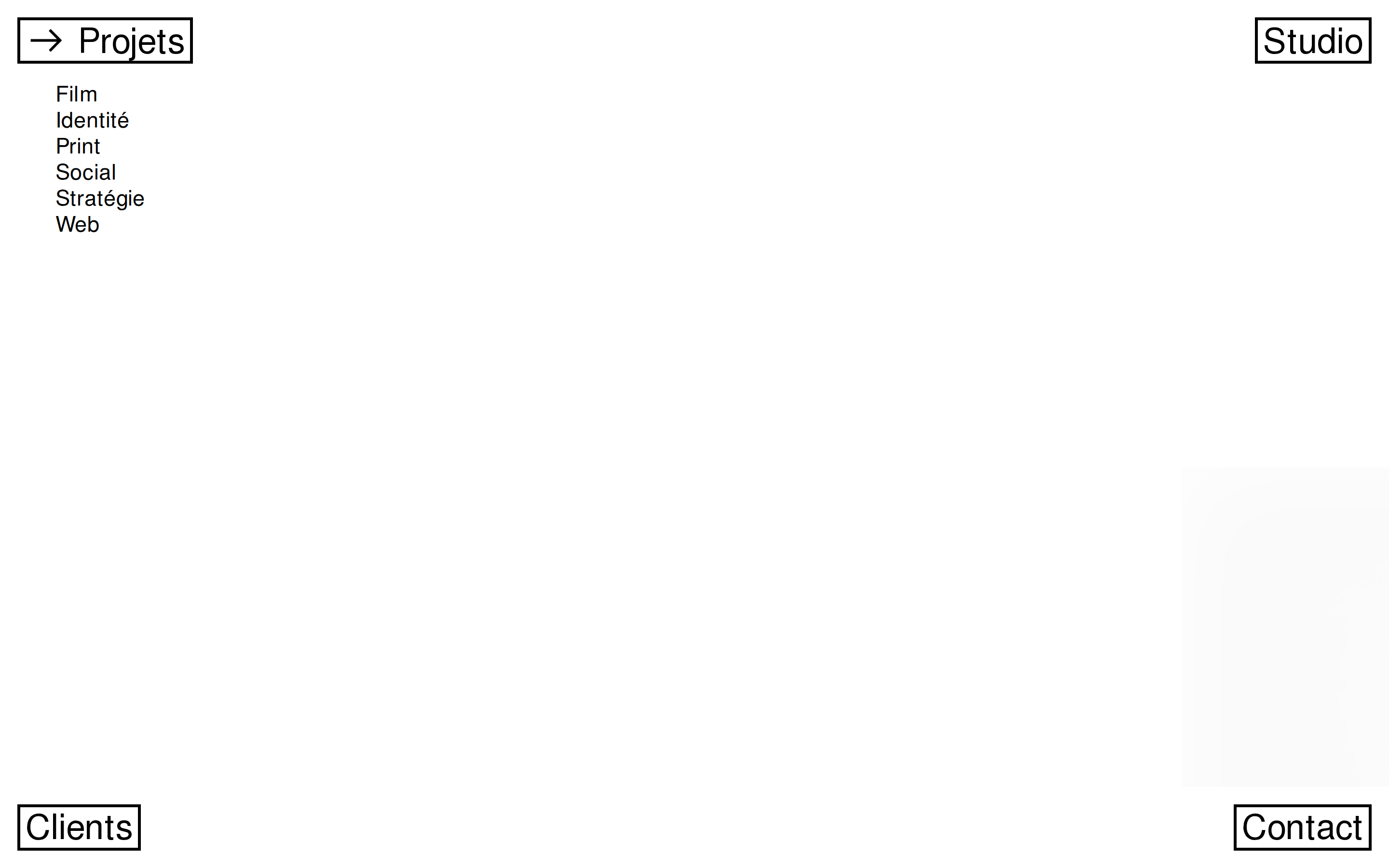
Solid 3px black borders used exclusively for boxed UI elements like buttons and navigation links.
06
Layout
1920container
12columns
18pxgutter
768 / 1024breakpoints
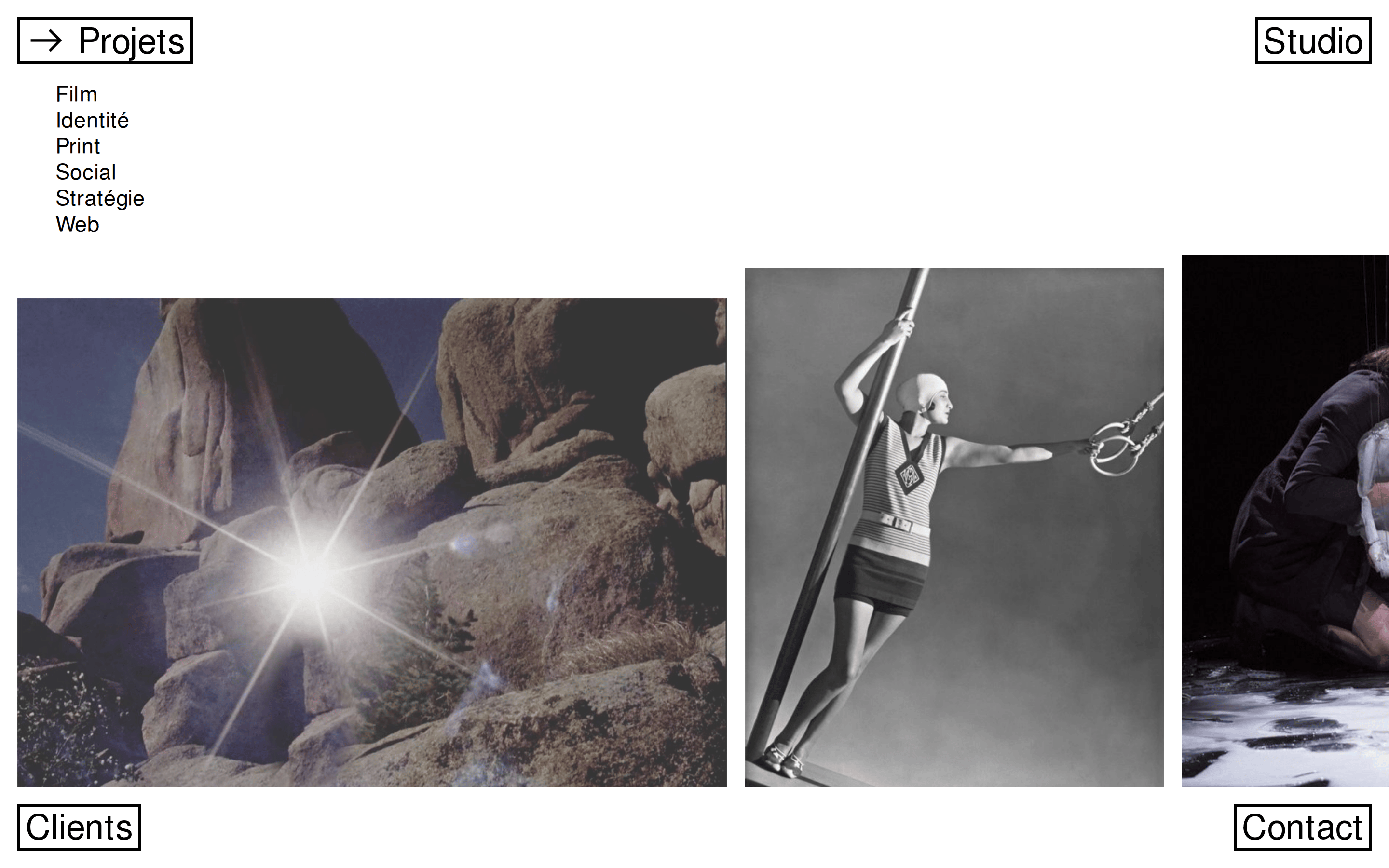
Asymmetric, edge-aligned layout with large typographic blocks pushing against the boundaries and corner-positioned boxed navigation.
07
Motion & Interaction
200msmicro
250mssmall
1000msmedium
cubic-bezier(0.25, 0.1, 0.25, 1.0)easing
transitions on all properties · opacity fading · color changes
Triggered on clickable boxed elements, likely changing text color or border color. · Standard pointer cursor on interactive elements.
08
Components
buttonBare, rectangular boxes with solid 3px black borders and internal padding, resembling basic HTML form elements.
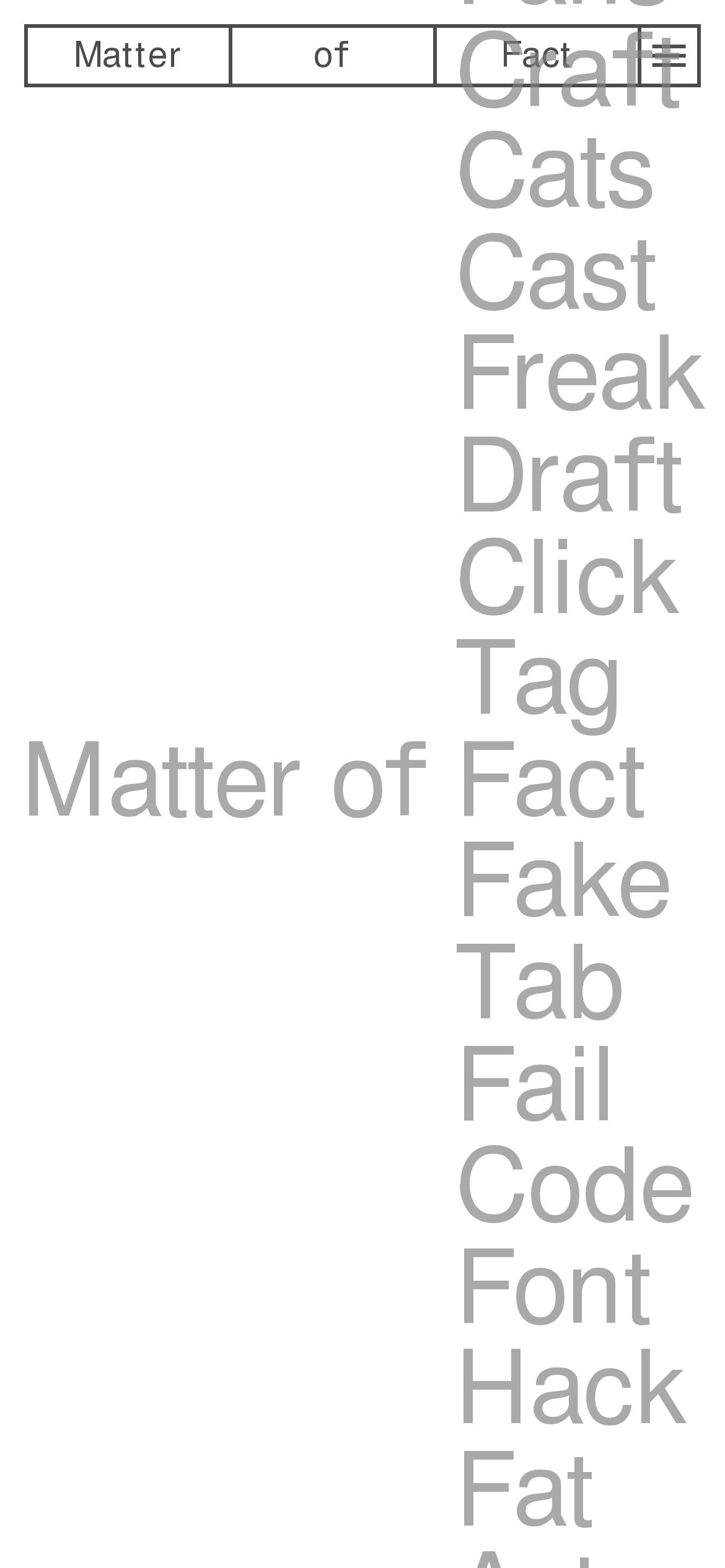
heroDominates the viewport with oversized, flowing typography that acts as a navigational element.
09
Voice & Don'ts
ToneDirect, unfiltered, and slightly confrontational.
HeadlinesPlayful, massive typography using rhyming or repetitive words (Fact, Fake, Tab, Hack).
CTAsBare, functional, and devoid of visual flair.
don't use rounded corners — screenshot shows sharp, 0px rectangular corners on all buttons and elements
don't apply drop shadows — screenshot shows completely flat, borderless UI with no elevation
don't use colored backgrounds — screenshot shows a strictly pure #ffffff white background
don't use decorative sans-serifs with distinct features — screenshot shows a uniform, neutral grotesque-sans
don't center-align all text — screenshot shows aggressively left-aligned and right-aligned typography
don't use bold font weights — screenshot shows all text strictly set to a regular font weight of 400
Captured from the live site · real computed styles
11
System prompt
Matter of Fact is a minimalist French creative studio portfolio that prioritizes raw typographic scale over traditional UI polish. The design is built on a strict black-and-white palette using #000000 ink on #ffffff backgrounds, with a neutral FreeSans typeface maintained at a constant 400 weight. Navigation and interactive elements are reduced to stark, 3px solid black bordered boxes, rejecting all modern embellishments. Critical don'ts: never use rounded corners (the UI is entirely sharp-edged), never apply shadows or gradients (the aesthetic is completely flat), and never use bold font weights (all text remains regular). The layout relies on massive, asymmetric typography to guide the user's eye, creating an expressive and intentionally unpolished feel that feels both raw and highly curated.
Bring this taste to your agent
Hand your AI agent a machine-readable spec of this design — tokens, type, motion, the whole DNA.