Like an art gallery showcasing wearable sculptures, where the jewelry is treated as a piece of contemporary art rather than a traditional accessory.
02
Color
#212123Ink
#000000BG
#FFFFFFBG soft
#A6A6A7Muted
rgba(21,21,23,1)Line
Strict monochrome with high contrast, relying entirely on white typography against black backgrounds or black text against white product grids to create a stark, editorial feel.
03
Typography
geometric-sans
display24px · 400
body16px · 400
caption11px · 400
All text is set in a wide geometric sans-serif · Frequent use of uppercase for headlines and labels · Standardize on a very tight leading for compact text blocks
04
Spacing
4px
8px
16px
24px
32px
48px
64px
96px
Grid-based with tight, deliberate spacing around text and images
05
Surfaces
sm · 0px
md · 0px
lg · 0px
pill · 999px
Thin 1px solid black lines for navigation separators, otherwise no borders, relying on image contrast.
06
Layout
1440container
12columns
24pxgutter
768 / 1024breakpoints
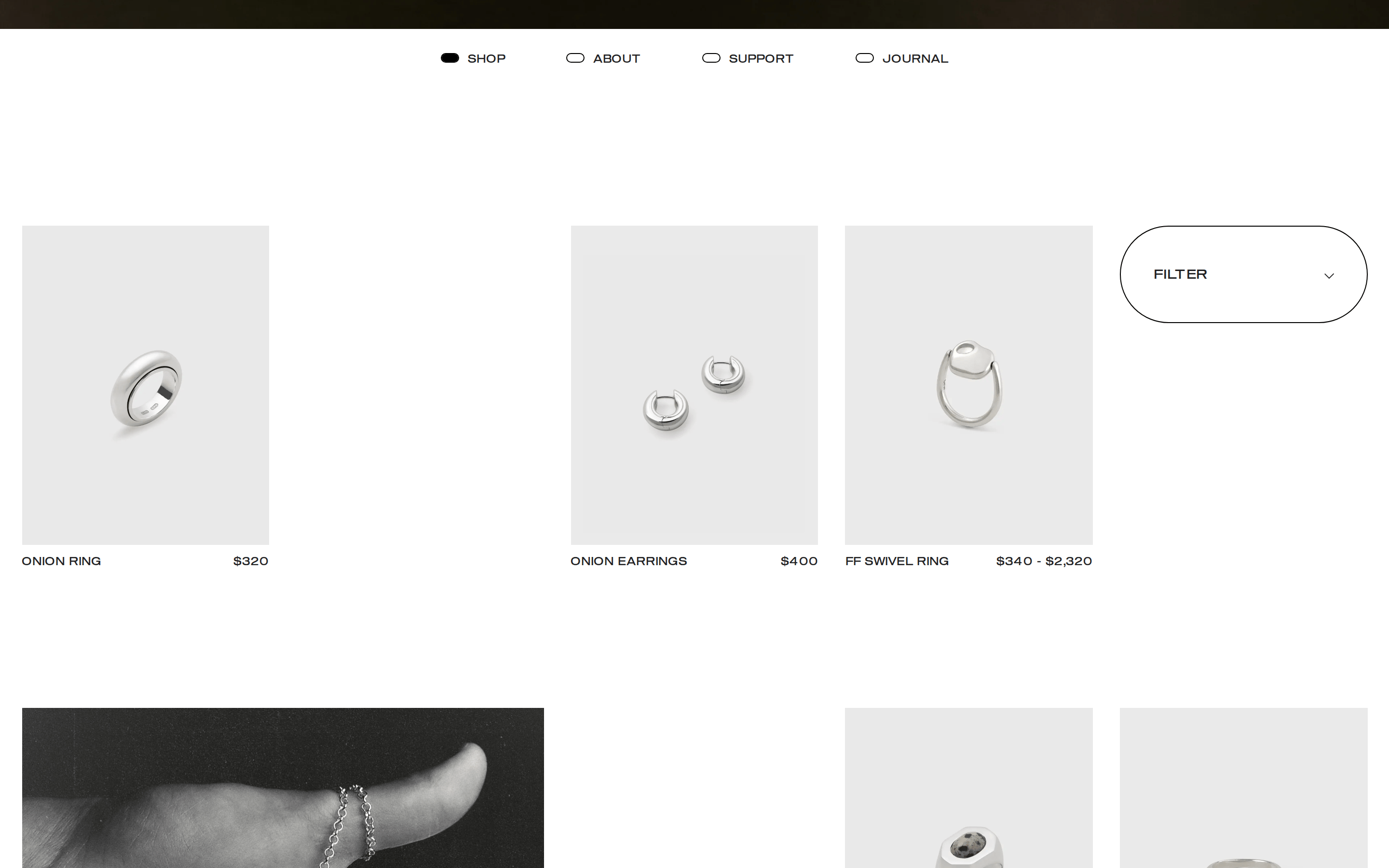
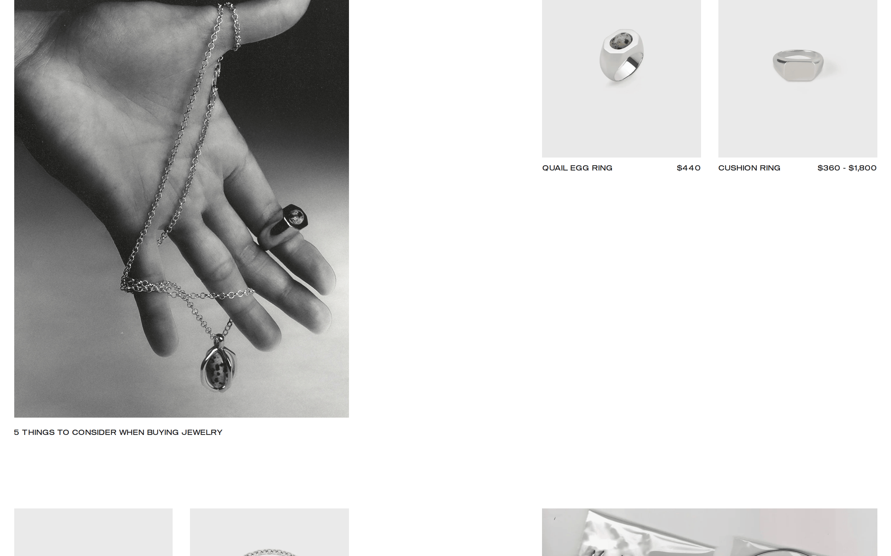
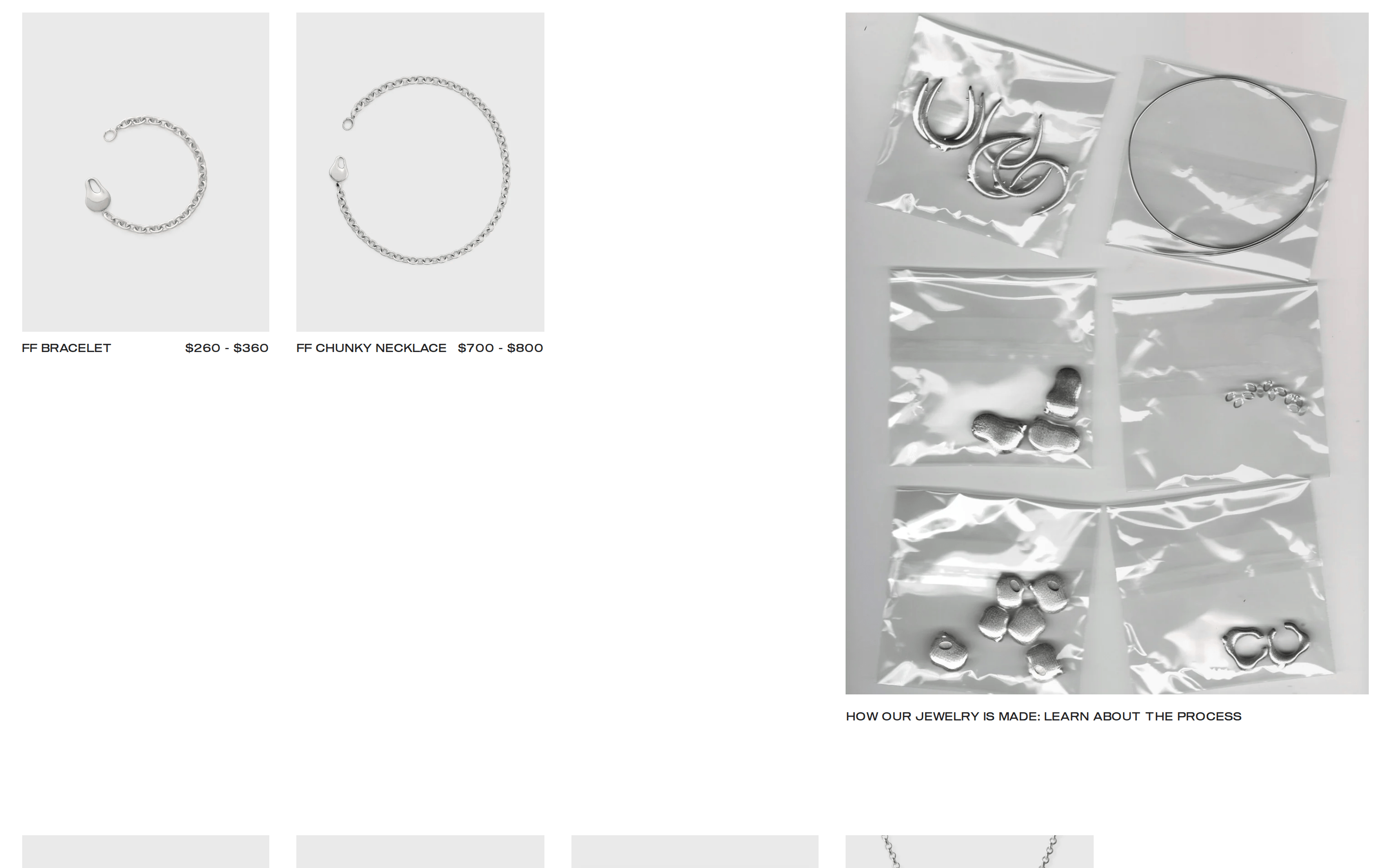
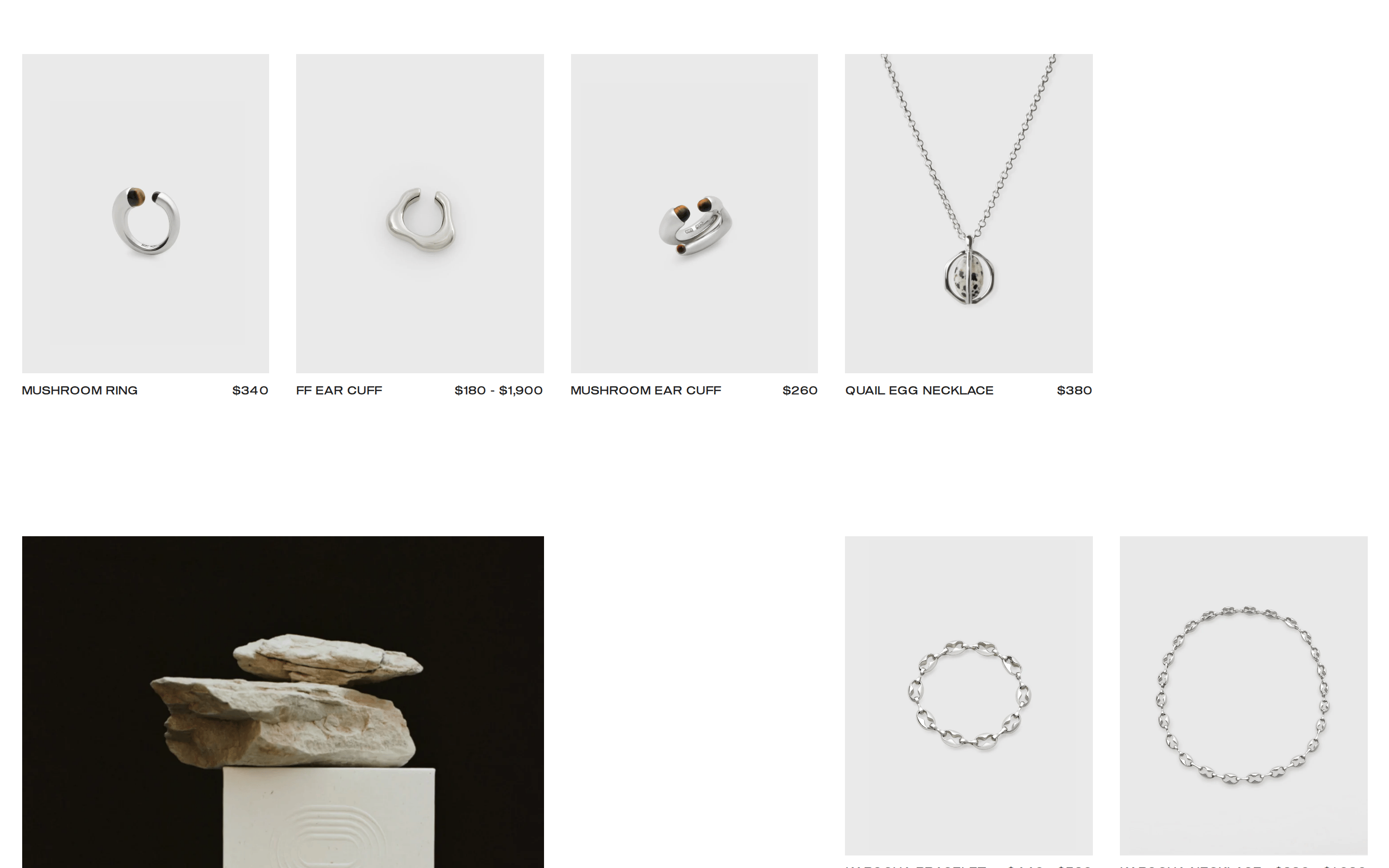
Full-bleed hero imagery followed by a stark two-column asymmetric product grid
07
Motion & Interaction
220msmicro
400mssmall
800msmedium
cubic-bezier(0.12, 0.67, 0.53, 1)easing
fade-in · opacity transitions
Simple opacity transition on clickable elements · Standard cursor change to pointer
08
Components
buttonSimple uppercase text links with a single underline on hover
cardImage-only cards with text labels placed outside the image container
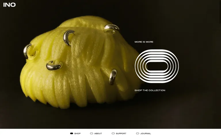
heroFull-screen, full-bleed photographic background with centered white typography and a graphic logo element
09
Voice & Don'ts
ToneMinimal, confident, avant-garde
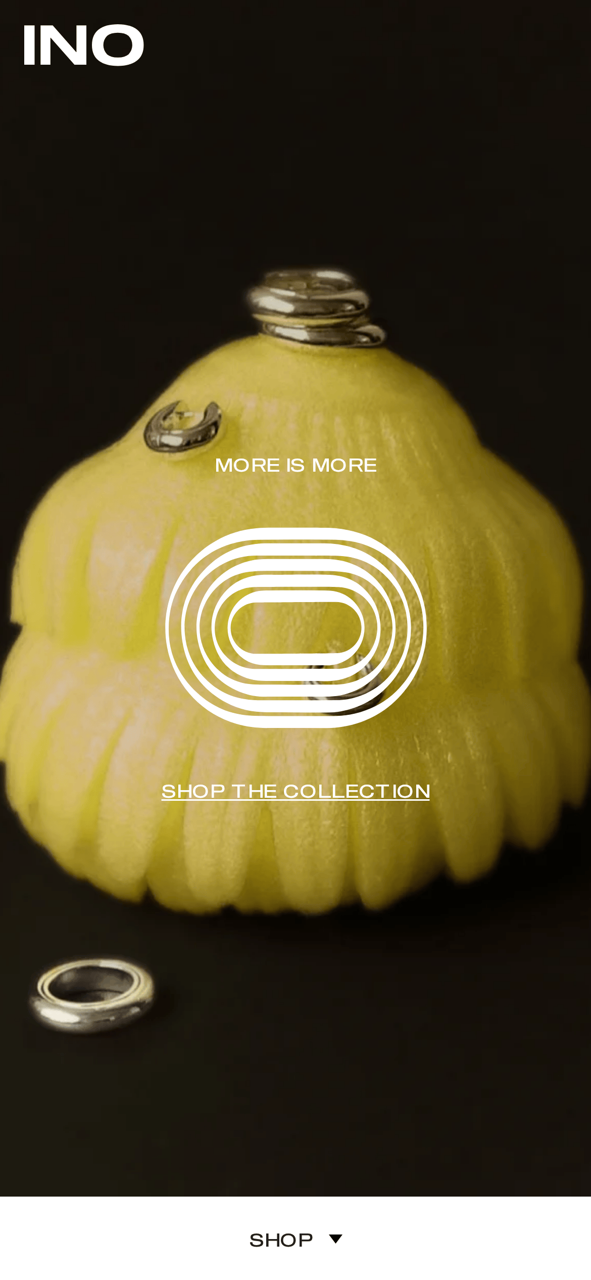
HeadlinesShort, punchy, uppercase statements like 'MORE IS MORE'
CTAsDirect, uppercase, underlined on hover
Don't use warm colors — screenshot shows strictly monochrome (black, white, grey) backgrounds and text
Don't use lowercase text for navigation or headlines — screenshot shows all uppercase for 'SHOP', 'ABOUT', 'MORE IS MORE'
Don't add drop shadows or complex UI styling — screenshot shows flat typography and simple 1px borders
Don't use rounded corners on cards or buttons — screenshot shows sharp edges and standard pill shapes only for specific icons
Don't use decorative or script fonts — screenshot uses only a wide geometric sans-serif
Don't clutter the layout with multiple elements — screenshot shows massive white space and focus on a single large image
Captured from the live site · real computed styles
11
System prompt
This is a premium, avant-garde jewelry e-commerce site. The design DNA is defined by stark, high-contrast photography, strict monochrome color palettes, and a wide geometric sans-serif typeface used in uppercase for a bold, editorial feel. The layout features full-bleed hero images and a clean, asymmetric grid. Key colors are deep black (#000000), pure white (#FFFFFF), and a near-black ink (#212123). Avoid warm colors, decorative fonts, lowercase text for UI elements, complex shadows, rounded corners on cards, and cluttered layouts. The typography should always be wide, geometric, and uppercase for headlines to maintain the brand's strong, sculptural identity.
Bring this taste to your agent
Hand your AI agent a machine-readable spec of this design — tokens, type, motion, the whole DNA.