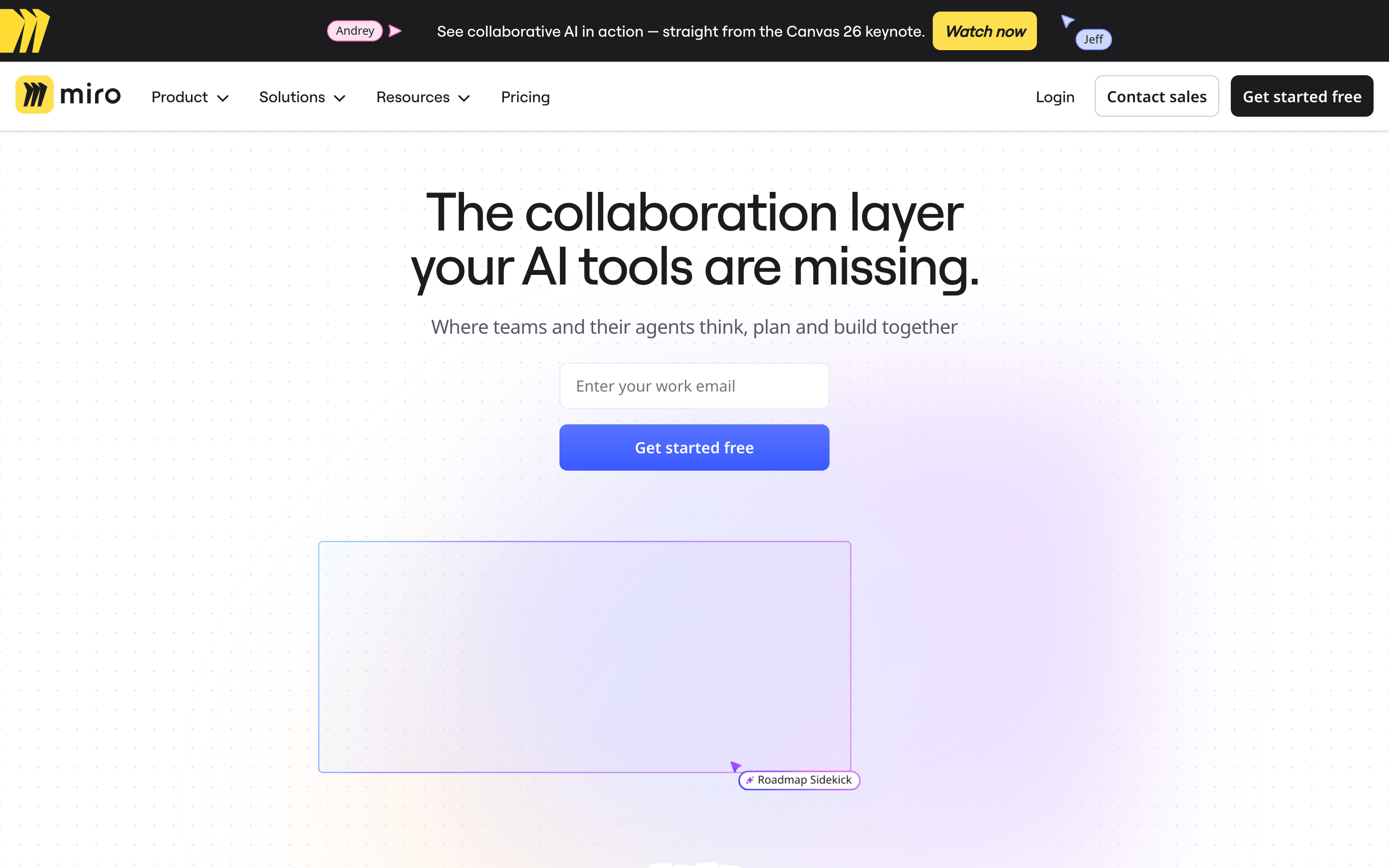
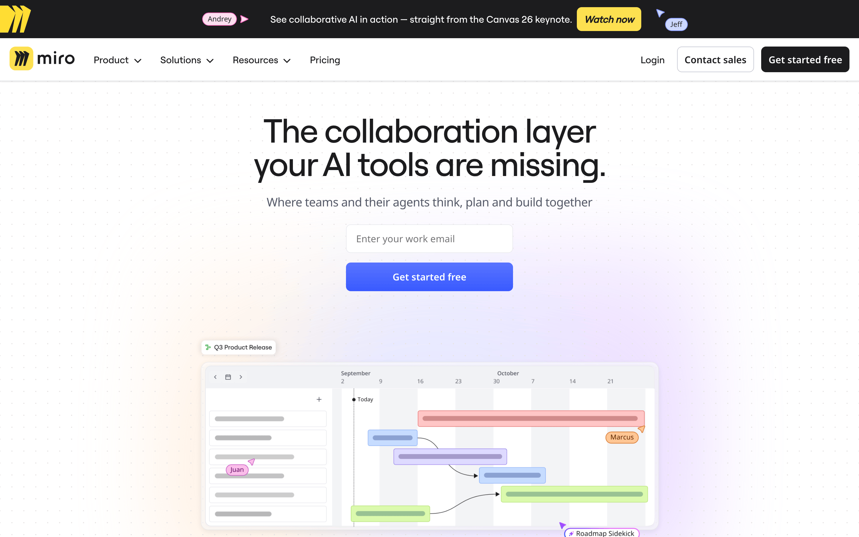
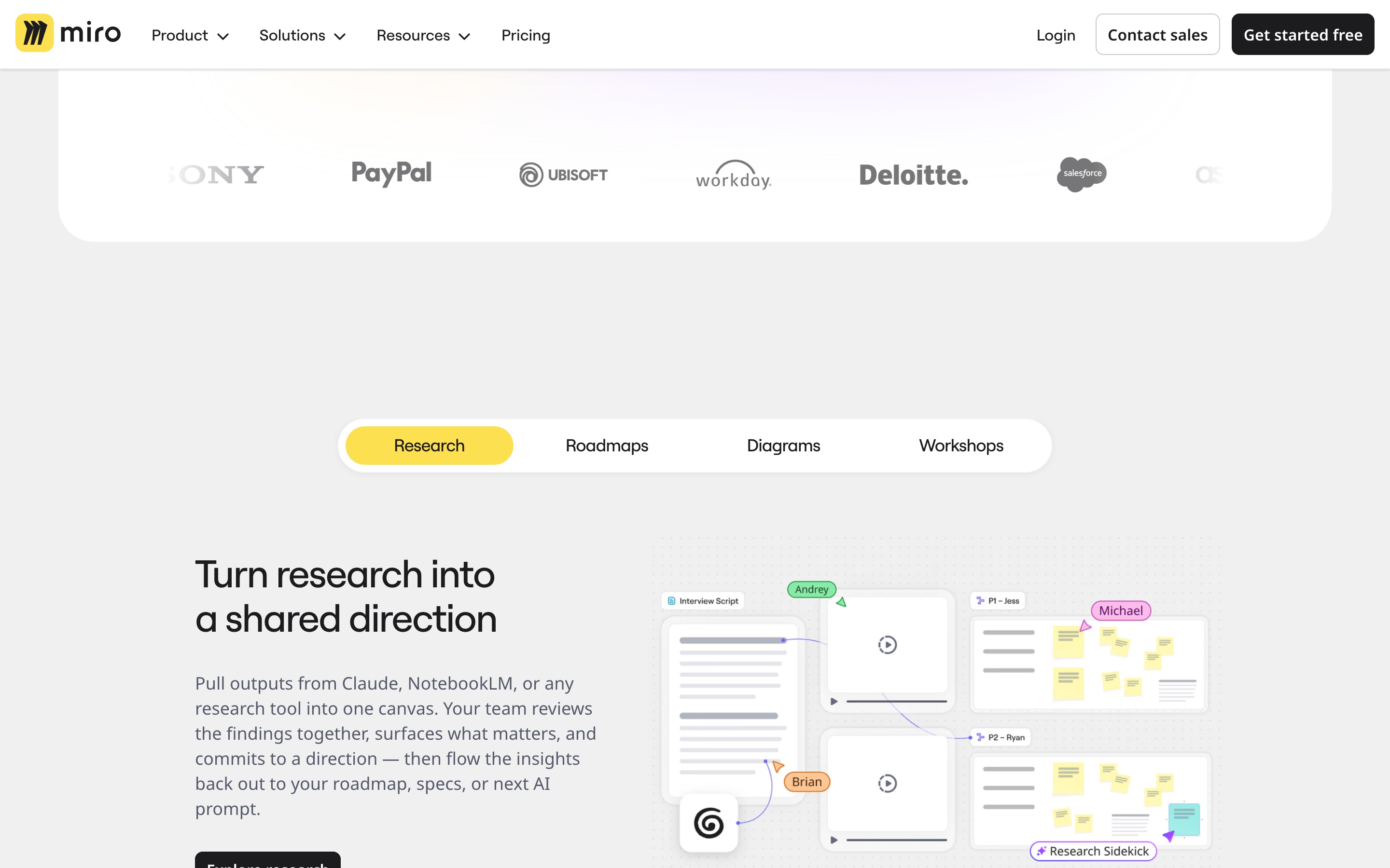
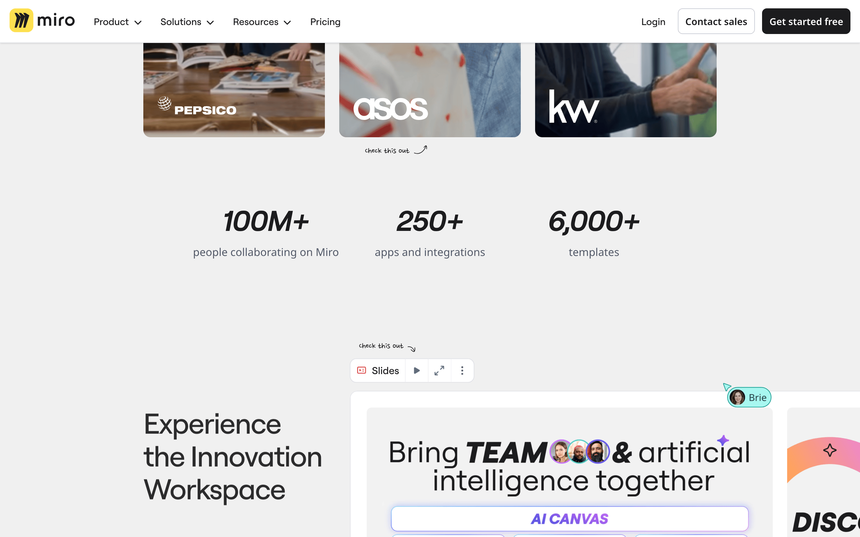
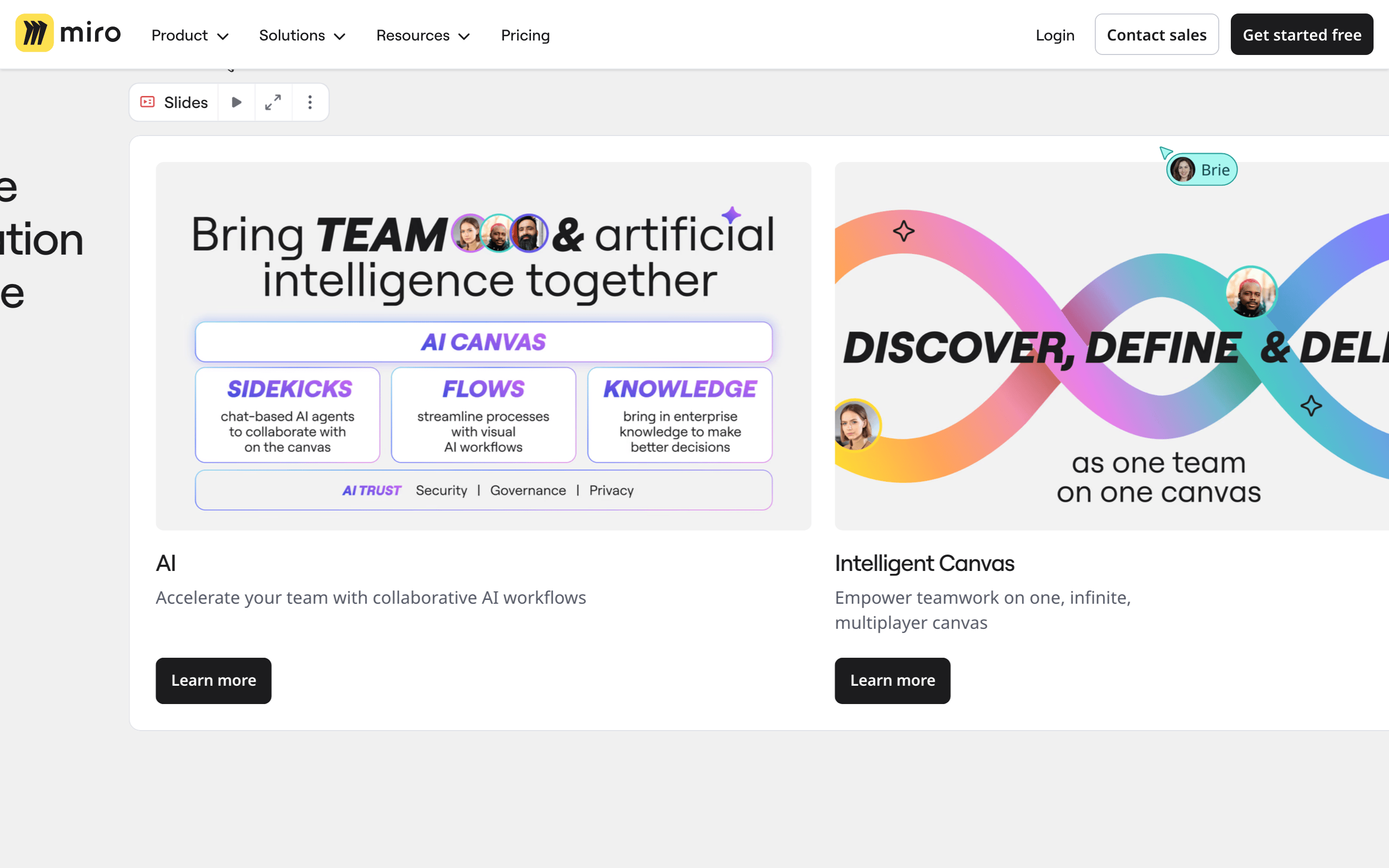
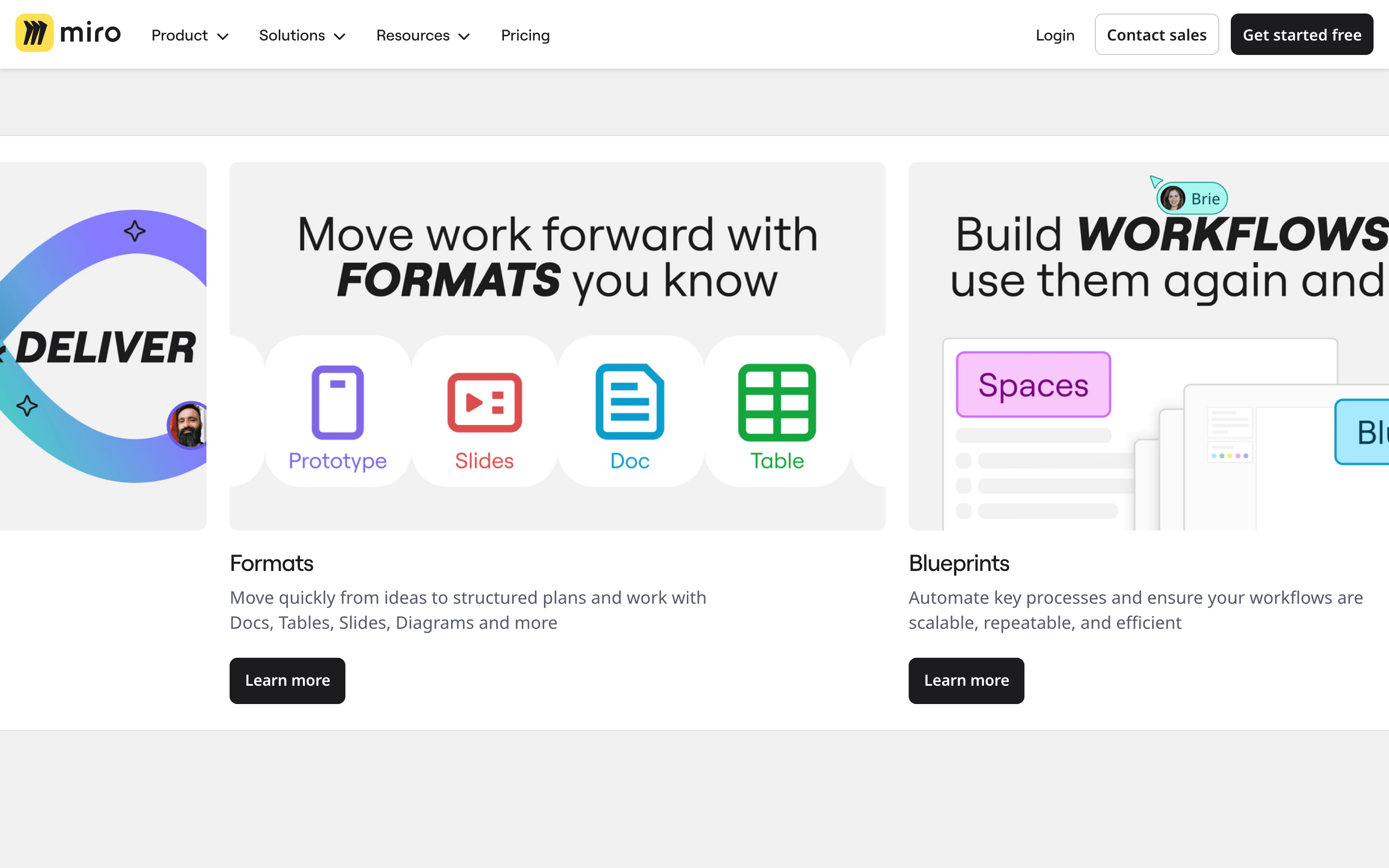
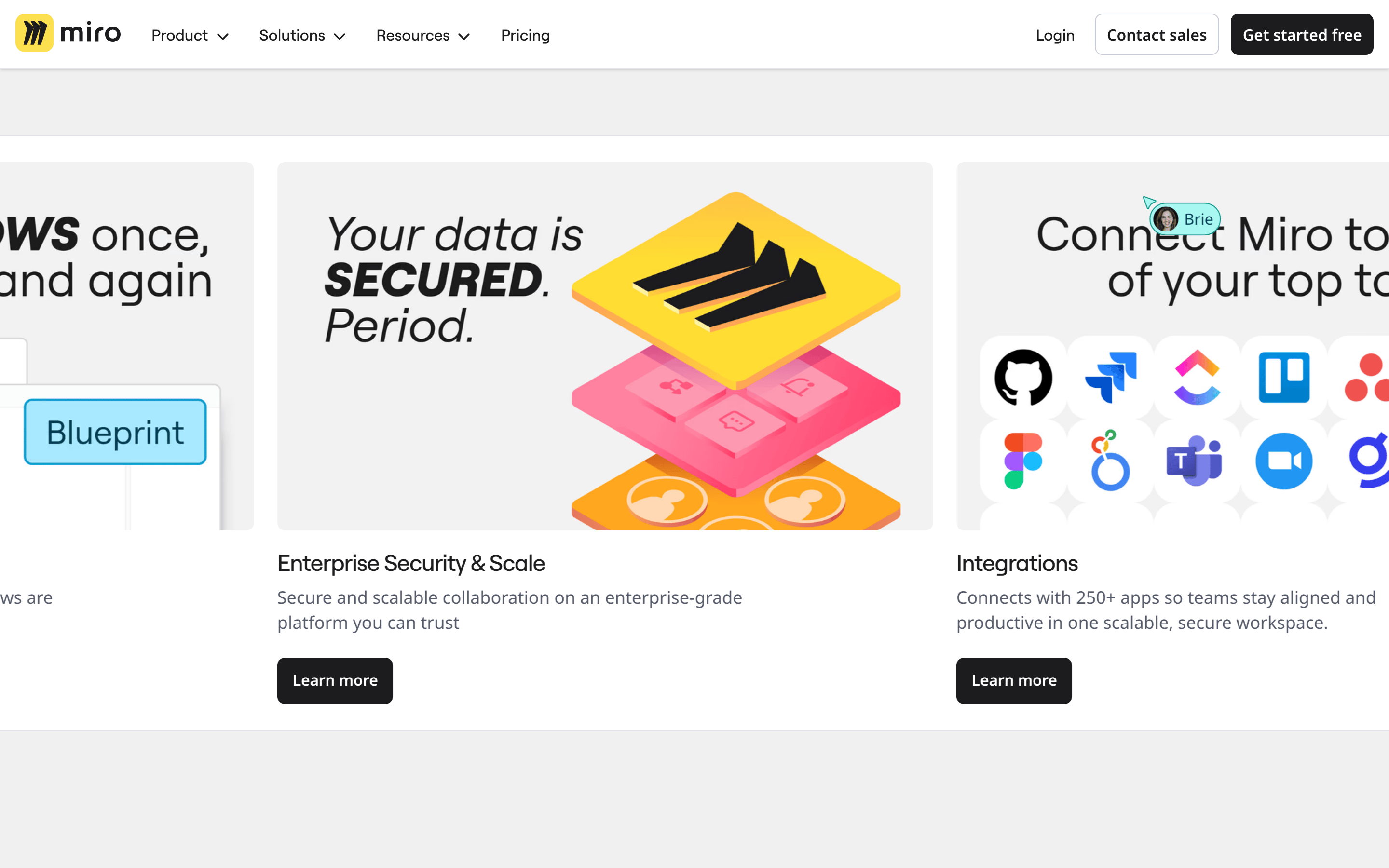
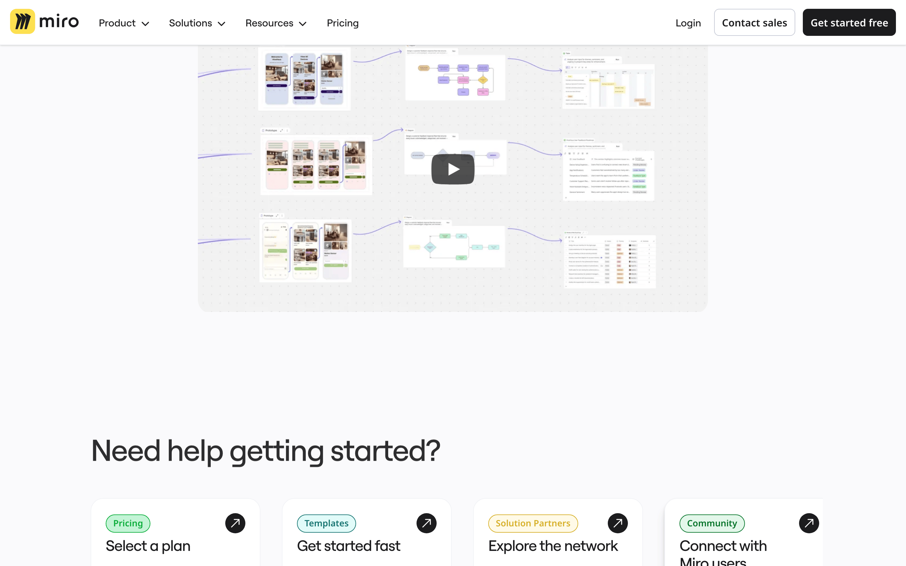
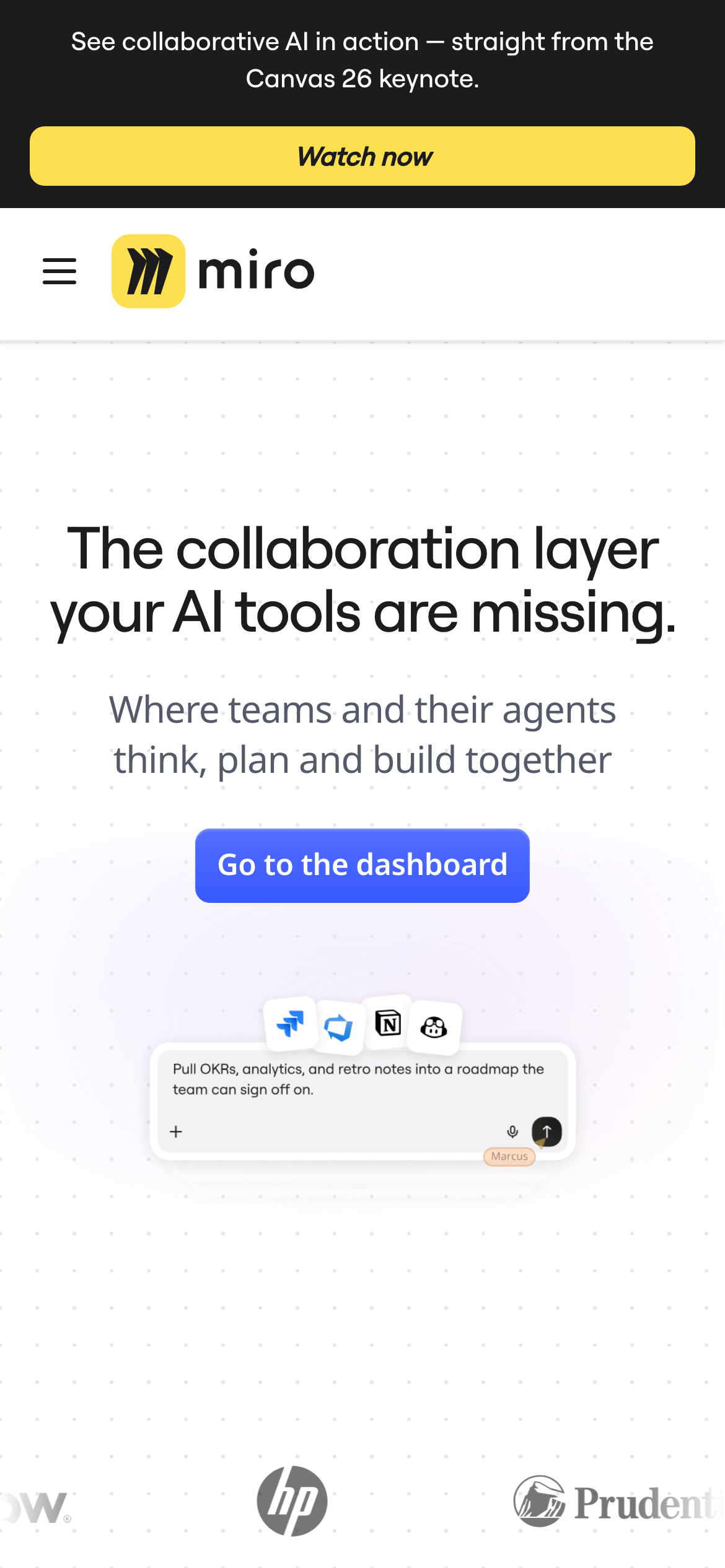
A digital whiteboard that serves as the central nervous system for team ideation and AI agent collaboration.
02
Color
#4B5BF0Accent
#1C1C1EInk
#555A6AInk soft
#FFFFFFBG
#F0F0F0BG soft
#F5F5F5BG quiet
#C7CAD5Muted
rgba(0,0,0,0.1)Line
Clean white canvases with high-contrast dark text for readability, using a singular vibrant blue for primary actions and soft grays for structure.
03
Typography
humanist-sans · monospace
display56px · 500
h148px · 500
h224px · 600
body16px · 400
small12px · 400
Use font-weight 500 for display headlines to maintain a friendly but professional feel. · Apply negative letter-spacing (tracking) to larger headlines to tighten the visual rhythm. · Body text remains at a neutral 400 weight with generous line-height for readability.
04
Spacing
4px
8px
12px
16px
20px
24px
32px
40px
48px
64px
80px
96px
Base-4 grid with consistent 8px and 16px intervals for internal padding and component gaps.
05
Surfaces
sm · 4px
md · 8px
lg · 12px
xl · 20px
pill · 999px
Subtle 1px borders used sparingly for input fields and cards.
Captured from the live site · real computed styles
11
System prompt
Miro is a collaborative whiteboard SaaS platform. Its visual identity is defined by a clean, light-mode aesthetic (white #FFFFFF and gray #F0F0F0 backgrounds) with high-contrast dark ink (#1C1C1E) for maximum readability. The primary accent color is a vibrant blue (#4B5BF0) used for interactive elements. Typography is humanist-sans with tight letter-spacing for headlines. Critical donts: Never use dark mode as the primary interface. Avoid heavy, complex shadows; keep them subtle. Do not use serif fonts or cluttered, multi-column hero sections. Maintain a clean, centered layout that emphasizes whitespace and clear calls to action.
Bring this taste to your agent
Hand your AI agent a machine-readable spec of this design — tokens, type, motion, the whole DNA.