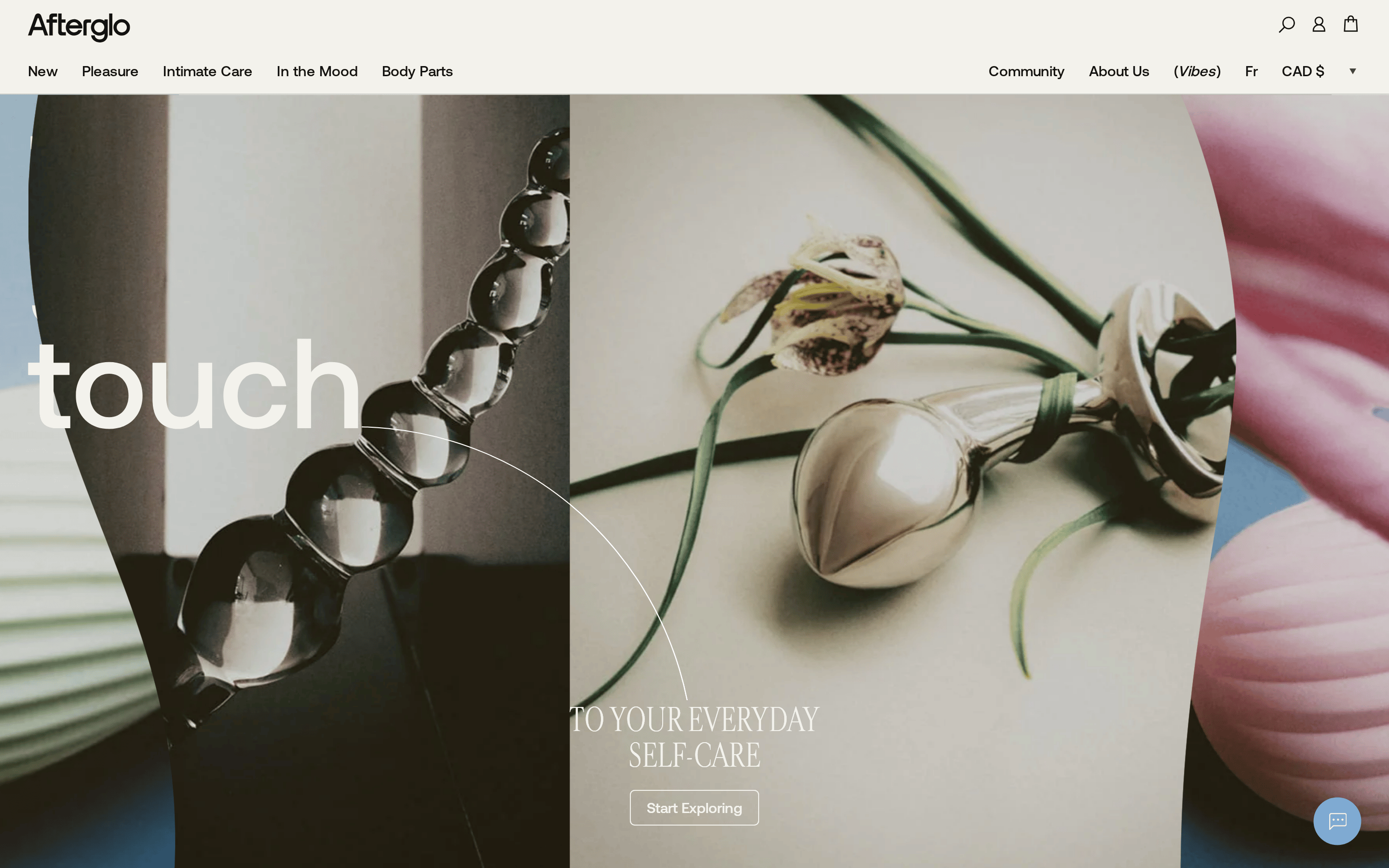
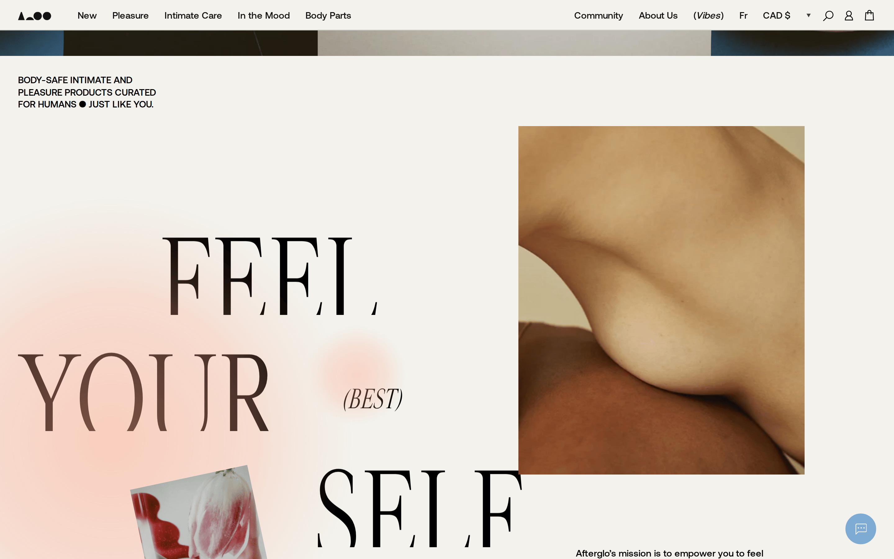
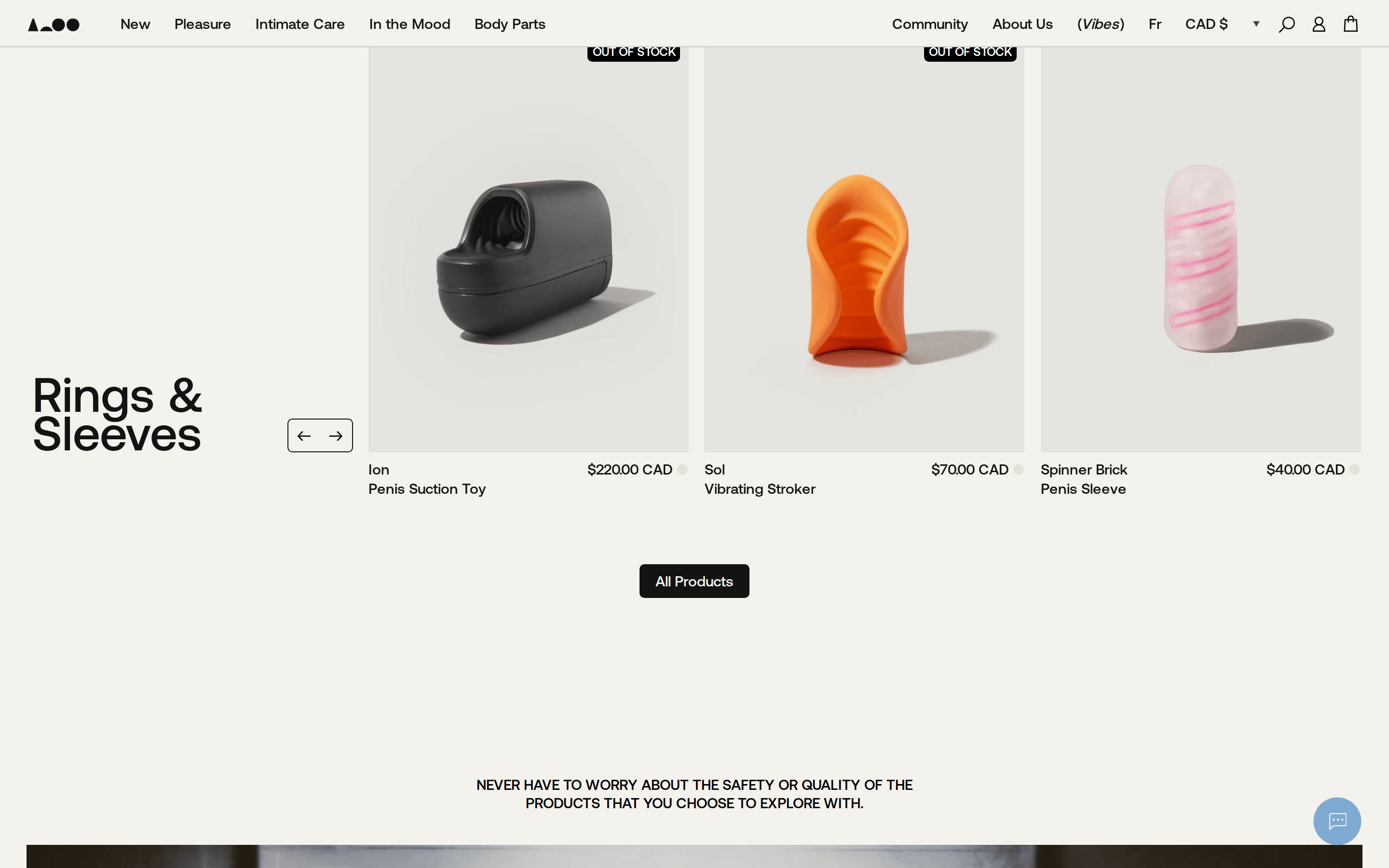
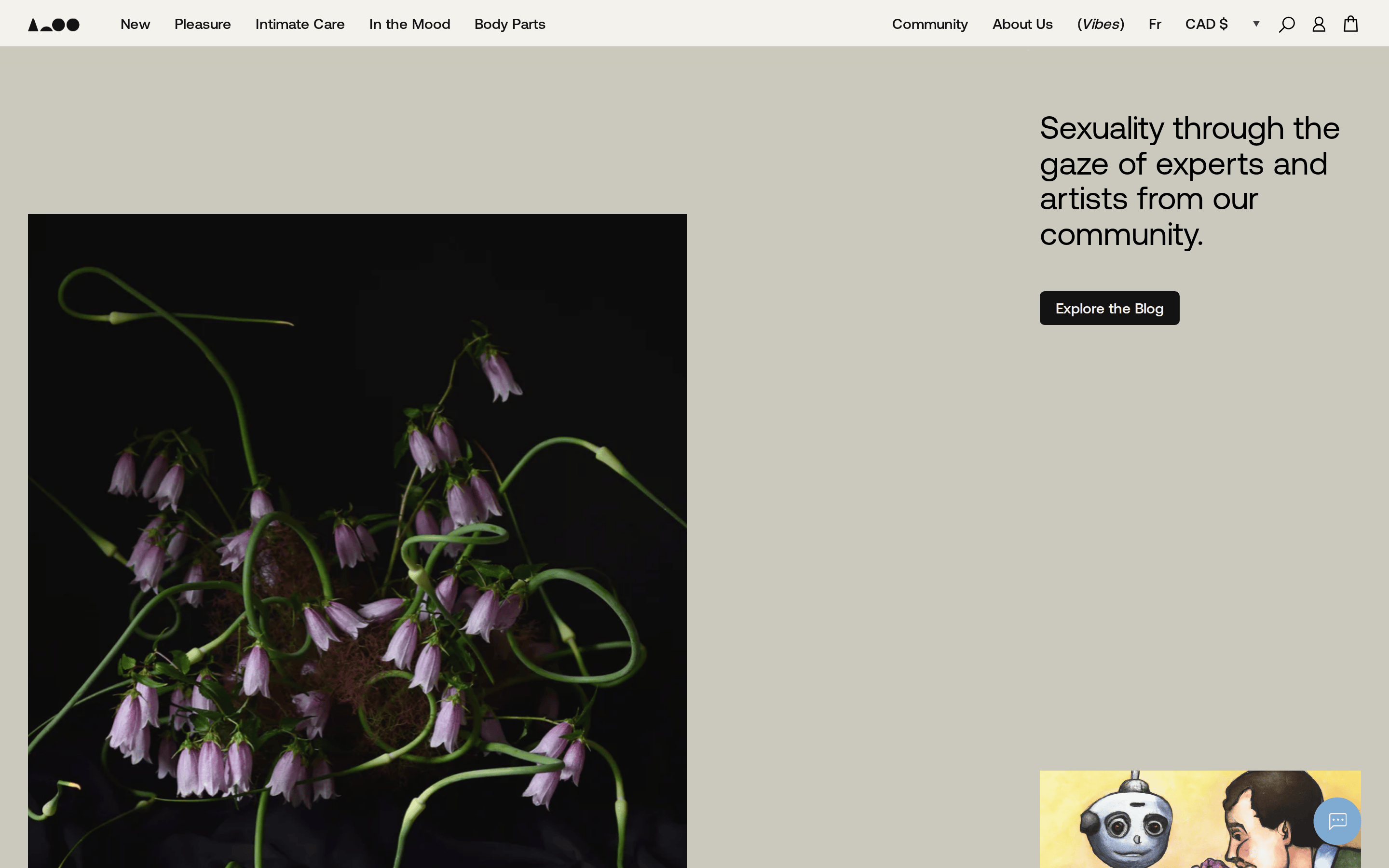
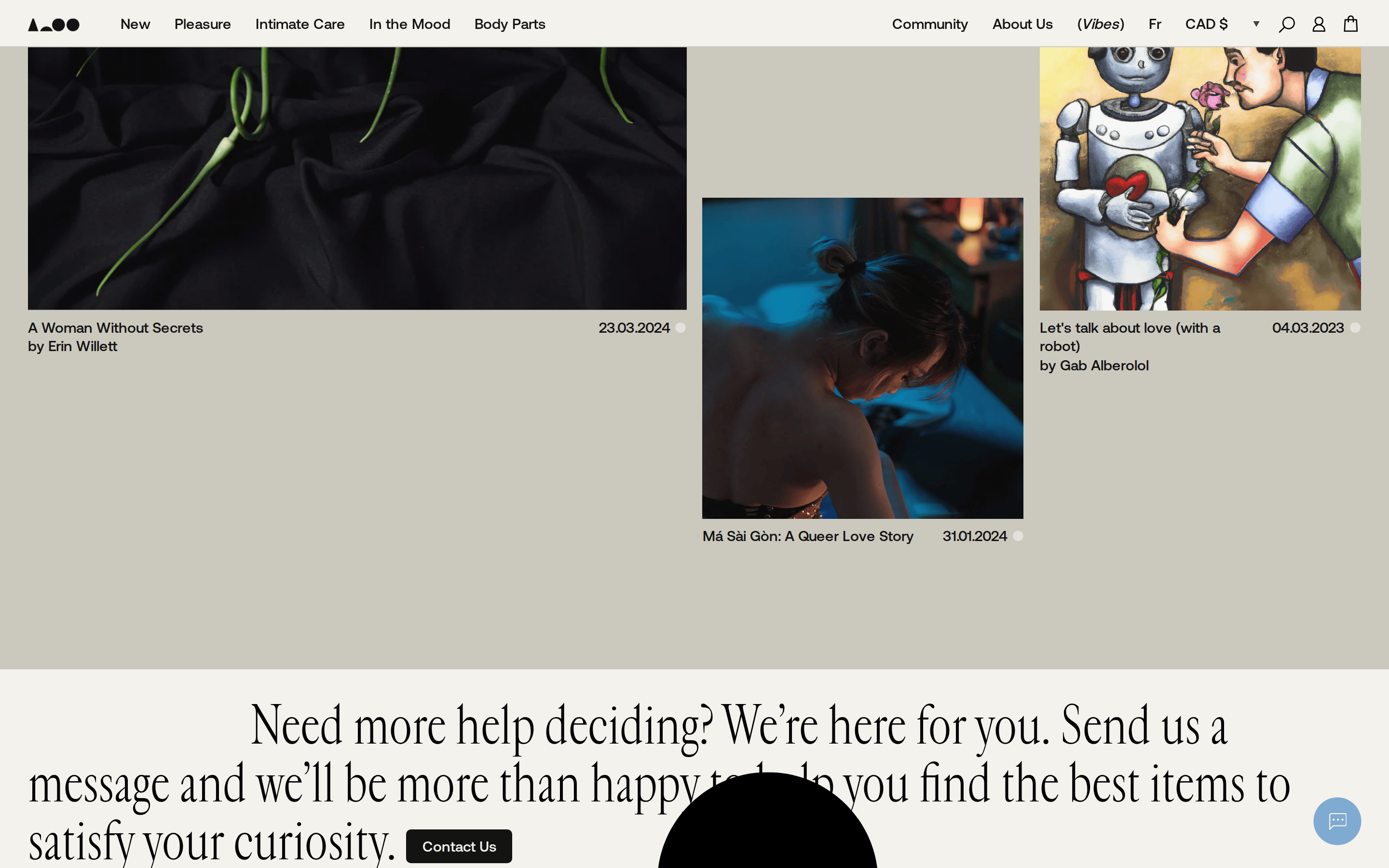
A curated gallery of intimate wellness objects presented with the restraint of a high-end design magazine.
02
Color
#000000Ink
#131313Ink soft
#f3f2ecBG
#e3e4dfBG soft
#ffffffBG quiet
#e3e1d9Muted
rgba(19, 19, 19, 0.15)Line
Warm, muted neutrals provide a soft canvas that lets the rich, photographic imagery take center stage.
03
Typography
transitional-serif · humanist-sans
display132px · 400
heading50px · 400
body15px · 400
Use transitional-serif for large, expressive headlines to convey elegance. · Use humanist-sans for navigation and UI elements for clarity. · Maintain generous letter-spacing for uppercase display text.
04
Spacing
4px
8px
16px
24px
32px
48px
64px
96px
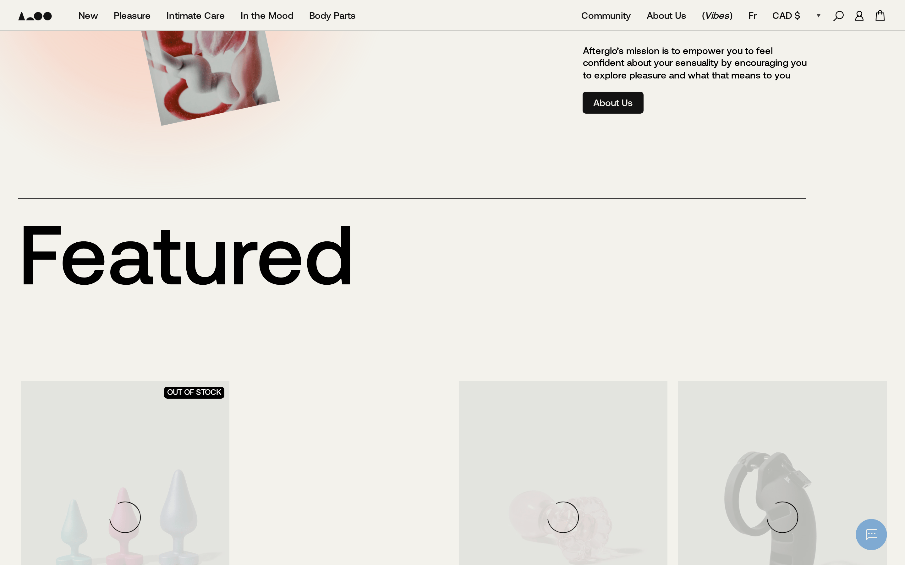
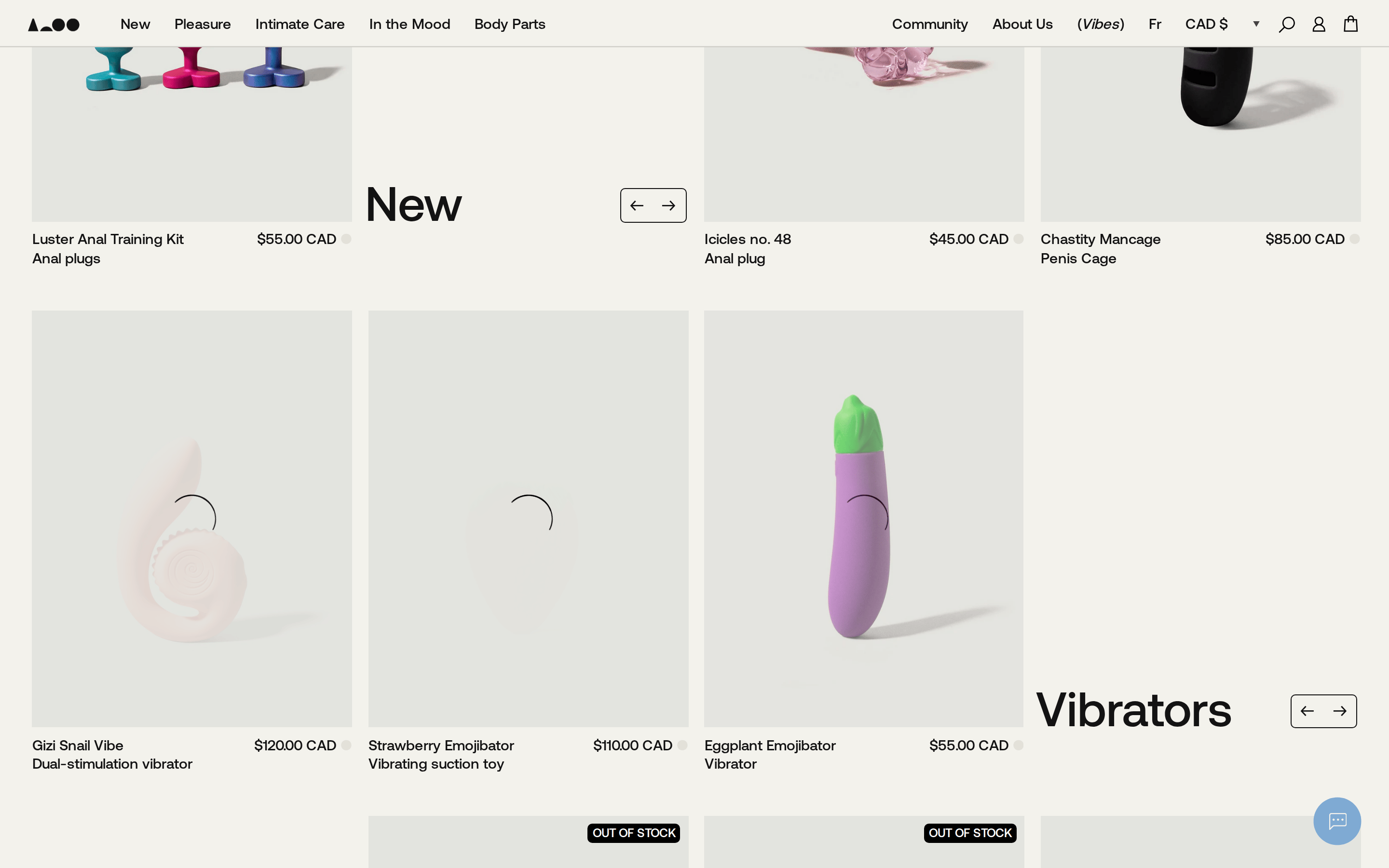
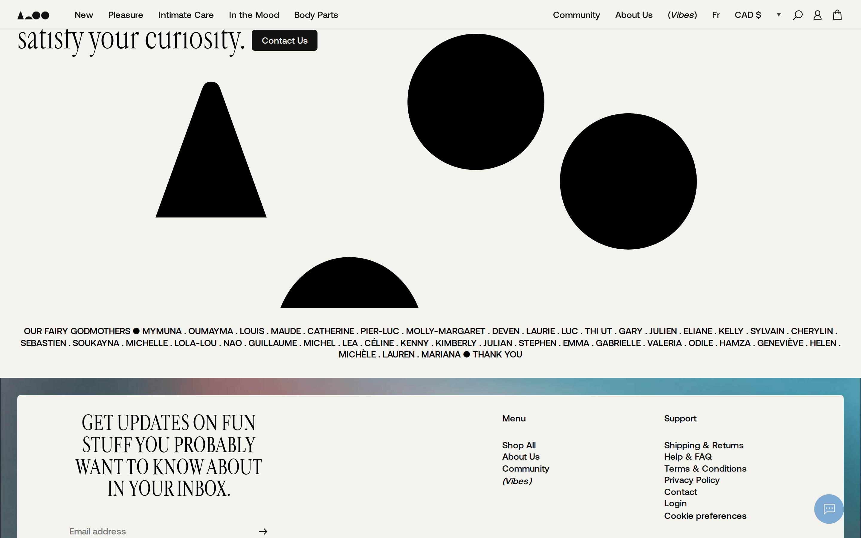
A generous, open layout with wide spacing around large photographic elements.
05
Surfaces
sm · 5px
md · 8px
lg · 12px
pill · 999px
1px solid rgba(19, 19, 19, 0.15) for inputs and subtle dividers.
rgb(203, 201, 189) 0px -6.66667px 0px 0px inset
06
Layout
1280container
12columns
24pxgutter
768 / 1024breakpoints
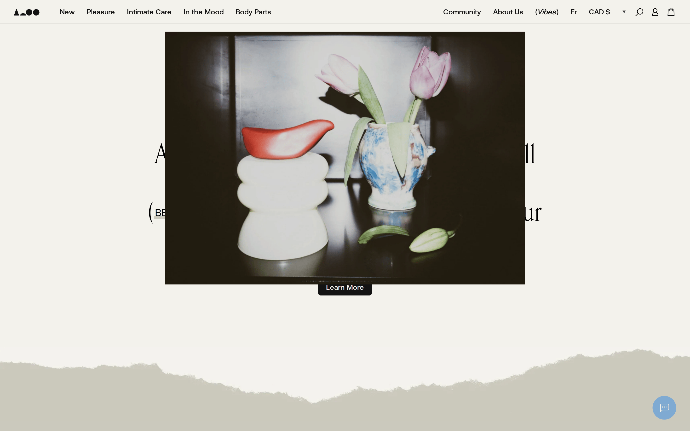
Full-bleed hero with centered text overlay, followed by a centered content column for editorial imagery.
07
Motion & Interaction
150msmicro
300mssmall
600msmedium
cubic-bezier(0.38, 0.005, 0.215, 1)easing
Smooth slide-in transitions for product carousels. · Subtle fade-in effects for text overlays on hero sections.
Subtle cursor changes (pointer) on interactive elements; minimal visual feedback to maintain aesthetic. · Immediate response with smooth state transitions.
08
Components
buttonMinimal, outlined buttons with rounded corners (border-radius: 5px) for 'Start Exploring'.
cardClean, borderless cards that rely on high-quality photography and generous whitespace.
chipSimple text-based navigation links in the header.
inputMinimal search and account icons integrated into the top navigation bar.
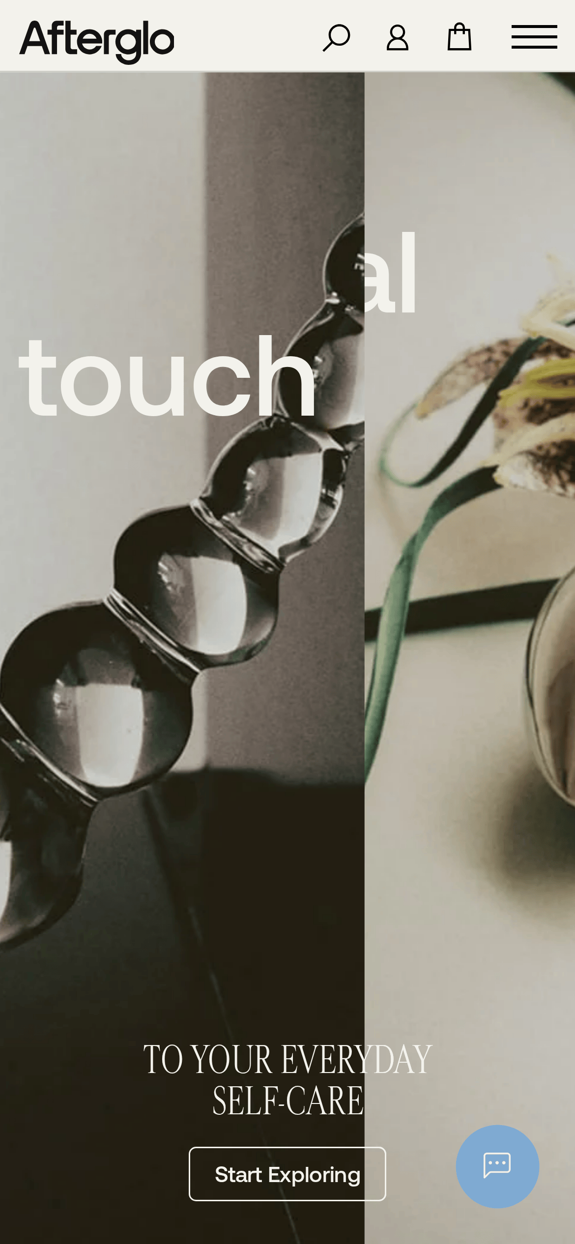
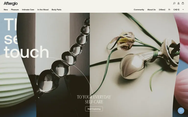
heroFull-screen, split-image hero with large, overlapping serif typography and a simple CTA button.
09
Voice & Don'ts
ToneSophisticated, intimate, and empowering.
HeadlinesLarge, expressive transitional-serif typography that blends with photographic imagery.
CTAsSimple, direct, and understated, often using outlined buttons.
Don't use vibrant, neon colors — the screenshot shows a muted palette of warm greys, off-whites, and deep blacks.
Don't use a dark mode interface — the primary background is a warm off-white (#f3f2ec).
Don't use harsh, geometric sans-serif fonts — the display typography is a refined transitional-serif.
Don't use heavy drop shadows or thick borders — surfaces are flat with minimal, subtle inset shadows.
Don't use a cluttered grid with small gaps — the layout is spacious with generous whitespace between sections.
Don't use generic product photography — the site uses artistic, still-life compositions with unique lighting.
Avoid: Loud, aggressive marketing language
Avoid: Overly technical or clinical descriptions
Avoid: Cluttered layouts with heavy borders or shadows
Captured from the live site · real computed styles
11
System prompt
This is a refined, gallery-like e-commerce site for intimate wellness products. It uses a warm, muted color palette (off-white #f3f2ec, deep black #000000) to create a calm, premium atmosphere. The typography features a mix of elegant transitional-serif for display headlines and a clean humanist-sans for body text. Key design elements include large, artistic photography, generous whitespace, and minimal UI components with subtle borders. The layout is spacious and centered, emphasizing the curated nature of the products. Critical donts include avoiding dark mode, bright neon colors, or cluttered grids. The tone is sophisticated and intimate.
Bring this taste to your agent
Hand your AI agent a machine-readable spec of this design — tokens, type, motion, the whole DNA.