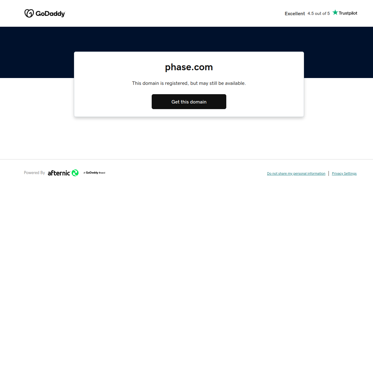
A simple digital kiosk or automated vending machine for a specific asset.
02
Color
#000000Ink
#FFFFFFBG
#666666Muted
rgba(0,0,0,0.1)Line
Strictly monochrome and utilitarian, relying on high contrast and white space for hierarchy without decorative color.
03
Typography
transitional-serif · humanist-sans
display40px · 400
Use a single font weight for the main display heading. · Keep body text lightweight and highly legible.
04
Spacing
4px
8px
16px
24px
32px
48px
64px
96px
Generous vertical padding around the central content card to create focus.
05
Surfaces
sm · 4px
md · 8px
lg · 12px
pill · 999px
A single horizontal rule separates the footer from the main content.
0 4px 20px rgba(0,0,0,0.08)
06
Layout
900container
1columns
768breakpoints
A single-column, vertically stacked layout with a centered content card and a separate footer bar.
07
Motion & Interaction
200msmicro
300mssmall
500msmedium
ease-in-outeasing
Minimal to no motion, focusing on static presentation.
Subtle feedback on the primary button, likely a slight change in background color or opacity. · Direct navigation or action triggered by the primary button.
08
Components
buttonA solid, high-contrast black button with white text, designed as the primary call-to-action.
cardA clean white card with a subtle shadow that floats over the main background to hold the core message.
heroA simple text-based hero section inside a card that communicates the domain status and acquisition option.
09
Voice & Don'ts
ToneDirect, factual, and transactional.
HeadlinesShort, declarative phrases stating the domain name and its availability status.
CTAsAction-oriented and clear, prompting an immediate response.
Don't use decorative gradients or shadows — screenshot shows a flat, shadow-lifted card.
Don't rely on multiple accent colors — screenshot shows a strictly monochrome palette.
Don't use complex multi-column layouts — screenshot shows a simple, centered, single-column layout.
Don't use display fonts that are overly stylized or expressive — screenshot uses a clean transitional serif.
Don't include extraneous navigation or social links — screenshot shows only a minimal header and footer.
Don't use playful or rounded UI elements — screenshot uses sharp, functional buttons and minimal borders.
Avoid: Marketing fluff
Avoid: Excessive adjectives
Avoid: Emotional appeals
Avoid: Complex jargon
11
System prompt
This is a minimalist, transactional domain parking page designed for maximum clarity and conversion. The visual identity is strictly utilitarian, relying on a clean, monochrome palette of pure white (#FFFFFF) and black (#000000) with functional gray accents (#666666) to create a high-contrast, distraction-free environment. Typography is a clear mix of a transitional serif for the main domain heading and a humanist sans-serif for body text, ensuring excellent legibility and a professional tone. The layout is a simple, centered single-column structure with a floating card element, emphasizing the core call-to-action. Critical design constraints include avoiding any decorative color or gradients, bypassing complex multi-column arrangements, and maintaining a strictly transactional and factual voice without emotional marketing. The motion is minimal, and the overall interaction model is straightforward and purpose-driven.
Bring this taste to your agent
Hand your AI agent a machine-readable spec of this design — tokens, type, motion, the whole DNA.