← OpenDesign CURATED · OPEN · FREE
Perkybros
A clean, typography-driven agency portfolio with a warm, neutral background.
Agency Portfolio Clean Typography Premium
01
Identity DNA
branding design craft ambitious conventions
A modern, craft-focused design studio portfolio that emphasizes clarity and bold typography.
02
Color
#1E1F20Ink
#F5F1E7BG
#9E9A91Muted
rgba(30,31,32,0.2)Line
High-contrast monochromatic core with a warm, off-white background.
03
Typography
geometric-sans · transitional-serif
display 48px · 500headline 40px · 400body 18px · 400Headlines use a geometric sans in uppercase. · Body text uses a transitional serif. · Small labels use a geometric sans in uppercase.
04
Spacing
4px
8px
16px
24px
32px
48px
64px
96px
Consistent base-4 scaling for tight, deliberate spatial relationships.
05
Surfaces
sm · 0px
md · 0px
lg · 0px
pill · 0px
Subtle 1px bottom borders for interactive elements and dividers.
06
Layout
1440 container
12 columns
24px gutter
768 / 1024 breakpoints
Flexible grid with large, unstructured image areas.
07
Motion & Interaction
220ms micro
300ms small
400ms medium
cubic-bezier(0.25, 0.1, 0.25, 1) easing
Subtle color and background transitions on hover. · Smooth border color transitions.
Standard color/background transitions for links and buttons. · No visible custom click animations.
08
Components
button Text-based navigation with uppercase styling and subtle hover transitions. card Simple layout consisting of a large image followed by text labels. chip Minimalist text-only indicators (e.g., '03 of 06'). input None visible. hero Full-width photographic presentation with overlaid navigation. 09
Voice & Don'ts
Tone Professional, confident, and craft-oriented. Headlines Direct and uppercase. CTAs Minimalist text-only. don't use drop shadows — screenshot shows completely flat design. don't use rounded corners — screenshot shows all edges are sharp. don't use complex gradients — screenshot shows solid, flat color fills. don't use dense text blocks — screenshot shows wide margins and large typography. don't use vibrant neon colors — screenshot shows muted earth tones and high-contrast monochrome. don't use generic sans-serif body text — screenshot shows a transitional serif for descriptions. Avoid: Decorative patterns Avoid: Rounded corners Avoid: Drop shadows Avoid: Gradients Avoid: Vibrant neon colors Avoid: Dense text blocks 10
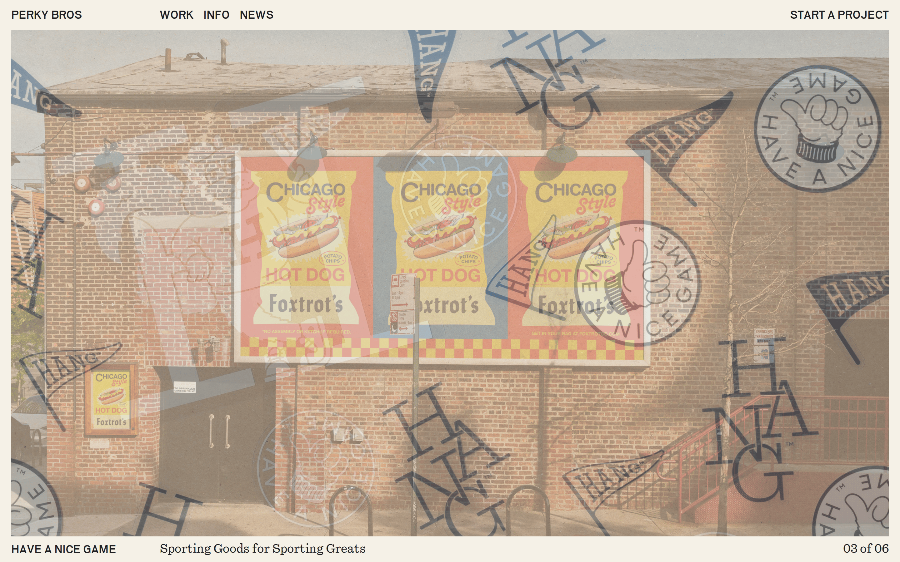
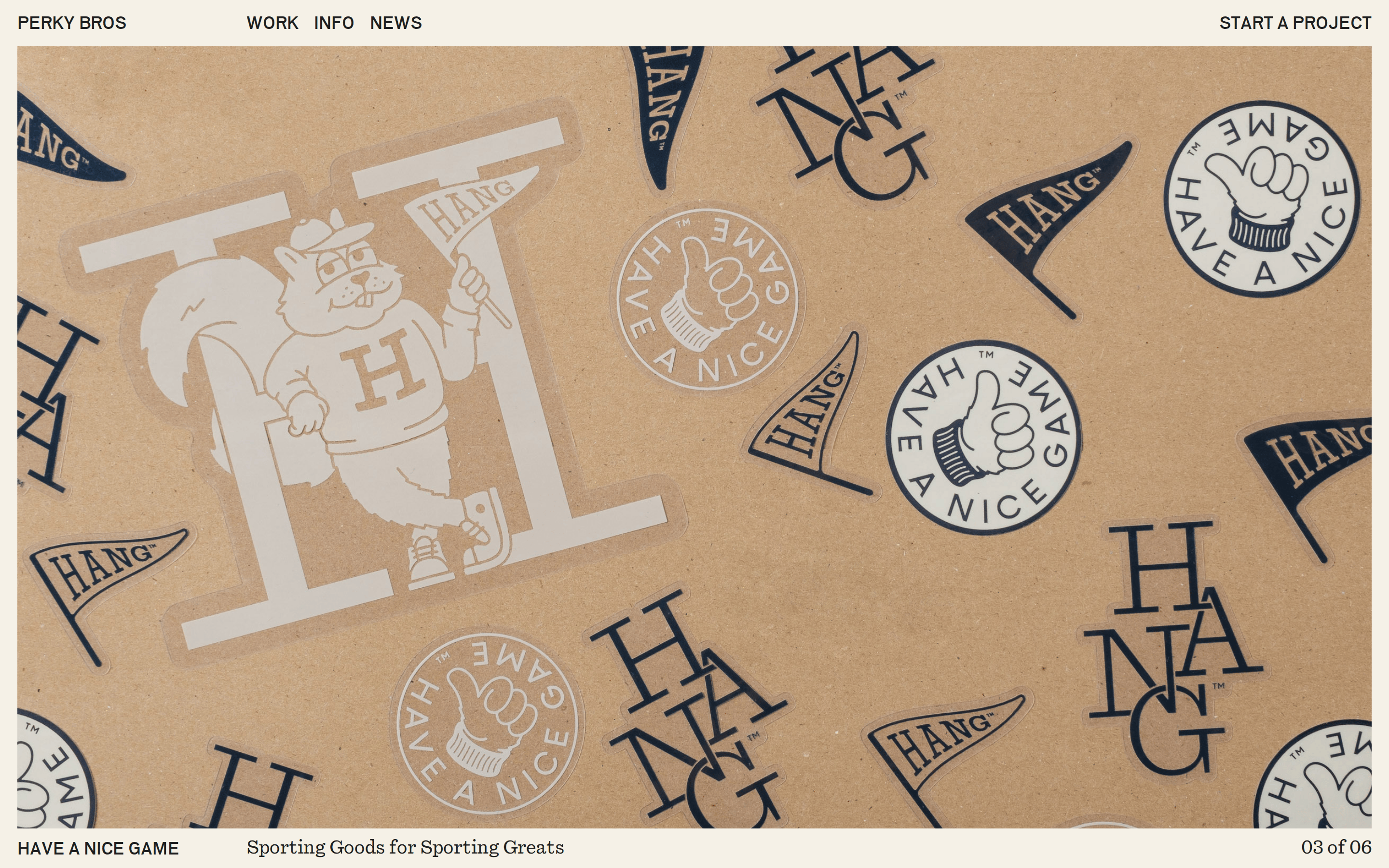
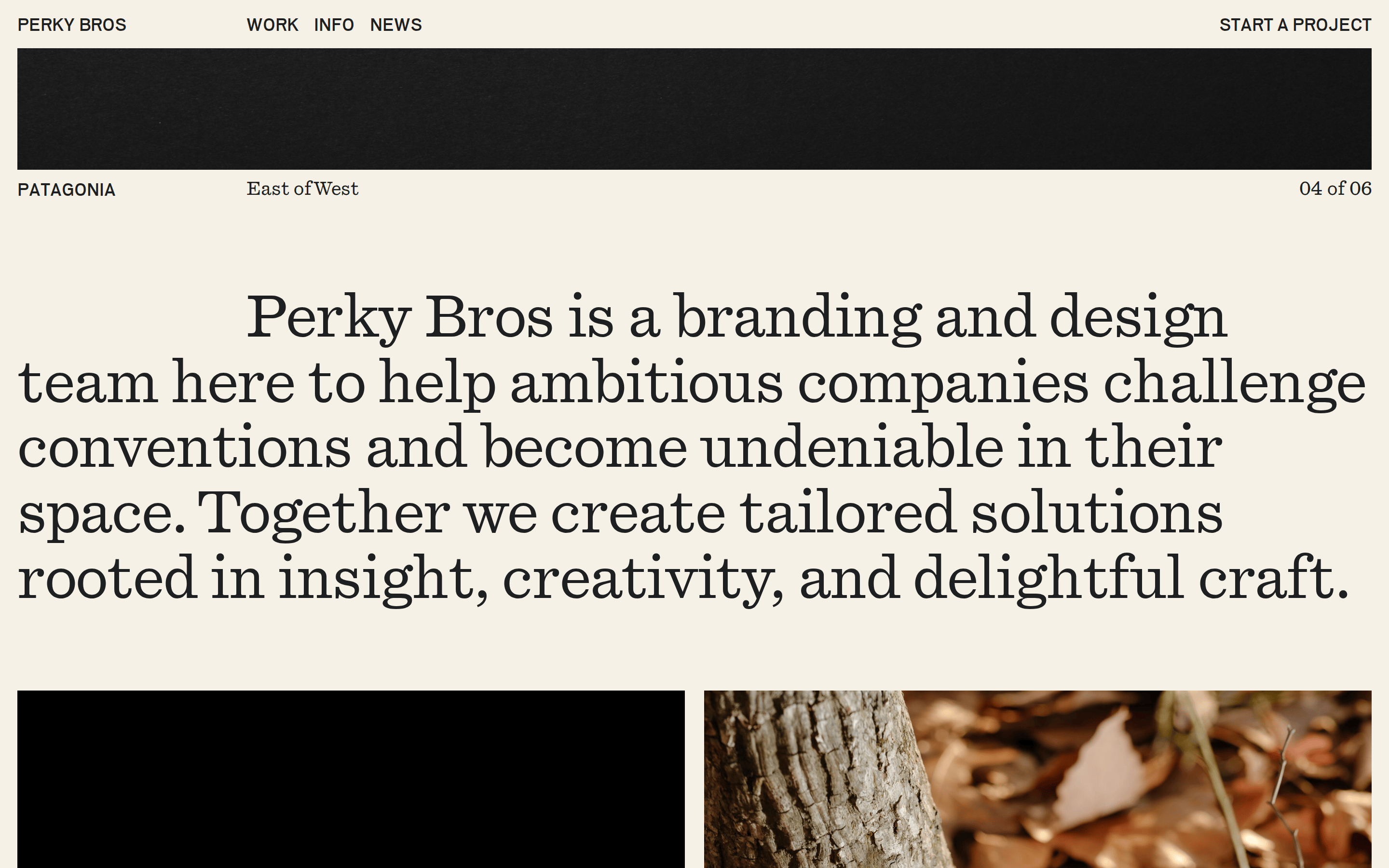
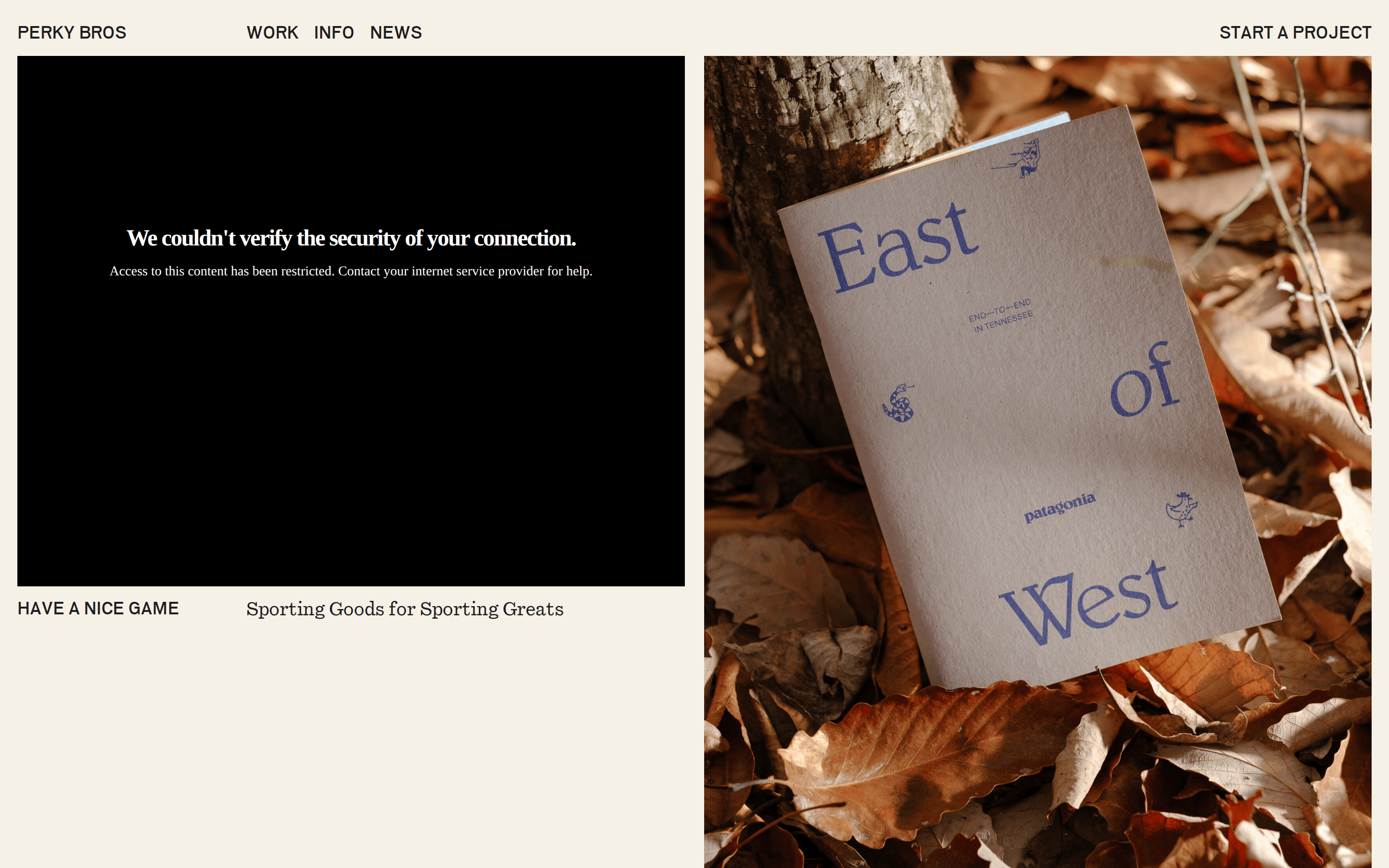
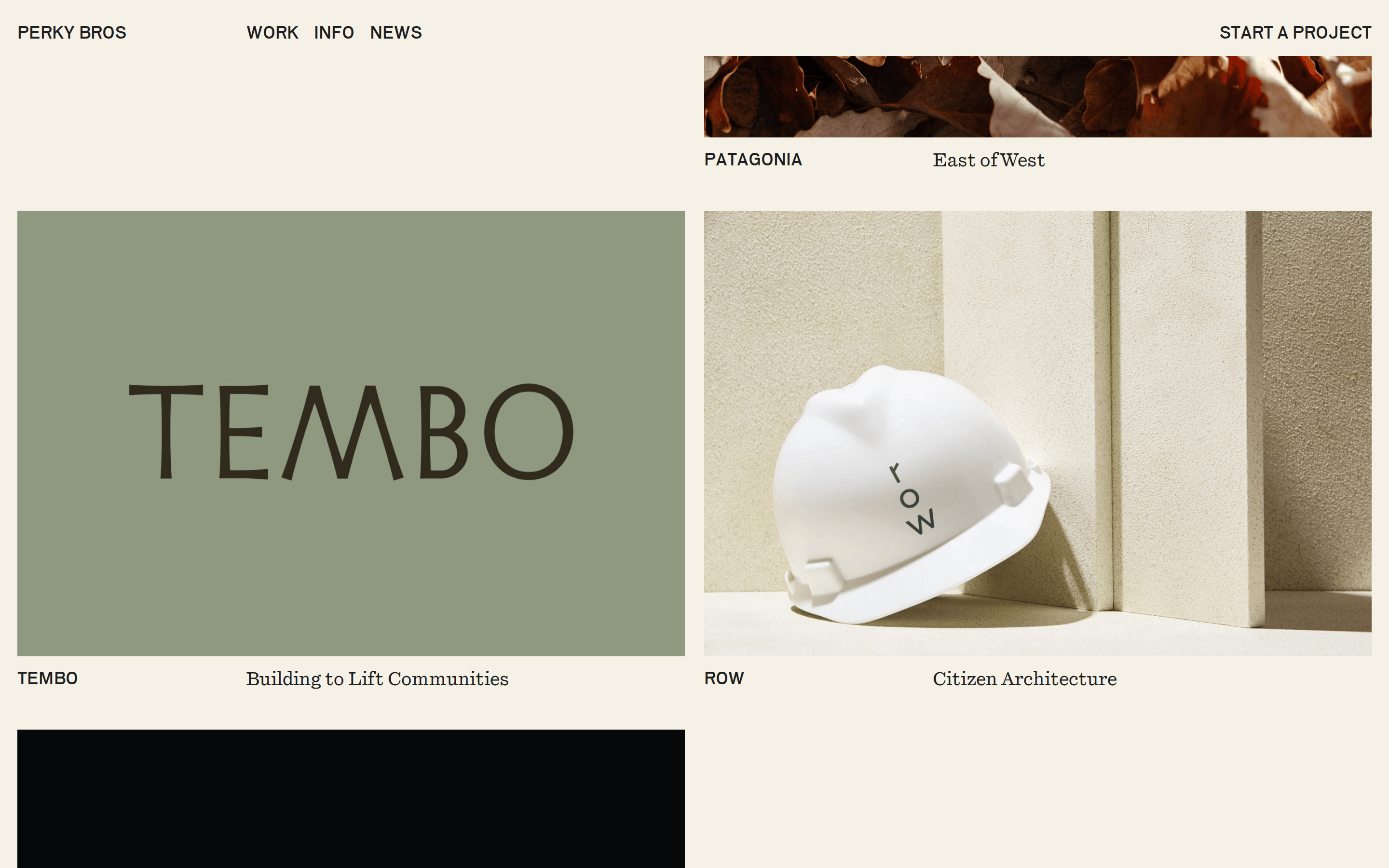
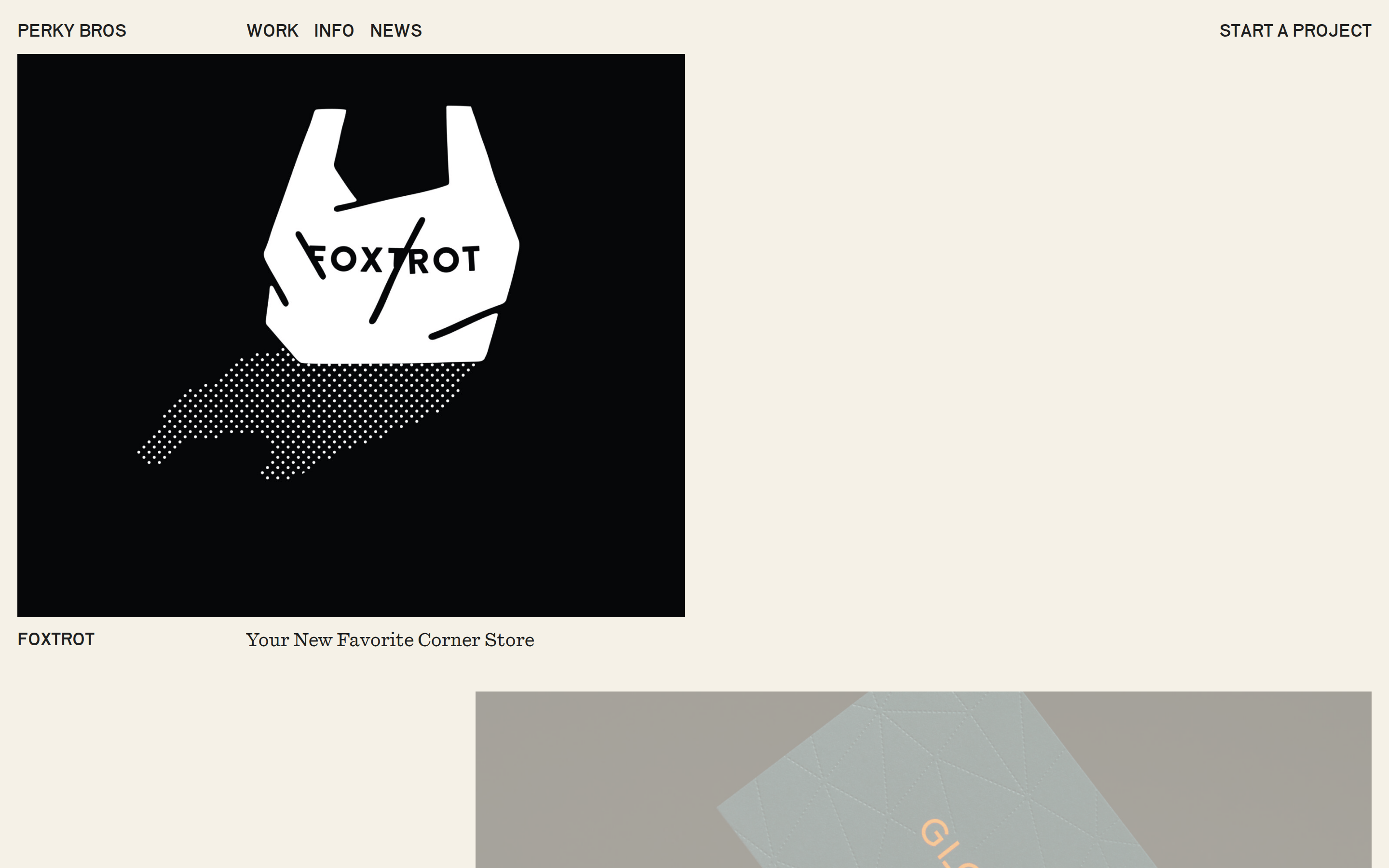
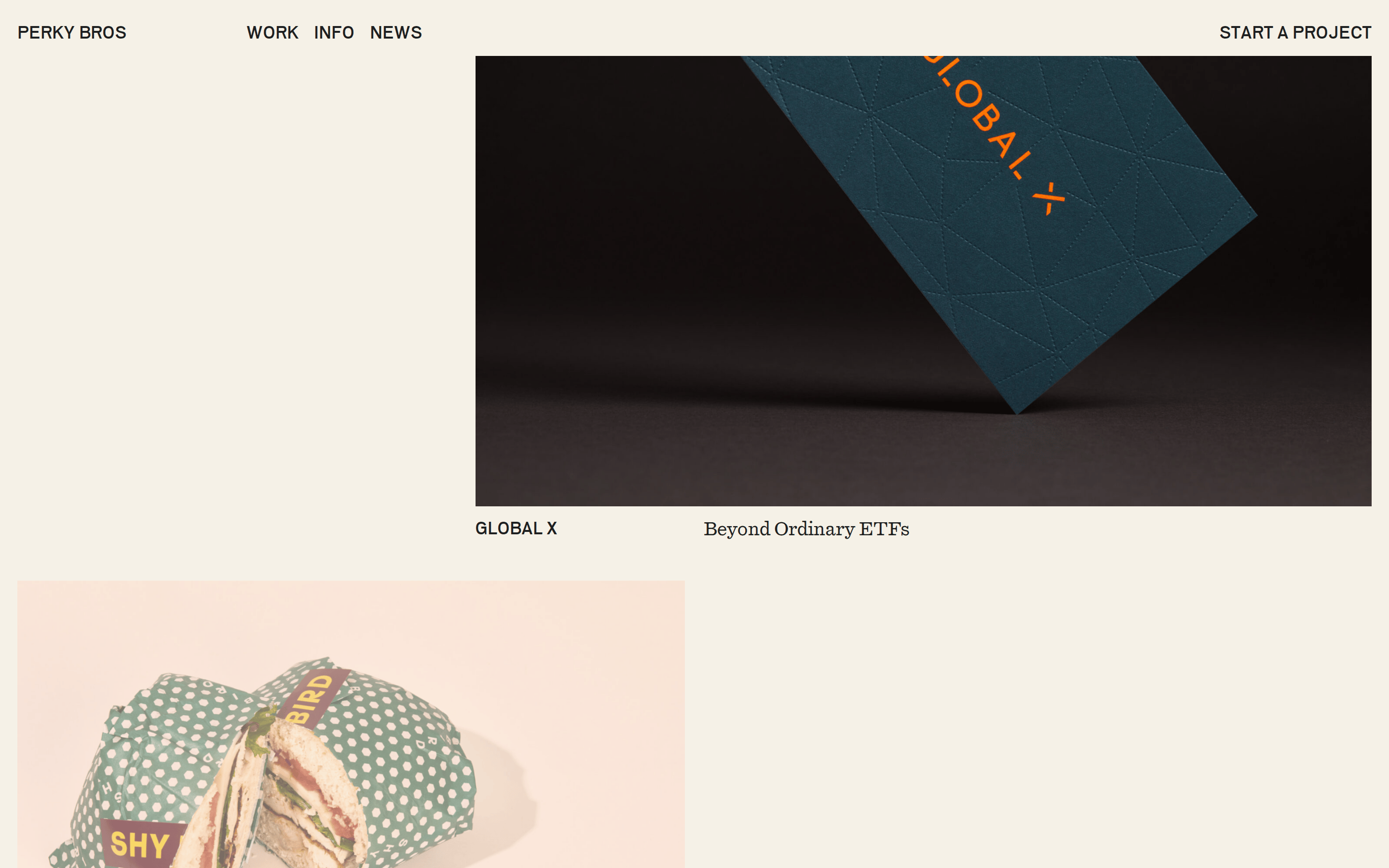
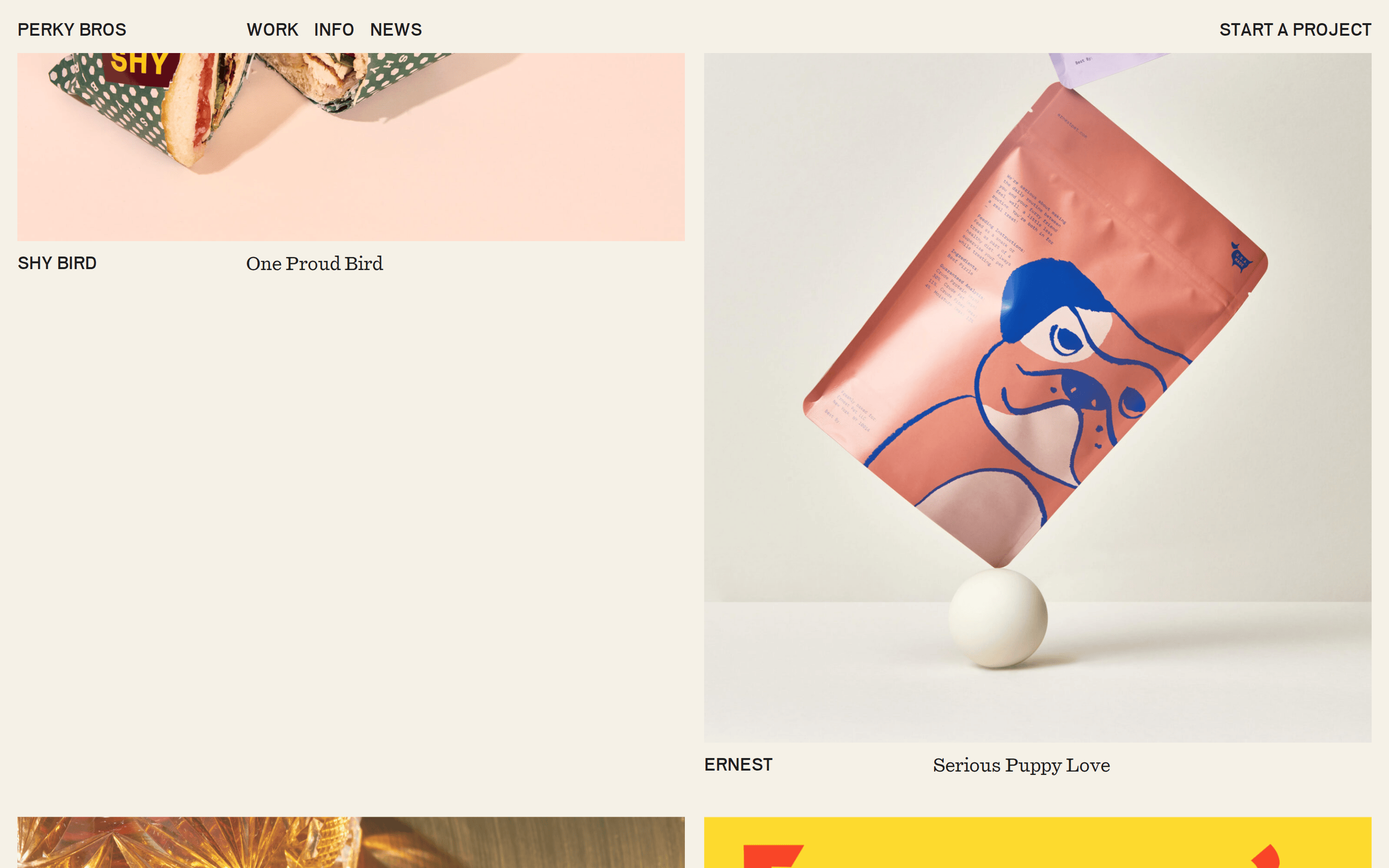
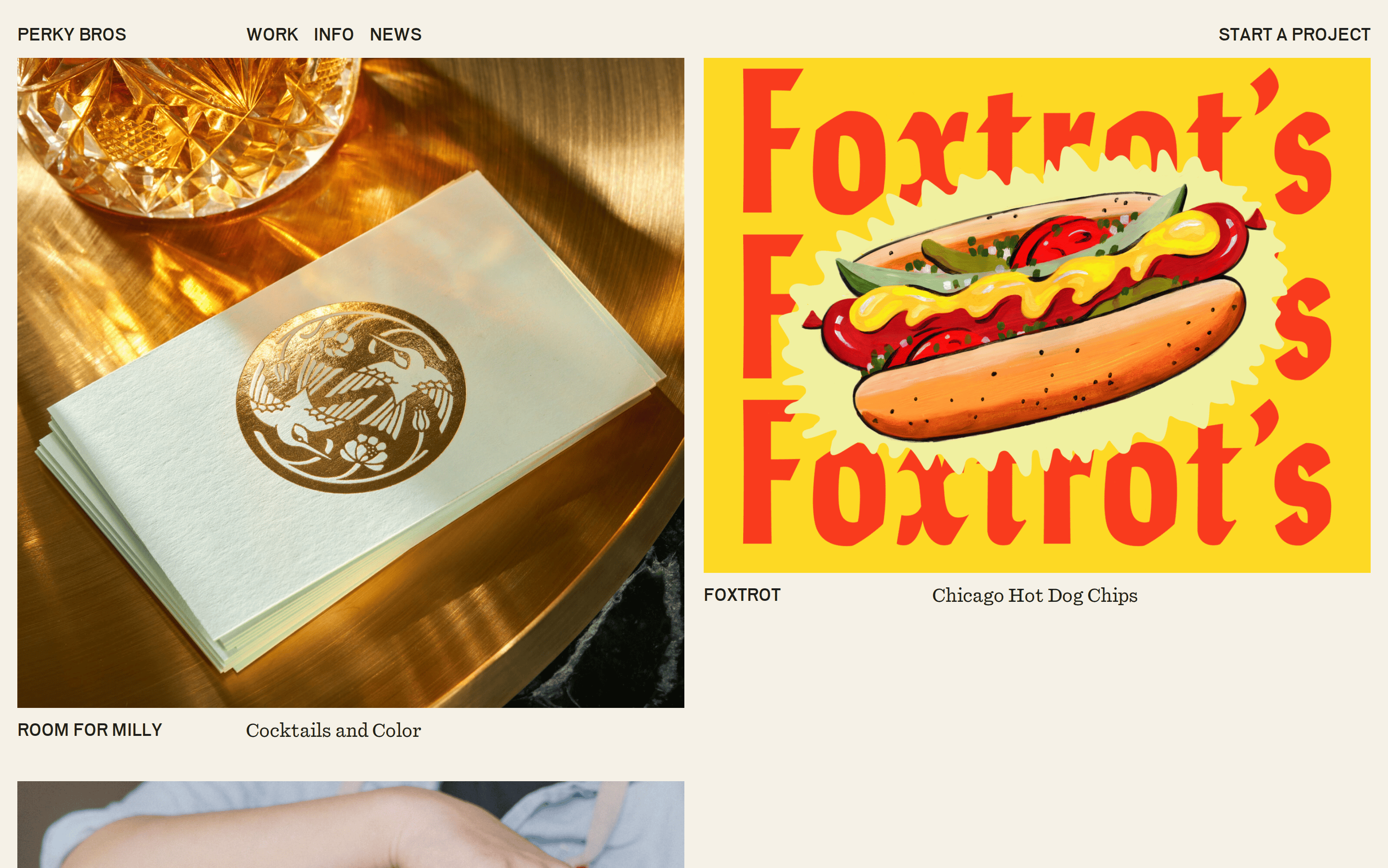
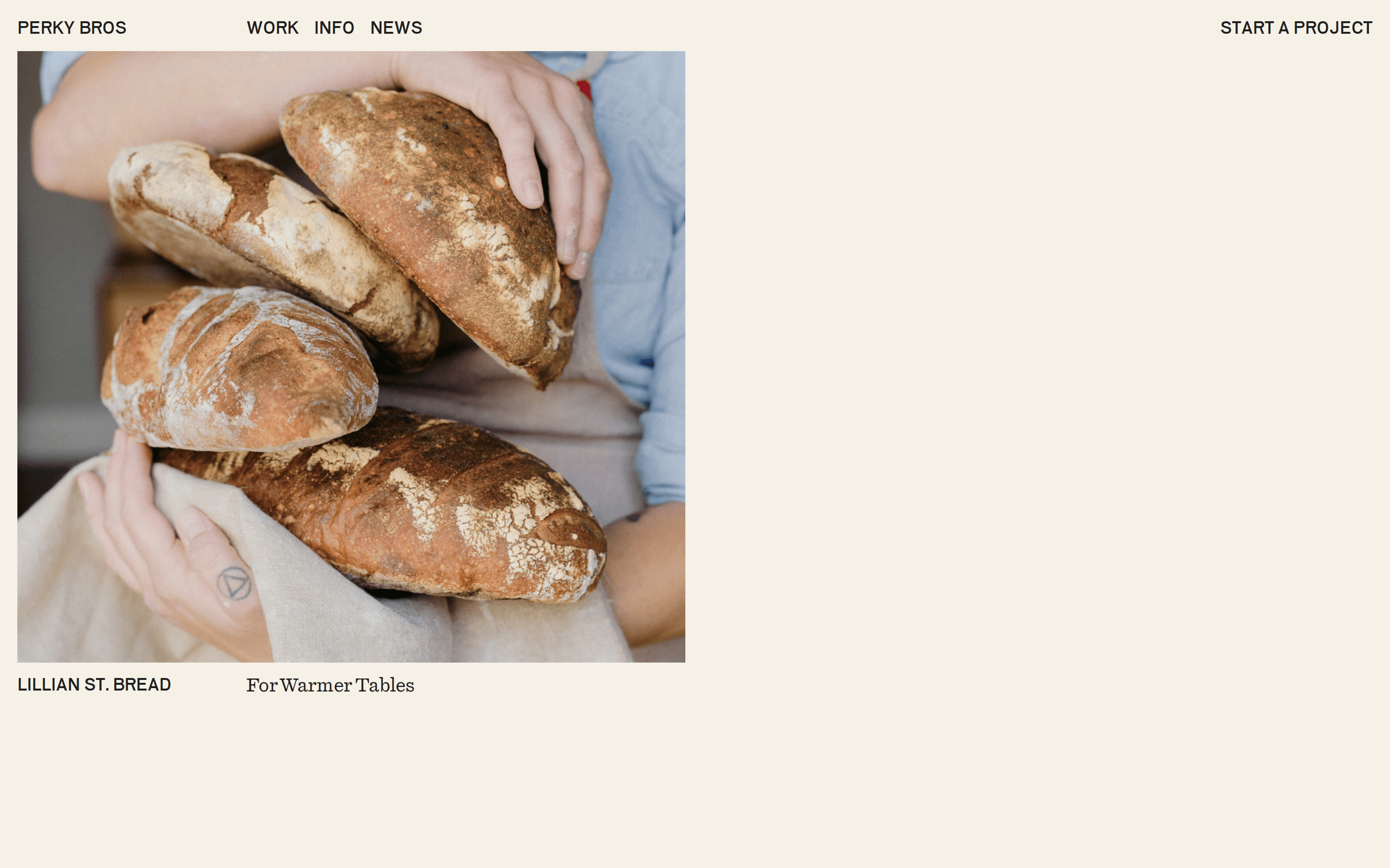
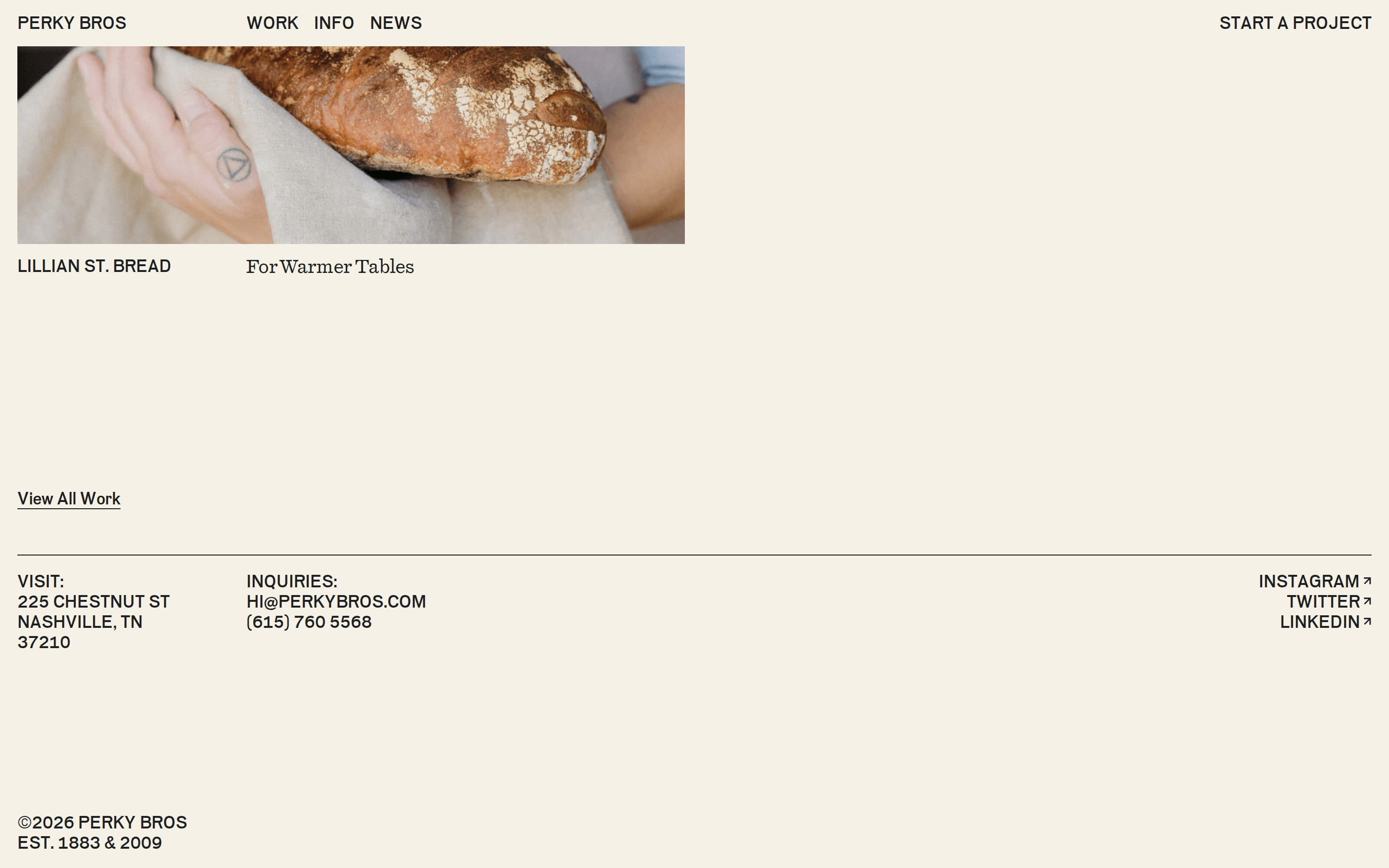
Inside the pack — real screenshots
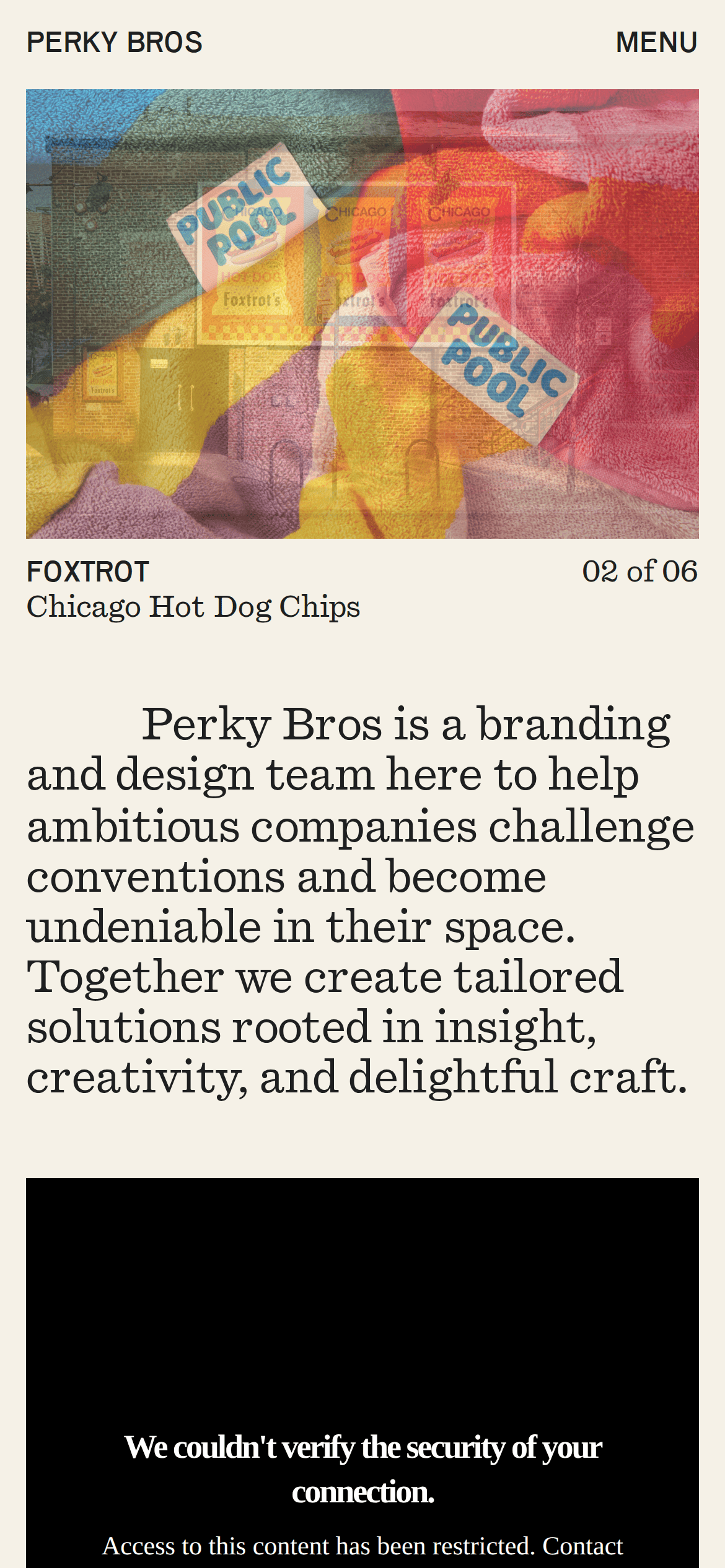
桌面首屏(hero) 桌面滚动分段(90% viewport 步进,作为视觉证据) 桌面滚动分段(90% viewport 步进,作为视觉证据) 桌面滚动分段(90% viewport 步进,作为视觉证据) 桌面滚动分段(90% viewport 步进,作为视觉证据) 桌面滚动分段(90% viewport 步进,作为视觉证据) 桌面滚动分段(90% viewport 步进,作为视觉证据) 桌面滚动分段(90% viewport 步进,作为视觉证据) 桌面滚动分段(90% viewport 步进,作为视觉证据) 桌面滚动分段(90% viewport 步进,作为视觉证据) 桌面滚动分段(90% viewport 步进,作为视觉证据) 移动首屏 Captured from the live site · real computed styles
11
System prompt
Perky Bros is a branding and design agency portfolio. It uses a warm off-white background (#F5F1E7) and high-contrast dark ink (#1E1F20) for a clean, sophisticated look. The typography combines a geometric sans for uppercase headlines and navigation with a transitional serif for body copy. Layouts are spacious and grid-based, featuring large photographic content. Critical donts: 1) Do not use rounded corners; the design uses sharp, 0-radius edges. 2) Do not use drop shadows; the surfaces are completely flat. 3) Do not use complex gradients; stick to solid color fills. 4) Do not use dense text layouts; maintain generous padding and margins.
More from the library en · zh-CN · zh-TW · ja · ko
OpenDesign · curated web aesthetics for AI-readable design DNA · opendesign.cc
Why we curated this: This site is a perfect example of a modern, typography-focused agency portfolio that relies on craft and restraint rather than flashy effects.