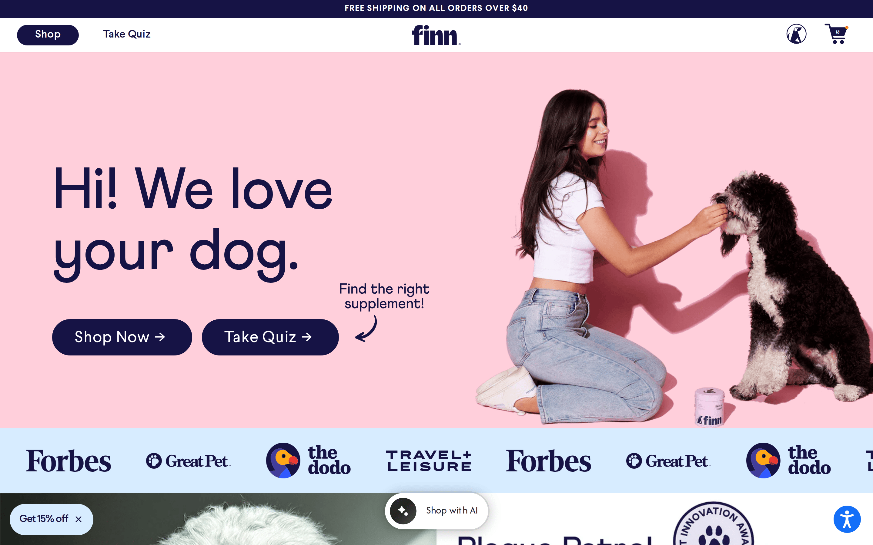
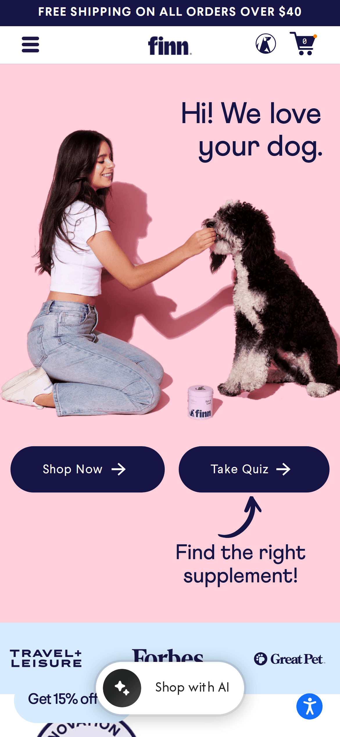
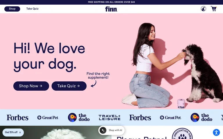
pet healthdog supplementsfriendlyapproachabletrustworthy
A friendly neighborhood pet store meets modern health brand.
02
Color
#FF7F00Accent
#161345Ink
#321004Ink soft
#FFFFFFBG
#F9F9F9BG soft
#F2E6ECBG quiet
#999999Muted
rgba(235,235,235,1)Line
High-contrast dark blue ink on soft pink or white backgrounds, punctuated by energetic orange accents for CTAs and highlights.
03
Typography
transitional-serif · geometric-sans
display80px · 400
heading30px · 400
body18px · 400
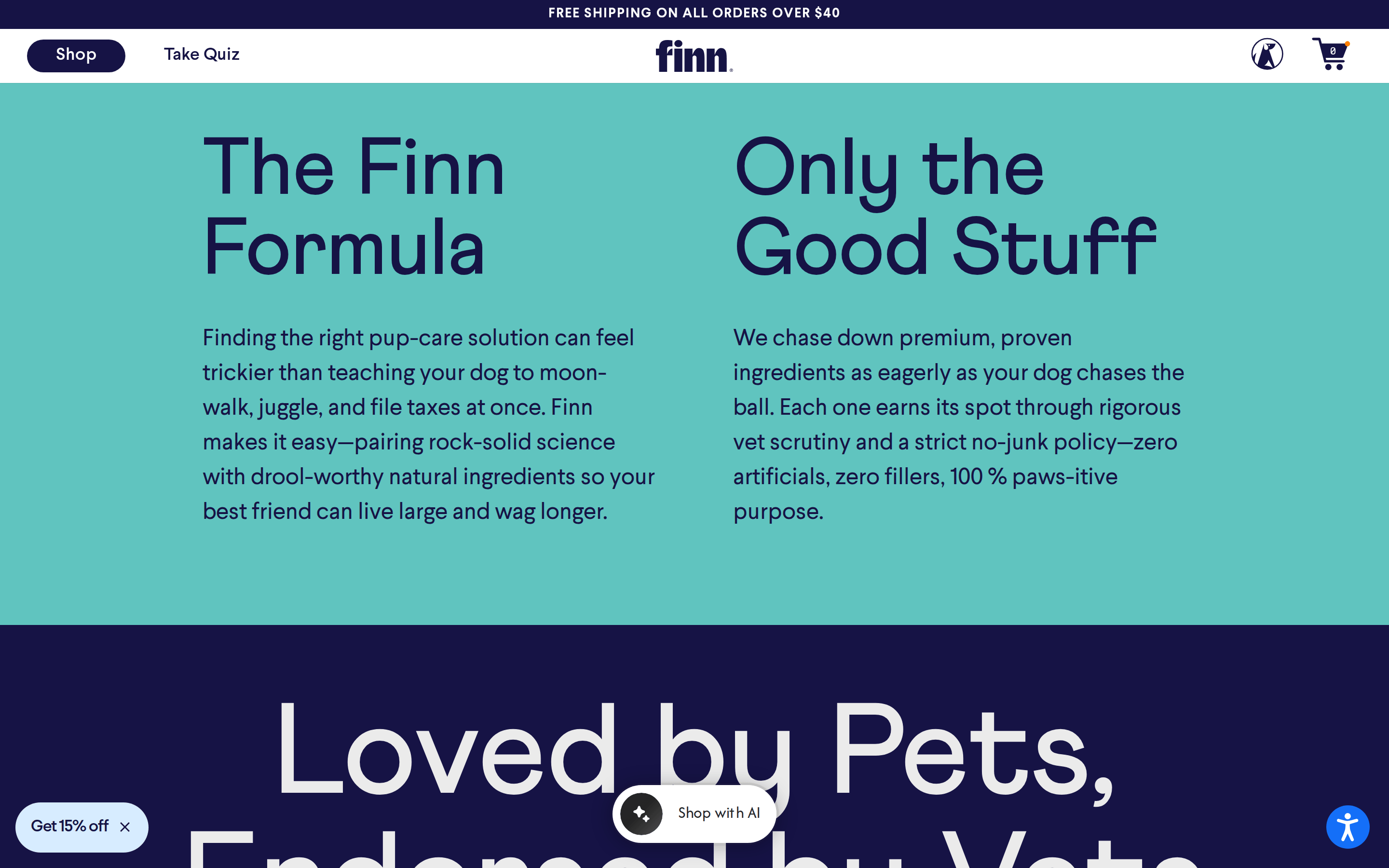
Headlines use a bold transitional serif with tight tracking. · Body text uses a clean geometric sans-serif for readability. · Text is primarily uppercase or sentence case depending on context.
04
Spacing
4px
8px
16px
24px
32px
48px
64px
96px
8px base rhythm with generous spacing between sections.
05
Surfaces
sm · 4px
md · 20px
lg · 32px
pill · 999px
Thin 1px borders used sparingly, mostly on outlined buttons.
0px 0px 1px 0px rgba(0, 0, 0, 0.2)
06
Layout
1280container
12columns
24pxgutter
768 / 1024breakpoints
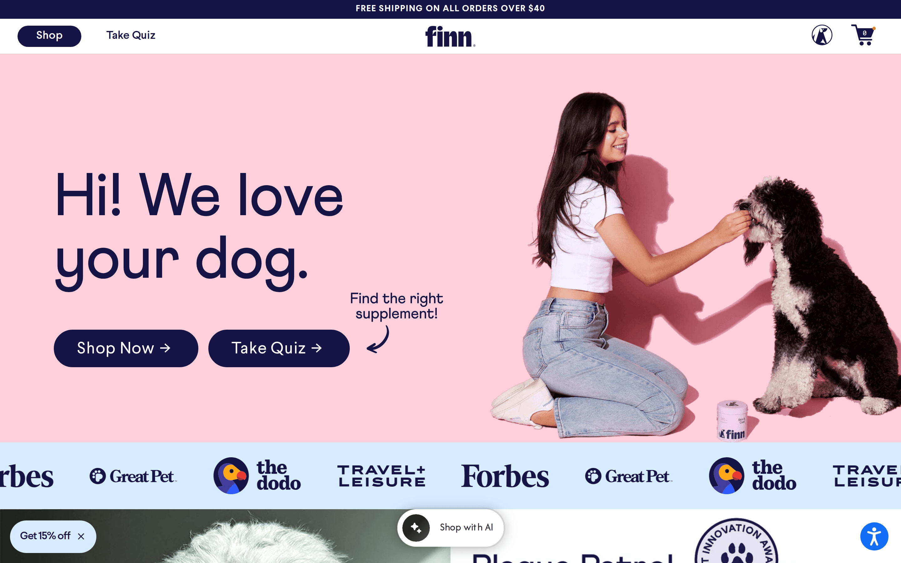
Full-width hero sections transitioning into centered content grids.
07
Motion & Interaction
100msmicro
250mssmall
500msmedium
ease-in-outeasing
Standard opacity and transform transitions for UI interactions.
Scale or opacity transitions on interactive elements. · Subtle scale down effect.
08
Components
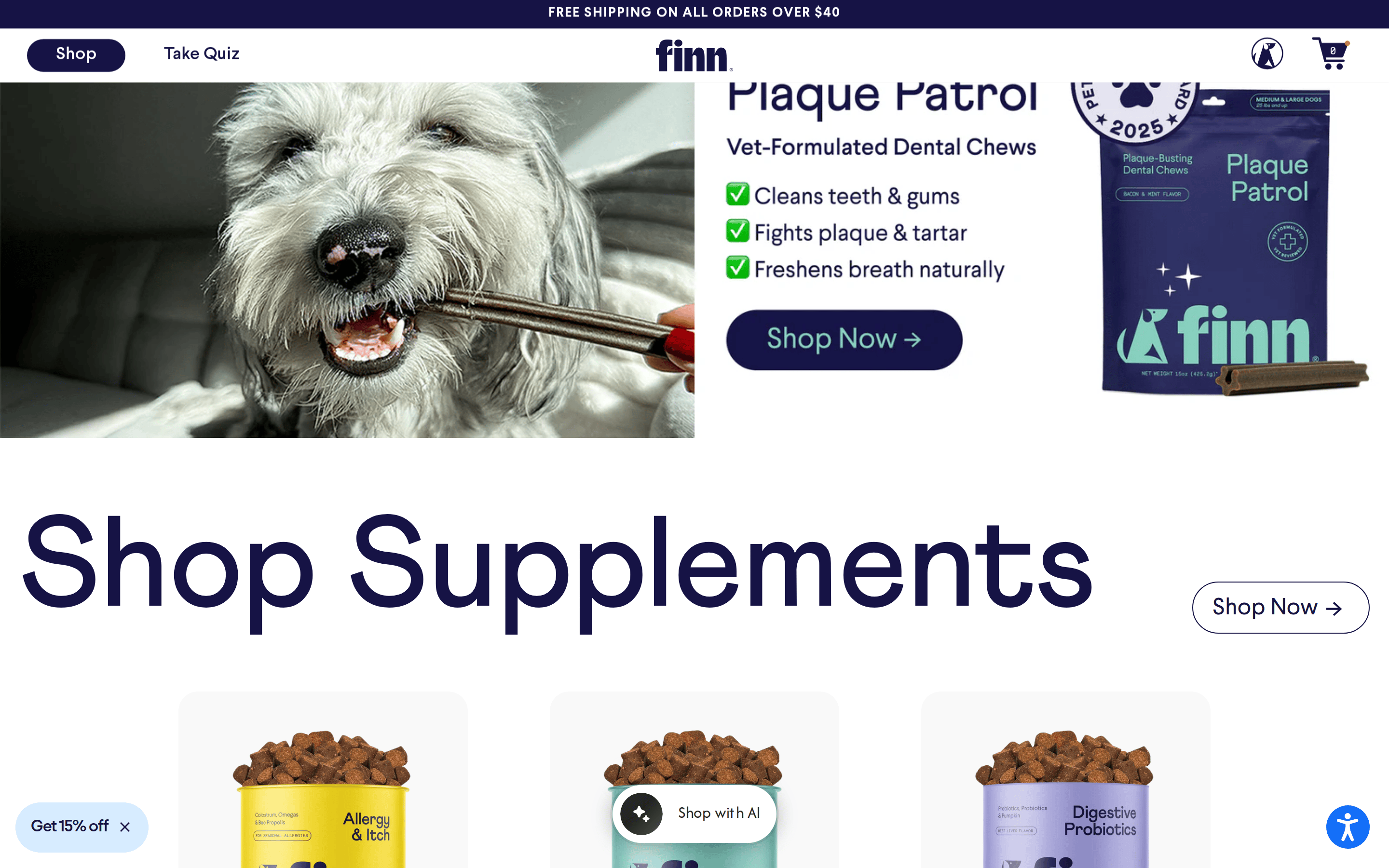
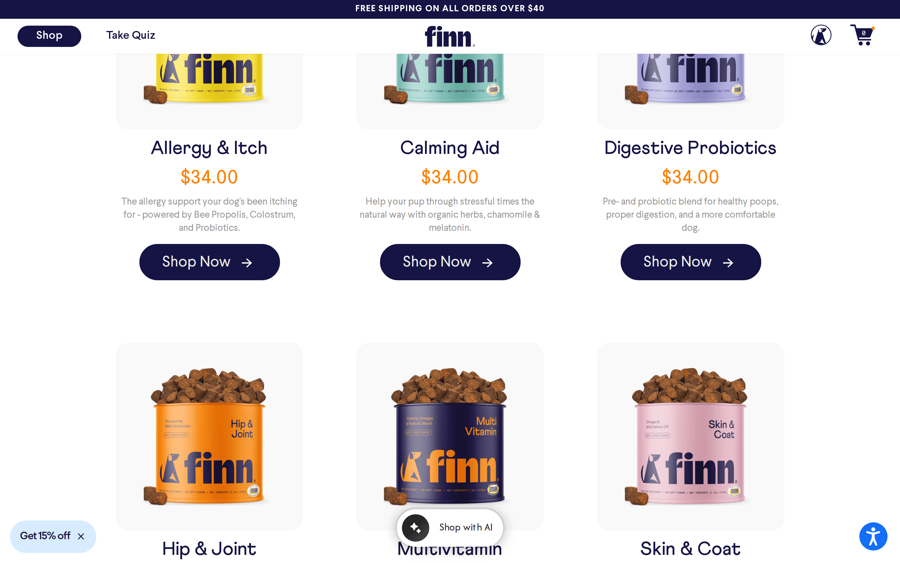
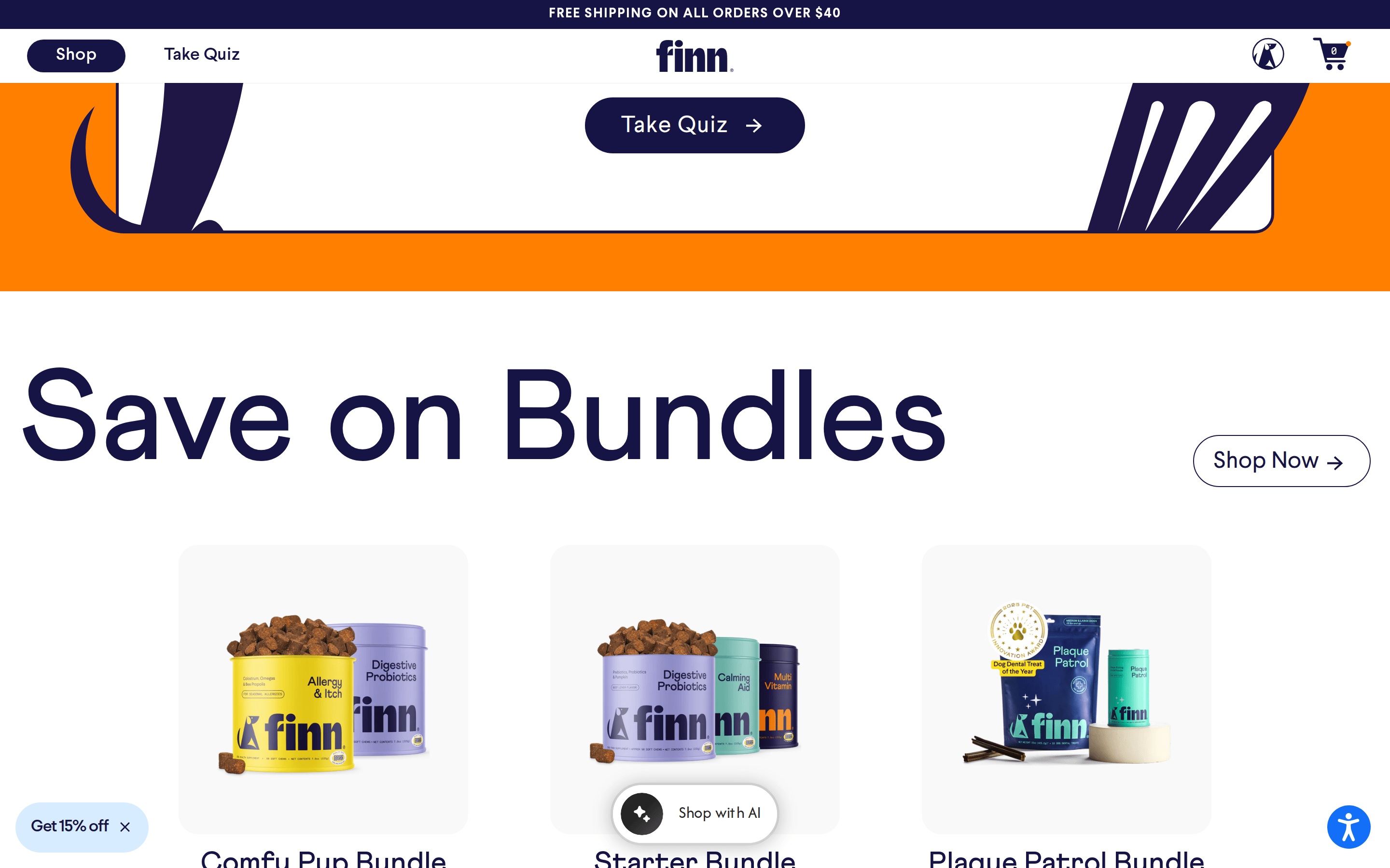
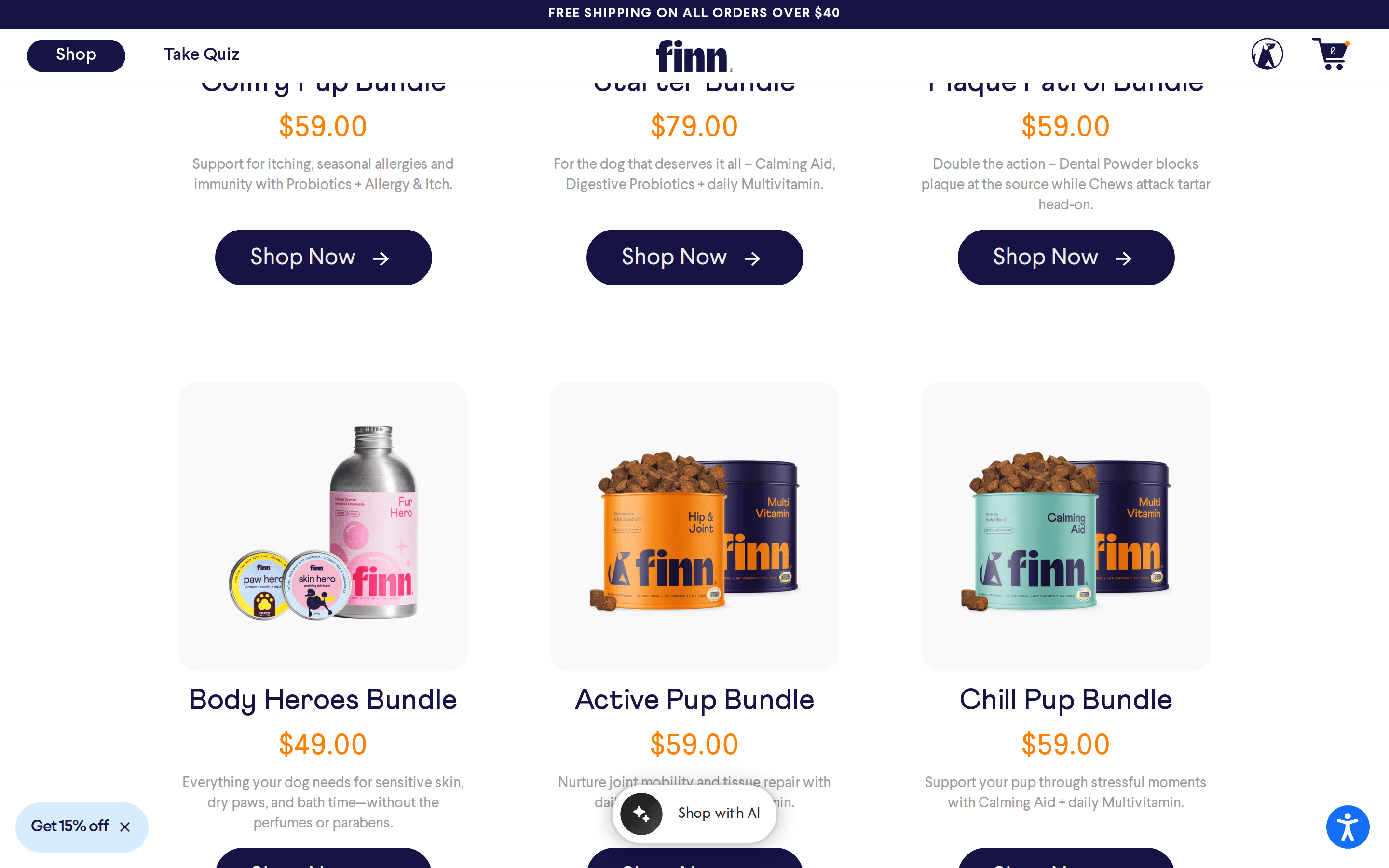
buttonPill-shaped primary buttons in dark blue with white text; outlined ghost buttons with dark blue text.
cardProduct cards with large imagery and minimal text, featuring rounded corners.
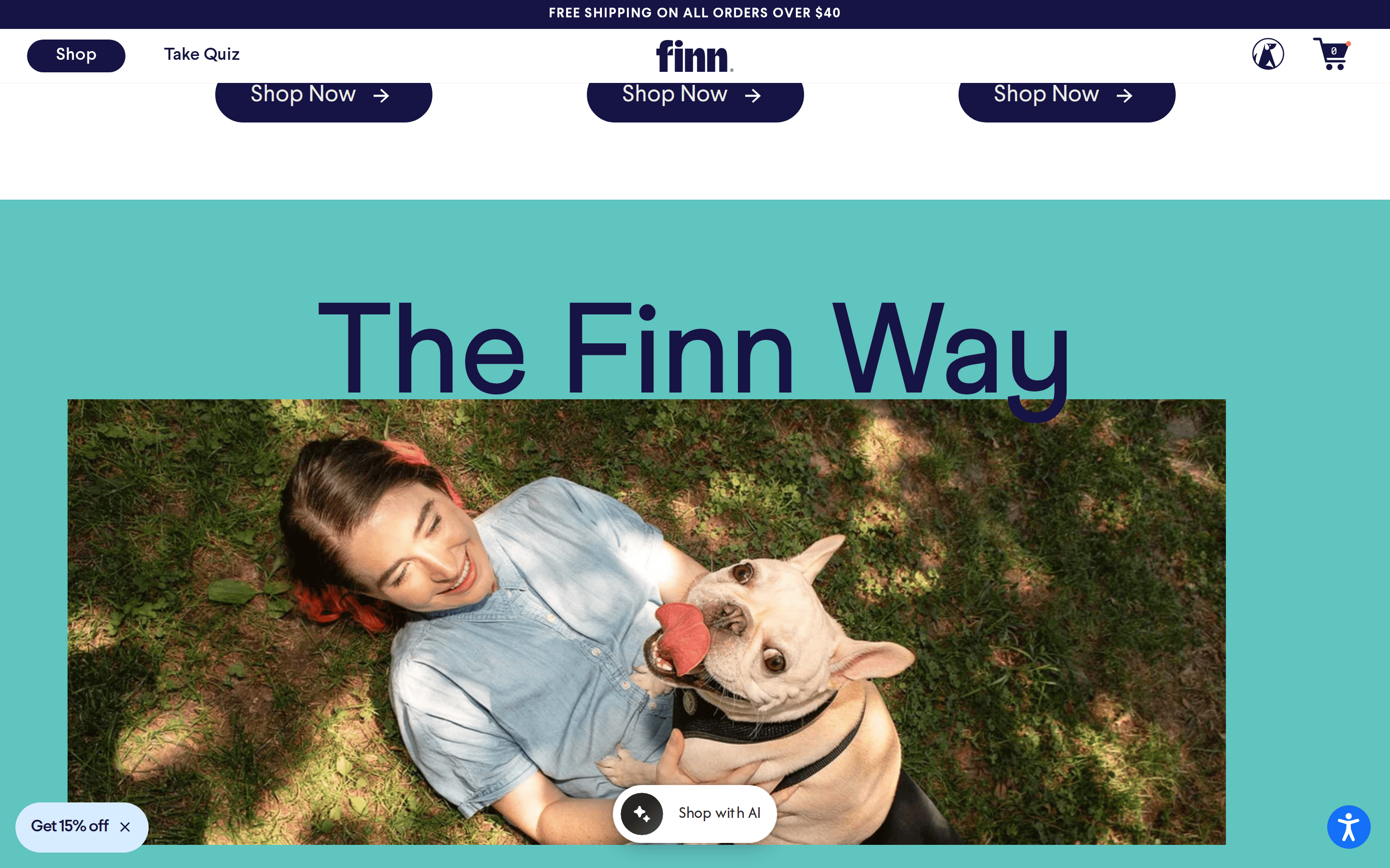
heroLarge split-layout hero with bold typography on a solid colored background paired with lifestyle photography.
09
Voice & Don'ts
ToneFriendly, enthusiastic, and approachable.
HeadlinesDirect and conversational, often starting with a greeting.
CTAsAction-oriented with arrows pointing the way.
Don't use harsh neon colors — the screenshot shows soft pastels and deep navy.
Don't use purely geometric sans-serif for headlines — the screenshot shows a prominent transitional serif.
Don't use sharp, square corners on containers — the screenshot shows consistently rounded corners.
Don't use small, dense text blocks — the screenshot shows large, legible type with ample spacing.
Don't use dark mode aesthetics — the screenshot is predominantly light and bright.
Don't use heavy drop shadows — the screenshot shows flat surfaces with minimal or no elevation.
Captured from the live site · real computed styles
11
System prompt
Finn is a consumer DTC brand for dog supplements. The design is warm, approachable, and clean, featuring a soft pink and white palette contrasted with deep navy and energetic orange accents. Typography relies on a bold transitional serif for display and a clean geometric sans-serif for body text. Critical constraints: Do not use dark mode aesthetics. Do not use harsh neon colors. Do not use purely geometric sans-serif for display headlines. Maintain high contrast and generous white space.
Bring this taste to your agent
Hand your AI agent a machine-readable spec of this design — tokens, type, motion, the whole DNA.