A sleek Scandinavian fashion house where clean typography and cinematic photography meet functional rain gear.
02
Color
#10100FInk
#2D2D2DInk soft
#E3E3E3BG
#FFFFFFBG soft
#F5F5F5BG quiet
#B3B3B2Muted
rgba(239, 239, 239, 1)Line
Photography-driven palette with neutral backgrounds, deep charcoal typography, and muted grays creating a clean, elevated canvas for product imagery.
03
Typography
geometric-sans
display48px · 700
display-sm40px · 700
body14px · 400
caption12px · 400
All navigation and labels use uppercase transformation with tracked spacing · Headlines use heavy weight geometric sans-serif with tight line-height · Body text uses regular weight with generous letter-spacing for readability · Text rarely exceeds 16px, maintaining an editorial grid aesthetic
04
Spacing
4px
8px
12px
16px
20px
24px
32px
48px
8px base unit with 4px increments for tight UI elements and generous whitespace for editorial photography breathing room
05
Surfaces
sm · 4px
md · 8px
lg · 12px
pill · 9999px
1px solid rgb(239, 239, 239) for dividers and input states, 1px solid rgb(45, 45, 45) for active elements
0px 0px 0px 1px rgba(0,0,0,1) inset for input borders · 1px 2px 8px 0px rgba(0,0,0,0.35) for floating elements
06
Layout
1280container
12columns
24pxgutter
768 / 1024breakpoints
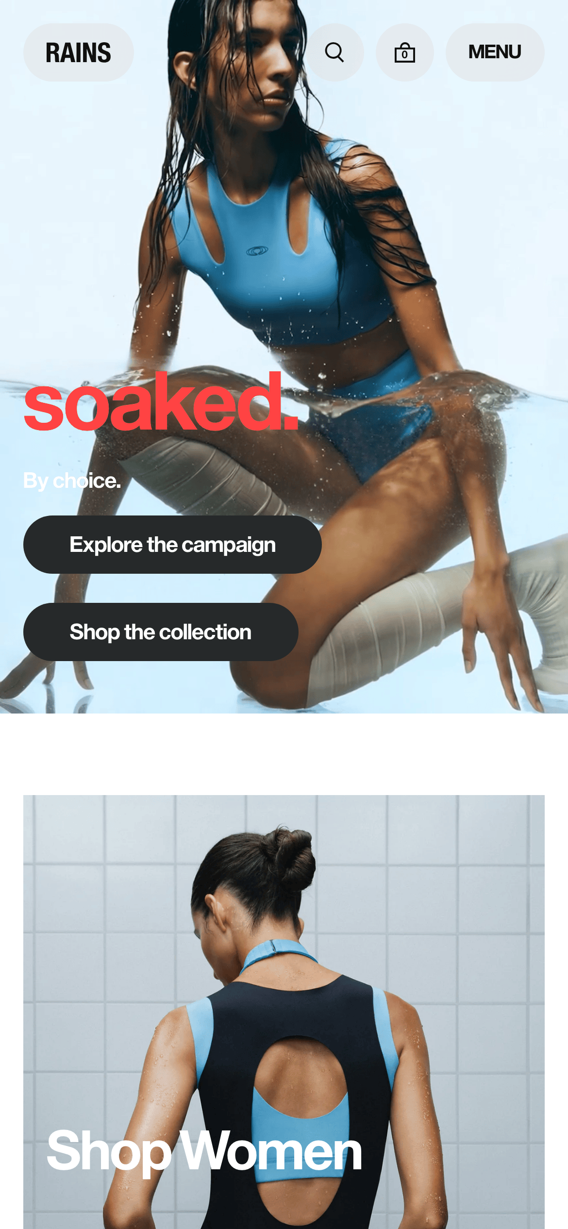
Full-width photography heroes with overlaid typography, transitioning to grid-based product sections below
07
Motion & Interaction
180msmicro
300mssmall
500msmedium
cubic-bezier(0.4, 0, 0.6, 1)easing
Smooth opacity transitions for modal overlays (0.3s) · Stroke-dashoffset animations for loading states · All interactive elements use 0.2s transition on hover states · Image transitions use 0.5-1s duration for cinematic feel
Subtle opacity reduction or color shift on interactive elements, maintained within 0.2s transition · Immediate visual feedback through background color change or border accent
08
Components
buttonPill-shaped buttons (border-radius: 9999px) with solid black fill and white text, or transparent with black border for secondary actions
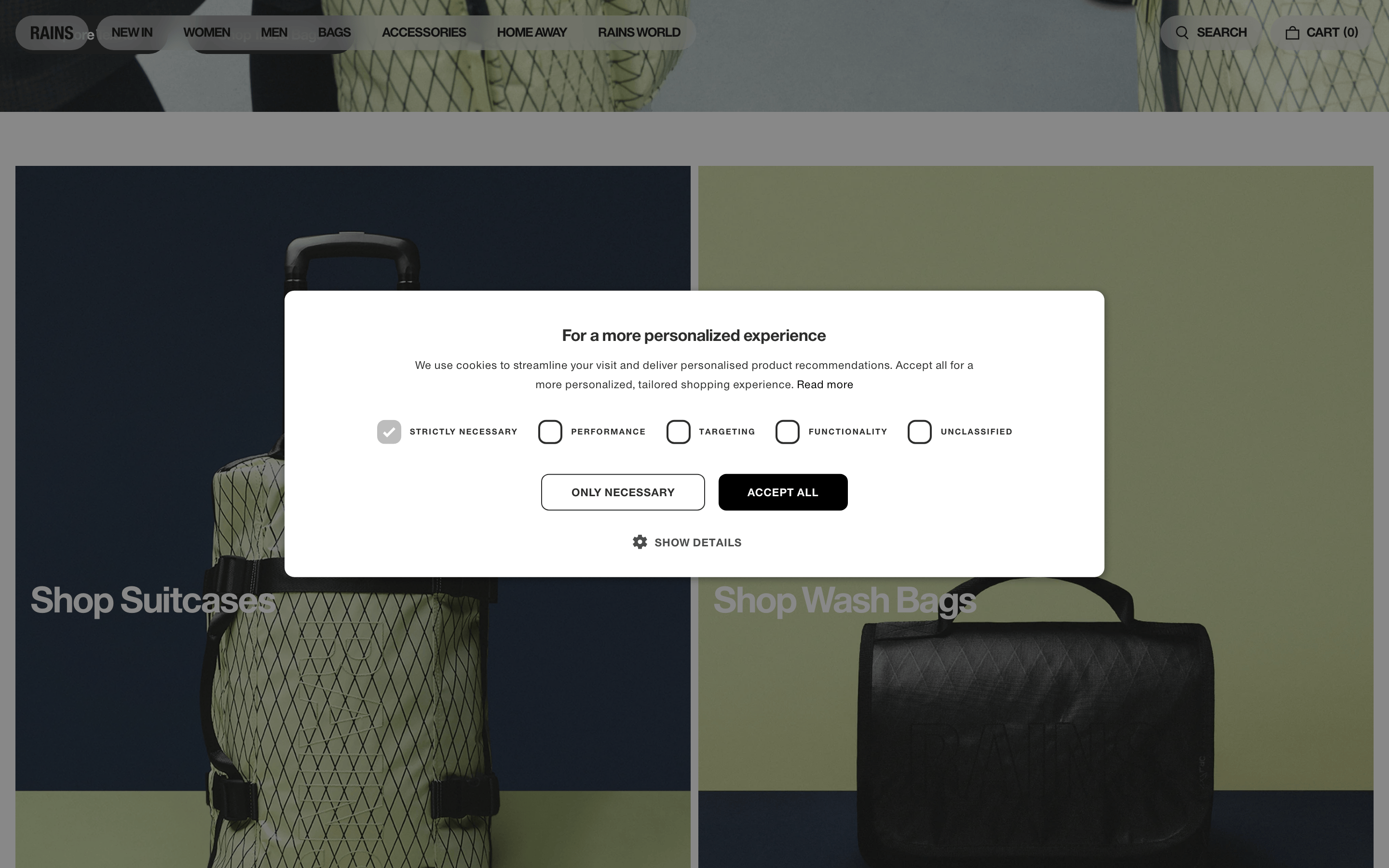
cardPhotography-focused cards with minimal chrome, using overlaid large typography for titles and transparent buttons
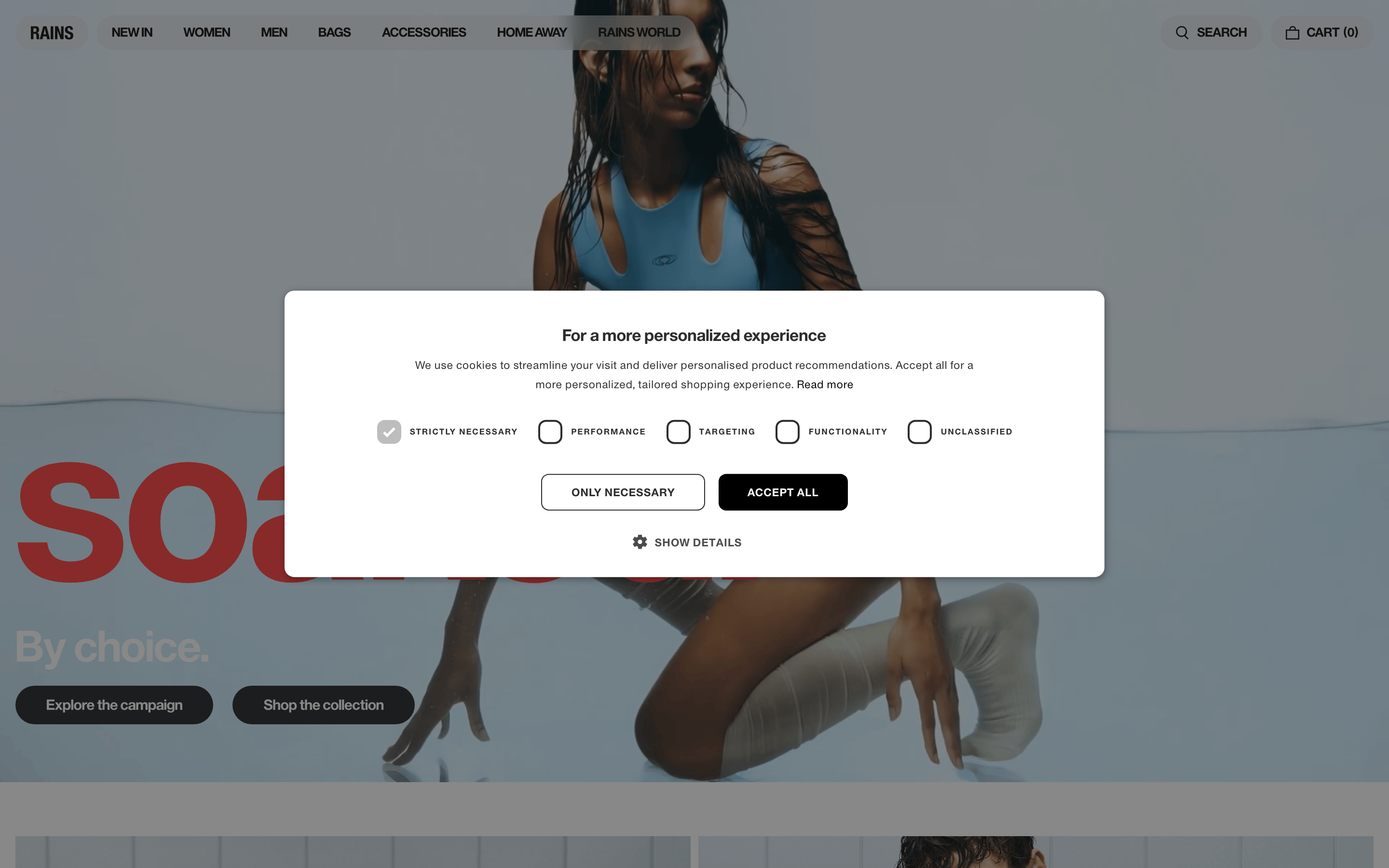
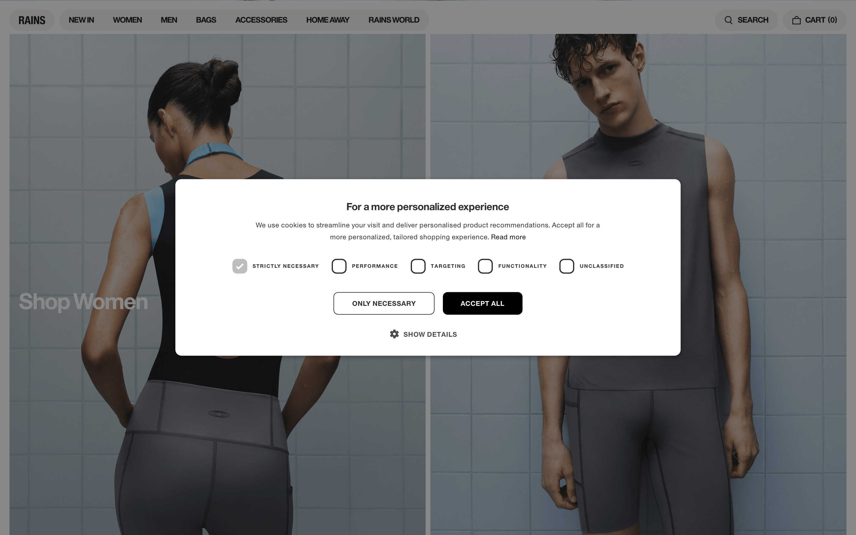
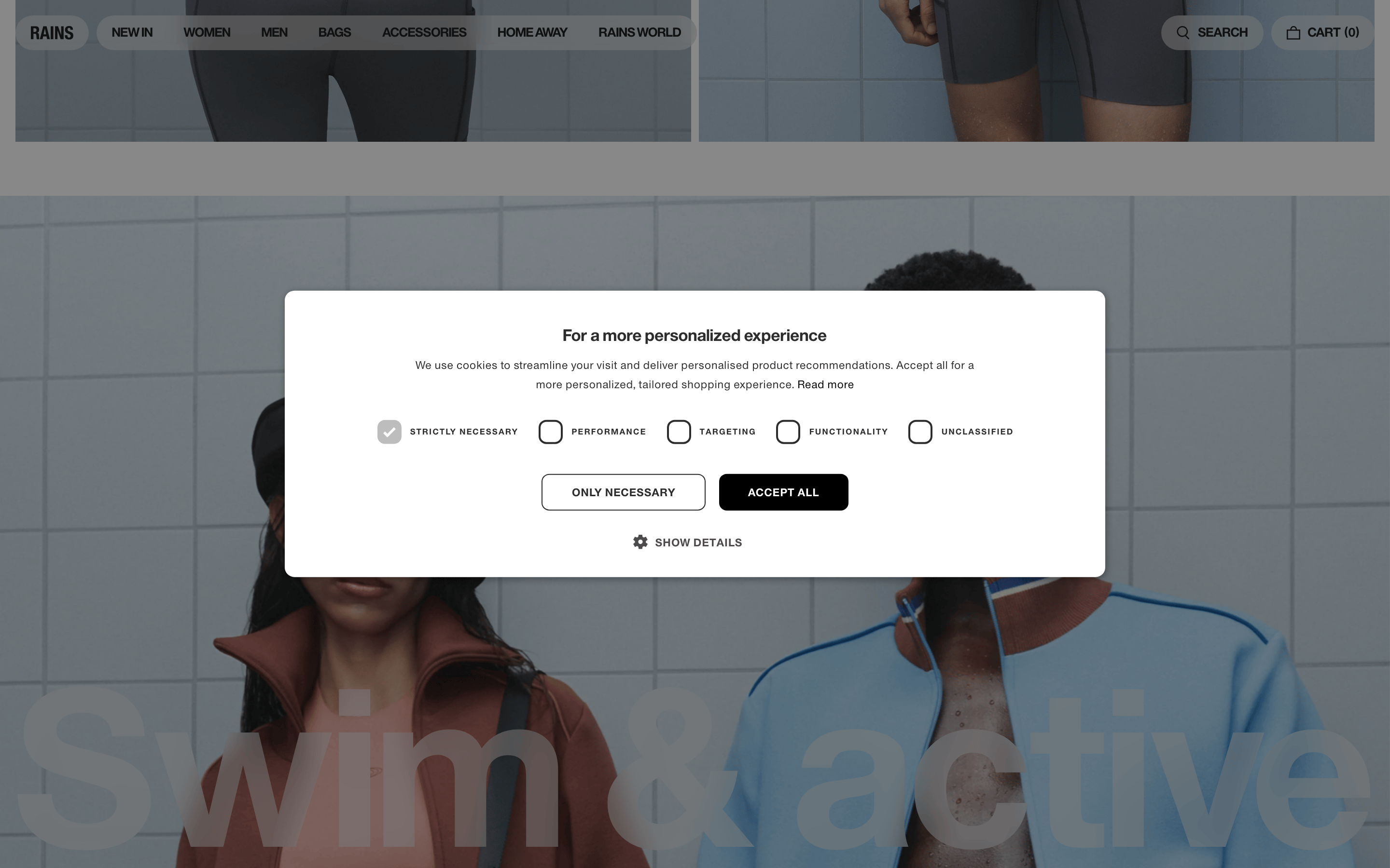
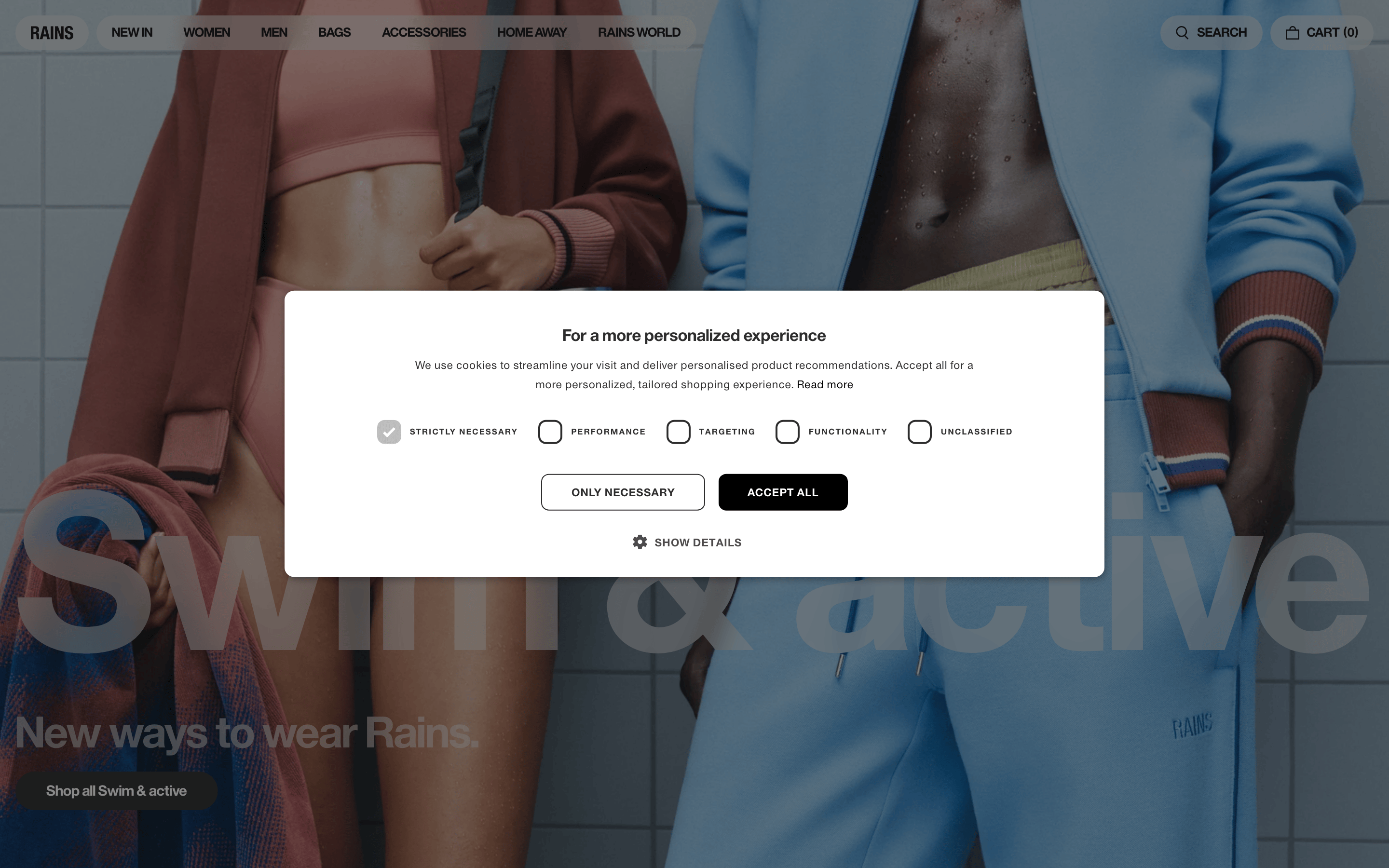
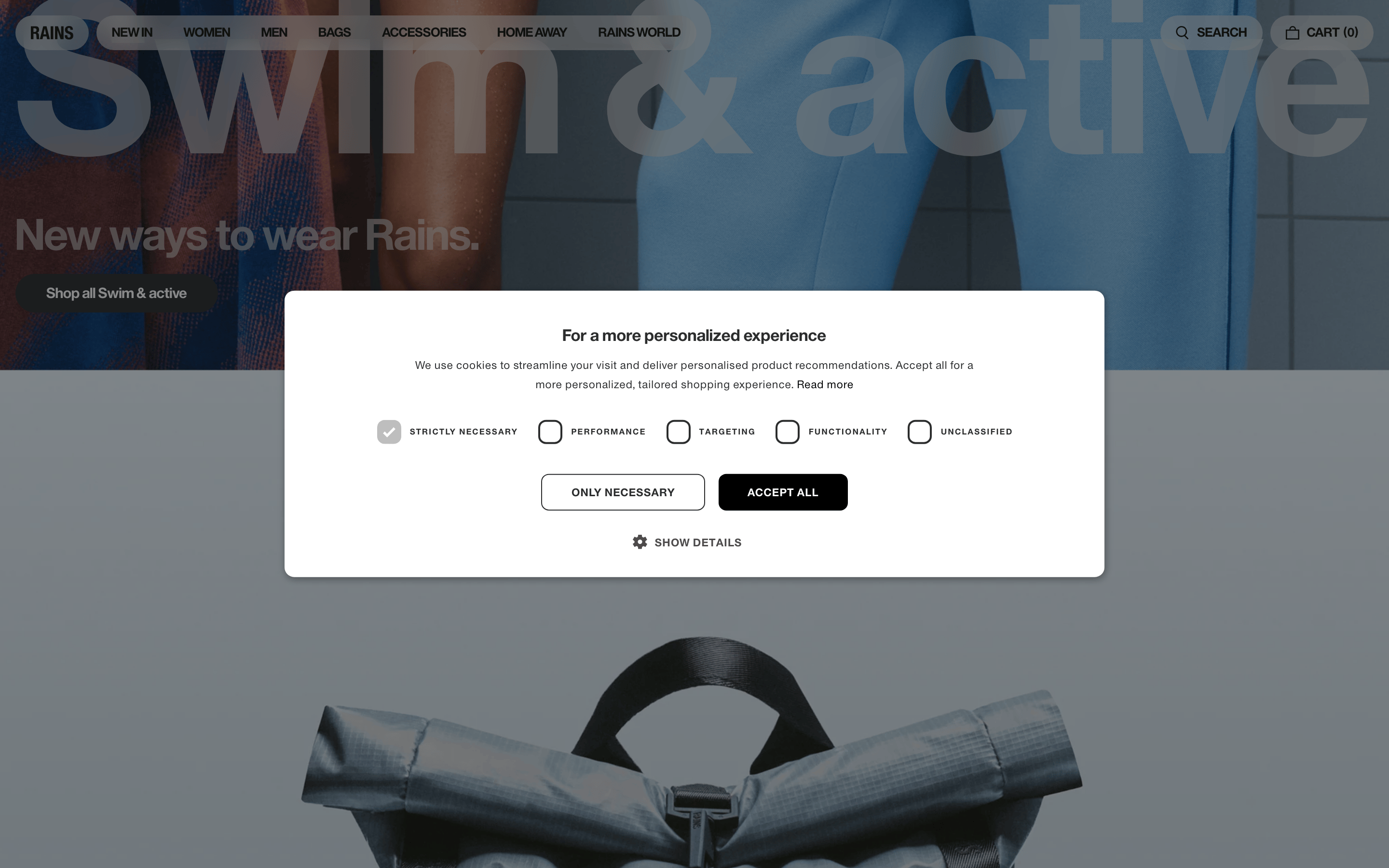
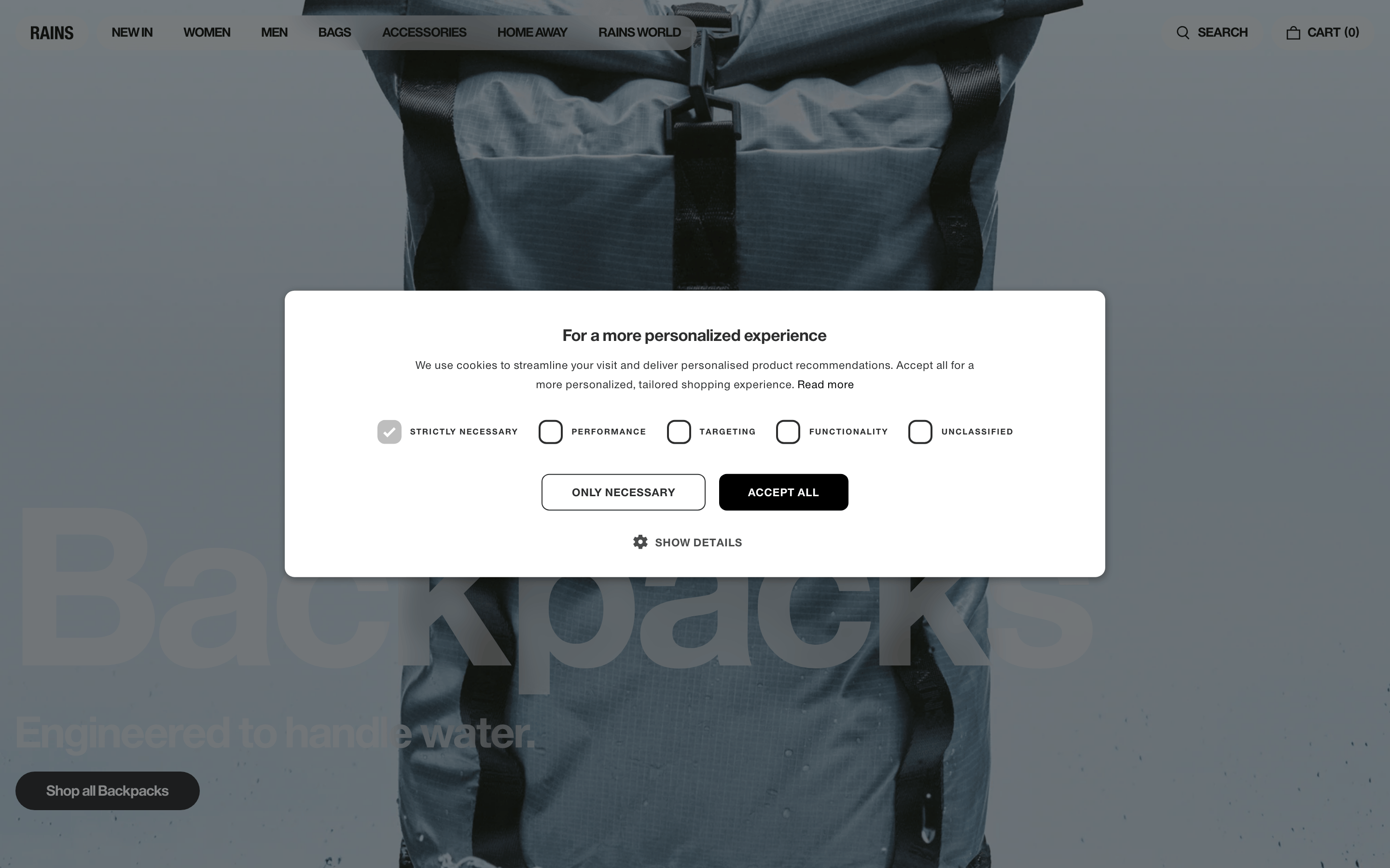
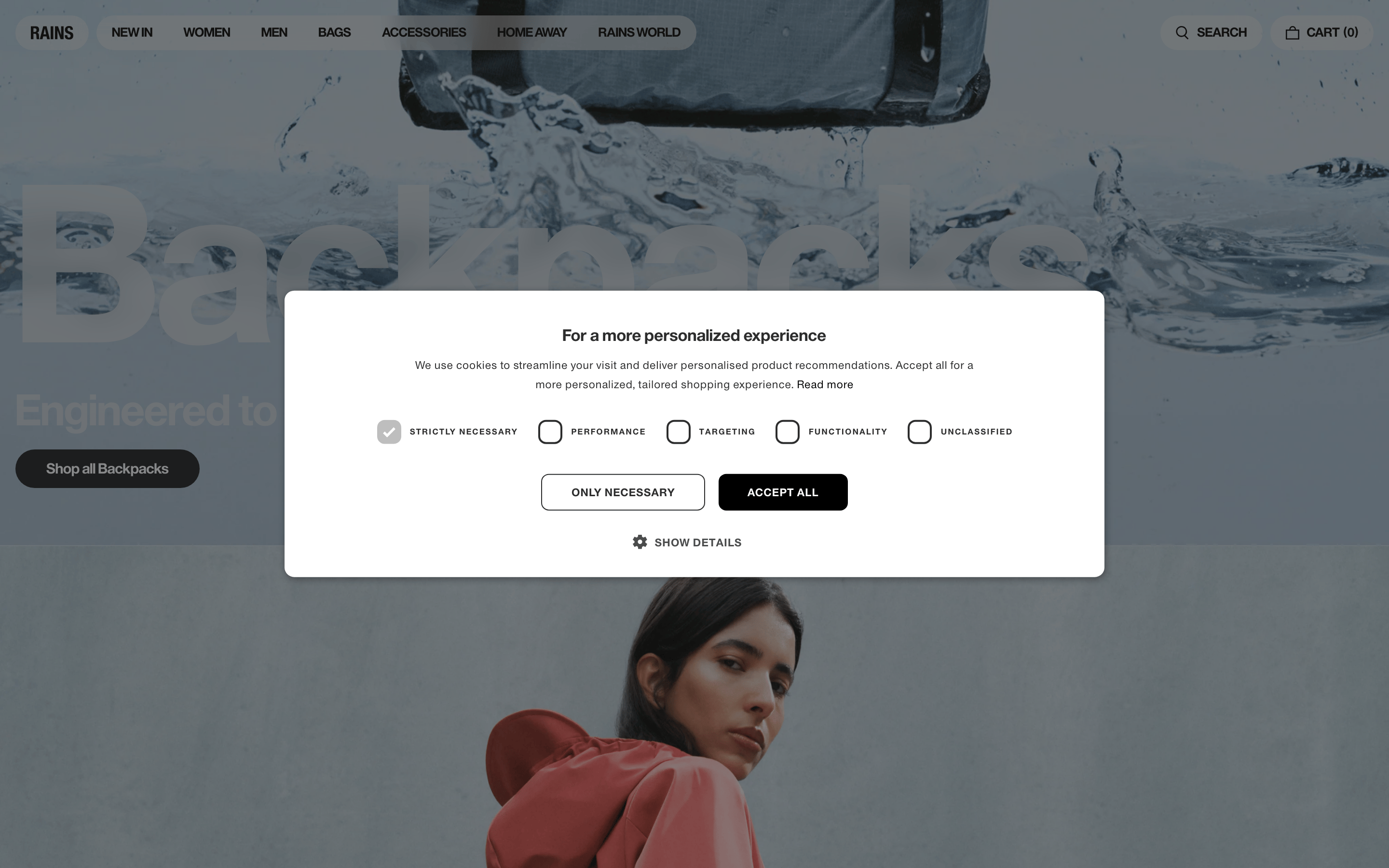
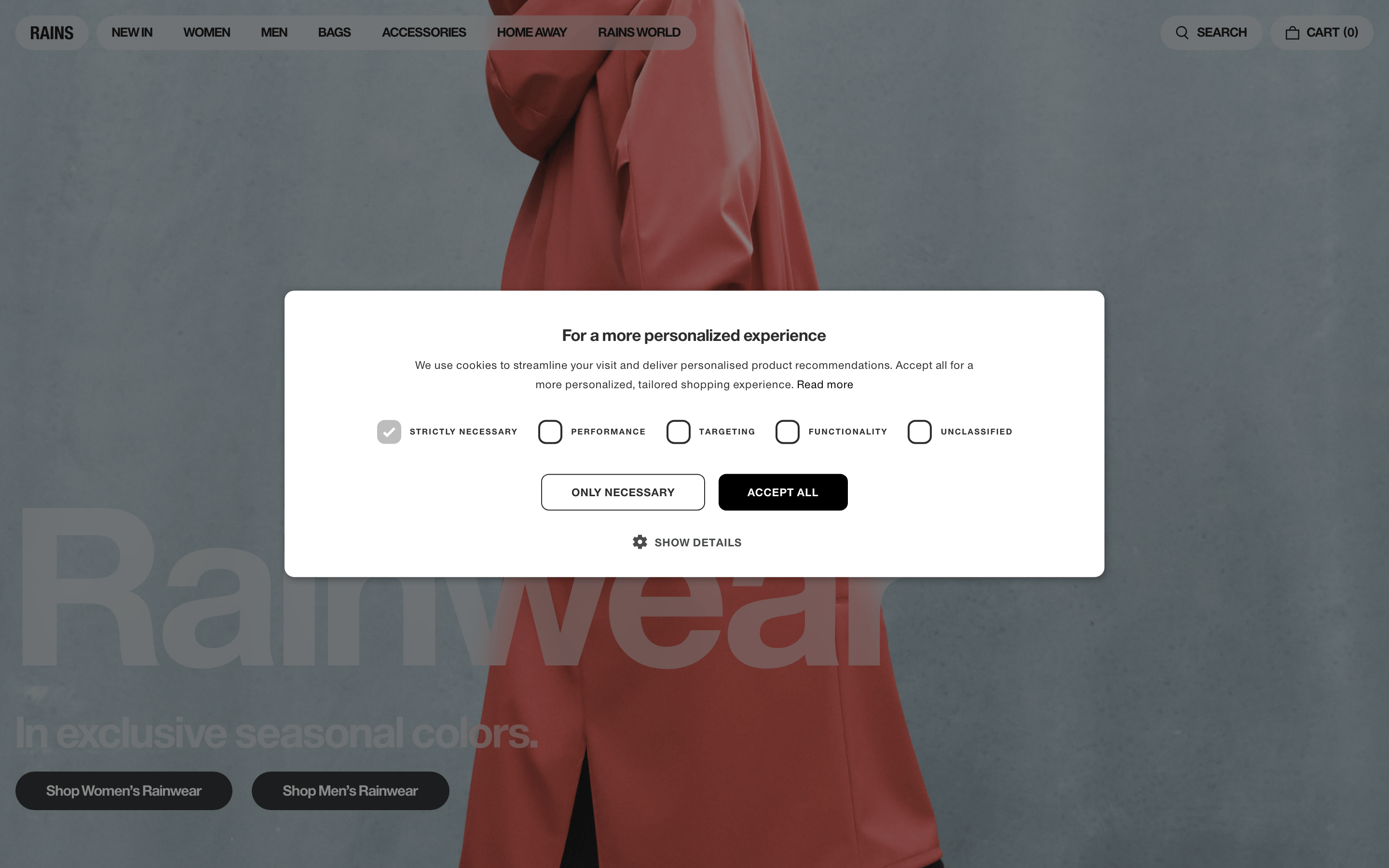
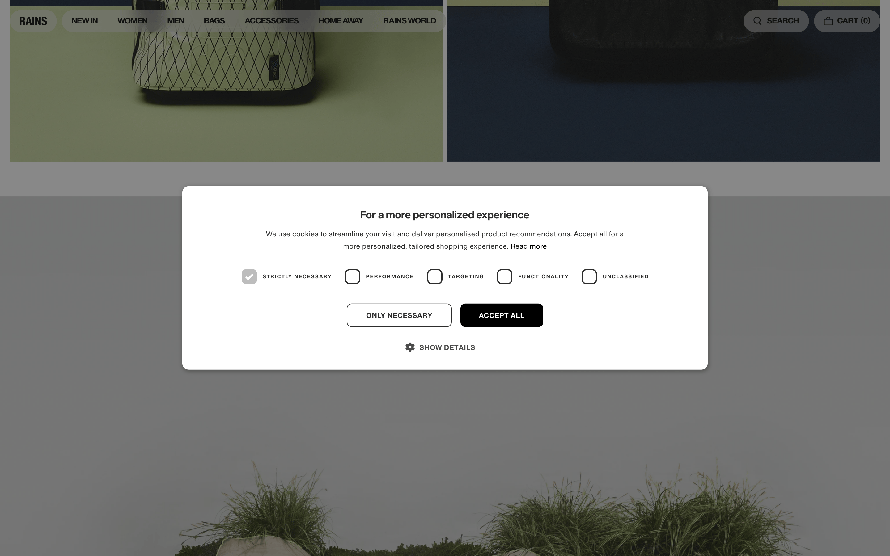
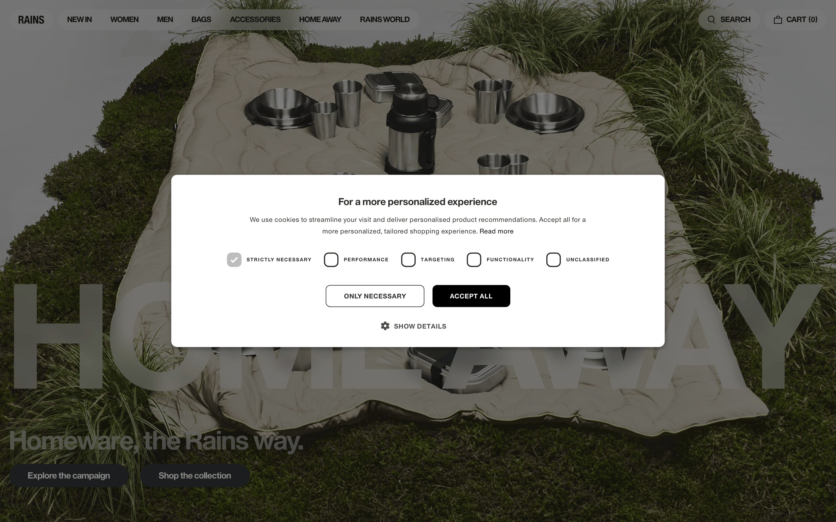
chipCheckbox-style chips with square borders (border-radius: 8px) and uppercase labels in the cookie consent modal
inputClean rectangular inputs with inset box-shadow borders, generous padding, and uppercase labels
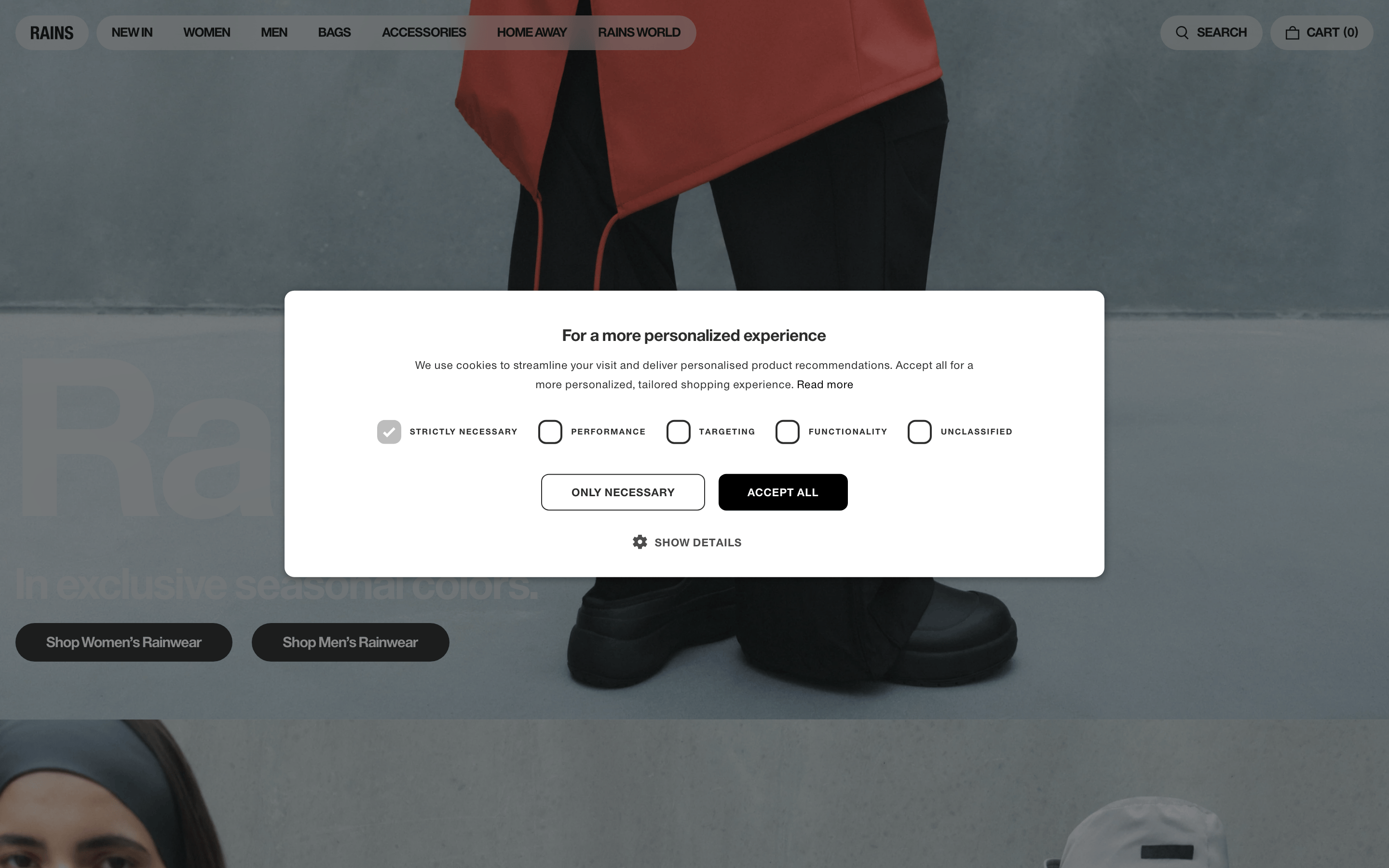
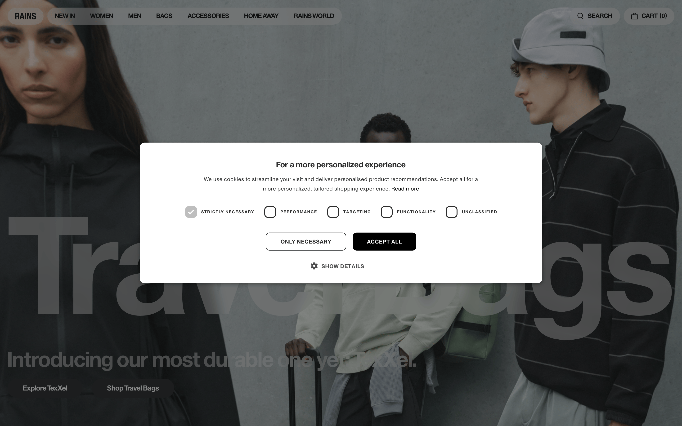
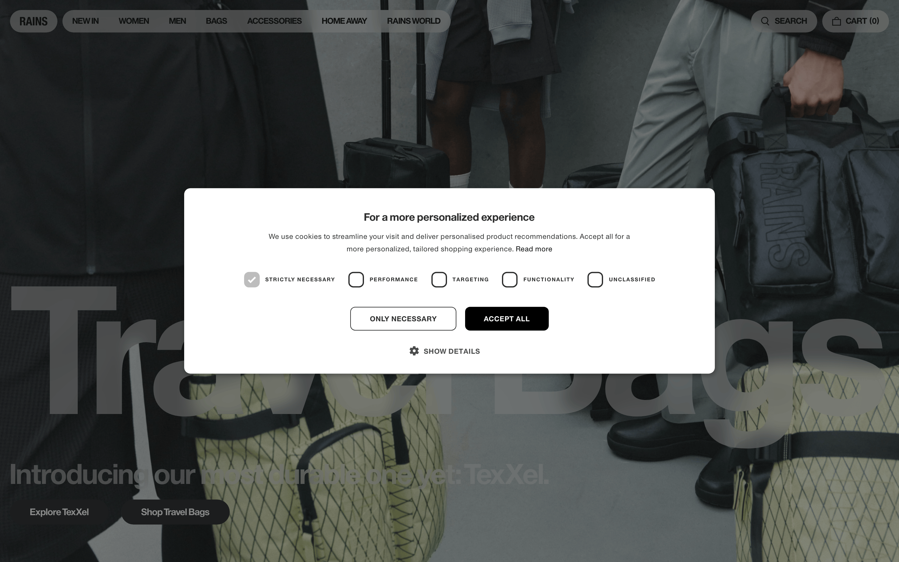
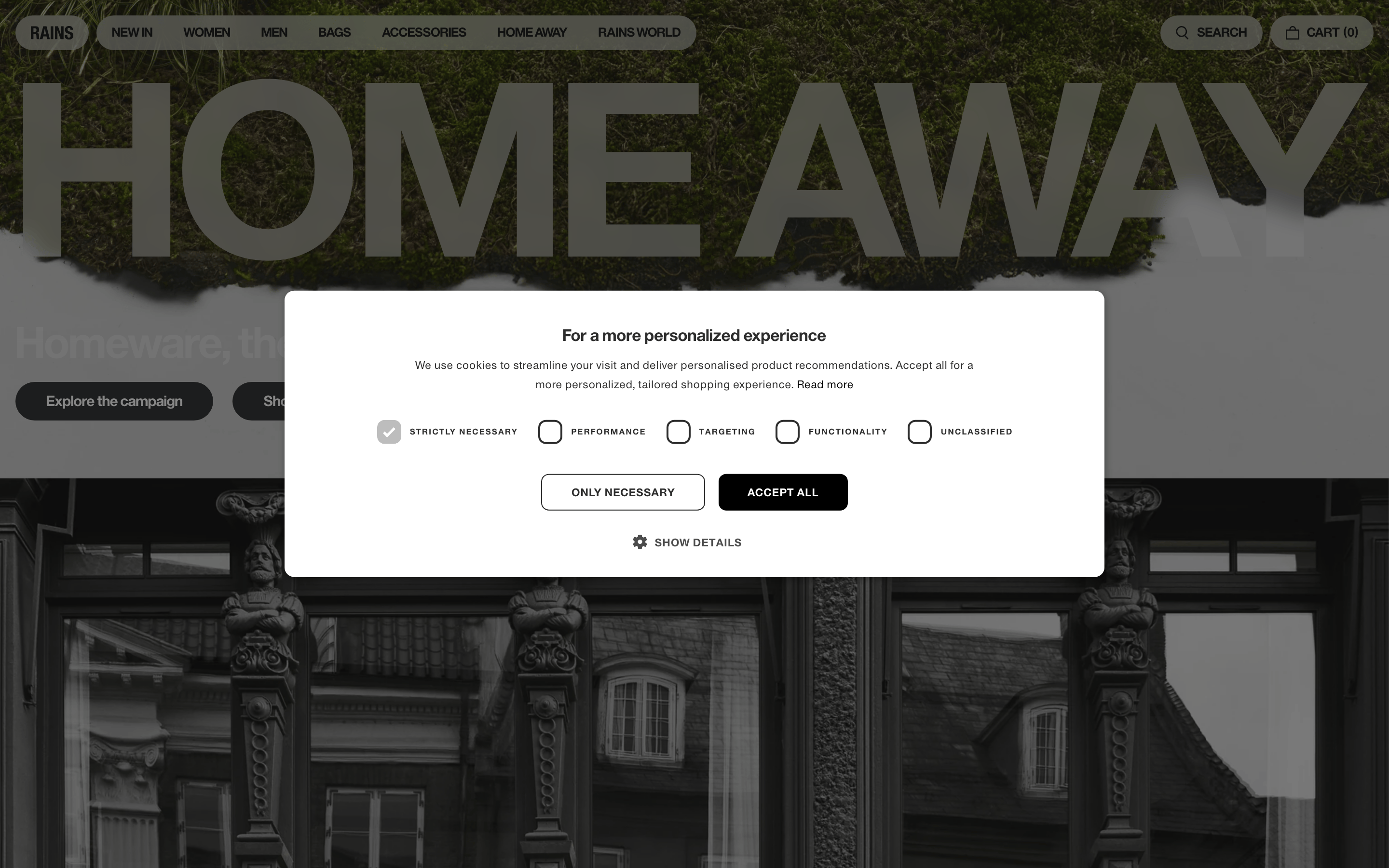
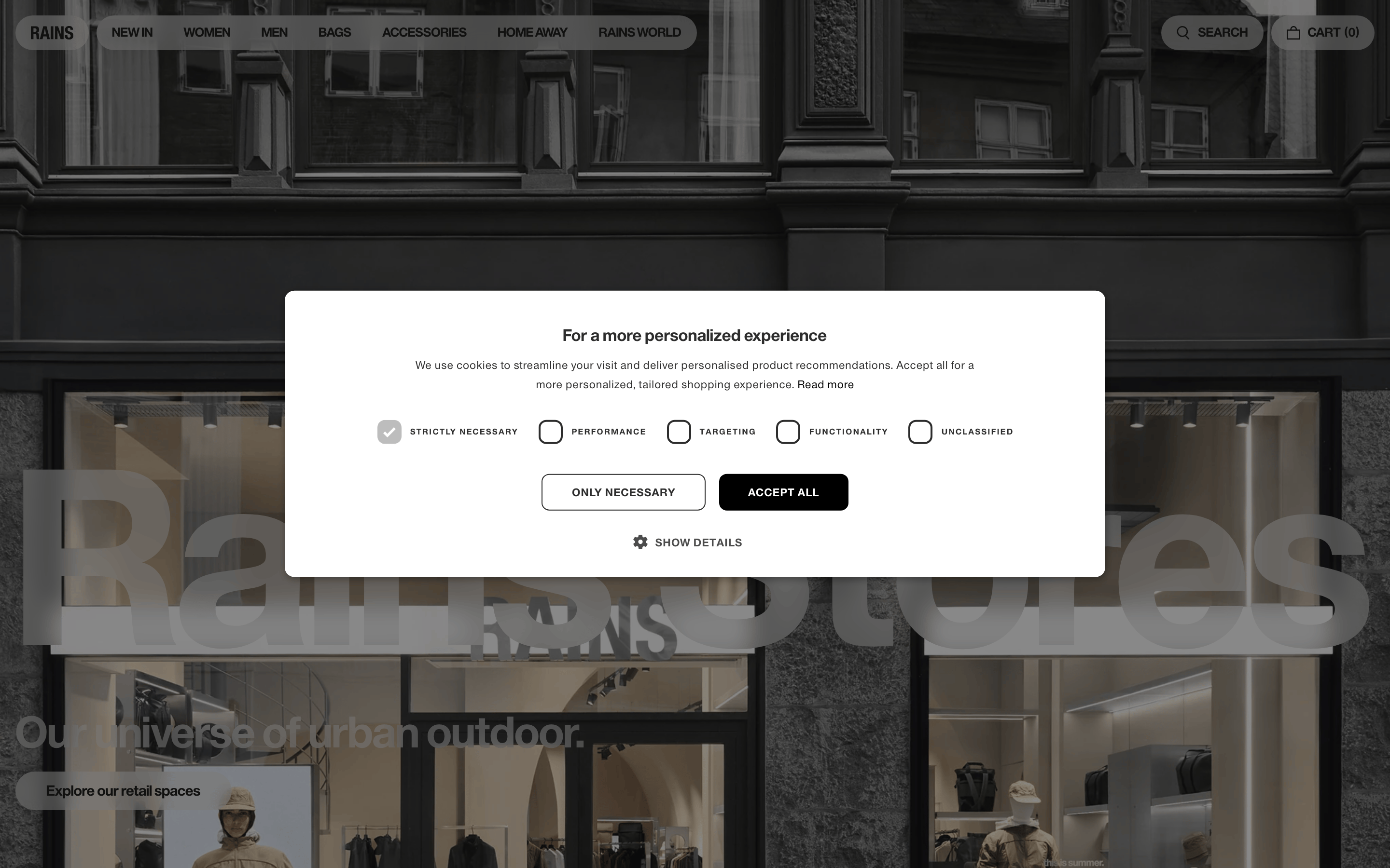
heroFull-bleed cinematic photography with large overlapping typography in white or accent colors, bottom-aligned navigation buttons
09
Voice & Don'ts
ToneConfident, minimal, editorial with Scandinavian restraint
HeadlinesShort, punchy, lowercase or sentence-case phrases that evoke mood rather than describe products directly
CTAsAction-oriented phrases like 'Explore the campaign' and 'Shop the collection' in clean pill-shaped buttons
Don't use decorative script fonts — screenshot shows clean geometric sans-serif throughout
Don't add drop shadows to hero images — screenshot shows flat photography with overlaid text
Don't use bright accent colors — screenshot shows neutral palette with occasional red/orange from photography only
Don't make navigation items colorful — screenshot shows all navigation in uniform black uppercase text
Don't use rounded card corners generously — screenshot shows sharp edges or minimal rounding on cards
Don't center-align all content — screenshot shows left-aligned typography over photography with right-aligned search/cart
Don't use gradient backgrounds — screenshot shows solid neutral colors and photography fills
Captured from the live site · real computed styles
11
System prompt
Rains.com is a premium Scandinavian rainwear brand combining minimalist Nordic design with bold editorial photography. The site uses a neutral palette (background #E3E3E3, primary ink #10100F, soft ink #2D2D2D, muted #B3B3B2) with photography providing all color. Typography is entirely geometric sans-serif (Europa Grotesk family) with uppercase navigation labels, tight headline spacing at 48px/1.0, and body text at 14px with 0.4px letter-spacing. Key UI patterns include pill-shaped buttons (border-radius 9999px), full-bleed photography heroes with overlaid large text, and clean input fields with inset borders. Three critical donts: never use decorative script fonts, never add gradients or texture overlays to photography, and never use bright neon or saturated accent colors in UI elements.
Bring this taste to your agent
Hand your AI agent a machine-readable spec of this design — tokens, type, motion, the whole DNA.