A high-end design gallery that blends raw organic textures with sharp, modern typography.
02
Color
#EB516DAccent
#FFFFFFInk
#808080Ink soft
#000000BG
rgba(255,255,255,1.0)Line
High-contrast monochromatic base with a single, vibrant pink accent for maximum impact.
03
Typography
didone-serif · grotesque-sans
display90px · 400
heading36px · 400
body18px · 400
Use the grotesque sans for all UI elements and body copy. · Use the didone serif exclusively for massive, impactful headlines. · Maintain tight letter-spacing for display text to enhance its editorial feel.
04
Spacing
4px
8px
16px
24px
32px
48px
64px
96px
Generous whitespace and wide gaps are used to separate sections and let the large typography breathe.
05
Surfaces
sm · 4px
md · 24px
lg · 40px
pill · 999px
1px solid rgba(255,255,255,1.0)
0px 8px 24px rgba(0,0,0,0.5)
06
Layout
1400container
12columns
24pxgutter
768 / 1024breakpoints
A full-width, edge-to-edge layout dominated by massive centered elements.
07
Motion & Interaction
220msmicro
300mssmall
600msmedium
cubic-bezier(0.25, 0.1, 0.25, 1.0)easing
Smooth opacity and transform transitions on interactive elements. · Hover effects on buttons and links.
Subtle color shifts or opacity changes on interactive elements. · Standard pointer interactions with immediate visual feedback.
08
Components
buttonPill-shaped buttons with white borders and black backgrounds.
cardCards with large border-radius and subtle dark gradients or solid backgrounds.
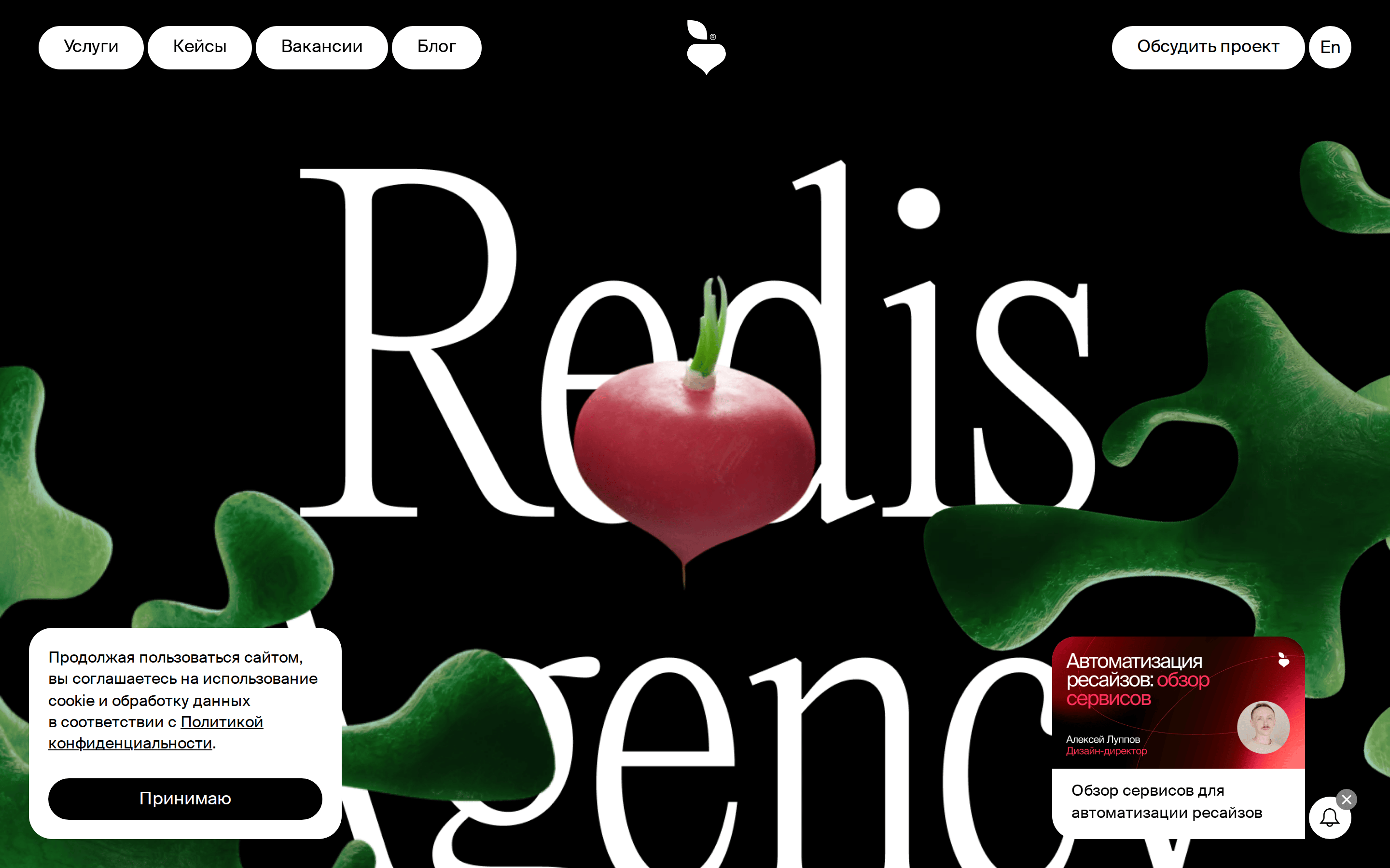
heroAn immersive full-screen section with a giant serif headline and floating 3D organic imagery.
09
Voice & Don'ts
ToneSophisticated, direct, and slightly avant-garde.
HeadlinesMinimalist and highly expressive, using large, evocative words.
CTAsSimple, action-oriented text enclosed in distinct pill shapes.
Don't use rounded, friendly shapes — screenshot shows sharp, tall serifs and pill-shaped buttons.
Don't use a light or colorful background — screenshot shows a dominant black background (#000000).
Don't use a multi-color palette — screenshot shows a strict white, black, and grey scheme with a single pink accent.
Captured from the live site · real computed styles
11
System prompt
Redis Agency is a bold, modern creative agency site. Its design DNA is built on a strict, high-contrast palette of pure black (#000000) and white (#FFFFFF), anchored by a single, vibrant pink accent (#EB516D). The typography is a dramatic pairing of a tall, elegant didone-serif for massive headlines and a clean grotesque-sans for all body and UI text. The layout is expansive, edge-to-edge, and dominated by oversized, expressive typography paired with organic 3D imagery. Critical design rules: Never use multiple accent colors; keep the palette strictly monochromatic with one pop. Never use small or subtle typography; display text must be oversized and impactful. Never use complex or cluttered grids; favor a minimal, spacious approach that lets the hero elements command attention. The overall tone is sophisticated and avant-garde, avoiding anything playful or generic.
Bring this taste to your agent
Hand your AI agent a machine-readable spec of this design — tokens, type, motion, the whole DNA.