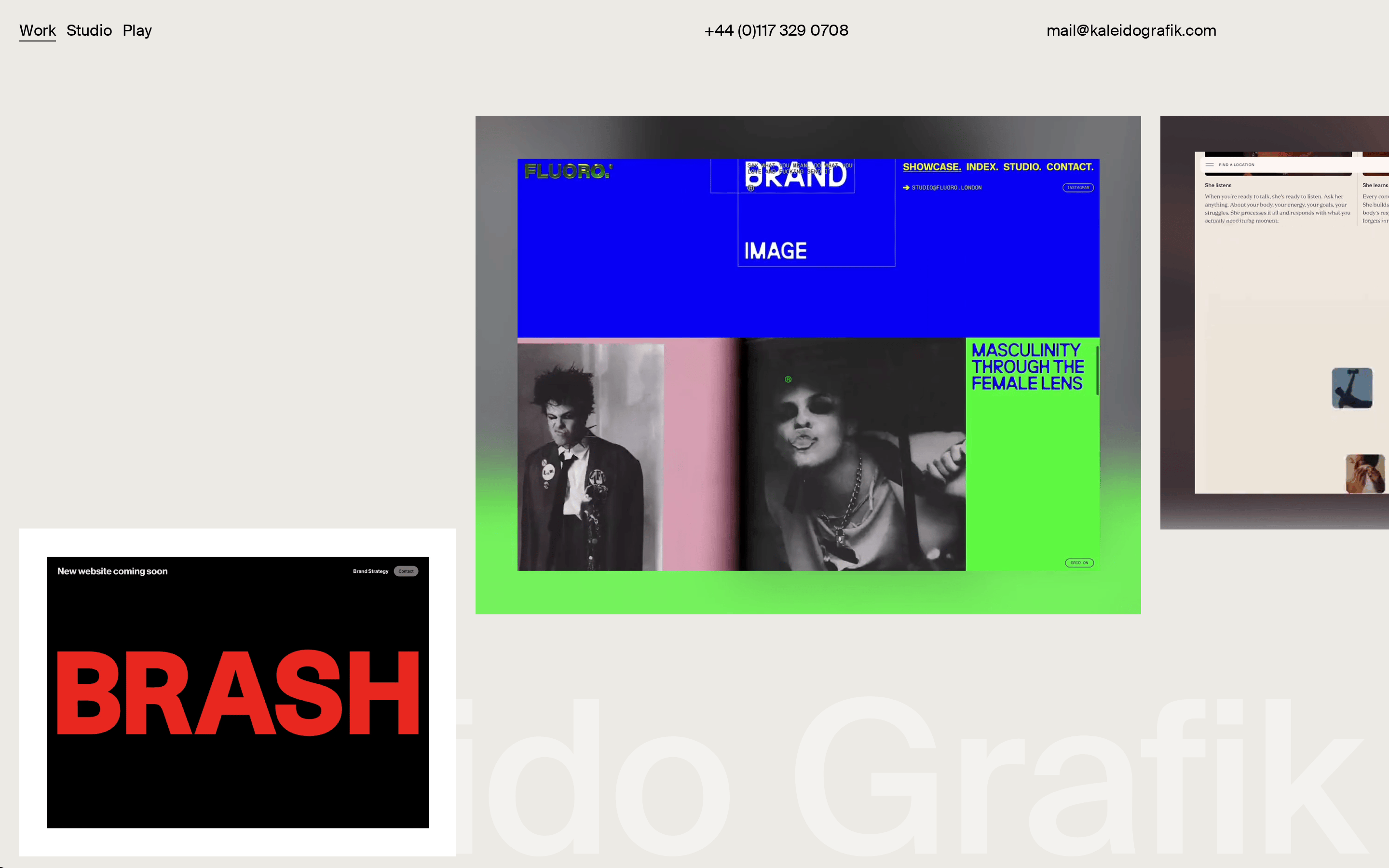
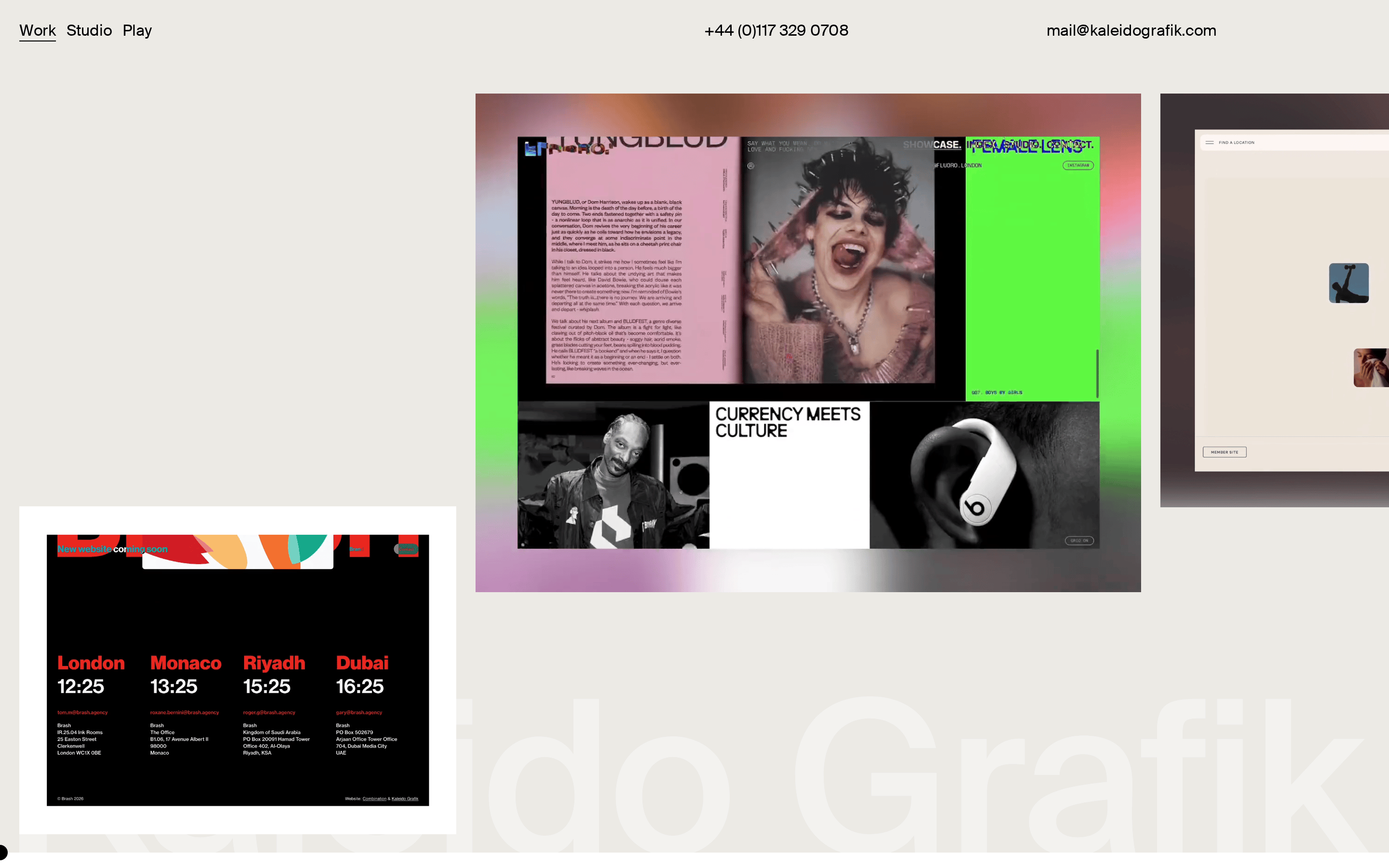
A blank canvas that lets bold client work speak for itself
02
Color
#000000Ink
#ECEAE5BG
rgba(0,0,0,1.0)Line
Strict monochrome canvas with warm off-white background, relying entirely on client work for color.
03
Typography
humanist-sans · monospace
display120px · 400
h132px · 400
body16px · 400
All typography uses Suisse Intl Regular at weight 400 · Navigation links use 16px body size with underline for active state · Massive background watermark text uses extremely large display size
04
Spacing
4px
8px
16px
20px
24px
48px
75px
Generous whitespace with 20px horizontal padding and 75px bottom padding on containers
05
Surfaces
sm · 0px
md · 8px
lg · 0px
pill · 0px
No visible borders on containers, 1px solid black underlines on active nav items
0 4px 20px rgba(0,0,0,0.1) on project cards
06
Layout
1400container
12columns
24pxgutter
768 / 1024breakpoints
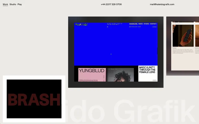
Masonry-like grid with varying card sizes, top navigation bar, and large background watermark text
07
Motion & Interaction
150msmicro
400mssmall
500msmedium
cubic-bezier(0.25, 0.1, 0.25, 1)easing
Opacity fade transitions on hover states · Smooth opacity and transform transitions for navigation · Background color transitions on interactive elements
Opacity reduction on navigation links and project cards · Navigate to project detail pages
08
Components
buttonMinimal text links with underline states, no visible button containers
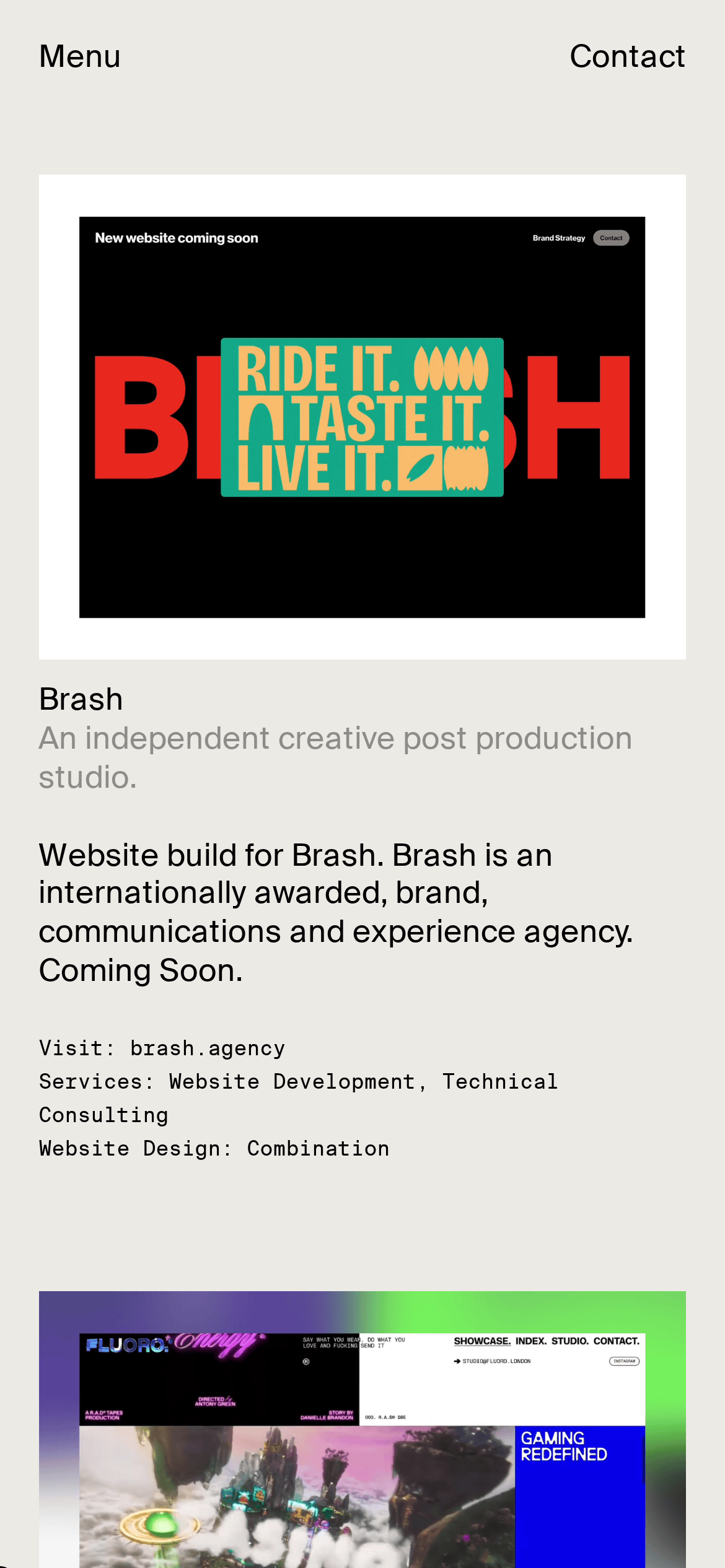
cardProject preview cards with varying aspect ratios, containing screenshots and case study imagery
chipSmall pill-shaped tags with 1px black border for project metadata
inputNot visible in current view
heroScattered project cards over large faded background typography
09
Voice & Don'ts
ToneUnderstated, professional, letting work speak for itself
HeadlinesMinimal, direct, uppercase for project categories
CTAsSimple text links without visual emphasis
Don't use multiple font weights — screenshot shows uniform weight 400 throughout
Captured from the live site · real computed styles
11
System prompt
Kaleidografik is an independent creative studio portfolio with a minimal, content-first design. The site uses a warm off-white background (#ECEAE5) with pure black text (#000000), creating a monochrome canvas that lets bold client work provide all visual interest. Typography is exclusively Suisse Intl Regular at weight 400, with massive background watermark text as the primary decorative element. Navigation is a simple three-item horizontal bar (Work, Studio, Play) with underline active states. Project cards are displayed in an asymmetric masonry layout with generous whitespace. Key don'ts: never use multiple font weights, never add decorative UI elements, never introduce colored backgrounds or accent colors, never create complex button styles, never add drop shadows to containers, never use brand-colored accents. The design philosophy is extreme restraint - the agency's own site deliberately steps back to showcase client work as the visual centerpiece.
Bring this taste to your agent
Hand your AI agent a machine-readable spec of this design — tokens, type, motion, the whole DNA.