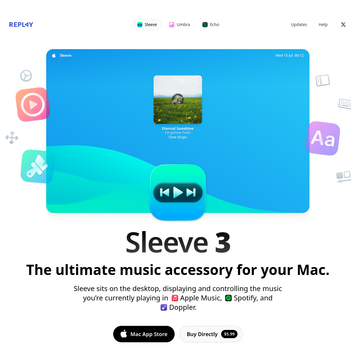
A sleek desktop music controller that blends into the macOS environment.
02
Color
#1A1A1AInk
#FFFFFFBG
#6B6B6BMuted
rgba(0,0,0,0.08)Line
Clean white canvas with high-contrast dark text for clarity and focus.
03
Typography
geometric-sans · humanist-sans
display64px · 700
heading40px · 700
body18px · 400
Headlines use a bold, geometric sans-serif with tight tracking. · Body text is a highly legible humanist sans-serif. · Large typography sizes dominate the layout for clear hierarchy.
04
Spacing
4px
8px
16px
24px
32px
48px
64px
96px
Generous vertical spacing emphasizes the large typography and creates a calm, premium feel.
05
Surfaces
sm · 8px
md · 16px
lg · 24px
pill · 999px
Subtle, thin borders on interactive elements.
0 4px 24px rgba(0,0,0,0.08)
06
Layout
1200container
12columns
24pxgutter
768 / 1024breakpoints
Single-column centered layout with a prominent hero graphic and clear typographic hierarchy.
07
Motion & Interaction
200msmicro
300mssmall
500msmedium
cubic-bezier(0.4, 0, 0.2, 1)easing
Hover transitions on buttons and navigation items.
Subtle color shift or shadow change on interactive elements. · Immediate visual feedback, likely a slight scale or opacity change.
08
Components
buttonPill-shaped or rounded rectangle with solid fill, high contrast text, and subtle shadows or borders.
cardUsed for the main product graphic, featuring a large image with rounded corners and a soft drop shadow.
chipSmall, rounded navigation pills in the header for product switching.
heroLarge, centered graphic showcasing the product in context, with floating decorative elements.
09
Voice & Don'ts
ToneConfident, minimalist, and premium.
HeadlinesDirect, bold, and benefit-oriented statements.
CTAsClear, action-oriented text with pricing if applicable.
Don't use dark mode — the screenshot shows a predominantly white background.
Don't use thin, delicate typography — the screenshot uses bold, heavy font weights.
Don't use complex grid layouts — the screenshot uses a simple, centered single-column layout.
Don't use a muted, desaturated color palette — the screenshot features vibrant, colorful product graphics.
Don't use small, cramped spacing — the screenshot features generous whitespace around elements.
Don't use ornate or decorative fonts — the screenshot uses clean, geometric sans-serif typography.
Avoid: Jargon
Avoid: Overly technical language
Avoid: Cluttered layouts
11
System prompt
Replay Software presents a premium, clean macOS app landing page. The design DNA is defined by a stark white background (#FFFFFF) with high-contrast dark text (#1A1A1A) and generous whitespace. Typography relies heavily on a bold, geometric sans-serif display font for headlines and a humanist sans-serif for body text. The layout is a simple, centered column with a large, colorful product hero image. Critical donts: avoid dark mode or dark backgrounds, avoid thin or light font weights, avoid cluttered or complex grid layouts, avoid small spacing, and avoid decorative typography. The overall feel is refined, minimal, and focused on showcasing the product's visual appeal.
Bring this taste to your agent
Hand your AI agent a machine-readable spec of this design — tokens, type, motion, the whole DNA.