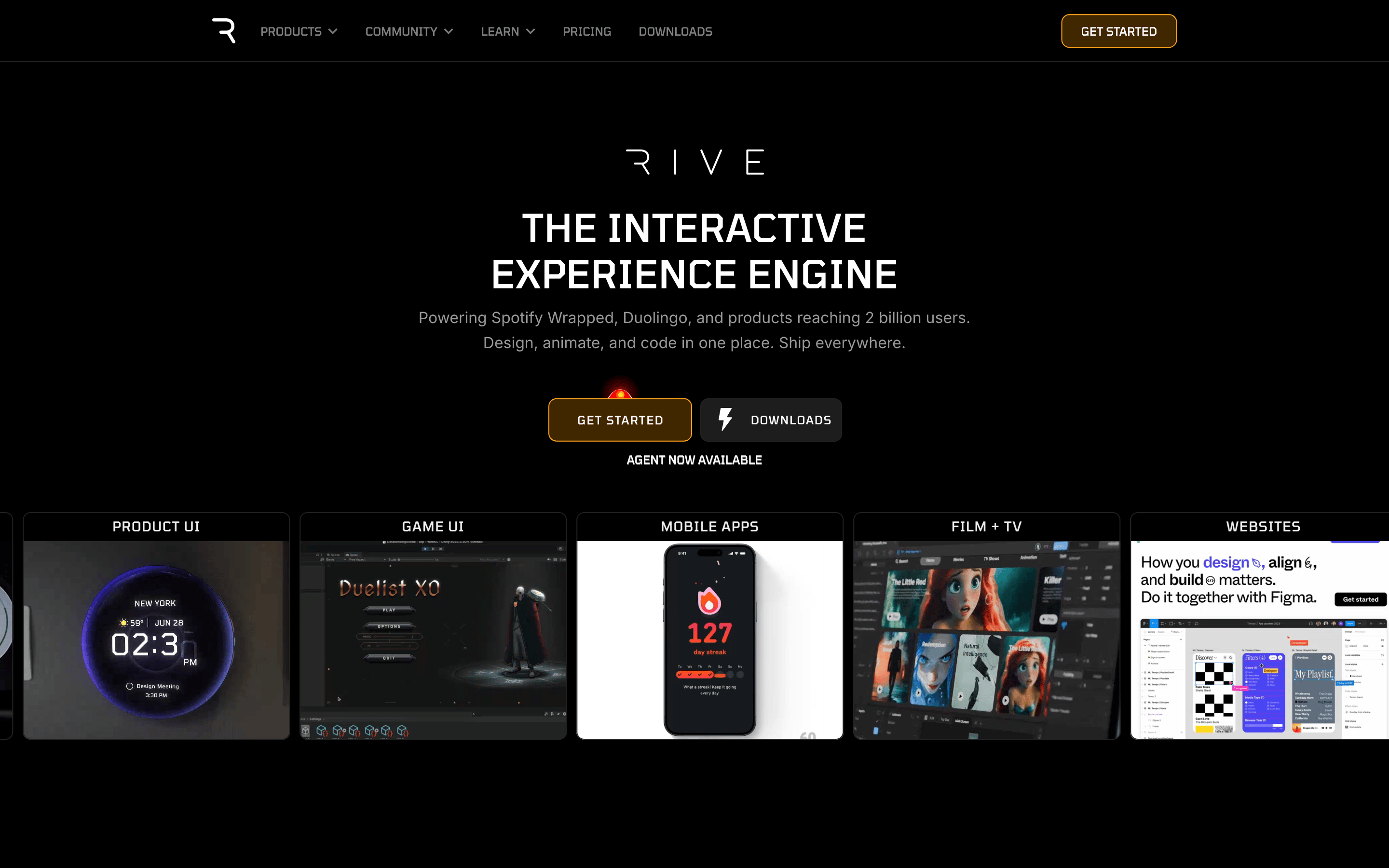
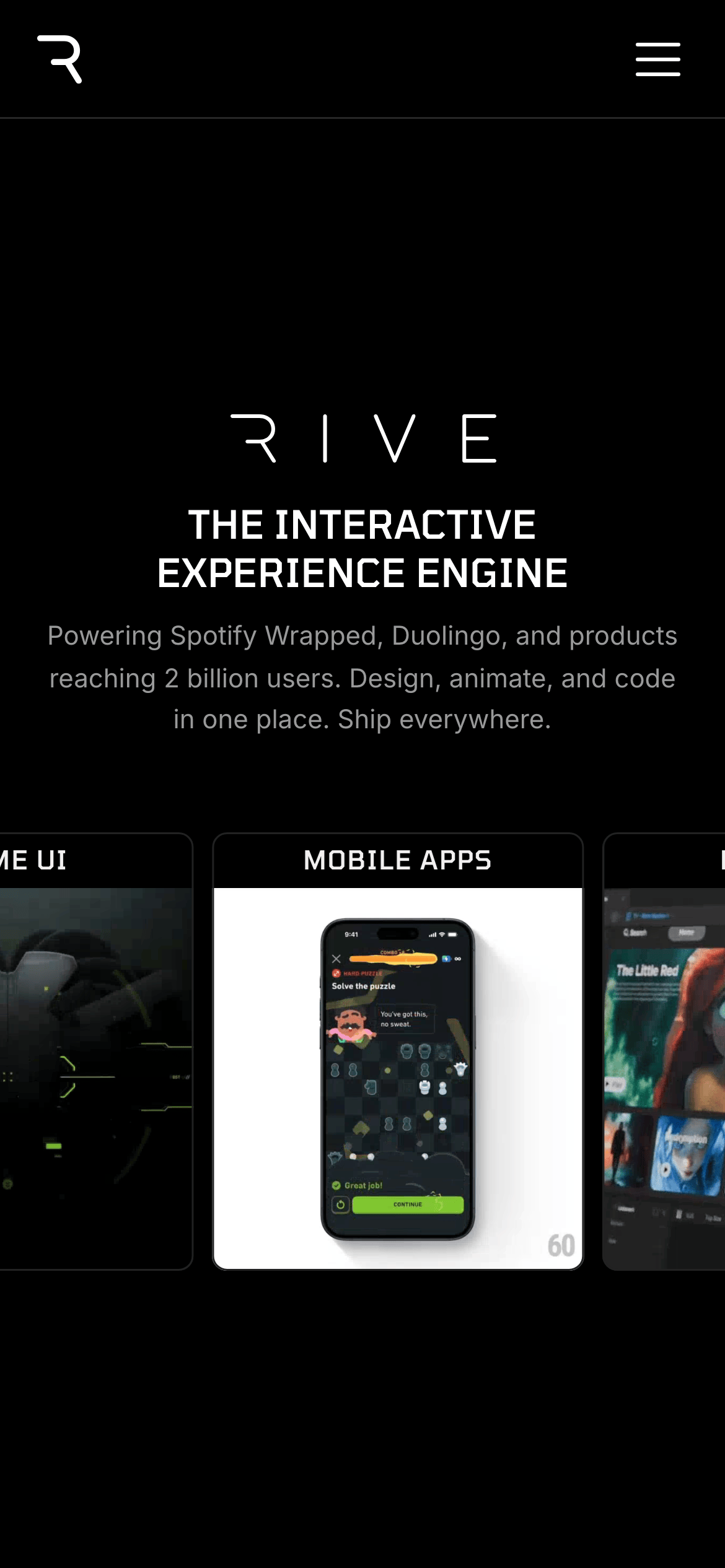
A sleek, professional workshop for building interactive animations across all platforms.
02
Color
#f1f1f1Ink
#999999Ink soft
#000000BG
#121212BG soft
#1d1d1dBG quiet
#666666Muted
rgba(255,255,255,0.1)Line
Deep dark canvas with high-contrast white text and subtle gray accents.
03
Typography
grotesque-sans · humanist-sans · monospace
display56px · 500
h232px · 500
body16px · 400
caption12px · 400
Display headlines use uppercase with tight tracking. · Body text uses a slightly expanded line height for readability. · Button text uses uppercase with wide tracking.
04
Spacing
4px
8px
16px
24px
32px
48px
64px
96px
Standard 4px base with consistent application of 8px and 16px increments.
05
Surfaces
sm · 4px
md · 8px
lg · 12px
pill · 999px
Subtle 1px solid borders using low-opacity white.
rgba(0, 0, 0, 0) 0px 0px 0px 1px inset
06
Layout
1280container
12columns
24pxgutter
768 / 1024breakpoints
Full-width dark background with centered content blocks and a 12-column grid.
07
Motion & Interaction
220msmicro
400mssmall
800msmedium
cubic-bezier(0.25, 0.1, 0.25, 1)easing
Hover transitions on interactive elements. · Smooth scrolling between sections.
Subtle color or opacity changes on buttons and links. · Immediate visual feedback on press.
08
Components
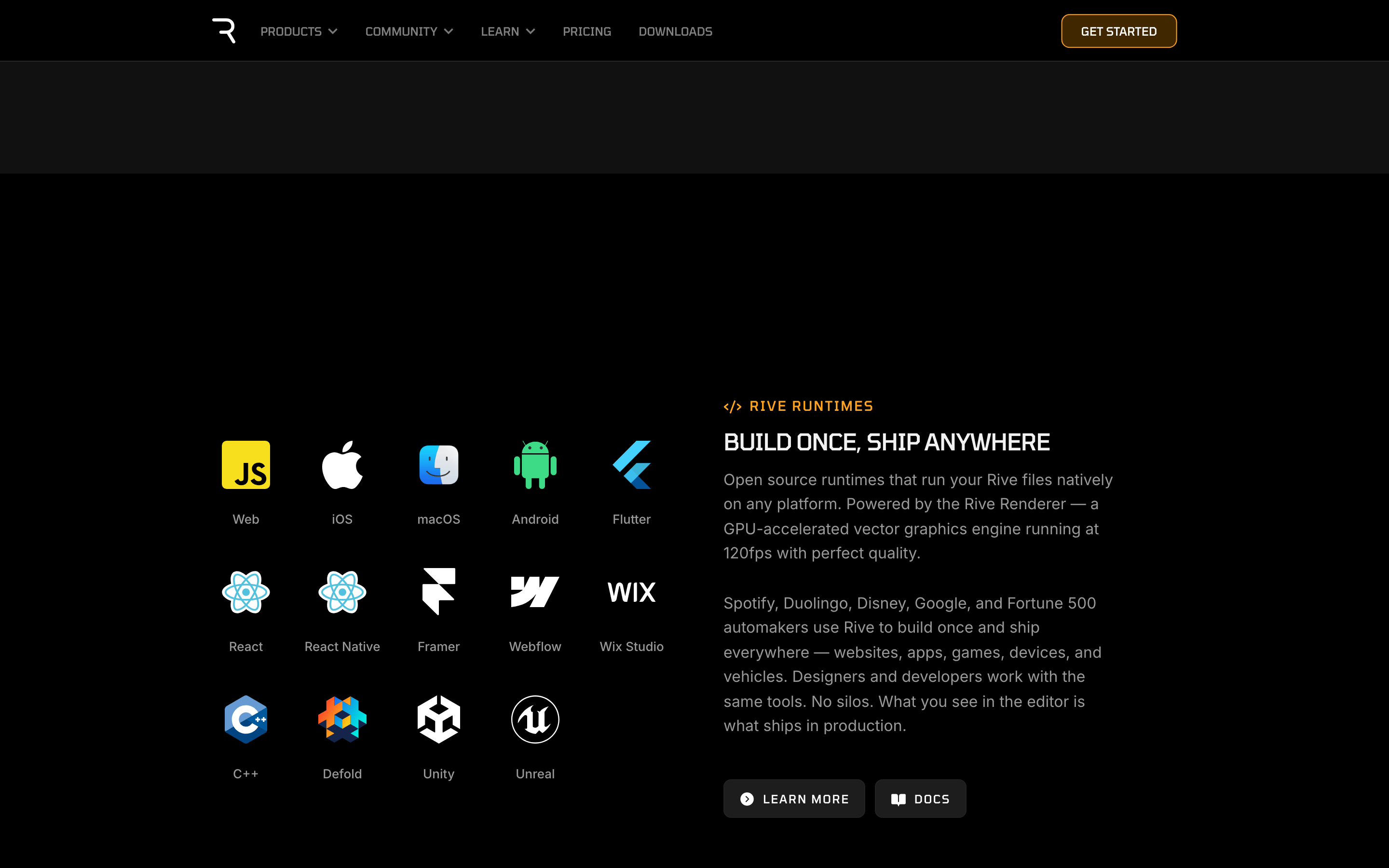
buttonHigh-contrast primary with gold outline, secondary with subtle border.
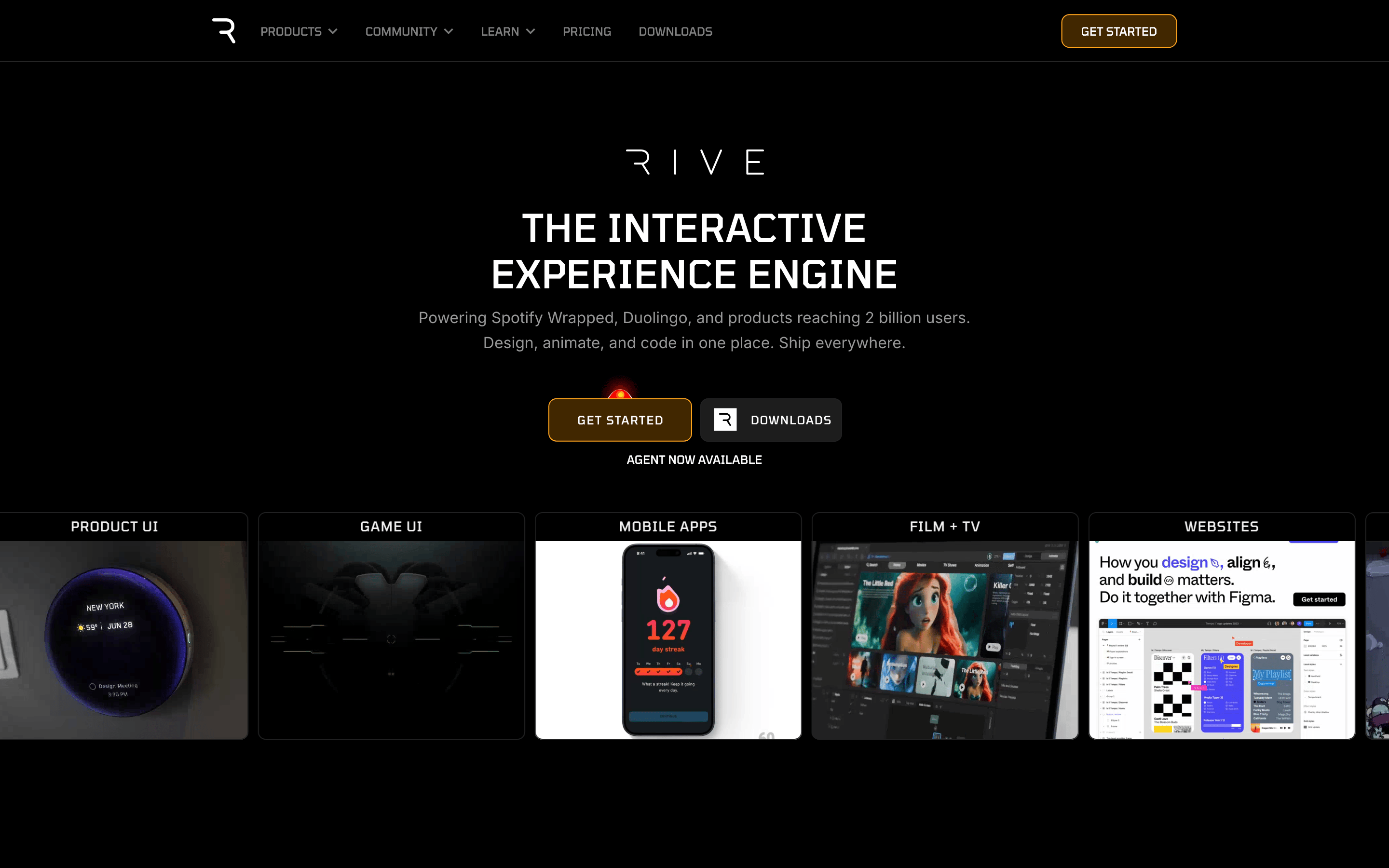
cardDark cards with subtle borders and rounded corners, showcasing visual examples.
chipNot prominently featured.
inputNot prominently featured.
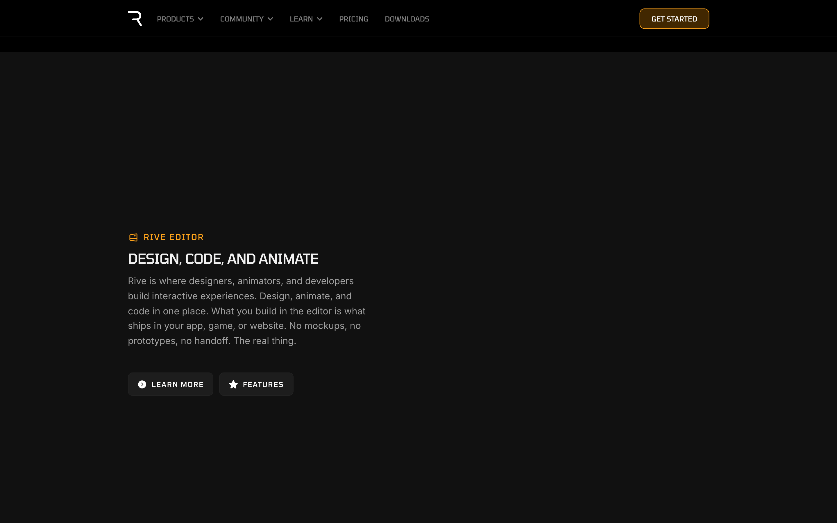
heroLarge centered typography with two prominent call-to-action buttons.
09
Voice & Don'ts
ToneProfessional, confident, and innovative.
HeadlinesBold, uppercase, and authoritative.
CTAsClear, action-oriented, and prominent.
Don't use light backgrounds — the screenshot shows a deep black canvas.
Don't use rounded, playful fonts — the screenshot shows sharp, geometric grotesque-sans.
Don't use colorful gradients as primary elements — the screenshot uses high-contrast white on black.
Don't use small, subtle buttons — the screenshot shows large, prominent call-to-action buttons.
Don't use complex multi-column layouts for hero sections — the screenshot uses centered, single-column focus.
Don't use drop shadows for depth — the screenshot relies on borders and contrast.
Captured from the live site · real computed styles
11
System prompt
This site is a high-end developer tool for creating interactive animations, positioned as the 'Interactive Experience Engine' for major brands. It features a sleek, dark-mode aesthetic with a pure black background (#000000), soft dark surfaces (#121212), and high-contrast white text (#f1f1f1). The typography uses clean, geometric grotesque-sans for display and humanist-sans for body text, creating a professional and authoritative feel. The layout is centered and spacious, emphasizing large headlines and prominent call-to-action buttons with gold outlines. Key design principles include restraint, clarity, and visual impact through contrast. Critical donts include avoiding light backgrounds, playful typography, cluttered layouts, subtle buttons, complex multi-column hero sections, and reliance on drop shadows for depth.
Bring this taste to your agent
Hand your AI agent a machine-readable spec of this design — tokens, type, motion, the whole DNA.