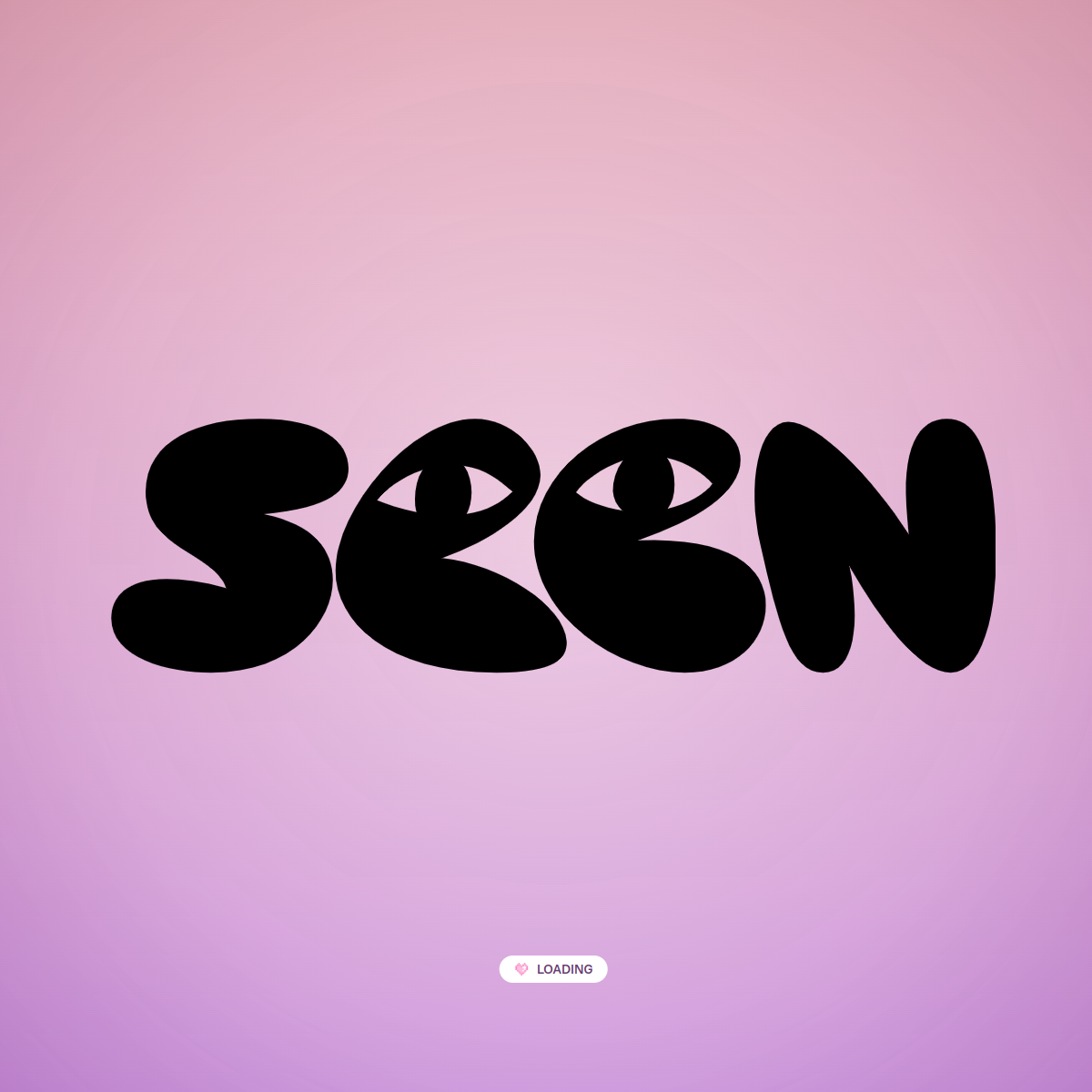
Don't use a dark or muted background — screenshot shows a vibrant pink/purple gradient.
Don't clutter the interface with multiple elements — screenshot shows only the wordmark and a tiny loading button.
Don't use sharp, geometric shapes for the logo — screenshot shows soft, rounded, organic letterforms.
Don't use a secondary color palette — screenshot shows a simple two-tone (black on pink/purple) scheme.
Avoid: Formal language
Avoid: Dense text
Avoid: Conventional navigation
11
System prompt
This is a playful, expressive brand identity for a creative platform called 'Seen'. The design is centered around a single, oversized, custom wordmark in a bold, bubble-like font. The background is a vibrant pink-to-purple gradient, creating a warm, inviting, and energetic mood. The primary colors are a deep black (#0A0A0A) for the text against a soft pink/purple background (#E8B8D8). The typography is highly expressive and decorative, not a conventional serif or sans-serif. Key critical don'ts: Do not use a grid-heavy layout; do not use thin typography; do not use a dark or muted background. The system is minimalist, focusing on a single, powerful visual statement.
Bring this taste to your agent
Hand your AI agent a machine-readable spec of this design — tokens, type, motion, the whole DNA.