A high-fashion magazine that also sells clothes, where photography drives the narrative and typography serves as quiet infrastructure.
02
Color
#333333Ink
#888888Ink soft
#F4F4F4BG
#FFFFFFBG quiet
#979797Muted
rgba(51, 51, 51, 0.2)Line
Strict monochrome palette using varying weights of black and gray to maintain a clean, gallery-like focus on photography.
03
Typography
transitional-serif
display66px · 400
heading20px · 400
body15px · 400
caption11px · 400
Use a geometric sans-serif for navigation and utility links, uppercase with tracking. · Use JHA Times Now (transitional-serif) for all editorial headings and body text. · Maintain extremely tight leading on large display text. · Utilize subtle negative letter-spacing for display and heading typography.
04
Spacing
4px
8px
16px
20px
30px
48px
80px
Generous padding surrounds content blocks to maintain a spacious, breathable editorial feel, often utilizing 80px vertical margins.
05
Surfaces
sm · 0px
md · 0px
lg · 0px
pill · 999px
Subtle 1px horizontal lines used to separate sections and define article card boundaries.
06
Layout
1280container
12columns
20pxgutter
768 / 1024breakpoints
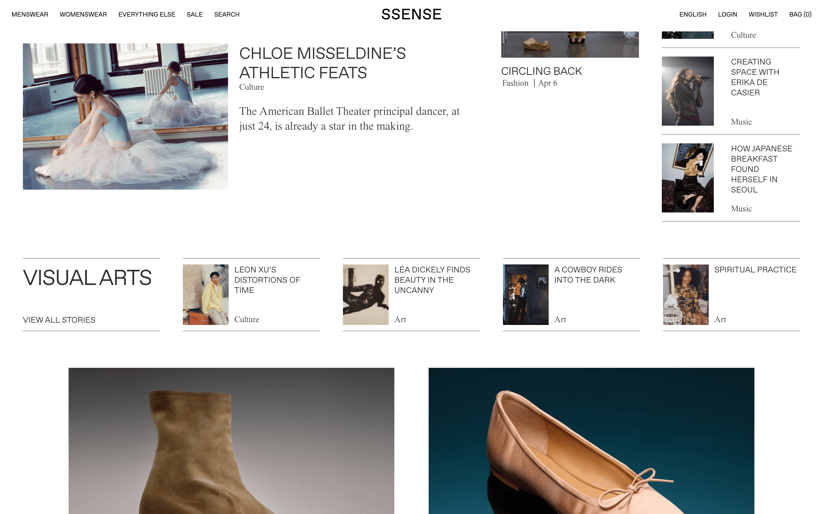
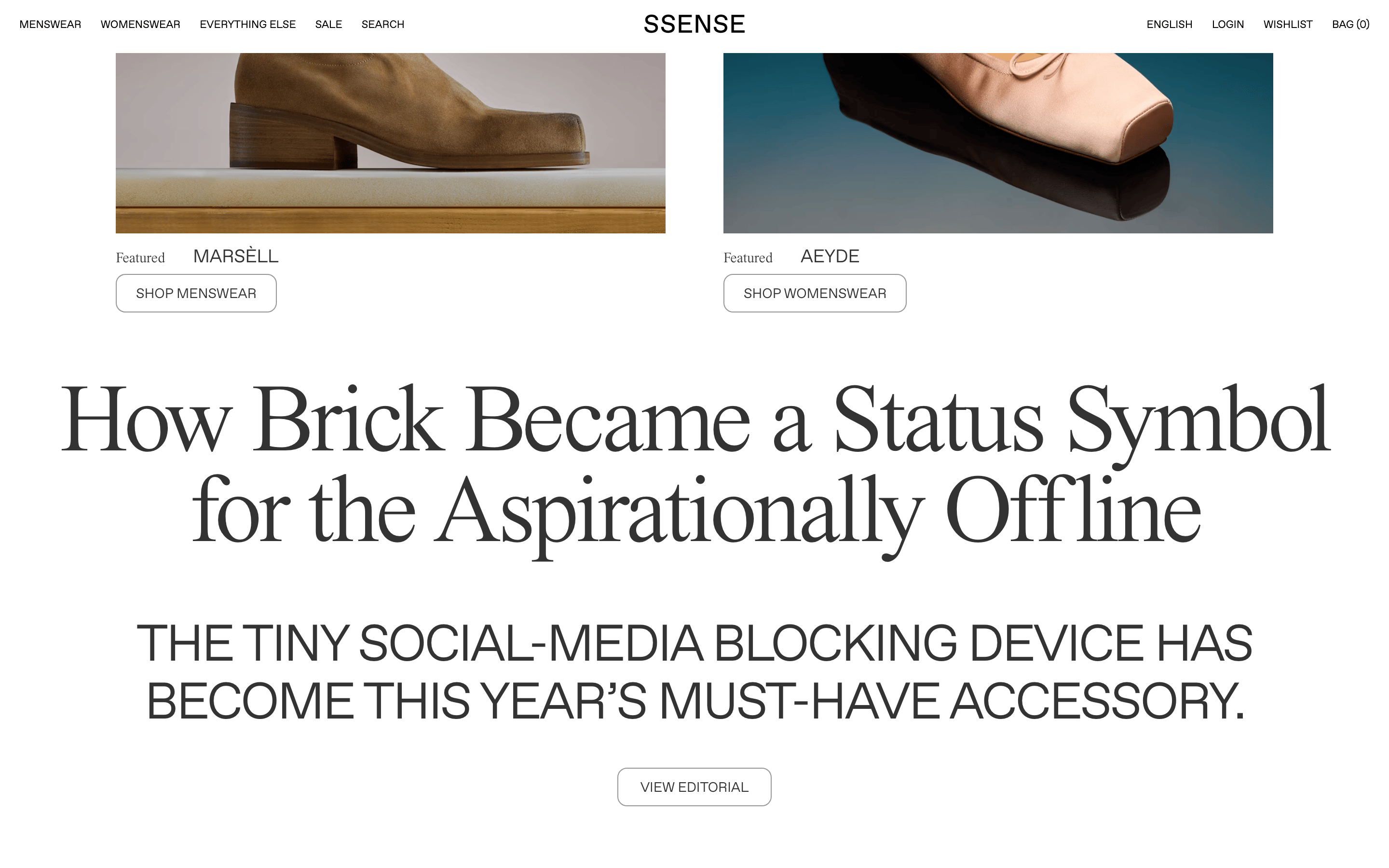
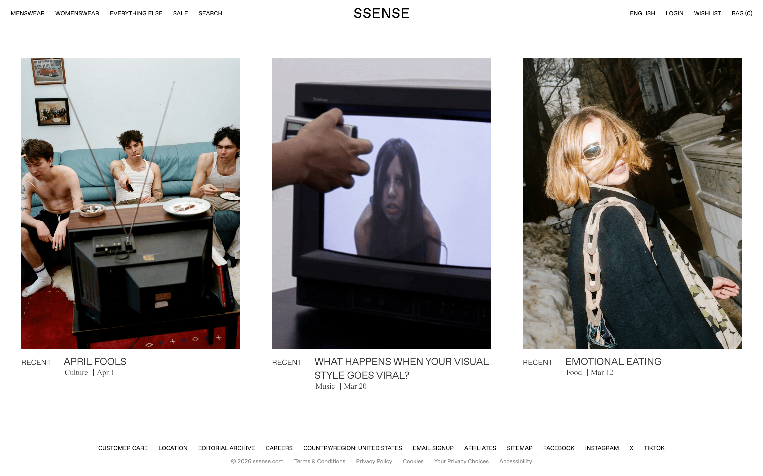
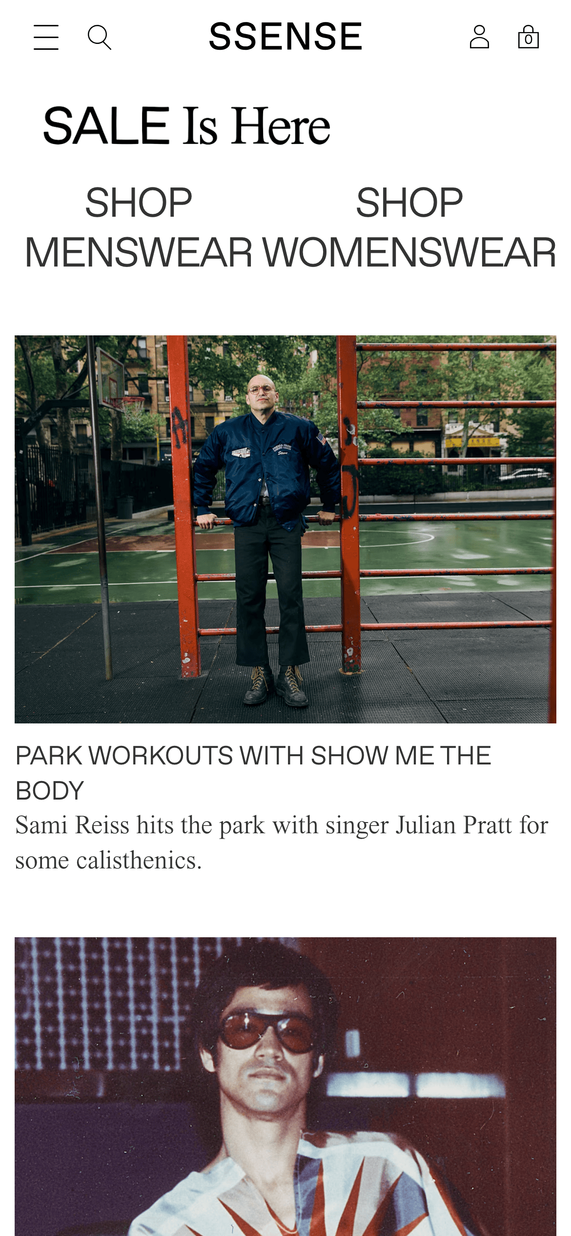
Asymmetric editorial grid with large hero imagery followed by mixed layouts combining wide images, stacked text blocks, and horizontal lists.
07
Motion & Interaction
220msmicro
350mssmall
500msmedium
cubic-bezier(0.25, 0.1, 0.25, 1)easing
Smooth hover transitions on interactive elements · Subtle scaling or panning on image hover · Seamless page transitions
Subtle underline appearance or color inversion for text links · Immediate navigation without heavy animation
08
Components
buttonText-based links, often uppercase sans-serif for utility navigation, relying on hover states rather than filled backgrounds.
cardBorderless photographic cards with typography positioned below, or split cards with a 1px border on the top or bottom.
chipNone
inputNone visible
heroFull-width photographic layout anchored by massive, custom typography with tight tracking.
09
Voice & Don'ts
ToneObjective, cool, and editorially detached.
HeadlinesAll-caps, tight-tracked, sans-serif or strong transitional serif for impact.
CTAsUnderstated uppercase text links with generous spacing.
Don't use drop shadows — the site relies on flat imagery and subtle borders for depth.
Don't introduce bright accent colors — the site enforces a strict monochrome palette of black, white, and gray.
Don't use heavily rounded corners — the site maintains sharp, square edges on all layout elements and images.
Don't use overly thick or bold typography — the site utilizes delicate font weights (100-400) for a refined aesthetic.
Don't clutter the interface — the site uses vast amounts of white space to create a premium, gallery-like experience.
Don't use decorative or playful icons — the interface relies purely on clean typography and high-quality photography.
Captured from the live site · real computed styles
11
System prompt
This is a premium fashion e-commerce platform that blends a stark, monochrome digital experience with rich editorial photography. The aesthetic is minimalist and gallery-like, using a primary palette of off-white (#F4F4F4) and deep gray (#333333) with no high-chroma accents. Typography relies heavily on a delicate transitional serif (JHA Times Now) for editorial content, paired with a geometric sans-serif for UI, using tight negative letter-spacing on massive, uppercase display text. Key critical don'ts: do not introduce drop shadows or decorative UI elements; never use brightly colored accents; avoid rounded corners or soft UI patterns; maintain delicate font weights rather than heavy boldestyles; use generous whitespace to preserve the editorial breathing room; rely purely on typography and photography rather than UI ornamentation.
Bring this taste to your agent
Hand your AI agent a machine-readable spec of this design — tokens, type, motion, the whole DNA.