← OpenDesign CURATED · OPEN · FREE
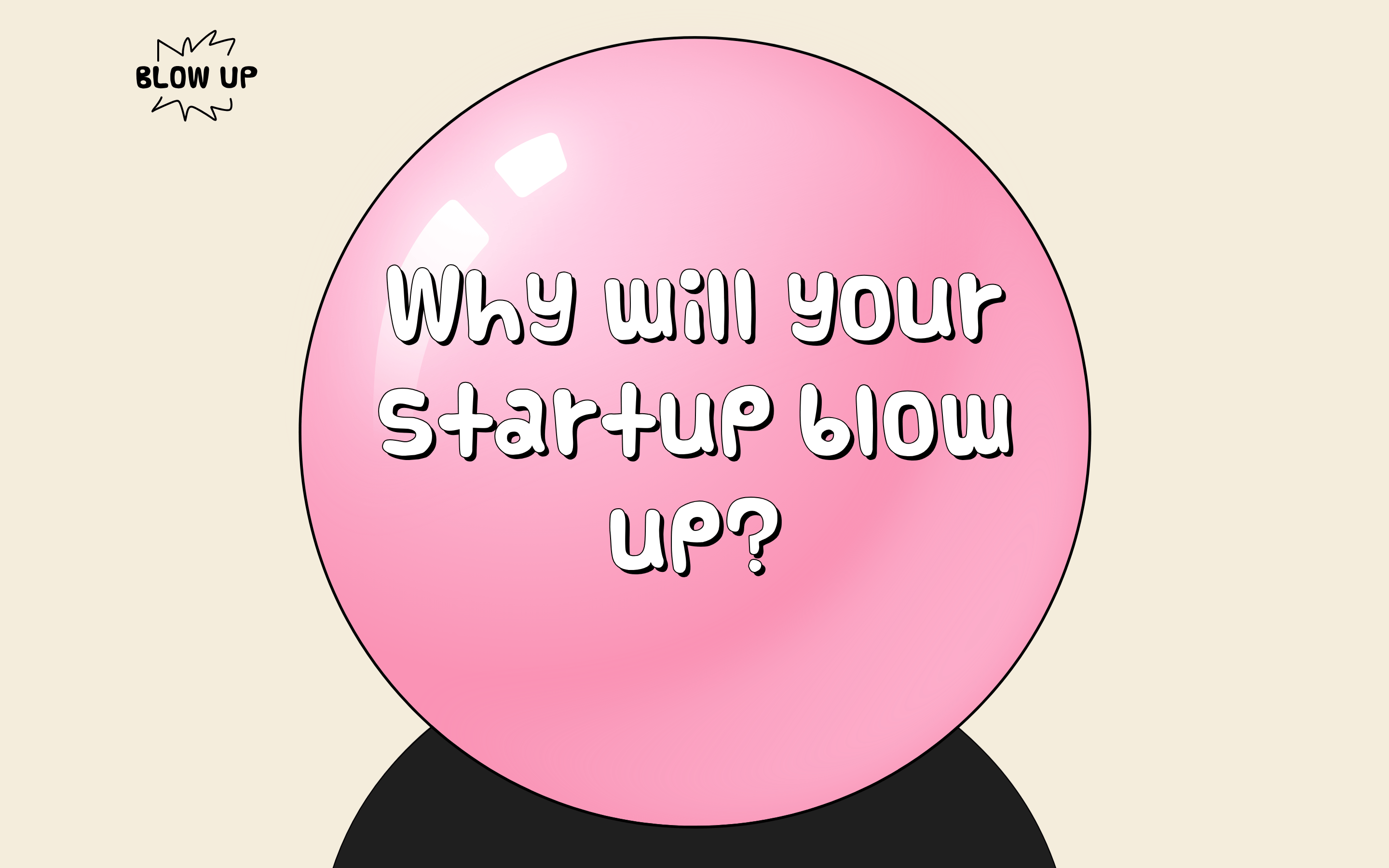
Startupblowup
A playful, comic-inspired service helping startups grow exponentially.
Playful Consumer Bold Typography Expressive Productivity
01
Identity DNA
playful startup comic inflation bold
A pop-art comic book page
02
Color
#000000Ink
#F4EDDCBG
#FFFFFFBG soft
rgba(0,0,0,1.0)Line
High-contrast comic book palette with stark black outlines and a single dominant pastel hue.
03
Typography
comic · humanist-sans
display 80px · 400body 16px · 400Use a comic-style font for large display text and a clean sans-serif for body copy.
04
Spacing
4px
8px
16px
24px
32px
48px
64px
96px
4px base grid
05
Surfaces
sm · 0px
md · 0px
lg · 0px
pill · 999px
2px solid black
06
Layout
1280 container
12 columns
24px gutter
768 / 1024 breakpoints
Large centered graphic elements with text overlaid directly on shapes.
07
Motion & Interaction
220ms micro
400ms small
800ms medium
cubic-bezier(0.25, 0.1, 0.25, 1.0) easing
Inflation/deflation effect implied by the balloon graphic and custom cursors.
Custom pointer cursor on interactive elements. · Custom pointer-small cursor on specific elements.
08
Components
button Custom cursor pointers (arrow, pointer, pointer-small) instead of standard buttons. card Large circular balloon shapes containing text. chip None visible. input None visible. hero Giant pink balloon graphic centered on the screen with overlaid comic text. 09
Voice & Don'ts
Tone Playful, energetic, and slightly provocative. Headlines Comic book style with a thick black outline and slight shadow effect. CTAs Not explicitly shown, but implied to be bold and interactive. Don't use subtle gradients — screenshot shows flat color fills. Don't use serif typography — screenshot shows comic and sans-serif fonts. Don't use a dark background — screenshot shows a light, warm background. Don't use complex shadows — screenshot shows flat elements with simple outlines. Don't use muted colors — screenshot uses a stark black and a bright pink. Don't use standard UI components — screenshot uses custom cursors and graphic shapes. Avoid: Serif fonts Avoid: Subtle gradients Avoid: Corporate jargon Avoid: Muted colors Avoid: Small text sizes 10
Inside the pack — real screenshots
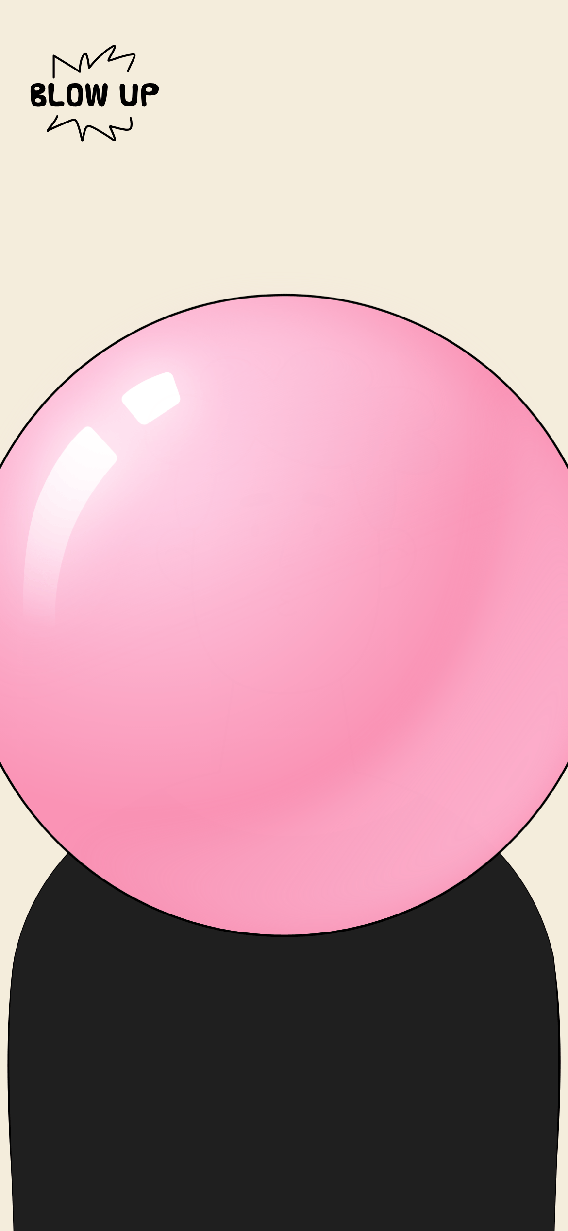
桌面首屏(hero) 桌面滚动分段(90% viewport 步进,作为视觉证据) 桌面滚动分段(90% viewport 步进,作为视觉证据) 移动首屏 Captured from the live site · real computed styles
11
System prompt
This site is a playful, comic-inspired service for startups. The design uses a stark black and white palette with a dominant pastel pink accent. The typography relies on a custom comic font for display text and a clean sans-serif for body copy. Key interactions include custom cursors and an inflation theme. Critical donts: don't use serif fonts, don't create subtle gradients, don't use a dark background, don't use complex shadows, don't use muted colors, and don't use standard UI components.
More from the library en · zh-CN · zh-TW · ja · ko
OpenDesign · curated web aesthetics for AI-readable design DNA · opendesign.cc
Why we curated this: This site is worth including as a prime example of expressive, non-corporate startup branding that uses graphic elements and custom interactions to create a memorable experience.