← OpenDesign CURATED · OPEN · FREE
Sandlandsleep
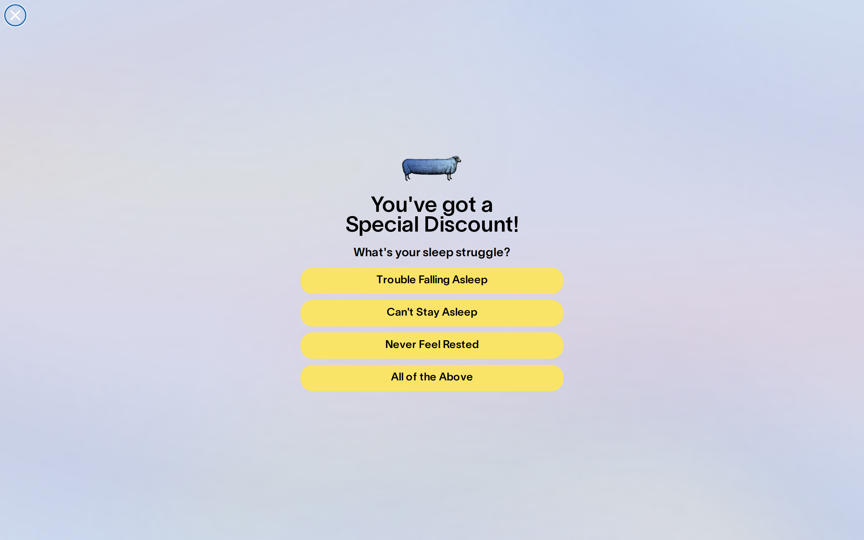
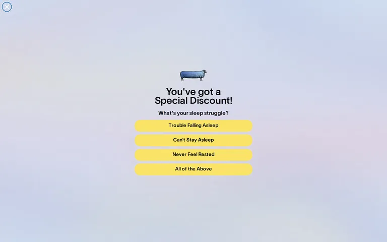
A minimalist wellness interface using a soft gradient background and bold yellow accents to guide users through a sleep struggle survey.
Consumer Premium Clean Playful Product
01
Identity DNA
sleep wellness discount comfort
a calm, premium invitation to better sleep
02
Color
#fae467Accent
#000000Ink
#9c9c9cInk soft
#dce4efBG
#f2ede8Muted
rgba(0,0,0,1)Line
High contrast between the vibrant yellow accent and the soft, cool gradient background.
03
Typography
humanist-sans · sans-serif
display 48px · 600subtitle 20px · 400body 14px · 40004
Spacing
4px
8px
16px
24px
32px
48px
64px
96px
standard base-4 vertical rhythm with generous spacing for a relaxed feel
05
Surfaces
sm · 4px
md · 10px
lg · 20px
pill · 999px
solid 1px black borders used for the primary icon container and some UI elements
0 4px 12px rgba(0,0,0,0.1) · 0 4px 20px rgba(0,0,0,0.1)
06
Layout
400 container
1 columns
16px gutter
768 breakpoints
centered single-column stack for mobile and focused desktop overlays
07
Motion & Interaction
125ms micro
200ms small
300ms medium
cubic-bezier(0.4, 0, 0.2, 1) easing
smooth color and box-shadow transitions on interactive elements
subtle change in background-color or box-shadow for buttons · immediate visual feedback via background-color change
08
Components
button Full-width pill-shaped buttons with high-contrast yellow backgrounds and dark text. card N/A chip N/A input N/A hero Centered promotional overlay with large typography and a simple illustration. 09
Voice & Don'ts
Tone playful, direct, and inviting Headlines Conversational, second-person questions and statements CTAs Clear, action-oriented statements for user selection Don't use a dark, moody background — screenshot shows a light, soft blue gradient. Don't use sharp, rectangular buttons — screenshot shows fully rounded pill-shaped buttons. Don't use a small, cramped layout — screenshot shows a vertically stacked, well-spaced layout. Don't use a complex, multi-column grid — screenshot shows a single centered column. Don't use low-contrast button text — screenshot shows dark text on a bright yellow background. Don't use subtle, pastel yellow accents — screenshot shows a vibrant, high-chroma yellow. Avoid: clinical terminology Avoid: aggressive sales language Avoid: complex medical jargon 10
Inside the pack — real screenshots
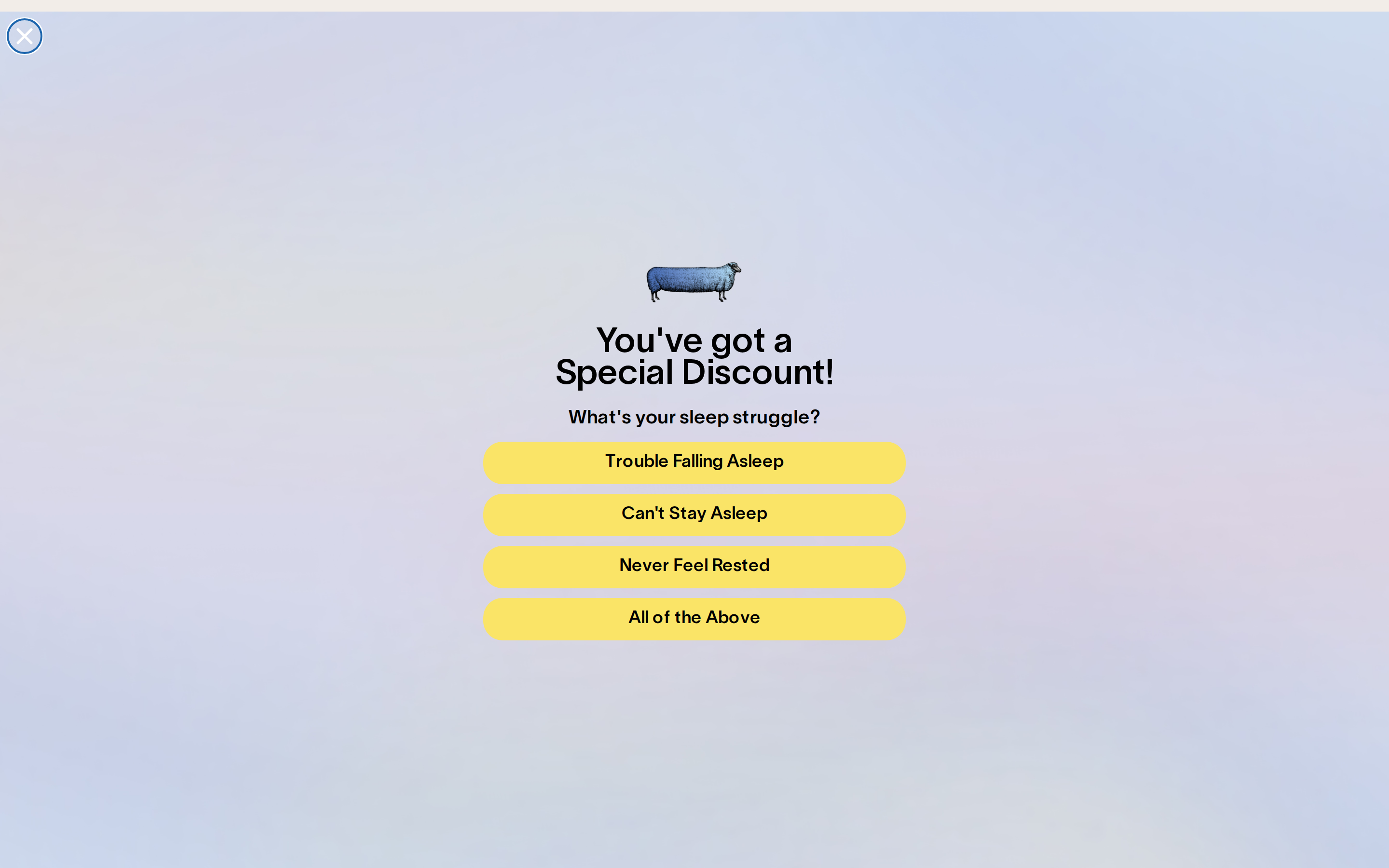
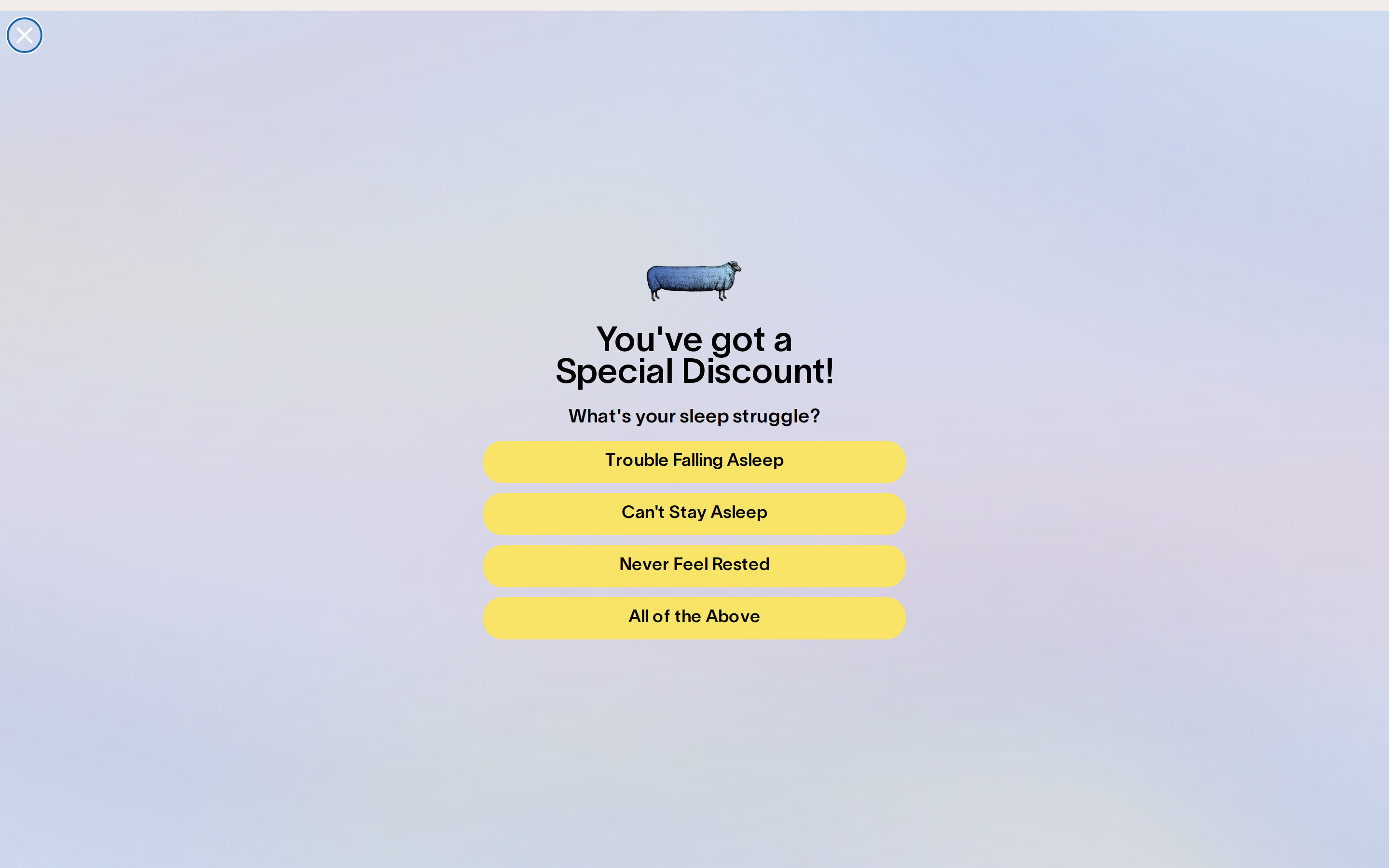
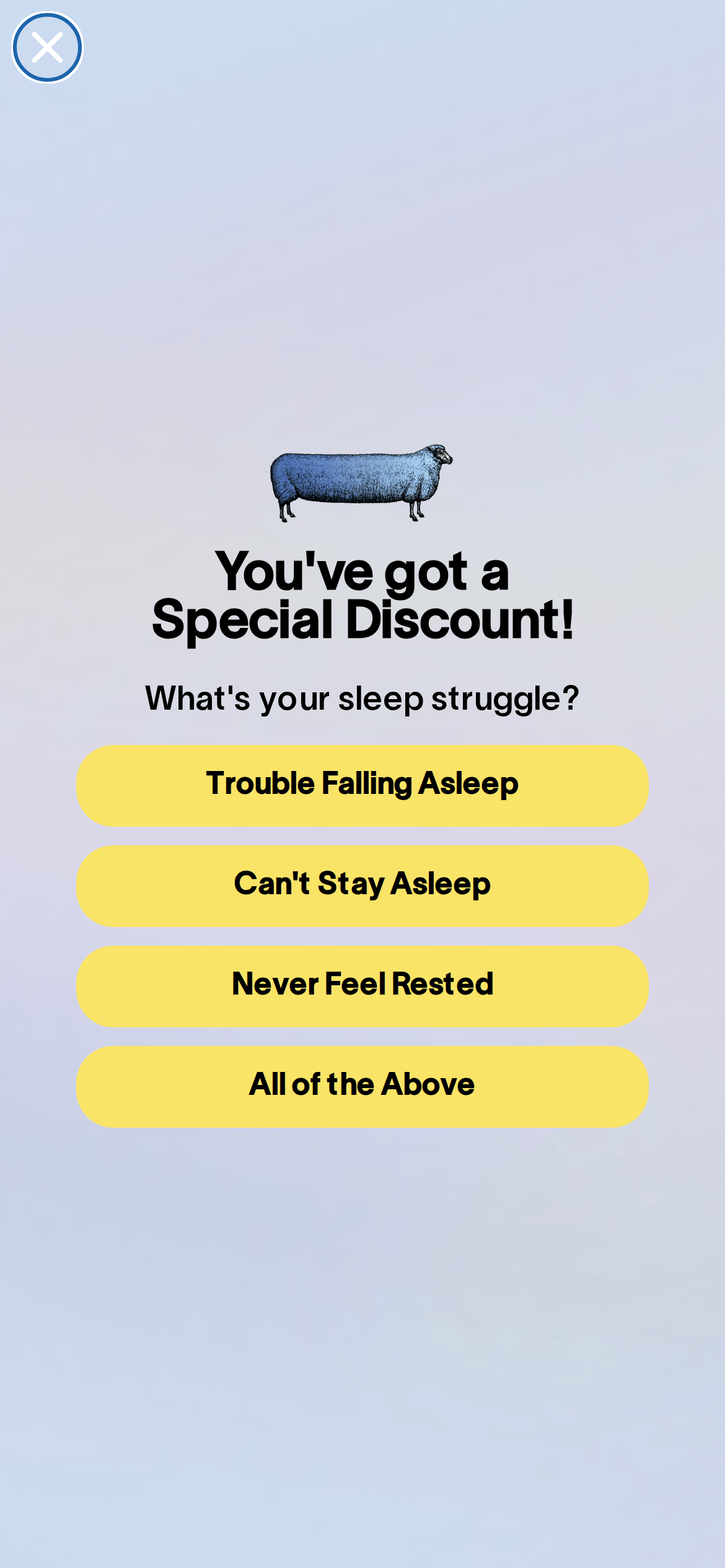
桌面首屏(hero) 桌面滚动分段(90% viewport 步进,作为视觉证据) 桌面滚动分段(90% viewport 步进,作为视觉证据) 桌面滚动分段(90% viewport 步进,作为视觉证据) 桌面滚动分段(90% viewport 步进,作为视觉证据) 桌面滚动分段(90% viewport 步进,作为视觉证据) 桌面滚动分段(90% viewport 步进,作为视觉证据) 移动首屏 Captured from the live site · real computed styles
11
System prompt
This is a minimalist, consumer-focused wellness interface centered around a sleep struggle survey. The design uses a soft, cool gradient background and vibrant yellow pill-shaped buttons to create a friendly, premium feel. Typography is a humanist-sans-serif with high contrast. Key hex colors include a dark ink (#000000) and a vibrant accent yellow (#fae467). The layout is a single centered column with generous spacing. Critical donts: do not use sharp button corners, do not use a dark background, and do not use low-contrast text on the yellow buttons. The tone is playful and direct, focusing on user needs.
More from the library en · zh-CN · zh-TW · ja · ko
OpenDesign · curated web aesthetics for AI-readable design DNA · opendesign.cc
Why we curated this: A great example of a focused, minimalist consumer interface that uses a single high-contrast accent to guide user attention.