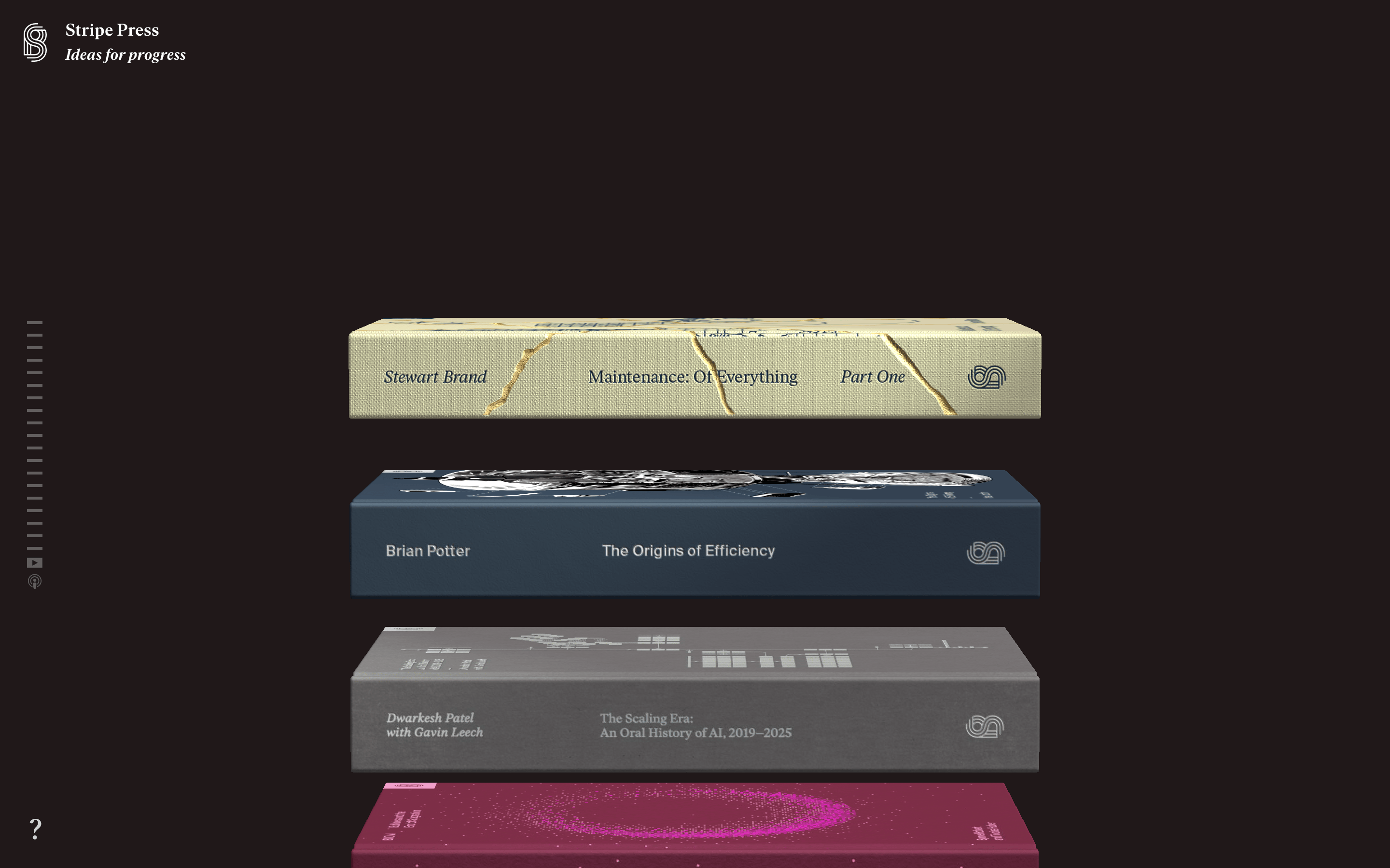
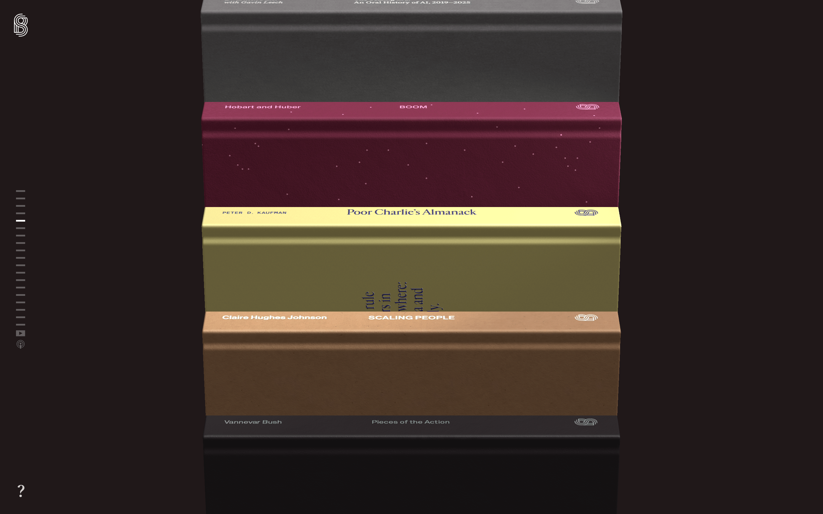
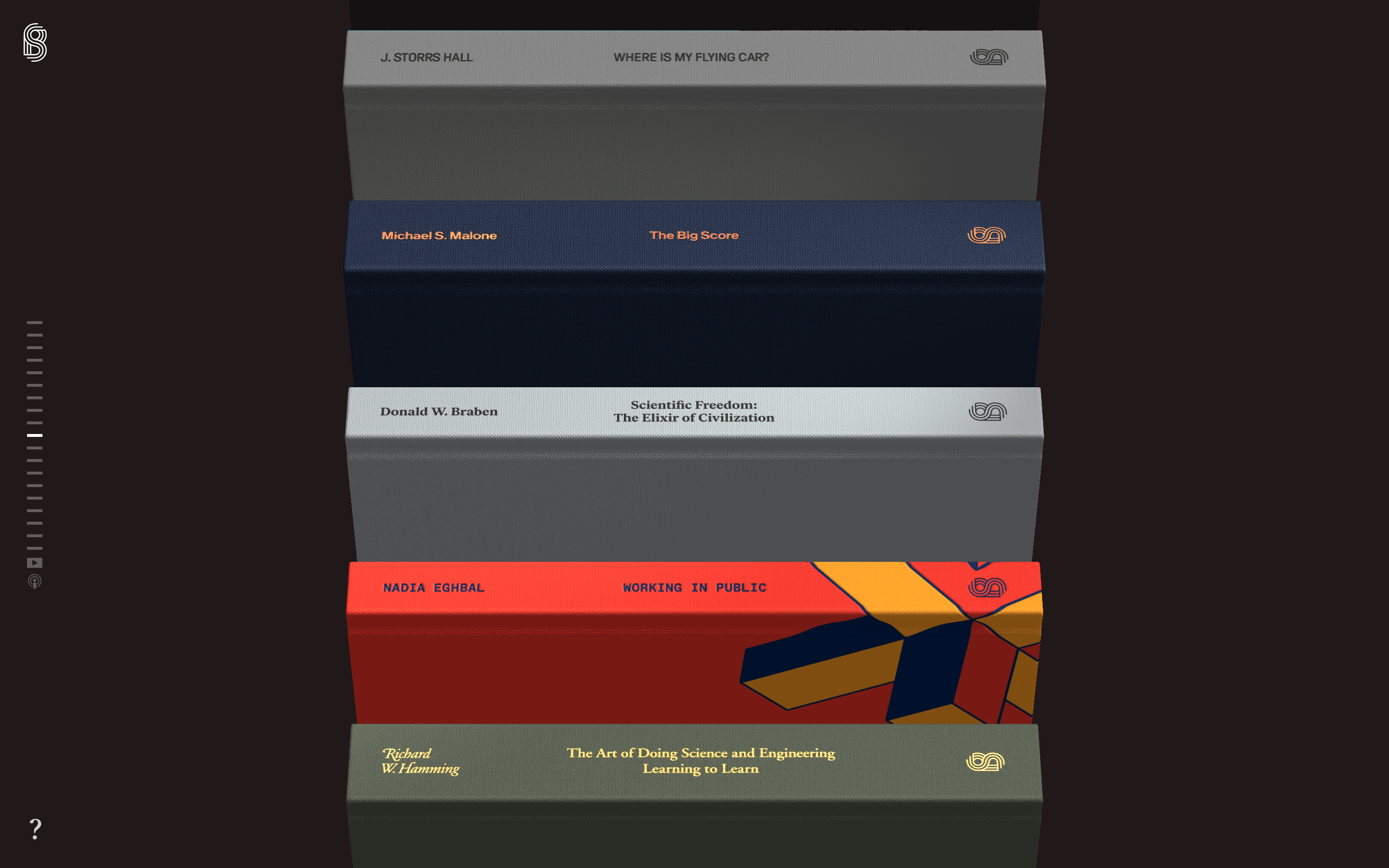
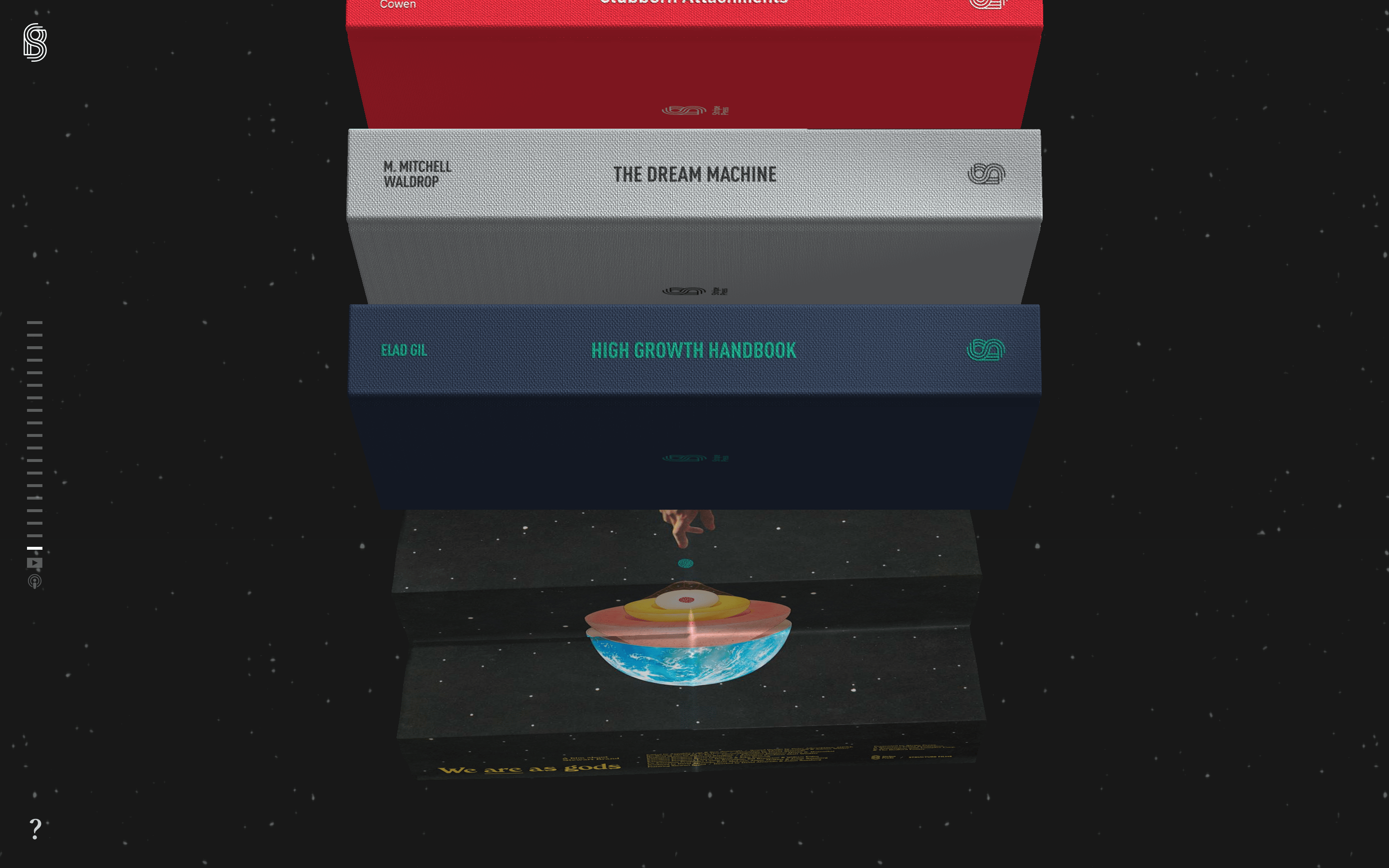
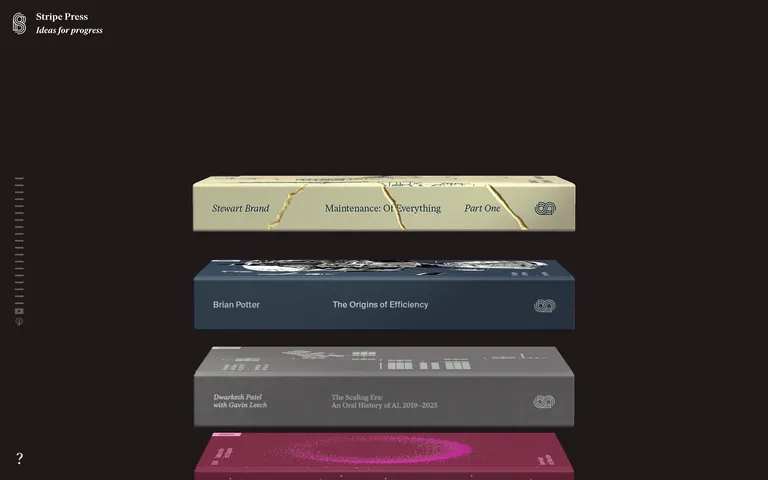
Dark, warm background creating a premium gallery atmosphere where colorful book objects are the focal point.
03
Typography
transitional-serif
display56px · 600
heading25px · 600
body16px · 400
Use Ivar Headline and Ivar Text (transitional serif) for all editorial content. · Maintain consistent light letter-spacing (0.32px) across all text elements. · Book spines use a mix of serif and monospaced typography.
04
Spacing
4px
8px
16px
24px
32px
48px
64px
96px
Vertical rhythm driven by content blocks and book spine spacing.
05
Surfaces
sm · 2px
md · 3px
lg · 0px
pill · 999px
Minimal; primarily 1px solid white with low opacity for dividers.
0 4px 24px rgba(0,0,0,0.4) for book spines
06
Layout
1280container
12columns
24pxgutter
768 / 1024breakpoints
Full-viewport vertical scroll focused on stacked 3D book objects.
07
Motion & Interaction
150msmicro
200mssmall
500msmedium
cubic-bezier(0.25, 0.1, 0.25, 1.0)easing
Smooth scroll-linked transitions for book spine reveals. · Opacity and transform animations for page load and navigation.
Subtle opacity changes or slight movement on interactive elements. · Standard pointer cursor indicating interactivity.
08
Components
buttonMinimal text-based or simple pill-shaped buttons.
card3D rendered book objects acting as interactive cards.
chipNone visible.
inputNone visible.
heroStacked 3D book spines on a dark background.
09
Voice & Don'ts
ToneIntellectual, refined, and serious.
HeadlinesFormal, uppercase or title-case serif text.
CTAsUnderstated and minimal.
Don't use sans-serif fonts for headlines — screenshot shows serif fonts.
Captured from the live site · real computed styles
11
System prompt
Stripe Press is a premium digital publishing imprint with a dark, intellectual aesthetic. The primary background is a deep warm black (#201819) with white (#FFFFFF) and muted gray (#D0D1D4) text. Typography is entirely transitional serif, specifically the Ivar family, maintaining a formal and editorial tone. Key interactions involve smooth 150ms transitions and scroll-linked animations. Critical donts: never use sans-serif for headlines, never use bright neon backgrounds, never use complex grid layouts, never use rounded corners on containers, never use multiple competing accent colors, and never use heavy drop shadows. The layout is a vertical stack of 3D book objects centered in a full-viewport container.
Bring this taste to your agent
Hand your AI agent a machine-readable spec of this design — tokens, type, motion, the whole DNA.