← OpenDesign CURATED · OPEN · FREE
Svz
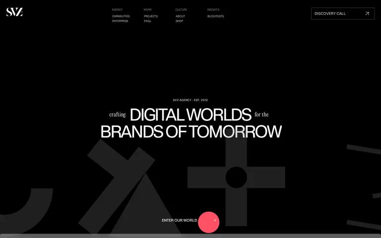
Bold typography and dark sophistication for a premium digital agency.
Agency Portfolio Bold Typography Dark Mode Premium
01
Identity DNA
digital agency brand building bold premium
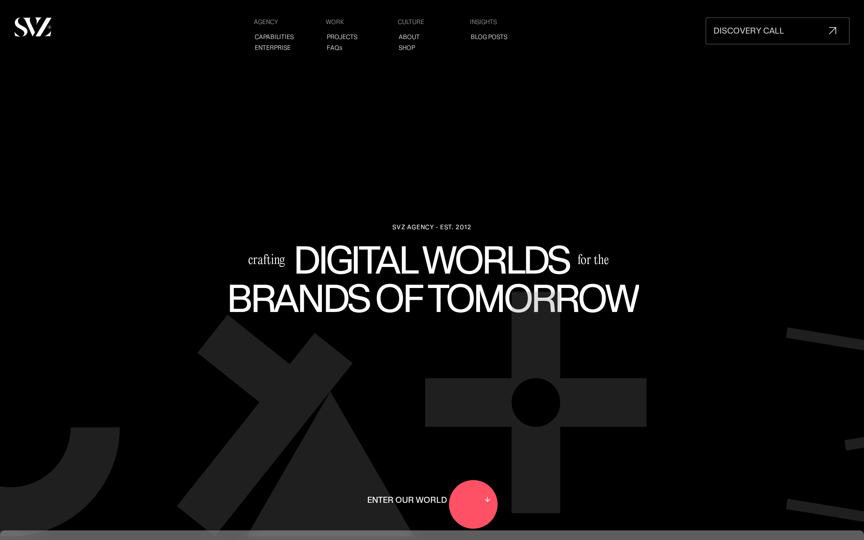
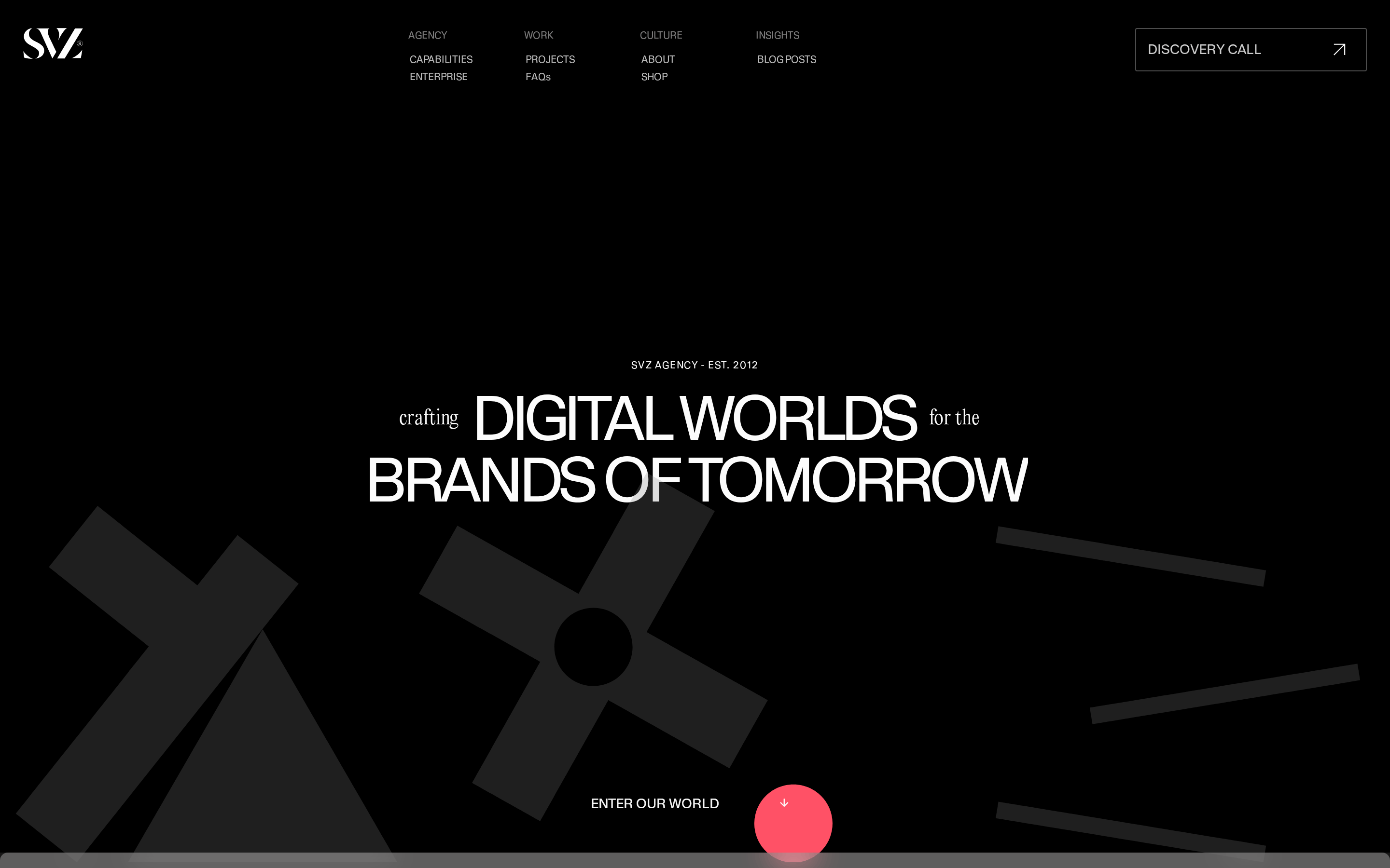
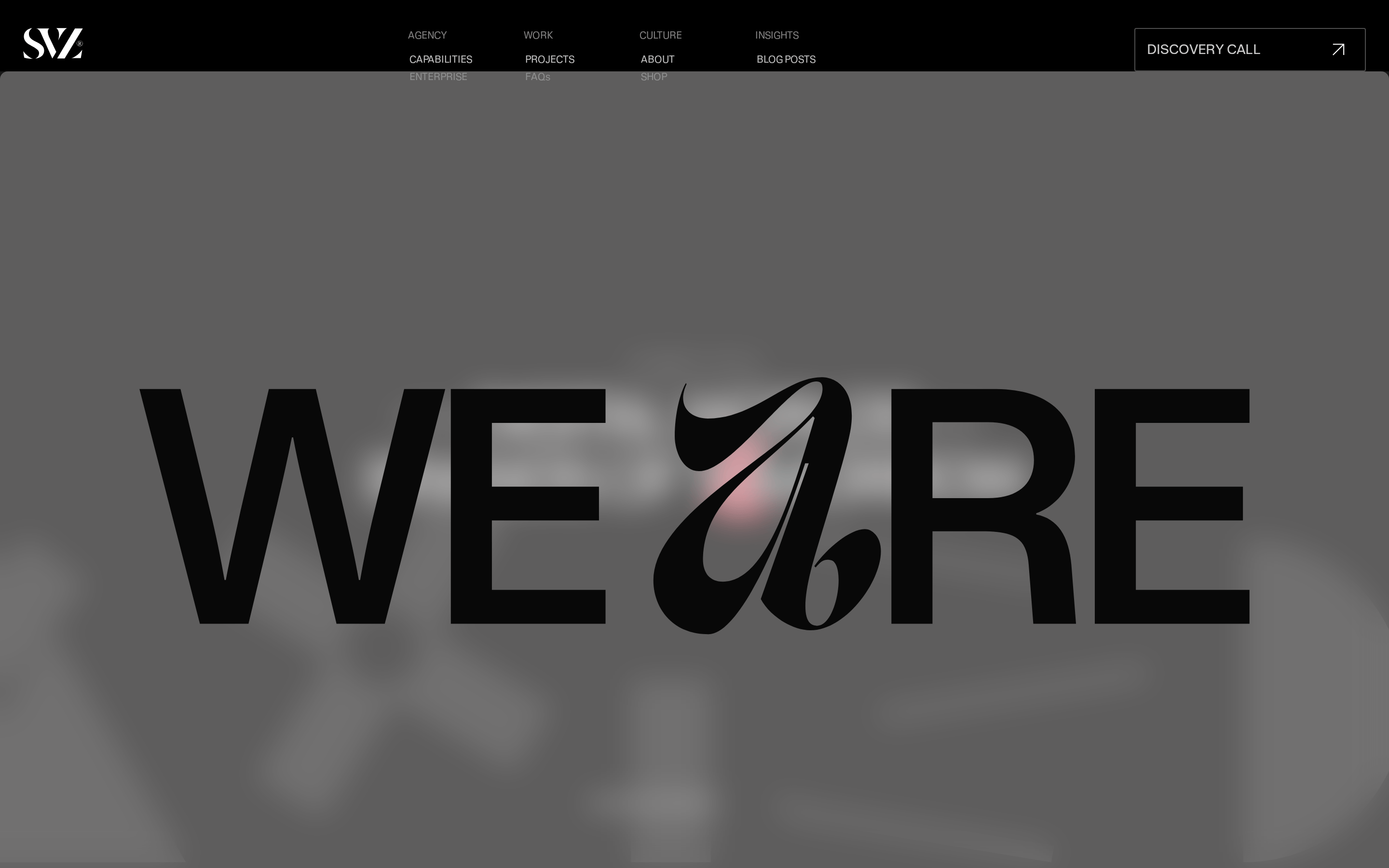
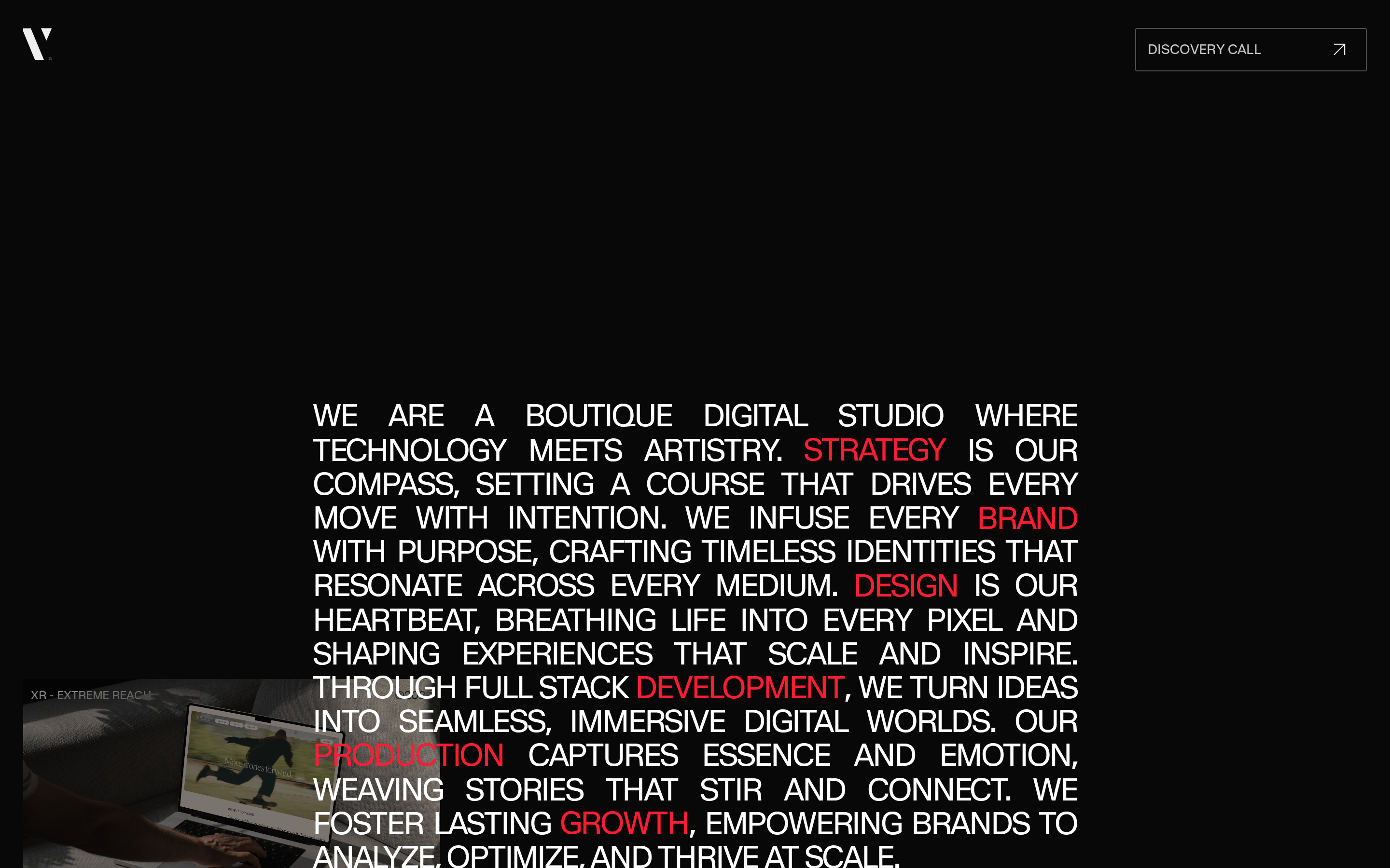
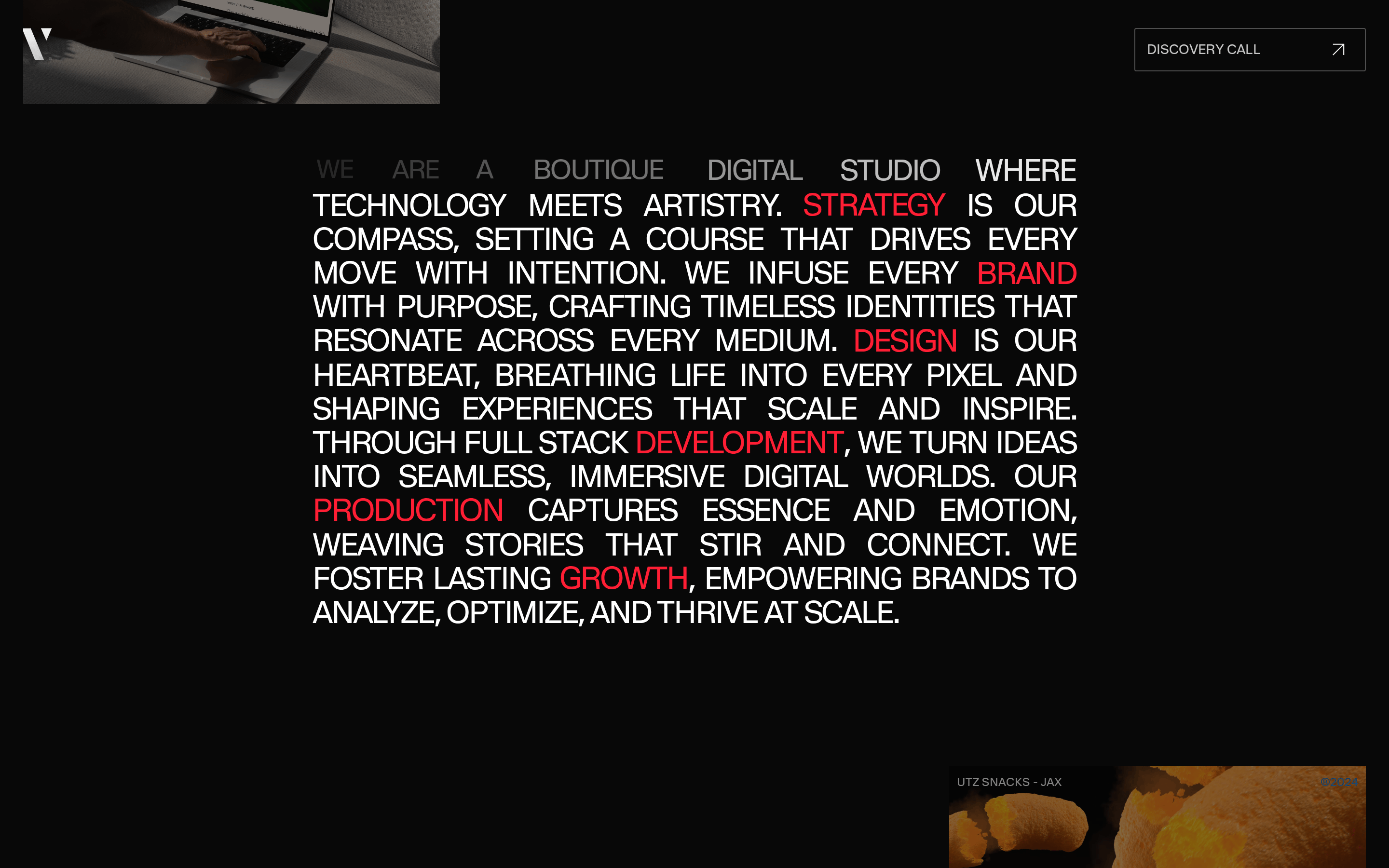
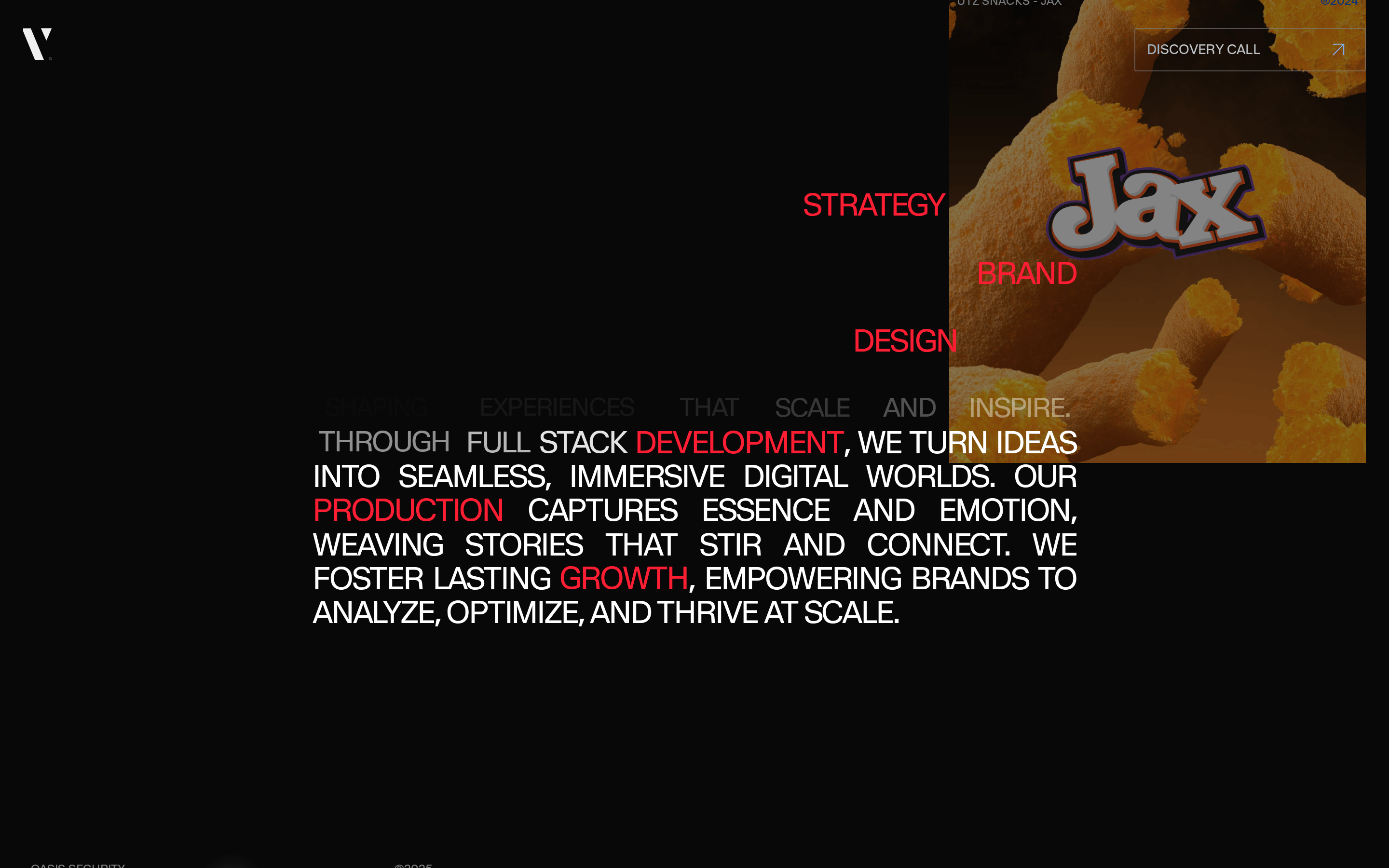
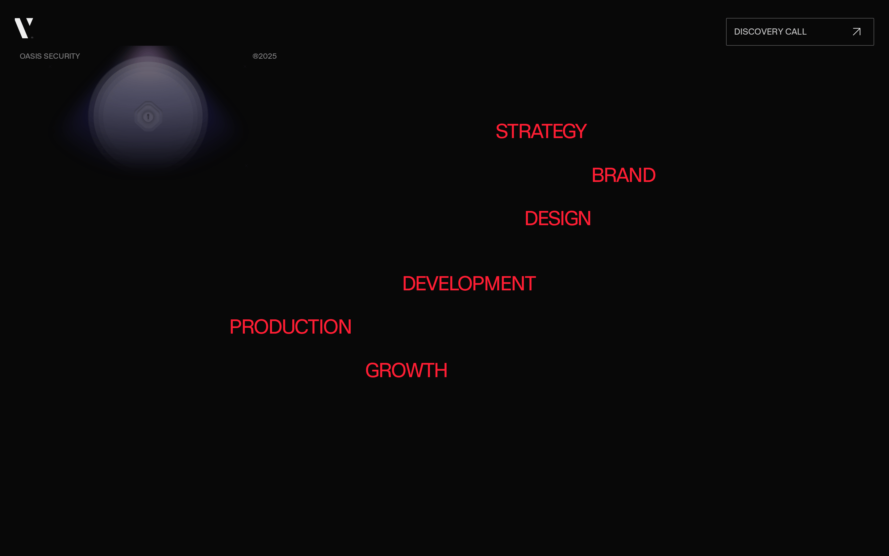
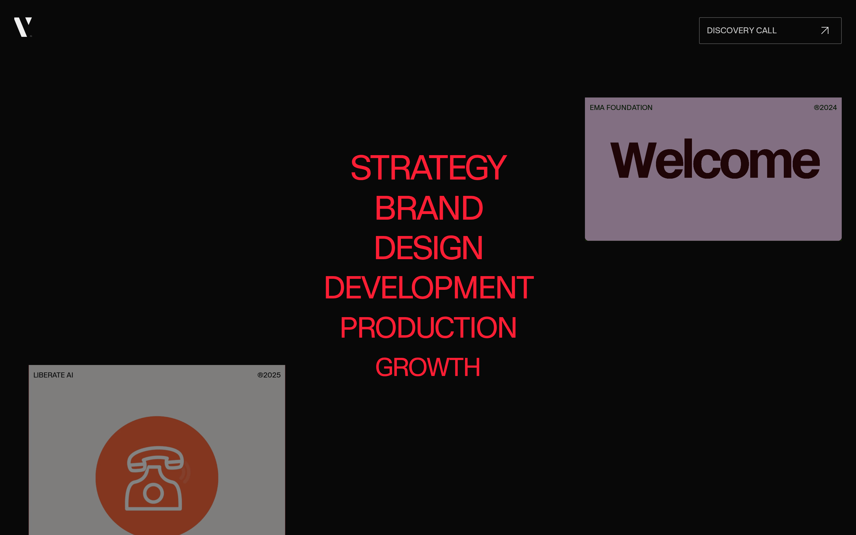
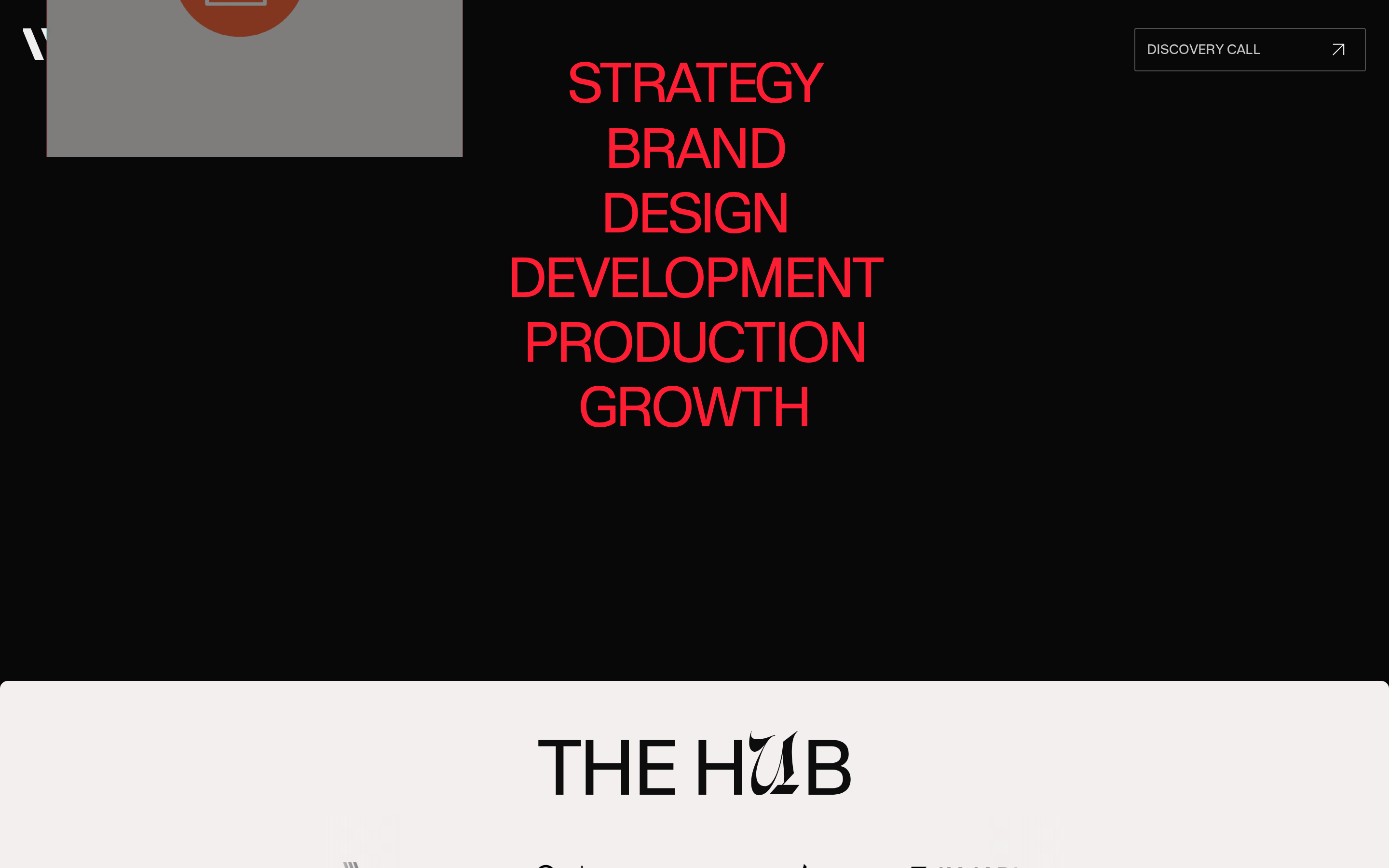
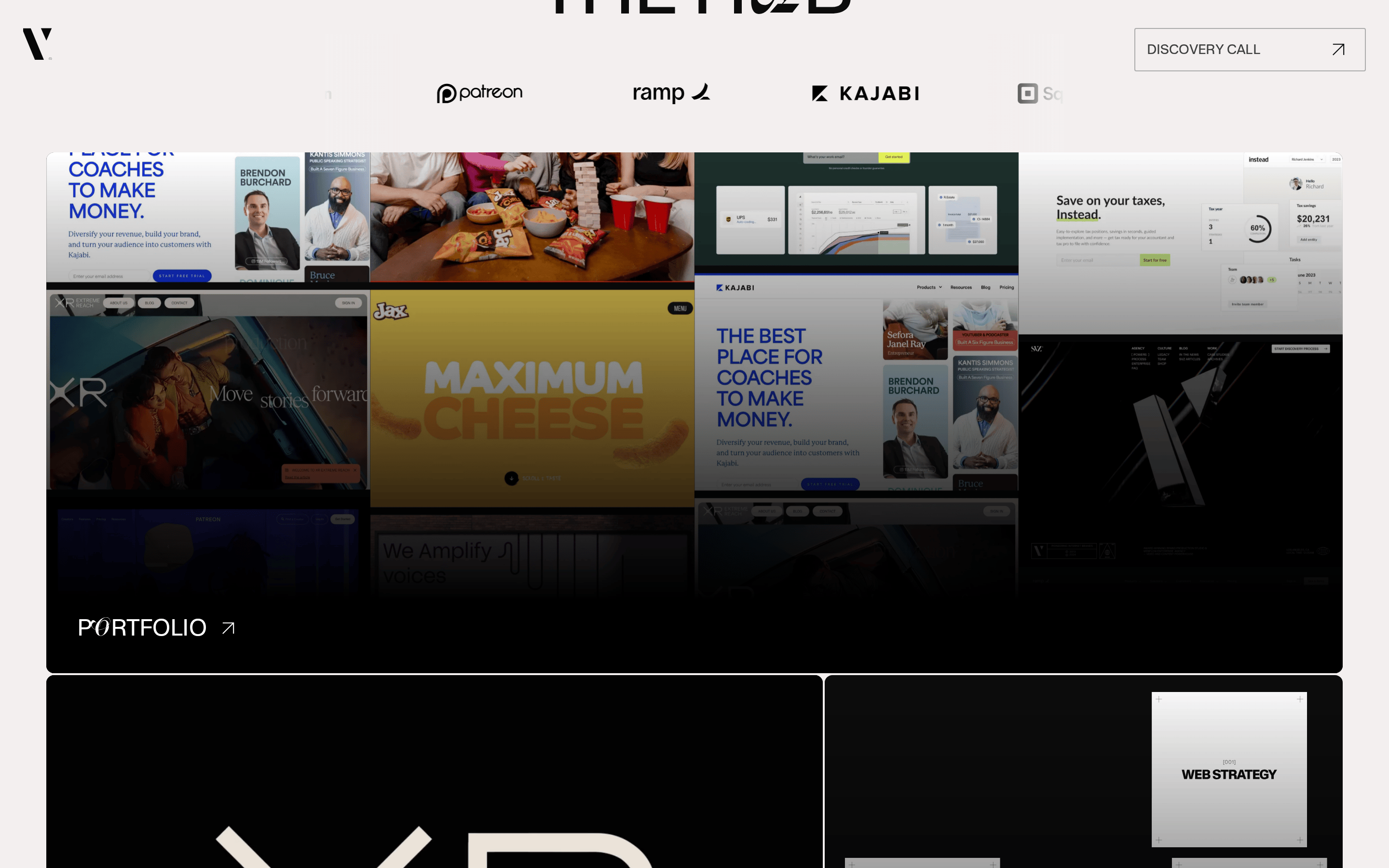
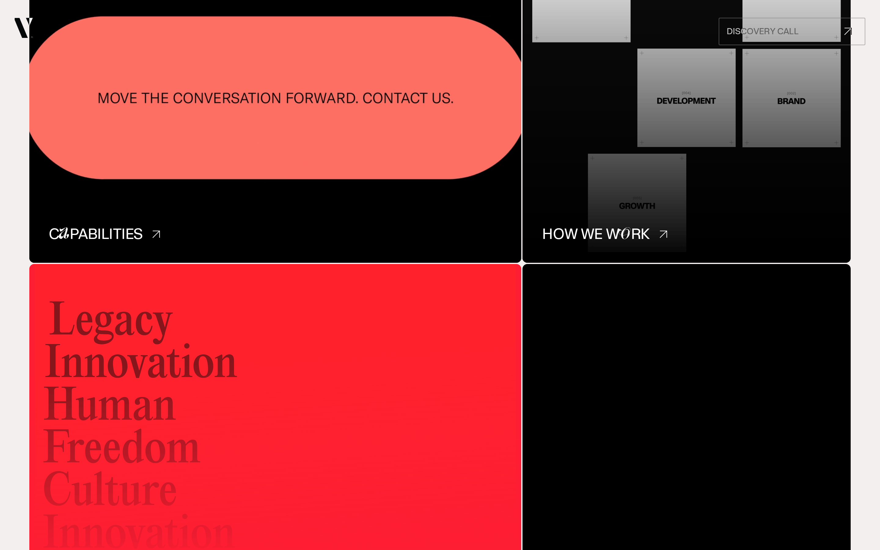
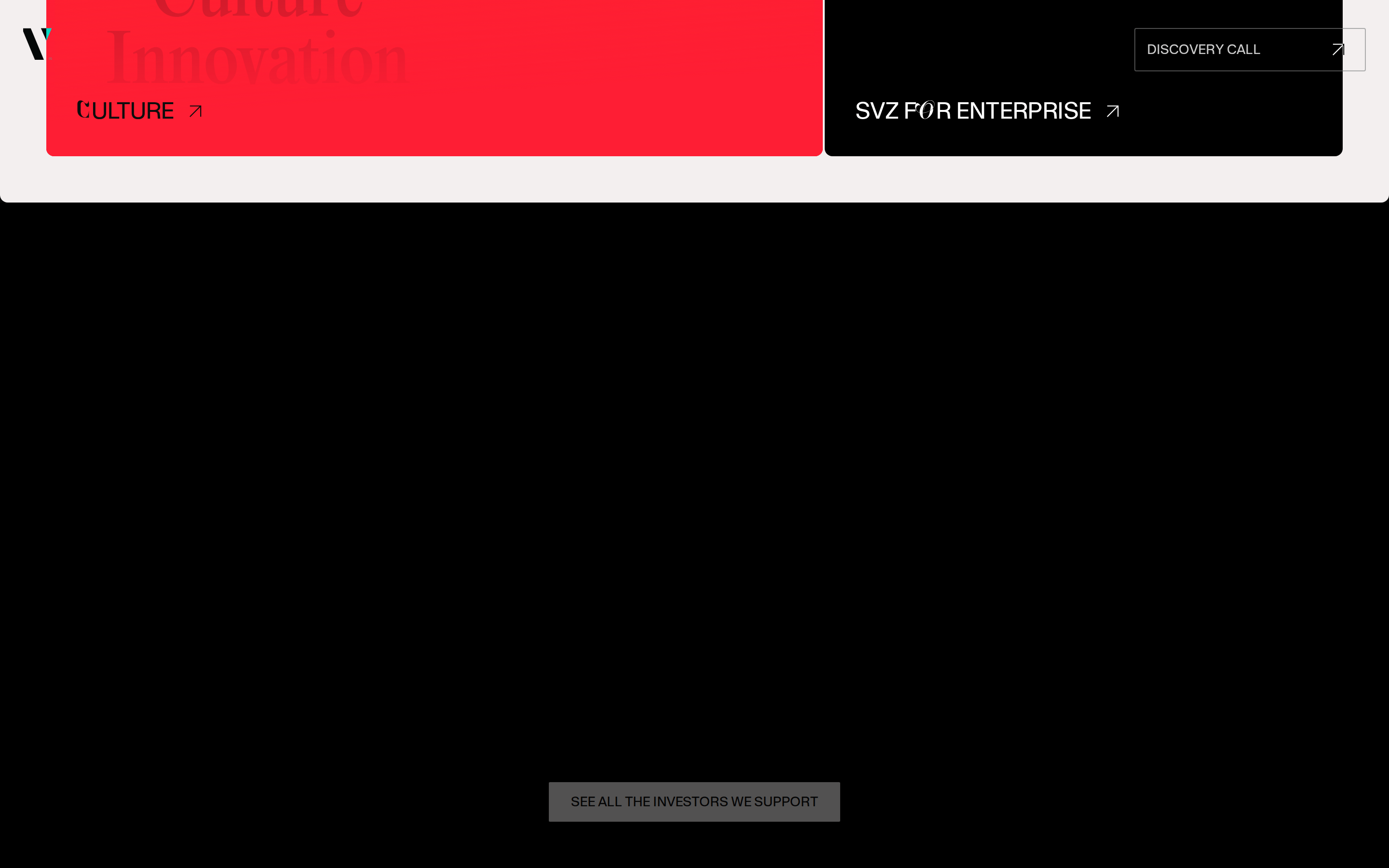
A premium design agency portfolio with bold, editorial typography and a dark, sophisticated atmosphere.
02
Color
#FF4D5CAccent
#fcfcfcInk
#f3efefInk soft
#080808BG
#262525BG soft
#0d0d0dBG quiet
rgba(255,255,255,0.1)Line
High-contrast dark mode with vibrant coral accent
03
Typography
transitional-serif · humanist-sans
display 64px · 700display 32px · 400body 14px · 400Use uppercase for navigation and labels · Mix serif and sans-serif for typographic contrast · Tight letter-spacing for large display text
04
Spacing
4px
8px
12px
16px
24px
32px
48px
64px
96px
Consistent 4px base grid with generous whitespace
05
Surfaces
sm · 2px
md · 4px
lg · 8px
pill · 999px
1px solid rgba(255,255,255,0.1)
rgba(255, 255, 255, 0.2) 0px 2px 5px 0px inset
06
Layout
1280 container
12 columns
24px gutter
768 / 1024 breakpoints
Full-width dark sections with centered content containers
07
Motion & Interaction
220ms micro
400ms small
800ms medium
cubic-bezier(0.4, 0, 0.2, 1) easing
Smooth fade-in transitions · Background element parallax · Hover state animations
Color transitions and opacity changes · Visual feedback through state changes
08
Components
button Bordered button with uppercase text and arrow icon card Dark cards with subtle borders and hover states chip Small uppercase tags or labels input Minimal borderless inputs hero Full-screen dark section with large typographic headline and geometric background elements 09
Voice & Don'ts
Tone Confident, premium, slightly provocative Headlines Bold, all-caps display type with mixed serif/sans CTAs Direct, action-oriented with arrow indicators don't use light backgrounds — screenshot shows predominantly dark (#080808) theme don't use decorative fonts for body text — screenshot shows clean sans-serif for UI elements don't add rounded corners to buttons — screenshot shows rectangular buttons with subtle radius don't use muted colors for emphasis — screenshot shows high-contrast white text on dark backgrounds don't use small font sizes for headlines — screenshot shows large 64px display text don't avoid uppercase navigation — screenshot shows all-caps navigation items Avoid: Casual language Avoid: Overly technical jargon Avoid: Generic corporate speak 10
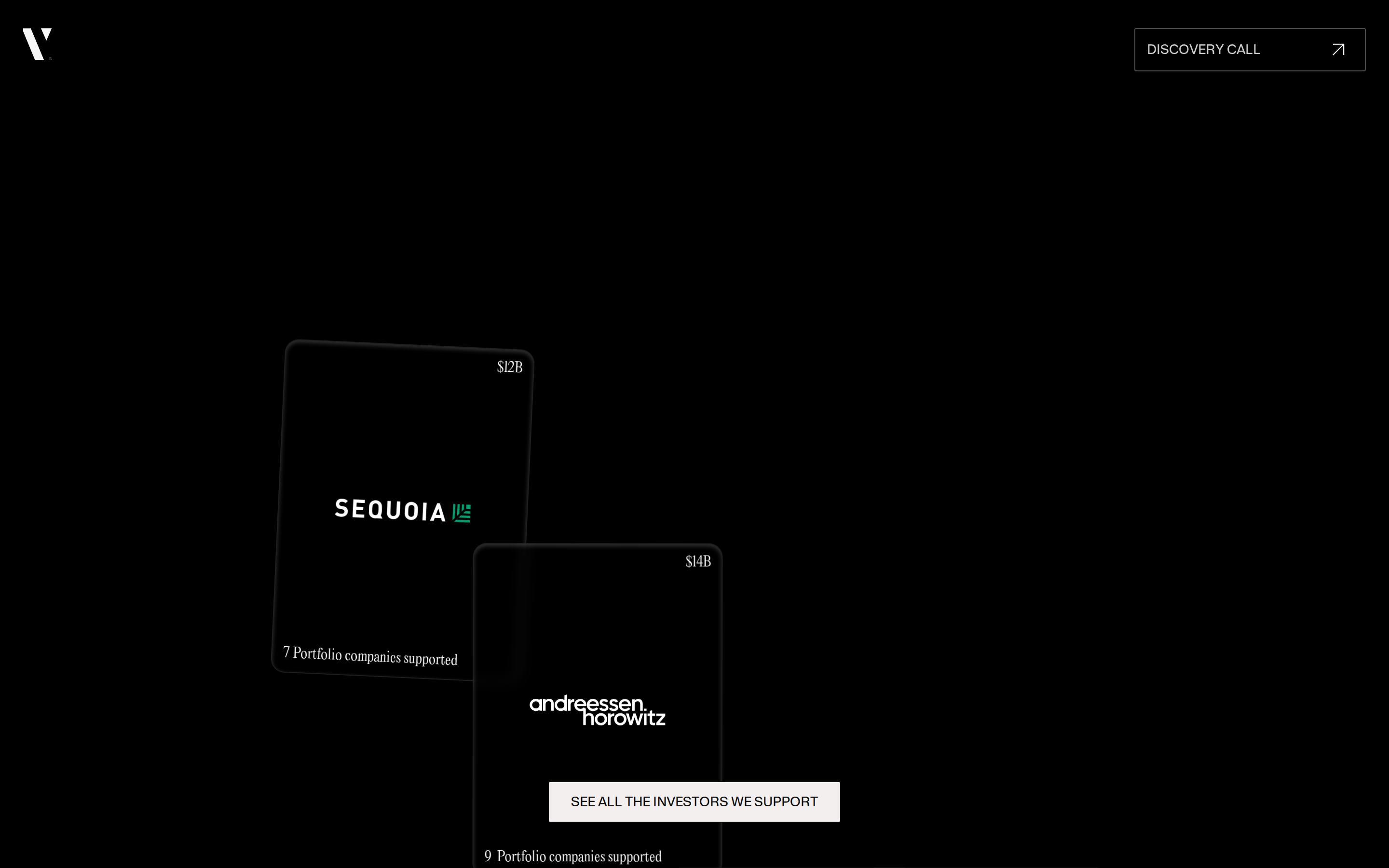
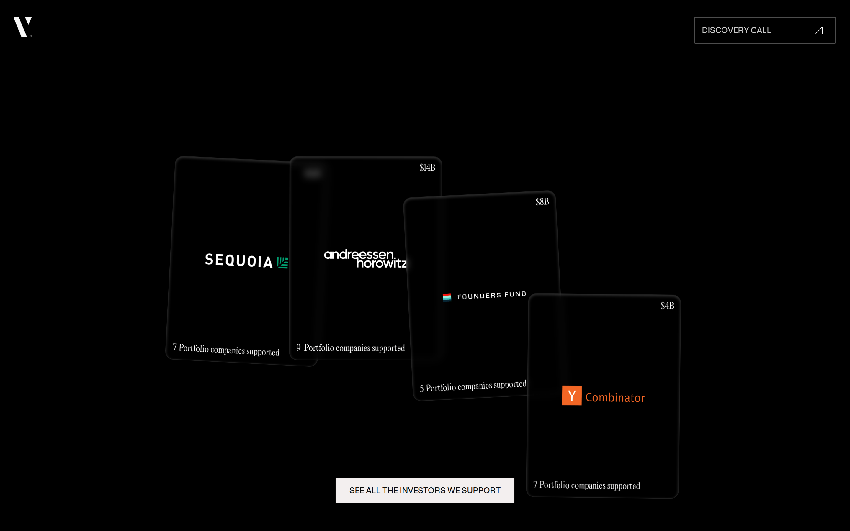
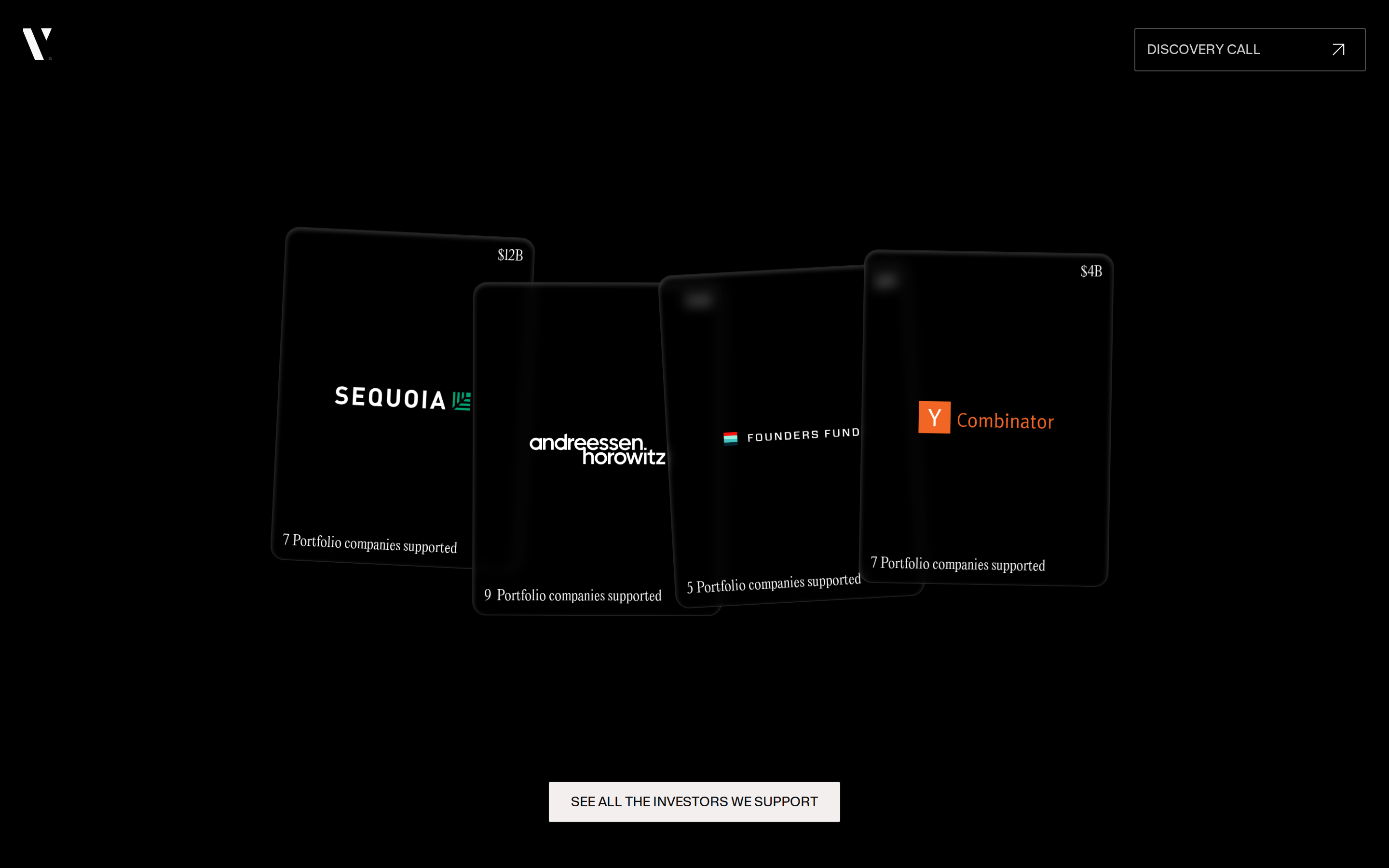
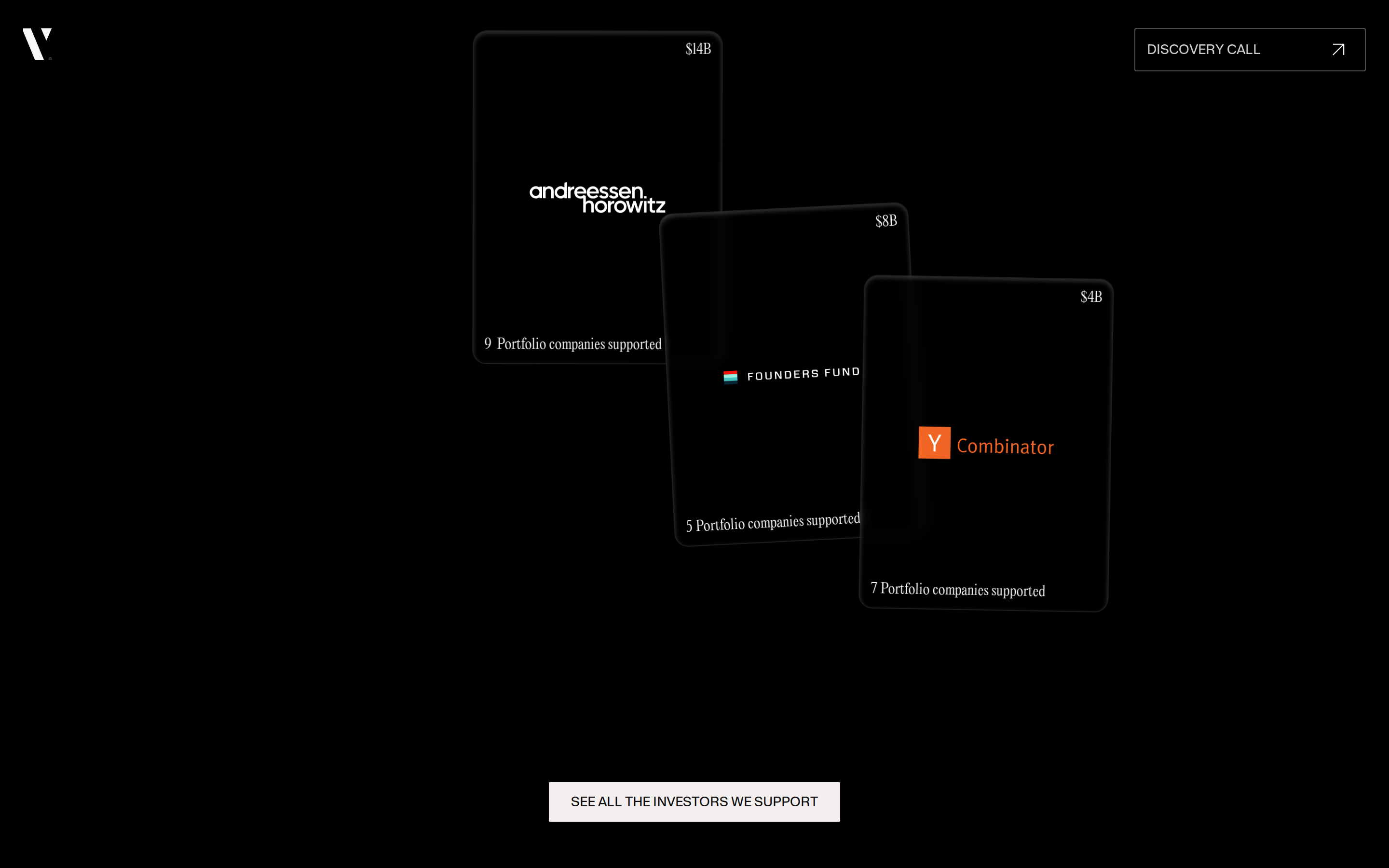
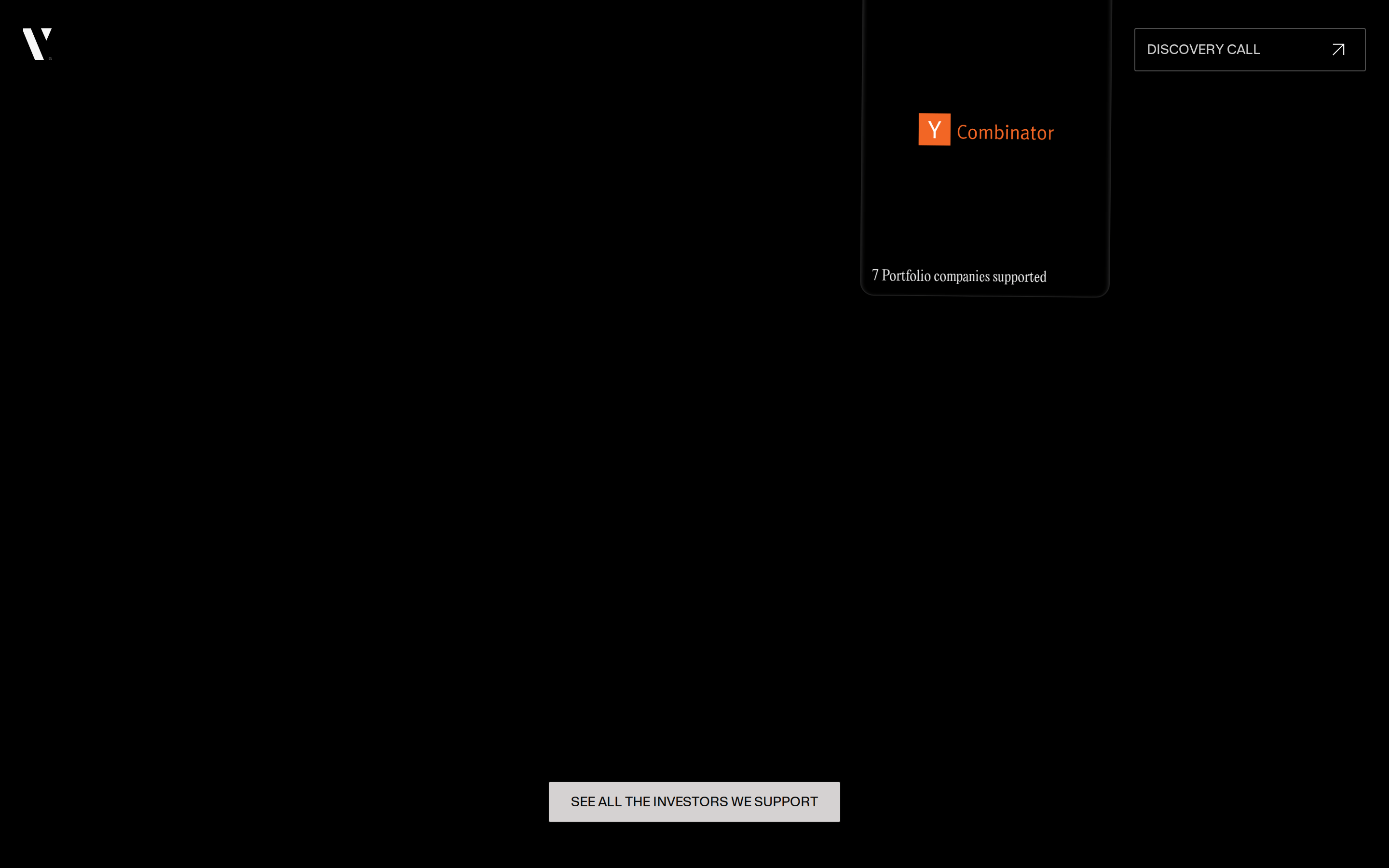
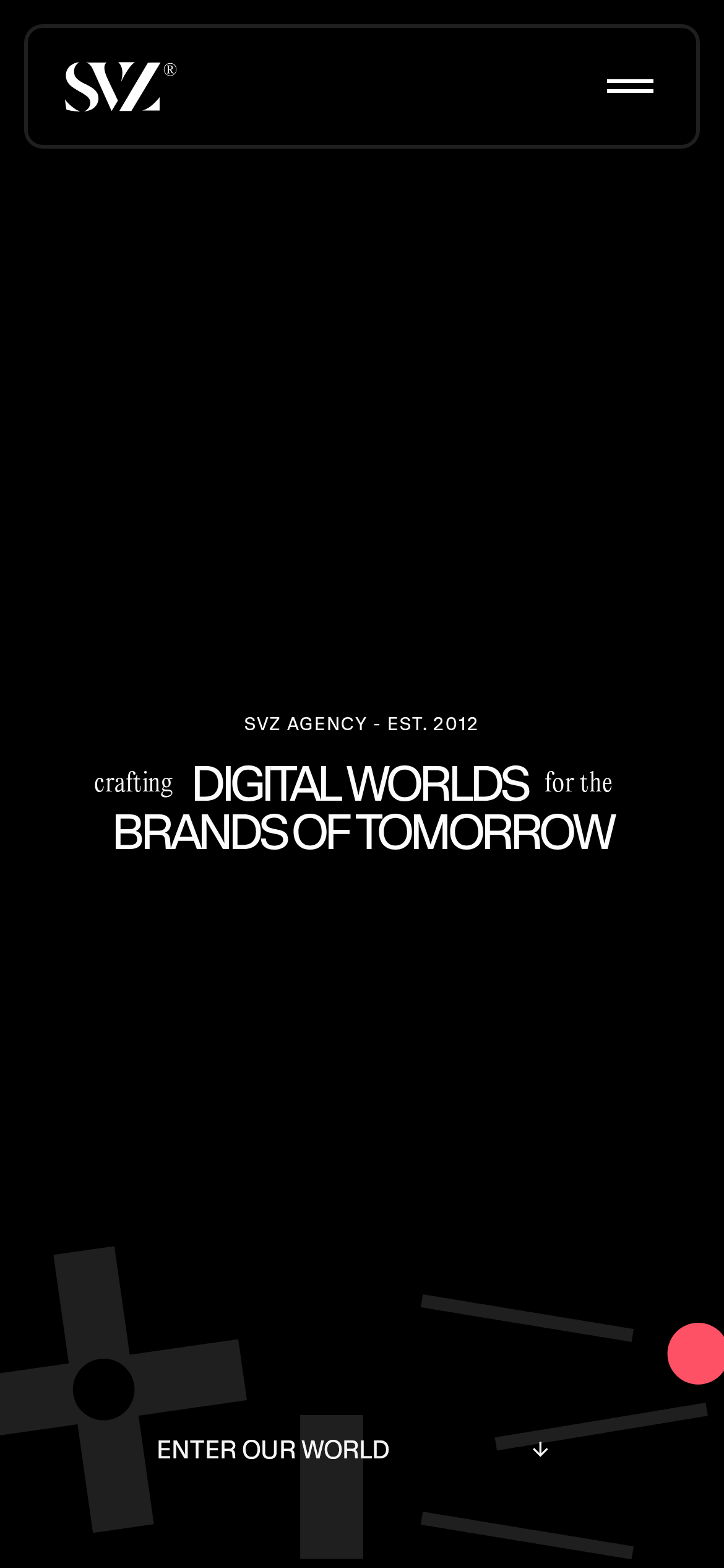
Inside the pack — real screenshots
桌面首屏(hero) 桌面滚动分段(90% viewport 步进,作为视觉证据) 桌面滚动分段(90% viewport 步进,作为视觉证据) 桌面滚动分段(90% viewport 步进,作为视觉证据) 桌面滚动分段(90% viewport 步进,作为视觉证据) 桌面滚动分段(90% viewport 步进,作为视觉证据) 桌面滚动分段(90% viewport 步进,作为视觉证据) 桌面滚动分段(90% viewport 步进,作为视觉证据) 桌面滚动分段(90% viewport 步进,作为视觉证据) 桌面滚动分段(90% viewport 步进,作为视觉证据) 桌面滚动分段(90% viewport 步进,作为视觉证据) 桌面滚动分段(90% viewport 步进,作为视觉证据) 桌面滚动分段(90% viewport 步进,作为视觉证据) 桌面滚动分段(90% viewport 步进,作为视觉证据) 桌面滚动分段(90% viewport 步进,作为视觉证据) 桌面滚动分段(90% viewport 步进,作为视觉证据) 桌面滚动分段(90% viewport 步进,作为视觉证据) 移动首屏 Captured from the live site · real computed styles
11
System prompt
Premium digital agency portfolio with dark sophisticated atmosphere. Primary colors: #080808 background, #fcfcfc white text, #FF4D5C coral accent. Typography mixes transitional-serif display with humanist-sans body. Critical donts: never use light backgrounds, avoid decorative body fonts, maintain high contrast, use uppercase navigation, keep buttons rectangular with minimal radius. Positioning: bold agency for forward-thinking brands. Layout uses 12-column grid with generous whitespace.
More from the library en · zh-CN · zh-TW · ja · ko
OpenDesign · curated web aesthetics for AI-readable design DNA · opendesign.cc
Why we curated this: Excellent example of premium agency design with bold typography and sophisticated dark aesthetic.