← OpenDesign CURATED · OPEN · FREE
Telfar
Minimalist, photography-driven fashion e-commerce focused on bold, accessible luxury.
fashion
01
Identity DNA
Minimalist Urban Accessible Luxury Iconic NYC
A clean, utilitarian boutique where the product is the hero
02
Color
#000000Ink
#FFFFFFBG
#F2F2F2BG quiet
#1F1F1FMuted
rgba(0, 0, 0, 0.1)Line
High-contrast minimalism to let product photography dominate
03
Typography
grotesque-sans
display 56px · 400body 16px · 400Use uniform weight for most UI elements · Ensure tight line-height for compact text blocks · Apply uppercase sparingly for labels and badges
04
Spacing
4px
8px
16px
24px
32px
48px
64px
96px
Consistent 4px base grid with standard e-commerce spacing
05
Surfaces
sm · 2px
md · 6px
lg · 12px
pill · 999px
Thin 1px solid black for cards and interactive elements
rgba(0, 0, 0, 0.01) 0px 0px 10px 0px
06
Layout
1440 container
12 columns
24px gutter
768 / 1024 breakpoints
Asymmetric masonry or 2-column grid for product showcases
07
Motion & Interaction
150ms micro
300ms small
600ms medium
cubic-bezier(0.25, 0.1, 0.25, 1) easing
Smooth scale transitions for hover states · Fade-in for modal and overlay elements
Subtle opacity change or background-color transition · Immediate visual feedback with minimal animation
08
Components
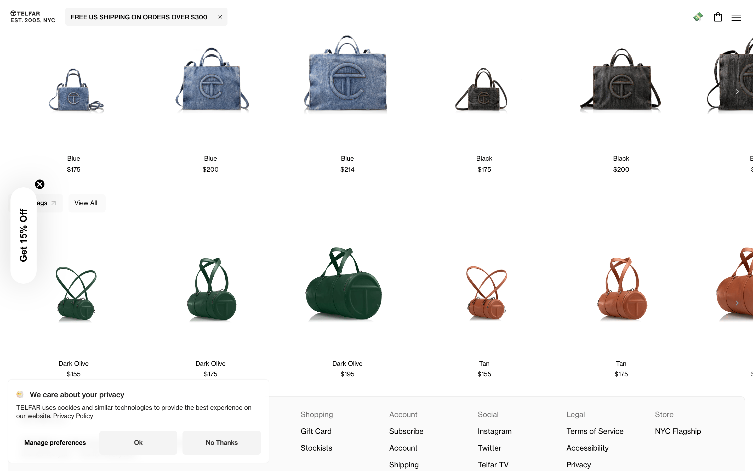
button Minimalist pill-shaped or rectangular with thin borders card Clean white cards with subtle borders for product grouping chip Simple text-based navigation tabs input Standard text inputs with clear labels hero Large, full-width photographic banners with minimal overlay text 09
Voice & Don'ts
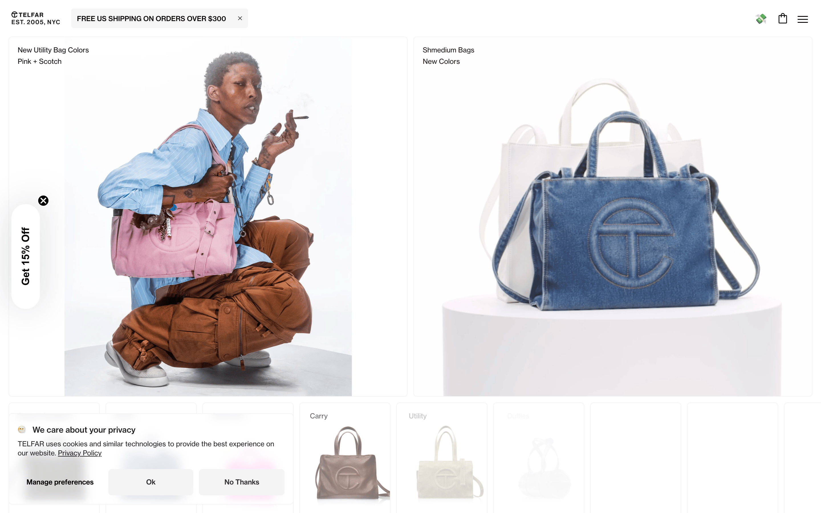
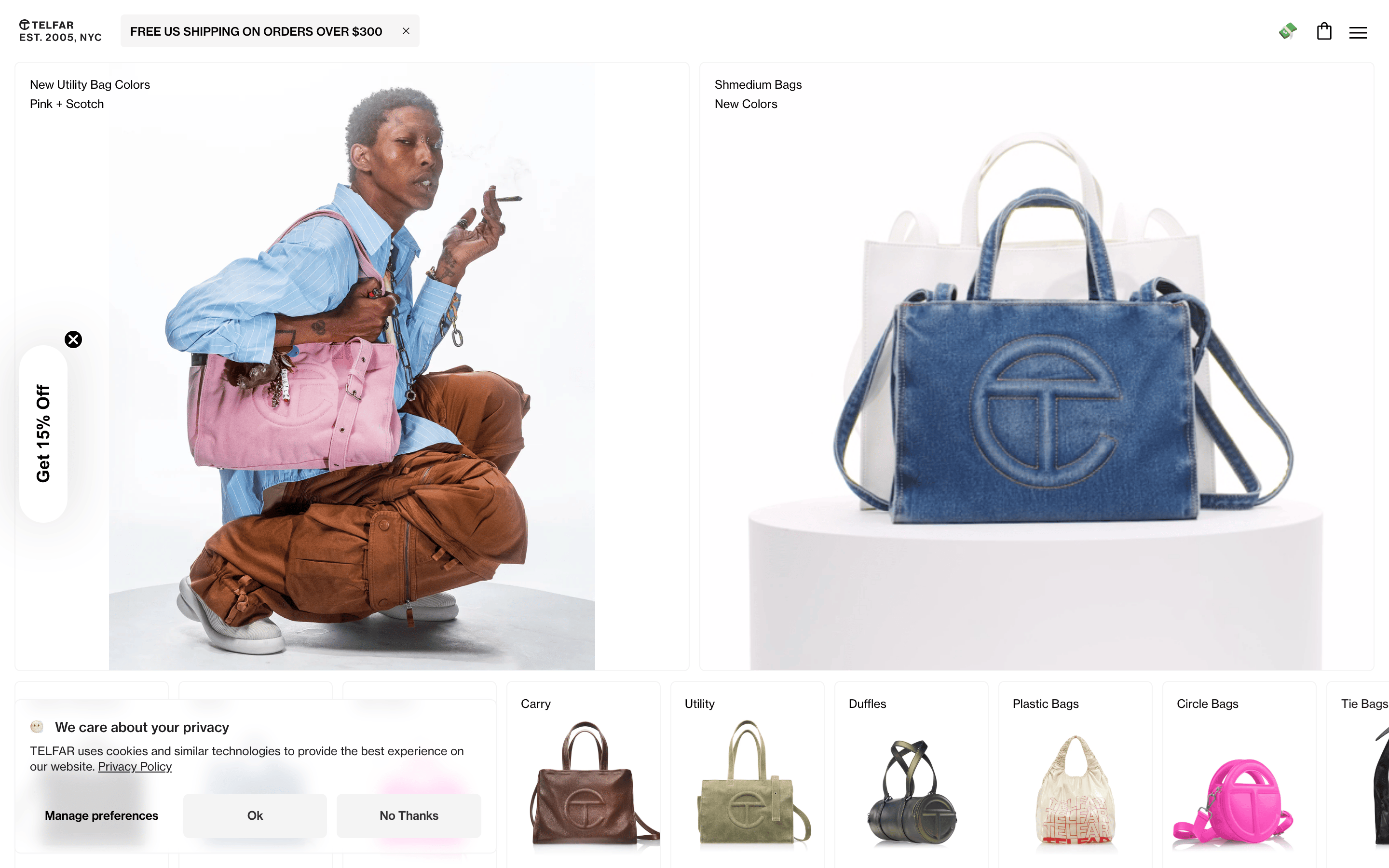
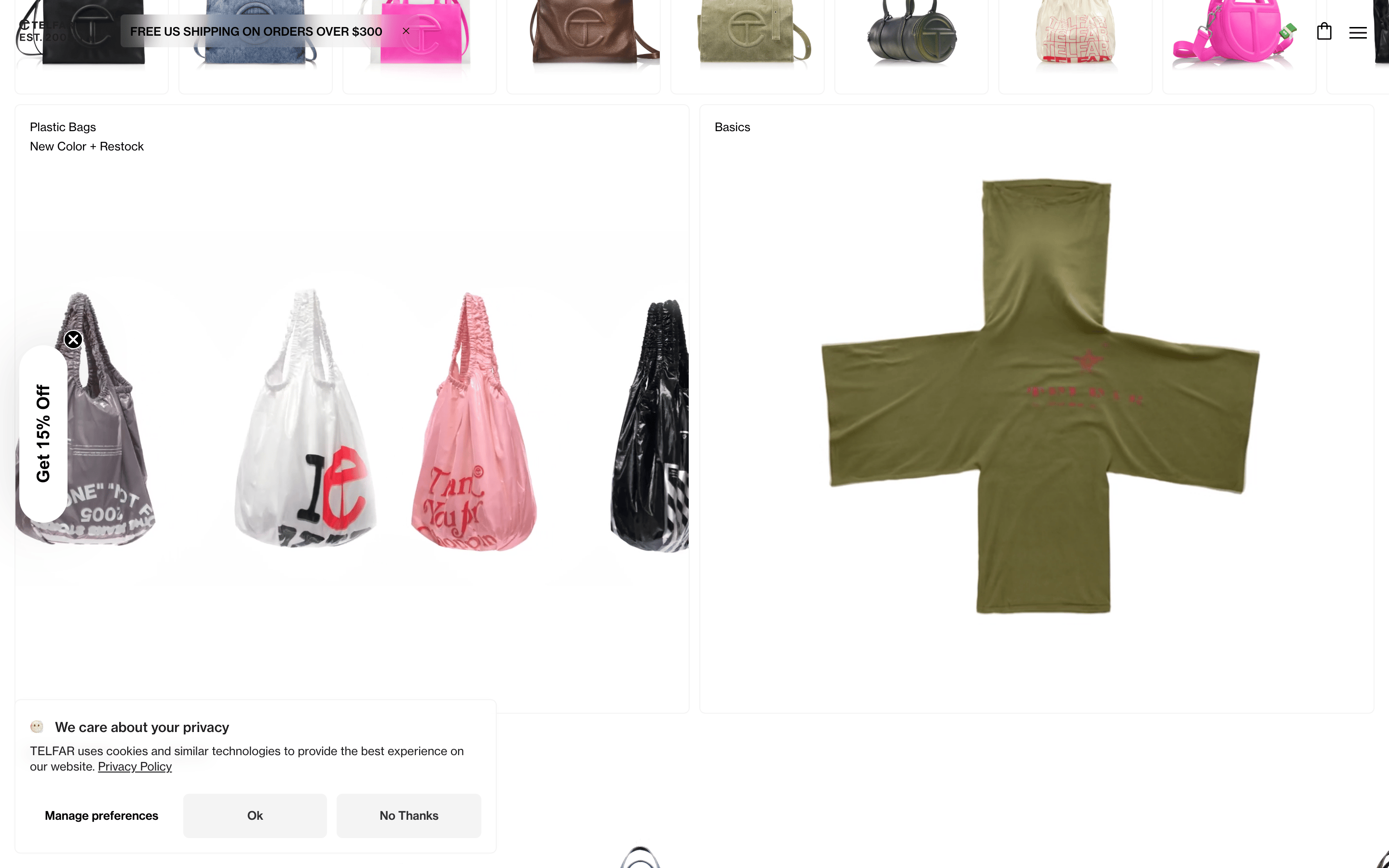
Tone Confident, direct, and understated Headlines Clear and informative, often stating color or product type CTAs Simple, action-oriented text like 'View All' or 'Manage preferences' Don't use decorative gradients — screenshot shows solid color backgrounds Don't use drop shadows heavily — screenshot shows only one very subtle box-shadow Don't use heavy typography weights — screenshot shows a preference for weight 400 Don't use vibrant accent colors in UI — screenshot shows no dominant accent color Don't use rounded corners everywhere — screenshot shows mostly sharp or slightly rounded corners Don't clutter the UI with icons — screenshot shows a minimalist icon set in the header Avoid: Excessive promotional language Avoid: Decorative ornaments Avoid: Loud color combinations 10
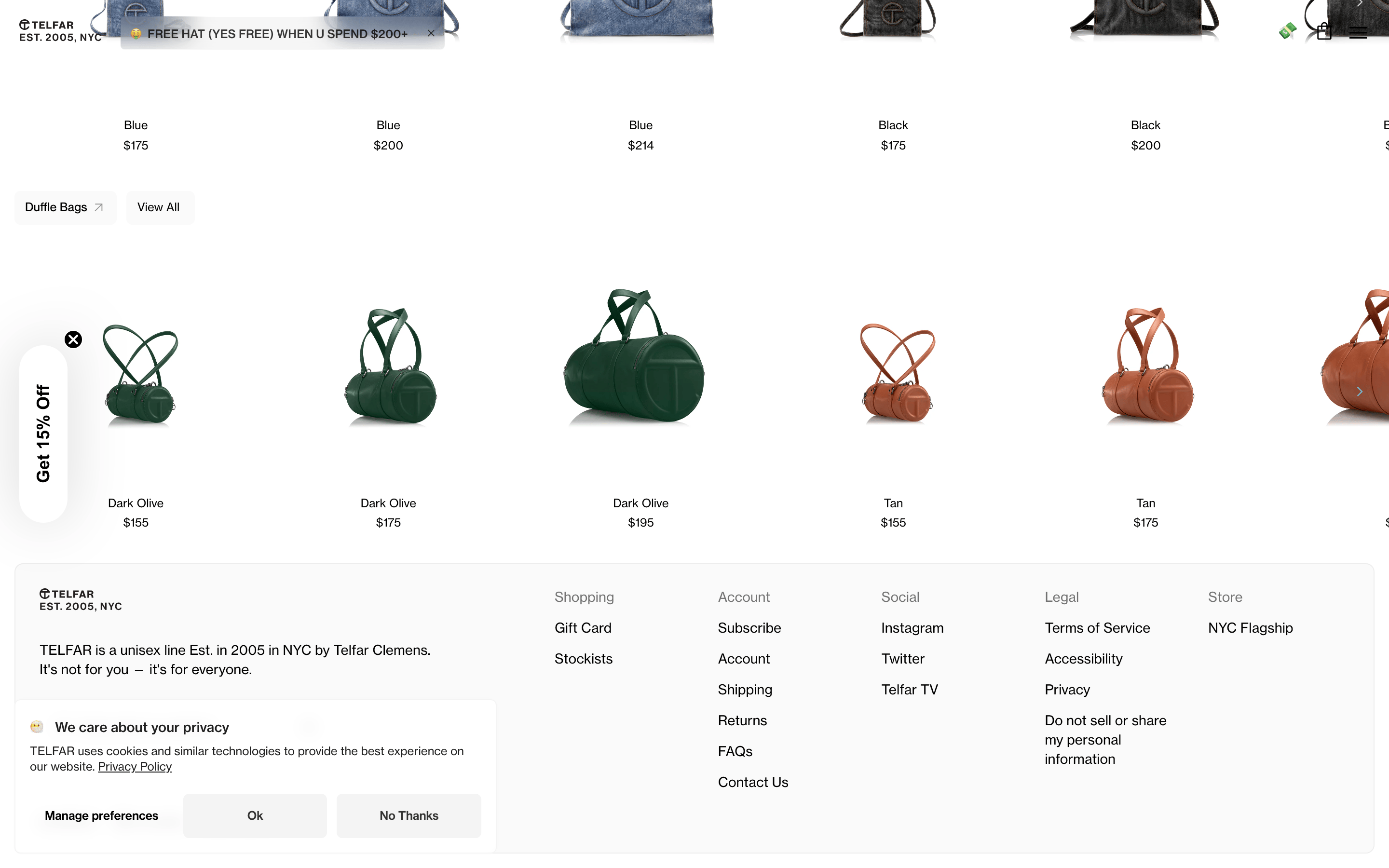
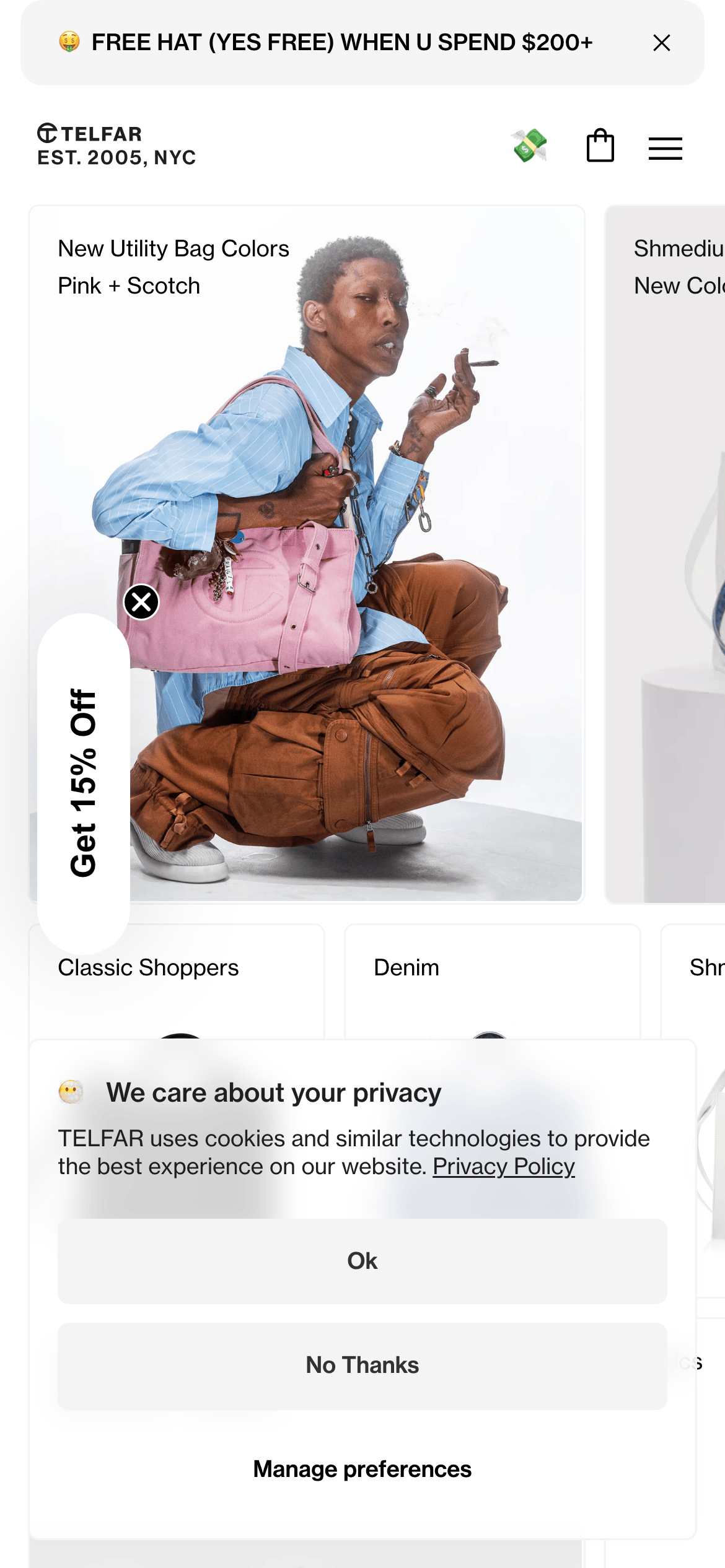
Inside the pack — real screenshots
桌面首屏(hero) 桌面滚动分段(90% viewport 步进,作为视觉证据) 桌面滚动分段(90% viewport 步进,作为视觉证据) 桌面滚动分段(90% viewport 步进,作为视觉证据) 桌面滚动分段(90% viewport 步进,作为视觉证据) 移动首屏 Captured from the live site · real computed styles
11
System prompt
Telfar is a minimalist fashion e-commerce site with a clean, utilitarian aesthetic. It uses a high-contrast palette of pure white (#FFFFFF) and black (#000000), allowing bold product photography to dominate the visual space. The typography relies on a grotesque sans-serif (Neue Haas Grotesk Text Pro) with a focus on legibility and clean lines. Critical design constraints include avoiding heavy shadows, excessive decorative elements, or vibrant accent colors that would compete with the products. The layout is spacious and grid-based, emphasizing the iconic 'Shopping Bag' product line through large, clear imagery and minimal interface chrome.
More from the library en · zh-CN · zh-TW · ja · ko
OpenDesign · curated web aesthetics for AI-readable design DNA · opendesign.cc
Why we curated this: An excellent example of minimalist e-commerce where the 'less is more' approach elevates the brand's iconic status and product appeal.