A vintage event invitation mixed with a modern startup portfolio showcase.
02
Color
#006EFFInk
#FFF8F1BG
rgba(0,110,255,1.0)Line
Dual-tone palette using a warm cream base and a vibrant blue for all interactive and typographic elements.
03
Typography
grotesque-sans
display77px · 400
heading62px · 400
subhead38px · 400
body18px · 400
small16px · 400
All uppercase text is used for labels and primary headings. · High contrast between the thick display font and the lighter body text. · Significant negative letter spacing is applied to large display text.
04
Spacing
4px
8px
16px
24px
32px
48px
64px
96px
144px
Generous horizontal padding (144px) centers content, with strict vertical rhythm defined by large white space and consistent margins.
05
Surfaces
sm · 0px
md · 0px
lg · 0px
pill · 999px
Thin solid blue lines act as horizontal dividers.
06
Layout
1280container
12columns
24pxgutter
768 / 1024breakpoints
Single-column centered layout with wide margins, transitioning to a split layout for specific details.
07
Motion & Interaction
200msmicro
300mssmall
950msmedium
cubic-bezier(0.19, 1, 0.22, 1)easing
Smooth background-color and color transitions on hover. · Transform and opacity changes for interactive elements.
Background-color and color transitions on buttons and links. · Scale or transform micro-interactions.
08
Components
buttonLarge, pill-shaped outline buttons with blue borders and text, centered on mobile.
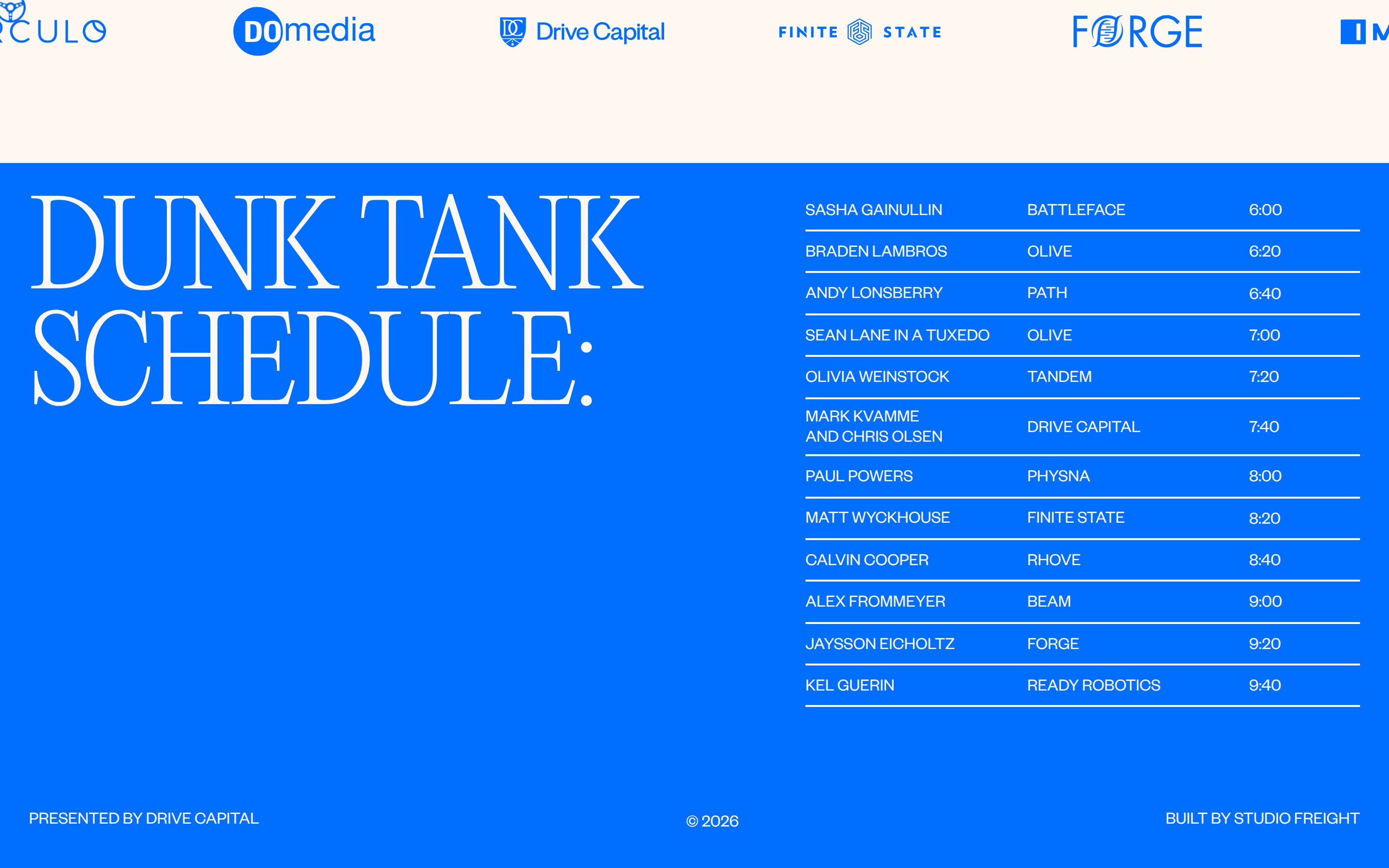
cardSimple bordered sections containing schedule lists or partner logos.
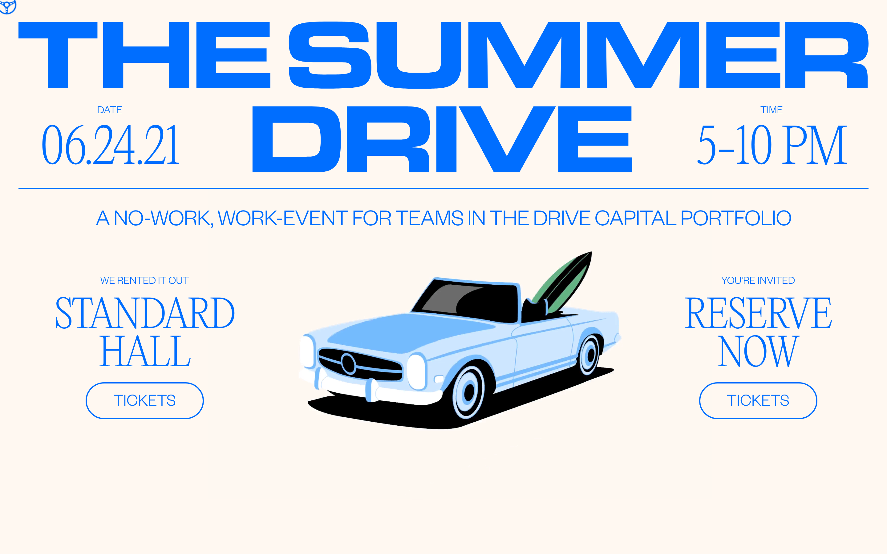
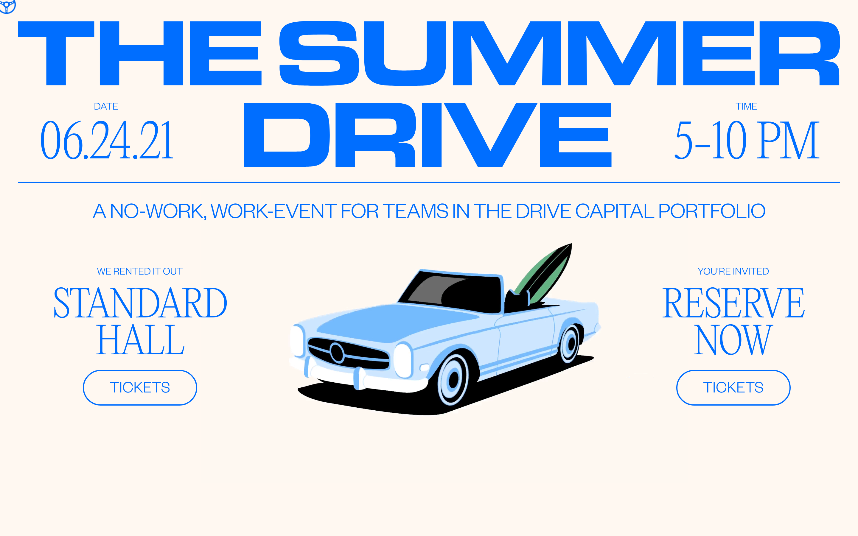
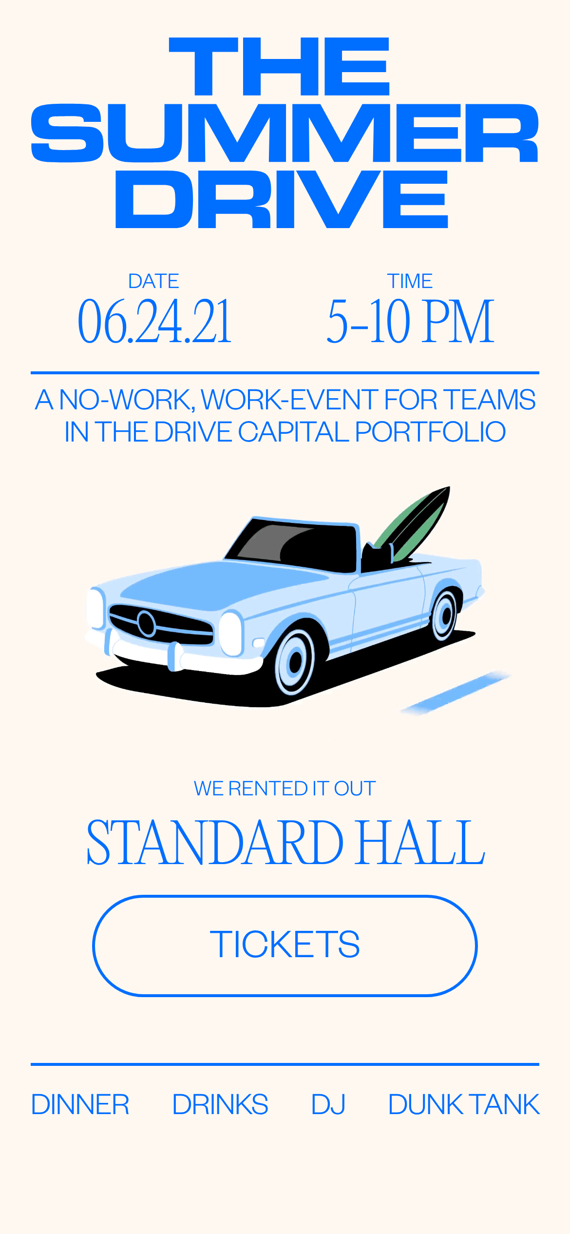
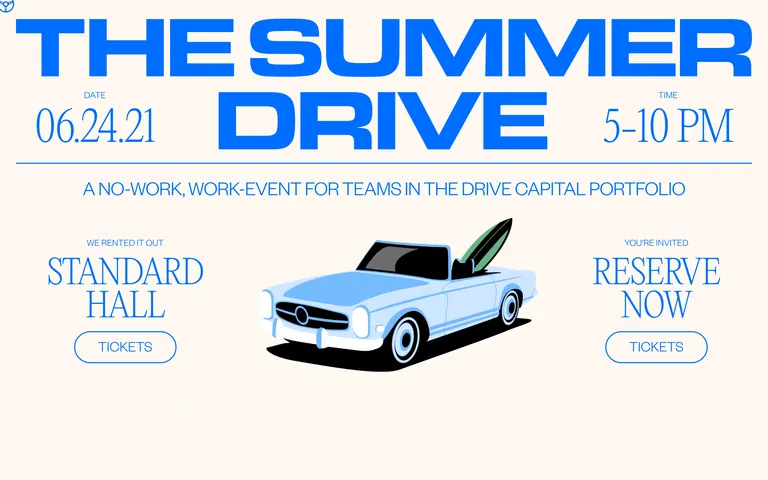
heroMassive typography-driven hero featuring a central illustration of a vintage car.
09
Voice & Don'ts
TonePlayful, exclusive, and informal yet corporate.
Captured from the live site · real computed styles
11
System prompt
This design is a playful, high-contrast event landing page for a venture capital portfolio gathering. It uses a minimal palette of a warm cream background (#FFF8F1) and a single vibrant blue (#006EFF) for all interactive elements and typography. The typography is entirely grotesque-sans, featuring massive, tight-kerned display text for headers and clean sans-serif for body copy. Critical constraints: avoid using serif fonts or dark backgrounds, never use multiple accent colors, and ensure buttons are always pill-shaped outlines rather than solid blocks. The layout is centered and spacious, relying on large white space and thin blue horizontal lines to structure content, avoiding dense grids or complex shadows.
Bring this taste to your agent
Hand your AI agent a machine-readable spec of this design — tokens, type, motion, the whole DNA.