← OpenDesign CURATED · OPEN · FREE
Ujjo
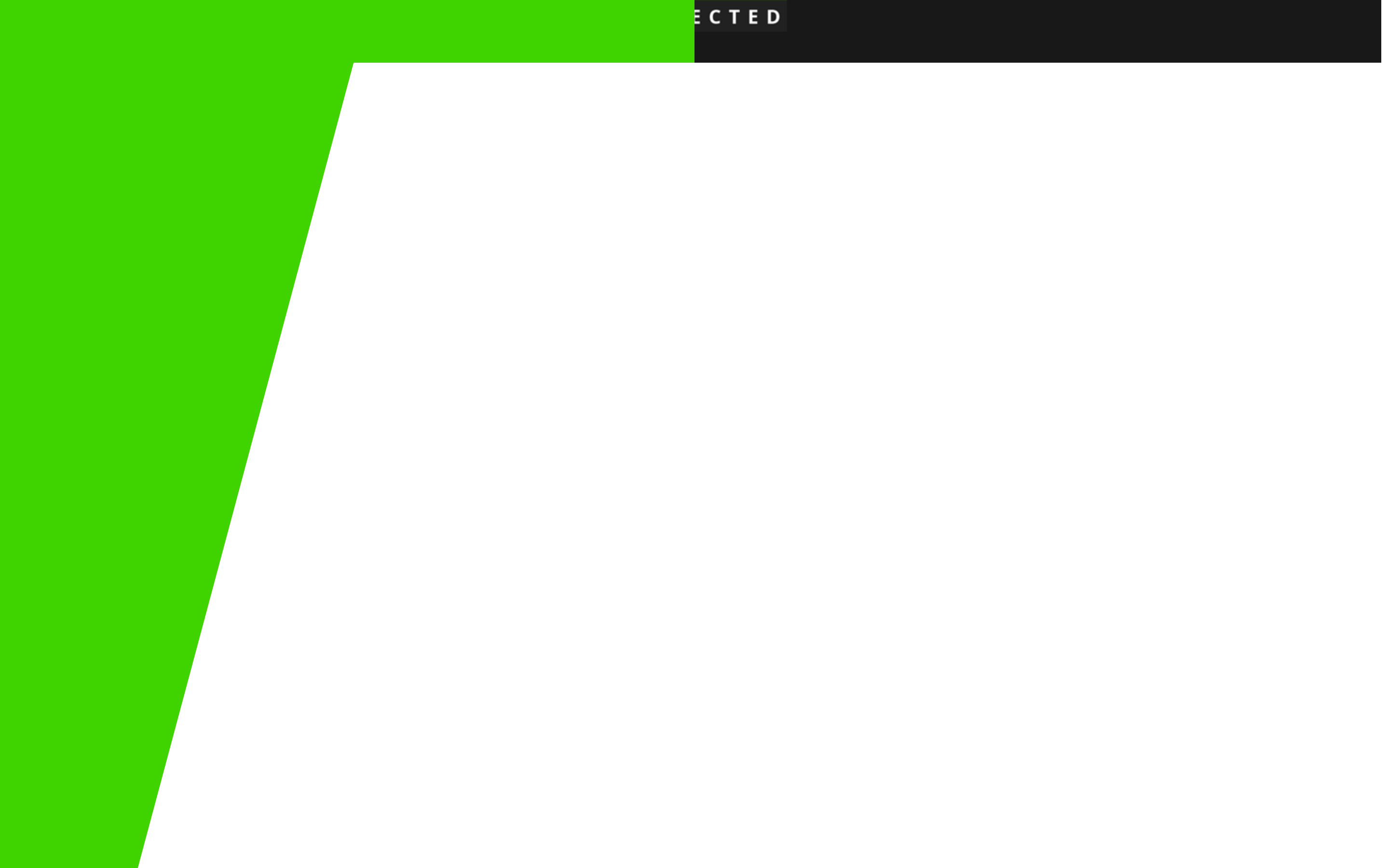
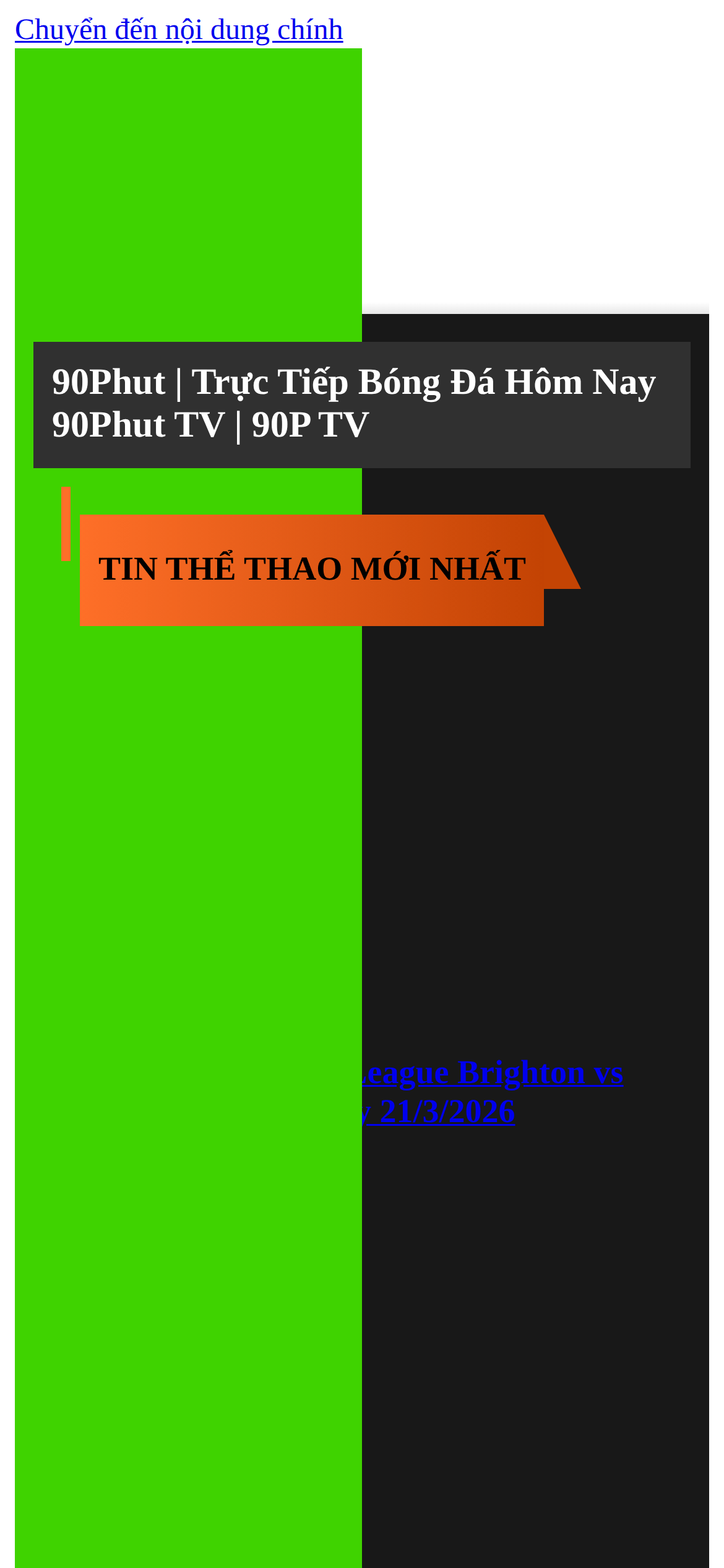
High-contrast editorial interface utilizing a bold neon green and dark gray split-background with sharp typographic accents.
Editorial Bold Typography Clean Consumer Restraint
01
Identity DNA
Bold Editorial Minimal High-Contrast
A sleek digital magazine or editorial platform with a striking split-tone layout.
02
Color
#3FD300Accent
#000000Ink
#212121BG
#303030BG soft
#1A1A1AMuted
rgba(0,0,0,1.0)Line
Extreme contrast between vibrant neon green and deep dark grays, using black for primary text.
03
Typography
transitional-serif · monospace
display 32px · 900heading 24px · 700body 16px · 400Serif typefaces dominate for both display and body text. · Heavy weights (700-900) are used frequently for emphasis and headers.
04
Spacing
4px
8px
16px
24px
32px
48px
64px
96px
4px base grid with generous padding around headline elements.
05
Surfaces
sm · 0px
md · 0px
lg · 0px
pill · 0px
No visible border radius; sharp rectangular edges on all surface elements.
06
Layout
1280 container
12 columns
24px gutter
768 / 1024 breakpoints
A split-background layout (left neon green, right dark gray) with overlaid content blocks.
07
Motion & Interaction
220ms micro
400ms small
800ms medium
cubic-bezier(0.25, 0.1, 0.25, 1.0) easing
Standard CSS transitions applied to interactive elements.
Standard text link hover effects via CSS transitions. · Default pointer cursor for interactive elements.
08
Components
button Standard text links without visible button containers, relying on default styling. card Content blocks presented as flat regions of color or text without distinct card boundaries. hero A large split-tone background area with overlaid text blocks for the main title. 09
Voice & Don'ts
Tone Authoritative, bold, and direct, suitable for sports news. Headlines Uppercase or heavily weighted serif type. CTAs Standard inline text links. Don't use rounded corners — screenshot shows sharp, rectangular edges on all elements. Don't use sans-serif fonts — screenshot shows serif fonts (Times New Roman) for all text. Don't use soft pastel colors — screenshot shows high-contrast neon green and dark grays. Don't apply drop shadows — screenshot shows completely flat, 2D surface styling. Don't center all text — screenshot shows left-aligned content blocks. Don't use colorful button shapes — screenshot shows simple underlined text links instead. Avoid: Playful or rounded elements Avoid: Soft or pastel color palettes Avoid: Heavy drop shadows 10
Inside the pack — real screenshots
桌面首屏(hero) 桌面滚动分段(90% viewport 步进,作为视觉证据) 桌面滚动分段(90% viewport 步进,作为视觉证据) 桌面滚动分段(90% viewport 步进,作为视觉证据) 桌面滚动分段(90% viewport 步进,作为视觉证据) 桌面滚动分段(90% viewport 步进,作为视觉证据) 桌面滚动分段(90% viewport 步进,作为视觉证据) 桌面滚动分段(90% viewport 步进,作为视觉证据) 桌面滚动分段(90% viewport 步进,作为视觉证据) 桌面滚动分段(90% viewport 步进,作为视觉证据) 桌面滚动分段(90% viewport 步进,作为视觉证据) 桌面滚动分段(90% viewport 步进,作为视觉证据) 桌面滚动分段(90% viewport 步进,作为视觉证据) 桌面滚动分段(90% viewport 步进,作为视觉证据) 桌面滚动分段(90% viewport 步进,作为视觉证据) 桌面滚动分段(90% viewport 步进,作为视觉证据) 桌面滚动分段(90% viewport 步进,作为视觉证据) 移动首屏 Captured from the live site · real computed styles
11
System prompt
This site features a bold, high-contrast editorial layout characterized by a striking split-background of neon green (#3FD300) and dark gray (#212121). Typography is strictly serif-based (Times New Roman) with heavy weights (700-900) used for emphasis. The design is completely flat with no border-radius, drop shadows, or soft gradients. Key hex colors include #3FD300, #000000, and #212121. Critical donts include: never use rounded corners, never use sans-serif fonts, and never apply drop shadows or soft pastel palettes. The layout relies on sharp geometric blocks and left-aligned text.
More from the library en · zh-CN · zh-TW · ja · ko
OpenDesign · curated web aesthetics for AI-readable design DNA · opendesign.cc
Why we curated this: The site is worth including for its unapologetic use of high-contrast color and traditional serif typography in a modern, flat web layout.