A premium fashion brand that blends minimalist e-commerce with high-end editorial storytelling.
02
Color
#000000Ink
#888888Muted
rgba(0,0,0,1)Line
Monochrome palette with high-contrast black and white, relying on photography for visual richness.
03
Typography
grotesque-sans
display60px · 700
body16px · 400
Use uppercase for navigation and major call-to-action text · Maintain a strict typographic hierarchy using Helvetica and sans-serif fallbacks · Ensure tight line-height for large display text and standard spacing for body copy
04
Spacing
4px
8px
16px
20px
24px
32px
40px
50px
64px
Consistent 4px grid with generous padding for interactive elements and modal layouts.
05
Surfaces
sm · 2px
md · 5px
lg · 10px
pill · 50px
1px solid borders for buttons and interactive states.
0px 0px 18px 0px rgba(0, 0, 0, 0.2)
06
Layout
1440container
12columns
20pxgutter
768 / 1024breakpoints
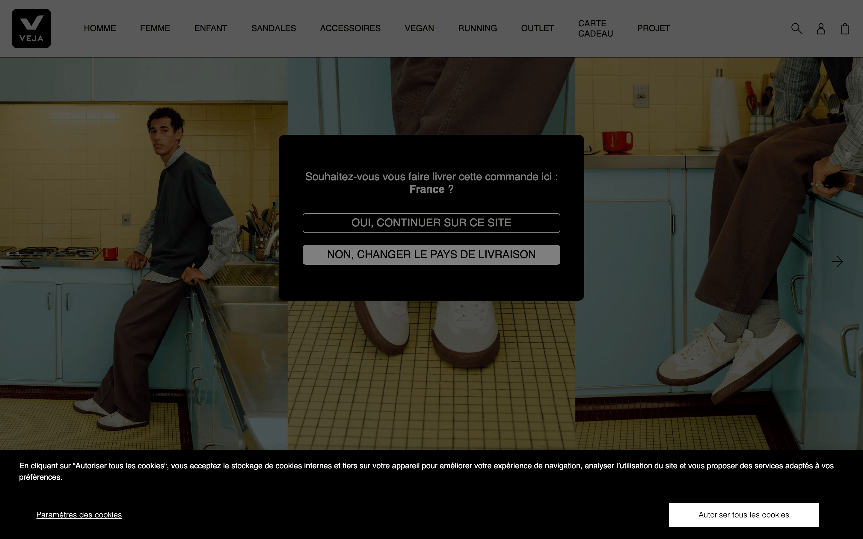
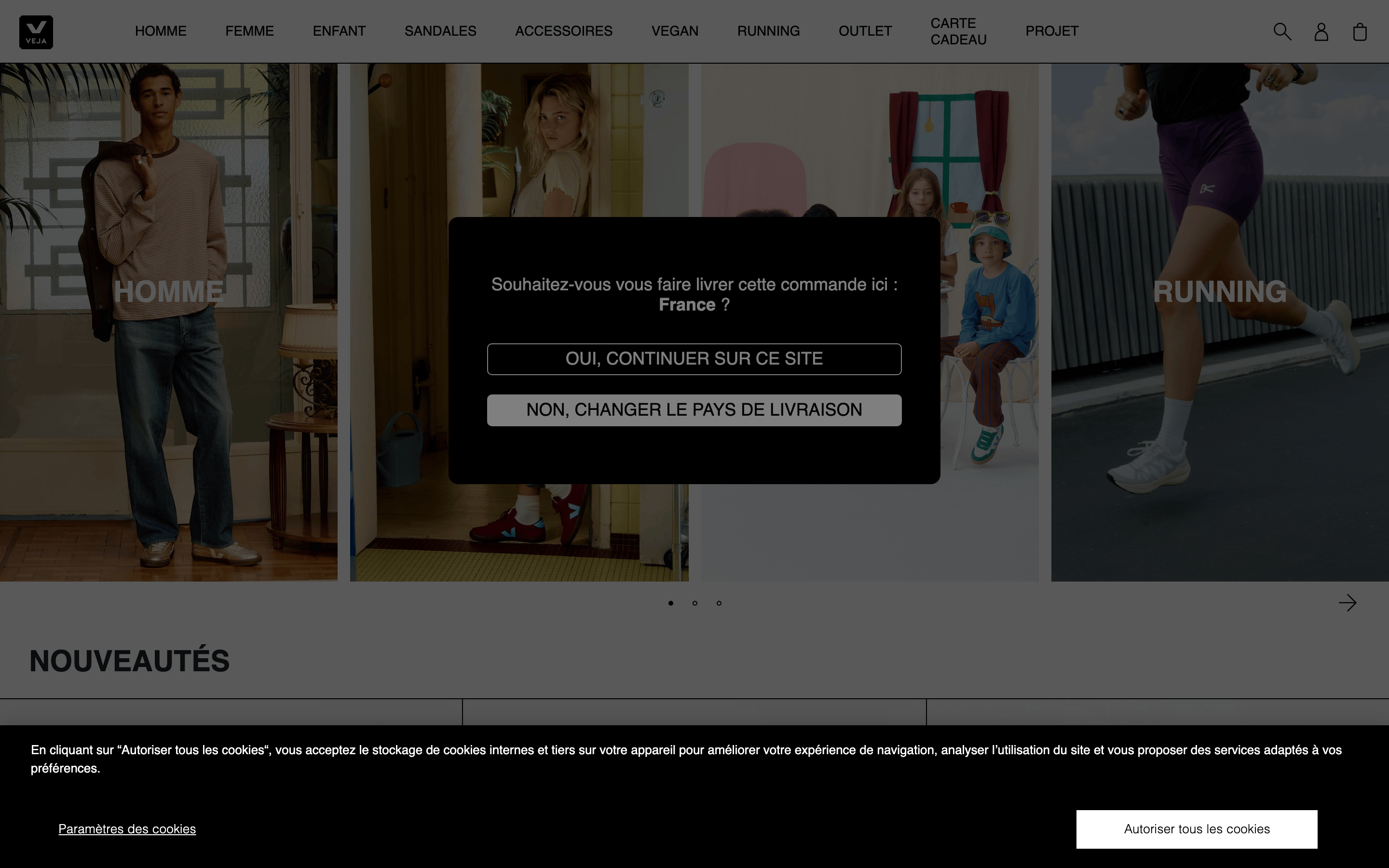
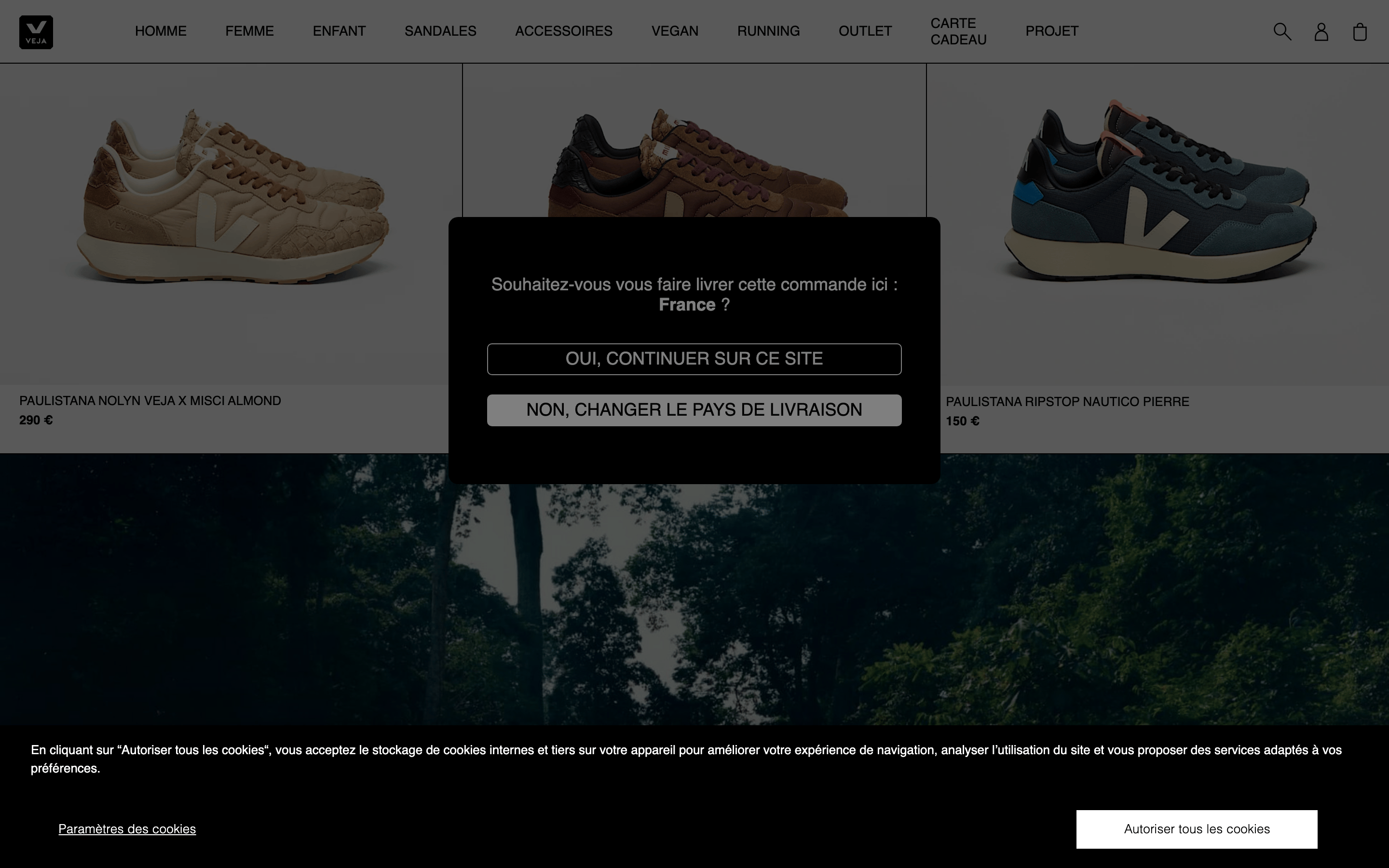
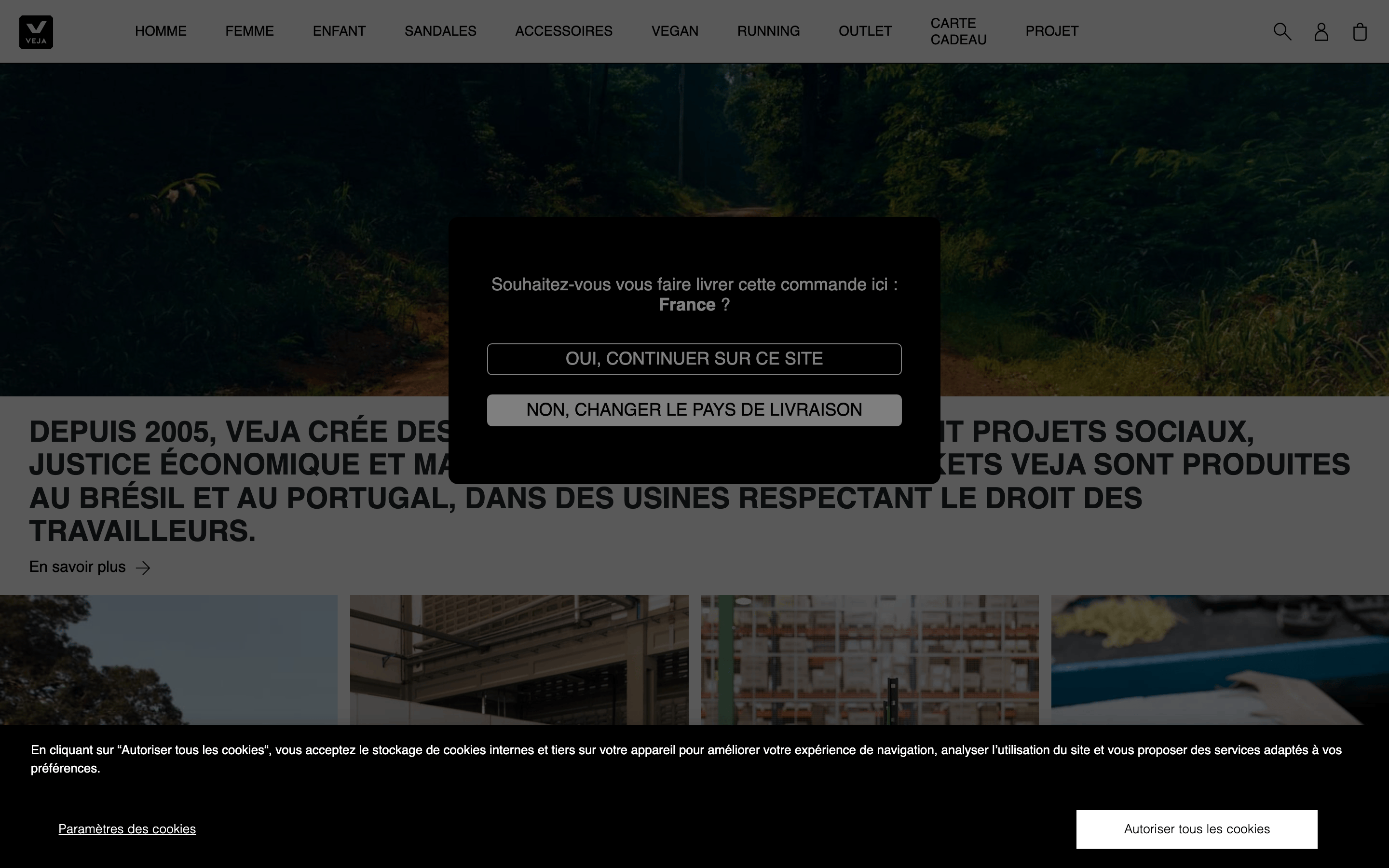
Photography-driven layout with a standard e-commerce grid hidden behind a central modal and bottom cookie banner.
07
Motion & Interaction
150msmicro
300mssmall
800msmedium
cubic-bezier(0.4, 0, 0.2, 1)easing
Opacity and transform transitions for hover states and modal reveals.
Subtle opacity or transform transitions on interactive elements. · Standard pointer cursor with transition feedback.
08
Components
buttonRectangular buttons with minimal border-radius and uppercase text.
cardGrid of product or editorial images without visible borders.
chipN/A
inputN/A
heroFull-bleed cinematic photography used as the primary hero element.
09
Voice & Don'ts
ToneQuietly confident, premium, and transparent.
HeadlinesBold, uppercase, and declarative.
CTAsDirect and functional, using all-caps for clarity.
Don't use vibrant accent colors — screenshot shows a strict monochrome palette of black, white, and gray.
Don't use rounded pill buttons — screenshot shows rectangular buttons with small border radii of 5px or less.
Don't use playful, handwritten, or serif typefaces — screenshot shows strict Helvetica/grotesque-sans usage.
Don't clutter the layout with multiple overlapping text elements — screenshot shows minimal text over large photographic areas.
Don't hide the brand identity behind complex navigation — screenshot shows a persistent, clear logo placement.
Don't use light, airy pastel backgrounds — screenshot shows deep blacks and stark whites for high contrast.
Captured from the live site · real computed styles
11
System prompt
This is a premium sustainable footwear e-commerce site that relies heavily on cinematic, photography-forward layouts. The visual system uses a strict monochrome palette (Black #000000, White #FFFFFF, Gray #888888) to let the editorial imagery stand out. Typography is driven by Helvetica and standard grotesque-sans fonts, with uppercase treatments for navigation and large, bold display text for headlines. Layouts are generous and minimal, prioritizing breathing room around imagery. Critical donts: avoid vibrant accent colors, avoid rounded/playful UI elements, and avoid cluttering the interface with dense text blocks. The design must remain restrained, premium, and photography-driven at all times.
Bring this taste to your agent
Hand your AI agent a machine-readable spec of this design — tokens, type, motion, the whole DNA.