A premium architectural catalog brought to the web, blending product showcase with editorial storytelling.
02
Color
#101010Ink
#333333Ink soft
#FFFFFFBG
#F7F7F7BG soft
#E6E6E6BG quiet
#767676Muted
rgba(204,204,204,1.0)Line
Strict monochrome palette relying on high-contrast photography for visual interest.
03
Typography
geometric-sans
display56px · 500
headline40px · 500
body17px · 500
small15px · 500
micro13px · 500
Use geometric sans-serif throughout · Maintain a weight of 500 for primary text · Uppercase tracking for small labels · Left-aligned paragraphs with generous line-height
04
Spacing
4px
8px
16px
24px
32px
48px
64px
96px
8px base unit with generous 64px-96px section spacing.
05
Surfaces
sm · 0px
md · 0px
lg · 0px
pill · 999px
Thin 1px solid borders in light gray for subtle separation, no drop shadows.
06
Layout
1440container
12columns
24pxgutter
768 / 1024breakpoints
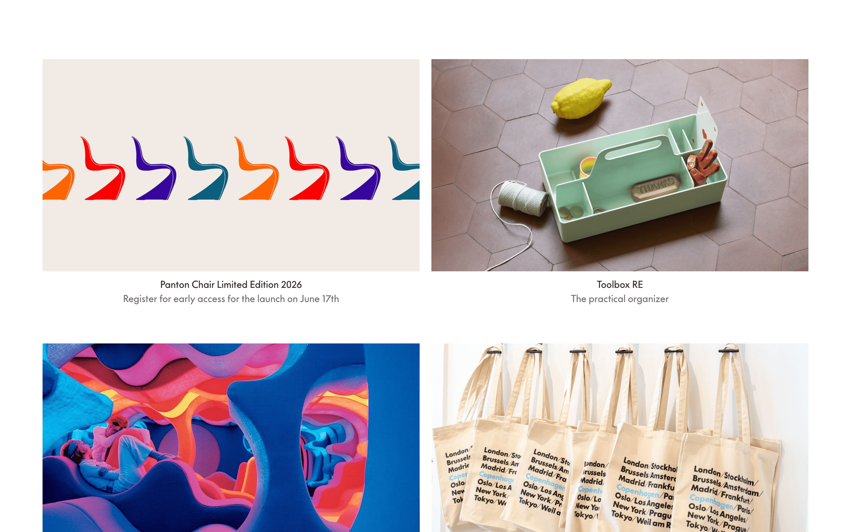
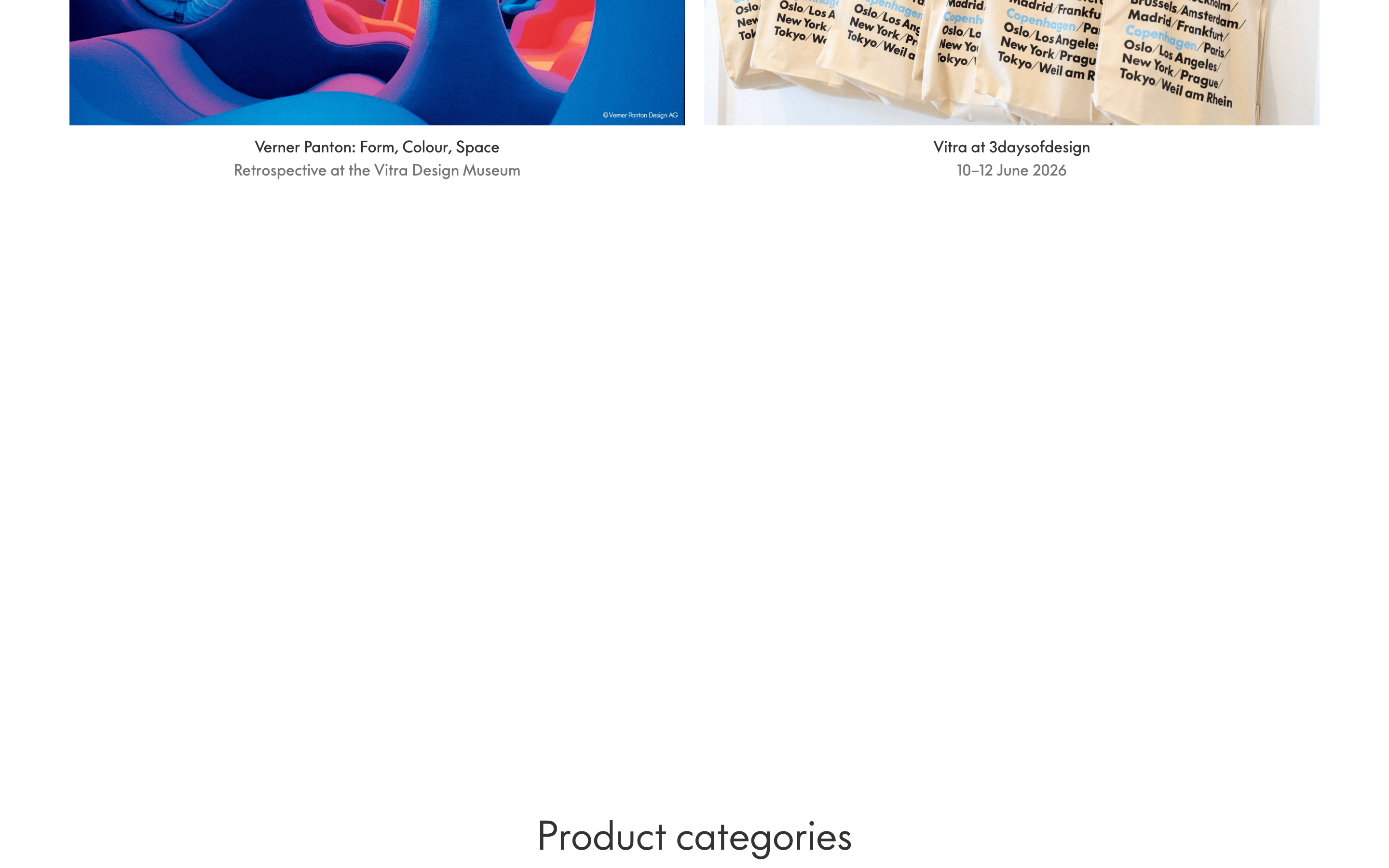
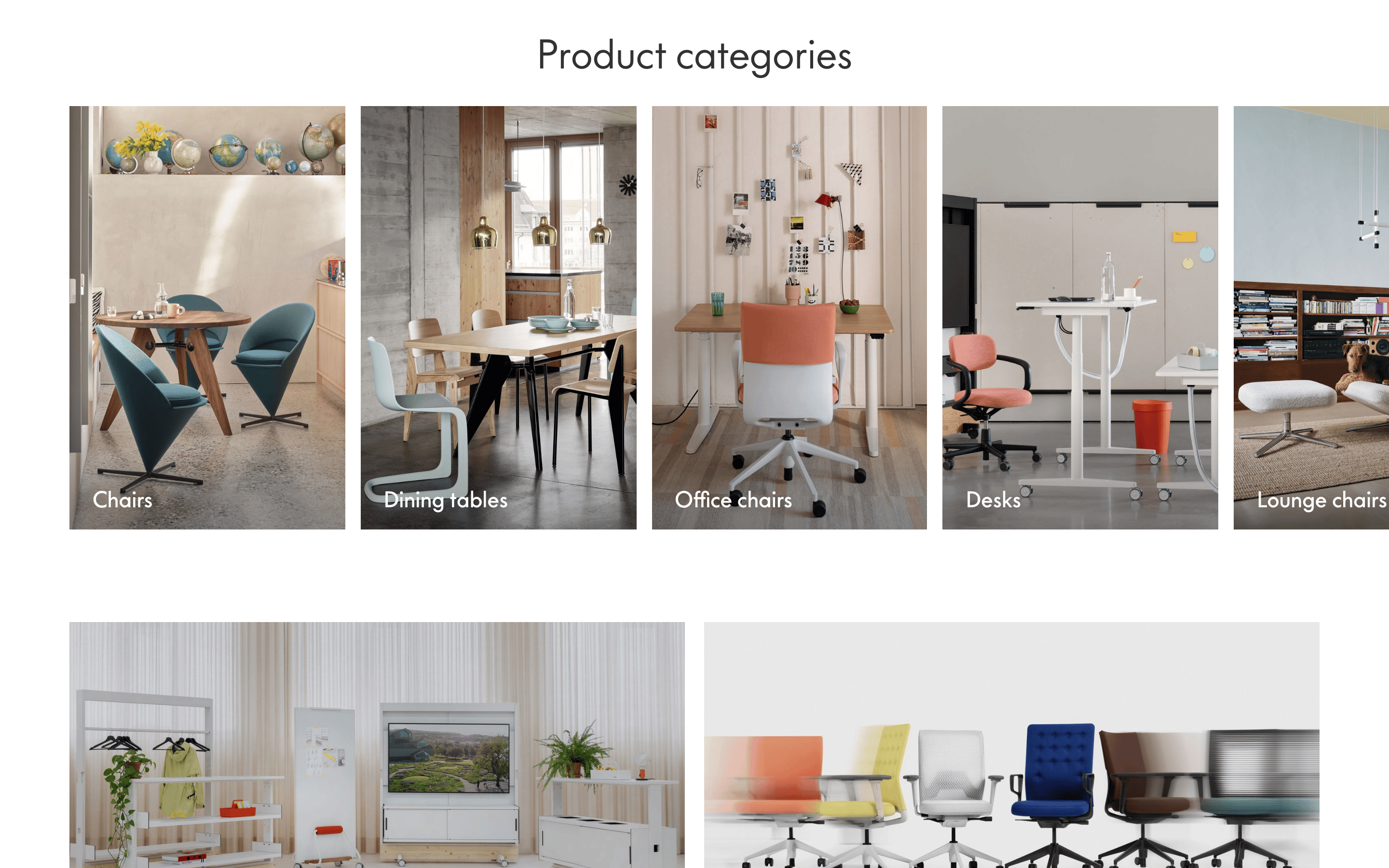
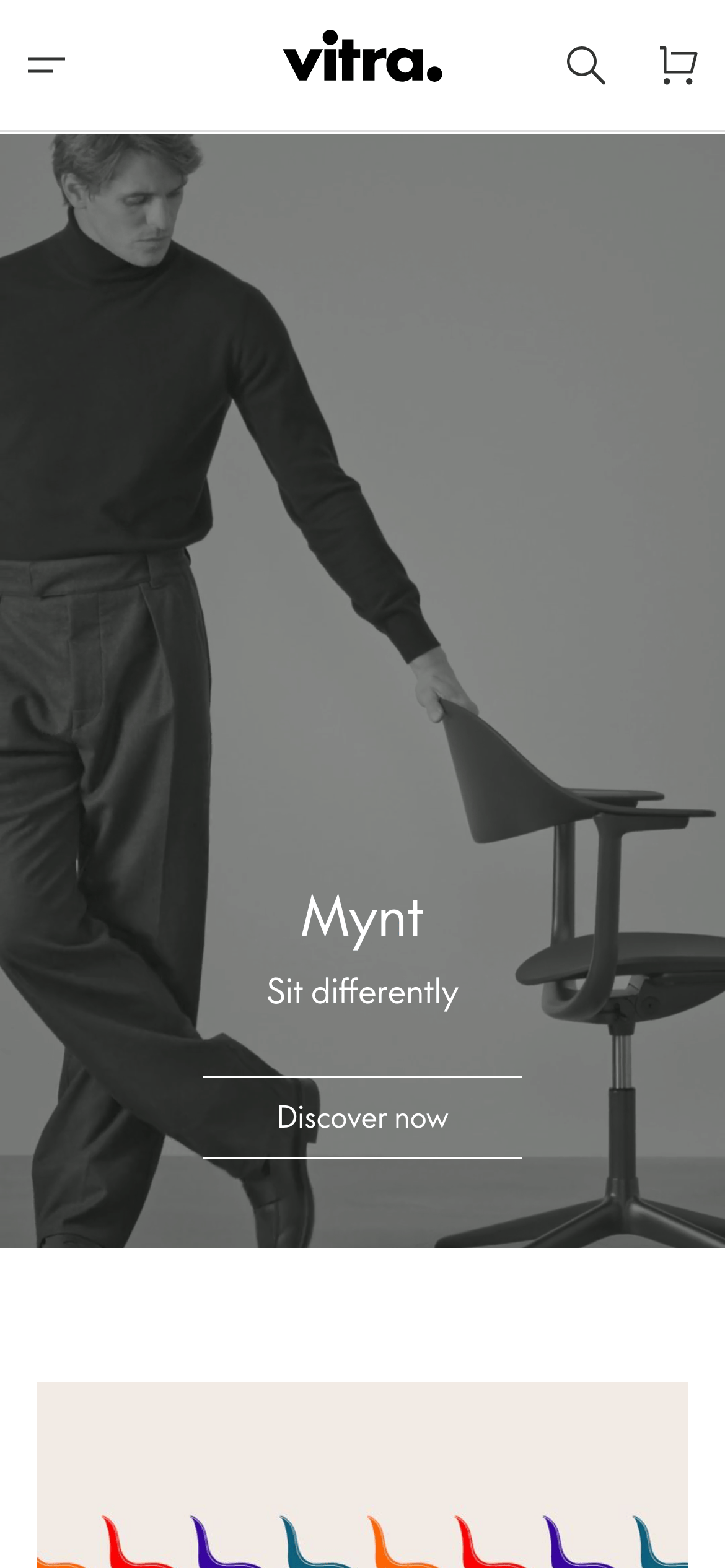
Full-bleed hero images with centered text, followed by tight two-column product grids.
07
Motion & Interaction
150msmicro
400mssmall
800msmedium
cubic-bezier(0.17, 0.16, 0, 0.6)easing
Smooth fade-ins for text overlays · Linear color transitions on interactive elements
Subtle color shifts to muted gray for text and icons. · Immediate response with minimal micro-interactions.
08
Components
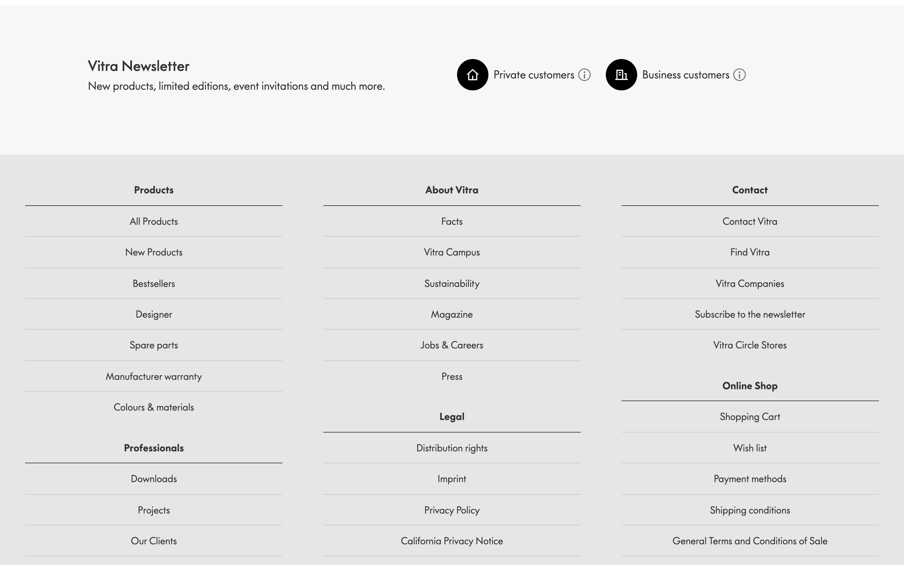
buttonText-only or outline buttons with thin borders, uppercase labels, and generous padding.
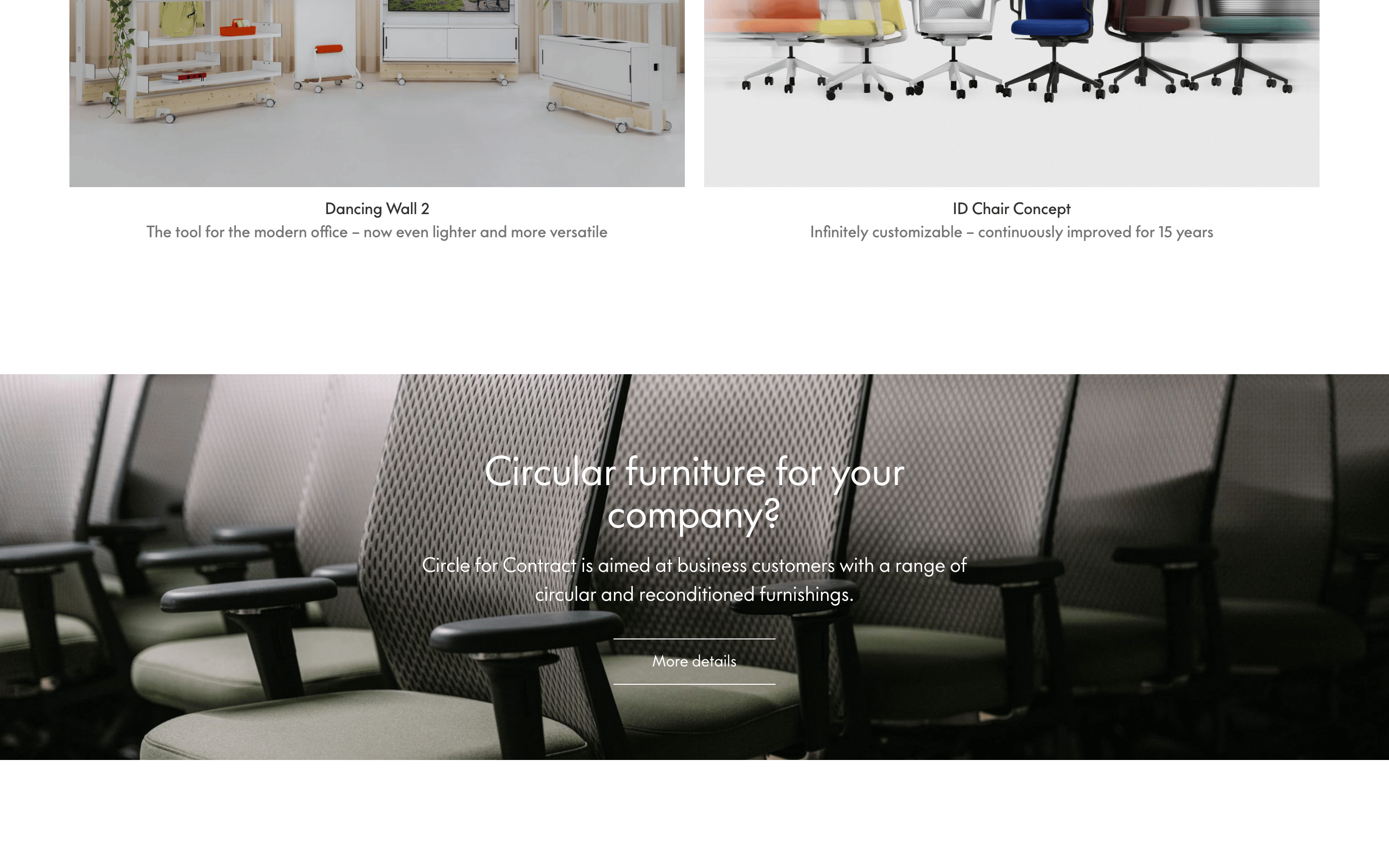
cardImage-dominant cards with centered text captions below, no borders or backgrounds.
chipN/A
inputMinimal search inputs with thin bottom borders.
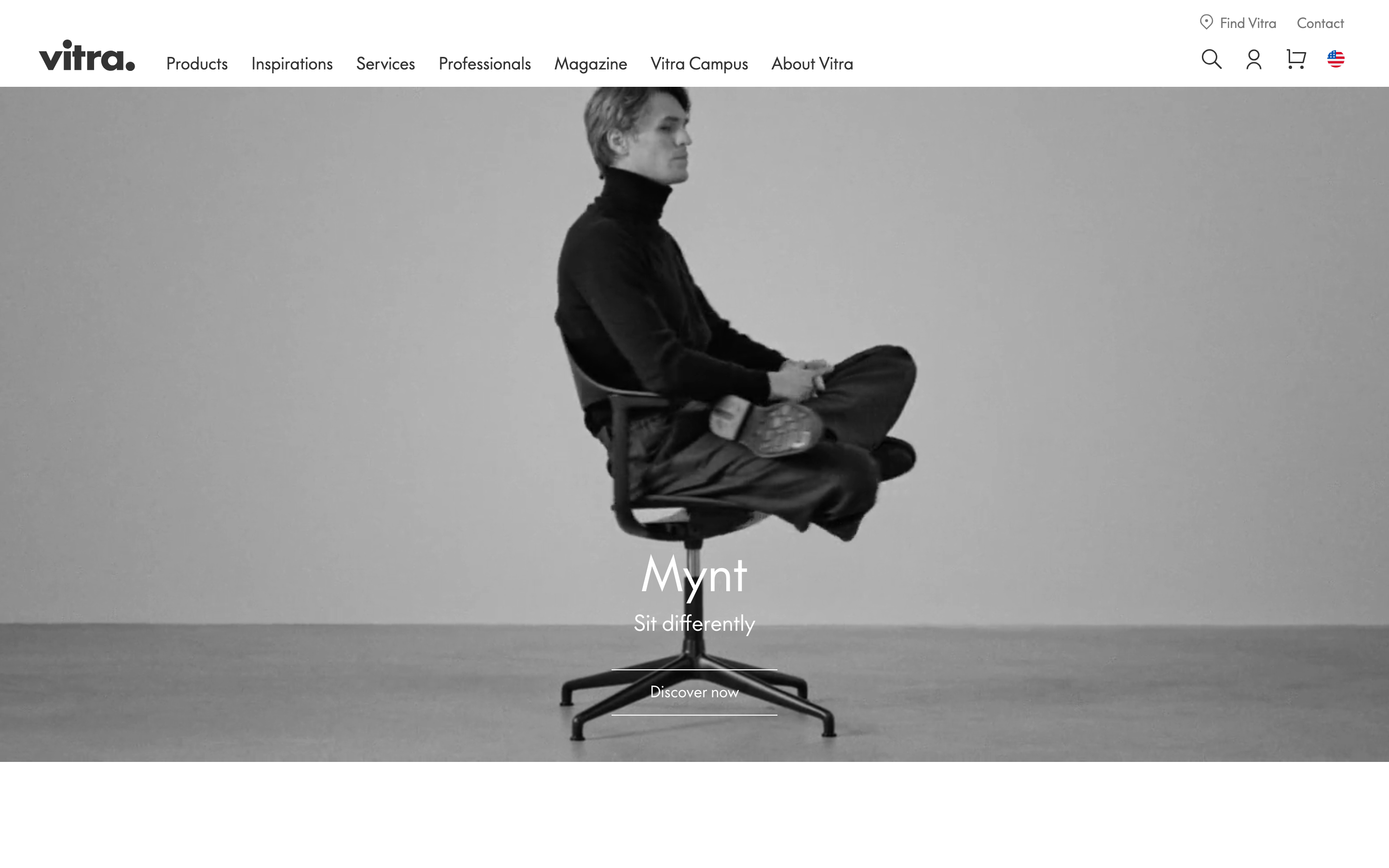
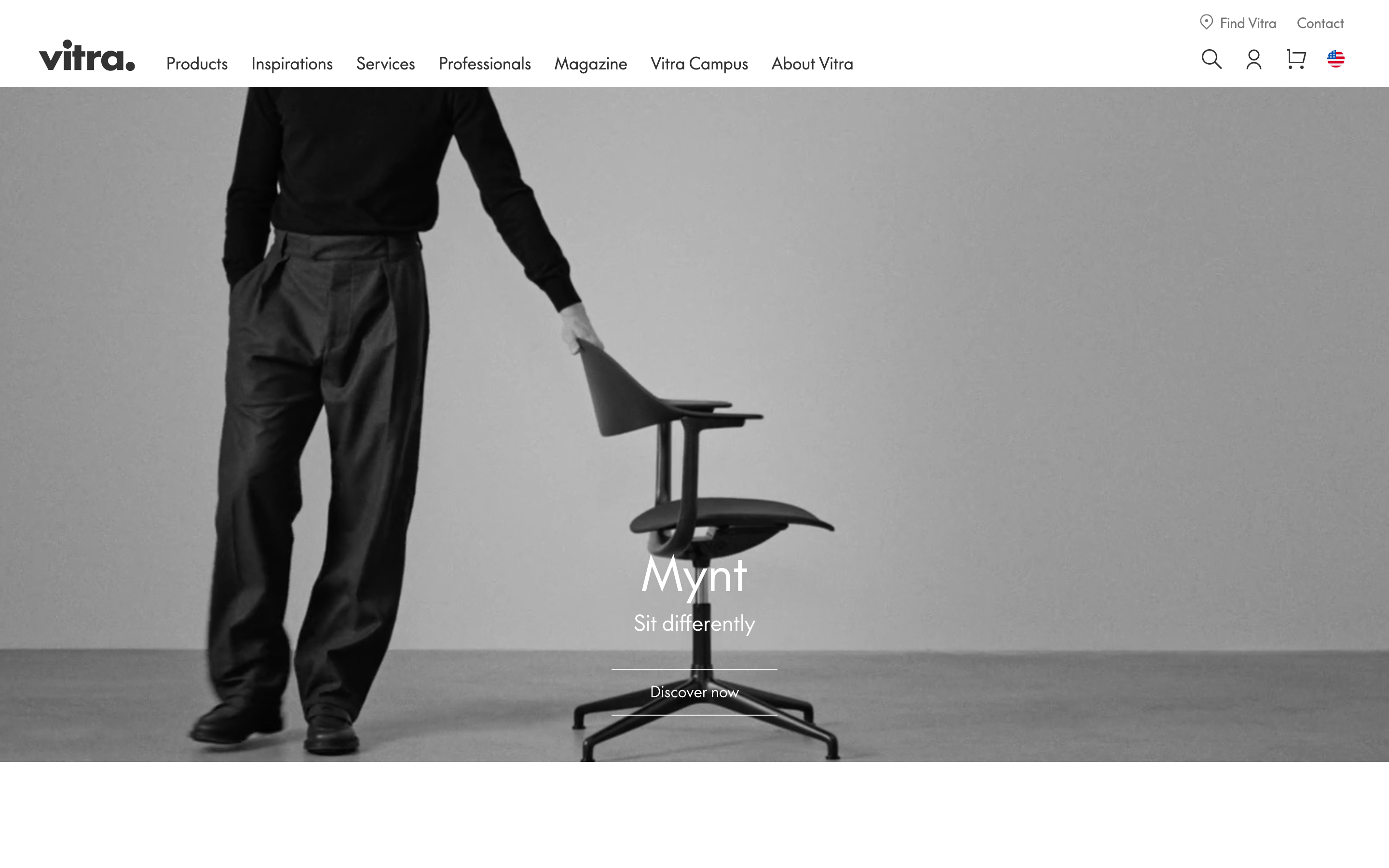
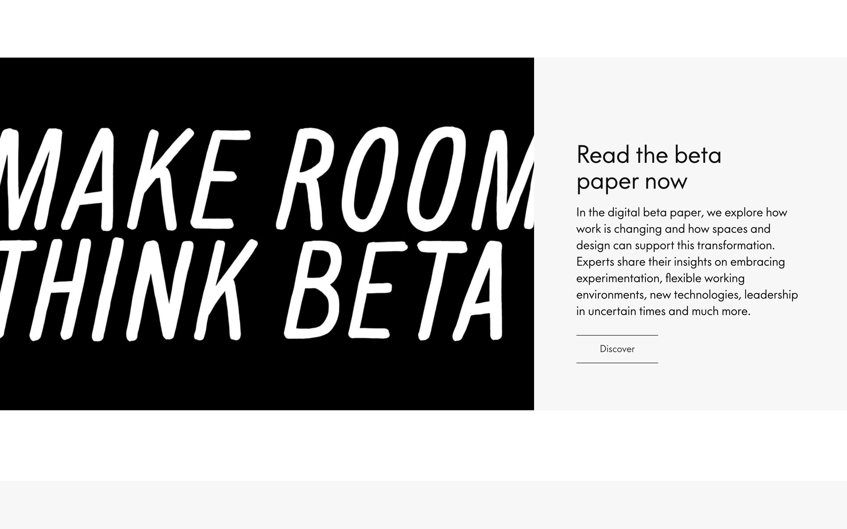
heroFull-viewport cinematic photography with vertically and horizontally centered text overlays.
09
Voice & Don'ts
ToneAuthoritative, refined, and visionary.
HeadlinesShort, impactful product names or conceptual questions.
CTAsDirect and action-oriented, such as 'Discover now' or 'More details'.
Don't use drop shadows — screenshot shows flat design relying on photography depth.
Don't use rounded corners on buttons or cards — screenshot shows sharp, square edges.
Don't use bright accent colors — screenshot shows a strict monochrome palette.
Don't use bold font weights for body text — screenshot shows medium weight (500) for all text.
Don't use dense text blocks — screenshot shows generous line-height and paragraph spacing.
Don't use decorative borders — screenshot shows only thin, functional 1px lines.
Avoid: Avoid casual language or emojis
Avoid: Avoid cluttering the visual hierarchy with too much text
Avoid: Avoid using bright, saturated accent colors
Captured from the live site · real computed styles
11
System prompt
Vitra's visual system is a premium, editorial-driven furniture showcase. It uses a strict monochrome palette centered on white (#FFFFFF), near-black ink (#101010), and soft grays (#F7F7F7, #333333, #767676). Typography is a clean geometric sans-serif used consistently at a medium weight (500) with generous line-heights and letter-spacing for labels. The layout is defined by full-bleed, cinematic photography and minimal, sharp-edged UI components. Critical constraints: never use drop shadows, never use bright accent colors, and never use rounded corners on UI elements like buttons or cards.
Bring this taste to your agent
Hand your AI agent a machine-readable spec of this design — tokens, type, motion, the whole DNA.