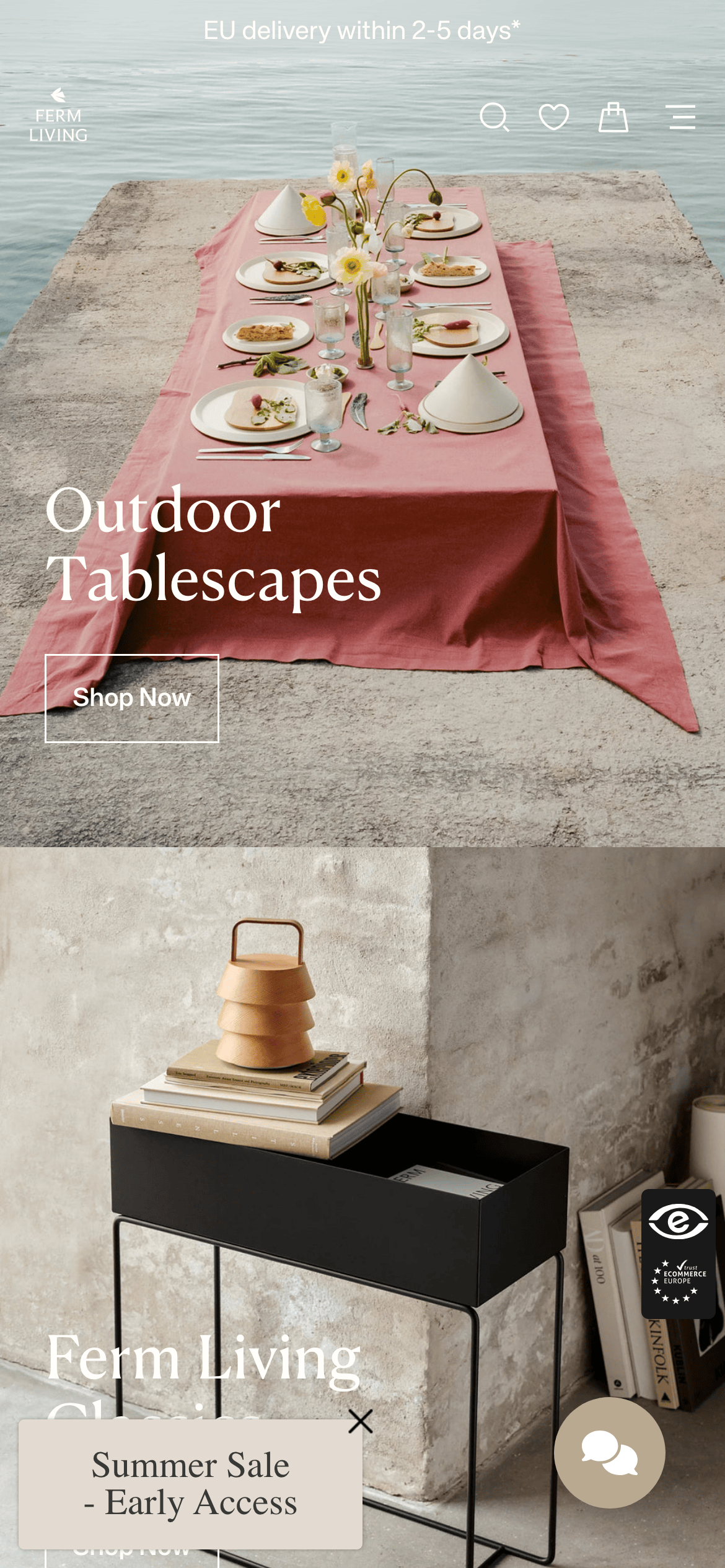
A restrained palette of warm off-whites and deep charcoals, relying on high-quality photography for visual richness and contrast.
03
Typography
transitional-serif · geometric-sans
display56px · 400
heading32px · 400
body16px · 400
small13px · 400
Use a high-contrast transitional serif for large display headlines · Use a clean geometric sans-serif for body copy and UI elements · Maintain a generous line-height for readability in long-form text
04
Spacing
4px
8px
16px
24px
32px
48px
64px
96px
Generous and spacious, relying heavily on the 24px base unit for alignment.
05
Surfaces
sm · 4px
md · 8px
lg · 12px
pill · 999px
1px solid rgb(56, 56, 56) for buttons, very minimal overall use of borders
0px 30px 70px 0px rgba(0, 0, 0, 0.3)
06
Layout
1280container
12columns
24pxgutter
768 / 1024breakpoints
Full-width photographic hero blocks interspersed with clean, wide-margin product grids.
07
Motion & Interaction
200msmicro
300mssmall
500msmedium
cubic-bezier(0.4, 0, 0.2, 1)easing
Smooth opacity and transform transitions on hover states · Subtle fade-ins for page load elements
Subtle color or opacity change on text and button borders · Immediate feedback with transition to new state
08
Components
buttonRectangular with 1px borders, uppercase text, minimal padding.
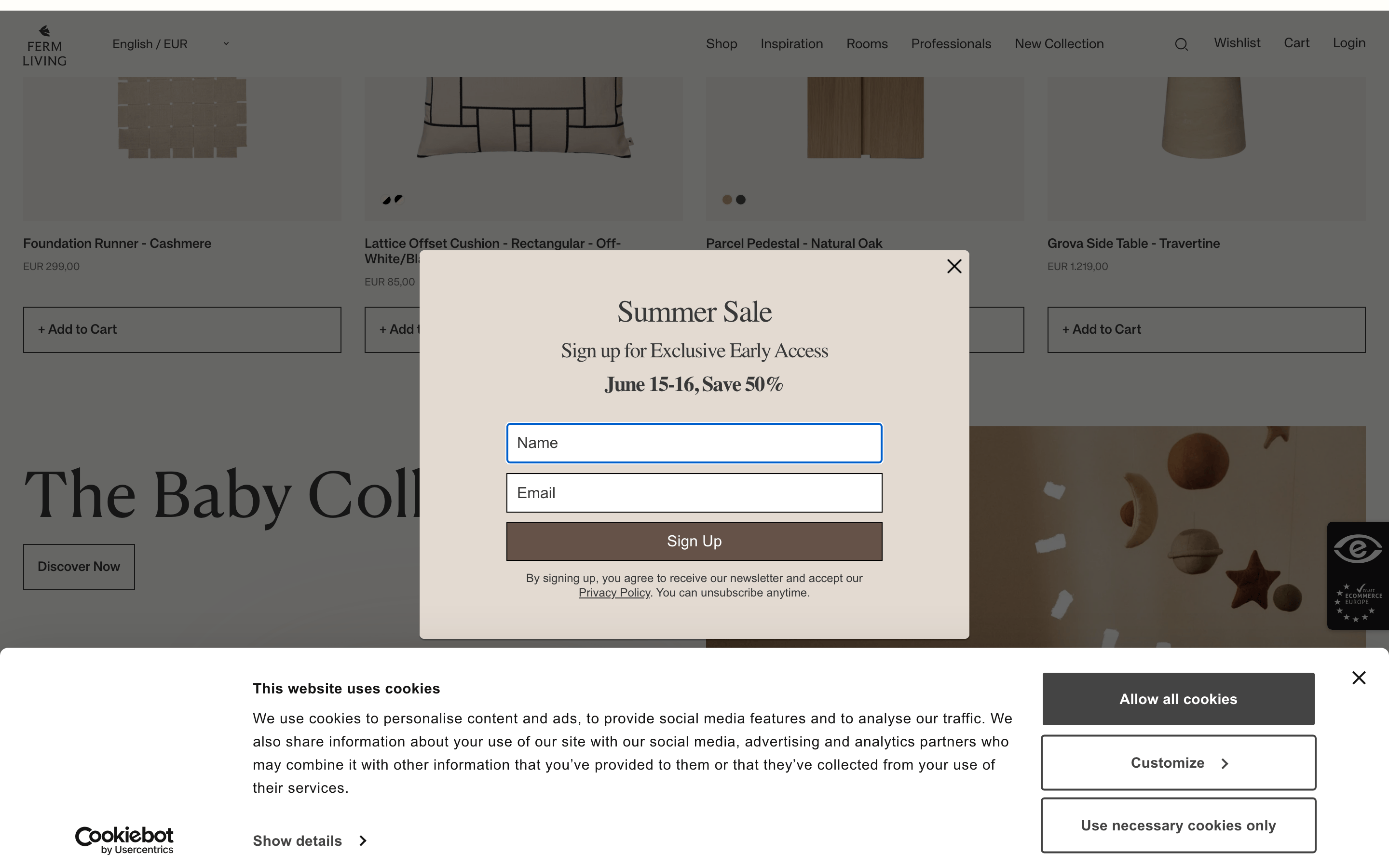
cardMinimalist product cards with top-aligned imagery, light background, and no borders.
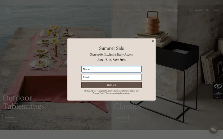
inputClean rectangular fields with 1px borders and rounded corners.
heroFull-bleed, high-quality lifestyle photography with large serif overlay text.
09
Voice & Don'ts
ToneSophisticated, serene, and understatedly confident.
HeadlinesShort, evocative, and image-focused.
CTAsSimple and direct, often using uppercase text in bordered boxes.
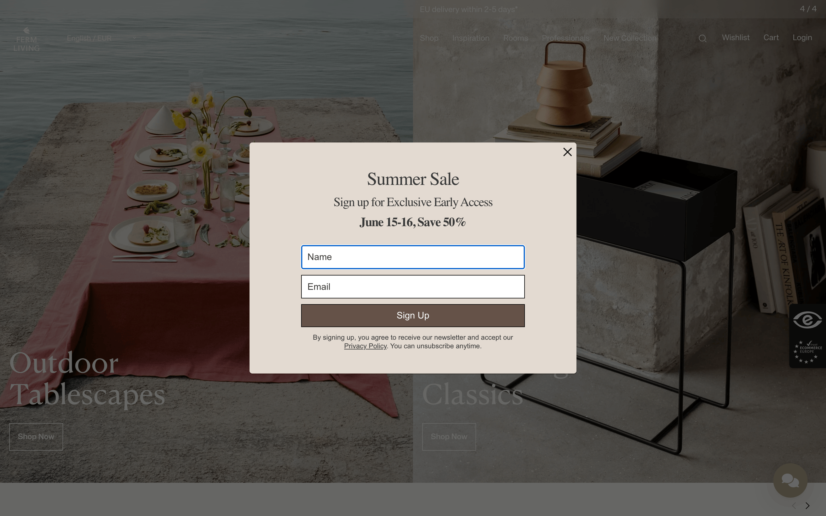
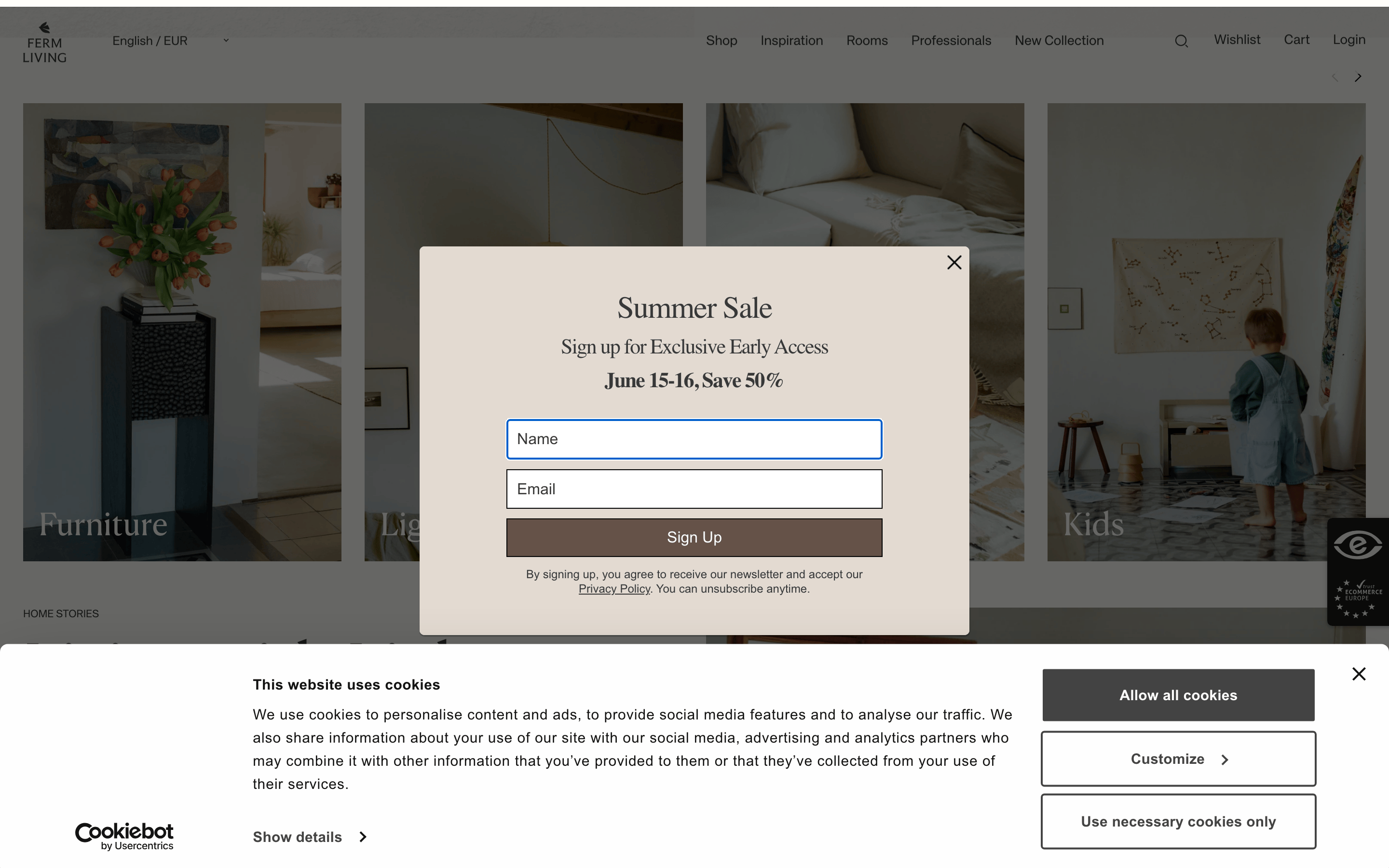
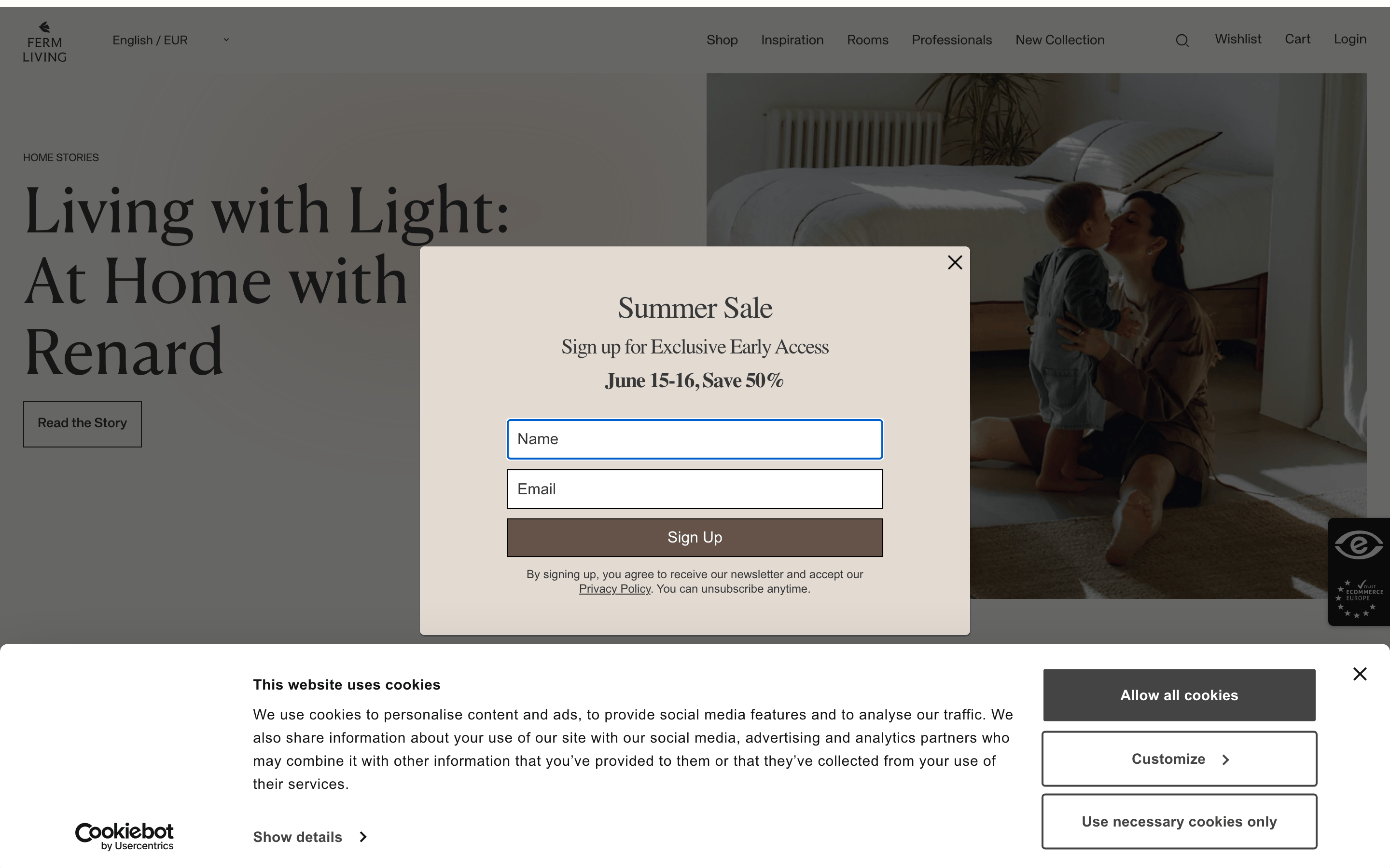
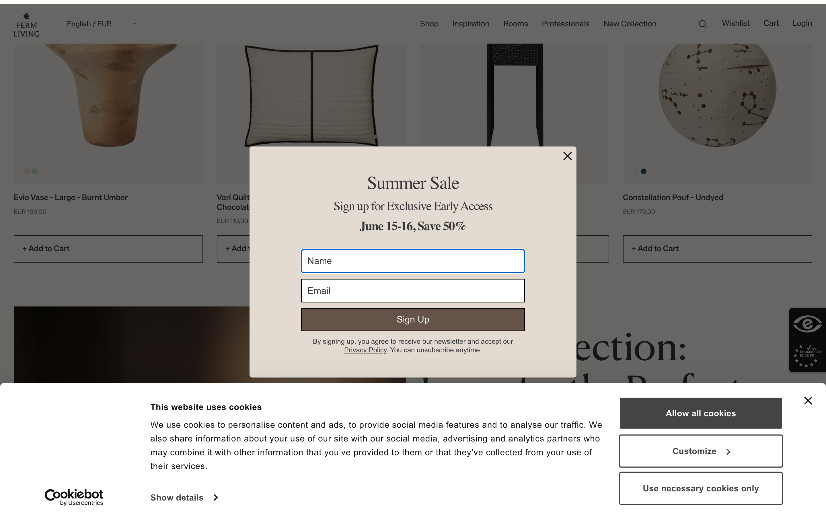
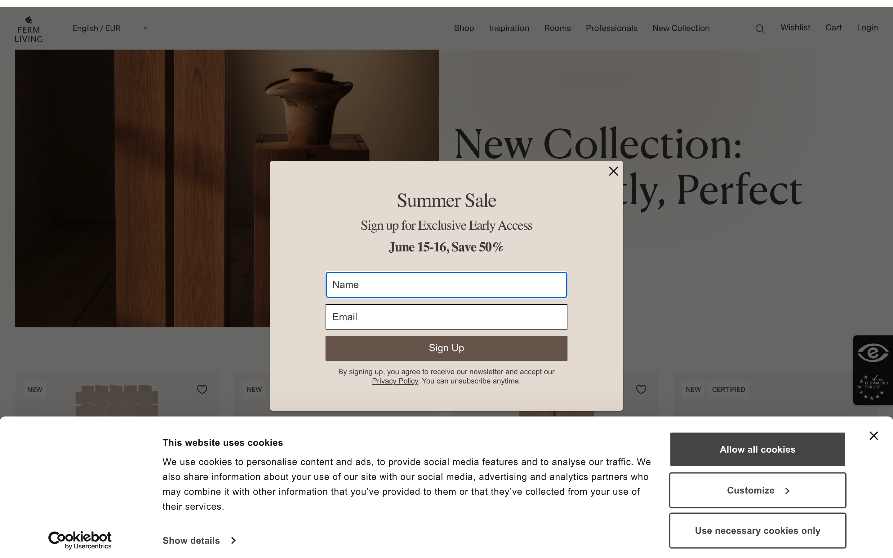
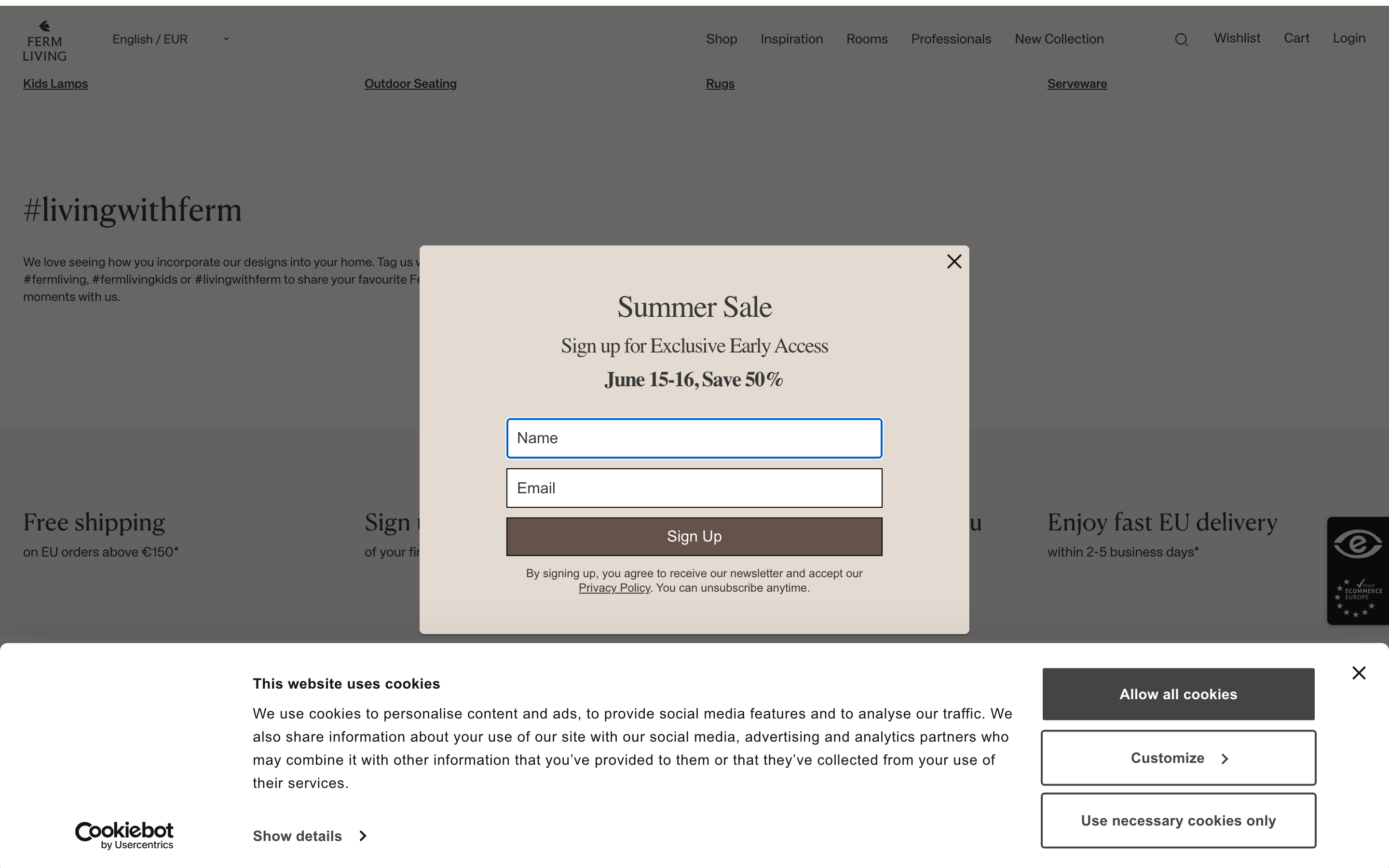
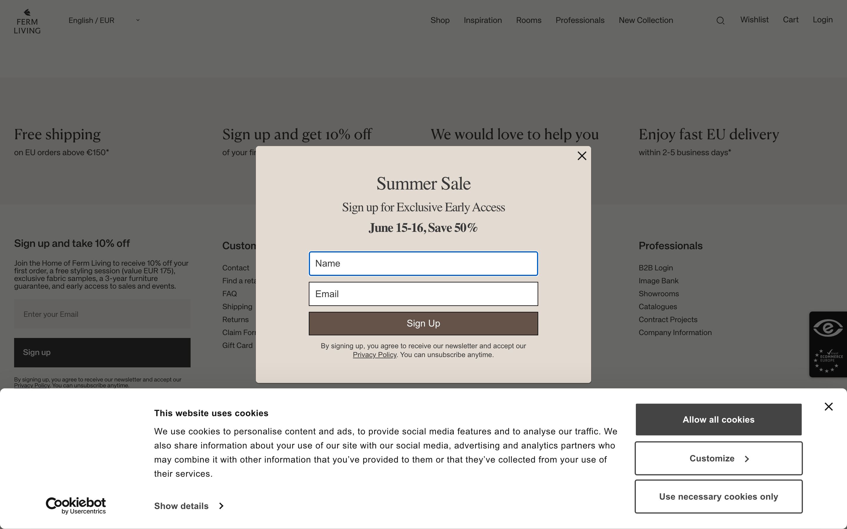
Don't use a bright neon accent — screenshot shows a muted, earthy palette instead.
Don't use heavy drop shadows on UI elements — screenshot shows only deep, large blur shadows on modals.
Don't use a complex gradient background — screenshot shows solid, warm off-white tones instead.
Don't use a playful or rounded sans-serif — screenshot shows clean geometric sans and high-contrast serifs.
Don't use a dense, cluttered grid — screenshot shows generous whitespace and large photographic blocks.
Don't use bold or italicized display text — screenshot shows clean, regular-weight typography.
Avoid: Aggressive promotional language or bright, clashing colors
Avoid: Cluttered layouts or excessive visual noise
Captured from the live site · real computed styles
11
System prompt
Ferm Living is a premium home goods and furniture e-commerce site that blends editorial photography with a minimalist Scandinavian aesthetic. The core palette relies on warm off-white backgrounds (#FFFEFA, #F7F5EF) contrasted against deep charcoal text (#383838). Typography pairs a sophisticated transitional serif for high-impact display headlines with a clean, geometric sans-serif for body copy and UI elements. Critical design constraints: never use bright, high-chroma accent colors; avoid heavy drop shadows on standard UI components; and maintain generous whitespace. Layouts are built on wide-margin grids with full-bleed lifestyle photography to drive emotional connection, requiring a restrained and elegant visual system.
Bring this taste to your agent
Hand your AI agent a machine-readable spec of this design — tokens, type, motion, the whole DNA.