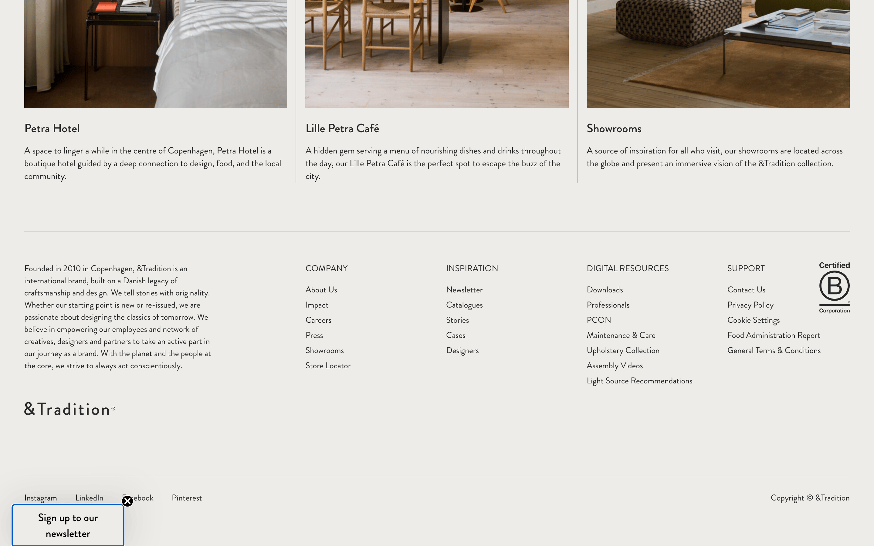
Warm, neutral backgrounds that provide a calm, gallery-like stage for high-quality photography.
03
Typography
transitional-serif · geometric-sans
display36px · 400
body14px · 400
Use geometric sans for all UI elements, navigation, and body text. · Use transitional serif for major editorial headings and feature titles. · Maintain a clean, open typographic feel with generous spacing.
04
Spacing
4px
8px
16px
24px
32px
48px
64px
96px
8px baseline grid with generous vertical rhythm.
05
Surfaces
sm · 0px
md · 0px
lg · 0px
pill · 999px
1px solid rgba(40,40,40,0.1)
rgba(0, 0, 0, 0.1) 0px 0px 2px 0px
06
Layout
1280container
12columns
24pxgutter
768 / 1024breakpoints
Asymmetric editorial grid, alternating large imagery with text.
07
Motion & Interaction
150msmicro
200mssmall
500msmedium
cubic-bezier(0.25, 0.1, 0.25, 1)easing
Subtle opacity and color transitions on hover. · Smooth transitions for opening overlays.
Subtle color change or underline for links and buttons. · Immediate visual feedback.
08
Components
buttonMinimal text links, occasionally with underlines.
cardImage-heavy editorial cards with clean typography underneath.
chipUppercase, small-caps navigation or category labels.
inputSimple text input, minimal border.
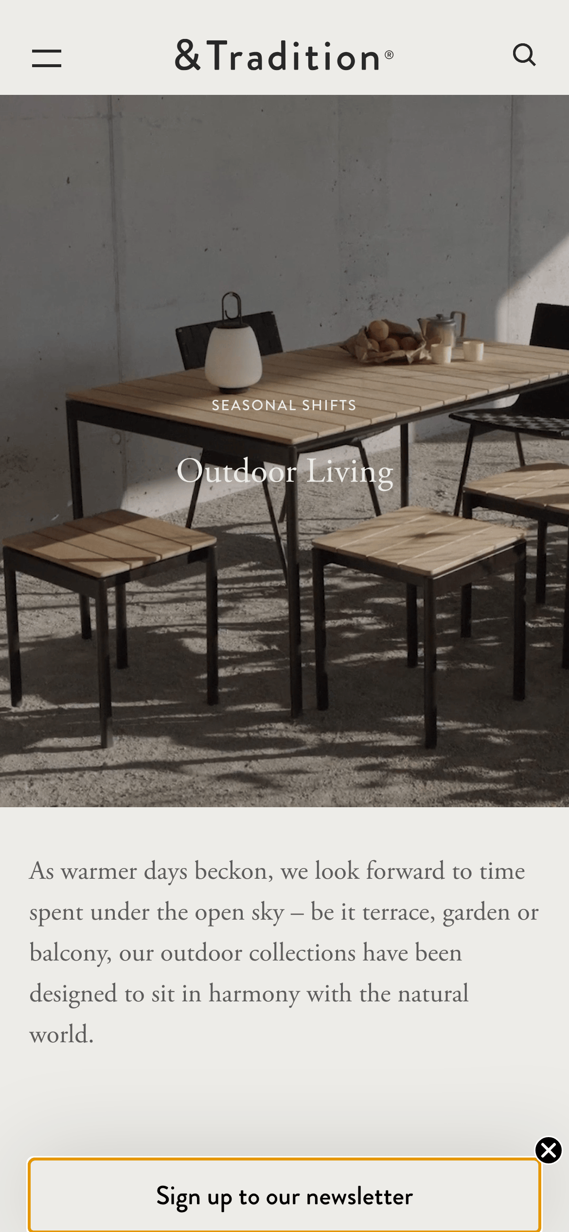
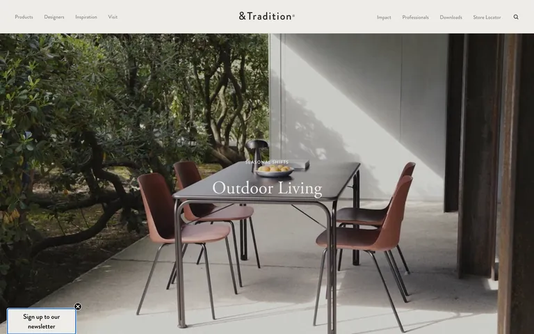
heroFull-width photographic hero with centered or bottom-aligned text.
09
Voice & Don'ts
ToneRefined, poetic, and descriptive.
HeadlinesEvocative and thematic, often using transitional serif.
CTAsMinimal and functional, often just a 'Read more' link.
Don't use neon or highly saturated primary colors — screenshot shows muted, earthy tones.
Don't use rounded, bubbly UI elements — screenshot shows sharp, rectangular forms.
Don't clutter the interface with many small icons — screenshot shows a very clean, sparse layout.
Don't use a heavy, bold sans-serif for all text — screenshot shows a mix of serif and sans-serif.
Don't use dark mode as the primary theme — screenshot shows a light, warm, off-white background.
Don't use aggressive drop shadows — screenshot shows extremely subtle, minimal shadow effects.
Captured from the live site · real computed styles
11
System prompt
This design DNA is for a premium, editorial furniture brand like &Tradition. Positioning is high-end and curated. Key colors are warm neutrals like #EDECE8 and #F6F6F6, with dark ink #282828. Typography mixes a transitional-serif for display with a geometric-sans for body. Critical donts: avoid using neon colors, avoid bubbly or highly rounded UI, and never clutter the interface with too many small icons. The overall feel is calm, refined, and gallery-like.
Bring this taste to your agent
Hand your AI agent a machine-readable spec of this design — tokens, type, motion, the whole DNA.