A curated gallery for high-end Scandinavian home goods
02
Color
#929172Accent
#2F2B23Ink
#141414Ink soft
#F5F3EBBG
#FFFFFFBG soft
#817E74Muted
rgba(47,43,35,0.3)Line
Warm neutrals with earthy, low-chroma accents create a calm, premium atmosphere
03
Typography
transitional-serif · geometric-sans
display48px · 400
heading28px · 400
body14px · 400
small12px · 400
Uppercase small text for navigation and category labels · Light weight (400) used across most text elements · Serif fonts used for branding and display to convey elegance
04
Spacing
4px
8px
16px
24px
32px
40px
64px
96px
Consistent vertical rhythm with generous padding for an airy feel
05
Surfaces
sm · 2px
md · 4px
lg · 10px
pill · 9999px
Subtle 1px borders in muted earthy tones, often only on specific sides
Captured from the live site · real computed styles
11
System prompt
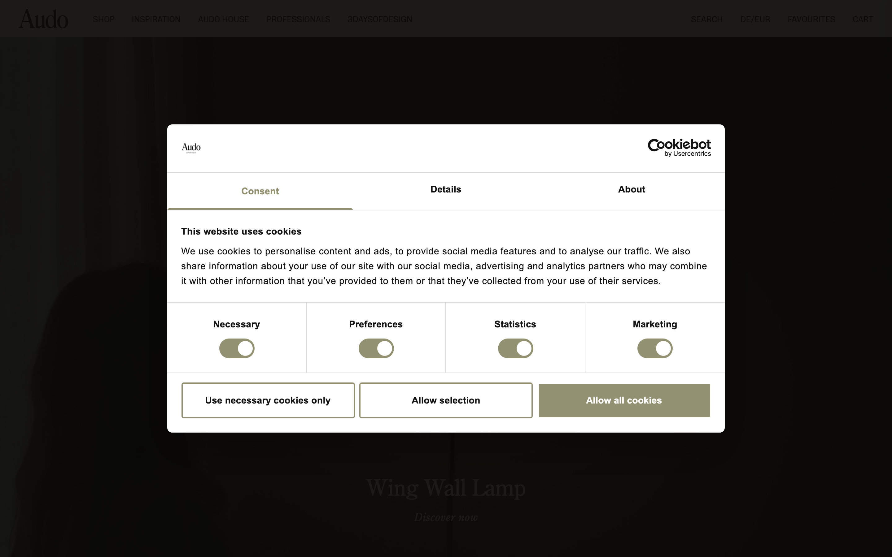
Design a premium Scandinavian furniture e-commerce site. Position it as a curated, editorial gallery rather than a typical retail shop. Use a warm, restrained palette: cream background (#F5F3EB), dark earthy ink (#2F2B23), and a muted olive accent (#929172). Typography should pair a transitional serif for elegant headlines with a clean geometric sans-serif for body text, keeping font weights light (400). Critical donts: Do not use bright, saturated colors or high-contrast accents. Do not use heavy, bold typography. Do not clutter the interface; prioritize generous whitespace and large, cinematic product photography. Do not use harsh, sharp corners everywhere. Do not use standard web blue or red for interactive elements. Do not create dense, crowded layouts.
Bring this taste to your agent
Hand your AI agent a machine-readable spec of this design — tokens, type, motion, the whole DNA.