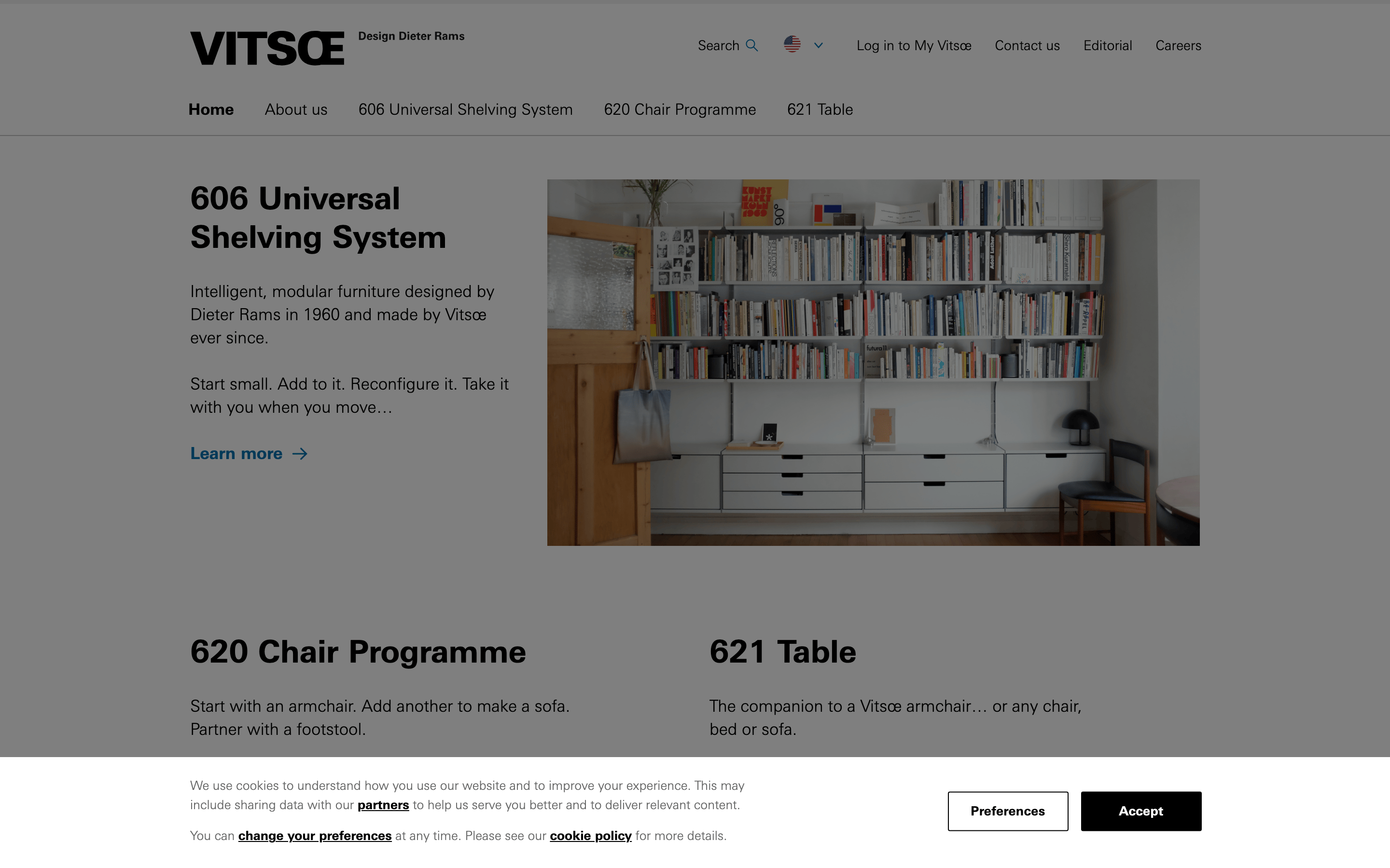
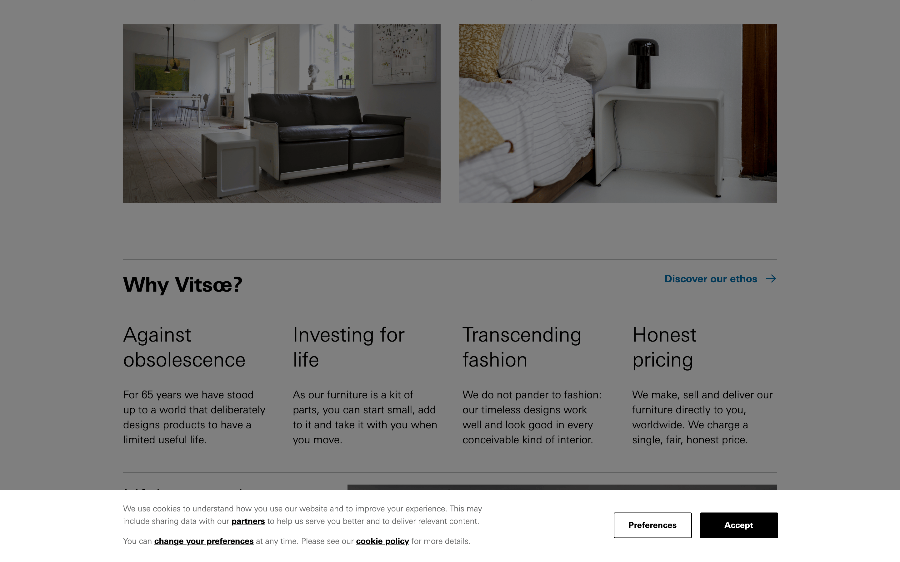
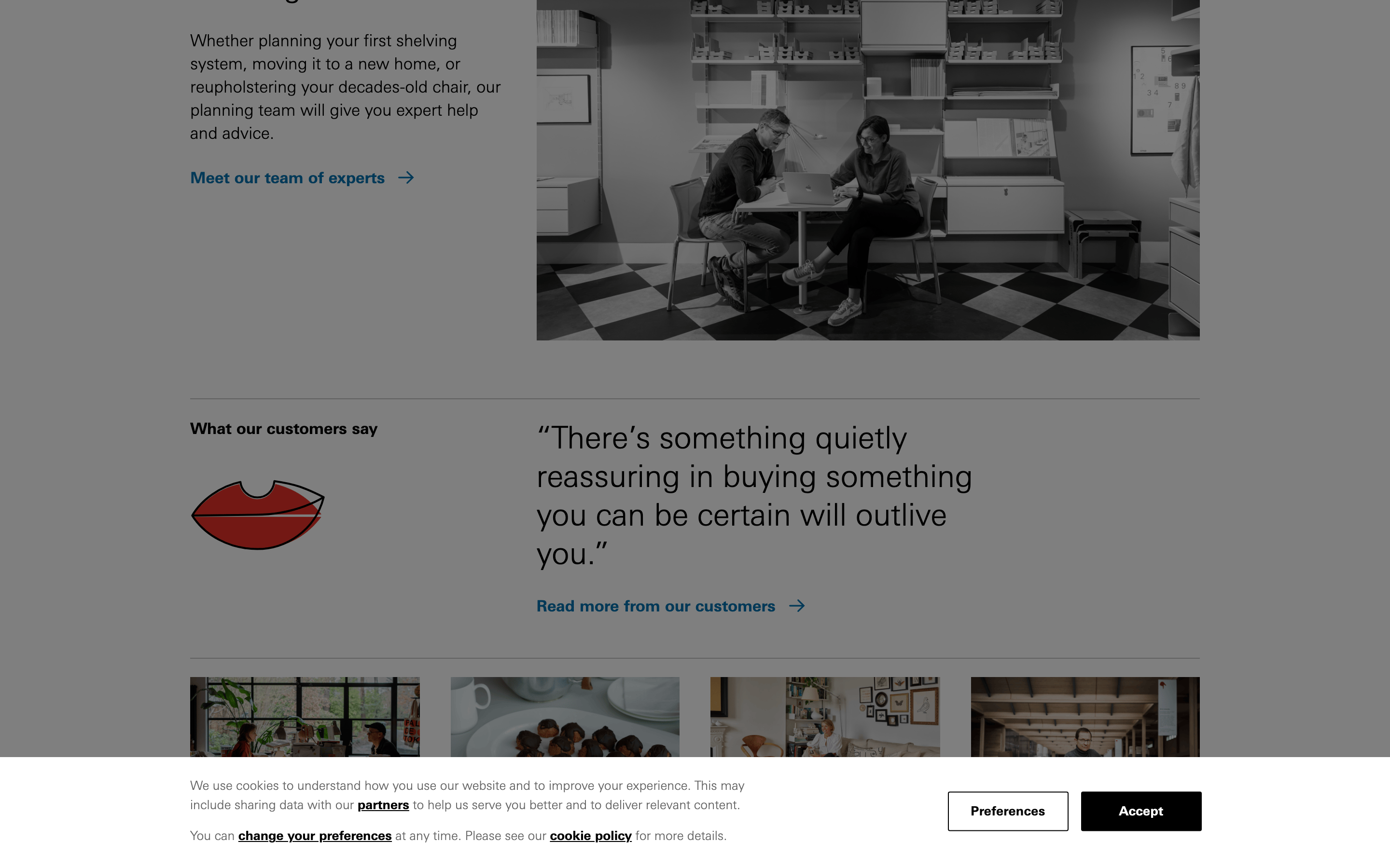
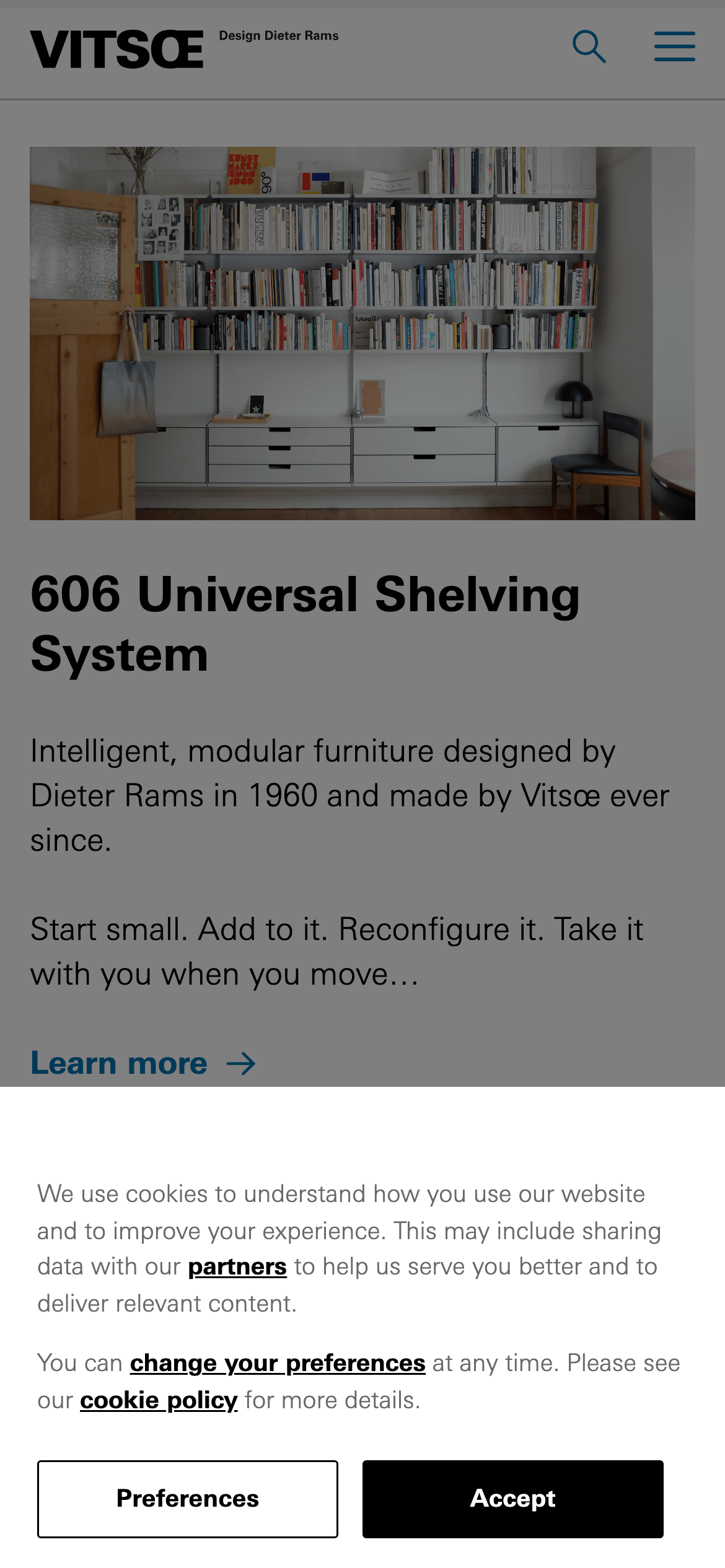
A curated, gallery-like product catalog with timeless restraint.
02
Color
#0073B1Accent
#000000Ink
#FFFFFFBG
#F0F0F0BG quiet
#696969Muted
rgba(194, 194, 194, 1)Line
Monochromatic with a single functional blue accent for interactivity.
03
Typography
grotesque-sans
display40px · 700
heading32px · 700
body16px · 400
Use Linotype Univers W01 for all text layers. · Maintain a strict typographic hierarchy with heavy weights for display and light for body. · Keep letter spacing tight for large display sizes.
04
Spacing
8px
16px
24px
32px
48px
64px
96px
128px
Generous vertical rhythm driven by 32px and 64px increments for clear section separation.
Captured from the live site · real computed styles
11
System prompt
Design DNA for Vitsœ, a heritage furniture brand rooted in Dieter Rams' minimalist philosophy. The system uses a monochromatic palette (#000000, #FFFFFF, #F0F0F0) with a single functional blue accent (#0073B1). Typography is exclusively a clean grotesque sans-serif (Linotype Univers W01) with heavy weights for display and light for body. Critical donts: 1) Never use decorative illustrations, as the site relies on honest photography. 2) Avoid complex shadows or rounded borders, as the system is defined by flat, rectilinear surfaces. 3) Do not use multiple accent colors; maintain strict restraint with only one high-chroma blue for interactive elements. Positioning is premium and functional, focusing on modular longevity over trendy aesthetics.
Bring this taste to your agent
Hand your AI agent a machine-readable spec of this design — tokens, type, motion, the whole DNA.