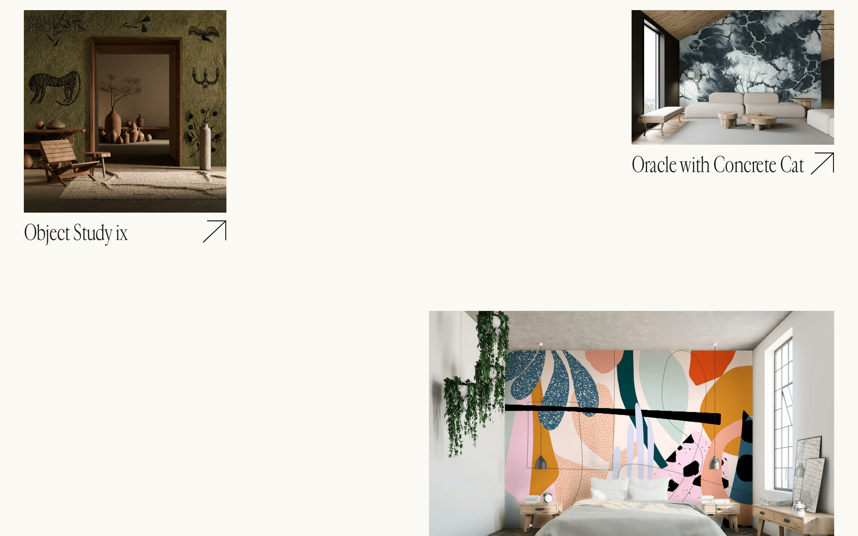
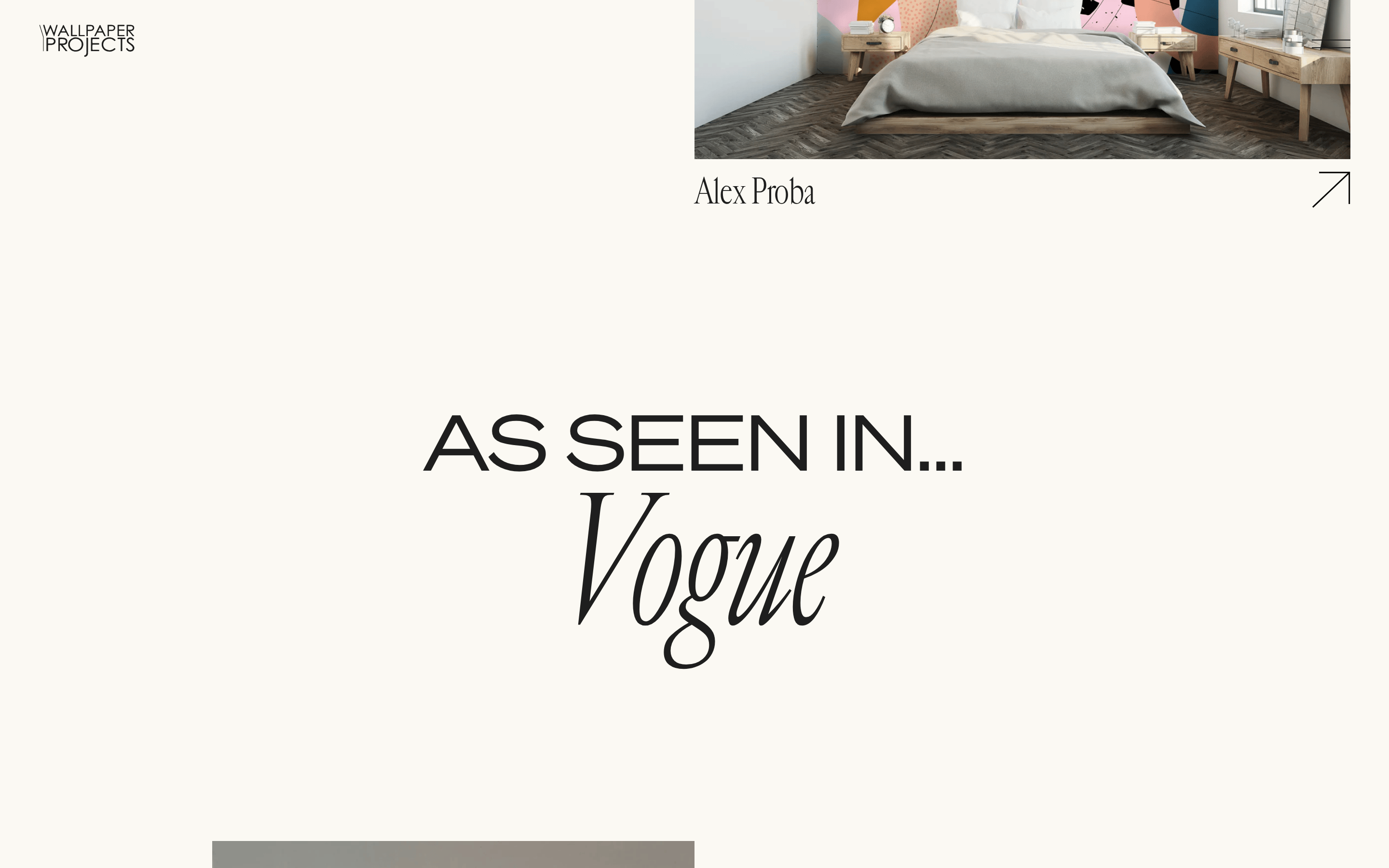
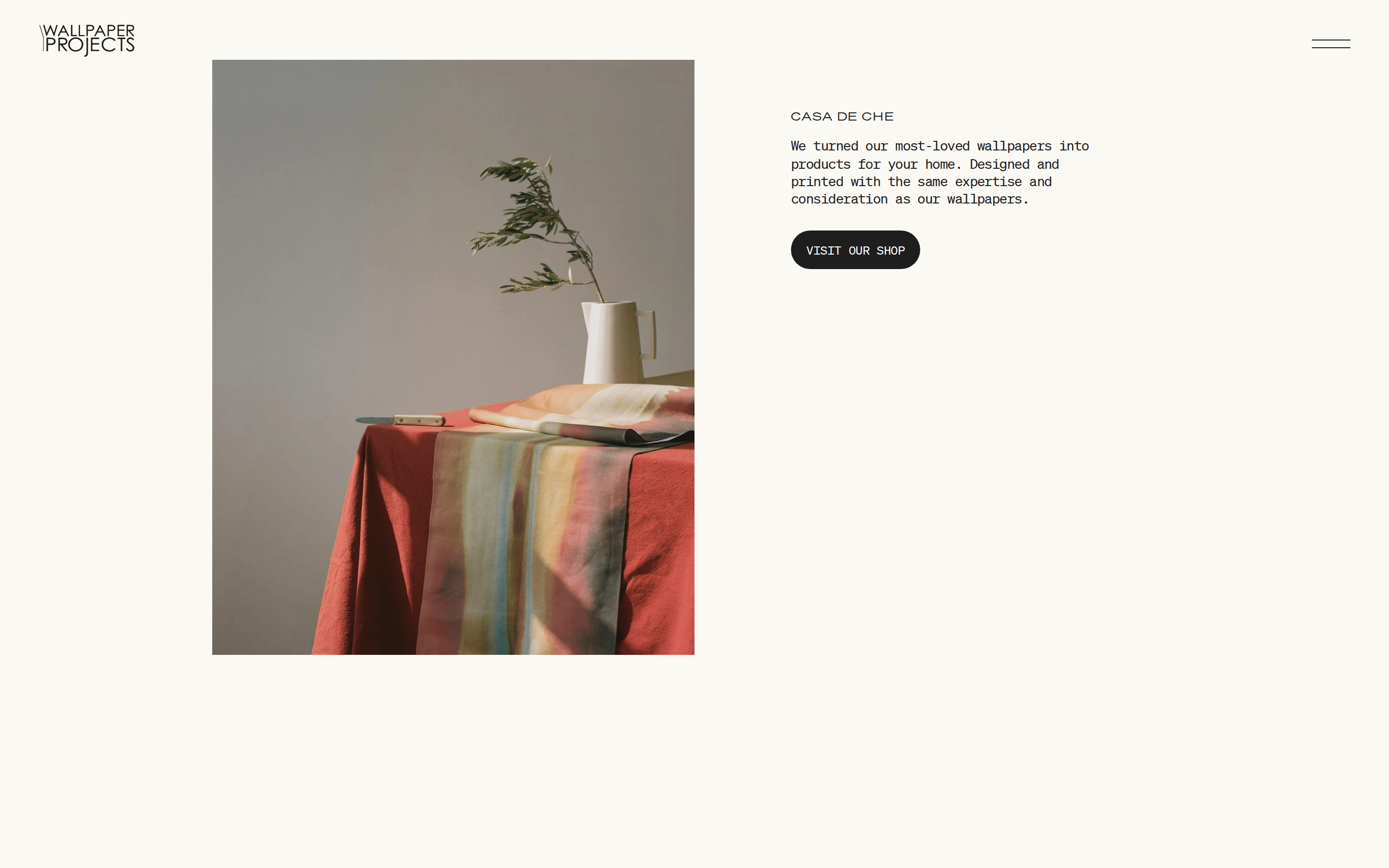
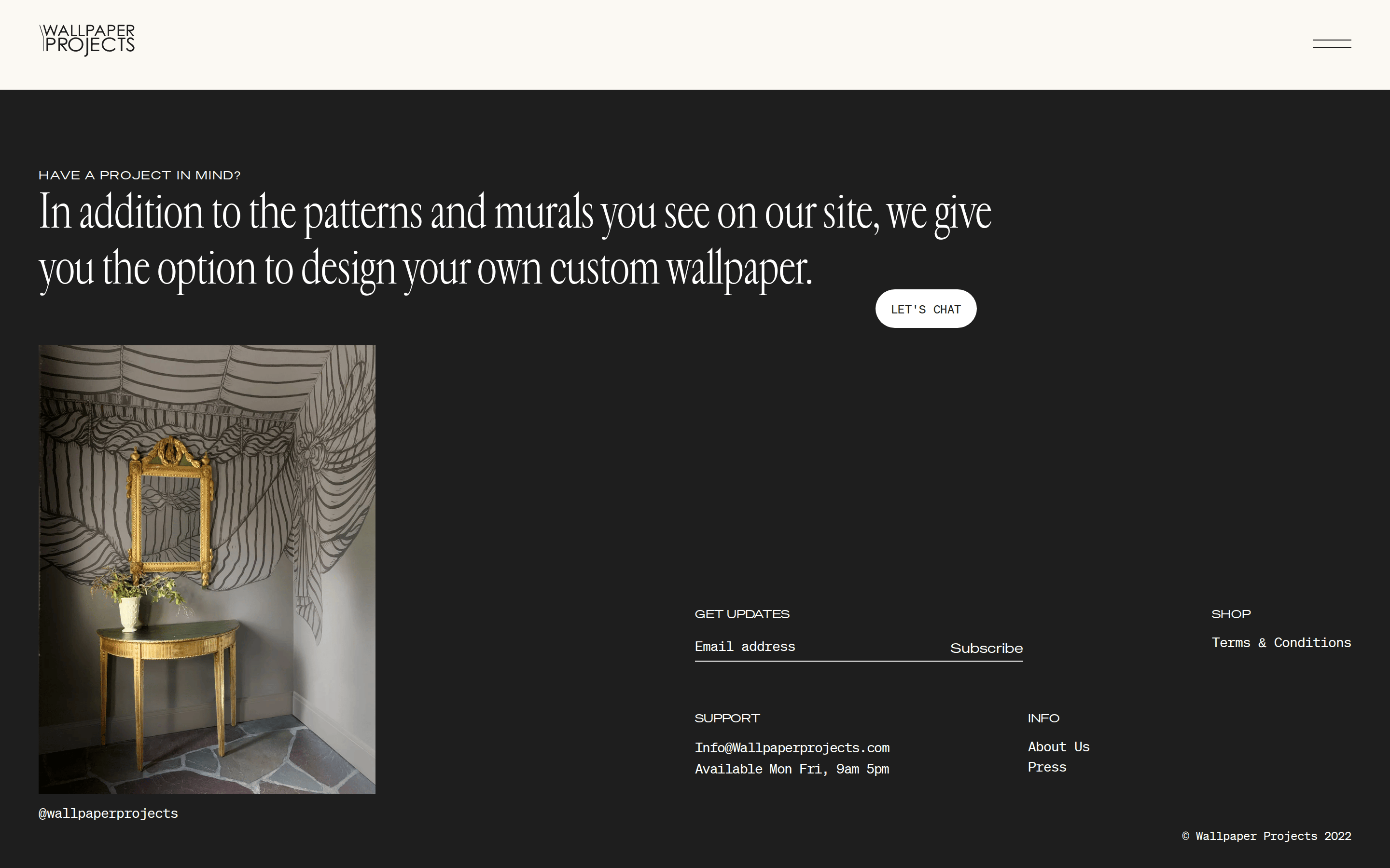
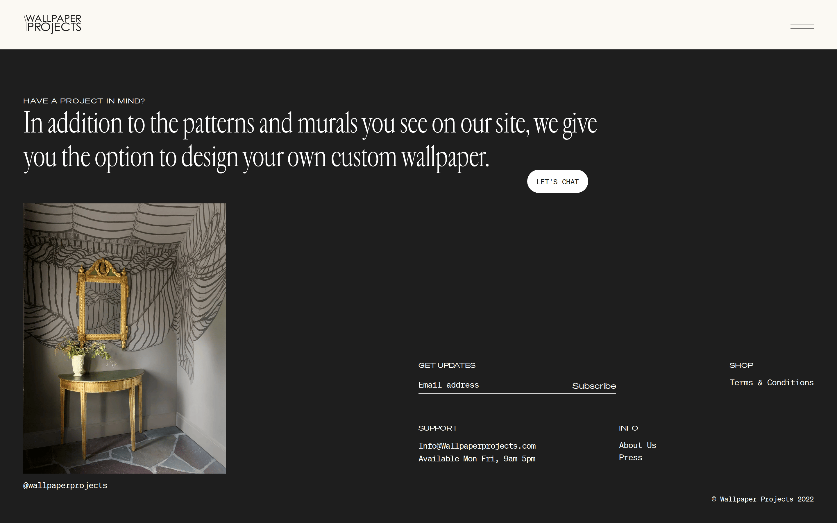
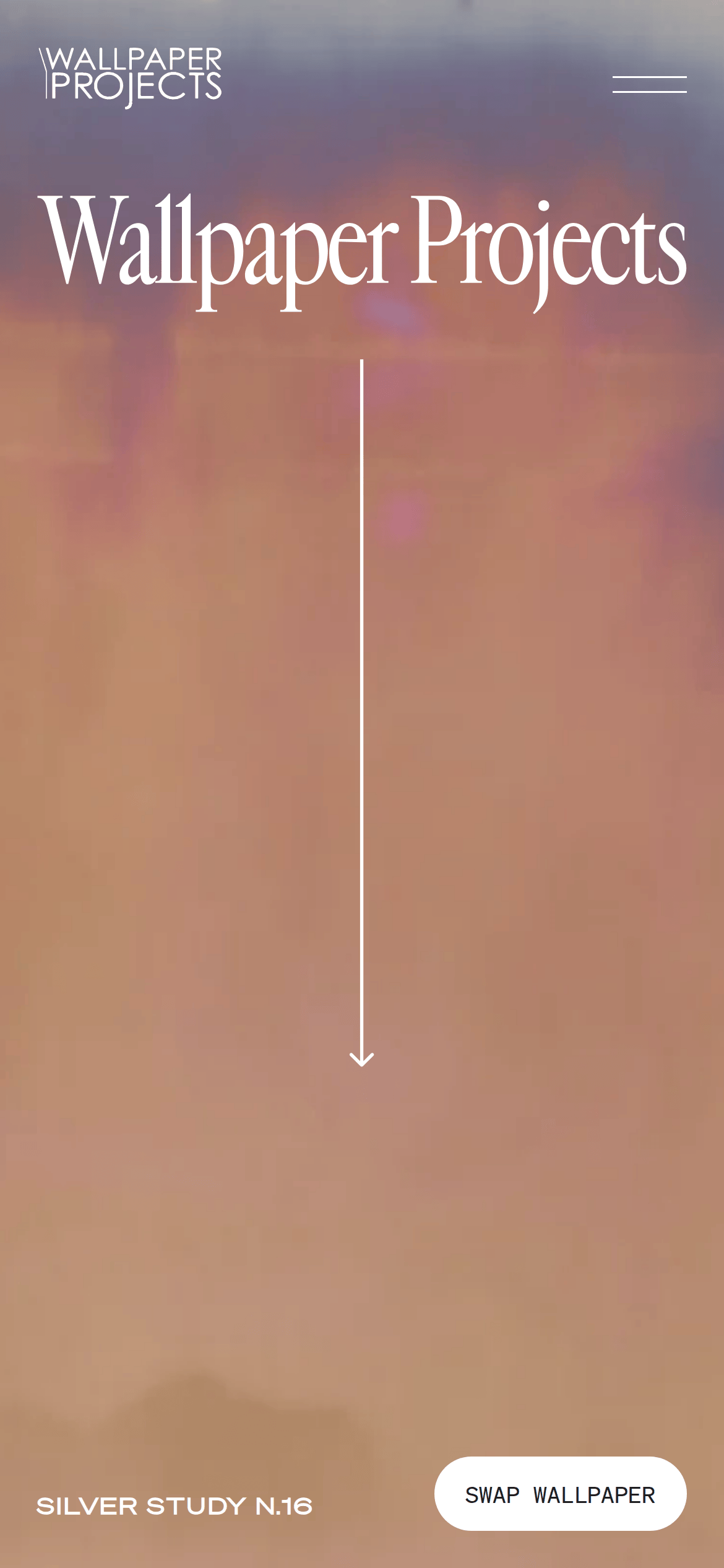
A high-end design magazine's digital exhibition space.
02
Color
#1E1E1EInk
#FBF9F3BG
rgba(30, 30, 30, 1.0)Line
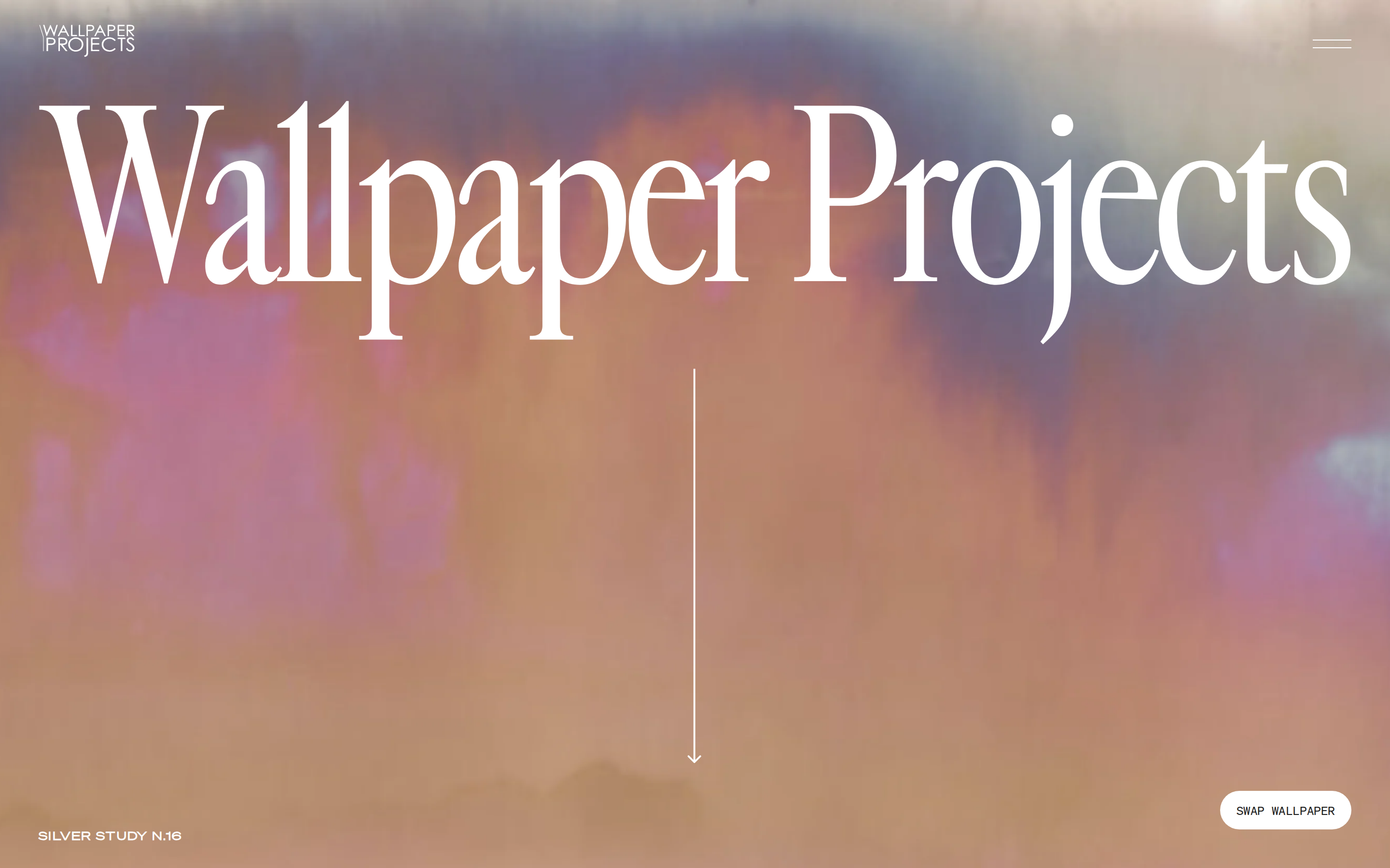
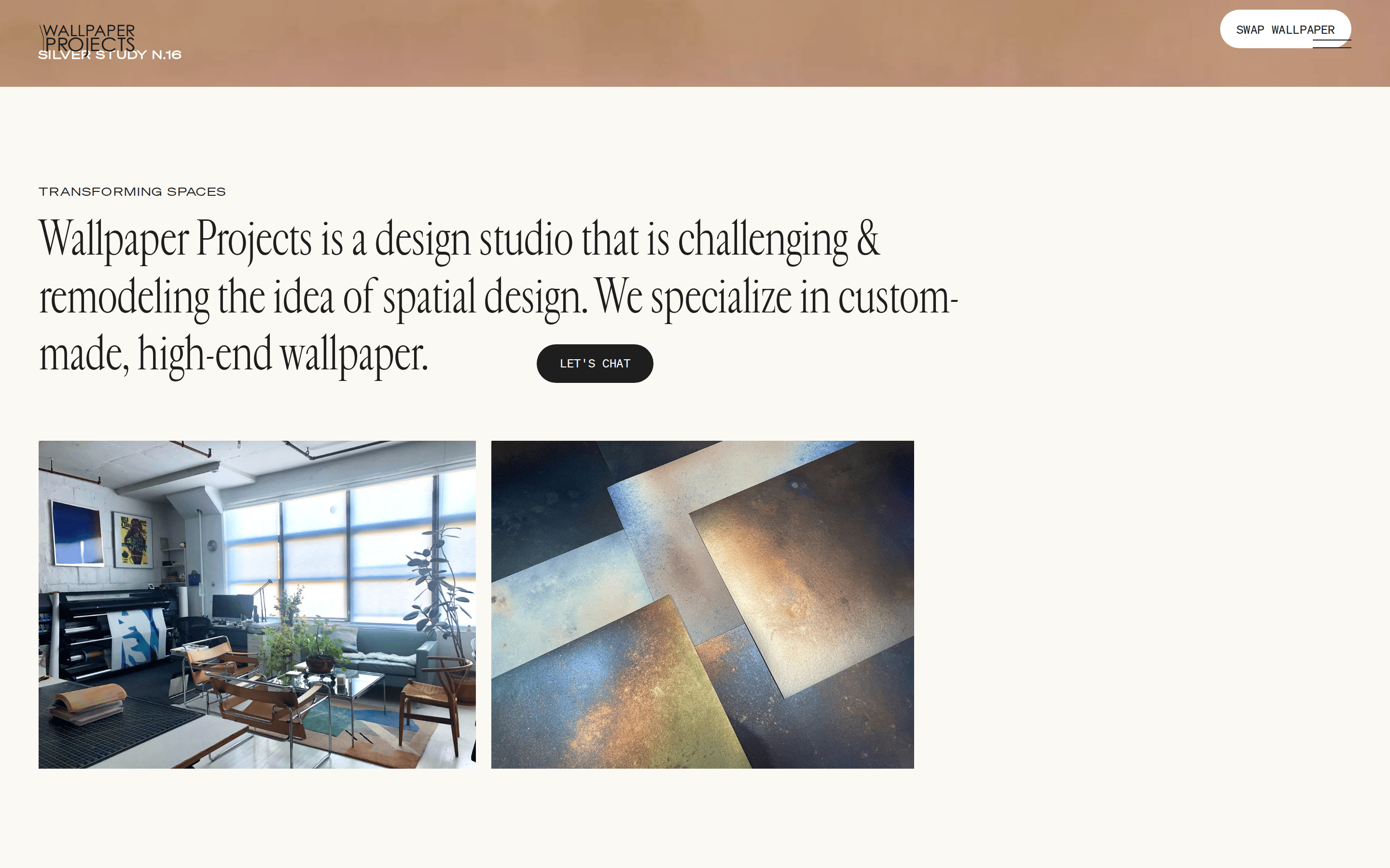
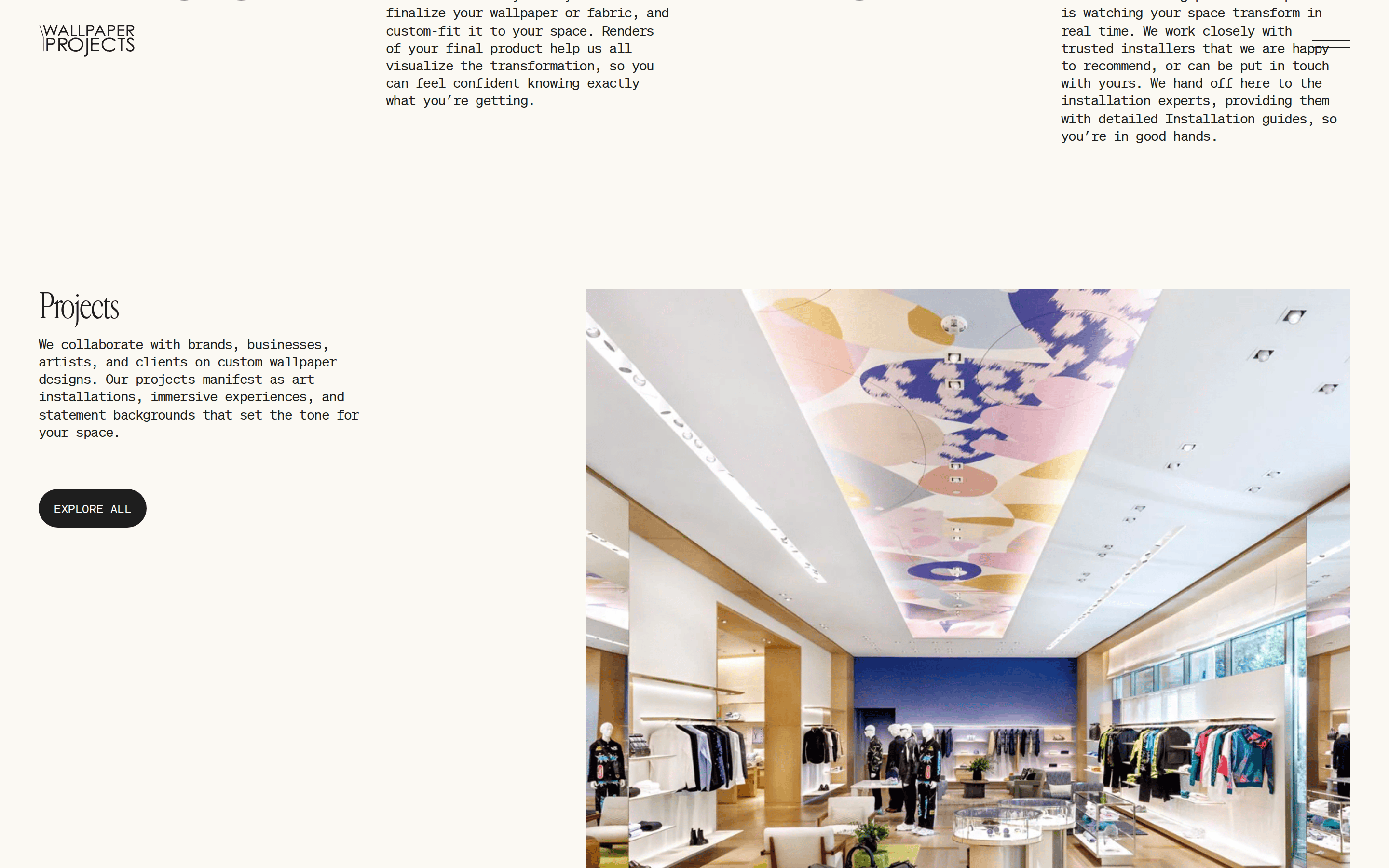
A strict monochromatic palette with a warm off-white background, allowing project imagery to provide all color.
03
Typography
transitional-serif · geometric-sans · monospace
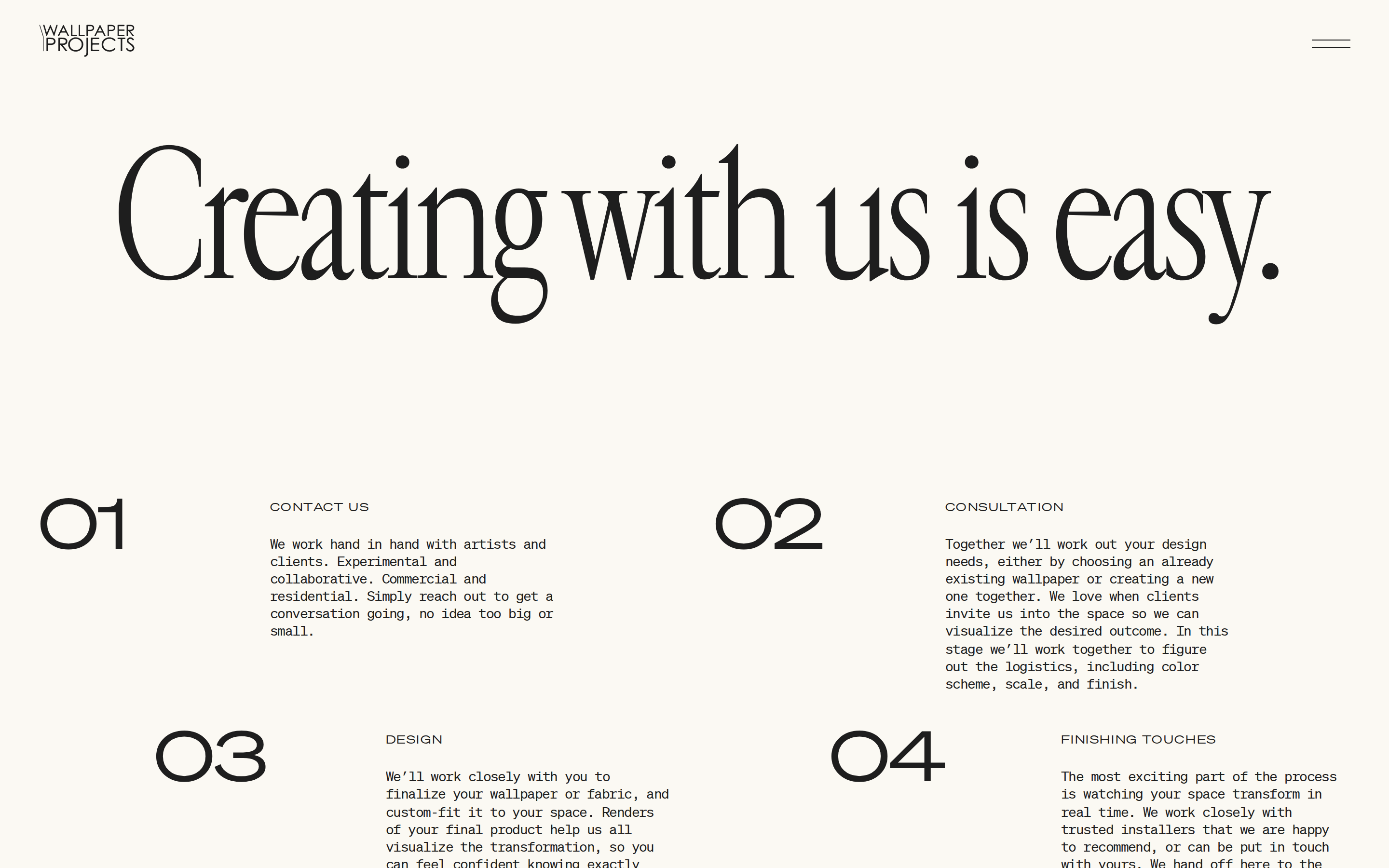
display180px · 400
display48px · 400
body12px · 400
All display text is set in a high-contrast transitional serif with tight tracking. · All UI and functional text is set in a wide, geometric sans-serif. · Uppercase is used for navigation and small labels, not for main headings.
04
Spacing
4px
8px
16px
24px
32px
48px
64px
96px
100px
A generous, spacious layout with large, clear zones and significant padding between major content blocks.
05
Surfaces
sm · 4px
md · 20px
lg · 20px
pill · 9999px
Minimal, 1px solid lines used sparingly for UI elements like the scroll indicator and menu icon.
06
Layout
1280container
12columns
24pxgutter
768 / 1024breakpoints
A clean, single-column layout that prioritizes large, immersive imagery and typography, with a fixed header.
07
Motion & Interaction
220msmicro
300mssmall
500msmedium
cubic-bezier(0.23, 1, 0.32, 1)easing
Smooth, decelerating transitions for most state changes (0.2s and 0.5s durations). · Opacity fades for content appearing and disappearing.
Cursor changes to a pointer for interactive elements; subtle opacity or color transitions. · No distinct click state shown, likely relying on the same transition as hover.
08
Components
buttonA pill-shaped button with uppercase geometric sans-serif text, used for primary actions.
cardA simple, borderless container for a project image and its associated serif title.
heroA full-bleed, visually dominant section featuring a large, abstract image and a massive typographic title.
09
Voice & Don'ts
ToneSophisticated, understated, and confident.
HeadlinesLarge, expressive serif typography that makes a bold visual statement.
CTAsClean, all-caps geometric sans-serif within a contained pill shape.
Don't use a pure white (#FFFFFF) background — the screenshot shows a warm, off-white (#FBF9F3) canvas instead.
Don't apply bold weight to the main serif display font — the screenshot shows it consistently at a regular weight (400).
Don't use tight, centered layouts — the screenshot shows expansive, often left-aligned or full-bleed compositions.
Don't introduce multiple accent colors — the screenshot shows a strict monochromatic scheme with color coming only from photography.
Don't use rounded rectangles for buttons — the screenshot shows a fully pill-shaped button with a high border-radius.
Don't stack the logo vertically in the header — the screenshot shows it on a single line in the top left.
Avoid: Visual clutter or unnecessary decorative elements.
Captured from the live site · real computed styles
11
System prompt
This is a premium, gallery-style editorial website for a design studio. It uses a very warm, off-white background (#FBF9F3) with dark, near-black text (#1E1E1E). The typography pairs a large, high-contrast transitional serif for display headlines with a wide, geometric sans-serif for UI elements, often set in uppercase. The layout is minimalist and spacious, focusing on large, immersive imagery and typography. Critical design rules: 1) Do not use pure white backgrounds; use the warm off-white tone. 2) Do not use bold weights for the main serif display font; keep it regular. 3) Do not introduce loud accent colors; let project photography provide all chromatic variation. 4) Maintain generous spacing and a single-column flow to preserve the editorial, gallery feel.
Bring this taste to your agent
Hand your AI agent a machine-readable spec of this design — tokens, type, motion, the whole DNA.